css centralization method summary
horizontally
①margin: 0 auto
Set the margin value of the child element to 0 auto.
Scope of use: All block-level elements
// html
<div class="parent">
    <div class="child"></div>
</div>


// css
.parent {
  width: 500px;
  height: 300px;
  border: 1px solid #333;
}
.child {
  width: 80px;
  height: 30px;
  background: blue;

  margin: 0 auto;   // Key style
}
Preview: 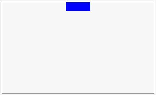
②display:inline-block
Set the parent element text-align: center;,
Set the child element display: inline-block;
Scope of use: All elements
// html
<div class="parent">
  <div class="child"></div>
</div>

// css
.parent {
  width: 500px;
  height: 300px;
  border: 1px solid #333;

  text-align: center;  // Key style
}
.child {
  width: 80px;
  height: 30px;
  background: blue;

  display: inline-block;  // Key style
}
③position:relative
Set the child element to relative positioning (position: relative;).
Deviation to the right is based on 50% of the parent element (left: 50%;).
Then shift to the left based on 50% of itself (transform: translateX(-50%);)
Scope of use: All elements
// html
<div class="parent">
  <div class="child"></div>
</div>

// css
.parent {
  width: 500px;
  height: 300px;
  border: 1px solid #333;

}
.child {
  width: 80px;
  height: 30px;
  background: blue;

  position: relative;           // Key style
  left: 50%;                    // Key style
  transform: translateX(-50%);  // Key style
}
④display:table
Using this method, we need to pay attention to the width of sub-elements.
At the same time, this method can also be used for vertical centering.
// html
<div class="parent">
  <div class="child"></div>
</div>

// css
.parent {
  width: 500px;
  height: 300px;
  border: 1px solid #333;
  box-sizing: border-box;
  padding: 100px;

  display: table;    // Key style
}
.child {
  width: 80px;
  height: 30px;
  background: blue;

  display: table-cell;   // Key style
}
Preview: 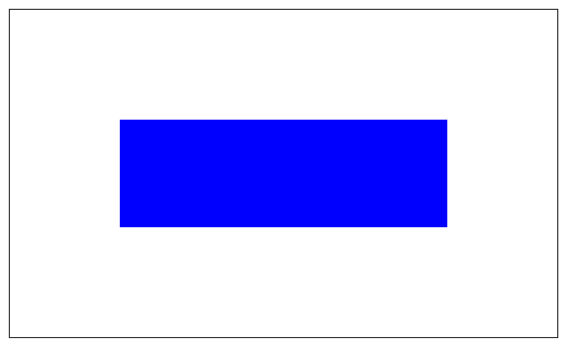
⑤flex
Using flex layout for centering can also be used for vertical centering.
```
// html
<div class="parent">
  <div class="child"></div>
</div>

// css
.parent {
  width: 500px;
  height: 300px;
  border: 1px solid #333;
  box-sizing: border-box;

  display: flex;            // Key style
  justify-content: center;  // Key style
}
.child {
  width: 80px;
  height: 30px;
  background: blue;
}
Method comparison
There is no doubt that the first method is the most commonly used, simple and easy to understand.
In addition, the fifth method is recommended, but attention should be paid to compatibility with low-version browsers.
The second method to the fourth method, understand the principle, it is not necessary to really use in the middle level; in addition, for the third method, its use in other areas is more extensive.
Vertical centering
(1) One-line text vertically centered
If the height of the element is equal to the line-height, the text in the element can be vertically centered.
However, this method is only suitable for single-line text, but not for multi-line text.
// html
<div class="parent">
  123456
</div>

//css
.parent {
  width: 500px;
  height: 300px;
  border: 1px solid #333;
  box-sizing: border-box;
  line-height: 300px;
}
(2) Multi-line text vertically centered
For multi-line text, we mentioned earlier that display: table-cell can be used to achieve horizontal and vertical centering. This method is applicable to single-line text and multi-line text.
// html
<div class="parent">
  <div class="child"></div>
</div>

// css
.parent {
  width: 500px;
  height: 300px;
  border: 1px solid #333;
  box-sizing: border-box;
  padding: 100px;

  display: table;    // Key style
}
.child {
  width: 80px;
  height: 30px;
  background: blue;

  display: table-cell;   // Key style
}
In addition, vertical-align can also be used for centering.
// html
<div class="parent">
  <span class="child">123<br>456<br>789</span>
</div>

//css
.parent {
  width: 300px;
  height: 200px;
  border: 1px solid #ccc;
  line-height: 200px;      // Key style
}
.child {
  display: inline-block;   // Key style
  line-height: 22px;       // Key style
  vertical-align: middle;  // Key style
}
(3) Pictures are vertically centered.
Absolute positioning is used, and the offset in all directions is set to 0.
This method can also be used to center the picture horizontally, vertically and horizontally.
// html
<div class="img-wrap">
    <img src="http://dummyimage.com/200x200/f66/"/>
</div>

// css
.img-wrap {
    position:relative;
    height: 400px;
    width: 400px;
    border: 1px solid
}
.img-wrap > img {
    position:absolute;
    top:0;
    bottom:0;
    left:0;
    right:0;
    margin:auto;
}