One thing I've noticed recently is CSS custom attributes. CSS custom attributes work a little like variables in SASS and other preprocessors. The main difference is whether other methods are generated after compiling in browsers or the original CSS writing. CSS custom attributes are real dynamic variables that can be updated instantly in stylesheets or using javascript, which makes them more likely. If you're familiar with JavaScript, I like to think of the difference between preprocessor variables and CSS custom attributes as similar to the difference between const and let -- they all have different uses.
CSS custom attributes can easily implement many functions (such as theme changes). Recently, I have been trying to use the combination of CSS custom attributes and CSS grid to achieve what magic effect, I need to redefine grid-template-rows and grid-template-columns attributes at different breakpoints. In the following code, for example, I use SASS variables to define different column width values for pages with different widths, which are passed to the grid-template-rows attribute. I did the same thing with the grid-gap attribute, so that the spacing between elements is different when the page width is different:
$wrapper: 1200px;
$col: 1fr;
$gutter: 20px;

$wrapper-l: 90%;
$col-l: calc((1000px - (13 * 40px)) / 12);
$gutter-l: 40px;

$col-xl: calc((1200px - (13 * 50px)) / 12);
$gutter-xl: 50px;

body {
    background-color: lighten(grey, 30%);
}

.wrapper {
    max-width: $wrapper;
    margin: 20px auto;

    @media (min-width: 1300px) {
        max-width: $wrapper-l;
    }
}

.grid {
    display: grid;
    padding: $gutter;
    grid-template-columns: 1fr repeat(12, $col) 1fr;
    grid-template-rows: repeat(2, minmax(150px, auto));
    grid-gap: $gutter;
    border: 1px solid grey;
    background: white;
    width: auto;

    @media (min-width: 1300px) {
        grid-template-columns: 1fr repeat(12, $col-l) 1fr;
        grid-gap: $gutter-l;
        padding: $col-l;
    }

    @media (min-width: 1500px) {
        grid-template-columns: 1fr repeat(12, $col-xl) 1fr;
        grid-gap: $gutter-xl;
        padding: $col-xl;
    }
}

.grid__item {
    border: 1px solid blue;
}

.grid__item--heading {
    grid-column: 2 / 11;
}
web Front-end development learning Q-q-u-n:  767273102 ,Share learning methods and small details that need attention, and keep updating the latest teaching and learning methods (detailed front-end project teaching video)
As you can see, basically you have to write the entire block of code again in the media query to change the style, because once the variables are defined, they are fixed. (Of course I can use mixin, but the end result is the same -- a big piece of code.)
Using CSS to customize attributes can reduce the amount of code, because I only need to update the variables in the media query, and the browser will recalculate the grid. Ten lines (sass) of code may not seem like a huge savings, but the readability of the code is much higher because there is no need to add media queries to handle our new variables in several places, I just declare them at the beginning of the component's code, and I don't have to worry about whether I have replaced the value being used:
:root {
--wrapper: 1200px;
--col: 1fr;
--gutter: 20px;
@media (min-width: 1300px) {
--wrapper: 90%;
--col: calc((1000px - (13 * 40px)) / 12);
--gutter: 40px;
}
@media (min-width: 1500px) {
--wrapper: 90%;
--col: calc((1200px - (13 * 50px)) / 12);
--gutter: 50px;
}
}
body {
background-color: lighten(grey, 30%);
}
.wrapper {
max-width: var(--wrapper);
margin: 20px auto;
}
.grid {
display: grid;
padding: var(--gutter);
grid-template-columns: 1fr repeat(12, var(--col)) 1fr;
grid-template-rows: repeat(2, minmax(150px, auto));
grid-gap: var(--gutter);
border: 1px solid grey;
background: white;
width: auto;
}
.grid__item {
border: 1px solid blue;
}
.grid__item--heading {
grid-column: 2 / 11;
}
.grid__item--body {
grid-column: 2 / 8;
grid-row: 2 / span 1;
}
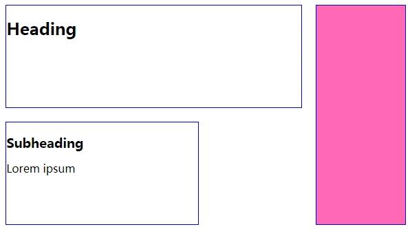
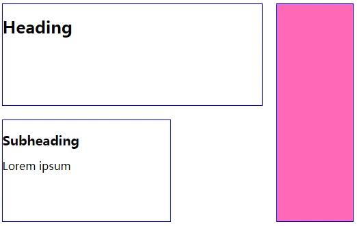
.grid__item--media {
background: hotPink;
grid-column: 11 / 14;
grid-row: 1 / span 2;
}
Small partners who are interested in web front-end technology can join our learning circle. They have been working for the sixth year. They can share some learning methods and details of practical development. 767-273-102 autumn skirt. How to learn the front-end from the zero foundation? They are all people with dreams. We may be in different cities, but we will travel together. Front end, front end, front end
I found that one of the characteristics of using CSS Grid is that the grammar is very verbose and it is not easy to see what is happening quickly and easily, especially in complex grids. But in this example, using CSS custom attributes, you can set variables for the size and coordinates of grid items, and write grid-column and grid-row attributes only once. For me, it's much clearer than writing out the complete attributes every time, and it's easy to see the location of grid items at a glance.