1, First we need to know what floating is
Take the official word
The float of CSS is a method to separate elements from the document flow. It will move elements to the left or right, and the surrounding elements will be rearranged. Float is often used for images, but it is also very useful in layout.
In plain English
CSS floating is like floating an element in its original position to make room for its own position. At this time, other elements occupying the document flow will be rearranged and occupy the original position of the element with floating settings. We think of the element as a solid piece of dry ice, After the floating attribute is set, it is equivalent to the sublimation of solid dry ice after gasification and floating above the original position. At the same time, the layout of the page will change and the original position will be occupied by other elements.
1. The following figure shows the normal document flow without setting floating for any of the three elements
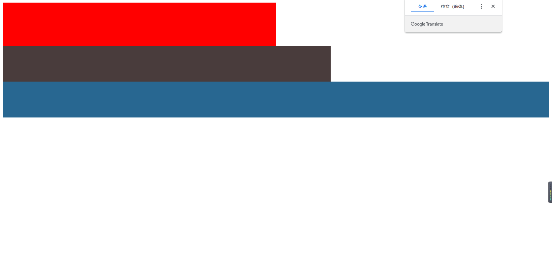
Here is the code
<!DOCTYPE html>
<html lang="en">
  <head>
    <meta charset="UTF-8" />
    <meta http-equiv="X-UA-Compatible" content="IE=edge" />
    <meta name="viewport" content="width=device-width, initial-scale=1.0" />
    <title>Document</title>
  </head>
  <body>
    <div class="box1"></div>
    <div class="box2"></div>
    <div class="box3"></div>
  </body>
  <style>
    .box1 {
      height: 120px;
      width: 50%;
      /* float: left; */
      background-color: red;
    }
    .box2 {
      height: 100px;
      width: 60%;
      background-color: rgb(73, 60, 60);
    }
    .box3 {
      height: 100px;
      width: 100%;
      background-color: rgb(40, 103, 145);
    }
  </style>
</html>
Next, we set the float for box1. In the following figure, the red box1 set to float floats, and the brown box2 occupies the position of the red box1. The overall layout moves upward and changes. At this time, the red box1 is the gaseous dry ice we gave the example above, but the solid dry ice is not set to float. The brown box2 and blue box3 move upward as a whole, It occupies the position of red box1, which also covers brown box2 and blue box3
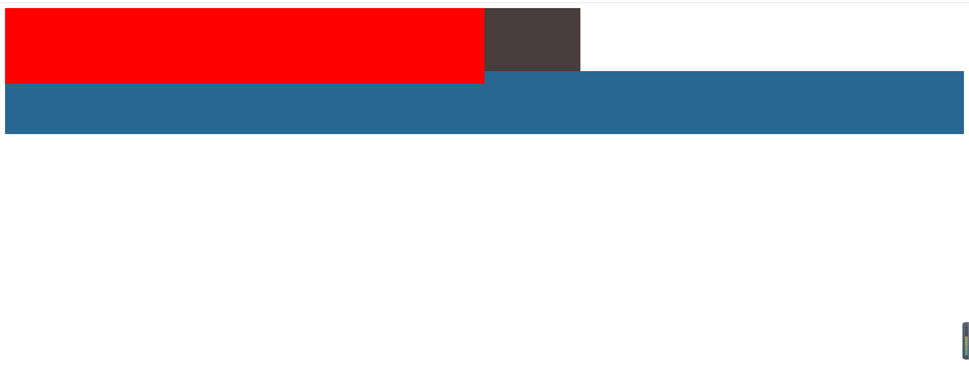
Code
<!DOCTYPE html>
<html lang="en">
  <head>
    <meta charset="UTF-8" />
    <meta http-equiv="X-UA-Compatible" content="IE=edge" />
    <meta name="viewport" content="width=device-width, initial-scale=1.0" />
    <title>Document</title>
  </head>
  <body>
    <div class="box1"></div>
    <div class="box2"></div>
    <div class="box3"></div>
  </body>
  <style>
    .box1 {
      height: 120px;
      width: 50%;
      float: left;
      background-color: red;
    }
    .box2 {
      height: 100px;
      width: 60%;
      background-color: rgb(73, 60, 60);
    }
    .box3 {
      height: 100px;
      width: 100%;
      background-color: rgb(40, 103, 145);
    }
  </style>
</html>
After floating, elements have the following important characteristics:
- Detach from document stream.
- Float left / right until you encounter a parent element or something else Floating element.
- Floating causes the parent element to collapse highly.
The third problem brought about by floating is the second point we want to talk about today - > removing floating
2, Remove float
Although floating is very convenient for us to layout when we use it, it will also cause some layout results we don't want to see when we are not very skilled in the use of floating but use it frequently
Generally, by default, the size of an element is supported by its content, but if you set floating, it will cause a serious problem: high collapse. Don't talk about the figure above!
The following one doesn't set floating for green box2 and blue box3
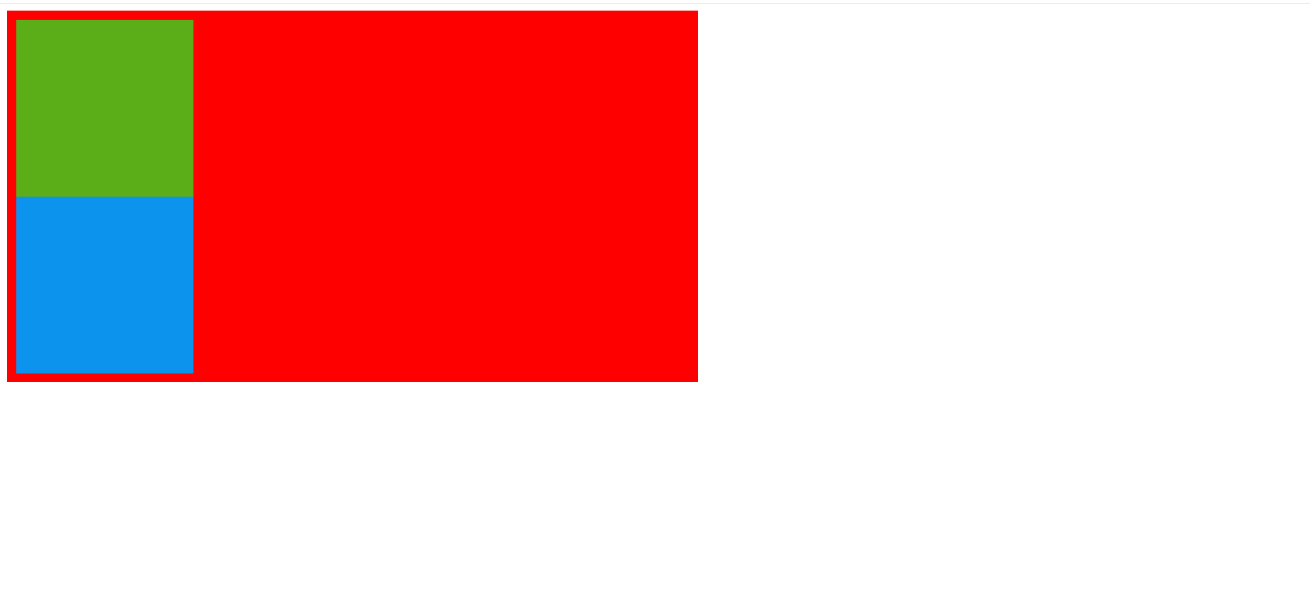
code
<!DOCTYPE html>
<html lang="en">
<head>
<meta charset="UTF-8" />
<meta http-equiv="X-UA-Compatible" content="IE=edge" />
<meta name="viewport" content="width=device-width, initial-scale=1.0" />
<title>Document</title>
</head>
<body>
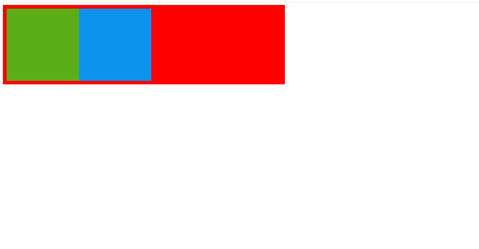
<div class="box1">
<div class="box2"></div>
<div class="box3"></div>
</div>
</body>
<style>
.box1 {
width: 50%;
background-color: red;
padding: 10px;
}
.box2 {
height: 200px;
width: 200px;
/* float: left; */
background-color: rgba(16, 253, 35, 0.685);
}
.box3 {
height: 200px;
width: 200px;
background-color: rgb(12, 147, 238);
/* float: left; */
}
</style>
</html>
Next, we set floating for both green box2 and blue box3, and the following situation will occur
We can find that the height of the red box1 is only the padding we set at the beginning. At this time, the phenomenon is height collapse. How do we solve it? I have accumulated two methods, but let's focus on the second
1. Set a fixed height for the parent container
Set a fixed height for box1, that is, set the height for the parent container of green box2 and blue box3. Although this can solve the problem of height collapse, it is not flexible. When the height of green box2 and blue box3 exceeds the red box1 for the parent container again, we have to reset the height of the parent container to keep the layout from being disordered
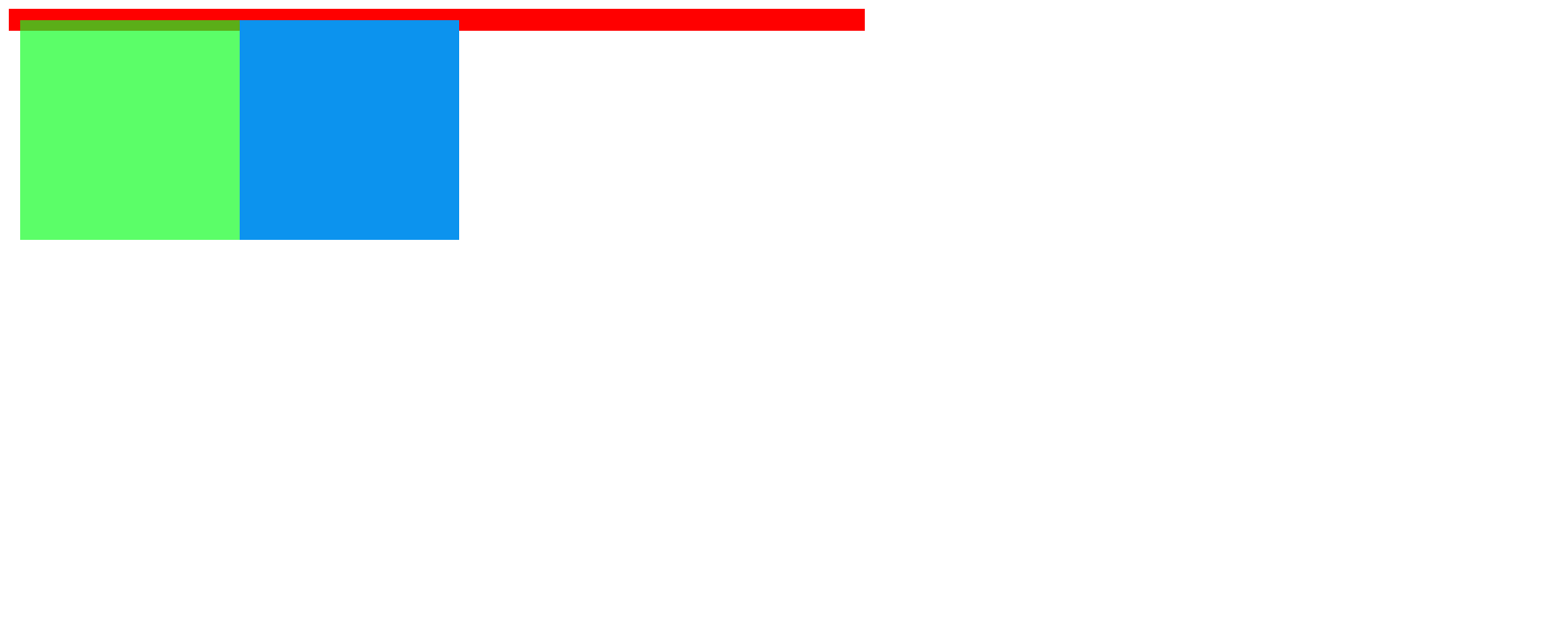
2. Use pseudo class to remove floating
In our example, we use the pseudo class after to remove floating. Before that, we need to know what a pseudo class is;
From the official explanation: CSS pseudo classes are used to add some special effects of selectors
At the moment, we also need to add some special effects, add pseudo classes to the parent element of red box1, and remove the floating code
<!DOCTYPE html>
<html lang="en">
  <head>
    <meta charset="UTF-8" />
    <meta http-equiv="X-UA-Compatible" content="IE=edge" />
    <meta name="viewport" content="width=device-width, initial-scale=1.0" />
    <title>Document</title>
  </head>
  <body>
    <div class="box1">
      <div class="box2"></div>
      <div class="box3"></div>
    </div>
  </body>
  <style>
    .box1 {
      width: 50%;
      background-color: red;
      padding: 10px;
    }
    .box1::after {
      content: "";
      /* Set content to empty */
      display: block;
      /* Set to block level element */
      clear: both;
      /* Clear float */
    }
    .box2 {
      height: 200px;
      width: 200px;
      float: left;
      background-color: rgba(16, 253, 35, 0.685);
    }
    .box3 {
      height: 200px;
      width: 200px;
      background-color: rgb(12, 147, 238);
      float: left;
    }
  </style>
</html>
Effect drawing after removing floating
At this time, we can see that the content of the red box1 is enlarged by the floating green box2 and blue box3. On the surface, we have successfully removed the floating
In fact, the purpose of clearing floating is to make the following elements not affected by the floating above. After pseudo element adds a block element with content '' after the parent element with floating box2 and box3 elements. Moreover, floating elements are not allowed on both sides of the block element, and the following floating elements can only float on another line. Here, the special effect of the pseudo element after is equivalent to forming a transparent wall, allowing both sides of the wall to float without being affected.
Finally, if you feel helpful, it's a great honor. Welcome to visit again next time. Thank you for reading!