Introduction to document flow
What is "document flow"? Simply put, it refers to the order in which elements appear on the page. It can be divided into "normal document flow" and "out of document flow".
1. Normal document flow
Normal document flow, also known as "normal document flow" or "normal flow", that is, what W3C standard calls "normal flow". The simple definition of normal document flow is: "normal document flow divides a page from top to bottom into one line, in which block elements monopolize one line, and the elements in adjacent lines are arranged from left to right in each line until the line is full." That is, normal document flow refers to the layout of page elements by default.
For example, div, p and hr are all block elements, so they are exclusive. span, i and img are all inline elements, so if two inline elements are adjacent, they will be located in the same row and arranged from left to right.
2. Detach from document flow
Out of document flow refers to out of normal document flow. To change the normal document flow, you can use two methods: floating and positioning.
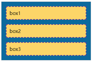
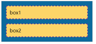
Normal document flow effect:
<!DOCTYPE html>
<html lang="en">
<head>
    <meta charset="UTF-8">
    <meta http-equiv="X-UA-Compatible" content="IE=edge">
    <meta name="viewport" content="width=device-width, initial-scale=1.0">
    <title>Normal document flow</title>
    <style>
        /* Define parent element style */
        .father{
            width: 300px;
            background-color: #0c6a9d;
            border: 1px solid silver;
        }

        /* Define child element styles */
        .father div{
            padding: 10px;
            margin: 15px;
            border: 2px dashed rebeccapurple;
            background-color: #fcd568;
        }
    </style>
</head>
<body>
    <div class="father">
        <div>box1</div>
        <div>box2</div>
        <div>box3</div>
    </div>
</body>
</html>
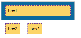
Set the effect after floating:
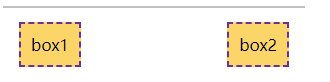
When we set the left float for the second and third div elements: under normal document flow, div is a block element and will monopolize one line. However, due to the setting of floating, the second and third div elements are on a side-by-side line and run outside the parent element, which is different from the normal document flow. That is, setting the float makes the element out of the normal document flow.
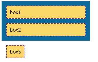
Set the effect after positioning:
When we set the absolute positioning for the third div element: because the positioning is set, the third div element runs above the parent element. That is, positioning is set so that the element is separated from the document flow.
float
In the traditional printing layout, the text can surround the picture according to the actual needs. We generally call this method "text surround". In front-end development, the use of floating page elements is actually like a picture surrounded by text in a printed layout. This metaphor is easy to understand. Floating is the best tool for CSS layout. We can flexibly locate page elements through floating to achieve the purpose of layout of web pages. For example, we can set the float attribute to float the element to the left or right, so that the surrounding elements or text surround the element.
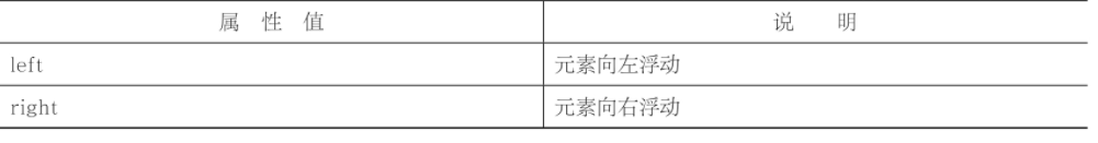
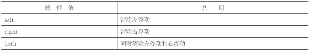
There are only two values for the float attribute:
Let's use the above example again:
<!DOCTYPE html>
<html lang="en">
<head>
    <meta charset="UTF-8">
    <meta http-equiv="X-UA-Compatible" content="IE=edge">
    <meta name="viewport" content="width=device-width, initial-scale=1.0">
    <title>Normal document flow</title>
    <style>
        /* Define parent element style */
        .father{
            width: 300px;
            background-color: #0c6a9d;
            border: 1px solid silver;
        }

        /* Define child element styles */
        .father div{
            padding: 10px;
            margin: 15px;
            border: 2px dashed rebeccapurple;
            background-color: #fcd568;
        }
    </style>
</head>
<body>
    <div class="father">
        <div>box1</div>
        <div>box2</div>
    </div>
</body>
</html>
Next, we add left float for box1 and right float for box2:
.son1{float: left;}
.son2{float: right;}
As can be seen from the above example, floating will affect the surrounding elements and cause many unexpected problems. In CSS, we can use the clear attribute to clear the impact of floating.
The value of clear attribute is as follows:
In actual development, we hardly use "clear:left;" Or "clear:right;" To clear the left float or right float separately, it is often straightforward to use "clear:both;" To clear all floats. Based on the above examples, we clear the floating:
<!DOCTYPE html>
<html lang="en">
<head>
    <meta charset="UTF-8">
    <meta http-equiv="X-UA-Compatible" content="IE=edge">
    <meta name="viewport" content="width=device-width, initial-scale=1.0">
    <title>Clear float</title>
    <style>
        /* Define parent element style */
        .father{
            width: 300px;
            background-color: #0c6a9d;
            border: 1px solid silver;
        }

        /* Define child element styles */
        .father div{
            padding: 10px;
            margin: 15px;
            border: 2px dashed rebeccapurple;
            background-color: #fcd568;
        }
        .son1{float: left;}
        .son2{float: right;}
        .son3{clear: both; display: block;}
    </style>
</head>
<body>
    <div class="father">
        <div class="son1">box1</div>
        <div class="son2">box2</div>
        <span class="son3"></span>
    </div>
</body>
</html>
We usually add an empty element after the floating element, and then define clear:both for this empty element; To clear the float. In actual development, if there is anything wrong after using floating, first check whether floating is cleared. In fact, clearing floats is not just clear:both;, There are overflow:hidden, and more commonly used pseudo elements.