How to center elements horizontally and vertically? What if the element has variable width and height?
1, Background
This problem is often encountered in development, that is, the content of an element is centered in the horizontal and vertical directions. The content is not limited to text, but may be pictures or other elements
Centering is a very basic but important application scenario. There are many methods to realize centering. These methods can be divided into two categories:
- The width and height of the middle element (child element) are known
- Unknown width and height of centered element
2, Implementation mode
How to center elements horizontally and vertically:
-
Use positioning + margin:auto
-
Use positioning + margin: negative value
-
Use positioning + transform
-
table layout
-
flex layout
-
grid layout
Use positioning + margin:auto
First code:
<style>
    .father{
        width:500px;
        height:300px;
        border:1px solid #0a3b98;
        position: relative;
    }
    .son{
        width:100px;
        height:40px;
        background: #f0a238;
        position: absolute;
        top:0;
        left:0;
        right:0;
        bottom:0;
        margin:auto;
    }
</style>
<div class="father">
    <div class="son"></div>
</div>
If the parent is set to relative positioning and the child is set to absolute positioning, and the values of the four positioning attributes are set to 0, then if the child does not set width and height, it will be pulled to the same width and height as the parent
Here, the width and height of the child element are set, so the width and height will be displayed according to our settings, but in fact, the virtual occupancy of the child has filled the whole parent. At this time, give it a margin: auto, and it can be centered up, down, left and right
Use positioning + margin: negative value
In most cases, the parent element is set as relative positioning, and the child element moves itself by 50% to achieve horizontal and vertical centering
<style>
    .father {
        position: relative;
        width: 200px;
        height: 200px;
        background: skyblue;
    }
    .son {
        position: absolute;
        top: 50%;
        left: 50%;
        margin-left:-50px;
        margin-top:-50px;
        width: 100px;
        height: 100px;
        background: red;
    }
</style>
<div class="father">
    <div class="son"></div>
</div>
The whole implementation idea is shown in the figure below:
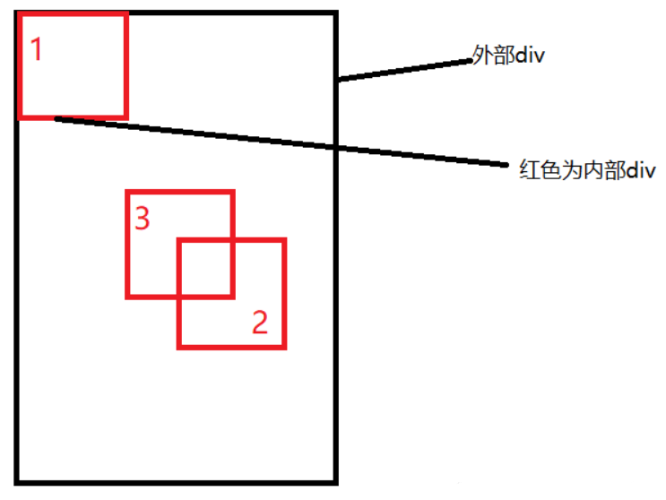
- The initial position is the position of block 1
- When left and top are set to 50%, the inner sub element is the position of block 2
- When margin is set to a negative number, the inner child element is moved to the position of block 3, that is, the middle position
This scheme does not require the height of the parent element, that is, even if the height of the parent element changes, it can still be maintained in the vertical center of the parent element, and the operation is the same in the horizontal direction
However, the scheme needs to know the width and height of the child element itself, but we can move it through the following transform attribute
Use positioning + transform
The implementation code is as follows:
<style>
    .father {
        position: relative;
        width: 200px;
        height: 200px;
        background: skyblue;
    }
    .son {
        position: absolute;
        top: 50%;
        left: 50%;
  transform: translate(-50%,-50%);
        width: 100px;
        height: 100px;
        background: red;
    }
</style>
<div class="father">
    <div class="son"></div>
</div>
translate(-50%, -50%) will shift the element by - 50% of its width and height
This method is actually the same as the negative value of margin rejected at the top. It can be said that it is an alternative to the negative value of margin, and does not need to know the width and height of its own element
table layout
Set the parent element to display: table cell, and the child element to display: inline block. vertical and text align can be used to center all block level elements in a row horizontally and vertically
<style>
    .father {
        display: table-cell;
        width: 200px;
        height: 200px;
        background: skyblue;
        vertical-align: middle;
        text-align: center;
    }
    .son {
        display: inline-block;
        width: 100px;
        height: 100px;
        background: red;
    }
</style>
<div class="father">
    <div class="son"></div>
</div>
flex flexible layout
Let's look at the overall code of the implementation:
<style>
    .father {
        display: flex;
        justify-content: center;
        align-items: center;
        width: 200px;
        height: 200px;
        background: skyblue;
    }
    .son {
        width: 100px;
        height: 100px;
        background: red;
    }
</style>
<div class="father">
    <div class="son"></div>
</div>
The flex layout in css3 makes it very easy to achieve vertical and horizontal centering
Here you can briefly look at the key attributes and functions of flex layout:
-
display: flex indicates that the elements inside the container will be arranged according to flex
-
Align items: center indicates that these elements will be centered horizontally relative to this container
-
Justify content: the same is true for center
Grid grid layout
<style>
    .father {
            display: grid;
            align-items:center;
            justify-content: center;
            width: 200px;
            height: 200px;
            background: skyblue;

        }
        .son {
            width: 10px;
            height: 10px;
            border: 1px solid red
        }
</style>
<div class="father">
    <div class="son"></div>
</div>
As you can see here, both gird grid layout and flex flexible layout are simple and crude
Summary
Among the above methods, the horizontal and vertical centering can be realized without knowing the width and height of the element:
-
Use positioning + margin:auto
-
Use positioning + transform
-
Use positioning + margin: negative value
-
flex layout
-
grid layout
3, Summary
According to the nature of element labels, they can be divided into:
- Inline element centered layout
- Block level element centered layout
Inline element centered layout
horizontally
- Inline elements can be set to: text align: Center
- flex layout setting parent element: display: flex; justify-content: center
Vertical center
- Confirmation height of parent element of single line text: height = = = line height
- Confirmation height of multi line text parent element: disapply: table cell; vertical-align: middle
Block level element centered layout
horizontally
- Fixed width: margin: 0 auto
- Absolute positioning + left:50%+margin: negative self half
Vertical center
- position: absolute set left, top, margin left, margin top (fixed height)
- display: table-cell
- transform: translate(x, y)
- Flex (variable height, variable width)
- Grid (variable height, variable width), relatively poor compatibility