statement
The content of this article comes from: https://www.imooc.com/learn/9
This article is mainly for personal learning and review. If there is infringement, please contact and delete it.
1, CSS introduction
The web page is divided into three parts:
- Structure (HTML)
- Presentation (CSS)
- Behavior (JavaScript)
CSS
- Cascading style sheets
- The web page is actually a multi-layer structure. We can set the style for each layer of the web page through CSS, and finally we can only see the top layer of the web page
- In a word, CSS is used to set the style of elements in web pages
CSS syntax
CSS style consists of selectors and declarations, and declarations consist of attributes and values, as shown in the following figure:
- Selector: also known as selector, it indicates the elements in the web page to which style rules are to be applied. As shown in the above figure, the text of all segments (p) in the web page will turn blue, while other elements (such as ol) will not be affected.
- Declaration: the declaration is in the English braces "{}", and the attribute and value are separated by the English colon ":". When there are multiple statements, the English semicolon ";" can be used in the middle Separate as follows:
p{
   font-size:12px;
   color:red;
}
2, Introduction of CSS
CSS can be introduced in the following three ways:
- Inline style (inline style)
- Internal style sheet
- External style sheet
<!DOCTYPE html>
<html lang="en">
<head>
<meta charset="UTF-8">
<title>Document</title>
<!--
Third method (external style sheet)
- Can CSS Style authoring to an external CSS In the document,
Then pass link Label to introduce external CSS file
- External style sheets need to pass link Label for introduction,
This means that any web page that wants to use these styles can reference them,
Enables styles to be reused between different pages
- Authoring styles to external CSS In the file, you can use the cache mechanism to the browser,
So as to speed up the loading speed of web pages and improve the user experience
-->
<link rel="stylesheet" href="./style.css">
<!--
The second way(Internal style sheet):
- Authoring styles to head Medium style Inside the label
Then pass CSS Select it to select the element and set various styles for it
You can style multiple labels at the same time, and you only need to modify one place
- Internal style sheets make it easier to reuse styles
- Question:
Our internal style sheet can only work in one web page,
The styles in it cannot be reused across pages
-->
<style>
p {
color: green;
font-size: 30px;
}
</style>
</head>
<body>
<!--
use CSS To modify the style of the element
The first method (inline style, inline style):
- Pass inside the label style Property to style the element
- Question:
With inline styles, styles can only work on one label
If you want to affect more than one element, you must copy it in each element.
And when the style changes, we have to modify it one by one, which is very inconvenient.
- Note: never use inline styles during development
-->
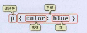
<p style="color: red;font-size: 20px;">Hello World!</p>
<p>Hello World!</p>
<p>Hello World!</p>
<h1>Hello World!</h1>
</body>
</html>
/* style.css */
p {
    color: yellow;
    font-size: 40px;
}
h1 {
    color: yellow;
    font-size: 40px;
}
Priority of three import methods
From the above figure, we can find that the priority of the three import methods is (inline > internal > external). However, there is a precondition that the internal style is greater than the external style. When the weight is the same, the reference of the internal style follows the external style.
If we put the internal style in front of the external style, the code is as follows, and the priority is not (internal > external).
<!DOCTYPE html>
<html lang="en">
<head>
<meta charset="UTF-8">
<title>Document</title>
<!--
The second way(Internal style sheet):
- Authoring styles to head Medium style Inside the label
Then pass CSS Select it to select the element and set various styles for it
You can style multiple labels at the same time, and you only need to modify one place
- Internal style sheets make it easier to reuse styles
- Question:
Our internal style sheet can only work in one web page,
The styles in it cannot be reused across pages
-->
<style>
p {
color: green;
font-size: 30px;
}
</style>
<!--
Third method (external style sheet)
- Can CSS Style authoring to an external CSS In the document,
Then pass link Label to introduce external CSS file
- External style sheets need to pass link Label for introduction,
This means that any web page that wants to use these styles can reference them,
Enables styles to be reused between different pages
- Authoring styles to external CSS In the file, you can use the cache mechanism to the browser,
So as to speed up the loading speed of web pages and improve the user experience
-->
<link rel="stylesheet" href="./style.css">
</head>
<body>
<!--
use CSS To modify the style of the element
The first method (inline style, inline style):
- Pass inside the label style Property to style the element
- Question:
With inline styles, styles can only work on one label
If you want to affect more than one element, you must copy it in each element.
And when the style changes, we have to modify it one by one, which is very inconvenient.
- Note: never use inline styles during development
-->
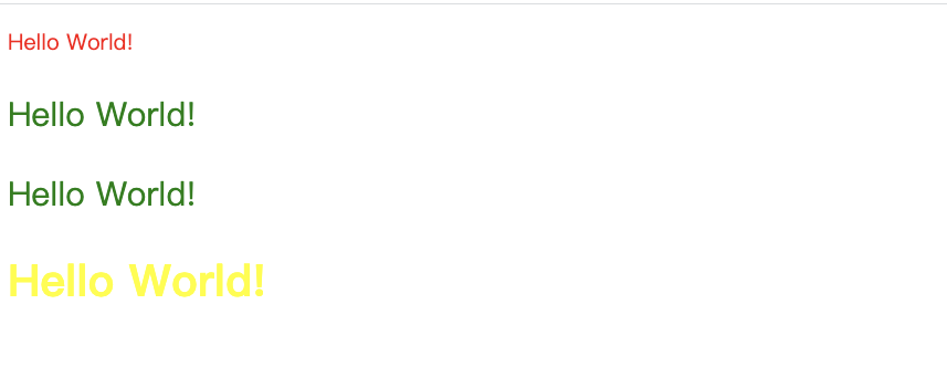
<p style="color: red;font-size: 20px;">Hello World!</p>
<p>Hello World!</p>
<p>Hello World!</p>
<h1>Hello World!</h1>
</body>
</html>
In summary, when the weight is the same, the proximity principle (the closer to the set element, the higher the priority).
3, Selector
Each css style declaration (definition) consists of two parts in the following form:
selector {
    style;
}
The part before {} is the "selector", which indicates the object of the "style" in {}, that is, which elements of the web page the "style" acts on.
tag chooser
A tag selector is actually a tag in html code. Such as < html >, < body >, < H1 >, < p >, < img >.
p {
 font-size:12px;
 line-height:1.6em;
}
The above css style code is used to set the 12px font size for the p label and the 1.6em style for the line spacing.
Class selector
Select a group of elements according to the class attribute value of the element.
Syntax:
.Class selector name {
 css Style code;
}
<!DOCTYPE html>
<html lang="en">
<head>
<meta charset="UTF-8">
<title>Document</title>
<style>
.blue {
color: blue;
}
.abc {
font-size: 30px;
}
</style>
</head>
<body>
<!--
class Is an attribute of a tag
Can pass class Attribute to group elements
You can specify multiple values for an element at the same time class attribute
-->
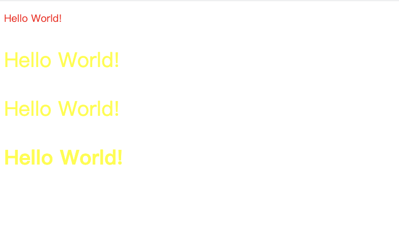
<p class="blue abc">The autumn river shares a scenic hue with the vast sky</p>
<p class="blue">The evening glow parallels with a lonely duck to fly</p>
</body>
</html>
ID selector
Select an element according to the id attribute value of the element.
Syntax:
#id {
	css Style code;
}
<!DOCTYPE html>
<html lang="en">
<head>
<meta charset="UTF-8">
<title>Document</title>
<style>
#green {
color: green;
}
</style>
</head>
<body>
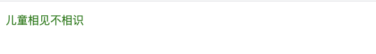
<p id="green">Do children know each other</p>
</body>
</html>
The difference between class and ID selector
- Similarities: can be applied to any element
- difference:
- The ID selector can only be used once in a document. Unlike class selectors, ID selectors can only be used once and only once in an HTML document. Class selectors can be used multiple times.
- You can use the class selector word list method to set multiple styles for an element at the same time. We can set multiple styles for an element at the same time, but we can only use the method of class selector. ID selector is not allowed (ID word list cannot be used).
The following code is correct
.stress{
    color:red;
}
.bigsize{
    font-size:25px;
}
<p>here we are<span class="stress bigsize">Third grade</span>Next term, our class has an open class...</p>
The function of the above code is to set the text color to red and the font size to 25px for the three words of "grade 3".
The following code is incorrect
#stressid{
    color:red;
}
#bigsizeid{
    font-size:25px;
}
<p>here we are<span id="stressid bigsizeid">Third grade</span>Next term, our class has an open class...</p>
The above code can not set the text color to red and the font size to 25px for the three words of "grade 3".
Child selectors
The child selector, that is, the greater than symbol (>), is used to select the first generation of child elements of the specified label element.
Syntax:
Parent element > Child element {
  css Style code;
}
<!DOCTYPE html>
<html>

<head>
    <meta charset="UTF-8">
    <title>Child selectors </title>
    <style type="text/css">

    .food>li {
        border: 1px solid red;
    }

    </style>
</head>

<body>
    <ul class="food">
        <li>Fruits
            <ul>
                <li>Banana</li>
                <li>Apple</li>
                <li>Pear</li>
            </ul>
        </li>
        <li>Vegetables
            <ul>
                <li>Chinese cabbage</li>
                <li>rape</li>
                <li>Cabbage</li>
            </ul>
        </li>
    </ul>
</body>

</html>
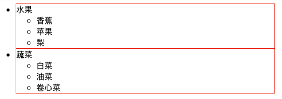
Descendant Selectors
The descendant selector, that is, adding a space, is used to select the descendant element under the specified label element.
Syntax:
Ancestors and descendants{
  css Style code;
}
<!DOCTYPE html>
<html>

<head>
    <meta charset="UTF-8">
    <title>Descendant Selectors </title>
    <style type="text/css">

    .food li {
        /*Add border style (solid line with thickness of 1px and color of red)*/
        border: 1px solid red;

    }
    </style>
</head>

<body>
    <ul class="food">
        <li>Fruits
            <ul>
                <li>Banana</li>
                <li>Apple</li>
                <li>Pear</li>
            </ul>
        </li>
        <li>Vegetables
            <ul>
                <li>Chinese cabbage</li>
                <li>rape</li>
                <li>Cabbage</li>
            </ul>
        </li>
    </ul>
</body>

</html>
universal selector
The universal selector is the most powerful selector. It is specified with an (*) sign. Its function is to match all tag elements in html.
Pseudo class selector
Why is it called pseudo class selector? It allows you to set the style for tags that do not exist in html (a certain state of the tag). For example, we set the font color for the mouse over state of a tag element in html:
a:hover{
	color:red;
}
<!DOCTYPE html>
<html>

<head>
    <meta charset="UTF-8">
    <title>Pseudo class selector</title>
    <style type="text/css">
    a:hover {
        color: red;
    }
    </style>
</head>

<body>
    <h1>courage</h1>
    <a href="http://www.imooc. Com "> as timid as a mouse < / A
</body>

</html>
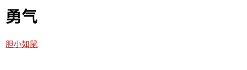
For pseudo class selectors, so far, The "pseudo class selector" that can be compatible with all browsers is the use of: hover on the a tag (in fact, there are many pseudo class selectors, especially in css3, but because they are not compatible with all browsers, this tutorial only talks about the most commonly used one). In fact: hover can be placed on any label, such as p:hover, but their compatibility is also very poor, so the combination of a:hover is still commonly used.
Group selector
When you want to set the same style for multiple tag elements in html, you can use the grouping selector (,).
The following code is the h1 and span labels in the code editor on the right, and the font color is set to red:
h1,span{
	color:red;
}
It is equivalent to the following two lines of code:
h1{
	color:red;
}
span{
	color:red;
}
4, Inheritance, priority and importance
Inheritance of styles
Some styles of CSS are inherited, so what is inheritance? Inheritance is a rule that allows styles to be applied not only to a particular html tag element, but also to its descendants.
For example, the following code: if a color is applied to the p tag, this color setting applies not only to the p tag, but also to all the sub element text in the p tag, where the sub element is the span tag.
p{color:red;}
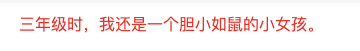
<p>In third grade, I was a<span>as timid as a mouse</span>My little girl.</p>
Note, however, that some css styles are not inherited. For example, border:1px solid red;
p{border:1px solid red;}

<p>In third grade, I was a<span>as timid as a mouse</span>My little girl.</p>

In the above example, the function of its code is to set the border of the p label as 1 pixel, red and solid border lines, but it is useless for the child element span.
Priority of selector
We've learned a lot about CSS3 selectors, but each selector has priority.
- If an element uses more than one selector, the style is given according to the priority of the selector.
- The priority of selectors is: inline style > ID selector > class selector > label selector > wildcard selector
Weight calculation
Sometimes we set different CSS style codes for the same element. Which CSS style will the element enable? Let's take a look at the code:
p{color:red;}
.first{color:green;}
<p class="first">In third grade, I was a<span>as timid as a mouse</span>My little girl.</p>
p and first matches the p label, so what color will be displayed? green is the right color, so why? Because the browser judges which css style to use according to the weight, and the one with high weight will use which css style.
The following is the rule of weight:
The weight of the tag is 1, the weight of the class selector is 10, and the maximum weight of the ID selector is 100. For example, the following code:
p{color:red;} /*The weight is 1*/
p span{color:green;} /*The weight is 1 + 1 = 2*/
.warning{color:white;} /*The weight is 10*/
p span.warning{color:purple;} /*The weight is 1 + 1 + 10 = 12*/
#footer .note p{color:yellow;} /* The weight is 100 + 10 + 1 = 111*/
Note: there is another special weight - inheritance also has a weight, but it is very low. Some literatures suggest that it is only 0.1, so it can be understood that the weight of inheritance is the lowest.
Selector highest level! important
When we do web page code, some special situations need to set the highest weight for some styles. What should we do? We can use it at this time! important to solve.
The following code:
p{color:red!important;}
p{color:green;}
<p class="first">In third grade, I was a<span>as timid as a mouse</span>My little girl.</p>
At this time, the text in the p paragraph will be displayed in red.
Note:! important should be written before the semicolon
5, Font style
Set font family using font family
We can use css style to set font, font size, color and other style attributes for the text in the web page. Let's take a look at an example. The following code is implemented: set the font for the text in the web page to Song typeface.
body{font-family:"Song typeface";}
Be careful not to set uncommon fonts here, because if the font you set is not installed on the user's local computer, the browser's default font will be displayed. (because whether the user can see the font style you set depends on whether the font you set is installed on the user's local computer.)
Now, general web pages like to set "Microsoft YaHei", with the following code:
body{font-family:"Microsoft Yahei";}
or
body{font-family:"Microsoft YaHei ";}
Use font size to set the font size
You can use the following code to set the font size of the text in the web page to 12 pixels:
body{font-size:12px;}
Use font weight to set the font weight
We can also use css style to change the text style: bold, italic, underline and strikeout. You can use the following code to set the text to be displayed in bold style.
p span{font-weight:bold;}
Here you can see that if you want to set bold text, you can use a separate css style. You don't need to use h1-h6 or strong tags to implement bold style.
Set font style using font style
1. Font style can be set, and there are three setting methods.
2. The normal font is normal, which is also the default value of font style.
3. Italic sets the font to italic, which is used to set the font to have an oblique style.
4. oblique is the font set to tilt, and the font is forced to tilt.
<!DOCTYPE html>
<html>

<head>
    <meta charset="UTF-8">
    <title>Italic style</title>
    <style type="text/css">
        p {
            font-style: oblique;
        }
    </style>
</head>

<body>
    <p>In third grade, I was a<a>as timid as a mouse</a>My little girl.</p>
</body>

</html>

Use color to set the font color
The color property sets the font color.
The value of color can be set in three ways:
1. English command color
p{color:red;}
2. RGB color
1. This is consistent with the RGB color in photoshop. The color is matched by the proportion of R(red), G(green) and B(blue).
p{color:rgb(133,45,200);}
The value of each item can be an integer between 0 and 255 or a percentage between 0% and 100%. For example:
p{color:rgb(20%,33%,25%);}
3. Hex color
This color setting method is now widely used. Its principle is actually RGB setting, but the value of each item has changed from 0-255 to hexadecimal 00 FF.
p{color:#00ffff;}
font style abbreviation
css style codes for fonts in web pages also have their own abbreviations. Here is the code for setting fonts for web pages:
body{
    font-style:italic;
    font-weight:bold;
    font-size:12px;
    line-height:1.5em;
    font-family:"Song typeface",sans-serif;
}
So many lines of code can actually be abbreviated to one sentence:
body{
    font:italic  bold  12px/1.5em  "Song typeface",sans-serif;
}
Note:
1. Using this shorthand, you must specify at least font size and font family attributes. If other attributes (such as font weight, font style, font variant, line height) are not specified, the default values will be automatically used.
2. In abbreviation, "/" shall be added between font size and line height.
Generally, there are few English for Chinese websites, so the following abbreviations are commonly used:
body{
    font:12px/1.5em  "Song typeface",sans-serif;
}
There are only font size, line spacing, Chinese font and English font settings.
6, Text style
Add text decoration using text decoration
1. Text decoration can set the decoration added to the text.
2. The default value of text decoration is none, which defines the standard text.
3. The value of text decoration is underline, which is a line under the definition text.
4. The value of text decoration is overline, which defines a line on the text.
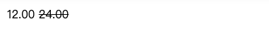
5. The value of text decoration is line through, which defines a line under the text. It is generally used for commodity discount price.
<!DOCTYPE html>
<html>

<head>
    <meta charset="UTF-8">
    <title>Text modification</title>
    <style type="text/css">
    span {
        text-decoration: line-through;
    }
    </style>
</head>

<body>
    <p>12.00 <span>24.00</span></p>
</body>

</html>
Use text indent to indent the first line of text
It is customary to leave two characters blank before the paragraph in Chinese text. This special style can be realized by the following code:
<!DOCTYPE html>
<html>
<head>
<meta charset="UTF-8">
<title>Indent style</title>
<style type="text/css">
p {
text-indent:2em; /*2em It means twice the size of the text.*/
}
</style>
</head>
<body>
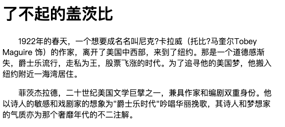
<h1>The Great Gatsby</h1>
<p>1922 In the spring of, a man who wanted to be famous was Nick?Callaway (Toby)?Maguire Tobey Maguire The writer left the Midwest and came to New York. It was an era when morality was losing, jazz was popular, smuggling was king, and stocks soared. In pursuit of his American dream, he moved into a bay near New York.</p>
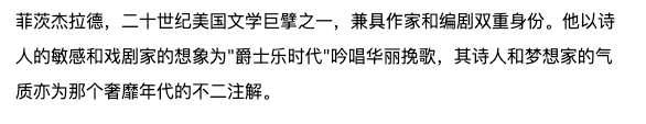
<p>Fitzgerald, one of the giants of American Literature in the 20th century, has the dual identity of writer and screenwriter. He is based on the poet's sensitivity and the dramatist's imagination"Jazz Age"Singing gorgeous elegy, the temperament of poet and dreamer is also the only annotation of that extravagant era.</p>
</body>
</html>
Use line height to set line spacing for text
Another line height attribute that plays an important role in paragraph typesetting, the following code sets the paragraph line spacing to 1.5 times.
<!DOCTYPE html>
<html>

<head>
    <meta charset="UTF-8">
    <title>Row spacing</title>
    <style type="text/css">
        p {
            line-height: 2em;
        }
    </style>
</head>

<body>
    <p>Fitzgerald, one of the giants of American Literature in the 20th century, has the dual identity of writer and screenwriter. He is based on the poet's sensitivity and the dramatist's imagination"Jazz Age"Singing gorgeous elegy, the temperament of poet and dreamer is also the only annotation of that extravagant era.</p>
</body>

</html>
Use letter / word spacing to increase or decrease the space between characters
Chinese character spacing and letter spacing settings:
If you want to set text spacing or letter spacing in web page layout, you can use letter spacing, as shown in the following code:
h1{
    letter-spacing:50px;
}
<h1>The Great Gatsby</h1>
Note: this style is used to set the spacing between letters when using English words.
Word spacing setting:
What if I want to set the spacing between English words? It can be implemented using word spacing. The following code:
h1{
    word-spacing:50px;
}
<h1>welcome to imooc!</h1>
<!DOCTYPE html>
<html>

<head>
    <meta charset="UTF-8">
    <title>Word spacing</title>
    <style type="text/css">
        h1 {
            letter-spacing: 20px;
        }
    </style>
</head>

<body>
    <h1>hello world!Hello!</h1>
</body>
</html>

Use text align to set text alignment
Do you want to set the center style for text and pictures in block elements? You can use the text align style code. The following code can realize the centered display of text.
h1{
    text-align:center;
}
<h1>The Great Gatsby</h1>
You can also set left:
h1{
    text-align:left;
}
<h1>The Great Gatsby</h1>
You can also set right:
h1{
    text-align:right;
}
<h1>The Great Gatsby</h1>
<!DOCTYPE html>
<html>

<head>
    <meta charset="UTF-8">
    <title>Alignment</title>
    <style type="text/css">
        div {
           text-align: center;
        }
    </style>
</head>

<body>
    <div><img src="http://img.mukewang.com/52b4113500018cf102000200.jpg"></div>
</body>

</html>
Length value
To sum up, px (pixel), em and% are commonly used. Note that these three units are relative units.
1. Pixels
Why are pixels relative units? Because pixels refer to small dots on the display (CSS specification assumes "90 pixels = 1 inch"). The actual situation is that browsers will use the actual pixel value of the display. At present, most designers tend to use pixels (px) as units.
2,em
Is the font size value of the font given by this element. If the font size of the element is 14px, 1em = 14px; If font size is 18px, 1em = 18px. The following code:
p{font-size:12px;text-indent:2em;}
The above code can indent the first line of a paragraph by 24px (that is, the distance between two font sizes).
Here is a special case:
However, when the unit of font size is em, the calculation standard is based on the font size of the parent element of p. The following code:
<p>With this<span>example</span>For example.</p>
p{font-size:14px}
span{font-size:0.8em;}
The font size of the font "example" in the result span is 11.2px (14 * 0.8 = 11.2px).
3. Percentage
p{font-size:12px;line-height:130%}
Set the line height (line spacing) to 130% of the font (12 * 1.3 = 15.6px).
7, Box model
Element classification
Before explaining CSS layout, we need to know some knowledge in advance. In CSS, tag elements in html are generally divided into three different types: block elements, inline elements (also known as inline elements) and inline block elements.
Common block elements are:
<div>,<p>,<h1>...<h6>,<ol>,<ul>,<dl>,<table>,<address>,<blockquote> ,<form>
Common inline elements are:
<a>,<span>,<br>,<i>,<em>,<strong>,<label>,<q>,<var>,<cite>,<code>
Common inline block elements are:
<img>,<input>
Block level element
What are block level elements? In html, < div >, < p >, < H1 >, < form >, < UL > and < li > are block level elements.
Setting display:block displays elements as block level elements.
The following code is to convert inline element a into block element, so that element a has the characteristics of block element.
a{
	display:block;
}
Block level element features:
1. Each block level element starts with a new line, and the subsequent elements start with another line. (it's so overbearing. One block level element monopolizes one line)
2. The height, width, row height and top and bottom edge spacing of elements can be set.
3. When the element width is not set, it is 100% of its own parent container (consistent with the width of the parent element), unless a width is set.
<!DOCTYPE html>
<html>
<head>
<meta charset="UTF-8">
<style type="text/css">
div,
p {
background: pink;
}
</style>
</head>
<body>
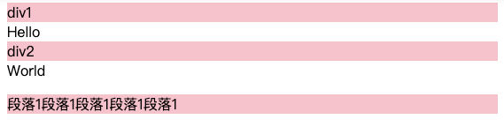
<div>div1</div>Hello
<div>div2</div>World
<p>Paragraph 1 paragraph 1 paragraph 1 paragraph 1 paragraph 1</p>
</body>
</html>
Inline element
In html, < span >, < a >, < label >, < strong > and < EM > are typical inline elements. Of course, block elements can also be set as inline elements through the code display:inline.
The following code is to convert the block element div into an inline element, so that the div element has the characteristics of an inline element.
 div{
     display:inline;
 }
<div>I want to become an inline element</div>
Inline element features:
1. And other elements are on the same line;
2. The height, width and top and bottom margins of elements cannot be set;
3. The width of an element is the width of the text or picture it contains, which cannot be changed.
<!DOCTYPE html>
<html>
<head>
<meta charset="UTF-8">
<style type="text/css">
a,span,em {
background: pink;
}
</style>
</head>
<body>
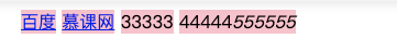
<a href="http://www.baidu. Com "> Baidu</a>
<a href="http://www.imooc. Com "> muke.com</a>
<span>33333</span>
<span>44444</span><em>555555</em>
</body>
</html>
Inline block element
Inline block elements have the characteristics of inline elements and block elements at the same time. Code display: inline block is to set elements as inline block elements. < img >, < input > tags are such inline block tags.
Features of inline block element:
1. And other elements are on the same line;
2. The height, width, row height and top and bottom edge spacing of elements can be set.
<!DOCTYPE html>
<html>

<head>
    <meta charset="UTF-8">
    <title>Inline block element</title>
    <style type="text/css">
    a {

        width: 20px;
        /*Width does not work by default*/
        height: 20px;
        /*Height does not work by default*/
        background: pink;
        /*Set the background color to pink*/
        text-align: center;
        /*Center text*/
        display: inline-block;
    }
    </style>
</head>

<body>
    <a>1</a>
    <a>2</a>
    <a>3</a>
    <a>4</a>
</body>

</html>

none does not occupy a position
none sets that this element will not be displayed. This value can be used when you want the element to be hidden.
<!DOCTYPE html>
<html>

<head>
    <meta charset="UTF-8">
    <title>none</title>
    <style type="text/css">
    p {
        display: none;
    }
    </style>
</head>

<body>
    <p>I love learning, I love lesson net</p>
</body>

</html>

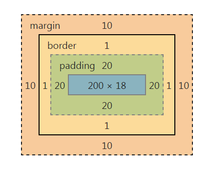
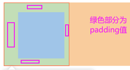
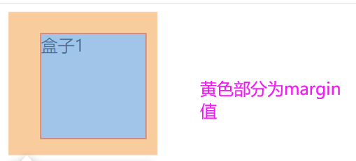
Box model
Width and height
The width and height of the box model are different from what we usually call the width and height of the object. The width and height defined in css refer to the content range filled in.
Therefore, the actual width of an element (the width of the box) = left border + left border + left fill + content width + right fill + right border + right border.
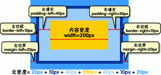
The same is true for the height of elements.
For example:
css code:
div{
    width:200px;
    padding:20px;
    border:1px solid red;
    margin:10px;
}
html code:
<body>
   <div>Text content</div>
</body>
The actual length of the element is: 10px+1px+20px+200px+20px+1px+10px=262px.
You can view the element box model in the chrome browser, as shown below:
Background color
Tags in web pages, whether inline elements or block elements, can be set with a background color.
Setting the background color for the label can be achieved by using the background color: color value.
Use border to add a border to the box
The border of the box model is a line around the content and padding. You can set its thickness, style and color (three properties of the border).
For example, the following code is div to set the border thickness as 2px, the style as solid and the color as red:
div{
    border:2px  solid  red;
}
The above is the abbreviation of border code, which can be written separately:
div{
    border-width:2px;
    border-style:solid;
    border-color:red;
}
Note:
1. Border style common styles are:
dashed | dotted | solid.
2. The color in border color can be set to hexadecimal color, such as:
border-color:#888;// Don't forget the pound sign in front.
3. The width in border width can also be set as:
thin | medium | thick (but not very commonly used), most often pixels (px).
<!DOCTYPE html>
<html>

<head>
    <meta charset="UTF-8">
    <title>frame</title>
    <style type="text/css">
        p {
            border: 2px dotted #ccc;
        }
    </style>
</head>

<body>
    <h1>courage</h1>
    <p>In the third grade, I was still a timid little girl. I never dared to answer the questions raised by the teacher in class for fear that the teacher would criticize me if I answered wrong. I have never had the courage to answer the questions raised by the teacher. I didn't have the courage to participate in the activities held by the school.</p>
    <p>In the second semester of grade three, our class had an open class. The teacher asked a very simple question. Many students in the class raised their hands, even those whose grades were much worse than mine, and said:"I'll do it. I'll do it."I looked around, but I didn't raise my hand.</p>
</body>

</html>
Now there is a problem. What if someone wants to set the lower border for the p label separately, but the other three sides do not set the border style?
css styles allow you to set styles for borders in only one direction:
div{border-bottom:1px solid red;}
You can also use the following code to set other three edges (top, right and left):
border-top:1px solid red;
border-right:1px solid red;
border-left:1px solid red;
<!DOCTYPE html>
<html>

<head>
   <meta charset="UTF-8">
    <title>frame</title>
    <style type="text/css">
    li {
        border-bottom: 1px dotted red;
    }
    </style>
</head>


<body>
    <ul>
        <li>Don't let your inability to speak hurt you</li>
        <li>You should have some knowledge at the age of twenty-eight</li>
        <li>Don't let me embarrass you</li>
    </ul>
</body>

</html>
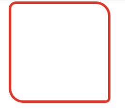
Use border radius to set the fillet
The fillet effect of the element border can be set using the border radius attribute. Fillet can be divided into upper left, upper right, lower right and lower left. The following code:
div{border-radius: 20px 10px 15px 30px;}
Effect:
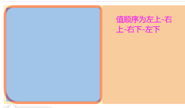
It can also be written separately:
div{
    border-top-left-radius: 20px;
   border-top-right-radius: 10px;
   border-bottom-right-radius: 15px;
   border-bottom-left-radius: 30px;
}
If all four fillets are 10px; It can be written as follows:
div{ border-radius:10px;}
If the fillet effect of the upper left corner and the lower right corner is 10px, and the fillet effect of the upper right corner and the lower left corner is 20px, it can be written as follows:
div{ border-radius:10px 20px;}
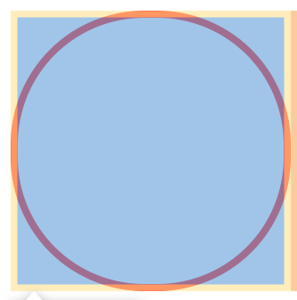
Special note: a square, when the fillet effect value is set to half the element width, the display effect is circular. For example:
 div {
        width: 200px;
        height: 200px;
        border: 5px solid red;
        border-radius: 100px;
    }
Effect:
It can also be written as a percentage of 50%
 div {
        width: 200px;
        height: 200px;
        border: 5px solid red;
        border-radius: 50%;
    }
<!DOCTYPE html>
<html>

<head>
    <meta charset="UTF-8">
    <title>fillet</title>
    <style type="text/css">
    div {
        width: 200px;
        height: 200px;
        border: 5px solid red;
        border-radius: 15px 30px 10px 30px;
    }
    </style>
</head>

<body>
    <div></div>
</body>

</html>
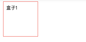
Use padding to set the inside margin (padding) for the box
The distance between the element content and the border can be set, which is called "inner margin (filling)". Filling can also be divided into top, right, bottom and left (clockwise). The following code:
div{padding:20px 10px 15px 30px;}
effect:
The order must not be confused. You can write the above code separately:
div{
   padding-top:20px;
   padding-right:10px;
   padding-bottom:15px;
   padding-left:30px;
}
If the filling of upper, right, lower and left is 10px; You can write that
div{padding:10px;}
If the upper and lower filling is 10px and the left and right filling is 20px, it can be written as follows:
div{padding:10px 20px;}
<!DOCTYPE html>
<html>

<head>
    <meta charset="UTF-8">
    <title>fill</title>
    <style type="text/css">
    #box1 {
        width: 100px;
        height: 100px;
        padding: 10px;
        border: 1px solid red;
    }
    </style>
</head>

<body>
    <div id="box1">Box 1</div>
</body>

</html>
Use margin to set the outer margin for the box
The distance between elements and other elements can be set by using the margin. The boundary can also be divided into upper, right, lower and left. The following code:
div{margin:20px 10px 15px 30px;}
effect:
It can also be written separately:
div{
   margin-top:20px;
   margin-right:10px;
   margin-bottom:15px;
   margin-left:30px;
}
If the upper, right, lower and left boundaries are 10px; It can be written as follows:
div{ margin:10px;}
If the upper and lower boundaries are 10px and the left and right boundaries are 20px, it can be written as follows:
div{ margin:10px 20px;}
To sum up: the difference between padding and margin is that padding is inside the border and margin is outside the border.
8, Layout model
CSS layout model
Layout model, like box model, is the most basic and core concept of CSS3. However, the layout model is based on the box model, which is different from the CSS3 layout style or CSS3 layout template. If the layout model is the foundation, then the CSS3 layout template is the last, which is an external form of expression.
CSS3 contains three basic layout models, which are summarized in English as Flow, Layer and Float.
In web pages, elements have three layout models:
1. Flow model
2. Floating model
3. Layer model
flow model
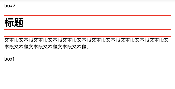
Let's first talk about the flow model. Flow is the default web page layout mode, that is, the HTML web page elements of the web page in the default state are distributed according to the flow model.
The flow layout model has two typical characteristics:
First, block elements are vertically extended and distributed from top to bottom in the containing elements, because the width of block elements is 100% by default. In fact, block elements occupy positions in the form of rows.
<!DOCTYPE html>
<html>

<head>
    <meta charset="UTF-8">
    <title>Block elements in flow mode</title>
    <style type="text/css">
    #box1 {
        width: 300px;
        height: 100px;
    }

    div,
    h1,
    p {
        border: 1px solid red;
    }
    </style>
</head>

<body>
    <div id="box2">box2</div>
    <!--For block elements, since the width is not set, the default width is 100%-->
    <h1>title</h1>
    <!--For block elements, since the width is not set, the default width is 100%-->
    <p>Text segment text segment text segment text segment text segment text segment text segment text segment text segment text segment text segment text segment text segment text segment text segment text segment text segment text segment text segment text segment text segment text segment text segment.</p>
    <!--For block elements, since the width is not set, the default width is 100%-->
    <div id="box1">box1</div>
    <!--Block element, due to the setting width:300px,The width is displayed as 300 px-->
</body>

</html>
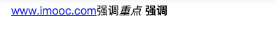
Second, in the flow model, inline elements are displayed horizontally from left to right in the containing element. (inline elements are not as domineering and exclusive as block elements)
<!DOCTYPE html>
<html>

<head>
    <meta charset="UTF-8">
    <title>Inline elements in flow mode</title>
    <style type="text/css">
    </style>
</head>

<body>
    <a href="http://www.imooc. Com "> www.imooc.com < / a > < span > emphasize the key points of < / span > < EM ></em>
    <strong>emphasize</strong>
</body>

</html>
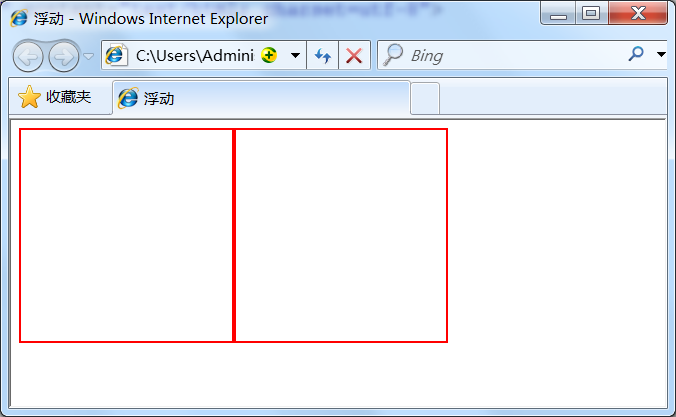
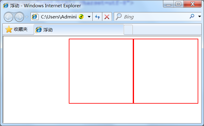
Floating model
Block elements are so domineering that they monopolize one line. What if we want to display two block elements side by side now? Don't worry, you can achieve this by setting the element float.
Any element cannot float by default, but it can be defined as floating by CSS. For example, div, p, table, img and other elements can be defined as floating. The following code can display two div elements in one line.
div{
    width:200px;
    height:200px;
    border:2px red solid;
    float:left;
}
<div id="div1"></div>
<div id="div2"></div>
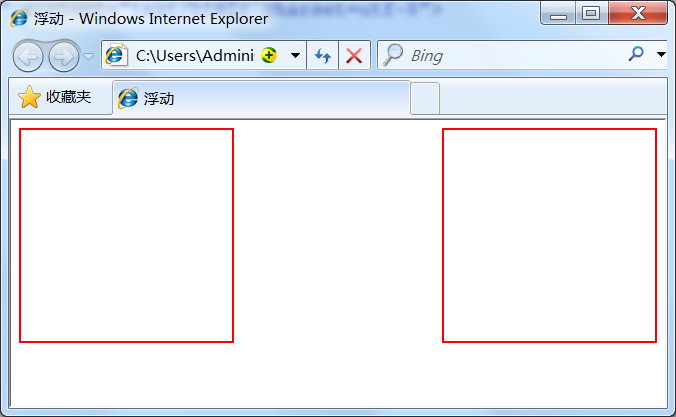
Of course, you can also set two elements to float right at the same time, or you can realize one line display.
div{
    width:200px;
    height:200px;
    border:2px red solid;
    float:right;
}
Another friend asked, can you set two elements, one left and one right, to display in one line? Certainly.
div{
    width:200px;
    height:200px;
    border:2px red solid;
}
#div1{float:left;}
#div2{float:right;}
Layer model
What is a layer layout model? The layer layout model is like a very popular layer editing function in the image software PhotoShop. Each layer can accurately locate the operation, but in the field of web page design, the layer layout has not been popular due to the activity of web page size. However, it is convenient to use layer layout locally on Web pages. Let's learn about the layer layout in html.
How to accurately locate html elements in web pages, just like layers in PhotoShop, an image software, can accurately locate each layer. CSS defines a set of positioning attributes to support the layer layout model.
The layer model has three forms:
1. Position: absolute
2. Position: relative
3. Position: fixed
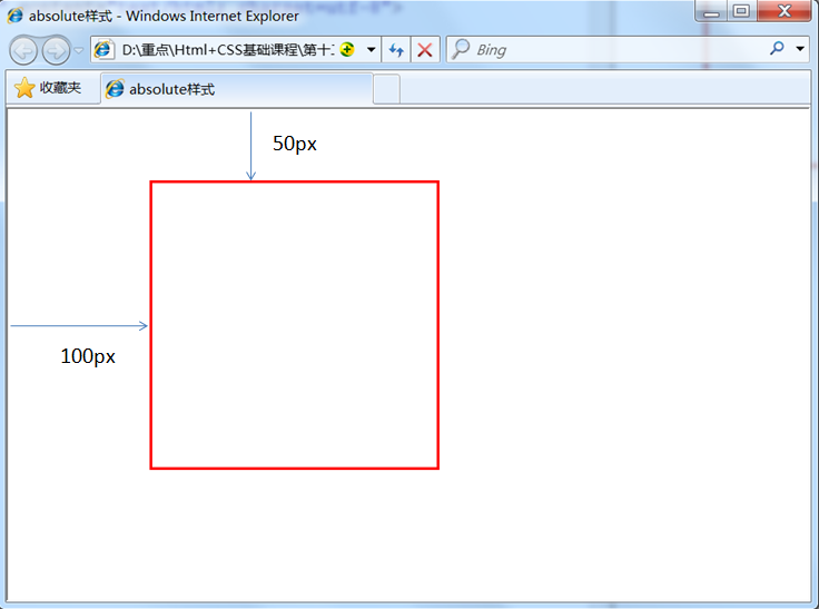
Absolute positioning
If you want to set the absolute positioning in the layer model for an element, you need to set position: absolute (indicating absolute positioning). The function of this statement is to drag the element out of the document flow, and then use the left, right, top and bottom attributes to perform absolute positioning relative to the nearest parent containing block with positioning attributes. If there is no such containing block, it is relative to the body element, that is, relative to the browser window.
As shown in the following code, the div element can move 100px to the right and 50px to the down relative to the browser window.
div{
    width:200px;
    height:200px;
    border:2px red solid;
    position:absolute;
    left:100px;
    top:50px;
}
<div id="div1"></div>
Relative positioning
If you want to set the relative positioning in the layer model for an element, you need to set position:relative (indicating relative positioning), which determines the offset position of the element in the normal document flow through the left, right, top and bottom attributes. The process of relative positioning is to first generate an element in the static(float) mode (and the element floats like a layer), Then move relative to the previous position. The direction and amplitude of the movement are determined by the left, right, top and bottom attributes. The position before the offset remains unchanged.
The following code moves 50px downward and 100px right relative to the previous position;
#div1{
    width:200px;
    height:200px;
    border:2px red solid;
    position:relative;
    left:100px;
    top:50px;
}

<div id="div1"></div>
What is "keep the position before offset"?
<!DOCTYPE html>
<html>

<head>
    <meta charset="UTF-8">
    <title>relative style</title>
    <style type="text/css">
    #div1 {
        width: 200px;
        height: 200px;
        border: 2px red solid;
        position:relative;
        left:100px;
        top:50px;
    }
    </style>
</head>

<body>
    <div id="div1"></div><span>The position before the offset remains unchanged and cannot cover the previous position div No position before offset</span>
</body>

</html>
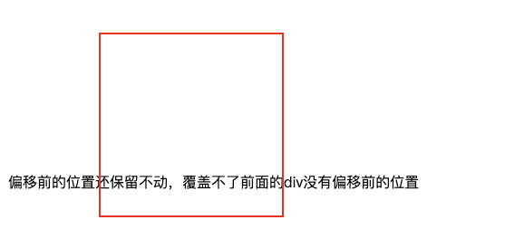
It is obvious from the rendering that although the div element is offset from the previous position, the previous position of the div element remains, so the following span element is displayed behind the previous position of the div element.
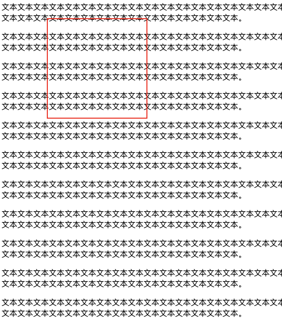
Fixed positioning
Fixed: indicates fixed positioning, which is similar to absolute positioning, But the coordinates of its relative movement are views (web page window in the screen) itself. Since the view itself is fixed, it will not change with the scroll bar of the browser window, unless you move the screen position of the browser window in the screen or change the display size of the browser window. Therefore, the fixed positioning element will always be located in a certain position of the view in the browser window and will not be affected by document flow And background attachment: fixed ; Properties have the same function.
The following code can move 100px to the right and 50px to the down relative to the browser view. And the position is fixed when you drag the scroll bar.
<!DOCTYPE html>
<html>

<head>
    <meta charset="UTF-8">
    <title>Fixed positioning</title>
    <style type="text/css">
    #div1 {
        width: 200px;
        height: 200px;
        border: 2px red solid;
        position:fixed;
        left:100px;
        top:50px;
    }
    </style>
</head>

<body>
    <div id="div1"></div>
    <p>Text text text text text text text text text text text text text text text text text text text text text text text text text text text text text text text text text text text text text text text.</p>
    <p>Text text text text text text text text text text text text text text text text text text text text text text text text text text text text text text text text text text text text text text text.</p>
    <p>Text text text text text text text text text text text text text text text text text text text text text text text text text text text text text text text text text text text text text text text.</p>
    <p>Text text text text text text text text text text text text text text text text text text text text text text text text text text text text text text text text text text text text text text text.</p>
    <p>Text text text text text text text text text text text text text text text text text text text text text text text text text text text text text text text text text text text text text text text.</p>
    <p>Text text text text text text text text text text text text text text text text text text text text text text text text text text text text text text text text text text text text text text text.</p>
    <p>Text text text text text text text text text text text text text text text text text text text text text text text text text text text text text text text text text text text text text text text.</p>
    <p>Text text text text text text text text text text text text text text text text text text text text text text text text text text text text text text text text text text text text text text text.</p>
    <p>Text text text text text text text text text text text text text text text text text text text text text text text text text text text text text text text text text text text text text text text.</p>
    <p>Text text text text text text text text text text text text text text text text text text text text text text text text text text text text text text text text text text text text text text text.</p>
    <p>Text text text text text text text text text text text text text text text text text text text text text text text text text text text text text text text text text text text text text text text.</p>
    <p>Text text text text text text text text text text text text text text text text text text text text text text text text text text text text text text text text text text text text text text text.</p>
    <p>Text text text text text text text text text text text text text text text text text text text text text text text text text text text text text text text text text text text text text text text.</p>
    <p>Text text text text text text text text text text text text text text text text text text text text text text text text text text text text text text text text text text text text text text text.</p>
</body>

</html>
Relative is used in combination with Absolute
Use position:absolute to locate the set element relative to the browser (body). Have you ever thought about whether you can locate it relative to other elements? The answer is yes, of course. Use position:relative to help, but you must comply with the following specifications:
1. The referenced element must be the predecessor element of the relative positioning element:
<div id="box1"><!--Referenced elements-->
    <div id="box2">Positioning relative to reference elements</div><!--Relative positioning element-->
</div>
From the above code, we can see that box1 is the parent element of box2 (of course, the parent element is also the predecessor element).
2. position:relative must be added to the referenced element;
#box1{
    width:200px;
    height:200px;
    position:relative;
}
3. By adding position:absolute to the positioning element, you can use top, bottom, left and right for offset positioning.
#box2{
    position:absolute;
    top:20px;
    left:30px;
}
In this way, box2 can be positioned relative to the parent element box1 (note here that the reference can be set freely instead of the browser).
<!DOCTYPE html>
<html>

<head>
    <meta charset="UTF-8">
    <title>Positioning relative to reference elements</title>
    <style type="text/css">
    div {
        border: 2px red solid;
    }

    #box1 {
        width: 200px;
        height: 200px;
        position: relative;

    }

    #box2 {
        position: absolute;
        top: 20px;
        left: 30px;

    }

    /*The following is the task section*/
    #box3 {
        width: 200px;
        height: 200px;
        position: relative;
    }

    #box4 {
        width: 99%;
        position: absolute;
        top: 78%;

    }
    </style>
</head>

<body>
    <div id="box1">
        <div id="box2">Positioning relative to reference elements</div>
    </div>
    <h1>The following is the task section</h1>
    <div id="box3">
        <img src="http://img.mukewang.com/541a7d8a00018cf102000200.jpg">
        <div id="box4">When I was a third grade student, I was a shy little girl.</div>
    </div>
</body>

</html>
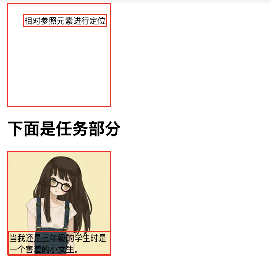
In this way, the box4 can be positioned at the bottom of the picture (box3).
9, flex elastic box model
flex attribute
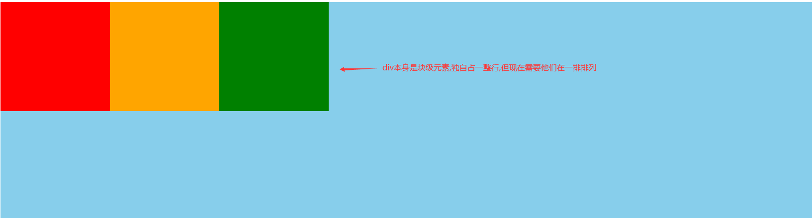
To achieve the above effect, we need to enter the following code:
<!DOCTYPE html>
<html>

<head>
    <meta charset="UTF-8">
    <title>flex layout</title>
    <style type="text/css">
    .box {
        height: 400px;
        background: blue;
        display: flex;
    }

    .box div {
        width: 200px;
        height: 200px;
    }

    .box1 {
        background: red;
    }

    .box2 {
        background: orange;
    }

    .box3 {
        background: green;
    }
    </style>
</head>

<body>
    <div class="box">
        <div class="box1"></div>
        <div class="box2"></div>
        <div class="box3"></div>
    </div>
</body>

</html>
Code above:
Set the size and background color of the three block elements, and add flex to the parent container.
Explanation of technical points:
1. Set the display: flex attribute to display block level elements in a row.
2. flex needs to be added to the parent element to change the arrangement order of child elements.
3. It is arranged from left to right by default, and there is no gap with the left of the parent element.
Use the justify content property to set the horizontal axis arrangement
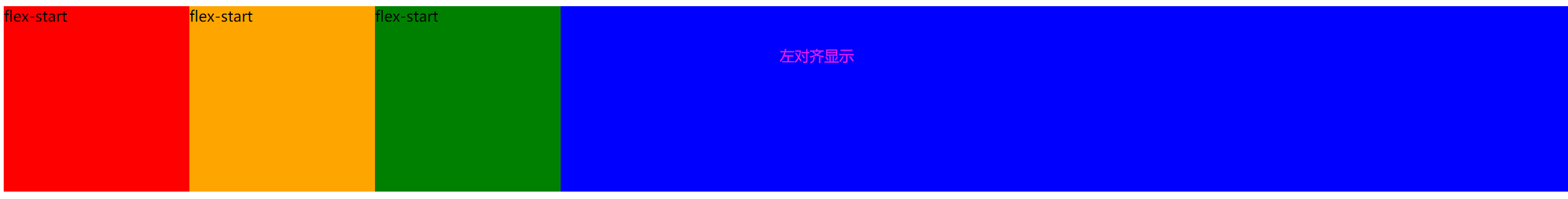
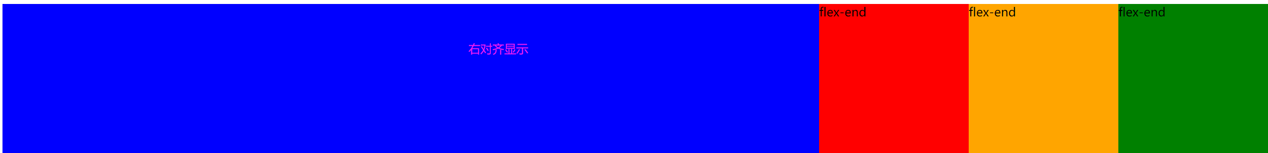
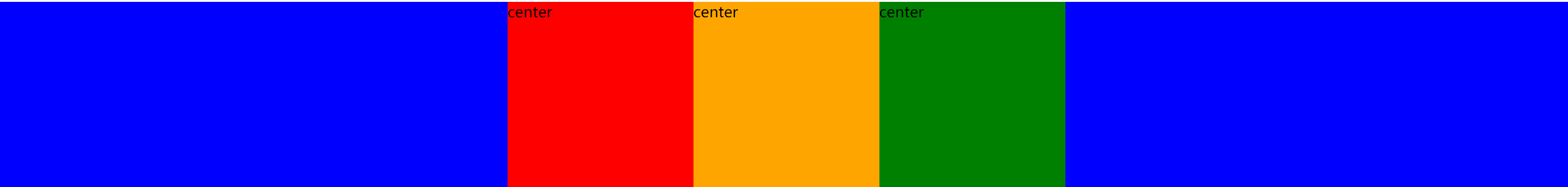
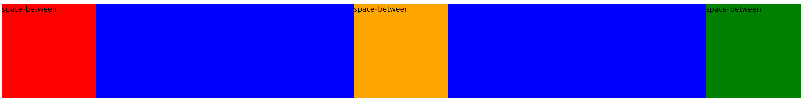
The justify content attribute defines the alignment of items on the spindle. In combination with the layout example in the previous section, the attribute values are:
justify-content: flex-start | flex-end | center | space-between | space-around;
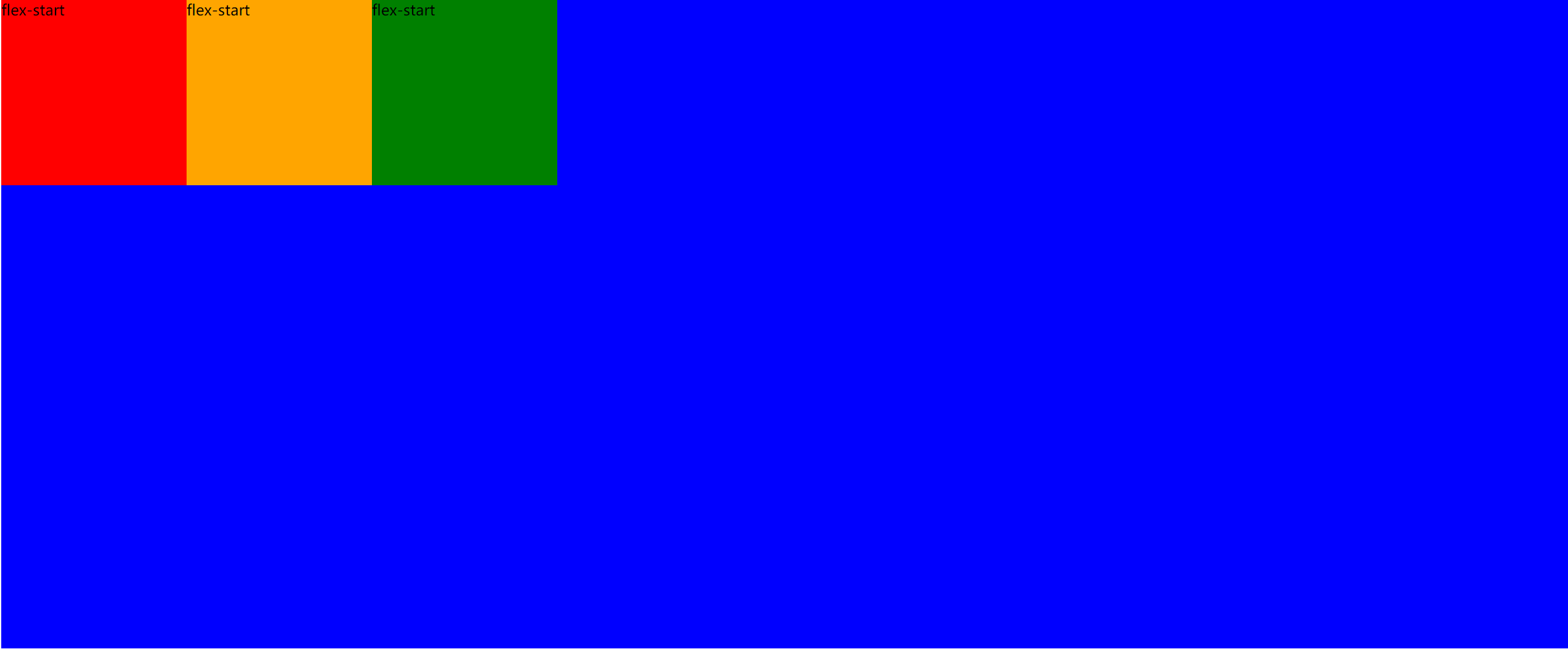
Flex start: align the start point of the cross axis
 .box {
        background: blue;
        display: flex;
        justify-content: flex-start;
    }
Effect achieved:
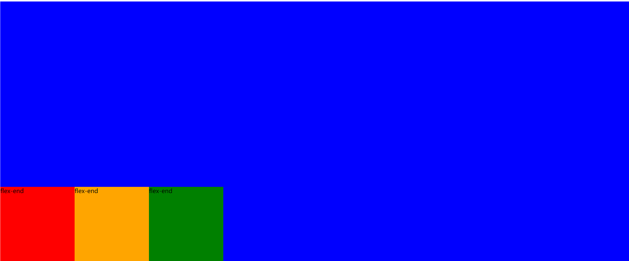
Flex end: right justified
 .box {
        background: blue;
        display: flex;
        justify-content: flex-end;
    }
Effect achieved:
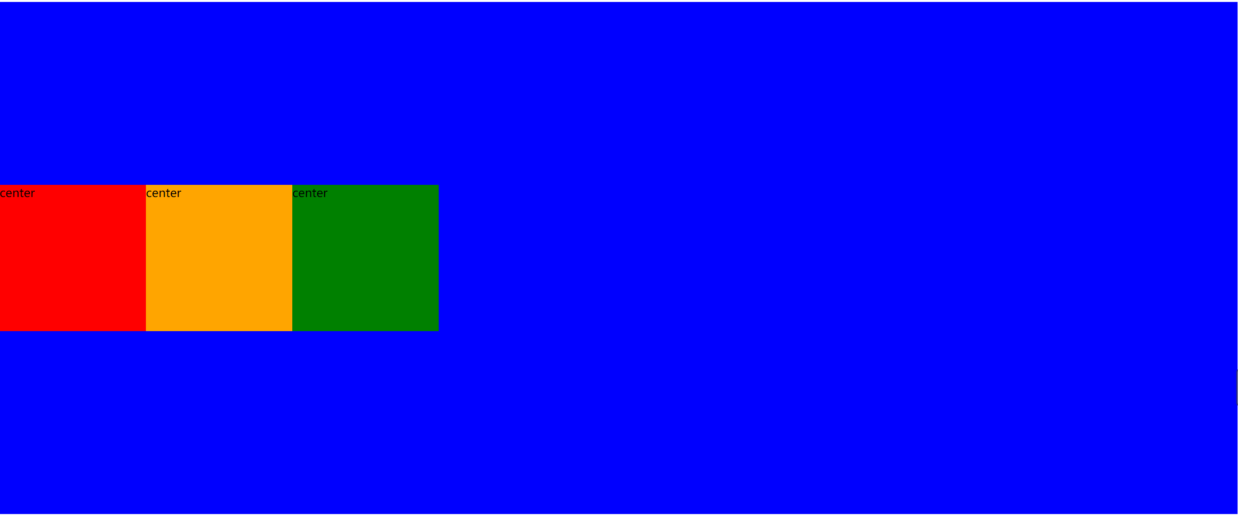
center: center
 .box {
        background: blue;
        display: flex;
        justify-content: center;
    }
Effect achieved:
Space between: both ends are aligned, and the spacing between items is equal.
.box {
        background: blue;
        display: flex;
        justify-content: space-between;
    }
Effect achieved:
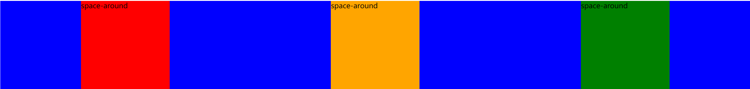
Space around: the space on both sides of each item is equal. Therefore, the interval between items is twice as large as that between items and borders.
.box {
        background: blue;
        display: flex;
        justify-content: space-around;
    }
Effect achieved:
Use the align items property to set the vertical axis arrangement
The ` align items · attribute defines the alignment of items on the cross axis. The attribute values are:
align-items: flex-start | flex-end | center | baseline | stretch;
Understand in combination with the following style settings:
Flex start: default, left aligned
   .box {
        height: 700px;
        background: blue;
        display: flex;
        align-items: flex-start;
    }
Effect achieved:
Flex end: end point alignment of the cross axis
 .box {
        height: 700px;
        background: blue;
        display: flex;
        align-items: flex-end;
    }
Effect achieved:
center: align the midpoint of the cross axis
.box {
        height: 700px;
        background: blue;
        display: flex;
        align-items: center;
    }
Effect achieved:
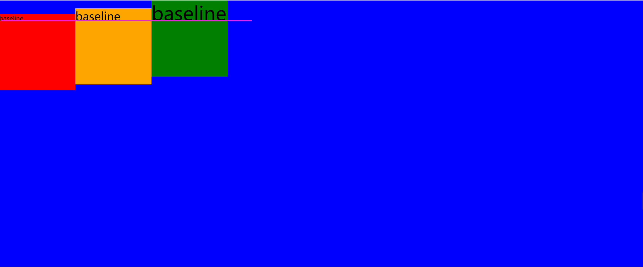
Baseline: the baseline alignment of the first line of text of the project.
.box {
        height: 700px;
        background: blue;
        display: flex;
        align-items: baseline;
    }
Different font sizes are set in the three boxes.
Effect achieved:
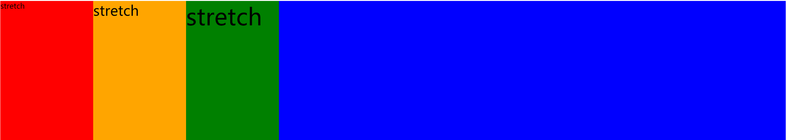
stretch (default): if the project is not set to height or set to auto, it will occupy the height of the entire container.
 .box {
        height: 300px;
        background: blue;
        display: flex;
        align-items: stretch;
    }

    .box div {
        /*Without setting the height, the element is spread vertically over the parent container*/
        width: 200px;
    }
Effect achieved:
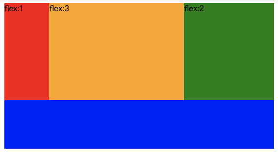
Set flex proportion for child elements
1. Set the flex attribute for the child element to set the proportion of the child element relative to the parent element.
2. The value of flex attribute can only be a positive integer, indicating the proportion.
3. After flex is set to the child element, its width attribute will become invalid.
<!DOCTYPE html>
<html>

<head>
    <meta charset="UTF-8">
    <title>flex Proportion</title>
    <style type="text/css">
    .box {
        height: 300px;
        background: blue;
        display: flex;
    }

    .box div {
        width: 200px;
        height: 200px;
    }

    .box1 {
        flex: 1;
        background: red;
    }

    .box2 {
        flex: 3;
        background: orange;
    }

    .box3 {
        flex: 2;
        background: green;
    }
    </style>
</head>

<body>
    <div class="box">
        <div class="box1">flex:1</div>
        <div class="box2">flex:3</div>
        <div class="box3">flex:2</div>
    </div>
</body>

</html>
10, css style setting tips
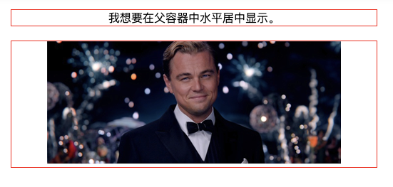
Horizontal center setting - inline elements
We often encounter scenes that need to be set horizontally centered in our actual work. For example, in order to be beautiful, the title of the article is generally displayed horizontally centered.
Here we score two cases: in-line elements or block elements. Block elements are divided into fixed width block elements and variable width block elements. Today, let's learn how to center the elements in a row horizontally?
If the element is set as text, picture and other inline elements, the horizontal centering is achieved by setting text align: Center for the parent element. (parent and child elements: for example, in the following html code, div is the parent element of the text "I want to display horizontally in the parent container". On the contrary, the text is the child element of DIV) the following code:
<!DOCTYPE HTML>
<html>
<head>
<meta charset="utf-8">
<title>Fixed width block element horizontally centered</title>
<style>
div{
    border:1px solid red;
    margin:20px;
}
.txtCenter{
	text-align:center;
}
.imgCenter {
    text-align:center;
}

</style>
</head>

<body>
<div class="txtCenter">I want to center it horizontally in the parent container.</div>

<!--The following is the task section-->

<div class="imgCenter"><img src="http://img.mukewang.com/52da54ed0001ecfa04120172.jpg" /></div>
</body>
</html>
Horizontal center setting - fixed width block element
When the set element is a block element, text align: center will not work. There are two cases: fixed width block element and variable width block element.
In this section, we will first talk about fixed width block elements. (fixed width block element: the width of the block element is a fixed value.)
Elements that meet the conditions of fixed width and block can be centered by setting the "left and right margin" value to "auto". Let's take an example to set div, a block element, to center horizontally:
<!DOCTYPE HTML>
<html>
<head>
<meta http-equiv="Content-Type" content="text/html; charset=utf-8">
<title>Fixed width block element horizontally centered</title>
<style>
div{
    border:1px solid red;

	width:200px;
	margin:20px auto;
}

</style>
</head>

<body>
<div>I'm a fixed width block element. I want to display it horizontally and centrally.</div>
</body>
</html>
The known width and height of common interview questions realize the horizontal and vertical center of the box
Given the width and height, the box is horizontally and vertically centered. It is usually done using positioning, for example, to achieve the following effects:
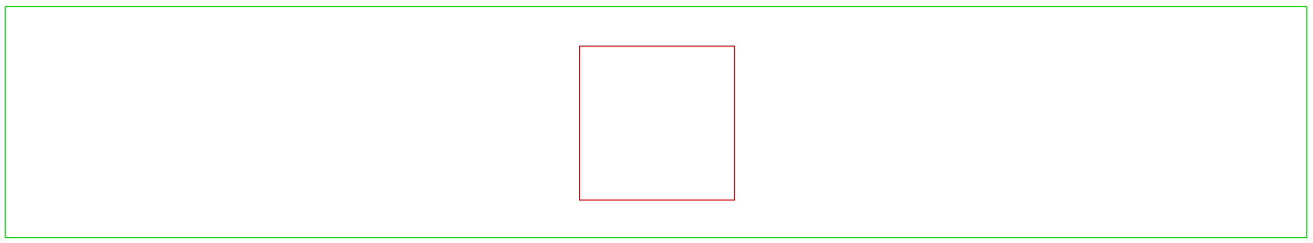
<!DOCTYPE html>
<html lang="en">

<head>
    <meta charset="UTF-8">
    <title>Given the width and height, the box can be centered horizontally and vertically</title>
    <style type="text/css">
    .box {
        width: 500px;
        border: 1px solid #00ee00;
        height: 300px;
        position: absolute;
    }

    .box1 {
        width: 200px;
        height: 200px;
        border: 1px solid red;
        position: relative;
        left: 50%;
        top: 50%;
        margin-top: -100px;
        margin-left: -100px;
    }
    </style>
</head>

<body>
    <div class="box">
        <div class="box1"></div>
    </div>
</body>

</html>
1. If the parent element is used to set relative positioning and the child element is used to set absolute positioning, the child element is the characteristic of positioning relative to the parent element.
2. The upper and left offset values of child elements are both 50%, which is the position of the upper left corner of the element at the center point of the parent element. effect:
3. Then use margin to give both the upper and left negative half of their own width and height, so as to achieve the effect of vertical and horizontal center.
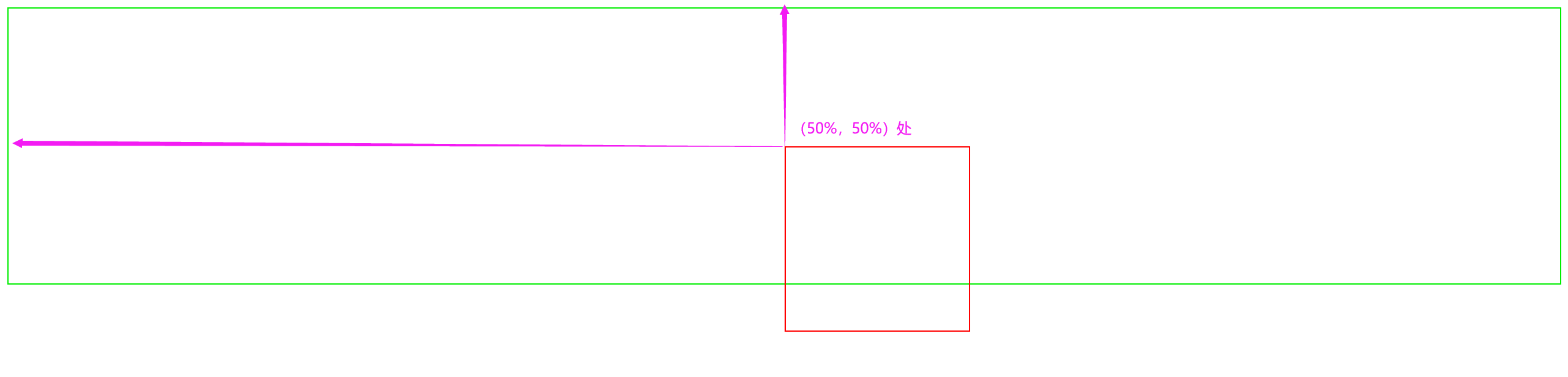
The width and height of the frequently used questions in the interview are uncertain, so as to realize the horizontal and vertical center of the box
The unknown width and height realizes the horizontal and vertical centering of the box, which is usually completed by positioning and translate.
<!DOCTYPE html>
<html lang="en">

<head>
    <meta charset="UTF-8">
    <title>The width and height are variable to realize the horizontal and vertical centering of the box</title>
    <style type="text/css">
    .box {
        border: 1px solid #00ee00;
        height: 300px;
        position: relative;
    }

    .box1 {
        border: 1px solid red;
        position: absolute;
        top: 50%;
        left: 50%;
        transform: translate(-50%, -50%);
    }
    </style>
</head>

<body>
    <div class="box">
        <div class="box1">
            Muke net Muke net Muke net Muke net Muke net Muke net Muke net Muke net Muke net Muke net Muke net Muke net Muke net Muke net Muke net Muke net Muke net Muke net Muke net Muke net Muke net Muke net Muke net Muke net Muke net Muke net Muke net Muke net Muke net Muke net Muke net Muke net Muke net Muke net Muke net Muke net Muke Wangmu class network
        </div>
    </div>
</body>

</html>
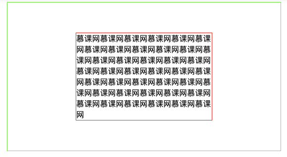
Explanation of technical points:
1. If the parent element is used to set relative positioning and the child element is used to set absolute positioning, the child element is the characteristic of positioning relative to the parent element.
2. The upper and left offset values of child elements are set to 50%.
3. Then use the css3 attribute to translate the displacement, and give both the upper and left displacement - 50% distance, so as to achieve the effect of vertical and horizontal center.