catalog:
1,Adaptive ellipse rendering
2,Drawing of parallelogram
3,Corner cutting effect
4,Trapezoidal tab
1. Adaptive ellipse rendering
Problem Description: we know that as long as we set a fixed value or percentage for border radius, we can achieve the effect of fillet, but how to achieve ellipse?
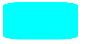
In fact, we can use border radius to separately set the specified horizontal and vertical radius to form the effect of ellipse angle. The effect of the following code is that the four angles are the angles of ellipse.
width: 200px;
height: 100px;
background-color: aqua;
border-radius: 50px/10px;
At this time, set the value as percentage and let the ellipse angle change adaptively to achieve the ellipse effect.
border-radius: 50% / 50%;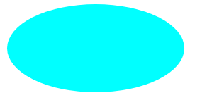
In addition, the border radius can set the horizontal and vertical radii of the four corners separately in the following ways:
Border radius: four horizontal / four vertical, such as:
border-radius: 50%/ 0 100% 100% 0;
The following effects can be drawn, which is very easy to use:
2. Drawing of parallelogram
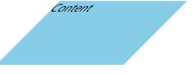
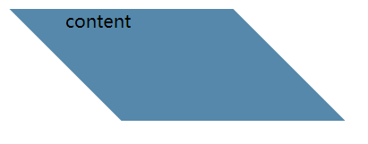
Problem Description: the first method we think of to realize parallelogram is transform to deform, but this will affect the content inside the track box. Is there any other alternative?
width: 200px;
height: 100px;
background-color: skyblue;
margin-left: 200px;
transform: skewX(-45deg);
Scheme 1: use nested elements
It is the simplest solution. Add a layer of box to the content and set the inclined transform in the opposite direction
transform: skewX(45deg);
Scheme 2: pseudo element
The core idea is to replace the pseudo elements to achieve the effect of parallelogram, which will neither affect the display of content nor add elements. The subsequent implementation of other background graphics can refer to the implementation of pseudo class elements.
.box2::before {
      content: '';
      /* Generate a rectangle with pseudo elements */
      width: 200px;
      height: 100px;
      position: absolute;
      top: 0;
      right: 0;
      bottom: 0;
      left: 0;
      z-index: -1;
      background: #58a;
      transform: skew(45deg);
      margin-left: 200px;
    }
3. Corner cutting effect
What is corner cutting? In fact, it is the effect of cutting a corner of a quadrilateral, as follows:
The specific implementation depends on gradient, which can be realized by adding one line of code
background:
 linear-gradient(-45deg, transparent 15px, #58a 0);
However, how to implement two or more corner cutting? First, try to write the command twice. It is found that the background setting in the back will overwrite the previous one, resulting in failure
Here, the background size is used to set the size of multiple backgrounds, so that the two transitions occupy twice respectively, so as to realize two corner cutting.
background: #58a;
background:
 linear-gradient(-45deg, transparent 15px, #58a 0)
 right,
 linear-gradient(45deg, transparent 15px, #655 0)
 left;
background-size: 50% 100%;
background-repeat: no-repeat;
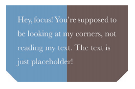
Similarly, it can also achieve the effect of four corners
4. Trapezoidal tab
Problem Description: trapezoid is a well-known graphic that can not be directly implemented with CSS, but its use scenarios are also very wide. For example, the browser tab often uses trapezoid implementation, so how to draw trapezoid label graphics appropriately?
Using 3D rotation to provide an angle to the quadrilateral can achieve the trapezoidal effect, but the problem is that its internal content will be affected, and the influence of 3D rotation can not be reversed, that is, the nested box can not be used to reply to the content.
transform: perspective(.5em) rotateX(5deg);
To solve the above problems, use the pseudo element technique again to avoid the impact on content:
.tab::before {
 content: ''; /* Generate a rectangle with pseudo elements */
 position: absolute;
 top: 0; right: 0; bottom: 0; left: 0;
 z-index: -1;
 background: #58a;
 transform: perspective(.5em) rotateX(5deg);
}
However, there is another problem, that is, the height after 3D rotation is changed and cannot be aligned with the height of the original quadrilateral. Therefore, it is necessary to use transform origin: bottom to make the bottom fixed during deformation.
Finally, use transform Scaley to restore the trapezoid to the height of the original quadrilateral.
transform: scaleY(1.3) perspective(.5em)
 rotateX(5deg);
transform-origin: bottom;