record some css that will be used but not often used. I don't remember these things very reliably. Every time I need to use them, I know what to use, but I don't remember how to write the code. Here's a record to deepen my impression
1, Adaptive layout and responsive layout
first, let's talk about adaptive layout and responsive layout. At the beginning of learning the front end, the concept was still very vague and thought they were the same
1. Adaptive layout
- Description: keep the original display mode under different screen resolutions. That is, the position of the element will change, but the size will not change
- Advantages: the page can be compatible with devices with different resolutions
- Disadvantages: the screen is too small, and the content will be too crowded. All devices look like the same website, but the length or pictures become smaller, and different display styles will not be adopted according to the device
- Scenario: traditional web site
2. Responsive layout
- Description: the page layout displayed is different under different screen resolutions
- Advantages: a set of code is compatible with web, tablet and mobile web pages
- Disadvantages: heavy workload, UI design also requires multiple versions
- Scenario: compatible with multiple different devices at the same time
2, Beautify scroll bars (Chrome and Firefox)
* {
	/*Firefox scroll bar settings*/
    /*Set scroll bar color*/
    scrollbar-color: #ccc #eee;
    /*Remove triangle (scroll bar width is 8px)*/
    scrollbar-width: thin;
    /*Hide scroll bar (scrollable)*/
    /* scrollbar-width: none; */
}

::-webkit-scrollbar {
    /*Chrome Hide the scroll bar (set the width to 0)*/
    width: 8px;
    background: #eee;
}

::-webkit-scrollbar-thumb {
    background-color: #ccc;
    opacity: 0.5;
    box-shadow: inset 0 0 2px #ccc;
}

::-webkit-scrollbar-thumb:hover {
    background: #aaa;
}
3, css text out of hiding
during project development, when there are too many text contents in some lists, an ellipsis (...) is added at the end of the text to hide the redundant text
1. Display ellipsis when single line exceeds hidden
the element must be a block or inline block. If the overflow is hidden, the text overflow will not work, and the element must have a defined width or maximum width.
p {
    display: inline-block;
    max-width: 300px;
    overflow: hidden;
    white-space: nowrap;
    text-overflow: ellipsis;
}
2. Display ellipsis when multiple lines exceed hidden
the height needs to be set
div {
    display: -webkit-box;
    -webkit-box-orient: vertical;
    -webkit-line-clamp: 3; /* Number of rows to display */
    overflow: hidden;
    word-break:break-all; /* Force English word break */
}
4, CSS Chinese to traditional
Font variant East Asian: traditional; can be set directly;, For example, add it to the body element
body {
    font-variant-east-asian: traditional;
}
5, css disable event
css can prevent js events. Pointer events: none;
For example: prohibit the click event of the picture
img {
	pointer-events: none;
}
6, css text color gradient
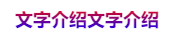
<div id="text">Text introduction</div>
#text {
    background: linear-gradient(to bottom, #f00, #02f);
    -webkit-background-clip: text;
    color: transparent;
}
7, css background color gradient

background: linear-gradient(135deg, rgba(212, 228, 239, 1) 0%, rgba(79, 158, 214, 1) 100%);
8, Disable selection
user-select: none;
9, Picture adaptation
img {
    object-fit: fill;		/* The width and height of the picture fill the container, and there will be stretching */
    object-fit: cover;		/* The image is scaled to the original scale and covered with containers. The excess may be cropped */
    object-fit: contain;	 /* Zoom the picture to the original scale, and all the pictures will be displayed */
}
10, HTML depth mode
set the filter inversion and color rotation through the css filter attribute filter line: invert (1) hue rotate (180DEG);
The following is to follow the system to switch the corresponding mode
/* Light mode style */
@media (prefers-color-scheme: light) {

}
/* Dark mode style */
@media (prefers-color-scheme: dark) {
    html {
    	transition: all 0.5s;	/* Add animation to make it less rigid */
        filter: invert(1) hue-rotate(180deg);
    }
}
CSS Tools
css configuration compatible style Autoprefix-http://autoprefixer.github.io/
css color gradient, border shadow and fillet settings https://www.cssmatic.com/gradient-generator