Effect view:

1, Build html page structure
First, create a box in the html page to store buttons and text
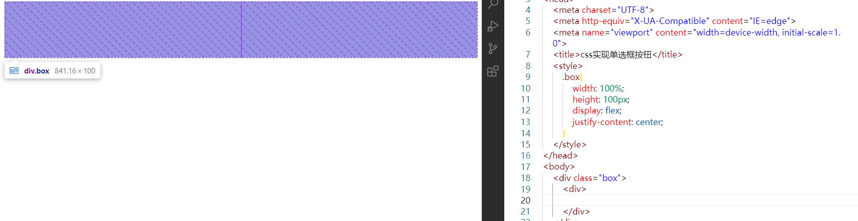
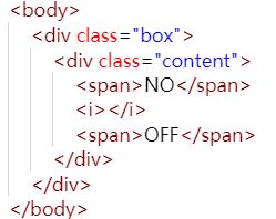
A large box is not enough. The span label is used to describe the text, and the i label is used to represent the dot in the middle of the radio box. These are covered with a small box, which is used to outline the frame of the radio box.
As shown in the figure. This completes the html page structure
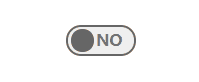
2, Planning style
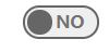
Outline the border of the small box, and then make the styles of each element. The initial state is as follows. By the way, don't forget to give the small box a transition effect style, otherwise the subsequent operations will have no dynamic effect ~!
3, Move in effect
How can pure css achieve a quasi click effect? I choose the hover pseudo class here. Although there are some defects, I can see the effect.
This pseudo class is placed on the style of small box, because the small box is the parent element of all required child elements. You can call the child elements directly by using this parent element.
Move the mouse into the small box element, the span label representing OFF should be displayed, while the span label representing NO should be hidden. At the same time, the origin in the middle should be moved to the left.
The effect after clicking is shown in the figure: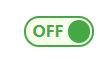
4, Key points of effect
The key point of such a gadget is to write the initial style and the style after clicking. We just add a transition effect to the two styles.
For html style, the key point lies in the small box, that is, the element. content. We give a relative positioning to this element. The position of the child element span tag and i tag can be adjusted according to the. content element.
5, JS implements real click events
If you need to click the event, you can write it in js. The change of style can simplify the amount of code by adding classes.
Create a variable to record the checked or unchecked status of the radio box
Specifically, replace the: hover pseudo class with. active. Of course, this class is user-defined.
When the. active class is added to the small box, it is the same as the: hover pseudo class. In this way, we only need to write a click event in js, add the. active class to the small box in the click event, and change the variable recording the state to the selected state, so as to complete the selected state.
When the radio box needs not to be checked, just remove the. active class and change back to the variable value in the recording state.
6, Js Demo:
<!DOCTYPE html>
<html lang="en">
<head>
    <meta charset="UTF-8">
    <meta http-equiv="X-UA-Compatible" content="IE=edge">
    <meta name="viewport" content="width=device-width, initial-scale=1.0">
    <title>css Implement radio button</title>
    <style>
        .box{
            z-index: -1;
            position: relative;
            width: 100%;
            height: 100px;
            display: flex;
            justify-content: center;
        }
        .content{
            cursor: pointer;
            margin-top: 100px;
            transition: all .5s;
            height: 20px;
            width: 55px;
            position: relative;
            padding: 2px;
            border-radius: 20px;
            border: 2px solid rgb(102, 102, 102) ;
            background-color: rgb(102, 102, 102, .1);
        }
        .content>span{
            color: rgb(102, 102, 102, .9);
            font-weight: bold;
            position: absolute;
            border-radius: 20px;
            opacity: 1;
            transition: all .5s;
        }
        .content>span:nth-of-type(1){
            left: 10%;
            opacity: 0;
        }
        .content>span:nth-of-type(2){
            right: 18%;
            opacity: 1;
        }
        .content>i{
            width: 20px;
            height: 20px;
            background-color: rgb(102, 102, 102);
            position: absolute;
            border-radius: 1000px;
            transition: all .5s;
            left: 5%;
        }

        /* Move in effect */
        /*
        .content:hover{
            background-color: rgba(172, 255, 47, 0.1);
            border:2px solid rgb(68, 168, 68);
        }
        .content:hover>span{
            color: rgb(68, 168, 68);
        }
        .content:hover>span:nth-child(1){
            opacity: 1;
        }
        .content:hover>span:nth-child(3){
            opacity: 0;
        }
        .content:hover>i{
            background-color:rgb(68, 168, 68);
            left: 63%;
        }
        */

        /* Click event */
        .content.active{
            background-color: rgba(172, 255, 47, 0.1);
            border:2px solid rgb(68, 168, 68);
        }
        .content.active>span{
            color: rgb(68, 168, 68);
        }
        .content.active>span:nth-child(1){
            opacity: 1;
        }
        .content.active>span:nth-child(3){
            opacity: 0;
        }
        .content.active>i{
            background-color:rgb(68, 168, 68);
            left: 63%;
        }


    </style>
</head>
<body>
    <div class="box">
        <div class="content">
            <span>OFF</span>
            <i></i>
            <span>NO</span>
        </div>
    </div>

    <script>
        window.onload = function (params) {
            var btn = document.querySelector(".content");
            var state = false;

            btn.onclick = function () {
                if (state==true) {
                    btn.setAttribute("class","content")
                    state = false
                    return;
                }
                btn.setAttribute("class","content active")
                state = true
            }

        }

    </script>
</body>
</html>