Goal: Write the following graphics in css

thinking
- Analytically, it is not difficult to write this figure. I count four concentric circles and eight rounded rectangles, which require 8 + 4 = 12 DOM nodes. It seems that there is still a long way to go.
- If we use border to write concentric circles, we can reduce two circles.
- Adding before and after pseudo-classes reduces the number of nodes
- If you use box-shadow skillfully, a div is enough!
The first step is to draw a concentric circle.
Knowledge Point 1: box-shadow
Grammar: none | [inset?& [< offset-x > < offset-y > < blur-radius > < spread-radius > < color >?]]#
Value:
The inset default shadow is outside the border. Use inset to become an inner shadow, above and below the background
offset-x offset-y sets horizontal and vertical offsets, respectively
blur-radius blur radius, the bigger the value, the bigger the blur area, the bigger and lighter the shadow.
When the spread-radius shadow size is positive, the shadow enlarges; when the spread-radius shadow size is negative, the shadow enlarges.
The color of color shadows
div{
        width: 200px;
        height: 200px;
        /* Setting box-shadow for div */
        box-shadow: 0px 0px 0px 50px  black , 0px 0px 0px 100px  skyblue , 0px 0px 0px 150px  black;
        margin: 200px auto;
        position: relative;
        border-radius: 50%;
    }
The effect is as follows: 1, 2 and 3 correspond to the values of three box-shadow s, respectively. 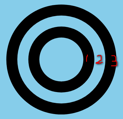
The second step is to construct the first pseudoclass
div::before{
        content: "";
        display: block;
        width: 50px;
        height: 50px;
        border-radius: 10px;
        background: orange;
    }
The small orange rounded rectangle is placed in the upper left corner of the div. 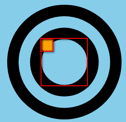
The third step is to draw four zigzags with box-shadow
/* Calculating offsets of x and y */
box-shadow: 75px -195px 0 black,75px 345px 0 black,-195px 75px 0 black,345px 75px 0 black;
It's easy to get the following picture. 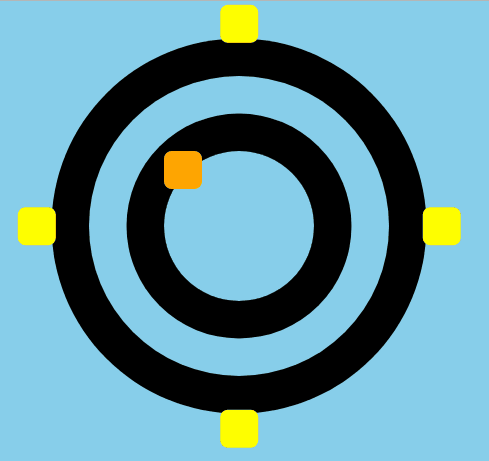
The fourth step is to construct the second pseudoclass in the same way and draw four jagged teeth.
This is a bit lazy, because to rotate, my second pseudoclass is exactly the same as the first pseudoclass.
div::after{
        content: "";
        display: block;
        width: 50px;
        height: 50px;
        border-radius: 10px;
        background: blue;
        position: absolute;
        /* Here we add positioning so that before is the same as after, and div is positioned relative at the same time. */
        box-shadow: 75px -195px 0 darkblue,75px 345px 0 darkblue,-195px 75px 0 darkblue,345px 75px 0 darkblue;
    }
The blue block covers the yellow block just written. 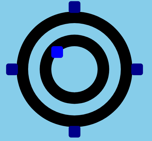
Step 5: Add animation to pseudo-classes
Define an animation first
@keyframes rotate{
        form{
            transform: rotate(0);
        }to{
            transform: rotate(360deg);
        }
    }
Add animation to before and after, and delay the animation time by one-eighth. When it turns, it's done!
/* before Animation */
animation: rotate2 10s linear infinite;
/* after Animation */
animation: rotate2 10s linear infinite 0.15s;
Last complete code
<!DOCTYPE html>
<html lang="en">
<head>
    <meta charset="UTF-8">
    <title>Document</title>
</head>
<body>
    <div></div>
</body>
<style>
    body{
        background: skyblue;
    }
    div{

        width: 200px;
        height: 200px;
        box-shadow: 0px 0px 0px 50px  black , 0px 0px 0px 100px  skyblue , 0px 0px 0px 150px  black;
        margin: 200px auto;
        position: relative;
        border-radius: 50%;
    }
    div::before{
        content: "";
        display: block;
        width: 50px;
        height: 50px;
        position: absolute;
        border-radius: 10px;
        box-shadow: 75px -195px 0 black,75px 345px 0 black,-195px 75px 0 black,345px 75px 0 black;
        animation: rotate 10s linear infinite;
        transform-origin: 100px 100px;
    }
    div::after{
        content: "";
        display: block;
        width: 50px;
        height: 50px;
        position: absolute;
        border-radius: 10px;
        box-shadow: 75px -195px 0 black,75px 345px 0 black,-195px 75px 0 black,345px 75px 0 black;
        animation: rotate 10s linear infinite 1.25s;
        transform-origin: 100px 100px;
    }
    @keyframes rotate{
        form{
            transform: rotate(0);
        }to{
            transform: rotate(360deg);
        }
    }
    @keyframes rotate2{
        form{
            transform: rotate(45deg);
        }to{
            transform: rotate(405deg);
        }
    }
</style>
</html>