Introduction: Hammer interviewer artifact - CSS
Whether in the actual development or in the job interview, the vertical centering of css is often an inseparable topic. Among them, there are many interviewers who have suffered double blows for many times without a good counterattack point. Just in combination with their previous grievances and pain, they give everyone a chance to blow up the interviewers.
In fact, vertical centering is mainly divided into two types: the width and height of the centered element are known and the width and height of the centered element are unknown. Let's combine these two types to give examples one by one.

The width and height of the center element are known
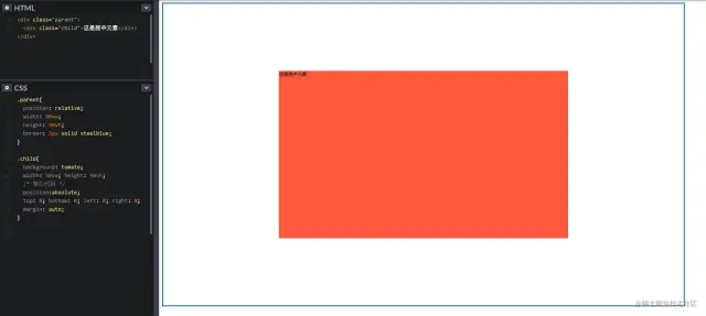
1. absolute + margin auto
As the name suggests, it uses the position: absolute of the current element; And margin: auto;
Note: use this method: the height between the parent element and the current element should be set;
By setting the distance in all directions to 0 and setting margin to auto, you can realize the vertical center display;
The specific codes are as follows:
.parent{
  position: relative;
  width: 90vw;
  height: 90vh;
  border: 3px solid steelblue;
}

.child{
  background: tomato;
  width: 50vw; height: 50vh;
  /* Core code*/
  position:absolute;
  top: 0; bottom: 0; left: 0; right: 0;
  margin: auto;
}
The specific effects are as follows:
2. absolute + negative margin
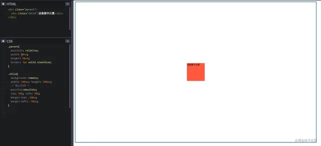
The absolute positioning percentage is 50%, because the percentage of the current element is located based on the relative positioning (that is, the parent element);
Then use the negative margin top and margin left to perform simple displacement, because the current negative margin is based on its own height and width.
The specific codes are as follows:
.parent{
  position:relative;
  width: 90vw;
  height: 90vh;
  border: 3px solid steelblue;
}

.child{
  background: tomato;
  width: 100px; height: 100px;
  /* Core code*/
  position:absolute;
  top: 50%; left: 50%;
  margin-top: -50px;
  margin-left: -50px;
}
The specific effects are as follows:
3. absolute + calc
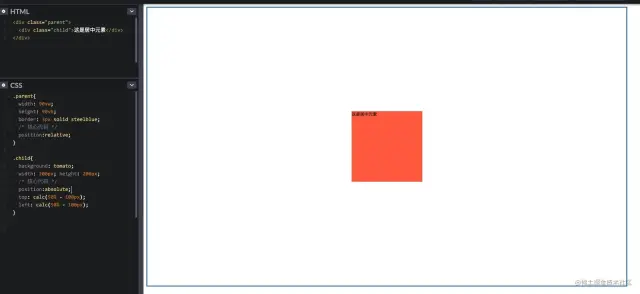
Use a calculation function of CSS3 to calculate; The method is similar to the above
The specific codes are as follows:
.parent{
  width: 90vw;
  height: 90vh;
  border: 3px solid steelblue;
  /* Core code*/
  position:relative;
}

.child{
  background: tomato;
  width: 200px; height: 200px;
  /* Core code*/
  position:absolute;
  top: calc(50% - 100px);
  left: calc(50% - 100px);
}
The specific effects are as follows:
Unknown width and height of centered element
4. absolute + transform
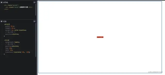
Transform using the new features of CSS3; Because if the value of the translate attribute of transform is a percentage, the percentage will be calculated based on its own width and height.
The specific codes are as follows:
.parent{
  width: 90vw;
  height: 90vh;
  border: 3px solid steelblue;
  /* Core code*/
  position:relative;
}

.child{
  background: tomato;
  /* Core code*/
  position:absolute;
  top: 50%;
  left: 50%;
  transform: translate(-50%, -50%);
}
The specific effects are as follows:
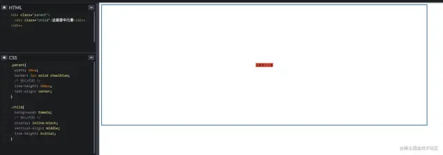
5. line-height + vertical-align
Set the current element as an inline element, and then set the text align: Center of the parent element; Achieve horizontal centering;
At the same time, set the vertical align: middle of the current element; To achieve vertical centering;
Finally, set the line height: initial of the current element; To inherit the line height of the parent element.
The specific codes are as follows:
.parent{
  width: 90vw;
  border: 3px solid steelblue;
  /* Core code*/
  line-height: 500px;
  text-align: center;
}

.child{
  background: tomato;
  /* Core code*/
  display: inline-block;
  vertical-align: middle;
  line-height: initial;
}
The specific effects are as follows:
6. table element
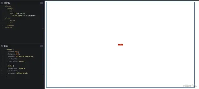
The most classic table element is used for horizontal and vertical centering, but the code looks very redundant and is not recommended;
The specific codes are as follows:
<table>
  <tbody>
    <tr>
      <td class="parent">
        <div class="child"></div>
      </td>
    </tr>
  </tbody>
</table>

<style>
  .parent {
    width: 90vw;
    height: 90vh;
    border: 3px solid steelblue;
    /* Core code*/
    text-align: center;
  }
  .child {
    background: tomato;
    /* Core code*/
    display: inline-block;
  }
</style>
The specific effects are as follows:
7. CSS table style
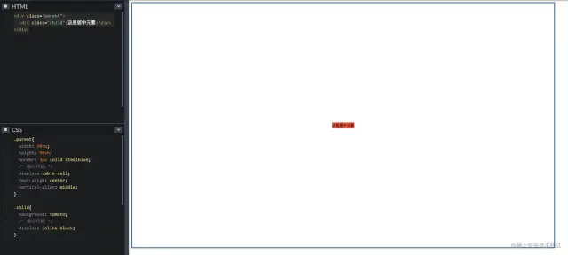
If you must use the feature of table, but do not want to write the table element, CSS table is very suitable for you;
The specific codes are as follows:
.parent{
  width: 90vw;
  height: 90vh;
  border: 3px solid steelblue;
  /* Core code*/
  display: table-cell;
  text-align: center;
  vertical-align: middle;
}

.child{
  background: tomato;
  /* Core code*/
  display: inline-block;
}
The specific effects are as follows:
8. flex layout (I)
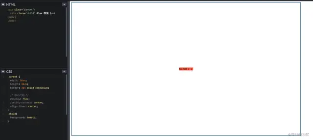
For the more popular and used layout schemes, flex is the only one. Take the two most common usage methods for example~
It can be implemented directly on the flex container through a few lines of code
The specific codes are as follows:
.parent {
  width: 90vw;
  height: 90vh;
  border: 3px solid steelblue;

  /* Core code*/
  display: flex;
  justify-content: center;
 align-items: center;
}
.child{
  background: tomato;
}
Justify content means to set or retrieve the alignment of elastic box elements in the main axis (horizontal axis) direction;
Align items: defines the alignment of flex sub items in the direction of the side axis (vertical axis) of the current row of the flex container.
The specific effects are as follows:
9. flex + margin auto (II)
More elegant implementation on flex item
The specific codes are as follows:
.parent{
  width: 90vw;
  height: 90vh;
  border: 3px solid steelblue;

  /* Core code*/
  display: flex;
}

.child{
  background: tomato;

  /* Core code*/
  margin: auto;
}
The specific effects are as follows:
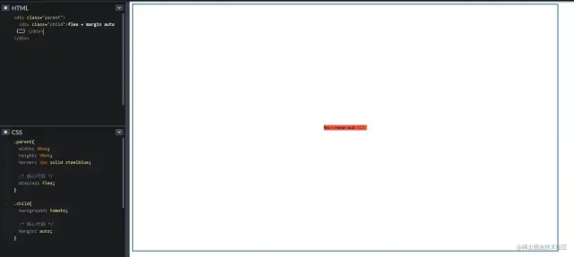
flex's two ways to use trade-offs are up to you
10. grid layout (I)
Grid layout is rarely used in actual projects. The main reason is that the layout is too advanced, resulting in less ideal compatibility. However, it is undeniable that the ability of grid is definitely a qualitative leap in css layout.
If you are not familiar with it, please see Mr. Ruan Yifeng's detailed introductory tutorial [1]
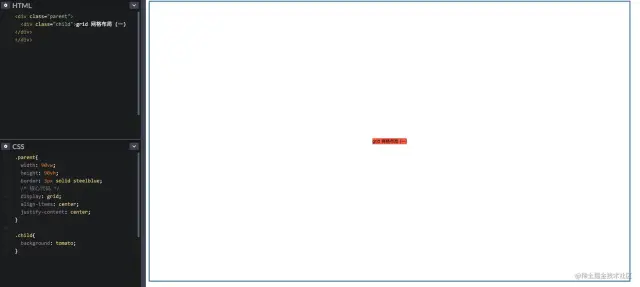
CSS Grid contains almost the same alignment options as Flexbox, so we can implement it gracefully on grid container
The specific codes are as follows:
.parent{
  width: 90vw;
  height: 90vh;
  border: 3px solid steelblue;
  /* Core code*/
  display: grid;
  align-items: center;
  justify-content: center;
}

.child{
  background: tomato;
}
The specific effects are as follows:
11. grid layout (II)
Similarly, we can implement it gracefully on grid item like Flexbox
The specific codes are as follows:
.parent{
  width: 90vw;
  height: 90vh;
  border: 3px solid steelblue;
  /* Core code*/
  display: grid
}

.child{
  background: tomato;
  /* Core code*/
  align-self: center;
  justify-self: center;
}
The specific effects are as follows:
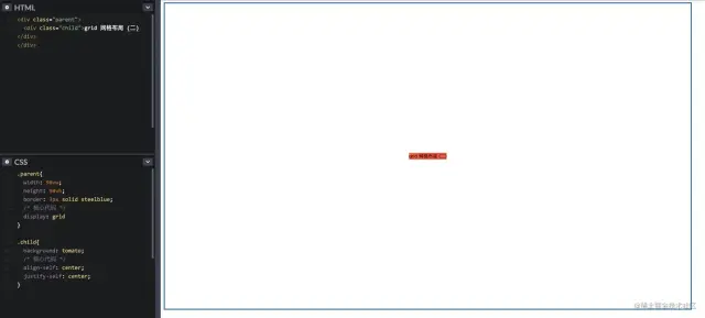
flex's two ways to use trade-offs are up to you
summary Front end development blog
After learning the above 11 vertical center layout methods, let's briefly summarize them
- If your project has compatibility requirements on the PC side and has fixed width and height, it is recommended to use absolute + negative margin method;
- If your project has compatibility requirements on the PC side and the width and height are not fixed, it is recommended to use CSS table;
- If your project has no compatibility requirements on the PC side, it is recommended to use flex to achieve centering. Of course, if IE is not considered, grid is also a good choice;
- If your project is used on the mobile terminal, you are recommended to use flex, and grid can also be used as an alternative.
Write at the end
In fact, the above is a vertical centering method, which is only common. In fact, there are some popular methods, such as pseudo class elements, grid template rows of grid container, etc. you can try it by yourself~
Original text: https://mp.weixin.qq.com/s/rGhhmeBFCx4RJW2UYi3BOg