What is animation in CSS3?
Animation is the effect of changing elements from one style to another. For example, an element goes from left: 0 to left: 300px. To create animations in CSS3, we first need to learn the @keyframes rule.
1.1,@keyframes
@ keyframes are used to specify animation names (@keyframes defined animation names used by animation-name) and animation effects. Its grammar is as follows:
@ keyframes animation name{
    (from or to or percentage) {style rules}
}
Starting with "@keyframes", followed by the "name of the animation" and a pair of curly braces "{}", in which there are some styling rules for different periods of time.
- When defining animation, simple animation can use keywords from and to directly, that is, from one state to another state:
@keyframes name{
    from { opacity: 1; }
    to { opacity: 0; }
}
Where name is the name of the animation, the animation represents the disappearance of an element.- If the animation is complex, you can use percentages to set the style at any point in a certain period of time:
@keyframes name{
    0% { left:0px;top:0px; }
    25% { left:300px;top:0px}
    50% { left:300px;top:300px; }
    75% { left:0px;top:300px; }
    100% { left:0px;top:0px; }
}
The percentage here is relative to the percentage of animation time. If the total animation time is 4s, then it reaches the position of left300, top0 at 1s, left300 and top300 at 2s... It reached left0 top0 at 4s. The animation is over.
The results are as follows:
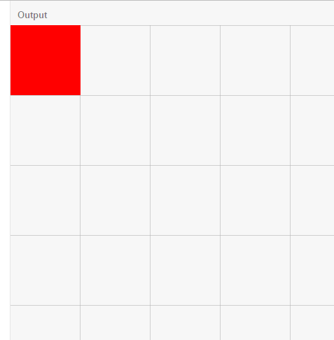
1.2. Basic usage
Knowing @keyframes, you already know how to write animation effects, so now you need to bind the animation effects to the elements so that the elements can move according to the animation effects. To bind animation, we need to know two css3 attributes: the name of the animation and the time of the animation. The usage is as follows:
<!DOCTYPE html>
<html>
<head>
  <meta charset="utf-8">
  <meta name="viewport" content="width=device-width">
  <title>JS Bin</title>
    <style>
      *{padding: 0;margin: 0;}
      /*Red squares*/
      .box1{
          width: 100px;
          height: 100px;
          background-color: red;
          position:absolute;
          top: 0;
          left: 0;
          /*Binding an animation requires:*/
          animation-name:left2right;/*1.Specify what animation effect to use, corresponding to the name defined by @keyframes*/
          animation-duration:4s;/*2.Specify the time of animation*/
          animation-fill-mode:
          /*Above can be abbreviated as animation:left2right 4s*/
      }
      /*Define an animation effect named left2right, which is very simple to run from left0 to left300*/
      @keyframes left2right{
          0% { left:0px;}
          100% { left:300px;}
      }
  </style>
</head>
<body>
  <div class="box1"></div>
</body>
</html>
The results are as follows:
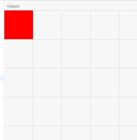
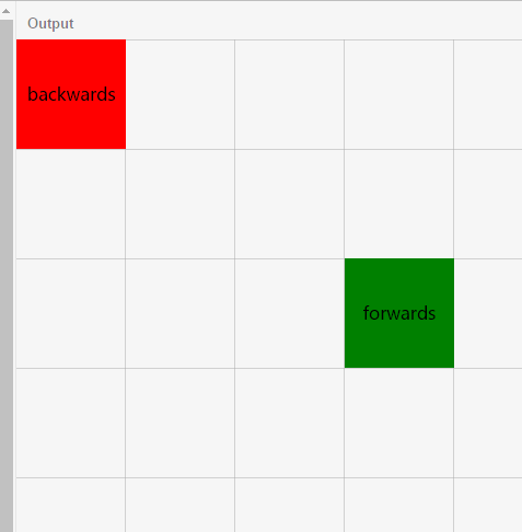
1.3, animation-fill-mode
Immediately after the animation is finished, it will jump from the end state to the start state. If you want to keep the animation in a particular state, you need to use the animation-fill-mode attribute. For example, to keep the animation at the end of the state, it has four values:
- none: Default value. No state other than object animation is set
- forwards: Set the object state to the state at the end of the animation
- backwards: Set the object state to the state at the beginning of the animation
- both: Set the object state to the end or start state of the animation
Here are two boxes to compare forwards and backwards. The code is as follows:
<!DOCTYPE html>
<html>
<head>
  <meta charset="utf-8">
  <meta name="viewport" content="width=device-width">
  <title>JS Bin</title>
    <style>
      *{padding: 0;margin: 0;}
      /*100x100 General Style of Block*/
      .box{
          width: 100px;
          height: 100px;
          position:absolute;
          left: 0;
          text-align:center;
          line-height:100px;
          font-size:16px;
      }

      /*Red squares*/
      .box1{
          top: 0;
          background-color: red;
          /*Binding an animation requires:*/
          animation-name:left2right;/*1.Specify what animation effect to use, corresponding to the name defined by @keyframes*/
          animation-duration:4s;/*2.Specify the time of animation*/

          /*The following items are selected as required:*/
          animation-fill-mode:backwards;/*Set the object state to the state at the beginning of the animation*/

          /*Above can be abbreviated as animation:left2right 4s backwards*/
      }
      /*Green squares*/
      .box2{
          background-color: green;
          top: 200px;
          animation-name:left2right;
          animation-duration:4s;
          animation-fill-mode:forwards;/*Set the object state to the state at the end of the animation*/
      }
  /*Define an animation effect named left2right, which is very simple to run from left0 to left300*/
  @keyframes left2right{
      0% { left:0px;}
      100% { left:300px;}
  }
  </style>
</head>
<body>
  <div class="box box1">backwards</div>
  <div class="box box2">forwards</div>
</body>
</html>
You can see that the red box animation returns to the start state after the end, while the green box remains in the end state:
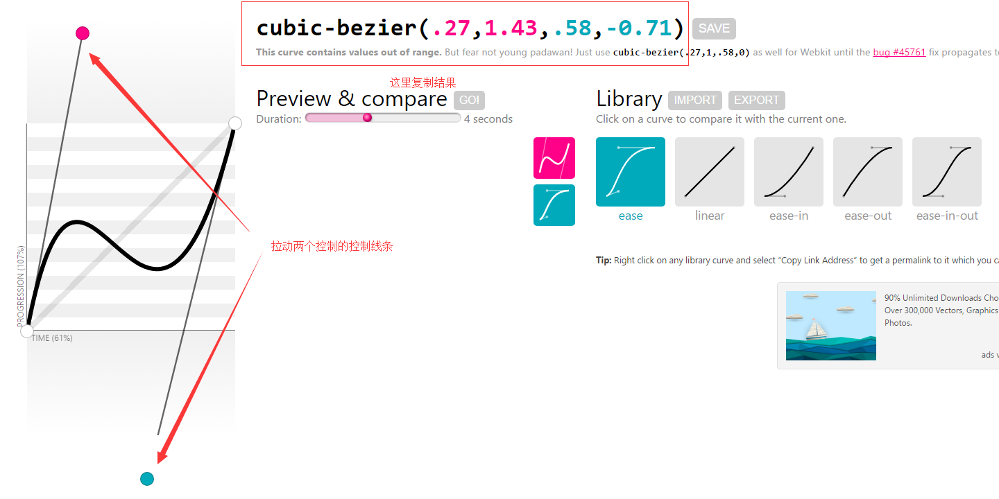
1.4, animation-timing-function
This property sets the transition type of the animation. What does that mean? It is an animation that has to go through the process of how to use it to reach the end. Is it the default ease? Or are they linear, ease-in, ease-out, or ease-in-out? What? Are you not satisfied with all this? It's all right. We can still use it. Bessel curve cubic-bezier(number, number, number, number) Customize the transition type we want, how to be considerate! click Here Customize immediately. We can pull two control points to control the line. The larger the slope, the faster the speed at this stage. Generally speaking, the slower the place is, the faster the steeper the place is.
Now let's make a comparison:
<!DOCTYPE html>
<html>
<head>
<meta charset="utf-8">
<meta name="viewport" content="width=device-width">
<title>JS Bin</title>
<style>
*{padding: 0;margin: 0;}
/*100x100 General Style of Block*/
.box{
width: 100px;
height: 100px;
position:absolute;
left: 0;
text-align:center;
line-height:100px;
font-size:16px;
color:#fff
}
/*Red squares*/
.box1{
top: 0;
background-color: red;
/*Binding an animation requires:*/
animation-name:left2right;/*1.Specify what animation effect to use, corresponding to the name defined by @keyframes*/
animation-duration:4s;/*2.Specify the time of animation*/
/*The following items are selected as required:*/
animation-fill-mode:forwards;/*Set the object state to the state at the beginning of the animation*/
animation-timing-function:ease;/*Setting the transition type of animation*/
/*Above can be abbreviated as animation:left2right 3s ease forwards*/
}
/*Green squares*/
.box2{
background-color: green;
top: 100px;
animation-name:left2right;
animation-duration:4s;
animation-timing-function:linear;/*Setting the transition type of animation*/
animation-fill-mode:forwards;/*Set the object state to the state at the end of the animation*/
}
/*Block 3*/
.box3{
background-color: gray;
top: 200px;
animation-name:left2right;
animation-duration:4s;
animation-timing-function:ease-in;/*Setting the transition type of animation*/
animation-fill-mode:forwards;/*Set the object state to the state at the end of the animation*/
}
/*Block 4*/
.box4{
background-color: orange;
top: 300px;
animation-name:left2right;
animation-duration:4s;
animation-timing-function:ease-out;/*Setting the transition type of animation*/
animation-fill-mode:forwards;/*Set the object state to the state at the end of the animation*/
}
/*Block 5*/
.box5{
background-color: blue;
top: 400px;
animation-name:left2right;
animation-duration:4s;
animation-timing-function:ease-in-out;/*Setting the transition type of animation*/
animation-fill-mode:forwards;/*Set the object state to the state at the end of the animation*/
}
/*Block 6*/
.box6{
background-color: black;
top: 500px;
animation-name:left2right;
animation-duration:4s;
animation-timing-function:cubic-bezier(.27,1.43,.58,-0.71);/*Setting the transition type of animation*/
animation-fill-mode:forwards;/*Set the object state to the state at the end of the animation*/
}
/*Define an animation effect named left2right, which is very simple to run from left0 to left300px*/
@keyframes left2right{
0% { left:0px;}
100% { left:300px;}
}
</style>
</head>
<body>
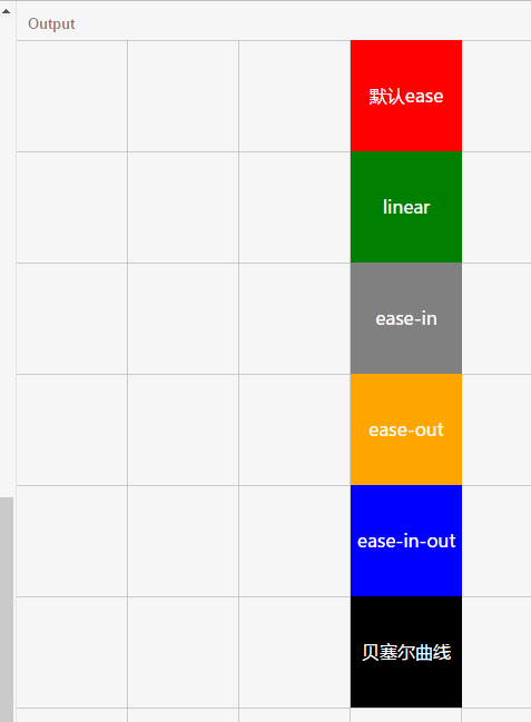
<div class="box box1">default ease</div>
<div class="box box2">linear</div>
<div class="box box3">ease-in</div>
<div class="box box4">ease-out</div>
<div class="box box5">ease-in-out</div>
<div class="box box6">bezier</div>
</body>
</html>steps
The animation-timing-function attribute not only has the above several attribute values, but also has a very important value step. Its grammar is as follows:
steps(<integer>[, [ start | end ] ]?)A step-by-step function with two parameters is accepted. The first parameter must be a positive integer, specifying the number of steps of the function. The second optional parameter can be start or end, which defaults to end, specifying the point at which the value of each step changes. What does that mean? Let's start with the following examples:
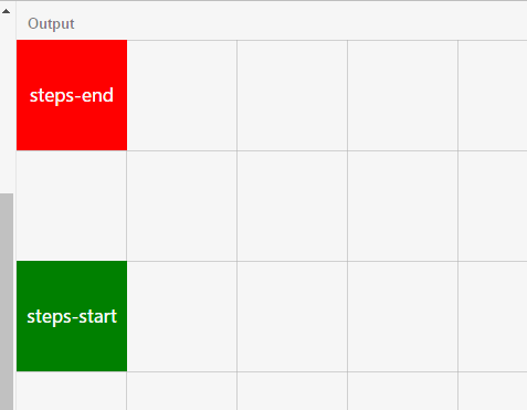
In this example, the animation time is 3s, and the animation effect moves from left 0 to left 300px! The first parameter of step is 3, that is, after three steps, the first step is 100 px, the second step is 200 px, and the third step is 300 px. At this time, the time of animation is also divided into three stages: 0s-1s, 1s-2s and 2s-3s. For the first stage, 0s is start, 1s is end, 1s is start, 2S is end, 2S is start, 3S is end. This is the origin of the second parameter of step. The second parameter of the green box is start, so the first step of the first time period of start (that is, 0s) of the green box runs, the left is 100px; and the red box is the first step of the first time period of end (1s).
In this example, we can see that the red square does not appear to be left 300px in the third step; why? This is because when the red box runs the third step, it is the end of the third period (that is, 3s), and the animation time is 3s, so the square is back to the initial stage, so it can not be seen. So let's set the animation-fill-mode property mentioned above to keep the animation at the end of the animation. Let's see the result:
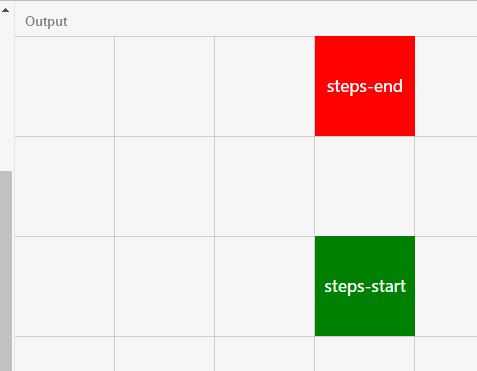
Yes, the red square still moves to the left 300px position. Come on, paste the code:
<!DOCTYPE html>
<html>
<head>
  <meta charset="utf-8">
  <meta name="viewport" content="width=device-width">
  <title>JS Bin</title>
    <style>
      *{padding: 0;margin: 0;}
      /*100x100 General Style of Block*/
      .box{
          width: 100px;
          height: 100px;
          position:absolute;
          left: 0;
          text-align:center;
          line-height:100px;
          font-size:16px;
          color:#fff
      }

      /*Red squares*/
      .box1{
          top: 0;
          background-color: red;
          /*Binding an animation requires:*/
          animation-name:left2right;/*1.Specify what animation effect to use, corresponding to the name defined by @keyframes*/
          animation-duration:3s;/*2.Specify the time of animation*/

          /*The following items are selected as required:*/
          animation-timing-function:steps(3,end);/*Setting the transition type of animation*/
          animation-fill-mode:forwards;/*Set the object state to the state at the end of the animation*/
          /*Above can be abbreviated as animation:left2right 3s steps(3,end) forwards*/
      }
      /*Green squares*/
      .box2{
          background-color: green;
          top: 200px;
          animation-name:left2right;
          animation-duration:3s;
          animation-timing-function:steps(3,start);/*Setting the transition type of animation*/
          animation-fill-mode:forwards;/*Set the object state to the state at the end of the animation*/
      }
  /*Define an animation effect named left2right, which is very simple to run from left0 to left300*/
  @keyframes left2right{
      0% { left:0px;}
      100% { left:300px;}
  }
  </style>
</head>
<body>
  <div class="box box1">steps-end</div>
  <div class="box box2">steps-start</div>
</body>
</html>
1.5,animation-delay
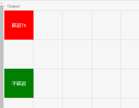
This property sets the delay time of the animation. As the name implies, you know, look directly at the example:
Code:
<!DOCTYPE html>
<html>
<head>
  <meta charset="utf-8">
  <meta name="viewport" content="width=device-width">
  <title>JS Bin</title>
    <style>
      *{padding: 0;margin: 0;}
      /*100x100 General Style of Block*/
      .box{
          width: 100px;
          height: 100px;
          position:absolute;
          left: 0;
          text-align:center;
          line-height:100px;
          font-size:16px;
          color:#fff
      }

      /*Red squares*/
      .box1{
          top: 0;
          background-color: red;
          /*Binding an animation requires:*/
          animation-name:left2right;/*1.Specify what animation effect to use, corresponding to the name defined by @keyframes*/
          animation-duration:3s;/*2.Specify the time of animation*/

          /*The following items are selected as required:*/
          animation-delay:1s;
          /*Above can be abbreviated as animation:left2right 3s 1s*/
      }
      /*Green squares*/
      .box2{
          background-color: green;
          top: 200px;
          animation-name:left2right;
          animation-duration:3s;
      }
  /*Define an animation effect named left2right, which is very simple to run from left0 to left300*/
  @keyframes left2right{
      0% { left:0px;}
      100% { left:300px;}
  }
  </style>
</head>
<body>
  <div class="box box1">Delay 1 s</div>
  <div class="box box2">No delay</div>
</body>
</html>
1.6,animation-iteration-count
Set the number of iterations of the object animation, which has the following values:
Infinite: infinite loop
number: number of specific loops for specified object animation
1.7,animation-direction
Retrieve or set whether the object animation moves backwards in the loop. It has the following values:
- normal: normal direction
- reverse: Operating in the opposite direction
- alternate: The animation runs normally before it runs in the opposite direction, and continues to run alternately.
- alternate-reverse: The animation runs in the reverse direction and then in the positive direction, and continues to run alternately.
1.8,animation-play-state
To retrieve or set the state of an object animation, it has two values: running, paused, paused, default value: running. Let's start with an example:
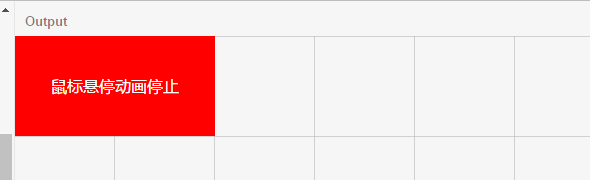
When the mouse is put up, through hover, we change animation-play-state to paused, and the red box pauses. The code is as follows. Here I keep the lattice code as well.
<!DOCTYPE html>
<html>
<head>
  <meta charset="utf-8">
  <meta name="viewport" content="width=device-width">
  <title>JS Bin</title>
    <style>
      *{padding: 0;margin: 0;}
      /*100x100 General Style of Block*/
      .box{
          width: 200px;
          height: 100px;
          position:absolute;
          left: 0;
          text-align:center;
          line-height:100px;
          font-size:16px;
          color:#fff
      }

      /*Red squares*/
      .box1{
          top: 0;
          background-color: red;
          /*Binding an animation requires:*/
          animation-name:left2right;/*1.Specify what animation effect to use, corresponding to the name defined by @keyframes*/
          animation-duration:4s;/*2.Specify the time of animation*/

          /*The following items are selected as required:*/
          animation-delay:1s;
          /*Above can be abbreviated as animation:left2right 3s 1s*/
      }
      /*Pause the mouse when it is up*/
      .box1:hover{
        animation-play-state:paused;
      }

    .svg{position:absolute;top: 0;left: 0;
      width: 100%;height: 100%;z-index:-1;
    }

  /*Define an animation effect named left2right, which is very simple to run from left0 to left300*/
  @keyframes left2right{
      0% { left:0px;}
      100% { left:300px;}
  }
  </style>
</head>
<body>
  <div class="box box1">Mouse hover animation stop</div>

  <svg class = "svg">
      <defs>
        <line x1="0" y1="0" x2="0" y2="10" stroke="#000" stroke-width="1" id="vline"/>
        <line x1="0" y1="10" x2="600" y2="10" stroke="#000" stroke-width="2" id="hline"/>
        <pattern width="100" height="100" patternUnits="userSpaceOnUse" id="grid">
          <path stroke="#aaa" fill="none" d="M0,0H100,100V100,100"></path>
        </pattern>
      </defs>
      <rect width="1920" height="1000" fill="url(#grid)"></rect>
  </svg>
</body>
</html>