1, What is css3 animation
css3 animation is the effect of using the animation properties of css3 to control page elements and gradually change elements from one style to another.
2, Use of css3 animation animation attributes
animation mainly contains eight attributes. The specific meanings are as follows:
(1) @ keyframes
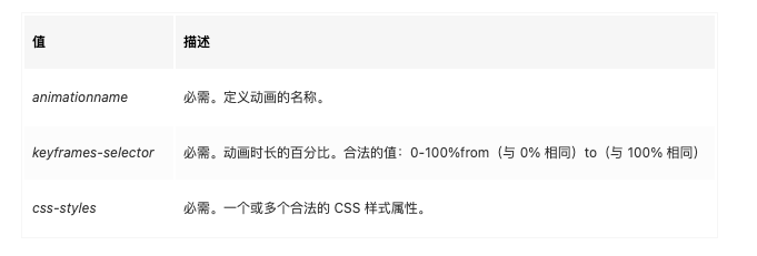
@Keyframes: define an animation. The defined animation name is the value of the animation name attribute. The @ keyframes rule is used to change the CSS style of elements step by step. During the animation process, you can change the CSS style many times and specify the style change. During the style change process, use%, or the keywords "from" and "to" to draw the animation change process. Where, from and to are the same as 0% and 100%, and 0% represents the style at the beginning of the animation, 100% represents the style of animation completion.
Syntax:
@keyframes animationname {
keyframes-selector {
    css-styles;
    }
}
Specific meaning:
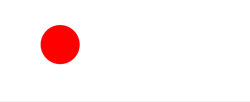
Case:
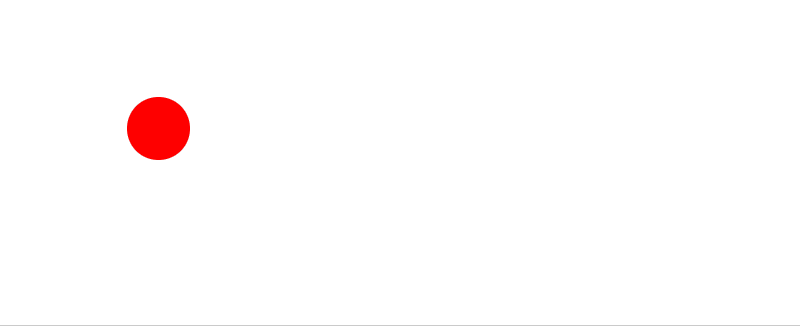
The code is as follows:
div{
    width:50px;
    height:50px;
    background:red;
    border-radius:50%;
    animation-name:mymove;
    animation-duration:2s;
}

@keyframes mymove{
    0%   {width:50px;height:50px;}
    50%   {width:100px;height:100px;}
    100%   {width:50px;height:50px;}
}
(2) Animation name animation name
The name used to specify the animation must be used in conjunction with the @ keyframes rule because the animation name is defined by @ keyframes
Like the example above
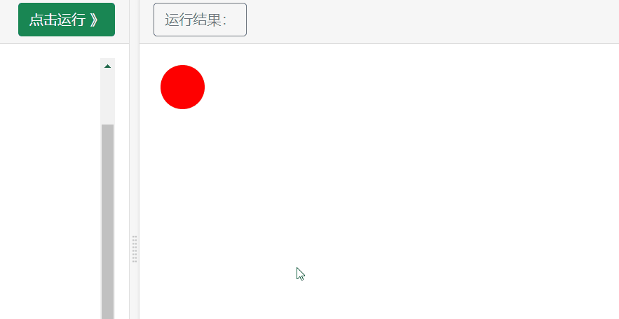
(3) Animation duration
Used to define the duration of the animation, in seconds or milliseconds. The default is 0.
Just having @ keyframe animation rules and the name of the animation to be executed is not enough to form an animation. We also need to set the time required for animation execution. Here we use the animation duration attribute. The time shown in the above case is once every two seconds.
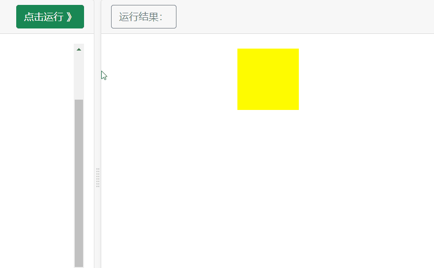
Case: bind "mymove" animation to div element, duration: 1 second
div
{
width:100px;
height:100px;
background:red;
animation-name:mymove;
animation-duration:1s;
}
@keyframes mymove
{
from {background:red;}
to {background:yellow;}
}
effect:
Set the animation to 5S animation duration: 5S

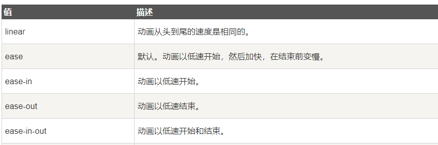
(4) Animation timing function animation transition
Set the transition type of object animation. The default is "ease".
The specific description is as follows:
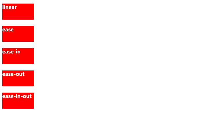
Case:
<div id="div1">linear</div>
<div id="div2">ease</div>
<div id="div3">ease-in</div>
<div id="div4">ease-out</div>
<div id="div5">ease-in-out</div>
div
{
width:100px;
height:50px;
background:red;
color:white;
font-weight:bold;
position:relative;
animation-name:move;
animation-duration:5s;
margin-bottom:20px;
}
#div1 {animation-timing-function:linear;}
#div2 {animation-timing-function:ease;}
#div3 {animation-timing-function:ease-in;}
#div4 {animation-timing-function:ease-out;}
#div5 {animation-timing-function:ease-in-out;}
@keyframes move
{
from {left:0px;background:red;}
to {left:300px;background:yellow;}
}
The effects are as follows:
(5) Animation delay time
The delay time for retrieving or animating an object. The default is 0
div{
    width:50px;
    height:50px;
    background:red;
    border-radius:50%;
    animation-name:mymove;
    animation-duration:2s;
    animation-delay:0s;
}

@keyframes mymove{
    0%   {width:50px;height:50px;}
    50%   {width:100px;height:100px;}
    100%   {width:50px;height:50px;}
}

When animation delay: 5S; When set to 5S, it means that the animation will be delayed after 5 seconds.
(6) Animation iteration count animation playback times
Specifies the number of times the animation is played. The default is 1. Therefore, the above cases are only executed once by default.
Case: let the above case animation execute three times and add the following code
animation-iteration-count:3;
div{
    width:50px;
    height:50px;
    background:red;
    border-radius:50%;
    animation-name:mymove;
    animation-duration:2s;
    animation-delay:0s;
    animation-iteration-count:3;
}

@keyframes mymove{
    0%   {width:50px;height:50px;}
    50%   {width:100px;height:100px;}
    100%   {width:50px;height:50px;}
}
The effects are as follows: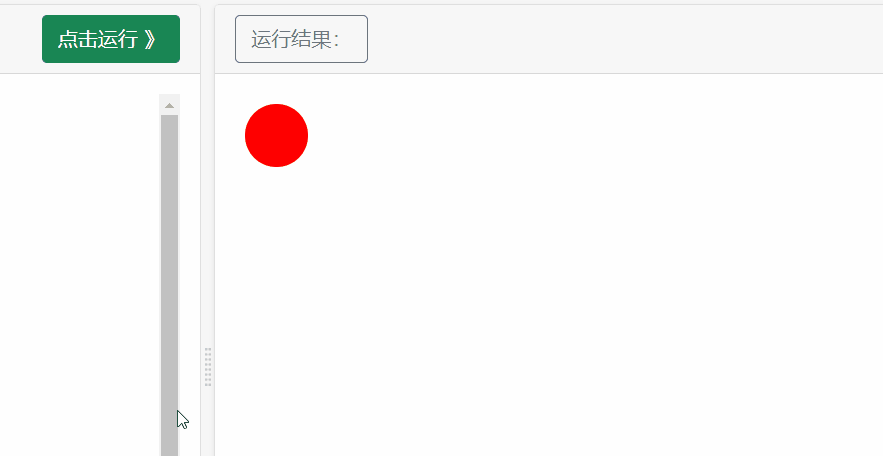
If you want to play the animation in an infinite loop, just set the value of animation iteration count to infinite to make the animation execute infinitely and achieve the effect of loop
(7) Animation direction animation playback direction
Specifies whether the animation plays backwards in the next cycle. The default is "normal", which plays normally.
The attribute values are: normal / reverse / alternate / alternate reverse
Attribute value:
html :
<div></div>
css:
div
{
width:100px;
height:100px;
background:red;
position:relative;
animation-name:mymove;
animation-duration:5s;
animation-iteration-count:1;
animation-direction:normal;
}
@keyframes mymove
{
0% {background:red; left:0px; top:0px;}
25% {background:yellow; left:200px; top:0px;}
50% {background:blue; left:200px; top:200px;}
75% {background:green; left:0px; top:200px;}
100% {background:red; left:0px; top:0px;}
}
1,
animation-direction:normal;

2,reverse

3,alternate
You need to set the animation iteration count attribute. If it is not set, the default value is 1, and the animation will only be executed once. Therefore, you need to set the animation iteration count to be executed multiple times. The following case is animation iteration count: 5, which sets the effect of executing five times
4,alternate-reverse
Opposite to the direction of alternate animation execution
(8) Animation play state animation state
Animate the state of the object running / paused
Case:
div
{
width:100px;
height:100px;
background:red;
position:relative;
animation:mymove 5s;
animation-play-state:running;
    }
div:hover{
animation-play-state:paused;
}
@keyframes mymove
{
from {left:0px;}
to {left:200px;}
}