[CSS3] CSS3 animation - I'm one step closer to the cool front end
Blog description
Part of the information involved in the article comes from the Internet. Of course, there are my own personal summaries and opinions. The purpose of sharing is to build a community and consolidate myself. If there is infringement on the cited materials, please contact me to delete! Luckily I'm here. Thank you for coming!
explain
CSS3 can animate HTML elements without using JavaScript or Flash.
In order to learn the dynamic effect of the front end, I simply don't break the means. At present, we will grasp the CSS animation to make a wave.
What is animation
⭕ The old rule, the beginning of the question.
Specify some key frames on the time node that needs to be changed. The key frame is the style defined at the moment. For example, when I move 5m to the left in 1s and 15m to the left in 3s, there are two key frames. Because of these two key frames, the picture will shift, and the animation will be generated.
The following sentence is summarized in place: animation gradually changes elements from one style to another.
The animation of CSS3 mainly depends on @ keyframes and animation.
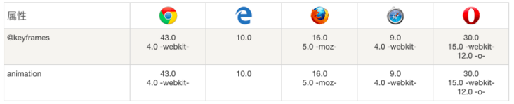
@Browser support for keyframes and animation
@keyframes rule
@The keyframes rule is to create animation.
@A CSS style and animation specified in the keyframes rule will be gradually changed from the current style to the new style.
@keyframes myfirst
{
    from {background: red;}
    to {background: yellow;}
}
The above is a simple animation. The keywords "from" and "to" are equivalent to 0% and 100%. 0% is the beginning of the animation and 100% is the completion of the animation. That is, from red to yellow.
For best browser support, using 0% and 100% selectors is the best choice.
animation
Since the animation has all the key frames, you need to implement and bind the key frame to a DOM.
grammar
Attributes can be written together or separately.
animation: name duration timing-function delay iteration-count direction fill-mode play-state;
animation-name
Specifies the name of the key to bind to the selector
grammar
animation-name: keyframename|none;
// keyframename specifies the name of the keyframe to bind to the selector
animation-duration
Specifies how many seconds or milliseconds the animation will take to complete
grammar
animation-duration: time;
// Time specifies the time it takes for the animation to finish playing.
animation-timing-function
Specifies how the animation will complete a cycle
grammar
animation-timing-function: value;
Animation function
- The speed of linear animation is the same from beginning to end.
- ease default. The animation starts at a low speed, then speeds up and slows down before it ends.
- The ease in animation starts at a low speed
- The ease out animation ends at a low speed.
- The ease in out animation starts and ends at a low speed.
steps(int,start|end) specifies the number of intervals (steps) in the time function.
There are two parameters. The first parameter specifies the number of intervals of the function. The parameter is a positive integer (greater than 0).
The second parameter is optional, indicating whether the animation is continuous from the beginning or end of the time period.
Cubic Bezier (n, N, N, n) Bezier curve
Give a website of Bezier curve, you will be grateful 🙏 My ha! address
animation-delay
Defines when the animation starts, in seconds (s) or milliseconds (ms)
grammar
animation-delay: time;
// Time defines the time, in seconds or milliseconds, to wait before the animation starts
animation-iteration-count
Defines how many times the animation should be played.
grammar
animation-iteration-count: value;
//  n defines how many times the animation should be played
//     infinite specifies that the animation should play indefinitely (forever)
animation-direction
Whether to play the animation alternately and reversely.
This is an attribute with high playability.
grammar
animation-direction: normal|reverse|alternate|alternate-reverse|initial|inherit;
Parameter analysis
- normal defaults. The animation plays normally.
- reverse animation plays backwards.
- alternate animation plays forward an odd number of times (1, 3, 5...) and backwards an even number of times (2, 4, 6...).
- Alternate reverse animation plays backwards in odd times (1, 3, 5...) and forwards in even times (2, 4, 6...).
- initial inherited properties
- inherit inherited properties
animation-fill-mode
Property specifies the style to be applied to the element when the animation does not play (when the animation is completed, or when the animation does not start playing with a delay).
If you need to consider the state of the animation, you can use this attribute, such as preserving the effect of the animation changes.
grammar
animation-fill-mode: none|forwards|backwards|both|initial|inherit;
Parameter analysis
- none defaults. The animation does not apply any styles to the target element before and after the animation is executed.
- forwards after the animation ends (as determined by the animation iteration count), the animation will apply the attribute value.
- The backwards animation applies the attribute values defined in the keyframes that start the first iteration of the animation during the animation delay definition.
- both animation follows the rules of forwards and backwards.
- initial inherited properties
- inherit inherited properties
animation--play-state
Specifies whether the animation is running or paused.
grammar
animation-play-state: paused|running;
// paused specifies to pause the animation
// Running specifies the running animation
case
Color transformation
The color of div changes from red to yellow
code
<!DOCTYPE html>
<html>
<head>
<meta charset="utf-8">
<title>Animation test</title>
<style>
div
{
    width:100px;
    height:100px;
    background:red;
    animation:myfirst 6s;
}

@keyframes myfirst
{
    from {background:red;}
    to {background:yellow;}
}
</style>
</head>
<body>
<div></div>
</body>
</html>
effect

Clockwise movement
Move div clockwise
code
<!DOCTYPE html>
<html>
<head>
<meta charset="utf-8">
<title>Animation test</title>
<style>
div
{
    width:100px;
    height:100px;
    background:red;
      position:relative;
    animation:myfirst 5s linear 2s;
}

@keyframes myfirst
{
    0%   {background:red; left:0px; top:0px;}
    25%  {background:yellow; left:200px; top:0px;}
    50%  {background:blue; left:200px; top:200px;}
    75%  {background:green; left:0px; top:200px;}
    100% {background:red; left:0px; top:0px;}
}
</style>
</head>
<body>
<div></div>
</body>
</html>
effect

summary
In fact, I also see that these basic animations are not complex to realize, and those complex animations are built through such basic animations. But is there a question, how to remember the use of such attributes?
This question is the same as asking how to remember the shortcut keys of PS, because they are not often used, how to remember. After drawing hundreds of complex animations, I believe I will have a better understanding of this animation!
Look forward to the animation cases of subsequent patterns! It's just beginning!
thank
Universal network
And hard-working themselves, Personal blog,GitHub test,GitHub
The official account - the son of the Mo, a small program - little blog
If you feel helpful to you, you might as well praise me 👍 Let's keep paying attention!