Frame animation creates animation by defining key points and key states in an animation.
Although transition also controls the frame, the control granularity is often large, which is mainly for a change process, such as setting the change time / speed and where to start the change in the process of width / background change. Although there is also a transition timing function: steps (5, start) similar to the frame to control each frame, each frame controls the same change. It is obviously not applicable to set different effects when you want to change elements.
You can use animation to solve this problem at this time.
- transition is a change between two states.
- Animation frame animation is the change of setting different states at different time points
1. Key frame
Because you can animate each frame, use @ keyframes to animate each frame.
Attribute value
| value | explain |
|---|---|
| from | Indicates the starting point |
| to | Indicates the end point |
| percentage | Represents the action when the animation runs to a percentage of time. |
Basic usage:
@keyframes my {
    from {
        transform: translateX(20px);
    }

    to {
        transform: translateX(-40px);
    }
}
Two frames are defined here: from and to. You can customize the name my to facilitate subsequent reference. However, the custom name cannot overlap with the keyword in the frame animation.
To use animation defined by frames, you need to declare it at the specified element.
Animation name is used to declare the frame animation.
div {
    animaition-name: my;// my is a custom name, corresponding to the frame animation
}
After the frame animation is declared, the current element will not produce animation.
Reason: frame animation is to divide the animation time and generate animation in each time.
Declare the animation time through animation duration: S / MS.
Check the following codes:
main:hover div {
    // Define frame animation as my
    animation-name: my;
    // Define the frame animation time as 5s
    animation-duration: 5s;
}


@keyframes my {
    from {
        transform: translateX(20px);
    }

    to {
        transform: translateX(-40px);
    }
}
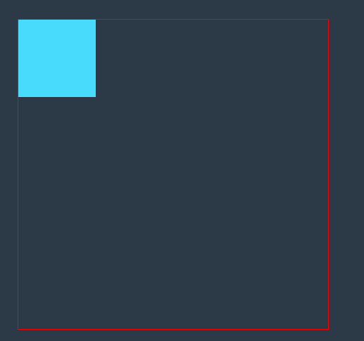
The above code shows that when the mouse hovers over the main, div will have 5s animation, and this animation is defined as my. 5s is divided twice in the animation my. For the beginning of the animation, the element needs to move 20px in the positive direction of the X axis, and for the other time, when the animation is about to end, the element needs to move 40px in the negative direction of the X axis at the position after the last animation, After the animation, return to the original state of the element.
So the effect is:

If you define a frame animation using a percentage:
main:hover div {
    animation-name: my;
    animation-duration: 5s;
}


@keyframes my {
    0% {
        background-color: #fff;
    }

    50% {
        width: 300px;
        height: 300px;
        background: #000;
    }

    100% {
        transform: scale(0);
    }
}
The above code indicates that when the mouse hovers over main, the div box will have 5s animation. The animation is my, which divides 5s time into three parts.
- At the beginning of 0s, the background color is white, but because the initial color of the box is blue, you can see that blue quickly turns white at the beginning of the animation.
- The second part is 0s to 2.5s, which can also be accurately described as the change of the second frame animation from the end of the first frame animation to 2.5s, that is, the change of height / width / background color.
- The third part is from 2.5s to 5S, that is, from the end of the second frame animation to 5S, as the change of the second frame animation, that is, the element is scaled based on the change of the previous animation.
Finally, the animation ends and the element returns to its original state. (if no other attributes are set for animation, the default animation ends and returns to the original state)

It is worth noting that if the state at 0% and 100% is expected to be the initial state of the element, it can not be set, because if it is not set, 0% and 100% are the initial state of the element by default.
In addition to the effect of setting percentages separately, similar to declaring CSS selectors, you can set effects in different percentages at the same time,
For example:
@keyframe my {
    0%,
    100% {
        border-radius: 50%;
    }

    25%,
    75% {
        background-color: #fff;
    }
}
1.1 define multiple frame animation
An element can define more than one frame animation, and can define more than one frame animation.
animation-name: Frame animation 1, frame animation 2...;
1.1.1 same animation time
If only one animation time is set, the animation time of all frame animation is the same by default.
For example:
main:hover div {
    // Use multiple frame animations on an element
     animation-name: my,other;
     animation-duration: 5s;
 }


@keyframes my {
    0% {
        width: 50px;
        height: 50px;
    }

    50% {
        width: 200px;
        height: 200px;
    }

    100% {
        width: 300px;
        height: 300px;
    }
}

@keyframes other {
    0% {
        background-color: #fff;
    }

    50% {
        background: #000;
    }

    100% {
        background-color: #e1b12c;
    }
}
The above code shows that when the mouse is suspended on main, the div box will have two animations within 5s, and these two animations divide 5s into three parts, each of which is doing the corresponding action.

In the above example, the attributes set in different animation frames are different. What happens if there are the same attribute values? The result is that the latter animation attributes take precedence.
That is, in the same time, for the animation of the same attribute, the later animation display will overwrite the change of the previous animation attribute, resulting in the invalidation of the previous attribute animation.
For example:
main:hover div {
     animation-name: my,other;
     animation-duration: 5s;
 }


@keyframes my {
    0% {
        width: 50px;
        height: 50px;
    }

    50% {
        width: 200px;
        height: 200px;
    }

    100% {
        width: 300px;
        height: 300px;
    }
}

@keyframes other {
    0% {
        background-color: #fff;
        width: 200px;
        height: 200px;
    }

    50% {
        background: #000;
    }

    100% {
        background-color: #e1b12c;
    }
}
The above two frame animations are defined and applied to the div at the same time. After the other animation is placed in the my animation, you can see the change of width / height in the other animation. Therefore, at the intersection of the other animation at the same time (0% of the other animation covers 0% of the my animation), the other animation will change the width / height first, so the 0% animation change of my is invalid, and you can see that the element directly changes to 200px
1.1.2 different animation time
If you set different times, each time cycle is applied to the frame animation.
main:hover div {
    animation-name: my,other;
    animation-duration: 4s,100ms;
}
At this time, the division time of my animation is 4s and that of other animation is 100ms.
main:hover div {
    animation-name: my,other,two;
    animation-duration: 4s,100ms;
}
At this time, the division time of my animation is 4s, the division time of other is 100ms, and the division time of two is 4s.
2. Repeat animation
The animation defined by the previous attributes can only be run once, but you can use animation iteration count to define that the animation can be run multiple times.
Attribute value:
- Integer n, representing n runs
- infinte stands for running countless times
Multiple attribute values can be set, and the usage is consistent with that of animation duration
main:hover div {
     animation-name: my;
     animation-duration: 1s;
    // Define 2 animations
    animation-iteration-count: 2;
 }


@keyframes my {
    0% {
        width: 50px;
        height: 50px;
    }

    50% {
        width: 200px;
        height: 200px;
    }

    100% {
        width: 300px;
        height: 300px;
    }
}

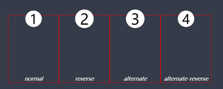
3. Animation direction
By default, the direction of the animation changes from 0% frame to 100%, and then quickly return to 0% frame after the 100% frame animation is completed.
However, you can use animation direction to control the animation direction, not only from 0% to 100%, but also from 100% to 0%, or change the speed back to the initial state.
Attribute value:
| Attribute value | explain |
|---|---|
| normal | Run the animation from 0% to 100% and quickly return to 0% |
| reverse | Run the animation from 100% to 0% and quickly return to 100% |
| alternate | First from 0% to 100%, and then from 100% to 0%, the intermediate process is smooth |
| alternate-reverse | From 100% to 0%, and then from 0% to 100%, the intermediate process is smooth |
4. Animation delay
Use animation delay to control how long it takes to start animation
Attribute unit: s/ms
5. Animation rate
Similar to transition timing function control, animation can also control the speed of the whole animation. If you need to set some frames of the animation, you need to use transition timing function at this time
Use animation timing function for control.
Refer to: CSS3 delay transition summary
5.1 smooth animation
| Attribute value | explain |
|---|---|
| linear | Specifies the transition effect from beginning to end at the same speed (equal to cubic Bezier (0,0,1,1)). |
| ease | Start slow, then fast, slow down, and end very slow (cubic Bezier (0.25,0.1,0.25,1)) |
| ease-in | Slow start and fast end (equal to cubic Bezier (0.42,0,1,1)) |
| ease-out | Fast start and slow end (equal to cubic Bezier (0,0,0.58,1)) |
| ease-in-out | Fast in the middle and slow on both sides (equal to cubic Bezier (0.42,0,0.58,1)) |
| cubic-bezier(n,n,n,n) | Define your own value in the cubic Bezier function |
The use of cubic Bezier is consistent with that of transition timing function
5.2 step animation
Use steps (n, start / end) step start step end
Use the same steps as in transition timing function
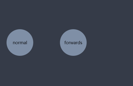
6. Playback status
By default, the animation is in the running state.
You can use animation play state to control the animation state
| Attribute value | explain |
|---|---|
| running | The animation works normally |
| paused | The animation does not execute and pauses at a frame |

When the mouse moves in, pause the animation. You can see that when you pause, the animation stays on a frame instead of returning to the initial state.
7. Filling mode
Animation fill mode is used to define the processing mode after the animation playback, whether to return to the original state or stop at the end of the animation.
By default, if the delay is set, it will delay the specified time first, and then change from the first frame defined to the end of the last frame, and the element will return to the original state.
| Attribute value | explain |
|---|---|
| none (default) | The start frame attribute is applied only after the delay ends, and finally returns to the original state of the element |
| backwards | In the delay time, the effect is the animation state of the first frame, and then changes from the first frame after the delay ends. |
| forwards | Stay at the last frame of the animation after all frames are finished |
| both | Contains the rules of backwards and forwards, that is, the animation effect ends at the starting frame with unequal delay, and stops at the last frame after the end |
Case:
<main>
        <ul>
            <li>normal</li>
            <li>backwards</li>
            <li>forwards</li>
            <li>both</li>
        </ul>
    </main>
</body>

<style>
* {
    padding: 0;
    margin: 0;
}

body {
    width: 100vw;
    height: 100vh;
    display: grid;
    justify-items: center;
    align-items: center;
    background-color: #353b48;
}

main {
    width: 400px;
    height: 100px;
}

main ul {
    width: 100%;
    height: 100%;
    list-style-type: none;
    display: grid;
    grid-template: 1fr/repeat(4,1fr);
}

ul li {
    background-color: #7f8fa6;
    border-radius: 50%;
    display: grid;
    align-items: center;
    justify-items: center;
    animation-duration: 2s;
    animation-delay: 2s;
}

ul li:nth-child(1) {
    animation-name: move;
}

ul li:nth-child(2) {
    animation-name: move;
    animation-fill-mode: backwards;
}

ul li:nth-child(3) {
    animation-name: move;
    animation-fill-mode: forwards;
}

ul li:nth-child(4) {
    animation-name: move;
    animation-fill-mode: both;
}


    // Define frame animation
@keyframes move {
    from {
        transform: scale(0);
    }

    to {
        background-color: #c23616;
        transform: scale(1);
    }
}
</style>
8. Combined writing
Use animation to combine animation name animation duration animation delay animation timing function animation direction animation iteration count animation fill mode.
Consistent with the transition combination writing method, we need to write at least animation duration, otherwise there is no animation effect. Reason: animation depends on animation time.
Note: animation delay needs to be written after animation duration, and other attributes have no writing order.