In CSS3, the transform attribute is applied to the 2D or 3D conversion of elements. The transform function can be used to realize the four types of deformation processing of text or image rotation, scaling, tilting and movement

Syntax:
div{
    transform: none|transform-functions;
}
The transform attribute can be specified as a keyword value none # or one or more < transform function > values
Note: when transform has multiple attribute values, it should be separated by spaces
Attribute value:
| value | describe |
|---|---|
| translate(x,y) | Move the element along the X and Y axes. |
| translateX(n) | Move the element along the X axis. |
| translateY(n) | Move the element along the Y axis. |
| scale(x,y) | Scale conversion, changing the width and height of the element. |
| scaleX(n) | Scale the transformation to change the width of the element. |
| scaleY(n) | Scale the transformation and change the height of the element. |
| rotate(angle) | Rotation, specify the angle in the parameter. |
| rotateX() | Rotate around the X axis |
| rotateY() | Rotate around Y axis |
| skew(x-angle,y-angle) | Tilt conversion, along the X and Y axes. |
| skewX(angle) | Tilt conversion, along the X axis. |
| skewY(angle) | Tilt conversion, along the Y axis. |
These attribute values are explained one by one below:
1, rotate
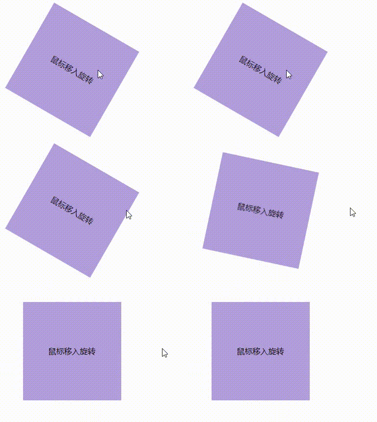
rotate(angle) specifies a 2D rotation for the original element through the specified angle parameter. Angle represents the rotation angle: a positive value indicates clockwise rotation and a negative value indicates counterclockwise rotation
Units: DEG (angle), RAD (radian), grad (gradient), turn (circle)
Conversion: radian = angle * π / 180
<div class="box"></div>
.box{
    width: 200px;
    height: 200px;
    background-color: #B39DDB;
    transition: .2s; /* Transition properties */
}
.box:hover{
    transform: rotate(30deg); /* Rotate 30 degrees clockwise */
}
I used it here transition in css3 Transition attribute, otherwise it will be stiff during deformation
The effect is as follows:
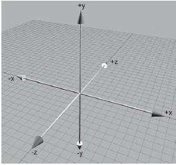
rotateX and rotateY # rotate around the X-axis and Y-axis. The above case can be regarded as rotating around the Z-axis. You can construct a three-dimensional coordinate system, and the direction of the screen seen by our eyes can be regarded as the Z-axis
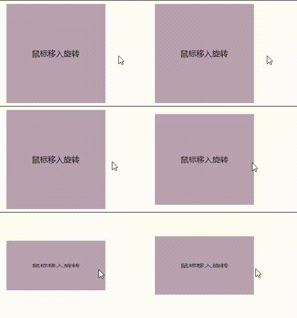
rotateX rotates about the X axis:
.box:hover{
    transform: rotateX(45deg); /* x The shaft rotates 45 degrees */
}
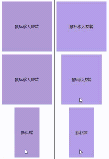
rotateY rotates about the Y axis:
.box:hover{
    transform: rotateY(45deg); /* Y The shaft rotates 45 degrees */
}
2, translate (displacement)
The translate() CSS function relocates elements horizontally and / or vertically
translate(x,y) moves the element to the X-axis and Y-axis at the same time. If the value is negative, it moves in the opposite direction
The translateX() element moves on the X axis
The translateY() element moves on the Y axis
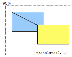
The following demonstrates the effects of these three functions:
.box:hover{
    transform: translate(40px,80px); /* Move + 40px to X axis and + 80px to y axis */
}
The effect is as follows:
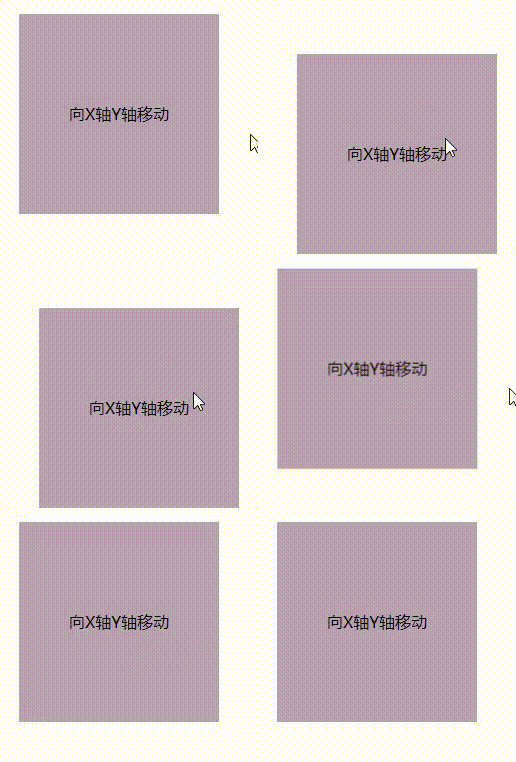
Note: if the translate() value passes a value, the default effect is the same as that of translateX()
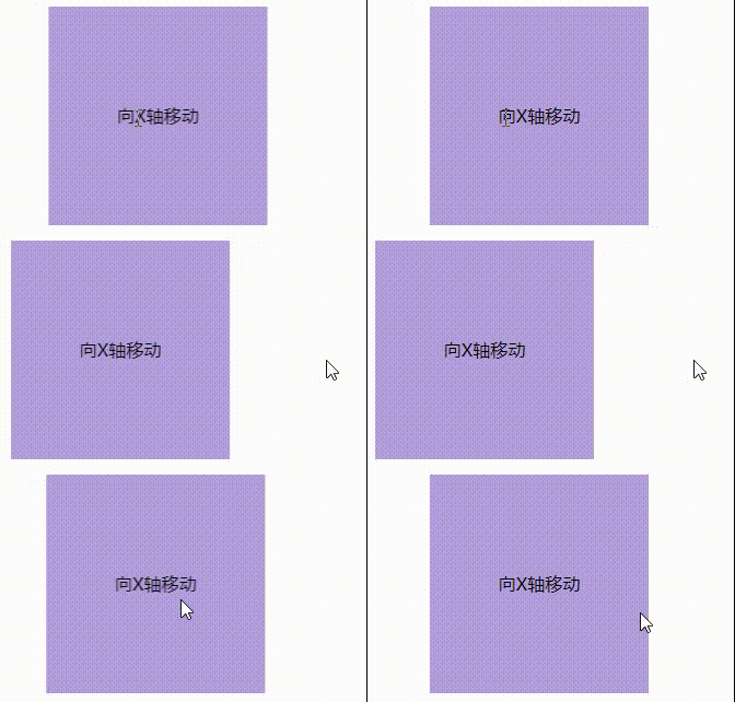
The translateX() element moves on the X axis
.box:hover{
    transform: translateX(50px); /* Move + 50px to X axis */
}
The effect is as follows:
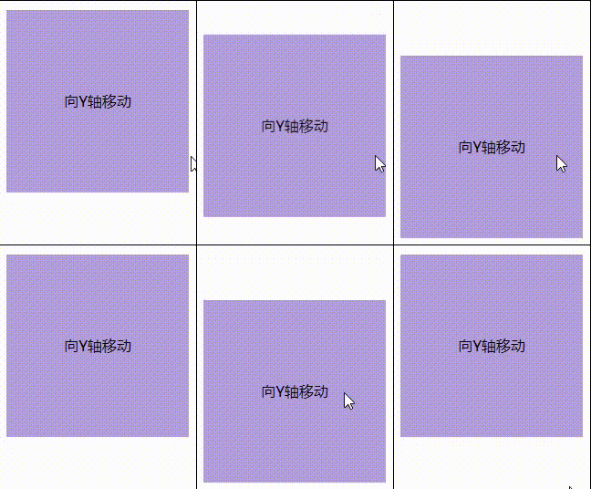
The translateY() element moves on the Y axis
.box:hover{
    transform: translateY(50px); /* Move + 50px to Y axis */
}
The effect is as follows:
3, scale
The CSS function used to modify the size of the scale() element. You can zoom in or out of the element by the scaling value defined in the form of vector, and you can set different scaling values in different directions
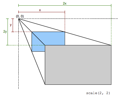
The transformation determines how much to scale in one direction through a two-dimensional vector
- When the coordinate value is outside the interval [- 1, 1], the transformation will enlarge the element in the corresponding coordinate direction
- When in the interval, the transformation will reduce the element in the corresponding coordinate direction
- When the value is 1, no processing is performed
- When it is negative, the size will be modified after pixel reflection.
Syntax:
scale(sx)
/* or */
scale(sx,sy)
sx represents the abscissa of the scaling vector
sy represents the ordinate of the scaling vector. If it is not set, its default value is set to sx. This allows the elements to scale equally while maintaining their original shape
html
<div class="box">Mouse in zoom in/narrow</div>
css
.box{
    width: 200px;
    height: 200px;
    background-color: #B39DDB;
    transition: .2s; /* Transition properties */
    margin: 300px auto;
    text-align:center;
    line-height:200px;
}
.box:hover{
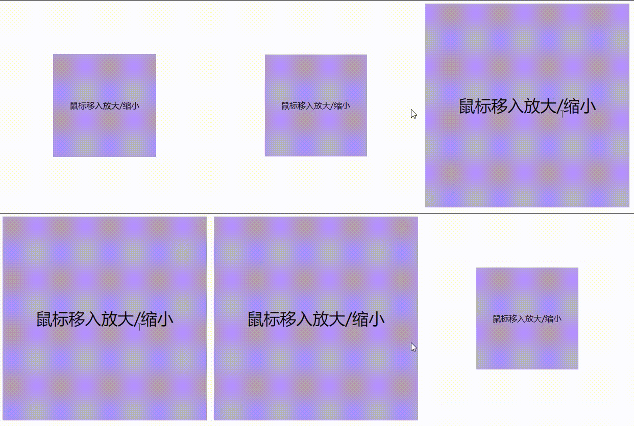
    transform: scale(2);
    /* Equivalent to */
    transform: scaleX(2) scaleY(2);
}
Setting a value is equal scaling. The effect is as follows:
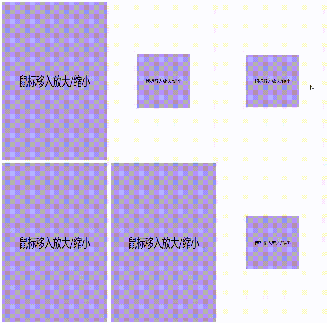
Setting two values is to scale and move the zoom center in the X and Y dimensions. Examples are as follows:
.box:hover{
    transform: scale(2,3);
}
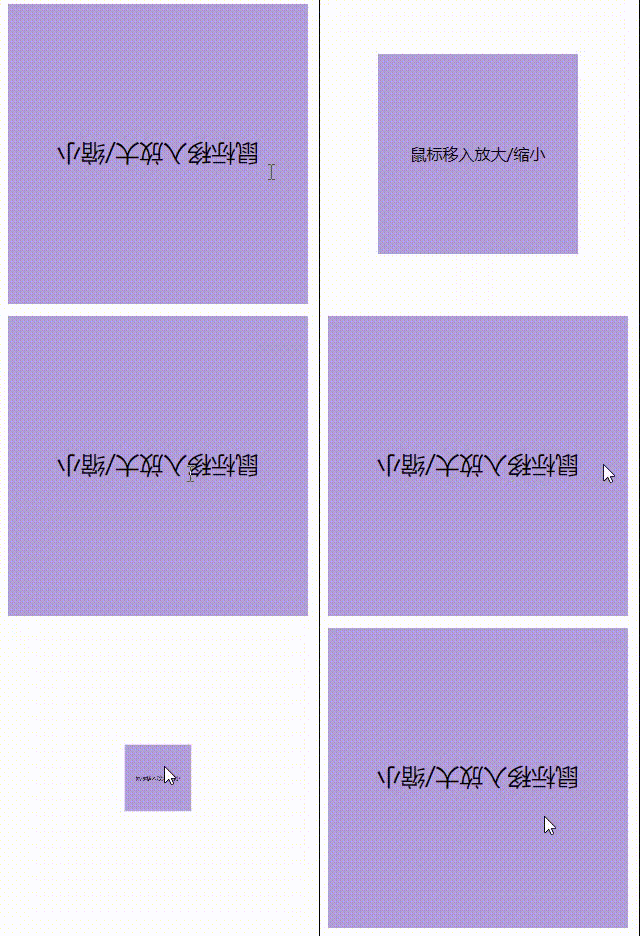
If the set value is between the interval [- 1, 1], the transformation will reduce the element in the corresponding coordinate direction:
.box:hover{
    transform: scale(0.5);
}
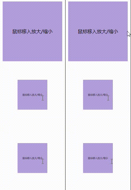
A value of 1 is the size of the element itself without any transformation
If the value is negative, the reverse mirror enlarges:
.box:hover{
    transform: scale(-1.5); /* Mirror magnification */
}
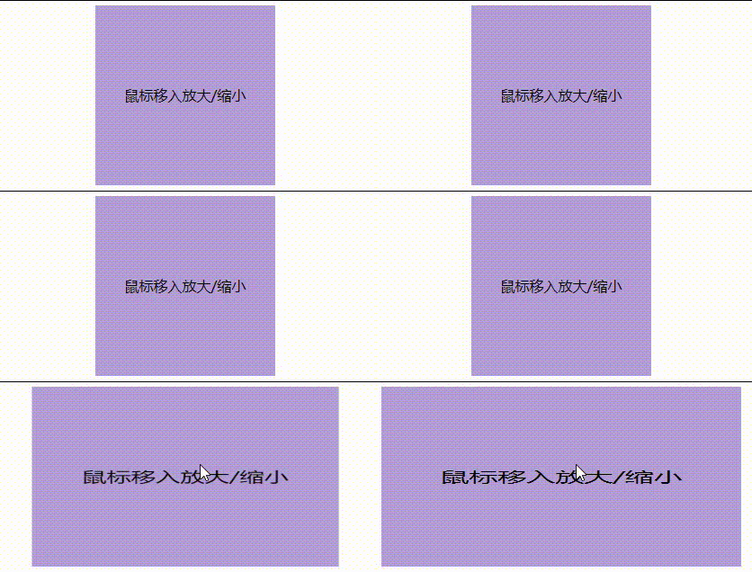
scaleX() and scaleY() only scale the elements in the X-axis and Y-axis directions separately. It can be understood that scale() is a composite attribute of them. If only scaling in a single direction, you can directly use the corresponding function:
scaleX() scales only in the X-axis direction:
.box:hover{
    transform: scaleX(2); /* x Zoom twice in direction */
    /* or */
    transform: scale(2,1);
}
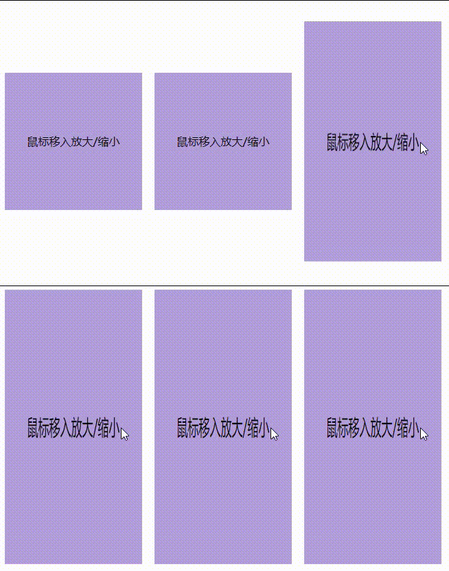
scaleY() scales only in the Y-axis direction:
.box:hover{
    transform: scaleY(2); /* Y Zoom twice in direction */
    /* or */
    transform: scale(1,2);
}
4, skew
The skew() function defines the skew transformation of an element on a two-dimensional plane
Units: DEG (angle), RAD (radian), grad (gradient), turn (circle)
Conversion: radian = angle * π / 180
This transformation is a shear mapping (crosscutting), which distorts each point in the cell by a certain angle in the horizontal and vertical directions. The coordinates of each point are adjusted proportionally according to the specified angle and the distance to the origin; Therefore, the farther a point is from the origin, the greater the value it increases
Syntax:
skew(ax)
/* or */
skew(ax, ay)
ax is a < angle >, which represents the angle used to twist the element along the abscissa
ay is a < angle >, which represents the angle used to twist the element along the ordinate. If not defined, it defaults to 0, resulting in a pure horizontal tilt.
html
<div class="box">Tilt element</div>
css
.box{
    width: 200px;
    height: 200px;
    background-color: #B39DDB;
    transition: .2s; /* Transition properties */
    margin: 300px auto;
    text-align:center;
    line-height:200px;
}
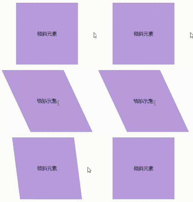
.box:hover{
    /* Pure horizontal tilt */
    transform: skew(25deg);
    /* or */
    transform: skew(25deg,0);
    /* or */
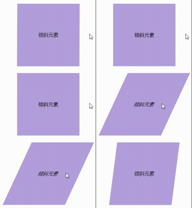
    transform: skewX(25deg);
}
The effect is as follows:
Note: if the value is negative, it tilts in the opposite direction, such as the following example:
.box:hover{
    /* Negative values tilt in the opposite direction */
    transform: skew(-25deg);
}
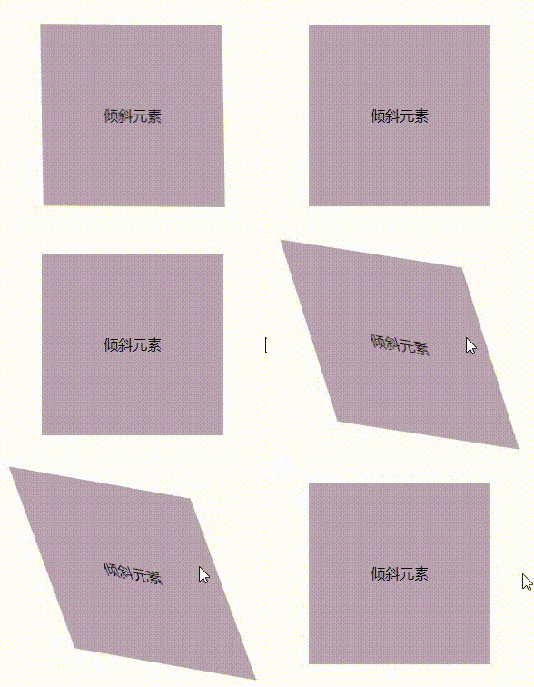
Setting two values tilts the element on both the X and Y axes:
.box:hover{
    /* Tilt the element on both the X and Y axes */
    transform: skew(20deg,10deg);
}
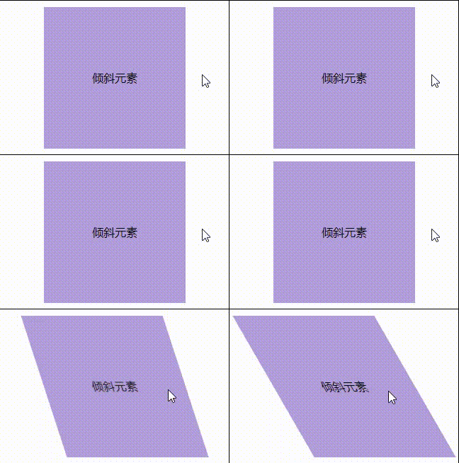
skewX() and skewY() only tilt the elements in the X-axis and Y-axis directions. It can be understood that skew() is a composite attribute of them. If it is only tilted in a single direction, you can directly use the corresponding function:
skewX() tilts only in the X-axis direction:
.box:hover{
    /* Tilt elements only on the X axis */
    transform: skewX(30deg);
}
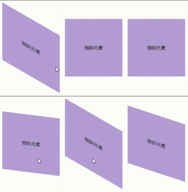
skewY() tilts only in the Y-axis direction:
.box:hover{
    /* Tilt elements only on the Y axis */
    transform: skewY(30deg);
}
5, Transform origin (base point)
The transform origin CSS property allows you to change the origin of an element's deformation
Syntax:
/* One-value syntax */
transform-origin: 2px;
transform-origin: bottom;

/* x-offset | y-offset */
transform-origin: 3cm 2px;

/* x-offset-keyword | y-offset */
transform-origin: left 2px;
x-offset represents the left offset value of the deformation center from the box model
y-offset represents the offset value of the deformation center from the top of the box model
Offset keyword means to define the corresponding deformation center offset
Value:
- Custom (unit: cm, px,%)
- Keywords: top, bottom, left, right, center (default)
The transform origin attribute can be specified with one, two, or three values, each representing an offset
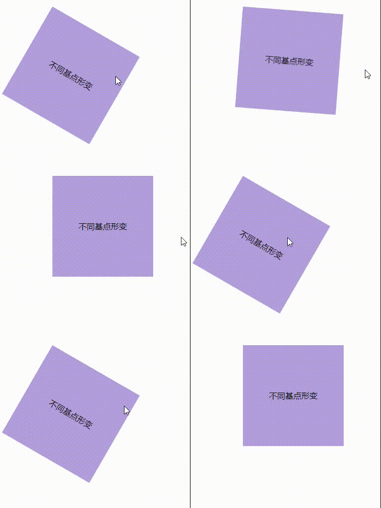
Chestnut 1:
html
<div class="box">Deformation of different base points</div>
css
.box{
    width: 200px;
    height: 200px;
    background-color: #B39DDB;
    transition: .2s; /* Transition properties */
    margin: 300px auto;
    text-align:center;
    line-height:200px;
    /* Set element deformation base point */
    transform-origin: 0 0; /* top left corner */
    /* Equivalent to */
    transform-origin: top left;
}
.box:hover{
    transform:  rotate(30deg); /* rotate */
}
The effect is as follows:
Chestnut 2:
.box{
    width: 200px;
    height: 200px;
    background-color: #B39DDB;
    transition: .2s; /* Transition properties */
    margin: 300px auto;
    text-align:center;
    line-height:200px;
    /* Set element deformation base point */
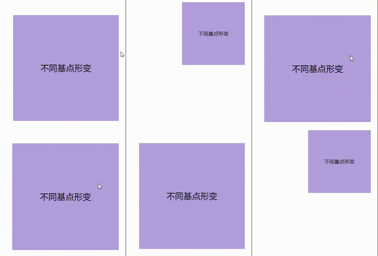
    transform-origin: 100% -30%;
}
.box:hover{
    transform: scale(1.7); /* rotate */
}
The effect is as follows:
Chestnut 3:
.box{
    width: 200px;
    height: 200px;
    background-color: #B39DDB;
    transition: .2s; /* Transition properties */
    margin: 300px auto;
    text-align:center;
    line-height:200px;
    /* Set element deformation base point */
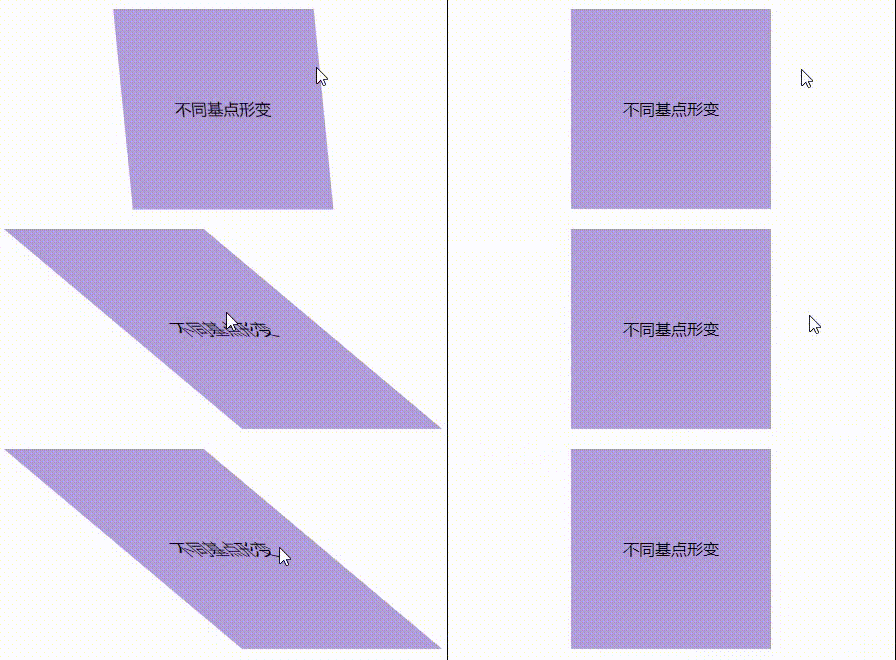
    transform-origin: bottom 100%;
}
.box:hover{
    transform: skewX(50deg);
}
The effect is as follows:
6, Concluding remarks
Here, the 2D deformation in css3 is shared here. In addition, it should be noted that if the transform has multiple attribute values, it needs to be separated by spaces, and the effect is different due to the different writing order of attribute values!!!
For example:
<!DOCTYPE html>
<html>
    <head>
        <meta charset="utf-8">
        <title></title>
        <style type="text/css">
.box{
    width: 200px;
    height: 200px;
    background-color: #B39DDB;
    transition: .2s; /* Transition properties */
    margin: 300px auto;
    text-align:center;
    line-height:200px;
}
.box:hover{
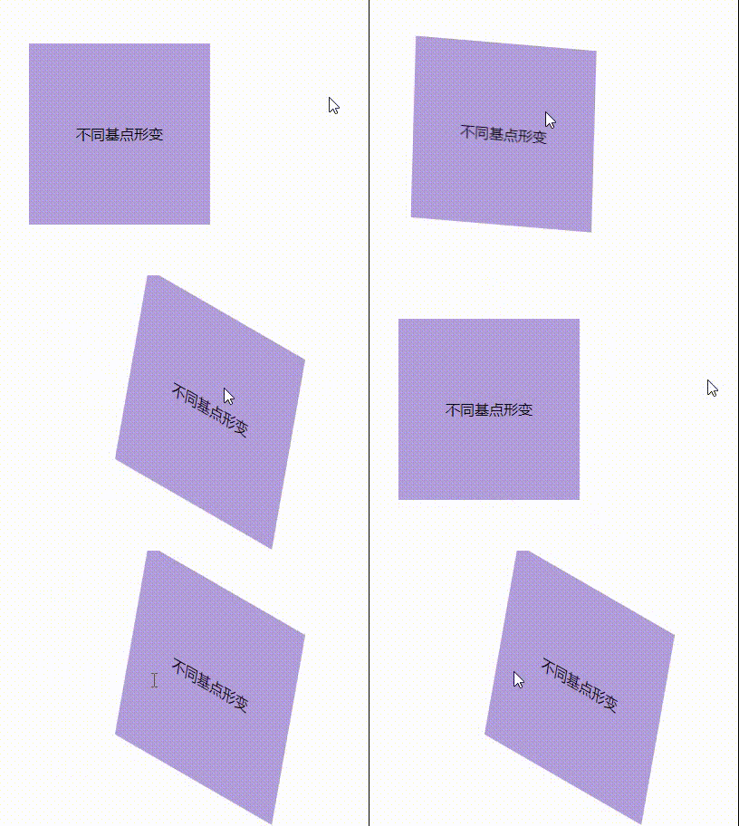
    transform: translateX(200px) rotate(30deg) skew(20deg);
}
        </style>
    </head>
    <body>
        <div class="box">Deformation of different base points</div>
    </body>
</html>
The effect is as follows:
Let's change the order of the attribute values of transform to see the effect:
.box:hover{
    transform: rotate(30deg) translateX(100px) skew(20deg);
}
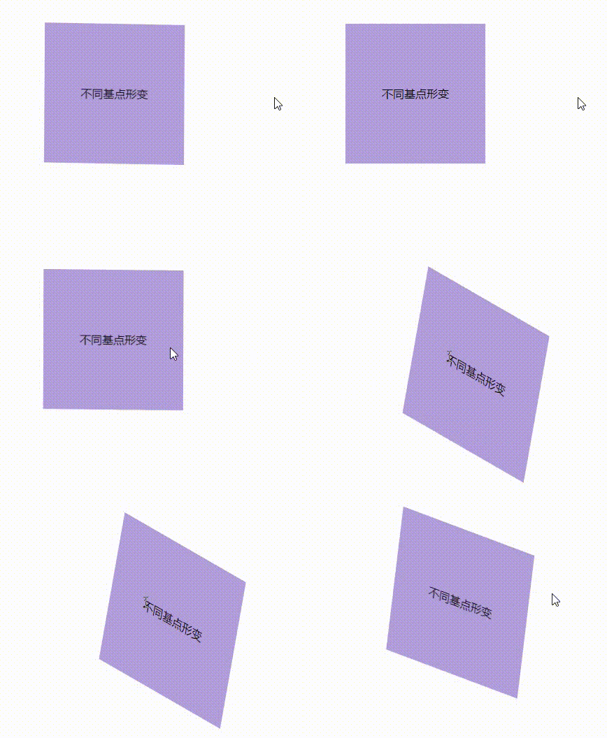
It can be seen that the effects of these two sequences are different. Each attribute value must be separated by a space!
This is the end of this sharing~