1. Deformation and animation in CSS3 (Part 2)
1.1 Keyframes introduction
Keyframes are called keyframes, which are similar to keyframes in Flash. In CSS3, it mainly starts with "@ keyframes", followed by the animation name and a pair of curly brackets "{...}". In the brackets are some style rules in different time periods
@keyframes changecolor{
  0%{
   background: red;
  }
  100%{
    background: green;
  }
}
The style rule in a "@ keyframes" can be composed of multiple percentages. For example, create more percentages between "0%" and "100%". Add different styles to the elements that need animation effect in each percentage, so as to achieve a changing effect
Browser support: Chrome and Safari need the prefix webkit -; Foxfire requires prefix - moz -.
<!--HTML:Line 1 creates an animation called“ changecolor",At '0'%"The background color is red,At 20%The background color is blue,At 40%Background color is orange,At 60%Background color is green,At 80%Time background color yellow,At 100%The background color is red-->
<div>Put the mouse on me</div>
<!--CSS:-->
@keyframes changecolor{
  0%{
    background: red;
  }
  20%{
    background:blue;
  }
  40%{
    background:orange;
  }
  60%{
    background:green;
  }
  80%{
    background:yellow;
  }
  100%{
    background: red;
  }
}
div {
  width: 300px;
  height: 200px;
  background: red;
  color:#fff;
  margin: 20px auto;
}
div:hover {
  animation: changecolor 5s ease-out .2s;
}
1.2 use of animation
Invoking animation in 1.2.1 CSS3
The animation name attribute is mainly used to call the animation defined by @ keyframes. Special attention: the animation name called by animation name needs to be exactly the same as the animation name defined by "@ keyframes" (case sensitive). If it is inconsistent, it will not have any animation effect
Syntax: animation name: none | ident [, none | dent] *;
-
IDENT is the animation name created by @ keyframes, as mentioned above (the animation name called by animation name needs to be completely consistent with the animation name defined by "@ keyframes";
-
None is the default value. When the value is none, there will be no animation effect, which can be used to overwrite any animation.
Note: you need to prefix Chrome and Safari with webkit and Firefox with moz-
1.2.2 set animation playback time in CSS3
Animation duration is mainly used to set the playing time of CSS3 animation. Its use method is similar to transition duration. It is used to specify the duration of element playing animation, that is, the time required to complete the animation from 0% to 100%. Unit: S seconds
Syntax: animation duration: < time > [, < time >]*
The value < time > is a value in seconds, and its default value is "0", which means that the animation period is "0", that is, there is no animation effect (if the value is negative, it will be regarded as "0")
1.2.3 set animation playback mode in CSS3
The animation timing function property is mainly used to set the animation playback mode. It mainly allows elements to change the transformation rate of attribute values according to the advance of time, which is simply the playback mode of animation
Syntax: animation timing function: ease | linear | ease in | ease out | ease in out | cubic Bezier (< number >, < number >, < number >, < number >) [, ease | linear | ease in | ease out | ease in out | cubic Bezier (< number >, < number >, < number >, < number >, < number >)]*
The method is consistent with the transition timing function in transition
1.2.4 set the time when the animation starts playing in CSS3
The animation delay attribute is used to define the time when the animation starts playing and the time point at which the animation is triggered. Like the transition delay attribute, it is used to define the time to wait before the browser starts executing the animation
Syntax: animation delay: < time > [, < time >]*
1.2.5 set animation playback times in CSS3
The animation iteration count attribute is mainly used to define the number of times the animation is played
Syntax: animation iteration count: infinite | < number > [, infinite | < number >]*
- Its value is usually an integer, but you can also use numbers with decimals. Its default value is 1, which means that the animation will only play once from the beginning to the end.
- If the value is infinite, the animation will play infinitely
1.2.6 set animation playback direction in CSS3
The animation direction property is mainly used to set the animation playback direction
Syntax: animation direction: normal | alternate [, normal | alternate]*
- Normal is the default value. If it is set to normal, each cycle of the animation is played forward
- The function of alternate is to play the animation forward for the even number of times and in the opposite direction for the odd number of times
1.2.7 playback status of animation in CSS3
The animation play state attribute is mainly used to control the playback state of element animation
Parameter: it mainly has two values: running and paused.
Among them, running is the default value. Its main function is to stop the animation being played through paused or replay the paused animation through running, just like the music player. The replay here does not necessarily start from the beginning of the element animation, but from the position where it is paused. In addition, if you pause the playback of the animation, the style of the element will return to the original setting state
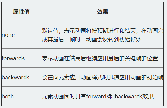
1.2.8 setting animation out of time attribute in CSS3
The animation fill mode attribute defines what happens before and after the animation starts. The corresponding effects of the four attribute values are as follows:
// html:
<div><span></span></div>
// css
@keyframes move {
  0%{
    transform: translateY(90px);
  }
  15%{
    transform: translate(90px,90px);
  }
  30%{
    transform: translate(180px,90px);
  }
  45%{
    transform: translate(90px,90px);
  }
  60%{
    transform: translate(90px,0);
  }
  75%{
    transform: translate(90px,90px);
  }
  90%{
    transform: translate(90px,180px);
  }
  100%{
    transform: translate(90px,90px);
  }
}

div {
  width: 200px;
  height: 200px;
  border: 1px solid red;
  margin: 20px auto;
}
span {
  display: inline-block;
  width: 20px;
  height: 20px;
  background: orange;
  transform: translateY(90px);
  animation-name: move;
  animation-duration: 10s;
  animation-timing-function: ease-in;
  animation-delay: .2s;
  animation-iteration-count:infinite;
  animation-direction:alternate;
  animation-play-state:paused;
}
div:hover span {
  animation-play-state:running;
}
2. Layout style related
2.1 multi column layout
2.1.1 Columns
Syntax: columns: < column width > | < column count >
Parameters: column width and number of columns

For example: to display 2 columns, the width of each column is 200px, and the code is: columns: 200px 2;
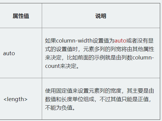
2.1.2 column-width
Syntax: column width: Auto | < length >
Value Description:
2.1.3 column-count
The column count attribute is mainly used to specify the desired number of columns and the maximum number of columns allowed for the element. Its syntax rule: column count: Auto | < integer >
Value Description:
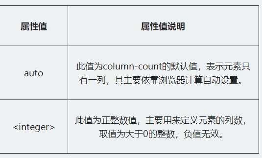
For example: divide the column into four columns, and the code is as follows: column count: 4;
2.2 column gap
Column gap is mainly used to set the spacing between columns. Its syntax rules are as follows: column gap: normal | < length >
Value Description:
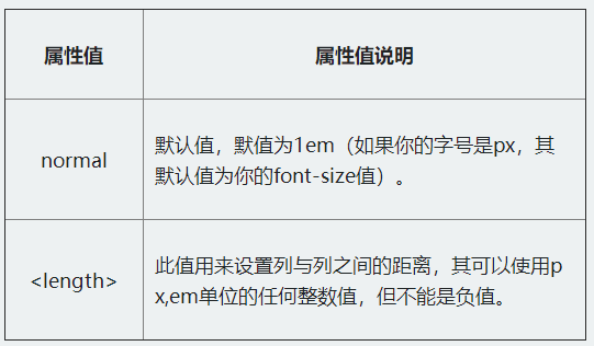
For example, the content is displayed in three columns, the spacing between columns is 2em, and the implementation code is:
column-count: 3;
column-gap: 2em;
2.3 list border column rule
Column rule is mainly used to define the border width, border style and border color between columns. However, column rule does not occupy any space. Changing its width between columns will not change the position of any column.
Syntax rules: column rule: < column rule width > | < column Rule Style > | < column rule color >
Value Description:
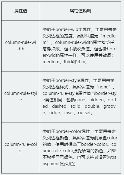
For example, in order to effectively distinguish the relationship between columns, you can set a column border for it. The code is:
column-rule: 2px dotted green;
2.4 cross column setting column span
Column span is mainly used to define how many child elements in a column element can span columns
Syntax: column span: none | all
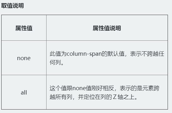
For example: span the first title across all columns, code: column span: all;
2.5 box model
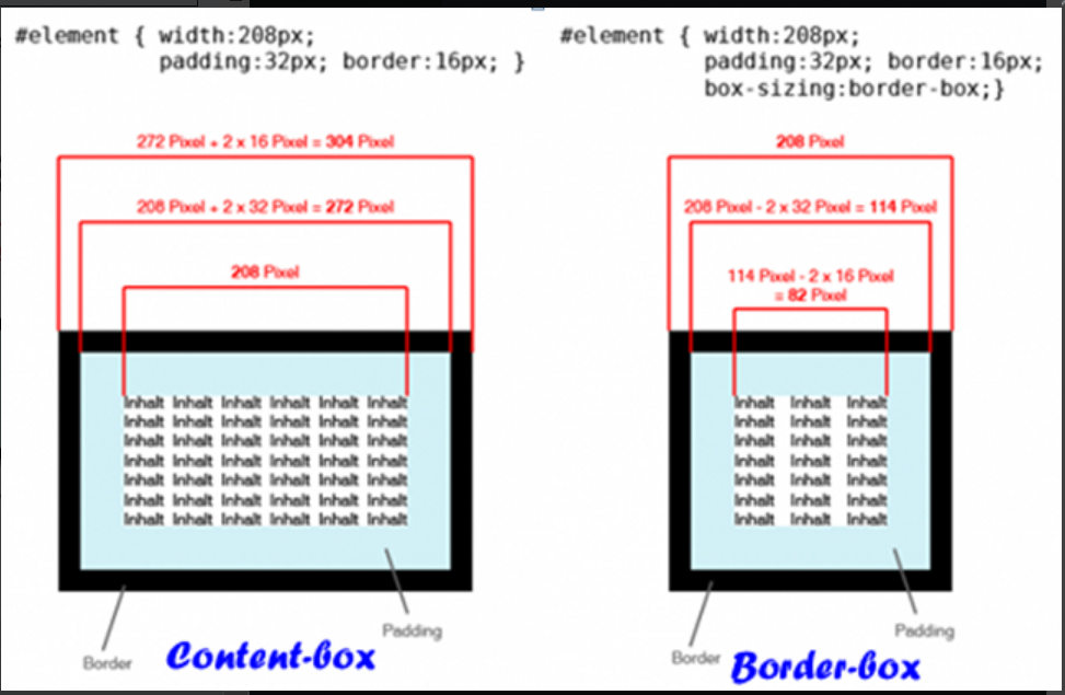
The box sizing attribute is added in CSS3, which can define the size resolution method of the box model in advance. Its syntax rules are as follows: box sizing: content box | border box | inherit
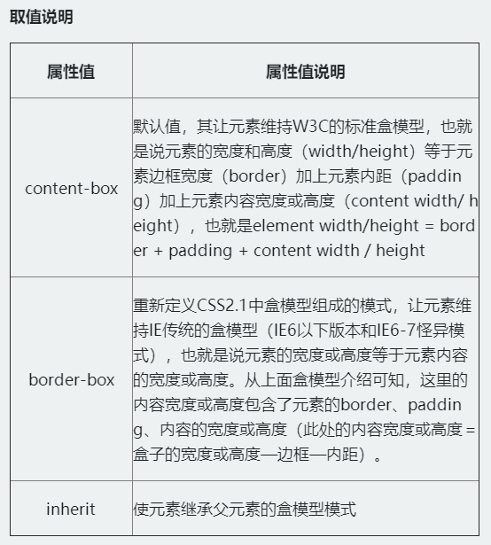
The most important one is the difference between content box and border box in box sizing:
Content box: outer margin 2 + border 2 + inner filling * 2 + height or width of content (height or width of written element);
Border box: the outer margin 2 + the height or width of the element written (border 2 + the height or width of the filled * 2 + content, which have been included in the written height or width);
2.6 CSS3 telescopic layout (Flexbox layout)
Functional features:
- The layout can also be adjusted flexibly when the size of screen and browser window changes;
- You can specify the expansion item to allocate additional space (expansion container additional space) in proportion along the main axis or side axis, so as to adjust the size of the expansion item;
- You can specify the telescopic item to allocate additional space of the telescopic container along the main axis or side axis before, after or between the telescopic items;
- You can specify how to distribute additional space perpendicular to the element layout axis around the element;
- You can control the layout direction of elements on the page;
- Elements on the screen can be reordered in a different order than specified by the document object model (DOM). In other words, you can rearrange the scaling items in the browser rendering without following the order of document flow
Case:
-
Create a flex container: the first step in any flexbox layout is to create a flex container. To do this, set the value of the display attribute of the element to flex. In Safari browser, you still need to add the prefix WebKit flexcontainer{ display: -webkit-flex; display: flex; }
-
Flex project display: the flex project is a child element of the flex container. They are positioned along the main and horizontal axes. The default is to arrange a row along the horizontal axis. You can change the spindle direction through flex direction to column, and its default value is row.
-
Flex project column display
.flexcontainer{ display: -webkit-flex; display: flex; -webkit-flex-direction: column; flex-direction: column; } -
Flex project moves to the top: key: depends on the direction of the spindle. The justify content attribute defines the alignment of items on the spindle. The align items property defines how items are aligned on the cross axis. If the spindle is horizontal, set it through align items; If the spindle is vertical, set it through justify content.
.flexcontainer{ // column -webkit-flex-direction: column; flex-direction: column; -webkit-justify-content: flex-start; justify-content: flex-start; } .flexcontainer{ // that 's ok display: -webkit-flex; display: flex; -webkit-flex-direction: row; flex-direction: row; -webkit-align-items: flex-start; align-items: flex-start; } -
Move flex items to the left: the movement of flex items to the left or right also depends on the direction of the spindle. If flex direction is set to row, set justify content to control the direction; If it is set to column, set align items to control the direction.
.flexcontainer{ // that 's ok display: -webkit-flex; display: flex; -webkit-flex-direction: row; flex-direction: row; -webkit-justify-content: flex-start; justify-content: flex-start; } .flexcontainer{ // column display: -webkit-flex; display: flex; -webkit-flex-direction: column; flex-direction: column; -webkit-align-items: flex-start; align-items: flex-start; } -
Flex project move right
.flexcontainer{ // that 's ok display: -webkit-flex; display: flex; -webkit-flex-direction: row; flex-direction: row; -webkit-justify-content: flex-end; justify-content: flex-end; } .flexcontainer{ // column display: -webkit-flex; display: flex; -webkit-flex-direction: column; flex-direction: column; -webkit-align-items: flex-end; align-items: flex-end; } -
Horizontal and vertical centering: making horizontal and vertical centering in a Flexbox container is trivial. Set justify content or align items to center. In addition, set the flex direction to row or column according to the direction of the spindle.
.flexcontainer{ display: -webkit-flex; display: flex; -webkit-flex-direction: row; flex-direction: row; -webkit-align-items: center; align-items: center; -webkit-justify-content: center; justify-content: center; } .flexcontainer{ display: -webkit-flex; display: flex; -webkit-flex-direction: column; flex-direction: column; -webkit-align-items: center; align-items: center; -webkit-justify-content: center; justify-content: center; } -
How flex automatically scales a project relative to flex. You need to set the flex property for each flex item and set the value that needs to be scaled.
.bigitem{
    -webkit-flex:200;
    flex:200;
}
.smallitem{
    -webkit-flex:100;
    flex:100;
}
3. Media Queries and Responsive design
3.1 Media Queries
3.1.1 media type
The biggest feature of Media Queries is querying the media through CSS3, and then calling the corresponding style.
-
media type
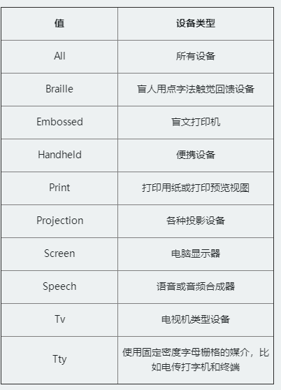
-
Link method: the media type introduced by the link method is actually to specify different media types through the media attribute in the link tag when the < link > tag references the style. As shown below.
<link rel="stylesheet" type="text/css" href="style.css" media="screen" />
<link rel="stylesheet" type="text/css" href="print.css" media="print" />
-
@Import method: reference the style file or the media type@ There are two ways to import media types: one is to call another style file through @ import in the style; Another way is to import the <style></style> in the <head></head> tag, but this method is not supported by IE6~7. If the other style file is called in the style file, the corresponding media type can be specified.
@importurl(reset.css) screen;
@importurl(print.css) print;
Introduce the media type method in the < style > tag in < head >.
<head> <style type="text/css"> @importurl(style.css) all; </style> </head> -
@Media method: it is a newly introduced feature in CSS3, which is called media query. You can also use this attribute to introduce media types in the page.
-
Reference media type in style file:
@media screen { selector{/*Your style code is written here*/} } -
The way to use @ media to introduce media types is in the tag
-
3.1.2 how to use media queries
Usage: @ media media type and (media characteristics) {your style}
Note: to use Media Queries, you must start with "@ media", then specify the media type, and then specify the media characteristics. The writing method of media features is similar to that of styles. It is mainly divided into two parts. The first part refers to the media features, and the second part refers to the values specified by the media features, which are separated by colons. For example: (max width: 480px)
Media Queries are commonly used in actual projects:
-
Max width: refers to that the style takes effect when the media type is less than or equal to the specified width
@media screen and (max-width:480px){ .ads { display:none; } } // When the screen is less than or equal to 480px, the advertising blocks (. ads) in the page will be hidden -
Min width: refers to that the style takes effect when the media type is greater than or equal to the specified width.
@media screen and (min-width:900px){ .wrapper{width: 980px;} } // When the screen is greater than or equal to 900px, the width of the container ". wrapper" is 980px. -
Use of multiple media features: you can use the keyword * * "and * *" to combine multiple media features
// When the screen is between 600px and 900px, the background color of the body is rendered as "#f5f5f5", as shown below. @media screen and (min-width:600px) and (max-width:900px){ body {background-color:#f5f5f5;} } -
Output width of device screen: the corresponding style can be set according to the size of the screen device (or call the corresponding style file)
<link rel="stylesheet" media="screen and (max-device-width:480px)" href="iphone.css" />
// The above code refers to the "iphone.css" style, which is applicable to the maximum device width of 480px,
-
Not keyword: the keyword "not" is used to exclude a specified media type, that is, to exclude devices that match the expression. That is, the not keyword means to reverse the following expression, such as
@media not print and (max-width: 1200px){Style code} // The style code will be used in all devices except printing devices and devices with width less than 1200px -
Only keyword: only is used to specify a specific media type. It can be used to exclude browsers that do not support media query
<linkrel="stylesheet" type="text/css" href="style.css" media="handheld and (max-width:480px), screen and (min-width:960px)" />
// If the Media Type is not explicitly specified, it defaults to all, which means it is used on handheld devices with a width less than or equal to 480px, or on devices with a screen width greater than or equal to 960px
Media Queries in other browsers, do not add prefixes in different browsers like other CSS3 properties
3.2 Responsive design
3.2.1 Responsive terms
-
Fluid grid: fluid grid is a simple grid system. This grid design refers to the grid system in fluid design. Each grid is controlled by percentage unit
-
Elastic picture: Elastic Picture refers to that the picture is not set with a fixed size, but scaled according to the fluid grid, which is used to adapt to the size of various grids, such as
// Breakpoint solution image adaptation example. <img src="image.jpg" data-src-600px="image-600px.jpg" data-src-800px="image-800px.jpg" alt="" /> // Corresponding CSS code: @media (min-device-width:600px){ img[data-src-600px]{ content: attr(data-src-600px,url); } } @media (min-device-width:800px){ img[data-src-800px] { content:attr(data-src-800px,url); } } -
Media query: use this attribute to make your design adapt to the corresponding style according to the user terminal device
-
Screen resolution: it is the resolution of the display screen when the user uses the device to browse your Web page
-
Main breakpoint: critical point of equipment width
Three key points should be grasped in setting breakpoints: meeting the main breakpoints; Add some other breakpoints if possible; Set desktop breakpoints above 1024
3.2.2 Responsive layout skills
-
abandon
First, try not to use insignificant div;
Second, do not use inline elements;
Third, try to use less JS or flash;
Fourth, discard useless absolute positioning and floating patterns;
Fifth, abandon any redundant structure and do not use 100% setting.
-
retain
First, use HTML5 Doctype and related guidelines;
Second, reset your style (reset.css);
Third, a simple semantic core layout;
Fourth, use simple techniques for important web elements, such as navigation menus.
3.2.3 meta label
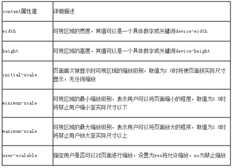
Usage: < meta name = "viewport" content = "" / >
The content attribute mainly includes the following attribute values, which are used to process the visual area:
3.2.4 resolution setting of different equipment
1.1024px display screen
@media screen and (max-width : 1024px) {
/* The style is written here */
}
2.800px display screen
@media screen and (max-width : 800px) {
/* The style is written here */
}
3.640px display screen
@media screen and (max-width : 640px) {
/* The style is written here*/
}
4.iPad horizontal display
@media screen and (max-device-width: 1024px) and (orientation: landscape) {
/* The style is written here */
}
5.iPad vertical display
@media screen and (max-device-width: 768px) and (orientation: portrait) {
/* The style is written here */
}
6.iPhone and Smartphones
@media screen and (min-device-width: 320px) and (min-device-width: 480px) {
/* The style is written here */
}
4. Other important attributes of users
4.1 Free scaling attribute resize
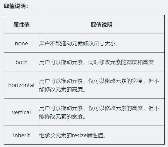
Allows the user to change the size of an element by dragging it
Syntax: resize: none | both | horizontal | vertical | inherit
For example, through the resize attribute, the text field can be dragged horizontally. The code is:
textarea {
  -webkit-resize: horizontal;
  -moz-resize: horizontal;
  -o-resize: horizontal;
  -ms-resize: horizontal;
  resize: horizontal;
}
4.2 CSS3 outer contour attribute
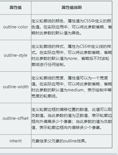
The effect of the outer contour in the page is very similar to that of the border, but it is completely different from the element border. The outer contour does not occupy the page layout space and is not necessarily rectangular. The outer contour belongs to a dynamic style. It is presented only when the element gets the focus or is activated. It is mainly used to draw an outline around the element, Can play the role of highlighting elements
[outline] - Outline
The value description is as follows:

Case:
div {
  padding: 20px;
  margin: 30px;
  outline: red solid 2px;
  border: 2px solid green;
}
// Make a two-color border effect
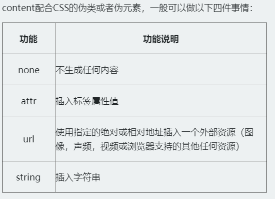
4.3 CSS generated content
Inserting content into the Web is realized through the pseudo classes ": before" and ": after" of CSS3 and the pseudo elements ":: before" and ":: after" of CSS3. The key is to rely on the "content" attribute in CSS3

<a href="##"Title =" I am a title attribute value, I insert it after you "> I am an element</a>

// Insert the "title" value of the element after the element content "I am an element" through ": after" and "content:attr(title)":
a:after {
    content:attr(title);
    color:#f00;
}
When activated, it is mainly used to draw an outline around the element, which can highlight the element
Syntax: Outline: [outline color] | [outline style] | [outline width] | [outline offset] | inherit
The value description is as follows:
Case:
div {
  padding: 20px;
  margin: 30px;
  outline: red solid 2px;
  border: 2px solid green;
}
// Make a two-color border effect
4.3 CSS generated content
Inserting content into the Web is realized through the pseudo classes ": before" and ": after" of CSS3 and the pseudo elements ":: before" and ":: after" of CSS3. The key is to rely on the "content" attribute in CSS3
<a href="##"Title =" I am a title attribute value, I insert it after you "> I am an element</a>

// Insert the "title" value of the element after the element content "I am an element" through ": after" and "content:attr(title)":
a:after {
    content:attr(title);
    color:#f00;
}