Floating layout
Basic introduction
Floating layout is one of the most commonly used layout methods in the early days of CSS.
To put it bluntly, it is a technical means to float elements out of the default document flow arrangement.
The following points should be noted when using floating layout:
- Floating should occur inside a large box (the body tag can also be regarded as a large box)
- Floating elements affect the arrangement of subsequent non floating elements
- Floating elements are automatically converted to inline block state
- Floating elements will only be in the content area of the parent box and will not overflow to the padding area of the parent box
- When all elements in a parent box float, it may cause the parent box to collapse
Use float
Using float on an element can float the element. It can specify the following directions:
| option | explain |
|---|---|
| left | Float left |
| right | Float right |
| none | No floating |
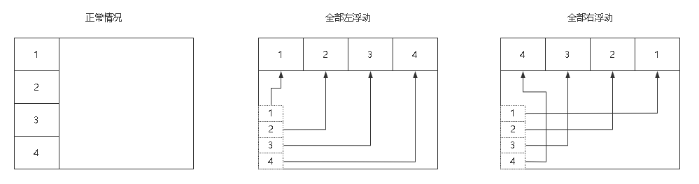
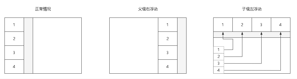
be careful! Using the right float will result in reverse order, 1234 becomes 4321, and the left float is positive order.
If you don't want to change their order, you can wrap them all in a parent label, float the parent label to the right, and then float the child label.
As shown in the figure below:
Document flow
Document flow arrangement is a top-down, left to right arrangement.
For block level elements, it should be exclusive.
Code example:
<!DOCTYPE html>
<html lang="en">

<head>
    <meta charset="UTF-8">
    <meta http-equiv="X-UA-Compatible" content="IE=edge">
    <meta name="viewport" content="width=device-width, initial-scale=1.0">
    <title>Document</title>
    <link rel="stylesheet" href="./css_reset.css">
    <style>
        * {
            box-sizing: border-box;
        }

        main {
            width: 230px;
            padding: .5rem;
            border: 1px solid #000;
        }

        main div {
            width: 100px;
            height: 100px;
        }

        main div:nth-of-type(1) {
            border: 1px solid blue;
        }

        main div:nth-of-type(2) {
            background-color: red;
        }
    </style>
</head>

<body>
    <main>
        <div></div>
        <div></div>
    </main>
</body>

</html>
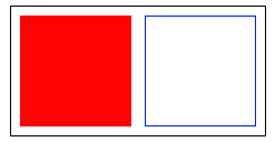
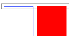
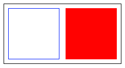
Render results:
Space occupation
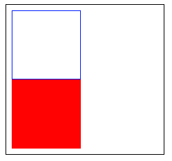
In the same level case, if the first label is floated out of the document flow, the last label will occupy the position of the previous label.
As shown below, if the front blue box div floats: left, the rear red background div will top up, occupying the space of the previous blue box div, and the blue box div floats above the red background Div.
        main div:nth-of-type(1) {
            border: 1px solid blue;
            float: left;
        }
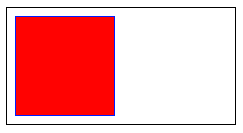
If the blue box div arranged in front is set to float: right, the red background div arranged in the back will still top up, occupying the space position of the previous blue box Div.
        main div:nth-of-type(1) {
            border: 1px solid blue;
            float: right;
        }
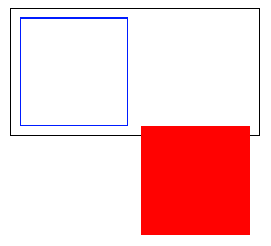
If we float the red background div arranged in the back, the label arranged in the front will not be affected, but the parent height will collapse, that is, the height of the parent box will be unexpected:
        main div:nth-of-type(2) {
            background-color: red;
            float: right;
        }
state transition
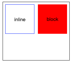
Elements that are set to float become inline block.
As shown below, when an inline tag is floated, its width and height can be set. When a block tag is floated, it will not monopolize one line:
Code example:
<!DOCTYPE html>
<html lang="en">

<head>
    <meta charset="UTF-8">
    <meta http-equiv="X-UA-Compatible" content="IE=edge">
    <meta name="viewport" content="width=device-width, initial-scale=1.0">
    <title>Document</title>
    <link rel="stylesheet" href="./css_reset.css">
    <style>
        * {
            box-sizing: border-box;
        }

        main {
            width: 230px;
            padding: .5rem;
            border: 1px solid #000;
            /* In order to prevent the parent box from collapsing, a height is set here */
            height: 200px;
        }

        main span,
        div {
            width: 100px;
            height: 100px;
            text-align: center;
            line-height: 100px;
        }

        main span {
            float: left;
            border: 1px solid blue;
        }
        main div{
            float: right;
            background-color: red;
        }
    </style>
</head>

<body>
    <main>
        <span>inline</span>
        <div>block</div>
    </main>
</body>

</html>
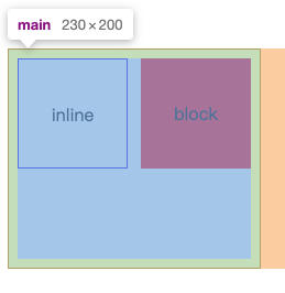
Floating boundary
The floating elements in the parent box will always be in the content area of the parent box and will not exceed the padding area.
As follows:
- content: Blue
- padding: Green
- margin: yellow
Code example:
<!DOCTYPE html>
<html lang="en">

<head>
    <meta charset="UTF-8">
    <meta http-equiv="X-UA-Compatible" content="IE=edge">
    <meta name="viewport" content="width=device-width, initial-scale=1.0">
    <title>Document</title>
    <link rel="stylesheet" href="./css_reset.css">
    <style>
        * {
            box-sizing: border-box;
        }

        main {
            width: 230px;
            padding: .5rem;
            border: 1px solid #000;
            /* In order to prevent the parent box from collapsing, a height is set here */
            height: 200px;
        }

        main span,
        div {
            width: 100px;
            height: 100px;
            text-align: center;
            line-height: 100px;
        }

        main span {
            float: left;
            border: 1px solid blue;
        }
        main div{
            float: right;
            background-color: red;
        }
    </style>
</head>

<body>
    <main>
        <span>inline</span>
        <div>block</div>
    </main>
</body>

</html>
Clear float
Collapse problem
When all child elements in a parent box without height float, the parent box will have the problem of height collapse:
<!DOCTYPE html>
<html lang="en">

<head>
    <meta charset="UTF-8">
    <meta http-equiv="X-UA-Compatible" content="IE=edge">
    <meta name="viewport" content="width=device-width, initial-scale=1.0">
    <title>Document</title>
    <link rel="stylesheet" href="./css_reset.css">
    <style>
        * {
            box-sizing: border-box;
        }

        main {
            width: 230px;
            padding: .5rem;
            border: 1px solid #000;
        }

        main div {
            width: 100px;
            height: 100px;
        }

        main div:nth-of-type(1) {
            border: 1px solid blue;
            float: left;
        }

        main div:nth-of-type(2) {
            background-color: red;
            float: right;
        }
    </style>
</head>

<body>
    <main>
        <div></div>
        <div></div>
    </main>
</body>

</html>
When the parent box collapses, it will affect the overall layout.
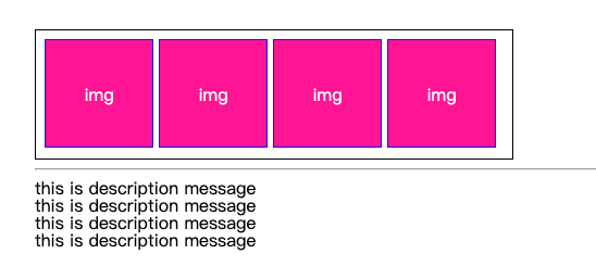
This is the normal layout:
<!DOCTYPE html>
<html lang="en">

<head>
    <meta charset="UTF-8">
    <meta http-equiv="X-UA-Compatible" content="IE=edge">
    <meta name="viewport" content="width=device-width, initial-scale=1.0">
    <title>Document</title>
    <link rel="stylesheet" href="./css_reset.css">
    <style>
        * {
            box-sizing: border-box;
        }

        main {
            width: 440px;
            padding: .5rem;
            border: 1px solid #000;
            height: 120px;
        }

        main div {
            border: 1px solid blue;
            float: left;
            width: 100px;
            height: 100px;
            margin-right: 5px;
            text-align: center;
            line-height: 100px;
            color: #fff;
            background-color: deeppink;
        }
    </style>
</head>

<body>
    <main>
        <div>img</div>
        <div>img</div>
        <div>img</div>
        <div>img</div>
    </main>
    <hr>
    <footer>
        <p>this is description message</p>
        <p>this is description message</p>
        <p>this is description message</p>
        <p>this is description message</p>
    </footer>
</body>

</html>
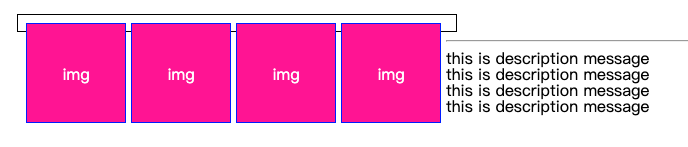
This is the layout after height collapse:
<!DOCTYPE html>
<html lang="en">

<head>
    <meta charset="UTF-8">
    <meta http-equiv="X-UA-Compatible" content="IE=edge">
    <meta name="viewport" content="width=device-width, initial-scale=1.0">
    <title>Document</title>
    <link rel="stylesheet" href="./css_reset.css">
    <style>
        * {
            box-sizing: border-box;
        }

        main {
            width: 440px;
            padding: .5rem;
            border: 1px solid #000;
            /* height: 120px; */
        }

        main div {
            border: 1px solid blue;
            float: left;
            width: 100px;
            height: 100px;
            margin-right: 5px;
            text-align: center;
            line-height: 100px;
            color: #fff;
            background-color: deeppink;
        }
    </style>
</head>

<body>
    <main>
        <div>img</div>
        <div>img</div>
        <div>img</div>
        <div>img</div>
    </main>
    <hr>
    <footer>
        <p>this is description message</p>
        <p>this is description message</p>
        <p>this is description message</p>
        <p>this is description message</p>
    </footer>
</body>

</html>
The solution to this problem is very simple. It is to set a fixed height for the parent box, but it is unrealistic to do so.
Let's use the following JD scroll bar to illustrate. If you carefully observe its structure, you will find that it is actually an a tag with img, which is very similar to the layout of our example above.
The a tag is set to float: left, which means that the div part of the black box may collapse, causing the whole page to mess up:
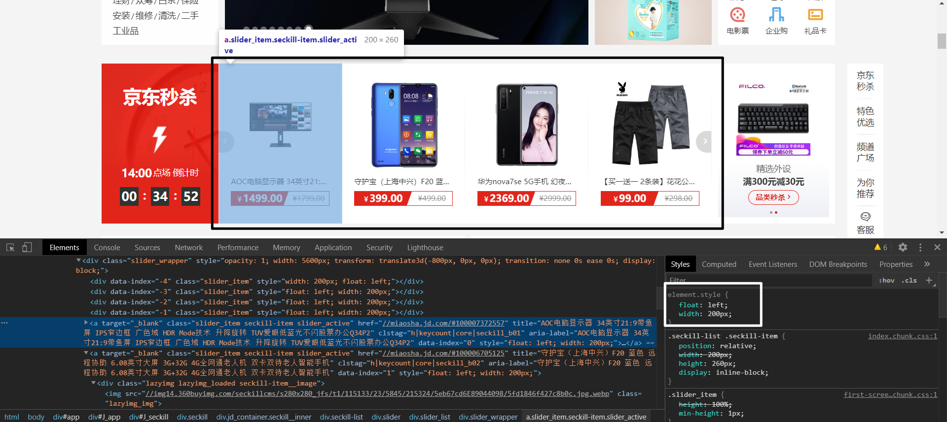
If you set a height for the black box div, it is obviously very troublesome if we need to adjust the height of the div after the img height changes in the subsequent new round of schemes.
Therefore, it is not advisable to set the height of the parent box to solve the collapse problem.
clear interior wall method
We can use the clear inner wall method to solve the problem of height collapse of the parent box.
The steps are as follows:
- step01: add a non floating blank block level label to the parent box and put it under all floating elements
- step02: add a clear attribute for the tag and configure options
The option values that can be set in clear are shown in the following table:
| value | describe |
|---|---|
| left | Left away from floating element |
| right | Right away from floating element |
| both | Left and right away from floating elements |
It means that floating elements are not allowed in one direction of the label. If so, start another line.
The following is the parent box after the clear inner wall method is set, which will no longer cause height collapse:

Let's pay attention to the following code. The clear element must be a block level element and must be set below the floating element, because the floating element will only affect the labels arranged in the back, not the labels arranged in the front:
<!DOCTYPE html>
<html lang="en">

<head>
    <meta charset="UTF-8">
    <meta http-equiv="X-UA-Compatible" content="IE=edge">
    <meta name="viewport" content="width=device-width, initial-scale=1.0">
    <title>Document</title>
    <link rel="stylesheet" href="./css_reset.css">
    <style>
        * {
            box-sizing: border-box;
        }

        main {
            width: 230px;
            padding: .5rem;
            border: 1px solid #000;
        }

        main div {
            width: 100px;
            height: 100px;
        }

        main div:nth-of-type(1) {
            border: 1px solid blue;
            float: left;
        }

        main div:nth-of-type(2) {
            background-color: red;
            float: right;
        }

        .clearfix {
            /* clear:both It means that if there is floating on both sides, I will start another line and do not occupy the spatial position of floating elements */
            clear: both;
        }
    </style>
</head>

<body>
    <main>
        <div></div>
        <div></div>
        <aside class="clearfix"></aside>
    </main>
</body>

</html>
Pseudo element interior wall method
Although the clear inner wall method can well solve the problem of height collapse of the parent box, it is very troublesome to use.
We need to create an empty label for each parent box with floating elements and add a clearfix class. The whole step is still cumbersome.
Therefore, you can use the pseudo element inner wall method and use the:: after inserter to automatically create an element for the parent box.
Note that:: after must be used to be effective, because it inserts text after the floating element. If:: before is used, it has no effect, and the floating element will not affect the arrangement of the previous elements.
The pseudo element inner wall method should be a method highly praised by individuals. It is very simple.
Code example:
<!DOCTYPE html>
<html lang="en">

<head>
    <meta charset="UTF-8">
    <meta http-equiv="X-UA-Compatible" content="IE=edge">
    <meta name="viewport" content="width=device-width, initial-scale=1.0">
    <title>Document</title>
    <link rel="stylesheet" href="./css_reset.css">
    <style>
        * {
            box-sizing: border-box;
        }

        main {
            width: 230px;
            padding: .5rem;
            border: 1px solid #000;
        }

        main div {
            width: 100px;
            height: 100px;
        }

        main div:nth-of-type(1) {
            border: 1px solid blue;
            float: left;
        }

        main div:nth-of-type(2) {
            background-color: red;
            float: right;
        }

        .clearfix::after {
            content: "";
            display: block;
            /* clear:both It means that if there is floating on both sides, I will start another line and do not occupy the spatial position of floating elements */
            clear: both;
        }
    </style>
</head>

<body>
    <main class="clearfix">
        <div></div>
        <div></div>
    </main>
</body>

</html>
overflow
Finally, this method is simpler. You only need to set overflow: auto for the parent box; Or overflow: hidden; The problem of high collapse can be solved.
It will trigger a BFC mechanism to solve the problem of high collapse, but it may cause the loss of child element content.
The specific BFC mechanism is troublesome. It will not be discussed here. Just use it:
Code example:
<!DOCTYPE html>
<html lang="en">

<head>
    <meta charset="UTF-8">
    <meta http-equiv="X-UA-Compatible" content="IE=edge">
    <meta name="viewport" content="width=device-width, initial-scale=1.0">
    <title>Document</title>
    <link rel="stylesheet" href="./css_reset.css">
    <style>
        * {
            box-sizing: border-box;
        }

        main {
            width: 230px;
            padding: .5rem;
            border: 1px solid #000;
        }

        main div {
            width: 100px;
            height: 100px;
        }

        main div:nth-of-type(1) {
            border: 1px solid blue;
            float: left;
        }

        main div:nth-of-type(2) {
            background-color: red;
            float: right;
        }

        .clearfix {
            /* overflow The BFC mechanism will be triggered. The disadvantage is that some contents of floating elements may be missing */
            overflow: auto;
        }
    </style>
</head>

<body>
    <main class="clearfix">
        <div></div>
        <div></div>
    </main>
</body>

</html>
Floating surround
Basic introduction
Floating wrapping is to wrap the text content around floating elements, similar to typesetting wrapping in word.
If the floating element is img, the IMG linked picture must be a png format picture with transparency.
The following is the effect display:

Distance control
Use shape outside for floating elements to control the distance between floating elements and text at the same level.
The values it can set are shown in the following table:
| value | explain |
|---|---|
| margin-box | Outer margin surround |
| padding-box | Inner margin wrap |
| border-box | frame |
| content-box | Content wrapping |
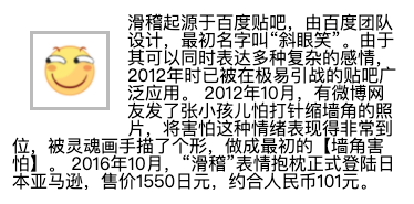
1) The text is surrounded by the outer margin of the floating element:
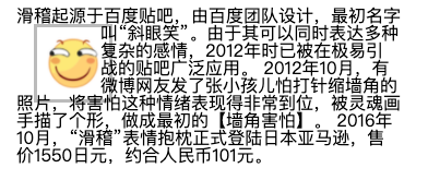
2) The text is surrounded by the inner margin of the floating element:

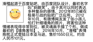
3) The border surrounds the text, and the words are surrounded according to the border of the floating element:

4) Content wrapping: the text is wrapped according to the content of the floating element:
Code example:
<!DOCTYPE html>
<html lang="en">
<head>
<meta charset="UTF-8">
<meta http-equiv="X-UA-Compatible" content="IE=edge">
<meta name="viewport" content="width=device-width, initial-scale=1.0">
<title>Document</title>
<link rel="stylesheet" href="./css_reset.css">
<style>
main {
width: 22rem;
}
main img {
width: 50px;
float: left;
padding: .5rem;
margin: 1rem;
border: 3px solid #bbb;
shape-outside: content-box;
/*
shape-outside: border-box;
shape-outside: padding-box;
shape-outside: margin-box;
*/
}
.clearfix {
overflow: auto;
}
</style>
</head>
<body>
<main class="clearfix">
<img src="./img-002.png" alt="">
<blockquote>
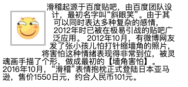
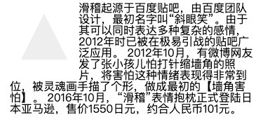
Funny originated from Baidu Post Bar, which was designed by Baidu team. Its original name was "squint smile". Because it can express a variety of complex feelings at the same time, it has been widely used in the post bar which is very easy to lead war in 2012.
2012 In October, a microblog netizen sent a picture of a child afraid of injection and shrinking the corner of the wall. He expressed his fear very well. He was shaped by the soul painter and made the original "corner fear".
2016 In October, the "funny" expression pillow officially landed on Amazon, Japan, for 1550 yen, about 101 yuan.
</blockquote>
</main>
</body>
</html>
Inward moving distance
In addition to using the above words to control the distance between floating elements and text, shape outside can also use inset to manually specify the inward moving distance of floating elements.
The specified order is: top, right, bottom and left
Code example:
<!DOCTYPE html>
<html lang="en">
<head>
<meta charset="UTF-8">
<meta http-equiv="X-UA-Compatible" content="IE=edge">
<meta name="viewport" content="width=device-width, initial-scale=1.0">
<title>Document</title>
<link rel="stylesheet" href="./css_reset.css">
<style>
main {
width: 22rem;
}
main img {
width: 50px;
float: left;
padding: .5rem;
margin: 1rem;
border: 3px solid #bbb;
shape-outside: inset(0px -30px 0px 50px) border-box;
}
.clearfix {
overflow: auto;
}
</style>
</head>
<body>
<main class="clearfix">
<img src="./img-002.png" alt="">
<blockquote>
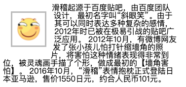
Funny originated from Baidu Post Bar, which was designed by Baidu team. Its original name was "squint smile". Because it can express a variety of complex feelings at the same time, it has been widely used in the post bar which is very easy to lead war in 2012.
2012 In October, a microblog netizen sent a picture of a child afraid of injection and shrinking the corner of the wall. He expressed his fear very well. He was shaped by the soul painter and made the original "corner fear".
2016 In October, the "funny" expression pillow officially landed on Amazon, Japan, for 1550 yen, about 101 yuan.
</blockquote>
</main>
</body>
</html>
Surround Mode
The shape outside of the floating element can also specify the text wrapping mode:
The values it can set are shown in the following table:
| value | explain |
|---|---|
| circle | circular |
| ellipse | ellipse |
| polygon | polygon |
1) Circle outer margin surround:
2) Ellipse outer margin Wrap:
3) Polygon outer margin Wrap:
Code example:
<!DOCTYPE html>
<html lang="en">
<head>
<meta charset="UTF-8">
<meta http-equiv="X-UA-Compatible" content="IE=edge">
<meta name="viewport" content="width=device-width, initial-scale=1.0">
<title>Document</title>
<link rel="stylesheet" href="./css_reset.css">
<style>
main {
width: 22rem;
}
main img {
width: 50px;
float: left;
padding: .5rem;
margin: 1rem;
border: 3px solid #bbb;
shape-outside: polygon(50% 0, 100% 100%, 0 100%) margin-box;
/*
Circle outer margin surround
shape-outside: circle(50%) margin-box;
Ellipse outer margin Wrap:
shape-outside: ellipse(50% 80%) margin-box;
Polygon outer margin Wrap:
shape-outside: polygon(50% 0, 100% 100%, 0 100%) margin-box;
*/
}
.clearfix {
overflow: auto;
}
</style>
</head>
<body>
<main class="clearfix">
<img src="./img-002.png" alt="">
<blockquote>
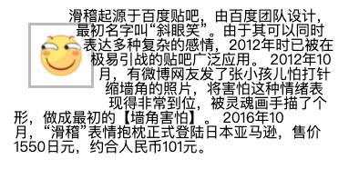
Funny originated from Baidu Post Bar, which was designed by Baidu team. Its original name was "squint smile". Because it can express a variety of complex feelings at the same time, it has been widely used in the post bar which is very easy to lead war in 2012.
2012 In October, a microblog netizen sent a picture of a child afraid of injection and shrinking the corner of the wall. He expressed his fear very well. He was shaped by the soul painter and made the original "corner fear".
2016 In October, the "funny" expression pillow officially landed on Amazon, Japan, for 1550 yen, about 101 yuan.
</blockquote>
</main>
</body>
</html>
Display area
Use clip path for floating elements to control the shape of their display.
The values it can set are shown in the following table:
| value | explain |
|---|---|
| circle | circular |
| ellipse | ellipse |
| polygon | polygon |
1) Round
2) Oval

3) Polygon
Code example:
<!DOCTYPE html>
<html lang="en">
<head>
<meta charset="UTF-8">
<meta http-equiv="X-UA-Compatible" content="IE=edge">
<meta name="viewport" content="width=device-width, initial-scale=1.0">
<title>Document</title>
<link rel="stylesheet" href="./css_reset.css">
<style>
main {
width: 22rem;
}
main div {
width: 50px;
height: 50px;
float: left;
padding: .5rem;
margin: 1rem;
background-color: #eee;
clip-path: polygon(50% 0, 100% 100%, 0 100%);
/*
Represents a circle with the center in the middle
clip-path: clip-path: circle(50% at center);
Represents an ellipse. The center of the circle is on the right. One represents the width and the other represents the height. The center of the circle is in the upper right corner
clip-path: ellipse(50% 80% at 100% 0);
Represents a triangle
clip-path: polygon(50% 0, 100% 100%, 0 100%);
*/
}
.clearfix {
overflow: auto;
}
</style>
</head>
<body>
<main class="clearfix">
<div></div>
<blockquote>
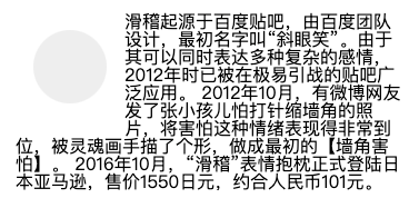
Funny originated from Baidu Post Bar, which was designed by Baidu team. Its original name was "squint smile". Because it can express a variety of complex feelings at the same time, it has been widely used in the post bar which is very easy to lead war in 2012.
2012 In October, a microblog netizen sent a picture of a child afraid of injection and shrinking the corner of the wall. He expressed his fear very well. He was shaped by the soul painter and made the original "corner fear".
2016 In October, the "funny" expression pillow officially landed on Amazon, Japan, for 1550 yen, about 101 yuan.
</blockquote>
</main>
</body>
</html>