preface
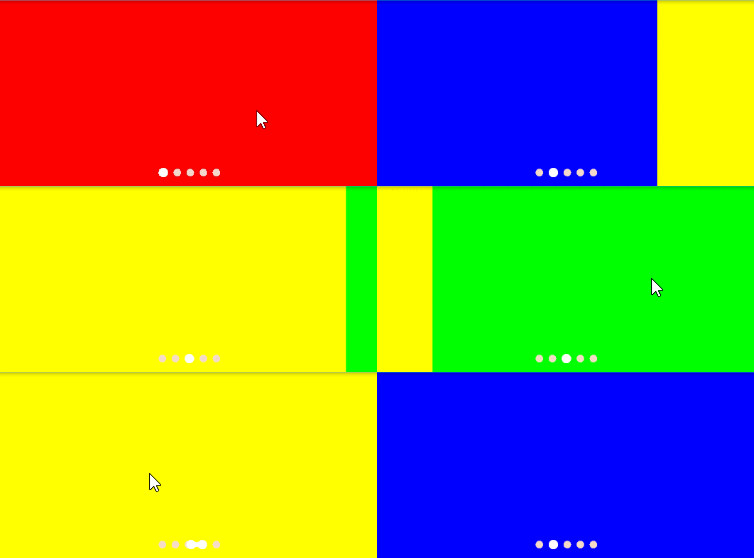
In the current App design, the rotation has basically become the "standard configuration" of each application. With the rotation, it is natural to have a corresponding indicator to represent the current rotation progress. Most of the indicator styles on the market are based on the form of small dots. To achieve this basic effect, there are many wheels on the Internet. This paper is mainly based on the realization of the basic effect, Add a sticky transition animation between switching dots.
Effect preview

Realization idea
Draw dots
If the dot is drawn based on the brush, divide the width of the control into N equal parts, and the radius of the selected dot is slightly larger.
Linkage rolling between dots
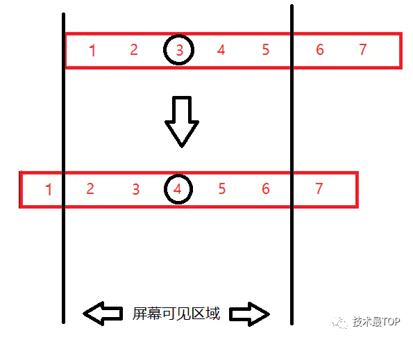
Support setting to display up to N dots. When the total number of dots exceeds N, it will not be displayed in the visible range of the control until it scrolls left / right close to the boundary, and all dots will be automatically translated, so that the newly selected dots will return to the center again. Use attribute animation combined with abscissa offset.
Dot transition animation
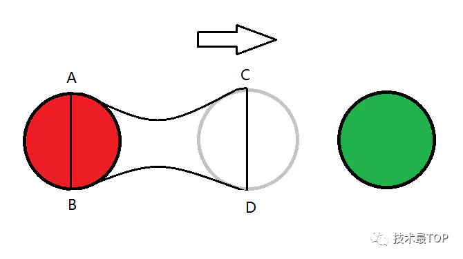
If you simply switch between dots, it will appear stiff, so you need to add some transitional animation effects to this process. Here is a common "sticky" effect, which is similar to the effect of long pressing and dragging the number of unread messages in the QQ contact list:

This is realized based on Bezier curve. By calculating the positions of the two dots ready for transition and the center point between them, the upper and lower Bezier curves can be drawn and closed. Then move it in combination with attribute animation to complete the final transition effect.
Implementation steps
1. Calculate the width and height of the control
According to the design effect, the width and height of the control depend on the arrangement of small circles:
Control width = The width of all small dots visible on the screen * Number of visible dots + Spacing between small circles * (Number of visible dots - 1)

Control height = Height of the largest small circle point
@Override
protected void onMeasure(int widthMeasureSpec, int heightMeasureSpec) {
    super.onMeasure(widthMeasureSpec, heightMeasureSpec);
    int count = Math.min(totalCount, showCount);
    int width = (int) ((count - 1) * smallDotWidth + (count - 1) * dotPadding + bigDotWidth);
    int height = (int) bigDotWidth;
    final int widthSpecMode = MeasureSpec.getMode(widthMeasureSpec);
    final int widthSpecSize = MeasureSpec.getSize(widthMeasureSpec);
    final int heightSpecMode = MeasureSpec.getMode(heightMeasureSpec);
    final int heightSpecSize = MeasureSpec.getMode(heightMeasureSpec);
    if (widthSpecMode == MeasureSpec.AT_MOST && heightSpecMode == MeasureSpec.AT_MOST) {
        setMeasuredDimension(width, height);
    } else if (widthSpecMode == MeasureSpec.AT_MOST) {
        setMeasuredDimension(width, heightSpecSize);
    } else if (heightSpecMode == MeasureSpec.AT_MOST) {
        setMeasuredDimension(widthSpecSize, height);
    } else {
        setMeasuredDimension(width, height);
    }
}
In addition, pay attention to the control of the maximum display quantity, i.e int count = Math.min(totalCount, showCount); If the current total number of dots exceeds the number visible on the screen, the width of the control is calculated based on the maximum number visible.
2. Draw small dots
After knowing the number of small circles, you only need to traverse and draw them in turn. Considering the difference between the selected dot and other dot styles, the width is set separately for the currently selected dot bigDotWidth to set the color separately selectColor, as follows:
@Override
protected void onDraw(Canvas canvas) {
    super.onDraw(canvas);
    float startX = curX;
    float selectX = 0;
    for (int i = 0; i < totalCount; i++) {
        if (curIndex == i) {
            //Draw the selected dot
            paint.setColor(selectColor);
            paint.setStyle(Paint.Style.FILL);

            selectRectF.left = startX;
            selectRectF.top = getHeight() / 2f - bigDotWidth / 2;
            selectRectF.right = startX + bigDotWidth;
            selectRectF.bottom = getHeight() / 2f + bigDotWidth / 2;
            canvas.drawCircle(startX + (bigDotWidth) / 2, bigDotWidth / 2, (bigDotWidth) / 2, paint);
            selectX = startX + bigDotWidth / 2;
            startX += (bigDotWidth + dotPadding);
        } else {
            //Draw other dots
            paint.setColor(defaultColor);
            paint.setStyle(Paint.Style.FILL);

            startX += smallDotWidth / 2;
            canvas.drawCircle(startX, bigDotWidth / 2, (smallDotWidth) / 2, paint);
            startX += (smallDotWidth / 2 + dotPadding);
        }
    }
}
3. Pan left and right animation
It can be seen from the effect drawing that the trigger time of indicator translation lies in each left-right switching, and the following conditions need to be met:
- 1. The current total number of dots exceeds the maximum visible number
- 2. The next dot to be switched is not in the middle of the screen
The first condition is that only when the total number of dots exceeds the maximum visible number can they be translated, which is well understood. The second is that the next dot of the switch is not in the middle of the screen. This is a rule of translation, such as the following example:

In the above figure, 3 is selected before switching. In the process of preparing to switch to 4, the current total number is 7, exceeding the maximum visible number of 5, meeting the first condition. At the same time, because 4 is in the middle of the screen before switching, it meets the second condition, and the whole body needs to be shifted to the left by one unit, so that after switching, 4 becomes the center of the screen, The logic is as follows:
public void setCurIndex(int index) {
    if (index == curIndex) {
        return;
    }
    //The current total number of dots exceeds the maximum number of visible dots
    if (totalCount > showCount) {
        if (index > curIndex) {
            //Slide to the left
            int start = showCount % 2 == 0 ? showCount/2 - 1 : showCount / 2;
            int end = totalCount - showCount / 2;
            //Determine whether to scroll first
            if (index > start && index < end) {
                startScrollAnim(Duration.LEFT, () -> invalidateIndex(index));
            } else {
                invalidateIndex(index);
            }
        } else {
            //Slide to the right
            int start = showCount / 2;
            int end = showCount % 2 == 0 ? totalCount - showCount / 2 + 1 : totalCount - showCount / 2;
            //Determine whether to scroll first
            if (index > start - 1 && index < end - 1) {
                startScrollAnim(Duration.RIGHT, () -> invalidateIndex(index));
            } else {
                invalidateIndex(index);
            }
        }
    } else {
        invalidateIndex(index);
    }
}
4. Dot transition animation
The viscous animation between dots is essentially that the previous dot is used as the reference position, and then the horizontal position of another dot is translated, so that the closed curve between them changes gradually until it is translated to coincide with the position of the next dot, as follows:

In the process of switching from red dot to green dot, take point A as the starting point, connect point A and point C to draw A Bezier curve. Similarly, draw A Bezier curve between point B and point D at the bottom, and then connect AB and CD. The four paths form A closed curve to form A basic shape.
Then, combined with the attribute animation, make the C point and D point move to the right until they completely coincide with the green circle. As follows:
Set the start and end values of the sticky attribute Animation:
//The horizontal center of the currently selected dot   As the starting point for sticky animation
float startValues = getCurIndexX() + bigDotWidth / 2;
//Sets the end value of the animation based on the direction
if (index > curIndex) {
    stickAnimator.setFloatValues(startValues, startValues + dotPadding + smallDotWidth);
} else {
    stickAnimator.setFloatValues(startValues, startValues - dotPadding - smallDotWidth);
}
Monitor the animation and constantly refresh the animation value of sticky transition:
ValueAnimator stickAnimator = new ValueAnimator();
stickAnimator.setDuration(animTime);
stickAnimator.addUpdateListener(animation -> {
    stickAnimX = (float) animation.getAnimatedValue();
    invalidate();
});
stickAnimator.removeAllListeners();
stickAnimator.addListener(new AnimatorListenerAdapter() {
    @Override
    public void onAnimationEnd(Animator animation) {
        isSwitchFinish = true;
        invalidate();
    }
});
stickAnimator.start();
Draw viscosity curve:
@Override
protected void onDraw(Canvas canvas) {
    super.onDraw(canvas);

    if (isSwitchFinish) {
        //Remember to reset the path after switching
        stickPath.reset();
    } else {
        paint.setColor(selectColor);
        //Draw with the currently selected dot as the starting point
        float quadStartX = selectX;
        float quadStartY = getHeight() / 2f - bigDotWidth / 2;
        stickPath.reset();
        //Connect 4 points
        stickPath.moveTo(quadStartX, quadStartY);
        stickPath.quadTo(quadStartX + (stickAnimX - quadStartX) / 2, bigDotWidth / 2, stickAnimX, quadStartY);
        stickPath.lineTo(stickAnimX, quadStartY + bigDotWidth);
        stickPath.quadTo(quadStartX + (stickAnimX - quadStartX) / 2, bigDotWidth / 2, quadStartX, quadStartY + bigDotWidth);
        //Form a closed curve
        stickPath.close();
        //Draw a circle during the transition
        canvas.drawCircle(stickAnimX, bigDotWidth / 2, (bigDotWidth) / 2, paint);
        canvas.drawPath(stickPath, paint);
    }
}
epilogue
If the maximum number of dots is specified, it will scroll left and right when the total number exceeds. If you want a non scrolling form, you can also set the maximum number of dots. This control mainly uses Bezier curve to create viscous effect to make the animation more vivid. It supports setting whether to turn on viscous effect, duration of viscous animation, style when small dots are selected and unselected, etc. later, other details will be expanded as required.
github address: https://github.com/GitHubZJY/...
Original link: https://www.jianshu.com/p/19a...
end of document
Your favorite collection is my greatest encouragement!
Welcome to follow me, share Android dry goods and exchange Android technology.
If you have any opinions on the article or any technical problems, please leave a message in the comment area for discussion!