TabBar
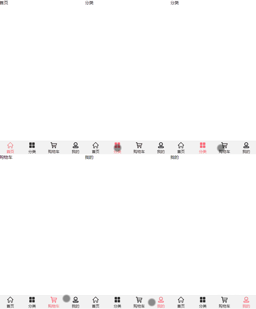
Customize vue bottom navigation bar component tabbar. The effect is as follows:

1. Basic structure construction
-
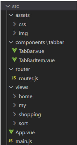
According to the idea of component encapsulation, we create several folders in advance to store the corresponding part of the code. The file results are shown in the following figure:

-
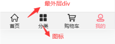
From the rendering, the bottom can be divided into two parts: the outermost frame area and the inner icon area

-
Components can be directly referenced and easily changed when needed, so we can divide the tabbar navigation bar component into two small components: tabbar vue,TabBarItem.vue
- TabBar.vue sets the appearance shape of the navigation bar component
- TabBarItem.vue is responsible for setting the style of built-in icon Chinese characters
2. Use of slot
We can't write the icons and Chinese characters in the component, so we need to use the < slot > slot to occupy the area to be filled.
3. TabBar.vue
<template>
    <div id="tab-bar">
        <slot></slot>
    </div>
</template>

<script>
export default {
    name: "TabBar",
}
</script>

<style scoped>
    #tab-bar{
        background: #f2f2f2;
        display: flex;
        position: fixed;
        left: 0;
        right: 0;
        bottom: 0;
        box-shadow: 0px -1px 1px rgba(100, 100, 100, 0.2);
    }
</style>
-
On app Used in Vue
- In the source code of the TabBar component, we use the slot to occupy the space. When we need to fill in the content, we can directly write the content into the < tab bar > < / tab bar > tag.
<template>
	<div id="app">
        <tab-bar></tab-bar>
    </div>
</template>
<script>
import TabBar from "./components/tabbar/TabBar"

export default {
  name: 'App',
  components: {
    TabBar,
  },
}
</script>
4. TabBarItem.vue
<template>
    <div class="tab-bar-item" @click="itemClick">
        <!-- Named slot -->
        <div><slot name="item-icon"></slot></div>
        <div><slot name="item-text"></slot></div>
    </div>
</template>

<script>
export default {
    name: "TabBarItem",
    data(){
        return{}
    },
}
</script>

<style scoped>
    .tab-bar-item{
        height: 49px;
        font-size: 14px;
        flex: 1;
        text-align: center;
    }
    .tab-bar-item img{
        margin-top: 3px;
        vertical-align: middle;
        margin-bottom: 2px;
    }
</style>
-
On app Used in Vue
- I only quote < tab bar item > once here. We need to quote it four times as required
- Because tabbaritem Vue uses a named slot, so the filled content may be added with the name of the corresponding slot to replace it to the correct position.
<template>
  <div id="app">
    <tab-bar>
      <tab-bar-item>
        <img slot="item-icon" src="./assets/img/home_page.svg" alt="">
        <div slot="item-text">home page</div>
      </tab-bar-item>
    </tab-bar>
  </div>
</template>

<script>
import TabBar from "./components/tabbar/TabBar"
import TabBarItem from "./components/tabbar/TabBarItem"

export default {
  name: 'App',
  components: {
    TabBar,
    TabBarItem
  },
}
</script>

<style>
@import "./assets/css/common.css";
</style>
5. Use of routing
Complete the above four steps to a basic framework, and finally connect the components with other pages through routing to realize page Jump
5.1 configuring routing
- router.js
// 1. Configure routing related information
import Vue from 'vue'
import VueRouter from 'vue-router'

const Home = () => import("../views/home/Home")
const Shopping = () => import('../views/shopping/Shopping')
const Sort = () => import('../views/sort/Sort')
const My = () => import('../views/my/My')

// 2. Install the routing plug-in
// All plug-ins need to be used, Vue use()
Vue.use(VueRouter);

// 3. Create vueroter object
const routes = [
    {
        path: '/',
        redirect: '/home'
    },
    {
        path: '/home',
        component: Home
    },
    {
        path: '/shopping',
        component: Shopping
    },
    {
        path: '/sort',
        component: Sort
    },
    {
        path: '/my',
        component: My
    }
];

const router = new VueRouter({
    // Configure the application relationship between routing and components
    routes,
    mode: 'history'
});

// 4. Pour out the routing instance object
export default router
- main.js
import Vue from 'vue'
import App from './App.vue'
import router from './router/router'

Vue.config.productionTip = false

new Vue({
  render: h => h(App),
  router,
}).$mount('#app')
5.2 using routing
-
Because we click tabbaritem The tab bar item area of Vue to realize page Jump. Then we can monitor him
- Bind him with a click event. When you click this area, you can jump to the page
<template>
    <div class="tab-bar-item" @click="itemClick"></div>
</template>
methods:{ itemClick(){ // Route jump is performed only when the current active route path is inconsistent with the transmitted one if(this.$route.path != this.link){ this.$router.push(this.link); } } } -
Realize parent-child component communication
-
Set props in the parent component app Bind the routing address to each ` ` tab bar item 'tag in Vue, and then pass the address to the sub component
- App.vue
<template> <div id="app"> <tab-bar> <tab-bar-item link="/home" activeColor="#ff6979"> <img slot="item-icon" src="./assets/img/home_page.svg" alt=""> <img slot="item-icon-active" src="./assets/img/home-page-active.svg" alt=""> <div slot="item-text">home page</div> </tab-bar-item> </tab-bar> <!-- View area --> <router-view></router-view> </div> </template>- TabBarItem.vue
export default{
    name: "TabBarItem",
    props:{
        link: String,
    },
}
-
6. Dynamically change style
Finally, let's change the style of pictures and text before and after clicking. It is black before clicking and red after clicking
-
The icon turns red when clicked
- In tabbaritem Add another slot in Vue and click to replace the original one
- Set the calculation attribute isActive and bind v-if and else to the two icon slots
- isActive is true when the current active routing path is consistent with the transmitted one, and is displayed in red
-
The font turns red after clicking
- Realize the communication between parent and child components, pass the activeColor (set font color) to the parent component through props, and receive the value returned by the parent component
- Dynamically bind style to the slot and set a calculation property activeStyle. If isActive is true, this is displayed activeColor
-
Complete code
- App.vue
<template> <div id="app"> <tab-bar> <tab-bar-item link="/home" activeColor="#ff6979"> <img slot="item-icon" src="./assets/img/home_page.svg" alt=""> <img slot="item-icon-active" src="./assets/img/home-page-active.svg" alt=""> <div slot="item-text">home page</div> </tab-bar-item> </tab-bar> <!-- View area --> <router-view></router-view> </div> </template>- TabBarItem.vue
<template>
    <div class="tab-bar-item" @click="itemClick">
        <!-- Named slot -->
        <div v-if="!isActive"><slot name="item-icon"></slot></div>
        <div v-else><slot name="item-icon-active"></slot></div>
        <div :style="activeStyle"><slot name="item-text"></slot></div>
    </div>
</template>

<script>
export default {
    name: "TabBarItem",
    props:{
        link: String,
        activeColor:{
            type: String,
        }
    },
    data(){
        return{

        }
    },
    computed:{
        isActive(){
            // Is the current active routing path consistent with the transmitted one
            // Consistent return true
            return this.$route.path.includes(this.link);
        },
        activeStyle(){
            return this.isActive ? {color: this.activeColor} : {};
        }
    },
    methods:{
        itemClick(){
            // Route jump is performed only when the current active route path is inconsistent with the transmitted one
            if(this.$route.path != this.link){
                this.$router.push(this.link);
            }
        }
    }
}
</script>

<style scoped>
    .tab-bar-item{
        height: 49px;
        font-size: 14px;
        flex: 1;
        text-align: center;
    }
    .tab-bar-item img{
        margin-top: 3px;
        vertical-align: middle;
        margin-bottom: 2px;
    }
</style>