Data visualization - ecarts - pie chart (VI)
Baidu Encyclopedia - pie chart
Echarts series
| title | address |
|---|---|
| Echarts first experience | Portal |
| Echarts general configuration | Portal |
| Histogram | Portal |
| Line chart | Portal |
| Scatter diagram | Portal |
| Echarts official website | Portal |
Basic implementation of pie chart
Implementation steps
I Build the most basic code structure of ECharts (this is the first step to implement any chart)
- Import js file (this js file can be Official website Download)
- Prepare a DOM container
- Initialize an echorts object
- Set configuration item option
You can take a look at the specific operations above
II Prepare data:
- The outermost layer of this set of data is an array
- Each element of the array is an object
- Each object contains two attributes, name and value
- For example: [{name: 'breakfast', value: '10'}, {name: 'lunch', value: '30'}]
III Chart type:
- Set the type under series in the configuration item to pie
IV Code implementation:
<!DOCTYPE html>
<html lang="en">
<head>
<meta charset="UTF-8">
<meta http-equiv="X-UA-Compatible" content="IE=edge">
<meta name="viewport" content="width=device-width, initial-scale=1.0">
<title>Basic implementation of pie chart</title>
<script src="./lib/echarts.min.js"></script>
</head>
<body>
<div id="app" style="width: 600px;height: 400px;"></div>
<script>
// 1. Creation of echarts basic structure
// Import js file - create container - initialize object - configure configuration item---
// 2. Prepare data [{name;??, value:??}, {}]
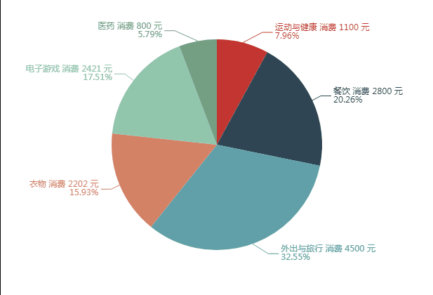
// Sports and health: 1100, catering: 2800, going out and traveling: 4500, clothing: 2202, video games: 2421, medicine: 800
// 3. Set type to pie
var myCharts = echarts.init(document.querySelector('#app'))
// Data to be set for pie chart
var pieData = [
{
name: 'Exercise and health',
value: '1100'
},
{
name: 'Restaurant',
value: '2800'
},
{
name: 'Going out and traveling',
value: '4500'
},
{
name: 'Clothing',
value: '2202'
},
{
name: 'computer game',
value: '2421'
},
{
name: 'medicine',
value: '800'
}
]
var option = {
// Note: pie chart is not a rectangular coordinate system chart, so you don't need to configure x-axis and y-axis
series: [
{
type: 'pie',
data: pieData
}
]
}
myCharts.setOption(option)
</script>
</body>
</html>
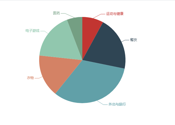
The renderings are as follows:
Common effect configuration of pie chart
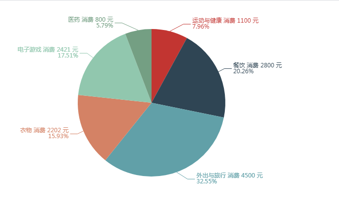
I Text display (note that this configuration is not unique to pie chart, and can also be used in histogram, line chart, map and other charts). We only need to add the following configuration under series:
label: {//Display of pie chart text
    show: true, //Default display text
    formatter: function (arg) {
        console.log(arg);
        return arg.name + ' consumption ' + arg.value + " element" +'\n'+ arg.percent + "%"
    }
}
After adding this configuration to the series, the effect diagram is as follows:
For formatter, please add here:
formatter: used to format legend text. It supports common string, string template, callback function and other forms.
Example:
// Use normal string
formatter: 'Legend'
// The string template is used, and the template variable is legend name {name}
formatter: 'Legend {name}'
// VC & Delphi
formatter: function (name) {
    return 'Legend ' + name;
}
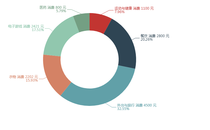
II Radius and torus effect:
To set the pie chart radius, you need to add a configuration item radius under series. Its value can be
- Exact number in px
- Percentage (here, it is calculated by half of the width and height of the DOM container)
- Array (set two radii to achieve the effect of ring)
// In the 600x400 DOM container, the icon sizes of the following two configurations are the same
radius: 40 //Radius of pie chart
radius: '20%' //Percentage refers to half of the smaller part of the width and height to set the percentage
Ring effect
//ring
radius: ['50%','80%']
design sketch:
III Nightingale map:
- Baidu Encyclopedia - Nightingale rose : the main effect of Nightingale chart is that our pie chart radius display will be different according to different value values corresponding to different regions
- To implement Nightingale diagram, you only need to add this line of code under series: roseType: 'radius'
Look at the renderings:
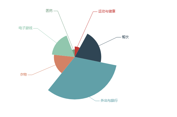
IV Selected effects:
// selectedMode: 'single' / / the selected effect can make the selected area deviate from the dot by a small distance
selectedMode: 'multiple',
selectedOffset: 30
The following effect diagram sets the selectedMode to multiple. If you are interested, you can try single or change the selectedOffset value to see what effect it has
design sketch:
Finally, the old rule, the complete code
<!DOCTYPE html>
<html lang="en">
<head>
    <meta charset="UTF-8">
    <meta http-equiv="X-UA-Compatible" content="IE=edge">
    <meta name="viewport" content="width=device-width, initial-scale=1.0">
    <title>Basic implementation of pie chart</title>
    <script src="./lib/echarts.min.js"></script>
</head>
<body>
    <div id="app" style="width: 600px;height: 400px;"></div>
    <script>
        // 1. Creation of echarts basic structure
        // Import js file - create container - initialize object - configure configuration item---
        // 2. Prepare data [{name;??, value:??}, {}]
        // Sports and health: 1100, catering: 2800, going out and traveling: 4500, clothing: 2202, video games: 2421, medicine: 800
        // 3. Set type to pie
        var myCharts = echarts.init(document.querySelector('#app'))
        // Data to be set for pie chart
        var pieData = [
            {
                name: 'Exercise and health',
                value: '1100'
            },
            {
                name: 'Restaurant',
                value: '2800'
            },
            {
                name: 'Going out and traveling',
                value: '4500'
            },
            {
                name: 'Clothing',
                value: '2202'
            },
            {
                name: 'computer game',
                value: '2421'
            },
            {
                name: 'medicine',
                value: '800'
            }

        ]
        var option = {
            // Note: pie chart is not a rectangular coordinate system chart, so you don't need to configure x-axis and y-axis
            series: [
                {
                    type: 'pie', // Type: pie chart
                    data: pieData,//data
                    label: {//Display of pie chart text
                        show: true, //Default display text
                        formatter: function (arg) {
                            console.log(arg);
                            return arg.name + ' consumption ' + arg.value + " element" +'\n'+ arg.percent + "%"
                        }
                    },
                    // radius: 20 / / radius of pie chart
                    // radius: '20%' / / set the percentage by referring to half of the smaller part of the width and height
                    // ring
                    // radius: ['50%','80%']

                    // The radius of each part of the Nightingale pie chart is different
                    // roseType: 'radius',
                    // selectedMode: 'single' / / the selected effect can make the selected area deviate from the dot by a small distance
                    selectedMode: 'multiple',
                    selectedOffset: 30
                }
            ]
        }
        myCharts.setOption(option)
    </script>
</body>
</html>