introduction:
ECharts is a data visualization chart Library Based on JavaScript, which provides intuitive, vivid, interactive and personalized data visualization charts. ECharts was originally opened by Baidu team and donated to Apache foundation in early 2018, becoming an ASF incubation project.
The most direct and effective way to learn ECharts is to look at the official website, which has everything you want. The official website address is: https://echarts.apache.org/en/index.html
Of course, I'm not talented. I wrote several articles. If you are interested, you can have a look. If it's helpful, give me a praise. Brother Kuan will still be very happy
| title | address |
|---|---|
| Eccharts first experience | Portal |
| ECharts general configuration | Portal |
| Histogram | Portal |
| ECharts official website | Portal |
Line chart
As we all know, there are five steps to use echarts for data presentation
Step 1: introduce echarts JS file
Step 2: prepare a box to present the chart (the box should be given width and height)
Step 3: initialize the ecarts instance object (remember to put the script tag behind the box that presents the chart, or window.onload)
Step 4: prepare configuration items (use ECharts to create different tables, only the configuration items will change, and other codes are fixed)
Step 5: configure the configuration item to the ecarts instance object
--------
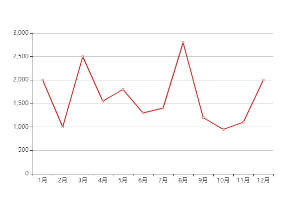
Basic implementation
Since the basic structure of line chart is not much different from that of bar chart, I will post a complete case code below
The difference lies in the type in the series, that is, type. The bar chart is bar and the line chart is line
<!DOCTYPE html>
<html lang="en">
<head>
    <meta charset="UTF-8">
    <meta name="viewport" content="width=device-width, initial-scale=1.0">
    <title>Line chart</title>
    <script src="./lib/echarts.min.js"></script>
</head>
<body>
    <div style="width: 600px;height: 400px;"></div>
    <script>
        var oDiv = document.querySelector('div');
        var xDataArr = ['1 month','2 month','3 month','4 month','5 month','6 month','7 month','8 month','9 month','10 month','11 month','12 month'],
        yDataArr = [2000,1000,2500,1550,1800,1300,1400,2800,1200,950,1100,2000];
        var mCharts = echarts.init(oDiv);
        var option = {
            type: 'line',
            name: 'sales volume',
            xAxis:{
               type: 'category',
               data: xDataArr
            },
            yAxis:{
               type: 'value'
            },
            series: {
            name: 'Sales volume of white elephant instant noodles',
            type: 'line',
            data: yDataArr

            }
        }
        mCharts.setOption(option)
    </script>
</body>
</html>
If you have doubts about the above code, you can look at the previous articles in the transmission door at the beginning of the article.
The above code runs on the browser, and the effect is like this
Style style
Similarly, the line chart also has the corresponding maximum value, minimum value, average value and other styles, and the method is also consistent with the histogram. There will be no more description here.
You can look at the histogram Data visualization - ecarts - histogram
Here we mainly talk about the differences between line chart and bar chart
Mark area
Write this code in the series. Note:
- The value of markArea must be an object
- There is an attribute data in markArea, and its value is an array
- The two arrays in the array are actually marked intervals
- The two objects are equivalent to the X-axis coordinates
markArea: {
   data: [
      [
         {xAxis:'1 month'},
         {xAxis:'2 month'}
      ],
      [
         {xAxis:'7 month'},
         {xAxis:'10 month'}
      ]
  	]
 }
smooth curve
Write this code in the series. This line of code is equivalent to markArea and markPoint
// Whether it is a smooth curve. The default is false
smooth: true,
Line style
Here, you can set the style of broken lines, including virtual and real lines, color, thickness, etc;
lineStyle: {
       color: 'green',
       // dashed dotted dotted solid
        type: 'solid'
 }
Fill style (areaStyle)
Write this line of code in the series
areaStyle: {
     color: 'yellow'
}
This is the case in the browser
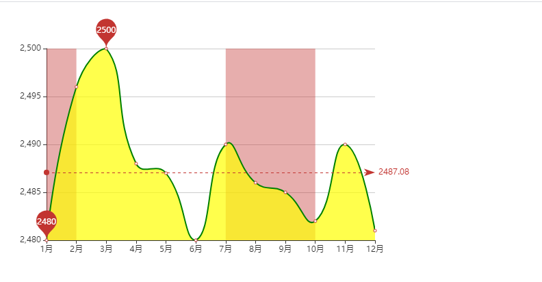
Forget the following two brothers:
scale: true ------ This should be written on the configuration of the value axisThe strategy of leaving blank on both sides of the coordinate axis is false
boundaryGap: false -------- this can be written in the category axis
The code is as follows:
<!DOCTYPE html>
<html lang="en">
<head>
    <meta charset="UTF-8">
    <meta name="viewport" content="width=device-width, initial-scale=1.0">
    <title>Line chart</title>
    <script src="./lib/echarts.min.js"></script>
</head>
<body>
    <div style="width: 600px;height: 400px;"></div>
    <script>
        var oDiv = document.querySelector('div');
        var xDataArr = ['1 month','2 month','3 month','4 month','5 month','6 month','7 month','8 month','9 month','10 month','11 month','12 month'],
        // yDataArr = [2000,1000,2500,1550,1800,1300,1400,2800,1200,950,1100,2000];
        yDataArr = [2480,2496,2500,2488,2487,2480,2490,2486,2485,2482,2490,2481];
        var mCharts = echarts.init(oDiv);
        var option = {
            xAxis:{
                type: 'category',
                data: xDataArr,
                //The coordinates on both sides are not left blank
                boundaryGap: false
            },
            yAxis:{
               type: 'value',
                //    boundaryGap: true
                // Scale, scale off 0 value
                scale: true
            },
            series: {
                name: 'Sales volume of white elephant instant noodles',
                type: 'line',
                data: yDataArr,
                // Maximum, minimum
                markPoint: {
                    data: [
                        {
                            type: 'max',name: 'Maximum'
                        },
                        {
                            type: 'min',name: 'minimum value'
                        }
                    ]
                },
                // average value
                markLine: {
                    data: [
                        {type: 'average',name: 'average value'}
                    ]
                },
                // Marking area
                markArea: {
                    data: [
                        [
                            {xAxis:'1 month'},
                            {xAxis:'2 month'}
                        ],
                        [
                            {xAxis:'7 month'},
                            {xAxis:'10 month'}
                        ]
                    ]
                },
                // Is it a smooth curve
                smooth: true,
                // Line style
                lineStyle: {
                    color: 'green',
                    // dashed dotted dotted solid
                    type: 'solid'
                },
                // Fill style
                areaStyle: {
                    color: 'yellow'
                }
            }
        }
        mCharts.setOption(option)
    </script>
</body>
</html>
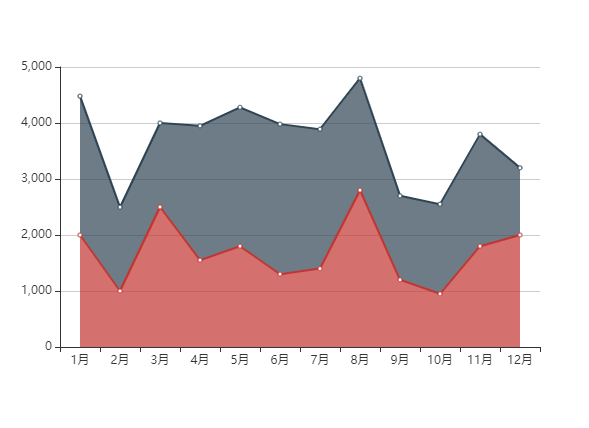
Stacking diagram
In fact, what we often use in our work is a chart called stack chart, which is actually a changed line chart
The key here is to configure the same stack value on the same category axis
<!DOCTYPE html>
<html lang="en">
<head>
    <meta charset="UTF-8">
    <meta name="viewport" content="width=device-width, initial-scale=1.0">
    <title>Stacking diagram</title>
    <script src="./lib/echarts.min.js"></script>
</head>
<body>
    <!--
        Data stack, with the same series configuration on the same category axis stack Value, the values of the latter series are added to the values of the previous series.
     -->
    <div style="width: 600px;height: 400px;"></div>
    <script>
        var oDiv = document.querySelector('div');
        var xDataArr = ['1 month','2 month','3 month','4 month','5 month','6 month','7 month','8 month','9 month','10 month','11 month','12 month'],
        yDataArr = [2000,1000,2500,1550,1800,1300,1400,2800,1200,950,1800,2000],
        yDataArr2 = [2480,1496,1500,2400,2480,2680,2490,2000,1500,1600,2000,1200];

        var mCharts = echarts.init(oDiv);
        var option = {
            xAxis:{
               type: 'category',
               data: xDataArr
            },
            yAxis:{
               type: 'value'
            },
            series: [
                {
                    name: 'Sales volume of white elephant instant noodles',
                    type: 'line',
                    data: yDataArr,
                    // The stack graph mainly depends on the stack attribute. The stack value of each object in the series should be maintained all the time
                    stack: 'all',
                    areaStyle: {}
                },
                {
                    name: 'Unified instant noodle sales',
                    type: 'line',
                    data: yDataArr2,
                    stack: 'all',
                    areaStyle: {}
                }
            ]
        }
        mCharts.setOption(option)
    </script>
</body>
</html>
The effect is as follows