preface
through seven articles, we give you a general introduction to the production process of data visualization, Of course, this project is also written by Eric Matthes "Python programming from introduction to practice" is a project in the book. However, I introduce this project to you through certain features and through the way I learn the project. From environment construction to subsequent step-by-step implementation. Of course, with the deepening of the project, the amount of code is increasing. In order to facilitate your reading, we just introduce the code method corresponding to the implementation function He wrote. Today, we give you the complete code of the project to give you a complete effect. However, readers are strongly encouraged to read from the beginning of this project. In this way, I believe you will benefit a lot. If you simply paste all the code in this article, it's useless. Maybe you don't even know the whole framework of this project. It should be noted here that since this project is data visualization, it is different from the previous project—— Alien invasion There are still some differences. Alien invasion is a small part of a module implementation project. It depends on all the code of the project to run. For example, we introduced earlier Armed spacecraft , we can't run with this piece of code alone. However, our data visualization is different. Each module is independent of each other, there is no necessary connection, and the coupling is very low. We mainly introduce the acquisition of data and the specific use of API, analyze our existing data, and teach us how to make some beautiful charts.
Project overview
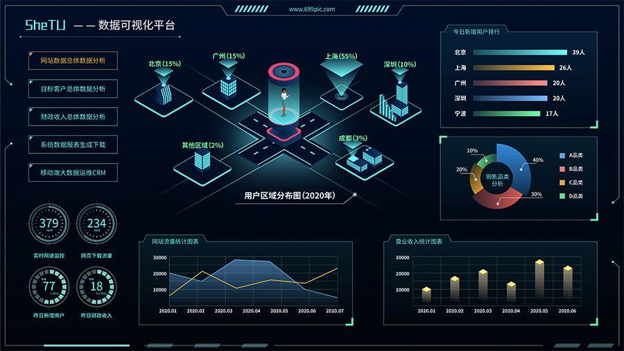
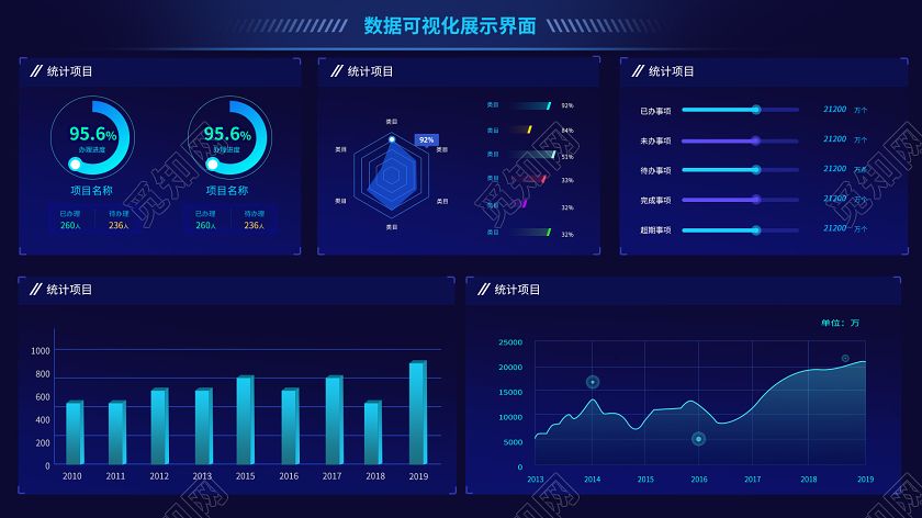
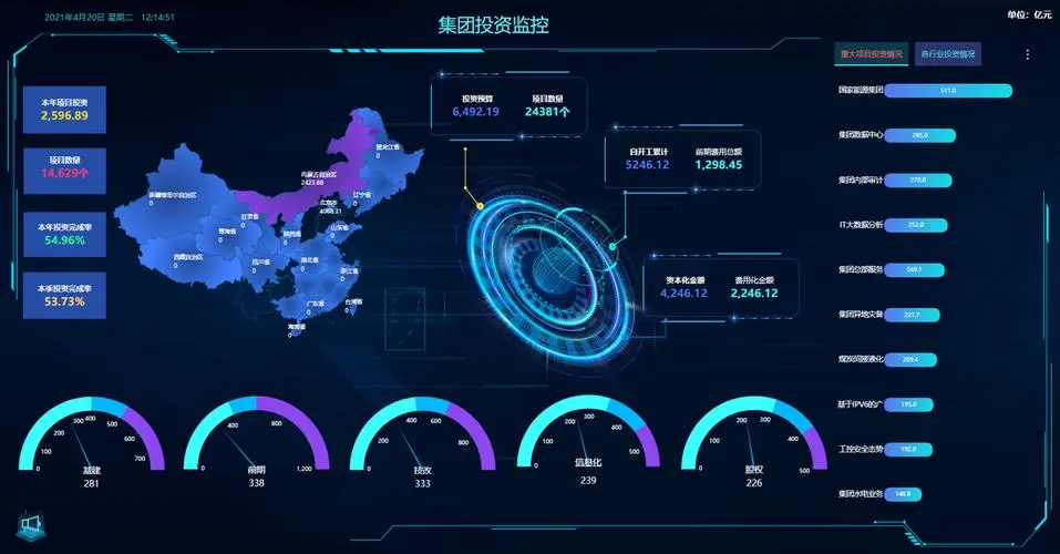
data visualization refers to exploring data through visual representation. It is closely related to data mining. In fact, accurately speaking, it is one of the links of data mining and artificial intelligence, and data mining refers to using code to explore the laws and associations of data sets. A dataset can be a small list of numbers that can be represented in one line of code, or it can be a more intuitive picture. The specific effects are as follows:


presenting data beautifully is not just about beautiful pictures. Present the data in a striking and concise way, so that users can clearly and intuitively understand the meaning behind the data, so as to better control the laws. The first thing this project introduces to you is to solve the problem of data, because the premise of data visualization is that we must have data first. It is mainly introduced to you through three articles Generate data That is, in the absence of data, we should generate some data for our analysis; Through two articles Download data ; With the data, the last is to introduce you through two articles Specific use and analysis of API.
however, this article only introduces some small methods, such as how to draw histogram and broken line chart. If readers want to learn this knowledge, there are a lot of online tutorials. You can learn it at once. It is relatively simple, there are many applications, and the cost performance is very good. Let's introduce all the codes in this project. It is convenient for everyone to refer to as a whole.
Complete code
1,dice_ visual. Implementation of PY
import pygal

from die import Die

# Create two D6 dice.
die_1 = Die()
die_2 = Die()

# Make some rolls, and store results in a list.
results = []
for roll_num in range(1000):
    result = die_1.roll() + die_2.roll()
    results.append(result)

# Analyze the results.
frequencies = []
max_result = die_1.num_sides + die_2.num_sides
for value in range(2, max_result+1):
    frequency = results.count(value)
    frequencies.append(frequency)

# Visualize the results.
hist = pygal.Bar()
hist.force_uri_protocol = 'http'

hist.title = "Results of rolling two D6 dice 1000 times."
hist.x_labels = ['2', '3', '4', '5', '6', '7', '8', '9', '10', '11', '12']
hist.x_title = "Result"
hist.y_title = "Frequency of Result"

hist.add('D6 + D6', frequencies)
hist.render_to_file('dice_visual.svg')
2,die. Implementation of PY
from random import randint

class Die():
    """A class representing a single die."""

    def __init__(self, num_sides=6):
        """Assume a six-sided die."""
        self.num_sides = num_sides

    def roll(self):
        """"Return a random value between 1 and number of sides."""
        return randint(1, self.num_sides)
3,die_ visual. Implementation of PY
import pygal

from die import Die

# Create a D6.
die = Die()

# Make some rolls, and store results in a list.
results = []
for roll_num in range(1000):
    result = die.roll()
    results.append(result)

# Analyze the results.
frequencies = []
for value in range(1, die.num_sides+1):
    frequency = results.count(value)
    frequencies.append(frequency)

# Visualize the results.
hist = pygal.Bar()
hist.force_uri_protocol = 'http'

hist.title = "Results of rolling one D6 1000 times."
hist.x_labels = ['1', '2', '3', '4', '5', '6']
hist.x_title = "Result"
hist.y_title = "Frequency of Result"

hist.add('D6', frequencies)
hist.render_to_file('die_visual.svg')
4,different_ dice. Implementation of PY
from die import Die

import pygal

# Create a D6 and a D10.
die_1 = Die()
die_2 = Die(10)

# Make some rolls, and store results in a list.
results = []
for roll_num in range(50000):
    result = die_1.roll() + die_2.roll()
    results.append(result)

# Analyze the results.
frequencies = []
max_result = die_1.num_sides + die_2.num_sides
for value in range(2, max_result+1):
    frequency = results.count(value)
    frequencies.append(frequency)

# Visualize the results.
hist = pygal.Bar()
hist.force_uri_protocol = 'http'

hist.title = "Results of rolling a D6 and a D10 50,000 times."
hist.x_labels = ['2', '3', '4', '5', '6', '7', '8', '9', '10', '11', '12',
    '13', '14', '15', '16']
hist.x_title = "Result"
hist.y_title = "Frequency of Result"

hist.add('D10 + D10', frequencies)
hist.render_to_file('dice_visual.svg')
5,mpl_ squares. Implementation of PY
import matplotlib.pyplot as plt

input_values = [1, 2, 3, 4, 5]
squares = [1, 4, 9, 16, 25]
plt.plot(input_values, squares, linewidth=5)

# Set chart title and label axes.
plt.title("Square Numbers", fontsize=24)
plt.xlabel("Value", fontsize=14)
plt.ylabel("Square of Value", fontsize=14)

# Set size of tick labels.
plt.tick_params(axis='both', labelsize=14)

plt.show()
6,random_ walk. Implementation of PY
from random import choice

class RandomWalk():
    """A class to generate random walks."""

    def __init__(self, num_points=5000):
        """Initialize attributes of a walk."""
        self.num_points = num_points

        # All walks start at (0, 0).
        self.x_values = [0]
        self.y_values = [0]

    def fill_walk(self):
        """Calculate all the points in the walk."""

        # Keep taking steps until the walk reaches the desired length.
        while len(self.x_values) < self.num_points:

            # Decide which direction to go, and how far to go in that direction.
            x_direction = choice([1, -1])
            x_distance = choice([0, 1, 2, 3, 4])
            x_step = x_direction * x_distance

            y_direction = choice([1, -1])
            y_distance = choice([0, 1, 2, 3, 4])
            y_step = y_direction * y_distance

            # Reject moves that go nowhere.
            if x_step == 0 and y_step == 0:
                continue

            # Calculate the next x and y values.
            next_x = self.x_values[-1] + x_step
            next_y = self.y_values[-1] + y_step

            self.x_values.append(next_x)
            self.y_values.append(next_y)
7,rw_ visual. Implementation of PY
import matplotlib.pyplot as plt

from random_walk import RandomWalk

# Keep making new walks, as long as the program is active.
while True:
    # Make a random walk, and plot the points.
    rw = RandomWalk(50000)
    rw.fill_walk()

    # Set the size of the plotting window.
    plt.figure(dpi=128, figsize=(10, 6))

    point_numbers = list(range(rw.num_points))
    plt.scatter(rw.x_values, rw.y_values, c=point_numbers, cmap=plt.cm.Blues,
        edgecolor='none', s=1)

    # Emphasize the first and last points.
    plt.scatter(0, 0, c='green', edgecolors='none', s=100)
    plt.scatter(rw.x_values[-1], rw.y_values[-1], c='red', edgecolors='none',
        s=100)

    # Remove the axes.
    plt.axes().get_xaxis().set_visible(False)
    plt.axes().get_yaxis().set_visible(False)

    plt.show()

    keep_running = input("Make another walk? (y/n): ")
    if keep_running == 'n':
        break
8,scatter_ squares. Implementation of PY
import matplotlib.pyplot as plt

x_values = list(range(1, 1001))
y_values = [x**2 for x in x_values]

plt.scatter(x_values, y_values, c=(0, 0, 0.8), edgecolor='none', s=40)

# Set chart title, and label axes.
plt.title("Square Numbers", fontsize=24)
plt.xlabel("Value", fontsize=14)
plt.ylabel("Square of Value", fontsize=14)

# Set size of tick labels.
plt.tick_params(axis='both', which='major', labelsize=14)

# Set the range for each axis.
plt.axis([0, 1100, 0, 1100000])

plt.show()
9,highs_ lows. Implementation of PY
import csv
from datetime import datetime

from matplotlib import pyplot as plt

# Get dates, high, and low temperatures from file.
filename = 'death_valley_2014.csv'
with open(filename) as f:
    reader = csv.reader(f)
    header_row = next(reader)

    dates, highs, lows = [], [], []
    for row in reader:
        try:
            current_date = datetime.strptime(row[0], "%Y-%m-%d")
            high = int(row[1])
            low = int(row[3])
        except ValueError:
            print(current_date, 'missing data')
        else:
            dates.append(current_date)
            highs.append(high)
            lows.append(low)

# Plot data.
fig = plt.figure(dpi=128, figsize=(10, 6))
plt.plot(dates, highs, c='red', alpha=0.5)
plt.plot(dates, lows, c='blue', alpha=0.5)
plt.fill_between(dates, highs, lows, facecolor='blue', alpha=0.1)

# Format plot.
title = "Daily high and low temperatures - 2014\nDeath Valley, CA"
plt.title(title, fontsize=20)
plt.xlabel('', fontsize=16)
fig.autofmt_xdate()
plt.ylabel("Temperature (F)", fontsize=16)
plt.tick_params(axis='both', which='major', labelsize=16)

plt.show()
10,btc_close_2017.py implementation
from __future__ import (absolute_import, division, print_function,
                        unicode_literals)
try:
    # Python 2.x version
    from urllib2 import urlopen
except ImportError:
    # Python 3.x version
    from urllib.request import urlopen  # 1
import json
import requests
import pygal
import math
from itertools import groupby


json_url = 'https://raw.githubusercontent.com/muxuezi/btc/master/btc_close_2017.json'
response = urlopen(json_url)  # 2
# Read data
req = response.read()
# Write data to file
with open('btc_close_2017_urllib.json', 'wb') as f:  # 3
    f.write(req)
# Load json format
file_urllib = json.loads(req.decode('utf8'))  # 4
print(file_urllib)


json_url = 'https://raw.githubusercontent.com/muxuezi/btc/master/btc_close_2017.json'
req = requests.get(json_url)  # 1
# Write data to file
with open('btc_close_2017_request.json', 'w') as f:
    f.write(req.text)  # 2
file_requests = req.json()  # 3


print(file_urllib == file_requests)


# Load data into a list
filename = 'btc_close_2017.json'
with open(filename) as f:
    btc_data = json.load(f)  # 1

# Print information for each day
for btc_dict in btc_data:
    date = btc_dict['date']
    month = int(btc_dict['month'])
    week = int(btc_dict['week'])
    weekday = btc_dict['weekday']
    close = int(float(btc_dict['close']))  # 1
    print("{} is month {} week {}, {}, the close price is {} RMB".format(
        date, month, week, weekday, close))


# Create 5 lists to store the date and closing price respectively
dates = []
months = []
weeks = []
weekdays = []
close = []
# Daily information
for btc_dict in btc_data:
    dates.append(btc_dict['date'])
    months.append(int(btc_dict['month']))
    weeks.append(int(btc_dict['week']))
    weekdays.append(btc_dict['weekday'])
    close.append(int(float(btc_dict['close'])))

line_chart = pygal.Line(x_label_rotation=20, show_minor_x_labels=False)  # ①
line_chart.title = 'Closing price(¥)'
line_chart.x_labels = dates
N = 20  # The x-axis coordinates are displayed every 20 days
line_chart.x_labels_major = dates[::N]  # ②
line_chart.add('Closing price', close)
line_chart.render_to_file('Closing price line chart(¥).svg')


line_chart = pygal.Line(x_label_rotation=20, show_minor_x_labels=False)
line_chart.title = 'Logarithmic transformation of closing price(¥)'
line_chart.x_labels = dates
N = 20  # The x-axis coordinates are displayed every 20 days
line_chart.x_labels_major = dates[::N]
close_log = [math.log10(_) for _ in close]  # ①
line_chart.add('log Closing price', close_log)
line_chart.render_to_file('Log conversion line chart of closing price(¥).svg')
line_chart


def draw_line(x_data, y_data, title, y_legend):
    xy_map = []
    for x, y in groupby(sorted(zip(x_data, y_data)), key=lambda _: _[0]):  # 2
        y_list = [v for _, v in y]
        xy_map.append([x, sum(y_list) / len(y_list)])  # 3
    x_unique, y_mean = [*zip(*xy_map)]  # 4
    line_chart = pygal.Line()
    line_chart.title = title
    line_chart.x_labels = x_unique
    line_chart.add(y_legend, y_mean)
    line_chart.render_to_file(title + '.svg')
    return line_chart


idx_month = dates.index('2017-12-01')
line_chart_month = draw_line(
    months[:idx_month], close[:idx_month], 'Monthly and daily average closing price(¥)', 'Monthly daily average')
line_chart_month


idx_week = dates.index('2017-12-11')
line_chart_week = draw_line(
    weeks[1:idx_week], close[1:idx_week], 'Daily average closing price(¥)', 'Daily mean')
line_chart_week


idx_week = dates.index('2017-12-11')
wd = ['Monday', 'Tuesday', 'Wednesday',
      'Thursday', 'Friday', 'Saturday', 'Sunday']
weekdays_int = [wd.index(w) + 1 for w in weekdays[1:idx_week]]
line_chart_weekday = draw_line(
    weekdays_int, close[1:idx_week], 'Weekly average closing price(¥)', 'Weekly average')
line_chart_weekday.x_labels = ['Monday', 'Tuesday', 'Wednesday', 'Thursday', 'Friday', 'Saturday', 'Sunday']
line_chart_weekday.render_to_file('Weekly average closing price(¥).svg')
line_chart_weekday


with open('Closing price Dashboard.html', 'w', encoding='utf8') as html_file:
    html_file.write(
        '<html><head><title>Closing price Dashboard</title><meta charset="utf-8"></head><body>\n')
    for svg in [
            'Closing price line chart(¥).svg', 'Log conversion line chart of closing price(¥).svg', 'Monthly and daily average closing price(¥).svg',
            'Daily average closing price(¥).svg', 'Weekly average closing price(¥).svg'
    ]:
        html_file.write(
            '    <object type="image/svg+xml" data="{0}" height=500></object>\n'.format(svg))  # 1
    html_file.write('</body></html>')
11,bar_ descriptions. Implementation of PY
import pygal
from pygal.style import LightColorizedStyle as LCS, LightenStyle as LS

my_style = LS('#333366', base_style=LCS)
chart = pygal.Bar(style=my_style, x_label_rotation=45, show_legend=False)

chart.title = 'Python Projects'
chart.x_labels = ['httpie', 'django', 'flask']
chart.force_uri_protocol = 'http'

plot_dicts = [
    {'value': 16101, 'label': 'Description of httpie.'},
    {'value': 15028, 'label': 'Description of django.'},
    {'value': 14798, 'label': 'Description of flask.'},
    ]

chart.add('', plot_dicts)
chart.render_to_file('bar_descriptions.svg')
12,python_ repos. Implementation of PY
import requests
import pygal
from pygal.style import LightColorizedStyle as LCS, LightenStyle as LS

# Make an API call, and store the response.
url = 'https://api.github.com/search/repositories?q=language:python&sort=stars'
r = requests.get(url)
print("Status code:", r.status_code)

# Store API response in a variable.
response_dict = r.json()
print("Total repositories:", response_dict['total_count'])

# Explore information about the repositories.
repo_dicts = response_dict['items']

names, plot_dicts = [], []
for repo_dict in repo_dicts:
    names.append(repo_dict['name'])

    plot_dict = {
        'value': repo_dict['stargazers_count'],
        'label': repo_dict['description'],
        'xlink': repo_dict['html_url'],
        }
    plot_dicts.append(plot_dict)

# Make visualization.
my_style = LS('#333366', base_style=LCS)

my_config = pygal.Config()
my_config.force_uri_protocol = 'http'
my_config.x_label_rotation = 45
my_config.show_legend = False
my_config.title_font_size = 24
my_config.label_font_size = 14
my_config.major_label_font_size = 18
my_config.truncate_label = 15
my_config.show_y_guides = False
my_config.width = 1000

chart = pygal.Bar(my_config, style=my_style)
chart.title = 'Most-Starred Python Projects on GitHub'
chart.x_labels = names

chart.add('', plot_dicts)
chart.render_to_file('python_repos.svg')
13,hn_ submissions. Implementation of PY
import requests

from operator import itemgetter

# Make an API call, and store the response.
url = 'https://hacker-news.firebaseio.com/v0/topstories.json'
r = requests.get(url)
print("Status code:", r.status_code)

# Process information about each submission.
submission_ids = r.json()
submission_dicts = []
for submission_id in submission_ids[:30]:
    # Make a separate API call for each submission.
    url = ('https://hacker-news.firebaseio.com/v0/item/' +
            str(submission_id) + '.json')
    submission_r = requests.get(url)
    print(submission_r.status_code)
    response_dict = submission_r.json()

    submission_dict = {
        'title': response_dict['title'],
        'link': 'http://news.ycombinator.com/item?id=' + str(submission_id),
        'comments': response_dict.get('descendants', 0)
        }
    submission_dicts.append(submission_dict)

submission_dicts = sorted(submission_dicts, key=itemgetter('comments'),
                            reverse=True)

for submission_dict in submission_dicts:
    print("\nTitle:", submission_dict['title'])
    print("Discussion link:", submission_dict['link'])
    print("Comments:", submission_dict['comments'])
this is the complete code of this article. I hope readers can have a clear understanding and a deeper understanding of the application of their basic Python knowledge.
Implementation process of each module
1. Generate data
[1].Generate data (Part 1)
[2].Generate data (medium)
[3].Generate data (Part 2)
2. Download data
[1].Download data (I)
[2].Download data (Part 2)
3. Use API
[1].Using API (I)
[2].Using API (Part 2)
this is the implementation details of each module of our project. You can read it carefully and it will be helpful for you in future data analysis.
summary
this paper summarizes the data visualization project, from requirement analysis to code structure, and gives the complete code of the project. Finally, it summarizes the article links of each function realization in front, which is convenient for everyone to read. Python is a language that pays attention to practical operation. It is the simplest and the best entry among many programming languages. When you learn the language, it's easier to learn java, go and C. Of course, Python is also a popular language, which is very helpful for the implementation of artificial intelligence. Therefore, it is worth your time to learn. We live and struggle. We work hard every day, study hard, and constantly improve our ability. I believe we will learn something. come on.