Generate data
Install matplotlib
- Input: pip install matplotlib in PyCharm terminal
- Or visit https://pypi.python.org/pypi/matplotlib/ , and find the wheel file (file with. whl extension) that matches the Python version you are using.
Take this Copy the whl file to your project folder, open a command window, switch to the project folder, and then use pip to install matplotli
> cd python_work
> python_work> python -m pip install --user matplotlib-1.4.3-cp35-none-win32.whl
Draw a simple line chart
Let's use matplotlib to draw a simple line chart, and then customize it to realize more informative data visualization. We will use the square number sequences 1, 4, 9, 16 and 25 to plot this chart. Just provide the following numbers to matplotlib, and matplotlib can complete other tasks:
import matplotlib.pyplot as plt
squares = [1, 4, 9, 16, 25]
plt.plot(squares)
plt.show()
The operation results are as follows: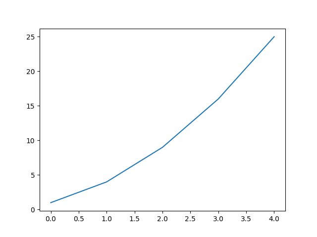
Change label text and line thickness
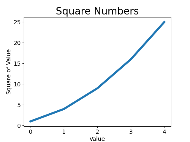
The figure above shows that the number is getting larger and larger, but the label text is too small and the lines are too thin. Fortunately, matplotlib allows you to adjust all aspects of visualization.
Here are some customizations to improve the readability of this graphic. The code is as follows:
import matplotlib.pyplot as plt
squares = [1, 4, 9, 16, 25]
plt.plot(squares, linewidth=5)
# Set the chart title and label the axis
plt.title("Square Numbers", fontsize=24)
plt.xlabel("Value", fontsize=14)
plt.ylabel("Square of Value", fontsize=14)
# Sets the size of the tick mark
plt.tick_params(axis='both', labelsize=14)
plt.show()
The parameter linewidth determines the thickness of the line drawn by plot(). The function title() assigns a title to the chart. In the above code, the parameter fontsize appears multiple times, which specifies the size of the text in the chart. The functions xlabel() and ylabel() let you set the title for each axis; And the function tick_params() sets the style of the scale, where the specified argument will affect the scale on the x-axis and y-axis (axes='both ') and set the font size of the scale mark to 14 (labelsize=14).
The final chart is much easier to read, as shown in the figure below: the label text is larger and the lines are thicker.
Correction graphics
After the graph is easier to read, we find that the data is not drawn correctly: the end point of the line graph indicates that the square of 4.0 is 25! Let's fix this problem. When you provide a series of numbers to plot (), it assumes that the X coordinate value corresponding to the first data point is 0, but the x value corresponding to our first point is 1. To change this default behavior, we can provide both input and output values to plot():
import matplotlib.pyplot as plt
input_values = [1, 2, 3, 4, 5]
squares = [1, 4, 9, 16, 25]
plt.plot(input_values, squares, linewidth=5)
# Set the chart title and label the axis
plt.title("Square Numbers", fontsize=24)
plt.xlabel("Value", fontsize=14)
plt.ylabel("Square of Value", fontsize=14)
# Sets the size of the tick mark
plt.tick_params(axis='both', labelsize=14)
plt.show()
Now plot() will plot the data correctly because we provide both input and output values, and it does not need to make assumptions about how the output values are generated. The final figure is correct, as shown in the figure below.

Use scatter() to draw a scatter chart and style it
Sometimes, you need to draw a scatter chart and set the style of each data point. For example, you might want to display smaller values in one color and larger values in another color. When drawing a large dataset, you can also set the same style for each point, and then redraw some points with different style options to highlight them. To draw a single point, use the function scatter() and pass it a pair of x and y coordinates, which will draw a point at the specified position:
import matplotlib.pyplot as plt
plt.scatter(2, 4, s=200)
# Set the chart title and label the axis
plt.title("Square Numbers", fontsize=24)
plt.xlabel("Value", fontsize=14)
plt.ylabel("Square of Value", fontsize=14)
# Sets the size of the tick mark
plt.tick_params(axis='both', which='major', labelsize=14)
plt.show()
The operation results are as follows: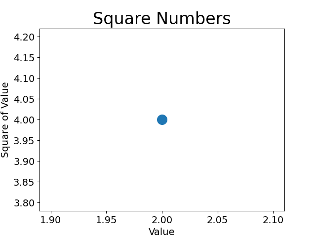
Draw a series of points using scatter()
To draw a series of points, pass scatter() two lists containing x and y values, as follows:
import matplotlib.pyplot as plt
x_values = [1, 2, 3, 4, 5]
y_values = [1, 4, 9, 16, 25]
plt.scatter(x_values, y_values, s=100)
# Set the chart title and label the axis
plt.title("Square Numbers", fontsize=24)
plt.xlabel("Value", fontsize=14)
plt.ylabel("Square of Value", fontsize=14)
# Sets the size of the tick mark
plt.tick_params(axis='both', which='major', labelsize=14)
plt.show()
The operation results are as follows: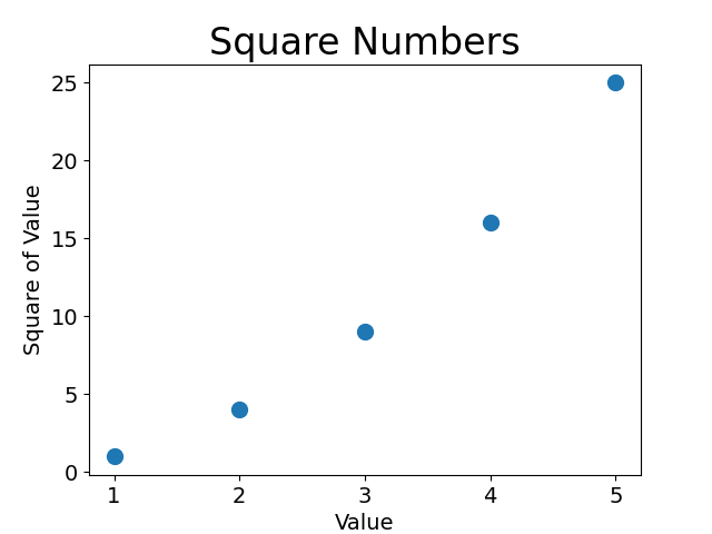
Automatically calculate data
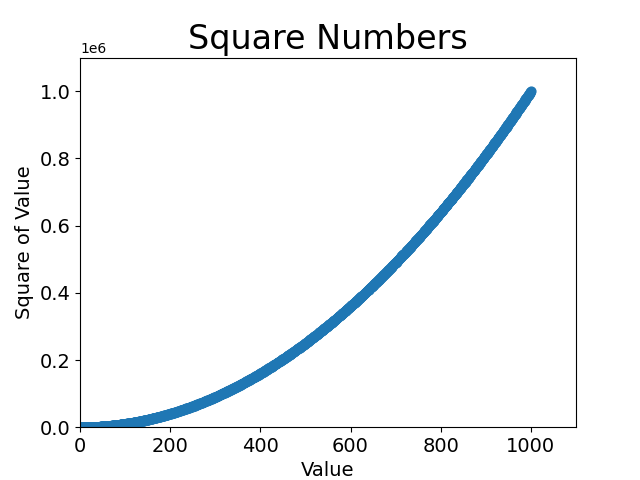
We first created a list of X values with numbers 1 to 1000. Next is a list parsing that generates Y values. It traverses the X values (for x in x_values), calculates its square value (x2), and stores the results in the list y_values. Then, it passes the input list and output list to scatter(). Due to the large data set, we set the points smaller and use the function axis() to specify the value range of each coordinate axis. The function axis() requires four values: the minimum and maximum values of the X and Y axes. Here, we set the value range of the x-axis to 0 ~ 1100 and the value range of the y-axis to 0 ~ 1 100 000.
import matplotlib.pyplot as plt
x_values = list(range(1, 1001))
y_values = [x**2 for x in x_values]
plt.scatter(x_values, y_values, s=40)
# Set the chart title and label the axis
plt.title("Square Numbers", fontsize=24)
plt.xlabel("Value", fontsize=14)
plt.ylabel("Square of Value", fontsize=14)
# Sets the size of the tick mark
plt.tick_params(axis='both', which='major', labelsize=14)
plt.axis([0, 1100, 0, 1100000])
plt.show()
The operation results are as follows:
Delete outline of data point
matplotlib allows you to assign colors to individual points in a scatter diagram. The default is blue dot and black outline, which works well when the scatter chart contains few data points. However, when drawing many points, the black outlines may stick together. To delete the outline of a data point, pass the argument edgecolor='none 'when calling scatter():
plt.scatter(x_values, y_values, edgecolor='none', s=40)
After modifying the corresponding call to the above code, if you run the program again, you will see a blue solid dot in the chart.
Custom color
To modify the color of the data point, pass the parameter c to scatter() and set it to the name of the color to use, as follows:
plt.scatter(x_values, y_values, c='red', edgecolor='none', s=40)
You can also customize colors using RGB color mode. To specify a custom color, pass the parameter c and set it to a tuple containing three small values between 0 and 1, which represent the red, green and blue components respectively. For example, the following code line creates a scatter chart consisting of light blue dots:
plt.scatter(x_values, y_values, c=(0, 0, 0.8), edgecolor='none', s=40)
The closer the value is to 0, the darker the color specified, and the closer the value is to 1, the lighter the color specified.
Use color mapping
A color map is a series of colors that gradually change from the start color to the end color. In visualization, color mapping is used to highlight the laws of data. For example, you may use lighter colors to display smaller values and darker colors to display larger values.
The module pyplot has a set of color mappings built in. To use these color maps, you need to tell pyplot how to set the color of each point in the dataset. The following shows how to set the color of each point according to its y value:
import matplotlib.pyplot as plt
x_values = list(range(1, 1001))
y_values = [x**2 for x in x_values]
plt.scatter(x_values, y_values, c=y_values, cmap=plt.cm.Blues, edgecolor='none', s=40)
# Set the chart title and label the axis
plt.title("Square Numbers", fontsize=24)
plt.xlabel("Value", fontsize=14)
plt.ylabel("Square of Value", fontsize=14)
# Sets the size of the tick mark
plt.tick_params(axis='both', which='major', labelsize=14)
plt.axis([0, 1100, 0, 1100000])
plt.show()
We set the parameter c to a list of Y values and use the parameter cmap to tell pyplot which color mapping to use. These codes display the points with small y value as light blue and the points with large y value as dark blue. The generated graphics are as follows:
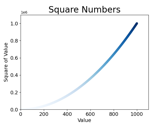
Note: to learn about all color mappings in pyplot, visit http://matplotlib.org/ , click Examples, scroll down to Color Examples, and then click color maps_ reference.
Auto save chart
To have the program automatically save the chart to a file Replace the call to show() with a call to PLT Call to savefig():
plt.savefig('squares_plot.png', bbox_inches='tight')
The first argument specifies what file name to save the chart in, which will be stored in scatter_squares.py directory; The second argument specifies to crop out the extra white space in the chart. If you want to leave extra white space around the chart, you can omit this argument.