preface
ConstraintLayout is a layout that uses "relative positioning" to flexibly determine the location and size of widgets. It was launched in Google I/O in 2016. Its emergence is to solve the problem of too complex page hierarchy nesting in development - too deep hierarchy will increase the time required to draw the interface and affect the user experience, Position and adjust widgets in a flexible way.
Since Android Studio 2.3, creating a layout file has been the default ConstraintLayout. However, despite Google's strong promotion of this technology, it was rarely used at that time. It has been gradually taken up by everyone in recent years. Ah, it's delicious! (no picture here is better than a picture). At present, the official version of ConstraintLayout has been updated to 2.0.4. This article will lead you to familiarize yourself with all the contents of ConstraintLayout.
Use of layout
Position constraint
ConstraintLayout uses directional constraints to locate the control. At least one constraint in the horizontal and vertical directions is required to determine the position of the control
- Basic direction constraint
For example, we want to achieve this position. The top is aligned with the top of the interface, and the left is aligned with the left of the interface:
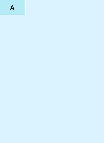
image
<?xml version="1.0" encoding="utf-8"?>
<androidx.constraintlayout.widget.ConstraintLayout xmlns:android="http://schemas.android.com/apk/res/android"
    xmlns:app="http://schemas.android.com/apk/res-auto"
    xmlns:tools="http://schemas.android.com/tools"
    android:layout_width="match_parent"
    android:layout_height="match_parent"
    android:background="#DAF3FE"
    tools:context=".MainActivity">
    <TextView
        android:layout_width="100dp"
        android:layout_height="60dp"
        android:background="@drawable/tv_bg"
        android:gravity="center"
        android:text="A"
        android:textColor="@color/black"
        android:textSize="25sp"
        android:textStyle="bold"
        app:layout_constraintStart_toStartOf="parent"
        app:layout_constraintTop_toTopOf="parent"
        tools:ignore="HardcodedText" />
</androidx.constraintlayout.widget.ConstraintLayout>
The core code is these two lines:
        app:layout_constraintStart_toStartOf="parent"
        app:layout_constraintTop_toTopOf="parent"
These two lines of code mean that the start direction of the control is aligned with the start direction of the parent container, and the top direction of the control is aligned with the top direction of the parent container. In fact, layout_constraintStart_toStartOf can also use layout_constraintLeft_toLeftOf, but using start and end to represent left and right is to consider the habits of other countries. Some countries start on the right, so using start and end can be compatible with this situation. Here you can see that the control uses layout_constraintStart_toStartOf and layout_ constraintTop_ The two totopof constraints determine their position. Here is a trick to use, that is, the control's?? In which control is the direction?? Direction, just remember that. All constraint attributes are described below:
<!-- Basic direction constraint -->

<!-- Where is my position? Where is my position -->

app:layout_constraintTop_toTopOf="" Whose top is my top aligned with

app:layout_constraintBottom_toBottomOf="" Whose bottom is my bottom aligned with

app:layout_constraintLeft_toLeftOf="" My left is aligned with whose left

app:layout_constraintRight_toRightOf="" Whose right is my right aligned with

app:layout_constraintStart_toStartOf="" My starting position is aligned with whose starting position

app:layout_constraintEnd_toEndOf="" My end position is aligned with whose end position

app:layout_constraintTop_toBottomOf="" Whose bottom is my top position

app:layout_constraintStart_toEndOf="" Whose end is my starting position

<!-- ...and so on -->
Then, ConstraintLayout uses these properties to determine the position of the control. Although there are many, there are rules to follow and there is no memory pressure
- Baseline alignment
Let's look at a scenario:
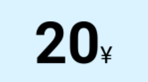
image
Sometimes we need to write a requirement that the two texts are baseline aligned, so we can use one of our attribute layout_constraintBaseline_toBaselineOf, which means that the baseline of this control is aligned with whose baseline. The code is as follows:
<?xml version="1.0" encoding="utf-8"?>

<androidx.constraintlayout.widget.ConstraintLayout xmlns:android="http://schemas.android.com/apk/res/android"
    xmlns:app="http://schemas.android.com/apk/res-auto"
    xmlns:tools="http://schemas.android.com/tools"
    android:layout_width="match_parent"
    android:layout_height="match_parent"
    android:background="#DAF3FE"
    tools:context=".MainActivity"
    tools:ignore="HardcodedText">
    <TextView
        android:id="@+id/tv1"
        android:layout_width="wrap_content"
        android:layout_height="wrap_content"
        android:text="20"
        android:textColor="@color/black"
        android:textSize="50sp"
        android:textStyle="bold"
        app:layout_constraintStart_toStartOf="parent"
        app:layout_constraintTop_toTopOf="parent" />
    <TextView
        android:id="@+id/tv2"
        android:layout_width="wrap_content"
        android:layout_height="wrap_content"
        android:text="¥"
        android:textColor="@color/black"
        android:textSize="20sp"
        app:layout_constraintBaseline_toBaselineOf="@id/tv1"
        app:layout_constraintStart_toEndOf="@id/tv1" />
</androidx.constraintlayout.widget.ConstraintLayout>
Through layout_ constraintBaseline_ To baseline of, we can align the baselines of two different sizes of documents
- Angle constraint
Sometimes we need a control at a certain angle of a control, so it is not easy to implement other layouts, but the ConstraintLayout provides us with angle position related properties
app:layout_constraintCircle="" Target control id

app:layout_constraintCircleAngle="" Angle to target(0-360)

app:layout_constraintCircleRadius="" Distance to target center
Let's implement the UI in the figure below. The jetpack icon is 45 degrees away from the android icon, and the distance is 60dp

image
<?xml version="1.0" encoding="utf-8"?>
<androidx.constraintlayout.widget.ConstraintLayout xmlns:android="http://schemas.android.com/apk/res/android"
    xmlns:app="http://schemas.android.com/apk/res-auto"
    xmlns:tools="http://schemas.android.com/tools"
    android:layout_width="match_parent"
    android:layout_height="match_parent"
    android:background="#DAF3FE"
    tools:context=".MainActivity"
    tools:ignore="HardcodedText">
    <ImageView
        android:id="@+id/android"
        android:layout_width="100dp"
        android:layout_height="100dp"
        android:src="@drawable/android"
        app:layout_constraintBottom_toBottomOf="parent"
        app:layout_constraintEnd_toEndOf="parent"
        app:layout_constraintStart_toStartOf="parent"
        app:layout_constraintTop_toTopOf="parent" />
    <ImageView
        android:id="@+id/jetpack"
        android:layout_width="60dp"
        android:layout_height="60dp"
        android:src="@drawable/jetpack"
        app:layout_constraintCircle="@+id/android"
        app:layout_constraintCircleAngle="45"
        app:layout_constraintCircleRadius="70dp" />
</androidx.constraintlayout.widget.ConstraintLayout>
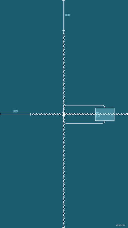
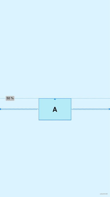
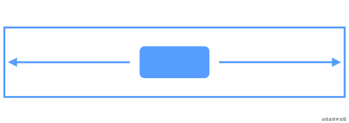
- Percentage offset
Sometimes we need to make the control in the horizontal or vertical position of the parent layout. You can use the following properties:
app:layout_constraintHorizontal_bias="" The value range of horizontal offset is 0-1 Decimal of

app:layout_constraintVertical_bias="" The value range of vertical offset is 0-1 Decimal of
Example: control A is offset 0.3 (30%) horizontally and 0.8 (80%) vertically in the parent layout
Note: when using percentage offset, you need to specify the constraint condition of the corresponding position
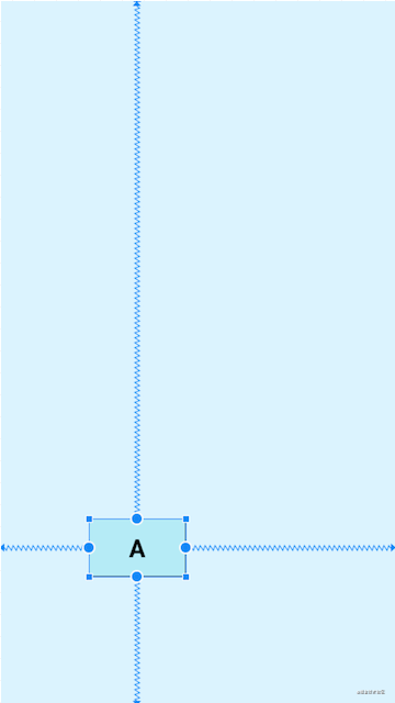
image
<?xml version="1.0" encoding="utf-8"?>

<androidx.constraintlayout.widget.ConstraintLayout xmlns:android="http://schemas.android.com/apk/res/android"
    xmlns:app="http://schemas.android.com/apk/res-auto"
    xmlns:tools="http://schemas.android.com/tools"
    android:layout_width="match_parent"
    android:layout_height="match_parent"
    android:background="#DAF3FE"
    tools:context=".MainActivity"
    tools:ignore="HardcodedText">

    <TextView
        android:layout_width="100dp"
        android:layout_height="60dp"
        android:background="@drawable/tv_bg"
        android:gravity="center"
        android:text="A"
        android:textColor="@color/black"
        android:textSize="25sp"
        android:textStyle="bold"
        app:layout_constraintBottom_toBottomOf="parent"
        app:layout_constraintEnd_toEndOf="parent"
        app:layout_constraintHorizontal_bias="0.3"
        app:layout_constraintStart_toStartOf="parent"
        app:layout_constraintTop_toTopOf="parent"
        app:layout_constraintVertical_bias="0.8" />
</androidx.constraintlayout.widget.ConstraintLayout>
Control inner margin, outer margin, GONE Margin
The inner and outer margins of the ConstraintLayout are actually used in the same way as other layouts
<!-- Margin  -->

android:layout_margin="0dp"

android:layout_marginStart="0dp"

android:layout_marginLeft="0dp"

android:layout_marginTop="0dp"

android:layout_marginEnd="0dp"

android:layout_marginRight="0dp"

android:layout_marginBottom="0dp"

<!-- padding  -->

android:padding="0dp"

android:paddingStart="0dp"

android:paddingLeft="0dp"

android:paddingTop="0dp"

android:paddingEnd="0dp"

android:paddingRight="0dp"

android:paddingBottom="0dp"
In addition to this, the ConstraintLayout has GONE Margin, which takes effect when the dependent target view is hidden. For example, B is constrained by A. when B is hidden, B will shrink to a point, its margin effect will fail, and the GONE Margin set by a will take effect. The attributes are as follows:
<!-- GONE Margin -->

app:layout_goneMarginBottom="0dp"

app:layout_goneMarginEnd="0dp"

app:layout_goneMarginLeft="0dp"

app:layout_goneMarginRight="0dp"

app:layout_goneMarginStart="0dp"

app:layout_goneMarginTop="0dp"
Example: GONE Margin will not take effect when the target control is displayed
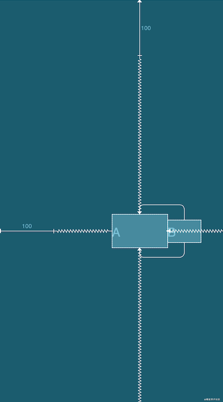
image
<?xml version="1.0" encoding="utf-8"?>

<androidx.constraintlayout.widget.ConstraintLayout xmlns:android="http://schemas.android.com/apk/res/android"
    xmlns:app="http://schemas.android.com/apk/res-auto"
    xmlns:tools="http://schemas.android.com/tools"
    android:layout_width="match_parent"
    android:layout_height="match_parent"
    android:background="#DAF3FE"
    tools:context=".MainActivity"
    tools:ignore="HardcodedText">

    <TextView
        android:id="@+id/A"
        android:layout_width="100dp"
        android:layout_height="60dp"
        android:layout_marginStart="100dp"
        android:layout_marginTop="100dp"
        android:background="@drawable/tv_bg"
        android:gravity="center"
        android:text="A"
        android:textColor="@color/black"
        android:textSize="25sp"
        android:textStyle="bold"
        app:layout_constraintBottom_toBottomOf="parent"
        app:layout_constraintEnd_toEndOf="parent"
        app:layout_constraintStart_toStartOf="parent"
        app:layout_constraintTop_toTopOf="parent" />
    <!-- The control sets layout_goneMarginStart="100dp" When A Control is hidden -->
    <TextView
        android:id="@+id/B"
        android:layout_width="60dp"
        android:layout_height="40dp"
        android:background="@drawable/tv_bg"
        android:gravity="center"
        android:text="B"
        android:textColor="@color/black"
        android:textSize="25sp"
        android:textStyle="bold"
        app:layout_constraintBottom_toBottomOf="@id/A"
        app:layout_constraintStart_toEndOf="@id/A"
        app:layout_constraintTop_toTopOf="@id/A"
        app:layout_goneMarginStart="100dp" />
</androidx.constraintlayout.widget.ConstraintLayout>
When the target A control is hidden, the GONE Margin of B will take effect
image
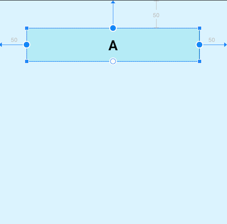
Control size
- Size limit
In the ConstraintLayout, some size limit attributes are provided, which can be used to limit the maximum and minimum width and height. These attributes can only be used when the given width or height is wrap_content. For example, if you want to set the minimum or maximum width, the width must be set to wrap_content, which is relatively simple and does not include the sample code. The specific properties are as follows:
android:minWidth="" set up view Minimum width of

android:minHeight="" set up view Minimum height of

android:maxWidth="" set up view Maximum width of

android:maxHeight="" set up view Maximum height of
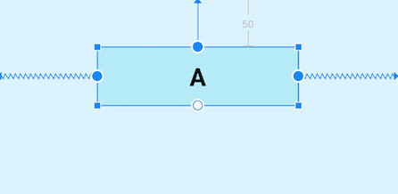
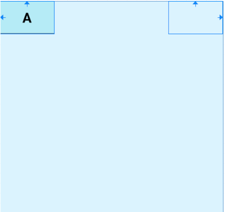
- 0dp(MATCH_CONSTRAINT)
Set the size of the view in addition to the traditional wrap_content, specified size, match_ In addition to parent, ConstraintLayout can also be set to 0dp (MATCH_CONSTRAINT), and the role of 0dp will vary according to the type of setting. The properties of the setting type are layout_constraintWidth_default and layout_constrainthheight_default, and the values can be spread, percent and wrap. The specific properties and examples are as follows:
app:layout_constraintWidth_default="spread|percent|wrap"

app:layout_constraintHeight_default="spread|percent|wrap"
spread (default): takes up all space that conforms to constraints
image
<?xml version="1.0" encoding="utf-8"?>
<androidx.constraintlayout.widget.ConstraintLayout xmlns:android="http://schemas.android.com/apk/res/android"
    xmlns:app="http://schemas.android.com/apk/res-auto"
    xmlns:tools="http://schemas.android.com/tools"
    android:layout_width="match_parent"
    android:layout_height="match_parent"
    android:background="#DAF3FE"
    tools:context=".MainActivity"
    tools:ignore="HardcodedText">

    <TextView
        android:id="@+id/A"
        android:layout_width="0dp"
        android:layout_height="60dp"
        android:layout_marginStart="50dp"
        android:layout_marginTop="50dp"
        android:layout_marginEnd="50dp"
        android:background="@drawable/tv_bg"
        android:gravity="center"
        android:text="A"
        android:textColor="@color/black"
        android:textSize="25sp"
        android:textStyle="bold"
        app:layout_constraintEnd_toEndOf="parent"
        app:layout_constraintStart_toStartOf="parent"
        app:layout_constraintTop_toTopOf="parent"
        app:layout_constraintWidth_default="spread" />
</androidx.constraintlayout.widget.ConstraintLayout>
It can be seen that the width of the view adapts to all effective constraint spaces, and the margin setting value of 50dp is reserved on the left and right. This effect is that the size of the view is full of configurable remaining space. Because the left and right constraints are the parent layout, the configurable space of the view is the width of the whole parent layout, and because the margin is set, the margin size will be reserved, Because spread is the default value, you can not write app:layout_constraintWidth_default="spread".
percent: set as a percentage of the parent layout
image
<?xml version="1.0" encoding="utf-8"?>
<androidx.constraintlayout.widget.ConstraintLayout xmlns:android="http://schemas.android.com/apk/res/android"
    xmlns:app="http://schemas.android.com/apk/res-auto"
    xmlns:tools="http://schemas.android.com/tools"
    android:layout_width="match_parent"
    android:layout_height="match_parent"
    android:background="#DAF3FE"
    tools:context=".MainActivity"
    tools:ignore="HardcodedText">

    <TextView
        android:id="@+id/A"
        android:layout_width="0dp"
        android:layout_height="60dp"
        android:layout_marginTop="50dp"
        android:background="@drawable/tv_bg"
        android:gravity="center"
        android:text="A"
        android:textColor="@color/black"
        android:textSize="25sp"
        android:textStyle="bold"
        app:layout_constraintEnd_toEndOf="parent"
        app:layout_constraintStart_toStartOf="parent"
        app:layout_constraintTop_toTopOf="parent"
        app:layout_constraintWidth_default="percent"
        app:layout_constraintWidth_percent="0.5" />
</androidx.constraintlayout.widget.ConstraintLayout>
The percent mode means that the size of its own view is a certain proportion of the size of the parent layout. The figure above shows that the width is 0.5 (50%, the value is a decimal of 0-1). This mode needs to be used with layout_constraintWidth_percent. However, after writing layout_constraintWidth_percent, layout_constraintWidth_default="percent" can be omitted.
wrap: matches the content size but does not exceed the constraint limit
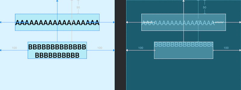
image
<?xml version="1.0" encoding="utf-8"?>
<androidx.constraintlayout.widget.ConstraintLayout xmlns:android="http://schemas.android.com/apk/res/android"
    xmlns:app="http://schemas.android.com/apk/res-auto"
    xmlns:tools="http://schemas.android.com/tools"
    android:layout_width="match_parent"
    android:layout_height="match_parent"
    android:background="#DAF3FE"
    tools:context=".MainActivity"
    tools:ignore="HardcodedText">
    <!-- Width set to wrap_content -->
    <TextView
        android:id="@+id/A"
        android:layout_width="wrap_content"
        android:layout_height="60dp"
        android:layout_marginStart="100dp"
        android:layout_marginTop="50dp"
        android:layout_marginEnd="100dp"
        android:background="@drawable/tv_bg"
        android:gravity="center"
        android:text="AAAAAAAAAAAAAAAAAA"
        android:textColor="@color/black"
        android:textSize="25sp"
        android:textStyle="bold"
        app:layout_constraintEnd_toEndOf="parent"
        app:layout_constraintStart_toStartOf="parent"
        app:layout_constraintTop_toTopOf="parent"
        app:layout_constraintWidth_default="spread" />
    <!-- Set the width to 0 dp wrap pattern -->
    <TextView
        android:id="@+id/B"
        android:layout_width="0dp"
        android:layout_height="60dp"
        android:layout_marginStart="100dp"
        android:layout_marginTop="150dp"
        android:layout_marginEnd="100dp"
        android:background="@drawable/tv_bg"
        android:gravity="center"
        android:text="BBBBBBBBBBBBBBBBBBBBBBB"
        android:textColor="@color/black"
        android:textSize="25sp"
        android:textStyle="bold"
        app:layout_constraintEnd_toEndOf="parent"
        app:layout_constraintStart_toStartOf="parent"
        app:layout_constraintTop_toTopOf="parent"
        app:layout_constraintWidth_default="wrap" />
</androidx.constraintlayout.widget.ConstraintLayout>
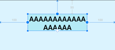
Two controls are written here for comparison. The width of control A is set to wrap_content, the width adapts to the content size and margin is set, but obviously the width has exceeded the setting value of margin, while the width of control B is set to 0dp wrap mode, the width adapts to the content size and will not exceed the setting value of margin, that is, it will not exceed the constraint limit, which is the difference between the two. Google also provides two properties to enforce constraints:
<!-- Be a view Width or height of,Set as wrap_content Time -->

app:layout_constrainedWidth="true|false"

app:layout_constrainedHeight="true|false"
In the previous example, control A is set with A mandatory constraint, and the effect is the same as that of control B:
image
<?xml version="1.0" encoding="utf-8"?>
<androidx.constraintlayout.widget.ConstraintLayout xmlns:android="http://schemas.android.com/apk/res/android"
    xmlns:app="http://schemas.android.com/apk/res-auto"
    xmlns:tools="http://schemas.android.com/tools"
    android:layout_width="match_parent"
    android:layout_height="match_parent"
    android:background="#DAF3FE"
    tools:context=".MainActivity"
    tools:ignore="HardcodedText">

    <TextView
        android:id="@+id/A"
        android:layout_width="wrap_content"
        android:layout_height="60dp"
        android:layout_marginStart="100dp"
        android:layout_marginTop="50dp"
        android:layout_marginEnd="100dp"
        android:background="@drawable/tv_bg"
        android:gravity="center"
        android:text="AAAAAAAAAAAAAAAAAA"
        android:textColor="@color/black"
        android:textSize="25sp"
        android:textStyle="bold"
        app:layout_constrainedWidth="true"
        app:layout_constraintEnd_toEndOf="parent"
        app:layout_constraintStart_toStartOf="parent"
        app:layout_constraintTop_toTopOf="parent"
        app:layout_constraintWidth_default="spread" />
</androidx.constraintlayout.widget.ConstraintLayout>
In addition, 0dp there are other unique properties for setting size limits for dimensions
app:layout_constraintWidth_min="" 0dp Minimum value of width under

app:layout_constraintHeight_min="" 0dp Minimum height under

app:layout_constraintWidth_max="" 0dp Maximum width under

app:layout_constraintHeight_max="" 0dp Maximum height at
- Ratio
In ConstraintLayout, you can set the scale for width and height, provided that at least one constraint dimension is set to 0dp, so that the scale will take effect. There are two settings for this attribute:
1. Floating point value indicating the ratio between width and height
2. Width: height, indicating the ratio between width and height
app:layout_constraintDimensionRatio = "" aspect ratio ""
image
<?xml version="1.0" encoding="utf-8"?>
<androidx.constraintlayout.widget.ConstraintLayout xmlns:android="http://schemas.android.com/apk/res/android"
    xmlns:app="http://schemas.android.com/apk/res-auto"
    xmlns:tools="http://schemas.android.com/tools"
    android:layout_width="match_parent"
    android:layout_height="match_parent"
    android:background="#DAF3FE"
    tools:context=".MainActivity"
    tools:ignore="HardcodedText">

    <TextView
        android:id="@+id/A"
        android:layout_width="0dp"
        android:layout_height="100dp"
        android:background="@drawable/tv_bg"
        android:gravity="center"
        android:text="A"
        android:textColor="@color/black"
        android:textSize="25sp"
        android:textStyle="bold"
        app:layout_constraintDimensionRatio="1:1"
        app:layout_constraintEnd_toEndOf="parent"
        app:layout_constraintStart_toStartOf="parent"
        app:layout_constraintTop_toTopOf="parent" />
</androidx.constraintlayout.widget.ConstraintLayout>
Chains
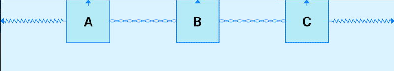
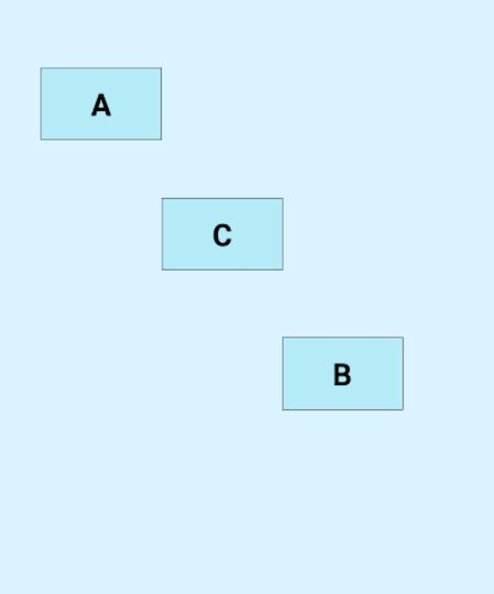
Chains is also a very useful feature. It forms a chain of many controls in the horizontal or vertical direction to balance the positions of these controls. So how to form a chain? Forming a chain requires that the controls in the chain are constrained to each other in the horizontal or vertical direction. In this way, a chain can be formed. If the horizontal directions are constrained to each other, a horizontal chain will be formed, otherwise a vertical chain will be formed. See the example below:
image
<?xml version="1.0" encoding="utf-8"?>
<androidx.constraintlayout.widget.ConstraintLayout xmlns:android="http://schemas.android.com/apk/res/android"
    xmlns:app="http://schemas.android.com/apk/res-auto"
    xmlns:tools="http://schemas.android.com/tools"
    android:layout_width="match_parent"
    android:layout_height="match_parent"
    android:background="#DAF3FE"
    tools:context=".MainActivity"
    tools:ignore="HardcodedText">

    <TextView
        android:id="@+id/A"
        android:layout_width="80dp"
        android:layout_height="80dp"
        android:background="@drawable/tv_bg"
        android:gravity="center"
        android:text="A"
        android:textColor="@color/black"
        android:textSize="25sp"
        android:textStyle="bold"
        app:layout_constraintEnd_toStartOf="@id/B"
        app:layout_constraintHorizontal_chainStyle="spread"
        app:layout_constraintStart_toStartOf="parent"
        app:layout_constraintTop_toTopOf="parent" />

    <TextView
        android:id="@+id/B"
        android:layout_width="80dp"
        android:layout_height="80dp"
        android:background="@drawable/tv_bg"
        android:gravity="center"
        android:text="B"
        android:textColor="@color/black"
        android:textSize="25sp"
        android:textStyle="bold"
        app:layout_constraintEnd_toStartOf="@id/C"
        app:layout_constraintStart_toEndOf="@id/A"
        app:layout_constraintTop_toTopOf="parent" />

    <TextView
        android:id="@+id/C"
        android:layout_width="80dp"
        android:layout_height="80dp"
        android:background="@drawable/tv_bg"
        android:gravity="center"
        android:text="C"
        android:textColor="@color/black"
        android:textSize="25sp"
        android:textStyle="bold"
        app:layout_constraintEnd_toEndOf="parent"
        app:layout_constraintStart_toEndOf="@id/B"
        app:layout_constraintTop_toTopOf="parent" />
</androidx.constraintlayout.widget.ConstraintLayout>
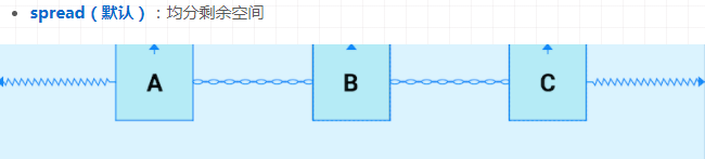
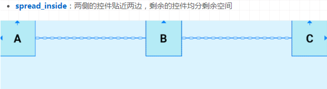
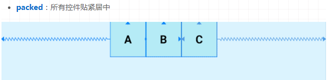
A. B, C and the three controls constrain each other in the horizontal direction, thus forming a horizontal chain. Their default mode is spread, sharing the remaining space equally. We can use layout_constraintHorizontal_chainStyle and layout_constraintVertical_chainStyle sets modes for horizontal and vertical chains respectively. The optional modes are spread, packed and spread_inside
image
image
image
Chains also supports the configuration of weight. Use layout_constrainthhorizontal_weight and layout_constraintVertical_weight to set the weight of chain elements
image
<?xml version="1.0" encoding="utf-8"?>
<androidx.constraintlayout.widget.ConstraintLayout xmlns:android="http://schemas.android.com/apk/res/android"
    xmlns:app="http://schemas.android.com/apk/res-auto"
    xmlns:tools="http://schemas.android.com/tools"
    android:layout_width="match_parent"
    android:layout_height="match_parent"
    android:background="#DAF3FE"
    tools:context=".MainActivity"
    tools:ignore="HardcodedText">
    <TextView
    android:id="@+id/A"
    android:layout_width="0dp"
    android:layout_height="80dp"
    android:background="@drawable/tv_bg"
    android:gravity="center"
    android:text="A"
    android:textColor="@color/black"
    android:textSize="25sp"
    android:textStyle="bold"
    app:layout_constraintEnd_toStartOf="@id/B"
    app:layout_constraintHorizontal_weight="2"
    app:layout_constraintStart_toStartOf="parent"
    app:layout_constraintTop_toTopOf="parent"
    app:layout_constraintVertical_chainStyle="packed"/>
    <TextView
    android:id="@+id/B"
    android:layout_width="0dp"
    android:layout_height="80dp"
    android:background="@drawable/tv_bg"
    android:gravity="center"
    android:text="B"
    android:textColor="@color/black"
    android:textSize="25sp"
    android:textStyle="bold"
    app:layout_constraintEnd_toStartOf="@id/C"
    app:layout_constraintHorizontal_weight="1"
    app:layout_constraintStart_toEndOf="@id/A"
    app:layout_constraintTop_toTopOf="parent"/>
    <TextView
    android:id="@+id/C"
    android:layout_width="0dp"
    android:layout_height="80dp"
    android:background="@drawable/tv_bg"
    android:gravity="center"
    android:text="C"
    android:textColor="@color/black"
    android:textSize="25sp"
    android:textStyle="bold"
    app:layout_constraintEnd_toEndOf="parent"
    app:layout_constraintHorizontal_weight="3"
    app:layout_constraintStart_toEndOf="@id/B"
    app:layout_constraintTop_toTopOf="parent"/>
</androidx.constraintlayout.widget.ConstraintLayout>
/Auxiliary class/
In order to solve the nesting problem, ConstraintLayout also provides a series of auxiliary controls to help developers layout. These tools are very convenient, and I use them very frequently in my daily development work
Guide line
The guide line is a reference line that can help developers with auxiliary positioning. In fact, it will not be really displayed in the layout. Like the auxiliary line in mathematical geometry, it is very convenient to use and has a high appearance rate. The guide line can also be used for some requirements such as percentage division, which has a good screen adaptation effect, The Guideline can be divided into horizontal and vertical directions. The position can use the percentage for the parent or the distance for the parent position
android:orientation="horizontal|vertical" Alignment of guides

app:layout_constraintGuide_percent="0-1" Percentage of width or height from parent(decimal form )

app:layout_constraintGuide_begin="" Distance from parent start(Left or top)

app:layout_constraintGuide_end="" Distance from parent end position(Right or bottom)
image
<?xml version="1.0" encoding="utf-8"?>
<androidx.constraintlayout.widget.ConstraintLayout xmlns:android="http://schemas.android.com/apk/res/android"
    xmlns:app="http://schemas.android.com/apk/res-auto"
    xmlns:tools="http://schemas.android.com/tools"
    android:layout_width="match_parent"
    android:layout_height="match_parent"
    android:background="#DAF3FE"
    tools:context=".MainActivity"
    tools:ignore="HardcodedText">

    <androidx.constraintlayout.widget.Guideline
        android:id="@+id/Guideline"
        android:layout_width="wrap_content"
        android:layout_height="wrap_content"
        android:orientation="horizontal"
        app:layout_constraintGuide_percent="0.5" />

    <TextView
        android:id="@+id/A"
        android:layout_width="120dp"
        android:layout_height="80dp"
        android:background="@drawable/tv_bg"
        android:gravity="center"
        android:text="A"
        android:textColor="@color/black"
        android:textSize="25sp"
        android:textStyle="bold"
        app:layout_constraintEnd_toEndOf="parent"
        app:layout_constraintStart_toStartOf="parent"
        app:layout_constraintTop_toTopOf="@id/Guideline" />
</androidx.constraintlayout.widget.ConstraintLayout>
In the above figure, A guide line with A horizontal position of 0.5 (50%) in the vertical direction of the parent is set, and the top of control A depends on the guide line. In this way, no matter how the layout is changed, the position of the guide line will always be 50% in the vertical direction of the parent, and the position of control A will not deviate from the preset
GBarrier (barrier)
Like the Guideline, this Barrier will not actually appear in the layout. Its function is like its name, forming a Barrier and obstacle, and it is used very often. Here with the help of the constraintlayout website( https://constraintlayout.github.io/basics/barriers.html )To explain Barrier.
When we create a layout, we sometimes encounter situations where the layout can be changed according to localization. Here is a very simple example:
image
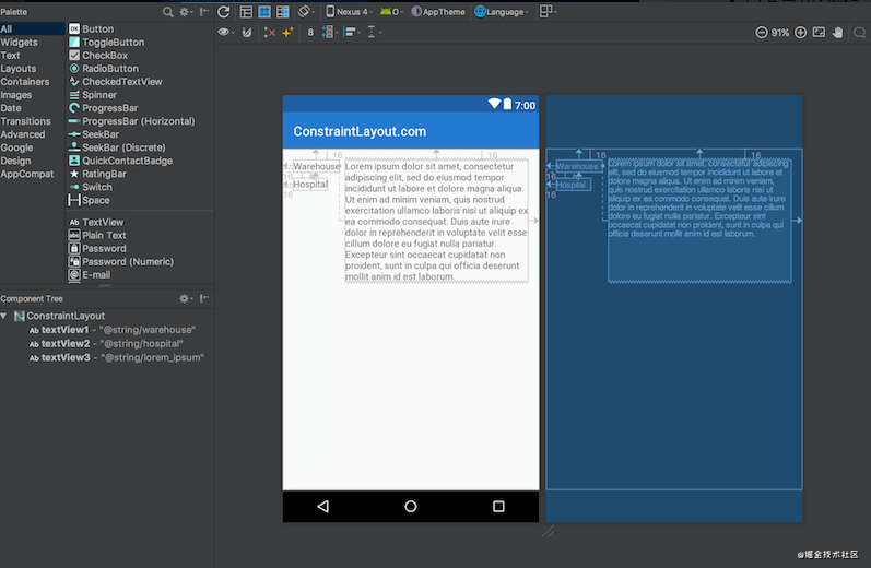
There are three text views: textView1 and textView2 on the left; textView3 on the right. textView3 is limited to the end of textView1, which works well -- it positions and sizes textView3 exactly as we need it.
However, if we need to support multiple languages, things will become more complicated. If we add a German translation, we will encounter a problem, because in the English version, the text in textView1 is longer than that in textView2, while in German, the text in textView2 is longer than textView1:
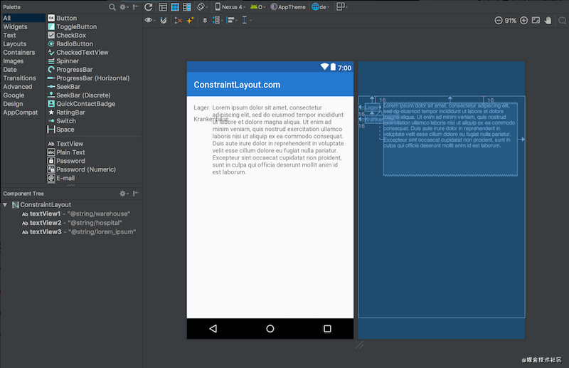
image
The problem here is that textView3 is still relative to textView1, so textView2 is directly inserted into textView3. It looks more obvious in the design view (the one with a white background). The more direct solution is to use TableLayout, or wrap textView1 & textView2 in a vertical, android:layout_width="wrap_content" In the LinearLayout of. Then let textView3 be constrained behind the LinearLayout. But we have a better way: Barriers. The configuration properties of Barriers are as follows:
<!-- For control Barrier Relative to a given View Location of -->

app:barrierDirection="top|bottom|left|right|start|end"

<!-- The value is the value of the control to depend on id,Barrier Will use ids The width of the largest of/High as their position -->

app:constraint_referenced_ids="id,id"
The modified code is as follows:
<?xml version="1.0" encoding="utf-8"?>
<androidx.constraintlayout.widget.ConstraintLayout xmlns:android="http://schemas.android.com/apk/res/android"
    xmlns:app="http://schemas.android.com/apk/res-auto"
    android:layout_width="match_parent"
    android:layout_height="match_parent">

    <TextView
        android:id="@+id/textView1"
        android:layout_width="wrap_content"
        android:layout_height="wrap_content"
        android:layout_marginStart="16dp"
        android:layout_marginTop="16dp"
        android:text="@string/warehouse"
        app:layout_constraintStart_toStartOf="parent"
        app:layout_constraintTop_toTopOf="parent" />

    <TextView
        android:id="@+id/textView2"
        android:layout_width="wrap_content"
        android:layout_height="wrap_content"
        android:layout_marginStart="16dp"
        android:layout_marginTop="8dp"
        android:text="@string/hospital"
        app:layout_constraintStart_toStartOf="parent"
        app:layout_constraintTop_toBottomOf="@+id/textView1" />

    <androidx.constraintlayout.widget.Barrier
        android:id="@+id/barrier7"
        android:layout_width="wrap_content"
        android:layout_height="wrap_content"
        app:barrierDirection="end"
        app:constraint_referenced_ids="textView2,textView1" />

    <TextView
        android:id="@+id/textView3"
        android:layout_width="0dp"
        android:layout_height="wrap_content"
        android:layout_marginStart="8dp"
        android:text="@string/lorem_ipsum"
        app:layout_constraintStart_toEndOf="@+id/barrier7"
        app:layout_constraintTop_toTopOf="parent" />
</androidx.constraintlayout.widget.ConstraintLayout>
image
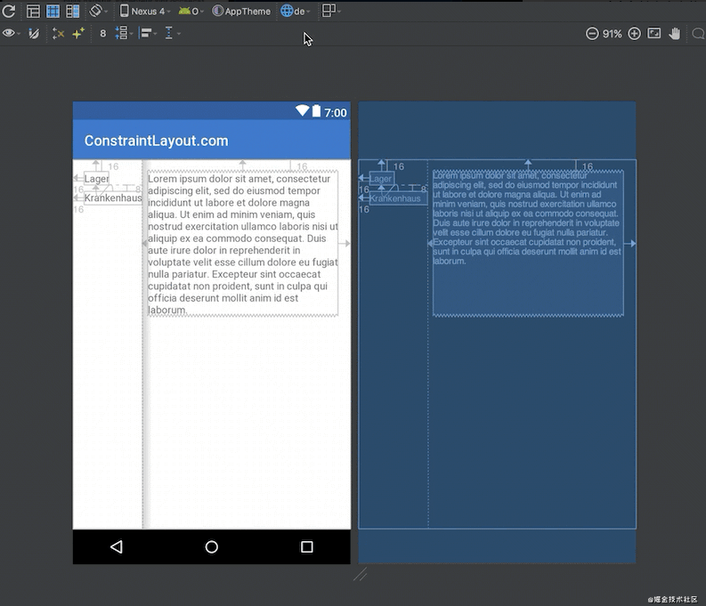
In order to see the overall effect, you can switch the language. At this time, you will see that the Barrier will automatically be behind the wider textView, which indirectly makes textView3 in the correct position.
Group
There are often scenes in which many controls are hidden or displayed at the same time. The traditional practice is either to nest, hide or display the parent layout, or set it one by one. Obviously, this is not a good way. The Group in ConstraintLayout is to solve this problem. The function of Group is to hide or display a Group of controls at the same time without other functions. Its properties are as follows:
app:constraint_referenced_ids="id,id" Controls added to groups id
image
<?xml version="1.0" encoding="utf-8"?>
<androidx.constraintlayout.widget.ConstraintLayout xmlns:android="http://schemas.android.com/apk/res/android"
    xmlns:app="http://schemas.android.com/apk/res-auto"
    android:layout_width="match_parent"
    android:layout_height="match_parent">

    <TextView
        android:id="@+id/A"
        android:layout_width="100dp"
        android:layout_height="60dp"
        android:layout_marginTop="56dp"
        android:background="@drawable/tv_bg"
        android:gravity="center"
        android:text="A"
        android:textColor="@color/black"
        android:textSize="25sp"
        android:textStyle="bold"
        app:layout_constraintEnd_toEndOf="parent"
        app:layout_constraintHorizontal_bias="0.115"
        app:layout_constraintStart_toStartOf="parent"
        app:layout_constraintTop_toTopOf="parent" />

    <TextView
        android:id="@+id/B"
        android:layout_width="100dp"
        android:layout_height="60dp"
        android:layout_marginTop="280dp"
        android:background="@drawable/tv_bg"
        android:gravity="center"
        android:text="B"
        android:textColor="@color/black"
        android:textSize="25sp"
        android:textStyle="bold"
        app:layout_constraintEnd_toEndOf="parent"
        app:layout_constraintHorizontal_bias="0.758"
        app:layout_constraintStart_toStartOf="parent"
        app:layout_constraintTop_toTopOf="parent" />

    <TextView
        android:id="@+id/C"
        android:layout_width="100dp"
        android:layout_height="60dp"
        android:layout_marginTop="164dp"
        android:background="@drawable/tv_bg"
        android:gravity="center"
        android:text="C"
        android:textColor="@color/black"
        android:textSize="25sp"
        android:textStyle="bold"
        app:layout_constraintEnd_toEndOf="parent"
        app:layout_constraintHorizontal_bias="0.437"
        app:layout_constraintStart_toStartOf="parent"
        app:layout_constraintTop_toTopOf="parent" />

    <androidx.constraintlayout.widget.Group
        android:layout_width="wrap_content"
        android:layout_height="wrap_content"
        android:visibility="visible"
        app:constraint_referenced_ids="A,B,C" />
</androidx.constraintlayout.widget.ConstraintLayout>
A. B and C view s are controlled by the Group. When the visibility of the Group is visible, they are displayed normally. When it is set to gone, they are hidden:
image
Placeholder
Placeholder is used to occupy space. It can occupy a good position in the layout. It can move a control to this placeholder by using the app:content = "" property or dynamically calling setContent to set the content
image
<?xml version="1.0" encoding="utf-8"?>
<androidx.constraintlayout.widget.ConstraintLayout xmlns:android="http://schemas.android.com/apk/res/android"
    xmlns:app="http://schemas.android.com/apk/res-auto"
    android:layout_width="match_parent"
    android:layout_height="match_parent">

    <TextView
        android:id="@+id/A"
        android:layout_width="100dp"
        android:layout_height="60dp"
        android:background="@drawable/tv_bg"
        android:gravity="center"
        android:text="A"
        android:textColor="@color/black"
        android:textSize="25sp"
        android:textStyle="bold"
        app:layout_constraintStart_toStartOf="parent"
        app:layout_constraintTop_toTopOf="parent" />

    <androidx.constraintlayout.widget.Placeholder
        android:layout_width="100dp"
        android:layout_height="60dp"
        app:layout_constraintEnd_toEndOf="parent"
        app:layout_constraintTop_toTopOf="parent" />
</androidx.constraintlayout.widget.ConstraintLayout>
When we set app:content="@+id/A" or call setContent, control A will be moved to the Placeholder. Of course, using app:content = "" in the layout obviously loses its function.
Flow (flow virtual layout)
Flow is a new virtual layout for building a chain. When the chain runs out, it can be wrapped to the next line or even another part of the screen. This is useful when you arrange multiple items in a chain, but you are not sure how large the container will be at run time. You can use it to build layouts based on dynamic dimensions in your application, such as screen width when rotating. Flow is a virtual layout. In ConstraintLayout, virtual layouts participate in constraints and layouts as the role of virtual view group, but they are not added to the view hierarchy as views, Instead, only other views are referenced to assist them in completing their layout functions in the layout system.
The following animation is used to show that Flow creates multiple chains to fill a full row with layout elements:
image
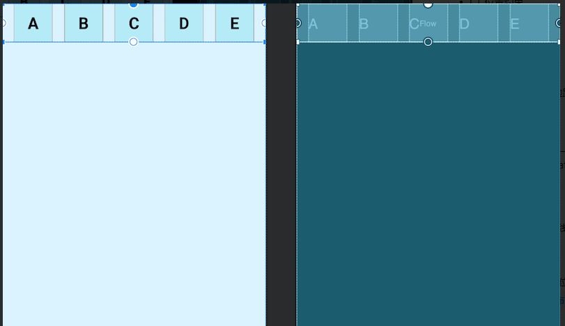
image
<?xml version="1.0" encoding="utf-8"?>
<androidx.constraintlayout.widget.ConstraintLayout xmlns:android="http://schemas.android.com/apk/res/android"
    xmlns:app="http://schemas.android.com/apk/res-auto"
    android:layout_width="match_parent"
    android:layout_height="match_parent">

    <TextView
        android:id="@+id/A"
        android:layout_width="60dp"
        android:layout_height="60dp"
        android:background="@drawable/tv_bg"
        android:gravity="center"
        android:text="A"
        android:textColor="@color/black"
        android:textSize="25sp"
        android:textStyle="bold" />

    <TextView
        android:id="@+id/B"
        android:layout_width="60dp"
        android:layout_height="60dp"
        android:background="@drawable/tv_bg"
        android:gravity="center"
        android:text="B"
        android:textColor="@color/black"
        android:textSize="25sp"
        android:textStyle="bold" />

    <TextView
        android:id="@+id/C"
        android:layout_width="60dp"
        android:layout_height="60dp"
        android:background="@drawable/tv_bg"
        android:gravity="center"
        android:text="C"
        android:textColor="@color/black"
        android:textSize="25sp"
        android:textStyle="bold" />

    <TextView
        android:id="@+id/D"
        android:layout_width="60dp"
        android:layout_height="60dp"
        android:background="@drawable/tv_bg"
        android:gravity="center"
        android:text="D"
        android:textColor="@color/black"
        android:textSize="25sp"
        android:textStyle="bold" />

    <TextView
        android:id="@+id/E"
        android:layout_width="60dp"
        android:layout_height="60dp"
        android:background="@drawable/tv_bg"
        android:gravity="center"
        android:text="E"
        android:textColor="@color/black"
        android:textSize="25sp"
        android:textStyle="bold" />

    <androidx.constraintlayout.helper.widget.Flow
        android:layout_width="match_parent"
        android:layout_height="wrap_content"
        app:constraint_referenced_ids="A,B,C,D,E"
        app:layout_constraintTop_toTopOf="parent" />
</androidx.constraintlayout.widget.ConstraintLayout>
- Chain constraint
Constraint of Flow_ referenced_ The controls associated with IDS do not have constraints, which is different from ordinary chains. This arrangement is the default method of Flow none. We can use app:flow_wrapMode = "" property to set the arrangement, and we can also use flow_horizontalGap and flow_verticalGap sets the horizontal and vertical intervals of two view s respectively. Next, we add several controls to show three arrangement methods:
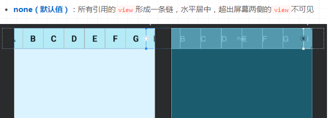
image
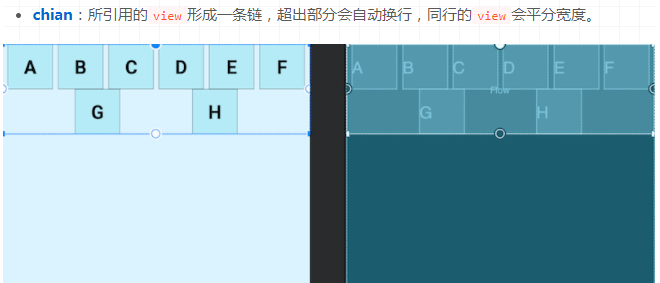
image
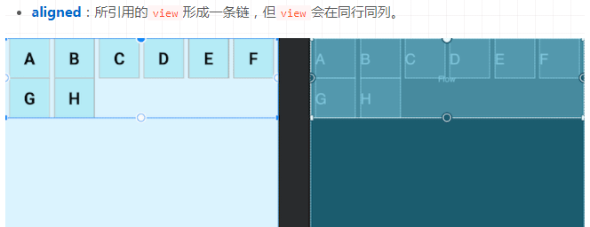
image
The following uses animation to show the changes of the three effects
image
When flow_ When the value of wrapmode is Chinese or aligned, we can also configure for different chains. We won't show the effects one by one here. The specific properties are as follows:
app:flow_horizontalStyle="packed|spread|spread_inside" Configuration of all horizontal chains

app:flow_verticalStyle="packed|spread|spread_inside" Configuration of all vertical chains

app:flow_firstHorizontalStyle="packed|spread|spread_inside" The configuration of the first horizontal chain is invalid

app:flow_firstVerticalStyle="packed|spread|spread_inside" The configuration of the first vertical chain is invalid

app:flow_lastHorizontalStyle="packed|spread|spread_inside" The configuration of the last horizontal chain will not take effect

app:flow_lastVerticalStyle="packed|spread|spread_inside" The configuration of the last vertical chain will not take effect
- alignment constraint
All the views shown above are of the same size. For the alignment of views of different sizes, Flow also provides corresponding attributes for configuration (when flow_wrapMode="aligned", I try to have no effect)
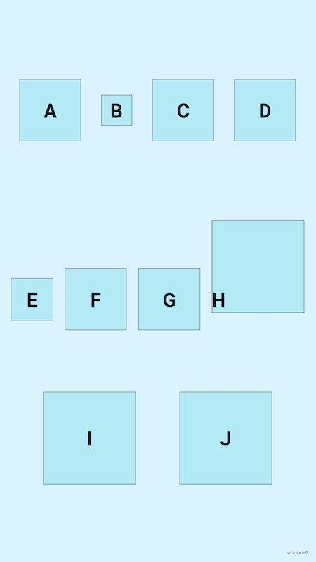
<!-- top:Top alignment bottom:Bottom alignment center:Center alignment baseline:Baseline alignment -->

app:flow_verticalAlign="top|bottom|center|baseline"

<!-- start:Start alignment end:End alignment center:Center alignment -->

app:flow_horizontalAlign="start|end|center"
Using flow_ When vertical align is used, the orientation is required to be horizontal, and flow is used_ When horizontalAlign, the orientation is required to be vertical
Here are the effects:
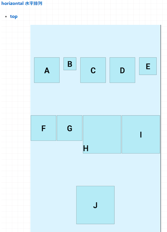
image
<androidx.constraintlayout.helper.widget.Flow
    android:layout_height="match_parent"
    android:layout_width="match_parent"
    android:orientation="horizontal"
    app:constraint_referenced_ids="A,B,C,D,E,F,G,H,I,J"
    app:flow_verticalAlign="top"
    app:flow_wrapMode="chain"
    app:layout_constraintTop_toTopOf="parent" />
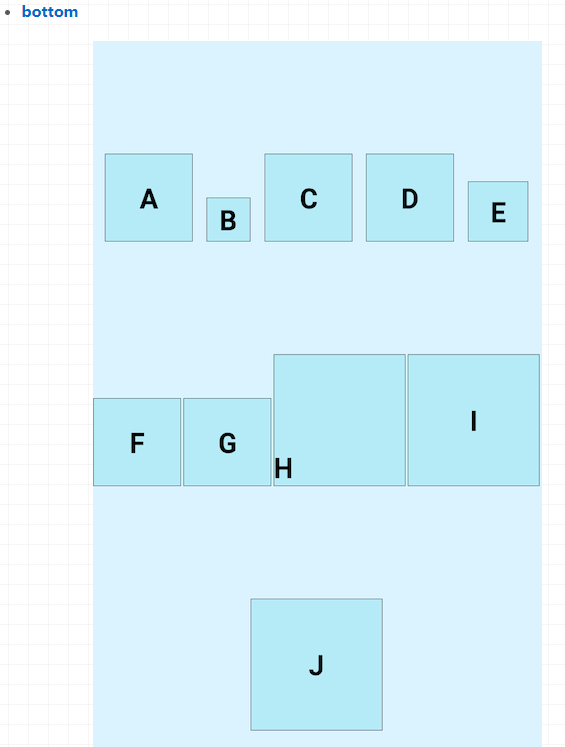
image
<androidx.constraintlayout.helper.widget.Flow
    android:layout_height="match_parent"
    android:layout_width="match_parent"
    android:orientation="horizontal"
    app:constraint_referenced_ids="A,B,C,D,E,F,G,H,I,J"
    app:flow_verticalAlign="bottom"
    app:flow_wrapMode="chain"
    app:layout_constraintTop_toTopOf="parent" />
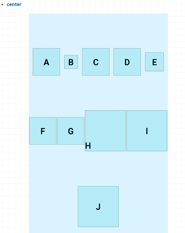
image
<androidx.constraintlayout.helper.widget.Flow
    android:layout_height="match_parent"
    android:layout_width="match_parent"
    android:orientation="horizontal"
    app:constraint_referenced_ids="A,B,C,D,E,F,G,H,I,J"
    app:flow_verticalAlign="center"
    app:flow_wrapMode="chain"
    app:layout_constraintTop_toTopOf="parent" />
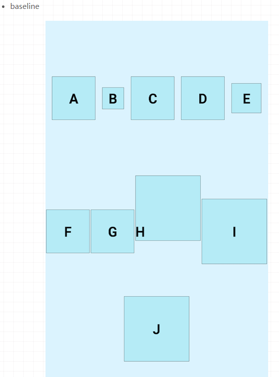
image
<androidx.constraintlayout.helper.widget.Flow
    android:layout_height="match_parent"
    android:layout_width="match_parent"
    android:orientation="horizontal"
    app:constraint_referenced_ids="A,B,C,D,E,F,G,H,I,J"
    app:flow_verticalAlign="baseline"
    app:flow_wrapMode="chain"
    app:layout_constraintTop_toTopOf="parent" />
Arranged vertically, there will be no more display here
- Quantitative constraints
When flow_ When the wrapmode attribute is aligned and Chinese, flow is used_ The maxelementswrap property controls the maximum number of subviews per row. For example, we set it to flow_maxElementsWrap=4, and the effect diagram is as follows:
image
Layer (layer layout)
Layer inherits from the constrainthhelper and is a constraint assistant. Compared with Flow, layer is easy to use. It is often used to add background or common animation. The size of layer will be adjusted during layout, and its size will be adjusted according to all views it references. The order of code will also determine its position, If the code is at the end of all referenced views, it will be at the top of all views, otherwise it will be at the bottom. If you add a background at the top, the referenced view will be overwritten. The example of adding a background is shown below, and the example of animation is not shown here
image
<?xml version="1.0" encoding="utf-8"?>
<androidx.constraintlayout.widget.ConstraintLayout xmlns:android="http://schemas.android.com/apk/res/android"
    xmlns:app="http://schemas.android.com/apk/res-auto"
    android:layout_width="match_parent"
    android:layout_height="match_parent">

    <androidx.constraintlayout.helper.widget.Layer
        android:layout_width="match_parent"
        android:layout_height="match_parent"
        android:background="@drawable/common_rect_white_100_10"
        android:padding="10dp"
        app:constraint_referenced_ids="AndroidImg,NameTv" />

    <ImageView
        android:id="@+id/AndroidImg"
        android:layout_width="200dp"
        android:layout_height="wrap_content"
        android:src="@drawable/android"
        app:layout_constraintBottom_toBottomOf="parent"
        app:layout_constraintEnd_toEndOf="parent"
        app:layout_constraintStart_toStartOf="parent"
        app:layout_constraintTop_toTopOf="parent" />

    <TextView
        android:id="@+id/NameTv"
        android:layout_width="100dp"
        android:layout_height="40dp"
        android:gravity="center"
        android:text="Android"
        android:textColor="@color/black"
        android:textSize="25sp"
        android:textStyle="bold"
        app:layout_constraintEnd_toEndOf="@id/AndroidImg"
        app:layout_constraintStart_toStartOf="@id/AndroidImg"
        app:layout_constraintTop_toBottomOf="@id/AndroidImg" />
</androidx.constraintlayout.widget.ConstraintLayout>
It can be seen that when the Layer code is on all referenced views, the effect is normal, because all views are on the Layer. Let's take a look at the Layer code on the last side:
image
<?xml version="1.0" encoding="utf-8"?>
<androidx.constraintlayout.widget.ConstraintLayout xmlns:android="http://schemas.android.com/apk/res/android"
    xmlns:app="http://schemas.android.com/apk/res-auto"
    android:layout_width="match_parent"
    android:layout_height="match_parent">

    <ImageView
        android:id="@+id/AndroidImg"
        android:layout_width="200dp"
        android:layout_height="wrap_content"
        android:src="@drawable/android"
        app:layout_constraintBottom_toBottomOf="parent"
        app:layout_constraintEnd_toEndOf="parent"
        app:layout_constraintStart_toStartOf="parent"
        app:layout_constraintTop_toTopOf="parent" />

    <TextView
        android:id="@+id/NameTv"
        android:layout_width="100dp"
        android:layout_height="40dp"
        android:gravity="center"
        android:text="Android"
        android:textColor="@color/black"
        android:textSize="25sp"
        android:textStyle="bold"
        app:layout_constraintEnd_toEndOf="@id/AndroidImg"
        app:layout_constraintStart_toStartOf="@id/AndroidImg"
        app:layout_constraintTop_toBottomOf="@id/AndroidImg" />

    <androidx.constraintlayout.helper.widget.Layer
        android:layout_width="match_parent"
        android:layout_height="match_parent"
        android:background="@drawable/common_rect_white_100_10"
        android:padding="10dp"
        app:constraint_referenced_ids="AndroidImg,NameTv" />
</androidx.constraintlayout.widget.ConstraintLayout>
We can see that Layer has covered all view s at this time
ImageFilterButton &ImageFilterView
ImageFilterButton and ImageFilterView are two controls. The relationship between them is the same as that between ImageButton and ImageView, so only ImageFilterView is used here. In terms of name, their positioning is related to filtering. Their general functions include two parts: one is to make fillet images, and the other is to overlay image resources for mixed filtering. They are shown one by one below:
- Fillet picture
ImageFilterButton and ImageFilterView can use two properties to set the fillet of image resources, roundPercent and {round. The value type accepted by roundPercent is 0-1 decimal. According to the size of the value, the image will be over scaled between square and circle. Round = can set the size of specific fillet. I found my android studio in the process of using, There is no code prompt for these two attributes and no preview effect, but it runs effectively. It may not be optimized. A hot topic recently is the new logo designed by Xiaomi at a cost of 2 million. Let's take it as an example:

image
<?xml version="1.0" encoding="utf-8"?>
<androidx.constraintlayout.widget.ConstraintLayout xmlns:android="http://schemas.android.com/apk/res/android"
    xmlns:app="http://schemas.android.com/apk/res-auto"
    android:layout_width="match_parent"
    android:layout_height="match_parent">

    <androidx.constraintlayout.utils.widget.ImageFilterView
        android:layout_width="100dp"
        android:layout_height="100dp"
        android:src="@drawable/mi"
        app:layout_constraintBottom_toBottomOf="parent"
        app:layout_constraintEnd_toEndOf="parent"
        app:layout_constraintStart_toStartOf="parent"
        app:layout_constraintTop_toTopOf="parent"
        app:roundPercent="0.7" />
</androidx.constraintlayout.widget.ConstraintLayout>
Although it is different from the arc of Xiaomi's new logo, this is not what we consider. We can see that we use roundPercent to set the fillet to 0.7 (70%), which is so simple to implement a fillet image.
- Image filtering
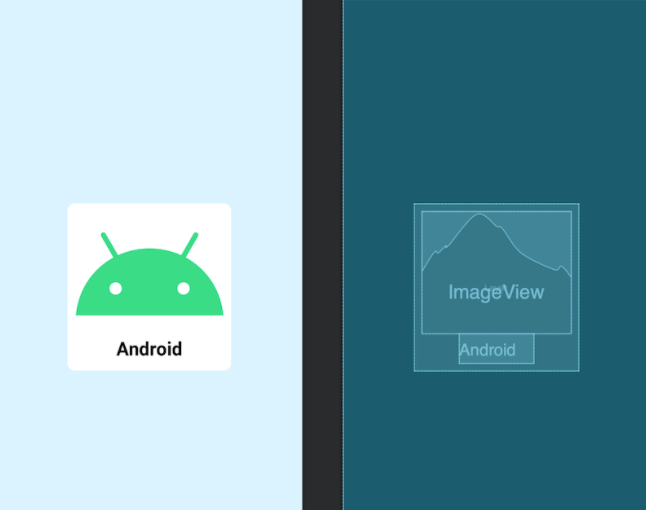
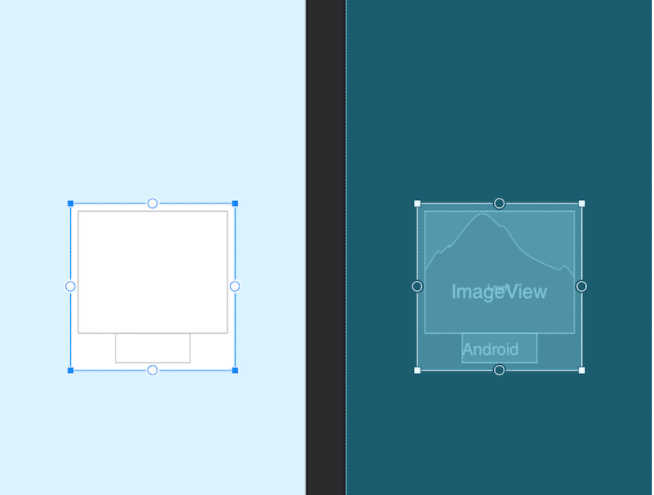
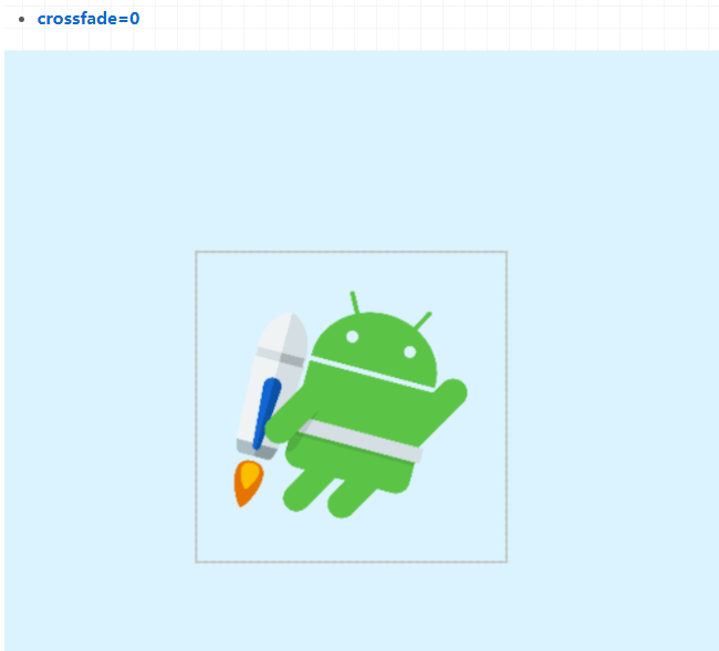
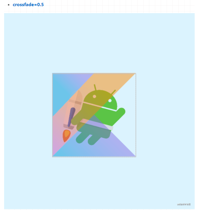
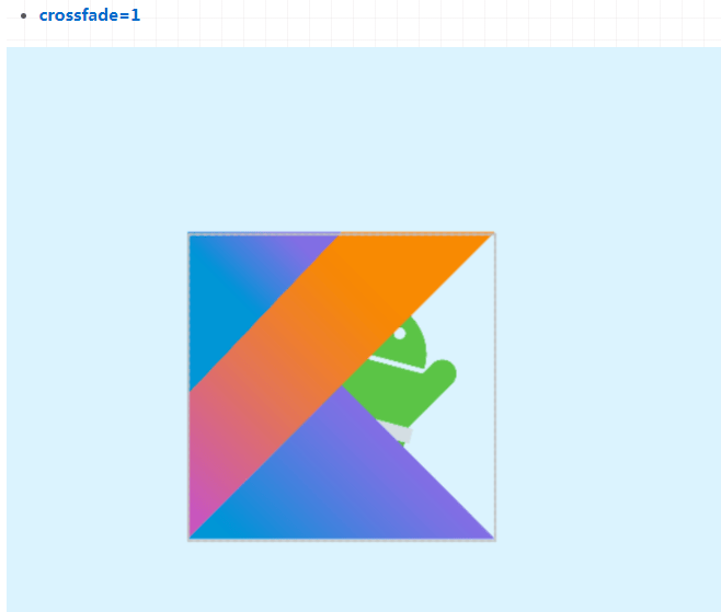
ImageFilterButton and ImageFilterView can not only use src to set image resources, but also use altSrc to set the second image resource. The resources provided by altSrc and the resources provided by src will form a cross fade effect through the crossfade attribute. By default, crossfade=0, and the resources referenced by altSrc are invisible, with a value of 0-1. Here is an example:
image
image
image
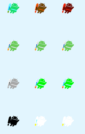
In addition, the warmth attribute can be used to adjust the color temperature, the brightness attribute to adjust the brightness, the saturation attribute to adjust the saturation, and the contrast attribute to adjust the contrast. The following shows the effects of their attributes and values:
image
MockView
Your product manager will often draw prototype drawings for you, but this is definitely not their exclusive. We also have our own prototype drawings. A mature programmer should learn to draw big cakes for his product manager. We can use MockView as the prototype drawing. See the following example:
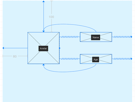
image
<?xml version="1.0" encoding="utf-8"?>
<androidx.constraintlayout.widget.ConstraintLayout xmlns:android="http://schemas.android.com/apk/res/android"
    xmlns:app="http://schemas.android.com/apk/res-auto"
    android:layout_width="match_parent"
    android:layout_height="match_parent">

    <androidx.constraintlayout.utils.widget.MockView
        android:id="@+id/Avatar"
        android:layout_width="100dp"
        android:layout_height="100dp"
        android:layout_marginStart="80dp"
        android:layout_marginTop="100dp"
        app:layout_constraintStart_toStartOf="parent"
        app:layout_constraintTop_toTopOf="parent" />

    <androidx.constraintlayout.utils.widget.MockView
        android:id="@+id/Name"
        android:layout_width="100dp"
        android:layout_height="30dp"
        app:layout_constraintEnd_toEndOf="parent"
        app:layout_constraintStart_toEndOf="@id/Avatar"
        app:layout_constraintTop_toTopOf="@id/Avatar" />

    <androidx.constraintlayout.utils.widget.MockView
        android:id="@+id/Age"
        android:layout_width="100dp"
        android:layout_height="30dp"
        app:layout_constraintBottom_toBottomOf="@id/Avatar"
        app:layout_constraintEnd_toEndOf="parent"
        app:layout_constraintStart_toEndOf="@id/Avatar" />
</androidx.constraintlayout.widget.ConstraintLayout>
ConstraintProperties (streaming API)
2.0 provides ConstraintProperties, which can be modified using streaming API
val properties = ConstraintProperties(findViewById(R.id.image))

properties.translationZ(32f)

.margin(ConstraintSet.START, 43)

.apply