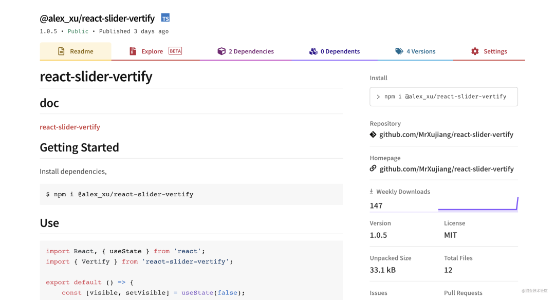
GitHub address: https://github.com/MrXujiang/react-slider-vertify
We will continue to share a lot of interesting design ideas with others based on the virtual front-end, from the low-end design of virtual to the practical implementation of virtual, and continue to share with others. Of course, if you prefer the development method of vue, don't worry. The design ideas and ideas in this paper are general. If you want to learn how to package vue components and publish them to npm, you can also refer to my previous article: From zero to one, it teaches you to develop a component library based on vue.
From this practical project, we can learn the following knowledge points:
- Basic ideas and skills of front-end component design
- Basic knowledge and use of canvas
- Basic knowledge and use of react hooks
- Basic design principle of sliding verification code
- How to encapsulate an extensible sliding verification code component
- How to use dumi to build component documents
- How to publish your first npm component package
If you are interested in any of the above knowledge points, I believe this article will inspire you.
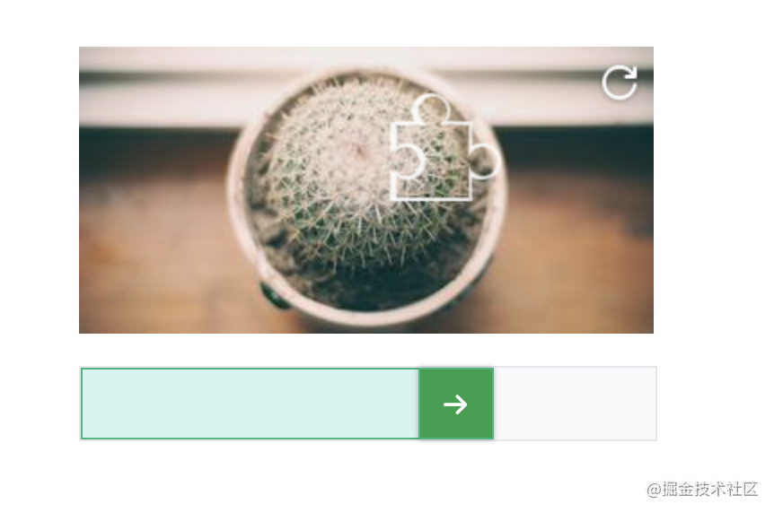
Effect demonstration

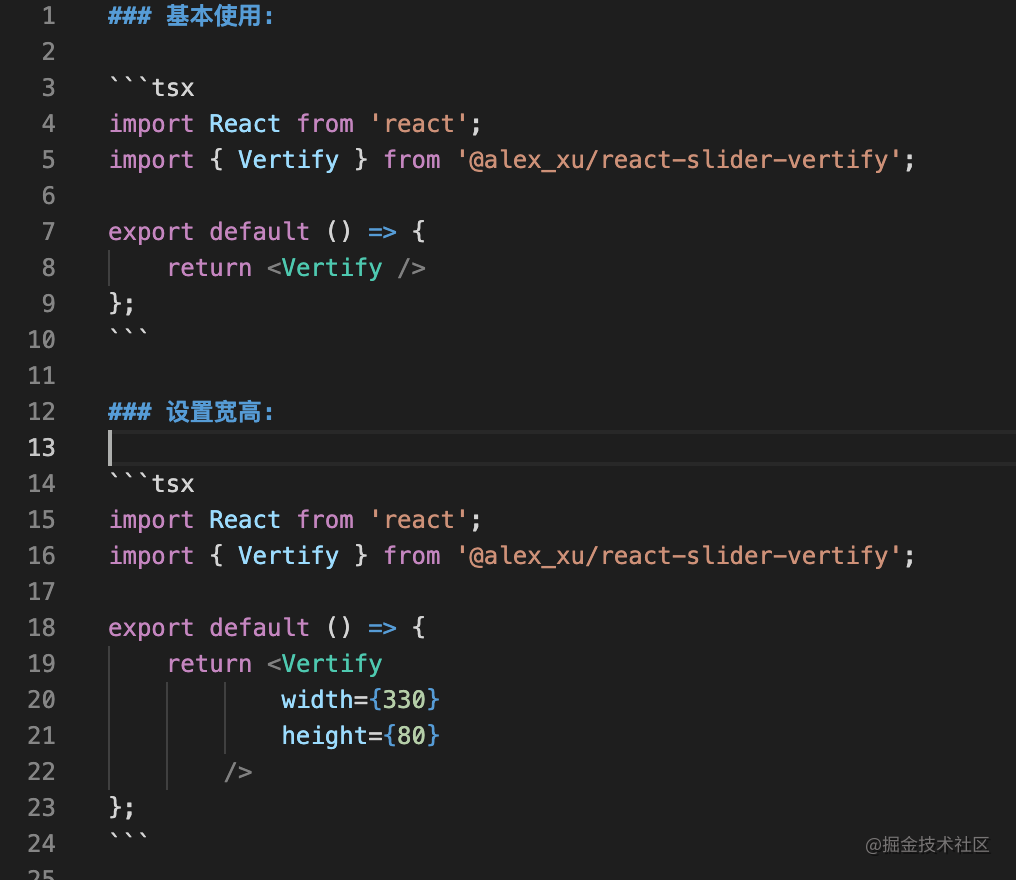
Basic use and technical implementation of sliding verification component
The figure above is an effect demonstration of the sliding verification component implemented. Of course, there are many configuration items to choose from, so as to support more customized scenarios. Next, I will introduce how to install and use this verification code plug-in to give you an intuitive experience, and then I will introduce the implementation idea of sliding verification code in detail. If you have a certain technical foundation, you can also jump to the technical implementation part directly.
Basic use
Because the react slider verify component has been released to npm, you can install and use it as follows:
- install
# Or yarn add @alex_xu/react-slider-vertify
npm i @alex_xu/react-slider-vertify -S
- use
import React from 'react';
import { Vertify } from '@alex_xu/react-slider-vertify';

export default () => {
    return <Vertify
            width={320}
            height={160}
            onSuccess={() => alert('success')}
            onFail={() => alert('fail')}
            onRefresh={() => alert('refresh')}
        />
};
Through the above two steps, we can easily use this sliding verification code component. Is it very simple?
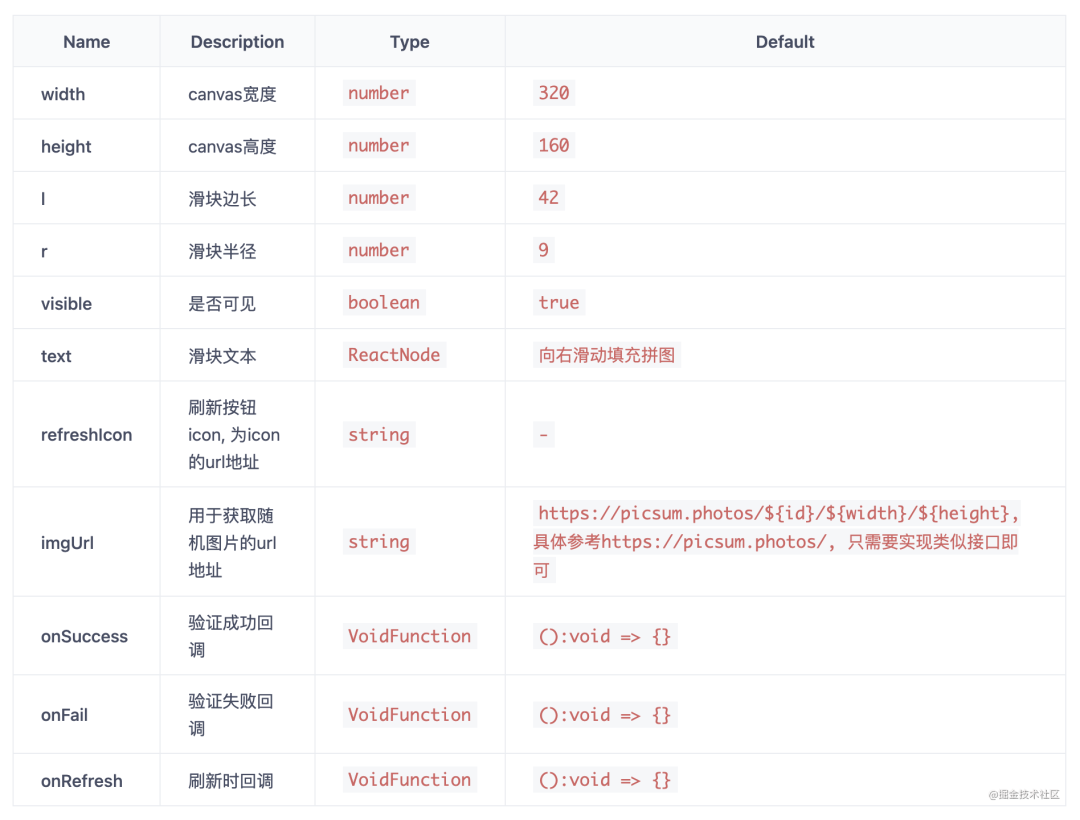
Of course, I also exposed many configurable properties to give you better control over the components. Reference is as follows:
Technical realization
Before doing this project, I also studied some sliding verification code knowledge and existing technical solutions, and gained a lot. Next, I will use my component design ideas to introduce to you how to use react to implement and encapsulate sliding verification code components. If you have better ideas and suggestions, you can also feed back to me at any time in the comment area.
1. Ideas and skills of component design
Everyone has their own way and style of designing components, but the ultimate goal is to design components more elegant. Here, I will give a brief list of the design indicators of elegant components:
- Readability (unified and clear code format, complete comments, clear code structure and proper use of programming paradigm)
- Availability (complete code functions, good compatibility in different scenarios, business logic coverage)
- Reusability (code can be reused by other business modules)
- Maintainability (the code is easy to maintain and expand, and has certain downward / upward compatibility)
- High performance
The above are the consideration indicators of my own design components, which you can refer to.
In addition, before designing the component, we also need to clarify the requirements. Take the sliding verification code component as an example. We need to know its use scenario (man-machine verification service for login registration, activities, forums, SMS and other high-risk business scenarios) and requirements (interaction logic, how to verify, and what attributes need to be exposed).
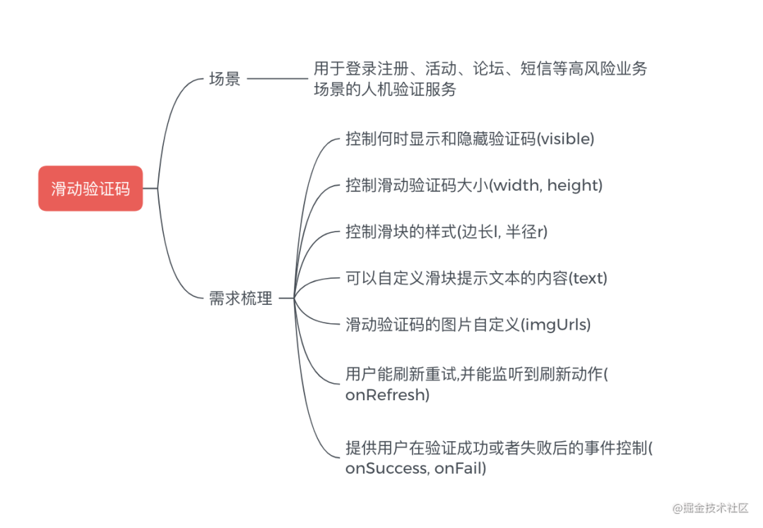
The above is a general component development requirement I combed. Before developing specific components, if we encounter complex business logic, we can also list each implementation step and implement it one by one, which will help to sort out our ideas and more efficient development.
2. Basic implementation principle of sliding verification code
After introducing the component design idea and requirement analysis, let's take a look at the implementation principle of sliding verification code.

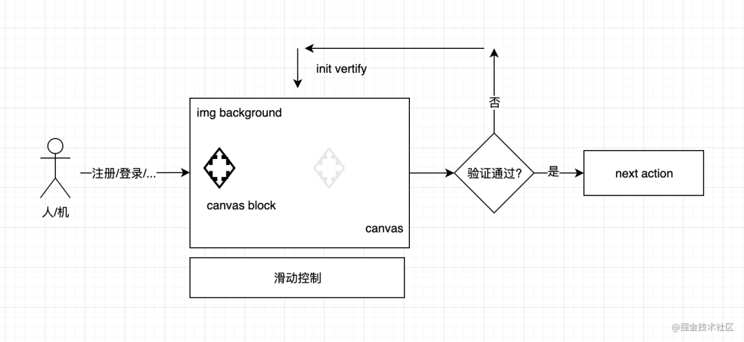
We all know that the main purpose of designing verification code is to prevent the machine from illegally and violently invading our application. The core problem to be solved is to judge who is operating the application (human or machine), so the usual solution is random identification.
In the above figure, we can see that the verification is successful only when the user manually drags the slider to the corresponding hollowed out area. The position of the hollowed out area is random (the randomness test is temporarily implemented in the front-end way, and the safer way is to return the position and picture through the back-end).
Based on the above analysis, we can get a basic design schematic diagram of sliding verification code:
Next, we will package this extensible sliding verification code component together.
3. Encapsulate an extensible sliding verification code component
According to my consistent style of developing components, I will first write the basic framework of components based on requirements:
import React, { useRef, useState, useEffect, ReactNode } from 'react';
interface IVertifyProp {
/**
* @description canvas width
* @default 320
*/
width:number,
/**
* @description canvas height
* @default 160
*/
height:number,
/**
* @description Slider side length
* @default 42
*/
l:number,
/**
* @description Slider radius
* @default 9
*/
r:number,
/**
* @description Is it visible
* @default true
*/
visible:boolean,
/**
* @description Slider text
* @default Slide fill puzzle right
*/
text:string | ReactNode,
/**
* @description The refresh button icon is the url address of the icon
* @default -
*/
refreshIcon:string,
/**
* @description url address used to get random pictures
* @default https://picsum.photos/${id}/${width}/${height}, Specific reference https://picsum.photos/ , you only need to implement similar interfaces
*/
imgUrl:string,
/**
* @description Verification successful callback
* @default ():void => {}
*/
onSuccess:VoidFunction,
/**
* @description Verification failure callback
* @default ():void => {}
*/
onFail:VoidFunction,
/**
* @description Callback on refresh
* @default ():void => {}
*/
onRefresh:VoidFunction
}
export default ({
width = 320,
height = 160,
l = 42,
r = 9,
imgUrl,
text,
refreshIcon = 'http://yourimgsite/icon.png',
visible = true,
onSuccess,
onFail,
onRefresh
}: IVertifyProp) => {
return <div className="vertifyWrap">
<div className="canvasArea">
<canvas width={width} height={height}></canvas>
<canvas className="block" width={width} height={height}></canvas>
</div>
<div className={sliderClass}>
<div className="sliderMask">
<div className="slider">
<div className="sliderIcon">→</div>
</div>
</div>
<div className="sliderText">{ textTip }</div>
</div>
<div className="refreshIcon" onClick={handleRefresh}></div>
<div className="loadingContainer">
<div className="loadingIcon"></div>
<span>Loading...</span>
</div>
</div>
}
The above is the basic framework of our components. From the code, we can find that the component attributes are clear at a glance, which is the benefit of sorting out the requirements in advance. It can make us think more clearly when writing components. After writing the basic css style, the interface we see is as follows:

Next, we need to implement the following core functions:
- Realization of hollowed out effect with canvas images
- Realization of hollow pattern canvas
- Slider movement and verification logic implementation
The above description may be abstract. Let me draw a diagram:

Because the component implementation completely adopts react hooks, if you are not familiar with hooks, you can also refer to my previous article:
1. canvas picture to achieve hollowed out effect

Before starting coding, we need to have a basic understanding of canvas. It is suggested that unfamiliar friends can refer to the efficient canvas learning document: Canvas of MDN.
It can be seen from the above figure that the first problem to be solved is how to draw irregular graphics with canvas. Here I simply draw a sketch:
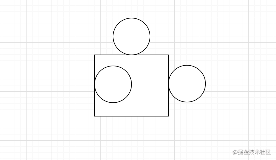
We only need to use the path api provided by canvas to draw the path in the figure above, and fill the path with any translucent color. It is suggested that those unfamiliar with the api can first understand the following api:
- beginPath() start path drawing
- moveTo() moves the stroke to the specified point
- arc() draws an arc
- lineTo() draw a line
- stroke() stroke
- Fill
- clip() cutting path
The implementation method is as follows:
const drawPath  = (ctx:any, x:number, y:number, operation: 'fill' | 'clip') => {
    ctx.beginPath()
    ctx.moveTo(x, y)
    ctx.arc(x + l / 2, y - r + 2, r, 0.72 * PI, 2.26 * PI)
    ctx.lineTo(x + l, y)
    ctx.arc(x + l + r - 2, y + l / 2, r, 1.21 * PI, 2.78 * PI)
    ctx.lineTo(x + l, y + l)
    ctx.lineTo(x, y + l)
    // anticlockwise is a Boolean value. When true, it is counterclockwise, otherwise it is clockwise
    ctx.arc(x + r - 2, y + l / 2, r + 0.4, 2.76 * PI, 1.24 * PI, true)
    ctx.lineTo(x, y)
    ctx.lineWidth = 2
    ctx.fillStyle = 'rgba(255, 255, 255, 0.8)'
    ctx.strokeStyle = 'rgba(255, 255, 255, 0.8)'
    ctx.stroke()
    ctx.globalCompositeOperation = 'destination-over'
    // Judge whether to fill or cut. Cutting is mainly used to generate pattern sliders
    operation === 'fill'? ctx.fill() : ctx.clip()
}
This implementation scheme also refers to the native js implementation of yield boss. What needs to be added here is the globalCompositeOperation attribute of canvas. Its main purpose is to set how to draw a source (New) image onto the target (existing) image.
- Source image = the drawing we intend to place on the canvas
- Target image = the drawing we have placed on the canvas
There is an image example on w3c:
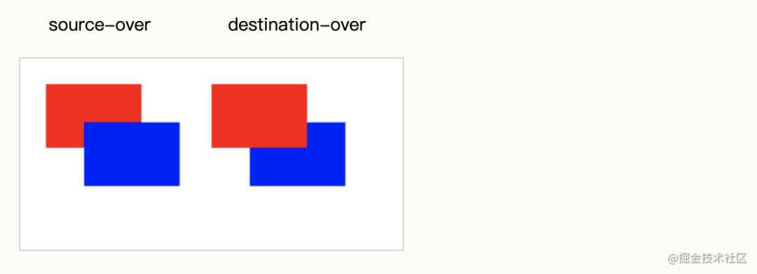
The reason why this attribute is set here is to make the hollowed out shape not affected by the background basemap and cover it above the background basemap. As follows:

Next, we just need to draw the picture on the canvas:
const canvasCtx = canvasRef.current.getContext('2d')
// Draw hollow shape
drawPath(canvasCtx, 50, 50, 'fill')

// Draw in picture
canvasCtx.drawImage(img, 0, 0, width, height)
Of course, as for how to generate random pictures and random positions, the implementation method is also very simple. For the front-end implementation, math Random.
2. Realize hollow pattern canvas
If the hollowed out shape is implemented above, the hollowed out pattern is similar. We only need to use the clip() method to cut the picture into the shape mask and place the hollowed out pattern on the left side of the canvas. The code is as follows:
const blockCtx = blockRef.current.getContext('2d')
drawPath(blockCtx, 50, 50, 'clip')
blockCtx.drawImage(img, 0, 0, width, height)

// Extract the pattern slider and place it to the far left
const y1 = 50 - r * 2 - 1
const ImageData = blockCtx.getImageData(xRef.current - 3, y1, L, L)
// Adjust slider canvas width
blockRef.current.width = L
blockCtx.putImageData(ImageData, 0, y1)
In the above code, we use getImageData and putImageData. These two APIs are mainly used to obtain the pixel data of canvas scene and write the pixel data of scene. The results are as follows:

3. Realize slider movement and verification logic
The scheme to move the slider is also relatively simple. We only need to use the event event event of the mouse:
- onMouseDown
- onMouseMove
- onMouseUp
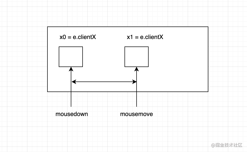
The above is a simple schematic diagram, and the specific implementation code is as follows:
const handleDragMove = (e) => {
    if (!isMouseDownRef.current) return false
    e.preventDefault()
    // To support the mobile terminal, you can use e.touches[0]
    const eventX = e.clientX || e.touches[0].clientX
    const eventY = e.clientY || e.touches[0].clientY
    const moveX = eventX - originXRef.current
    const moveY = eventY - originYRef.current
    if (moveX < 0 || moveX + 36 >= width) return false
    setSliderLeft(moveX)
    const blockLeft = (width - l - 2r) / (width - l) * moveX
    blockRef.current.style.left = blockLeft + 'px'
}
Of course, we also need to monitor the events after the drag is stopped to judge whether the verification is successful, and embed successful and failed callbacks. The code is as follows:
const handleDragEnd = (e) => {
    if (!isMouseDownRef.current) return false
    isMouseDownRef.current = false
    const eventX = e.clientX || e.changedTouches[0].clientX
    if (eventX === originXRef.current) return false
    setSliderClass('sliderContainer')
    const { flag, result } = verify()
    if (flag) {
      if (result) {
        setSliderClass('sliderContainer sliderContainer_success')
        // Custom callback function after success
        typeof onSuccess === 'function' && onSuccess()
      } else {
        // Verification failed, refresh reset
        setSliderClass('sliderContainer sliderContainer_fail')
        setTextTip('please try again')
        reset()
      }
    } else {
      setSliderClass('sliderContainer sliderContainer_fail')
      // Custom callback function after failure
      typeof onFail === 'function' && onFail()
      setTimeout(reset.bind(this), 1000)
    }
}
The results are as follows:

Of course, there are still some details that need to be optimized. Here is a complete code on github. You can refer to it and learn it. If you want to contribute to this component, you can also mention issue at any time.
4. How to use dumi to build component documents
In order to make components better understood and used by others, we can build component documents. As a front-end coder who loves open source, writing component documents is also a good development habit. Next, we also write component documents for react slider verify. Here I use dumi to build component documents. Of course, you can also use other schemes (such as storybook). Let's take a look at the effect after construction:


The dumi build component document is very simple. Next, I'll introduce the installation and use methods to you.
- install
$ npx @umijs/create-dumi-lib        # Initialize a document mode component library development scaffold
# or
$ yarn create @umijs/dumi-lib

$ npx @umijs/create-dumi-lib --site # Initialize a site mode component library development scaffold
# or
$ yarn create @umijs/dumi-lib --site
- Local operation
npm run dev
# or
yarn dev
- Document
Dumi convention defines the location and method of document writing. There are also specific descriptions on its official website. Here is a brief diagram of the component directory structure built by dumi:
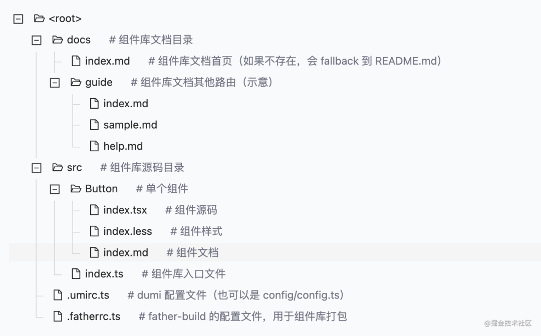
We can write the description of the first page and guide page of the component library document under docs, and use index. In the folder of a single component MD is used to write the usage document of the component itself. Of course, the whole process is very simple. Here is an example of a document:
In this way, dumi can help us automatically render a component usage document. If you want to learn more about component documentation, you can also learn on dumi's official website.
5. Publish your first npm component package
The last problem is component publishing. Before, many friends asked me how to publish my components to npm for more people to use. There are a lot of materials to learn from this knowledge online. Today, let's use the sliding verification code @ Alex_ Xu / react slider verify example, let's make a brief introduction to you.
- Have an npm account and log in
If you don't have an npm account before, you can register one on the npm official website and log in once with the familiar IDE terminal:
npm login
After entering the user name and password, we can publish the component package through the command line:
npm publish --access public
The reason why the public parameter is added after the instruction is to avoid the failure of publishing the component package due to permission problems. In order to save trouble, we can also configure the release command to package JSON, automatically publish after the component is packaged:
{
    "scripts": {
        "start": "dumi dev",
        "release": "npm run build && npm publish --access public",
  }
}
In this way, we can easily publish components to npm for others to use! I have also opened many component libraries before. If you have any questions about the details of component packaging and construction process, you can also refer to the scheme of my previous open source project. Effect after publishing to npm:
last
If you are interested in visual construction or low code / zero code, you can also refer to my previous articles or exchange your ideas and experiences in the comment area. Welcome to explore the real front-end technology together.