Write in front
The mastery of CSS layout determines your page development speed in Web development. With the continuous innovation of Web technology, there are countless ways to realize various layouts.
Recently, it took about half a month to organize a series by using fragment time. This series of articles summarizes various layouts, implementation methods and common skills in CSS. Let you have a new understanding of CSS layout through this series of articles.
Navigation posts of this series Point me in , you can quickly jump to the articles you want to know (recommended Collection)
Article overview
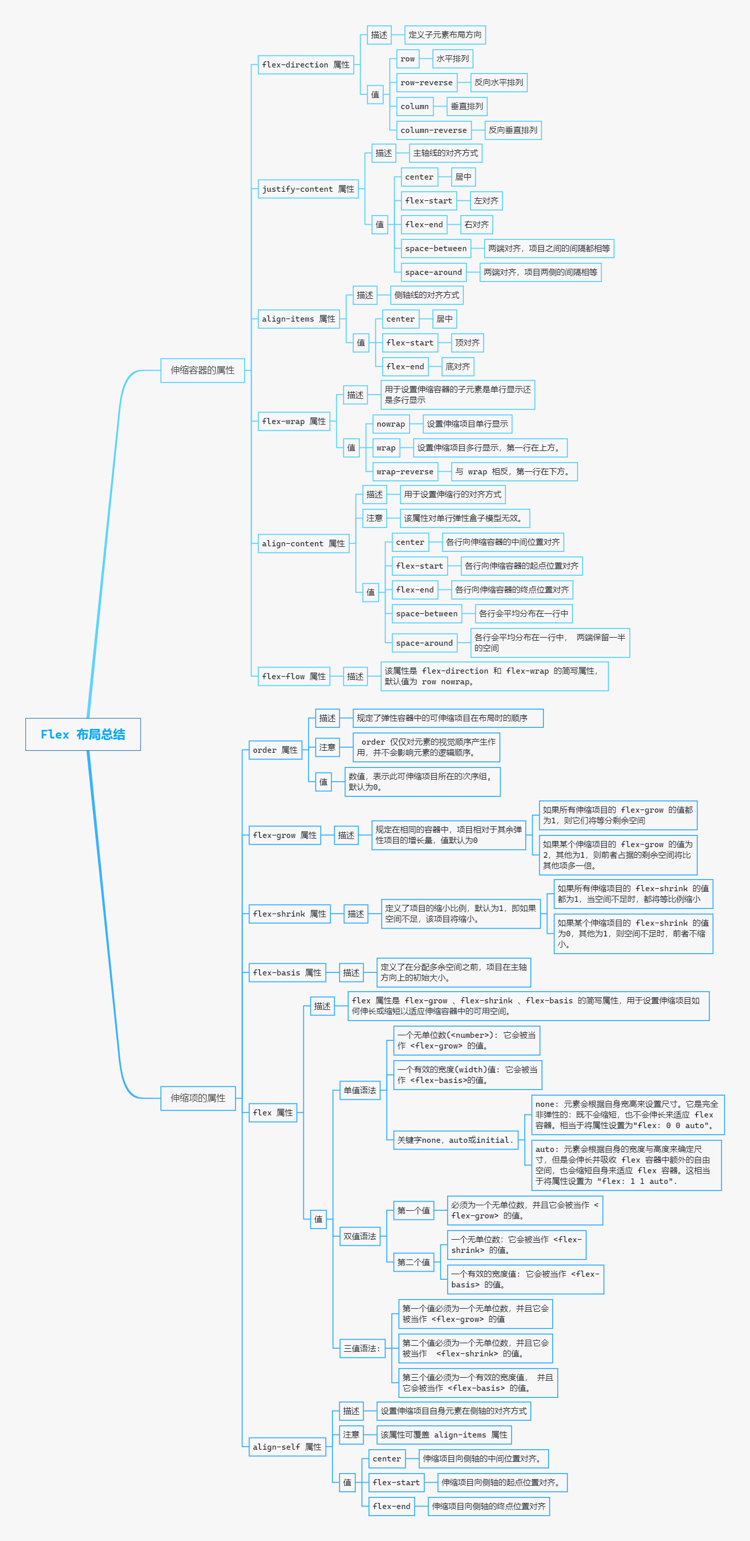
Due to the long length (please read carefully), the following figure covers the main knowledge points of this article
Text start
What is the elastic box model
CSS3 adds a Flexible Box model (Flexible Box or FlexBox), which is a new way to realize layout in HTML pages. So that elements can run predictably when HTML pages adapt to different sizes of screens and different devices.
The elastic box model implements HTML page layout independent of direction. Unlike block level layout, which focuses on vertical direction, inline layout focuses on horizontal direction.
The elastic box model is mainly applicable to the components of HTML pages and small-scale layout, but not to large-scale layout, otherwise it will affect the performance of HTML pages.
Related concepts of elastic box model
The new elastic box model in CSS3 is a complete module, involving many style attributes. Firstly, we have a basic understanding of the related concepts of the elastic box model.
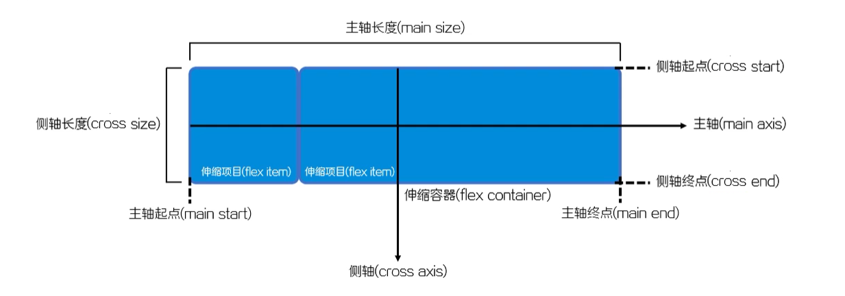
- Flex container: the parent element that wraps the telescopic item.
- Flex item: each child element of the flex container.
- Axis: each elastic box model has two axes.
- Main axis: the axis along which the telescopic items are arranged at one time is called the main axis.
- Cross axis: the axis perpendicular to the main shaft is called the side axis.
- Direction: the main shaft of the telescopic container consists of the starting point and the ending point of the main shaft, and the side shaft describes the arrangement direction of the telescopic items by the starting point and the ending point of the side shaft.
- Dimension: the width and height of the telescopic item according to the main axis and side axis of the telescopic container.
- The corresponding spindle is called the spindle size.
- The dimension corresponding to the side shaft is called the side shaft dimension.
Define elastic box model
If you want to set it as an elastic box model in CSS3, you need to set the value to flex or inline flex through the display style attribute.
display: fiex; /* The value flex makes the elastic container a block level element. */
/* perhaps */
display: inline-fiex; /* The value inline flex makes the elastic container a single, indivisible inline element. */
The above code can specify an element as an elastic box model, the element becomes a telescopic container, and the child element becomes a telescopic project.
The elastic box model also has browser compatibility problems. The solutions are as follows:
/* WebKit Engine browser (Chrome, Safari, Opera) */
display: -webkit-fiex;
/* Trident Engine browser (IE 10 +) */
dispaly: -ms-fiex;
/* Gecko Engine browser (Firefox) */
display: -moz-fiex;
/* Presto Engine browser (Opera) */
dispaly: -o-fiex;
The example code is as follows: define a simple Flex Box
<!DOCTYPE html>
<html lang="en">
    <head>
        <meta charset="UTF-8" />
        <meta name="viewport" content="width=device-width, initial-scale=1.0" />
        <title>Define elastic box model</title>
        <link rel="stylesheet" href="./init.css" />
        <style>
            /*
                Set the parent element to the elastic box model
                * If this is set, all elements of the child are elastic box models
                * By default, all child elements are arranged horizontally along the main axis as telescopic items
            */
            .container {
                display: flex;
            }
        </style>
    </head>

    <body>
        <!-- HTML The structure is a parent-child structure -->
        <div class="container">
            <div class="item1 item">1</div>
            <div class="item2 item">2</div>
            <div class="item3 item">3</div>
        </div>
    </body>
</html>
There are no floating and other styles about layout, just The display of the container is set to flex
The execution results are as follows:;
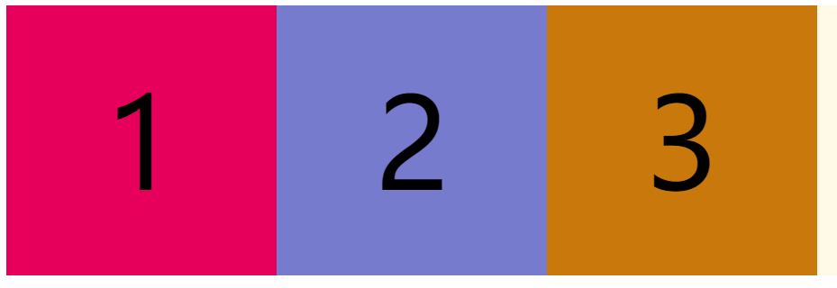
By default, all child elements are arranged horizontally along the main axis as telescopic items
Properties of the telescopic container
Flex direction property
The CSS flex direction attribute specifies how the internal elements are laid out in the flex container and defines the direction of the spindle (positive or negative).
Grammatical structure
flex-direction: row | row-reverse | column | column-reverse;
value
-
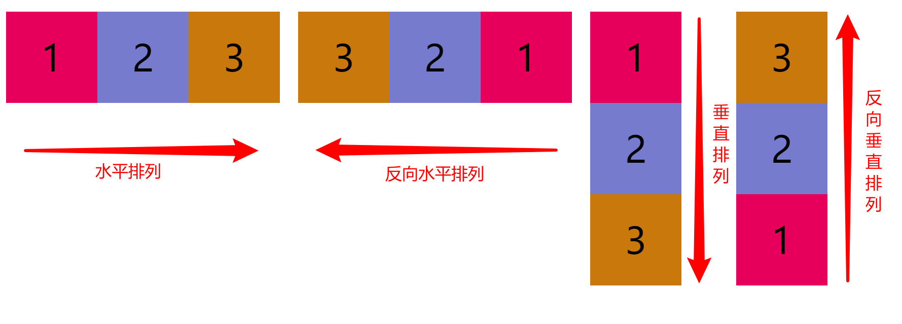
row: by default, the main axis of the flex container is defined to be the same as the text direction. The spindle start point and spindle end point are the same as the content direction (the start point is at the left end).
-
Row reverse: behaves the same as row, but replaces the spindle start point and spindle end point (the start point is at the right end)
-
column: the main axis of the flex container is the same as the block axis. The starting point of the spindle is the same as the end point of the spindle and the front and rear points of the writing mode (the starting point is on the top edge)
-
Column reverse: the performance is the same as that of column, but the spindle start point and spindle end point are replaced (the start point is on the lower edge)
<!DOCTYPE html>
<html lang="en">
    <head>
        <meta charset="UTF-8" />
        <meta http-equiv="X-UA-Compatible" content="IE=edge" />
        <meta name="viewport" content="width=device-width, initial-scale=1.0" />
        <title>02 flex-direction attribute</title>
        <link rel="stylesheet" href="./init.css" />
        <style>
            body {
                display: flex;
            }
            .container {
                display: flex;
                margin: 20px;
            }
            /*
                flex-direction attribute
                * Function: create spindle direction
                * For telescopic container elements
                * value
                    * row: Sets the spindle to be horizontal by default
                    * row-reverse: Opposite to row
                    * column: Sets the direction of the spindle to be vertical
                    * column-reverse: Opposite to column direction
            */
            .row {
                /* Default, horizontal */
                flex-direction: row;
                height: 200px;
            }
            .row-reverse {
                /* Horizontal, reverse */
                flex-direction: row-reverse;
                height: 200px;
            }
            .column {
                /* Vertical arrangement */
                flex-direction: column;
            }
            .column-reverse {
                /* Vertical reverse */
                flex-direction: column-reverse;
            }
        </style>
    </head>
    <body>
        <div class="container row">
            <div class="item1 item">1</div>
            <div class="item2 item">2</div>
            <div class="item3 item">3</div>
        </div>
        <div class="container row-reverse">
            <div class="item1 item">1</div>
            <div class="item2 item">2</div>
            <div class="item3 item">3</div>
        </div>
        <div class="container column">
            <div class="item1 item">1</div>
            <div class="item2 item">2</div>
            <div class="item3 item">3</div>
        </div>
        <div class="container column-reverse">
            <div class="item1 item">1</div>
            <div class="item2 item">2</div>
            <div class="item3 item">3</div>
        </div>
    </body>
</html>
The implementation effect is as follows
Justify content attribute
The CSS justify content property is applicable to the telescopic container element and is used to set the alignment of the telescopic items along the main axis.
Grammatical structure
justify-content: center| flex-start| flex-end| space-between| space-around;
value
- center: align (center) the telescopic items to the middle of the first line.
- Flex start: align the telescopic item to the start position of the first line (left alignment).
- Flex end: align the telescopic item to the end of the first line (right alignment).
- Space between: the scaling items are evenly distributed in a row (both ends are aligned, and the spacing between items is equal).
- Space around: the telescopic items will be evenly distributed in a row (both ends are aligned, and the spacing on both sides of the items is equal).
Sample code
<!DOCTYPE html>
<html lang="en">
    <head>
        <meta charset="UTF-8" />
        <meta http-equiv="X-UA-Compatible" content="IE=edge" />
        <meta name="viewport" content="width=device-width, initial-scale=1.0" />
        <title>justify-content attribute</title>
        <link rel="stylesheet" href="./init.css" />
        <style>
            .container {
                display: flex;
                width: 1080px;
                margin: 100px auto 0;
            }
            .item {
                height: 100px;
                width: 240px;
                line-height: 100px;
            }
            /*
            justify-content attribute
            * Purpose: sets the alignment of telescopic items along the main axis
              * value
                - center: The telescopic item is aligned (centered) to the middle of the first row.
                - flex-start: The telescopic item is aligned to the start of the first line (left aligned).
                - flex-end: The telescopic item is aligned to the end of the first line (right alignment).
                - space-between: The scaling items are evenly distributed in a row (both ends are aligned, and the spacing between items is equal).
                - space-around: The telescopic items are evenly distributed in a row (aligned at both ends and equally spaced on both sides of the item).
            */
            .center {
                justify-content: center; /* Center */
            }
            .start {
                justify-content: flex-start; /* Align left */
            }
            .end {
                justify-content: flex-end; /* Right align */
            }
            .between {
                justify-content: space-between; /* Align both ends so that the spacing between items is equal */
            }
            .around {
                justify-content: space-around; /* Both ends are aligned with equal spacing on both sides of the item */
            }
        </style>
    </head>
    <body>
        <div class="container center">
            <div class="item1 item">1</div>
            <div class="item2 item">2</div>
            <div class="item3 item">3</div>
        </div>
        <div class="container start">
            <div class="item1 item">1</div>
            <div class="item2 item">2</div>
            <div class="item3 item">3</div>
        </div>
        <div class="container end">
            <div class="item1 item">1</div>
            <div class="item2 item">2</div>
            <div class="item3 item">3</div>
        </div>
        <div class="container between">
            <div class="item1 item">1</div>
            <div class="item2 item">2</div>
            <div class="item3 item">3</div>
        </div>
        <div class="container around">
            <div class="item1 item">1</div>
            <div class="item2 item">2</div>
            <div class="item3 item">3</div>
        </div>
    </body>
</html>
The implementation effect is as follows
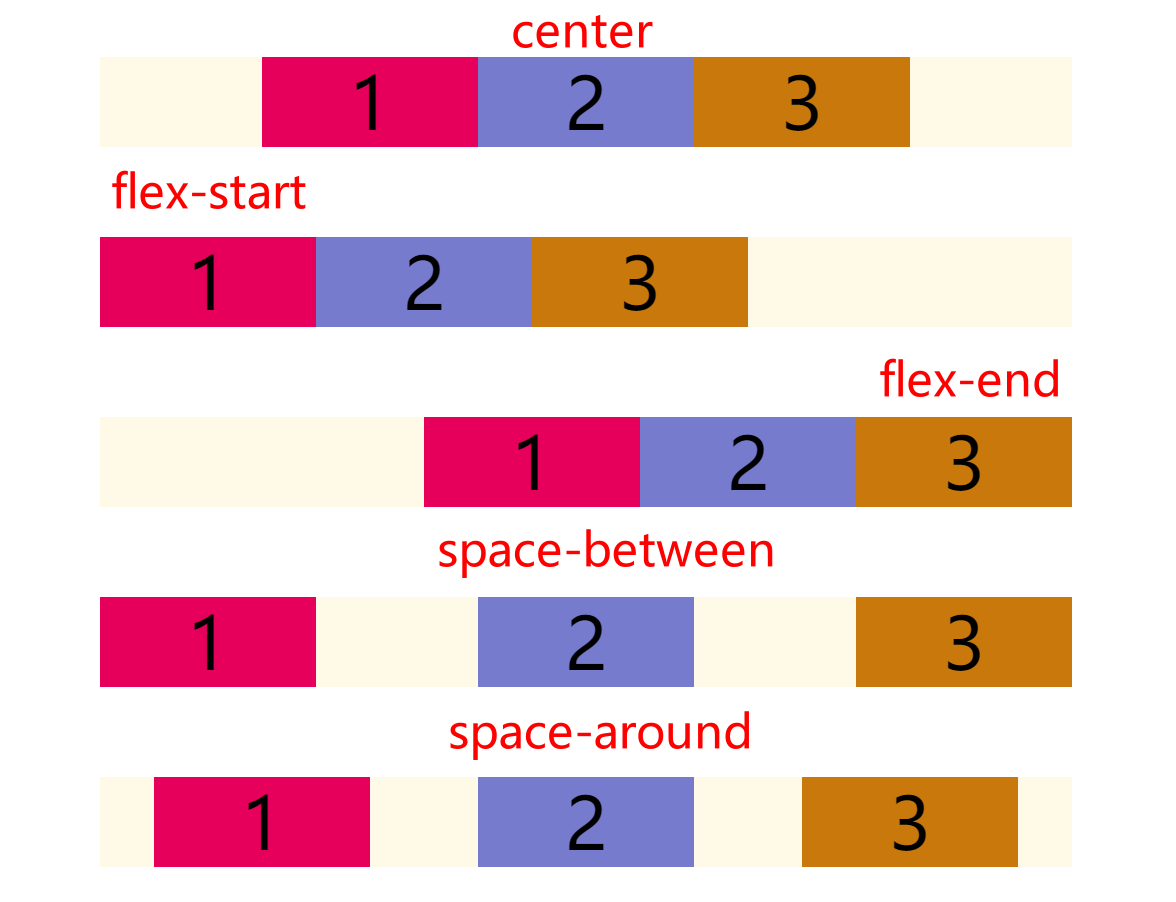
It is worth noting that the implementation is the alignment of the scaling project relative to the scaling container, independent of the page
Align items property
The CSS align items property is applicable to the telescopic container element and is used to set the alignment of the row where the telescopic item is located along the side axis.
Grammatical structure
align-items: center | flex-start| flex-end| baseline| stretch;
value
- center: the telescopic items are aligned to the middle of the side axis.
- Flex start: the telescopic item is aligned to the starting position of the side axis.
- Flex end: the telescopic item is aligned to the end position of the side axis.
- Baseline: the telescopic project is aligned according to the baseline of the telescopic project.
- Stretch: by default, the stretch item stretches to fill the entire stretch container.
<!DOCTYPE html>
<html lang="en">
    <head>
        <meta charset="UTF-8" />
        <meta http-equiv="X-UA-Compatible" content="IE=edge" />
        <meta name="viewport" content="width=device-width, initial-scale=1.0" />
        <title>align-items attribute</title>
        <link rel="stylesheet" href="./init.css" />
        <style>
            body {
                display: flex;
            }
            .container {
                display: flex;
                width: 600px;
                height: 500px;
            }
            /*
              align-items attribute
              * Function: sets the alignment of the row where the telescopic item is located along the side axis
                * value
                  - center: The telescopic items are aligned to the middle of the side shaft.
                  - flex-start: The telescopic item is aligned to the starting position of the side axis.
                  - flex-end: The telescopic item is aligned to the end position of the side axis.
                  - baseline: The telescopic items are aligned according to the baseline of the telescopic items.
                  - stretch: By default, the telescopic item stretches to fill the entire telescopic container.
            */
            .center {
                align-items: center; /* Center */
            }
            .start {
                align-items: flex-start; /* Top alignment */
            }
            .end {
                align-items: flex-end; /* Bottom  */
            }
        </style>
    </head>
    <body>
        <div class="container center">
            <div class="item1 item">1</div>
            <div class="item2 item">2</div>
            <div class="item3 item">3</div>
        </div>
        <div class="container start">
            <div class="item1 item">1</div>
            <div class="item2 item">2</div>
            <div class="item3 item">3</div>
        </div>
        <div class="container end">
            <div class="item1 item">1</div>
            <div class="item2 item">2</div>
            <div class="item3 item">3</div>
        </div>
    </body>
</html>
The implementation effect is as follows

With the justify content attribute, horizontal and vertical centering can be made
Flex wrap attribute
The CSS flex wrap attribute is applicable to the telescopic container element. It is used to set whether the child elements of the telescopic container are displayed in a single line or multiple lines.
Grammatical structure
flex-wrap: nowrap| wrap| wrap-reverse
value
- nowrap: sets the single line display of scalable items. This may cause overflow of the telescopic container
- wrap: sets the multi line display of telescopic items, with the first line above.
- Wrap reverse: opposite to wrap, the first line is below.
<!DOCTYPE html>
<html lang="en">
    <head>
        <meta charset="UTF-8" />
        <meta http-equiv="X-UA-Compatible" content="IE=edge" />
        <meta name="viewport" content="width=device-width, initial-scale=1.0" />
        <title>flex-wrap attribute</title>
        <link rel="stylesheet" href="./init.css" />
        <style>
            body {
                display: flex;
            }
            .container {
                display: flex;
                width: 600px;
                height: 400px;
            }
            .item {
                width: 200px;
            }
            /*
              flex-wrap attribute
              * Function: set whether the child elements of the telescopic container are displayed in a single line or in multiple lines.
              * value
               - nowrap: Set the single line display of telescopic items. This may cause overflow of the telescopic container
               - wrap: Set the multi line display of telescopic items, with the first line above.
               - wrap-reverse: In contrast to 'wrap', the first line is below.
            */
            .nowrap {
                flex-wrap: nowrap;
            }
            .wrap {
                flex-wrap: wrap;
            }
            .wrap-reverse {
                flex-wrap: wrap-reverse;
            }
        </style>
    </head>
    <body>
        <div class="container nowrap">
            <div class="item1 item">1</div>
            <div class="item2 item">2</div>
            <div class="item3 item">3</div>
            <div class="item4 item">4</div>
        </div>
        <div class="container wrap">
            <div class="item1 item">1</div>
            <div class="item2 item">2</div>
            <div class="item3 item">3</div>
            <div class="item4 item">4</div>
        </div>
        <div class="container wrap-reverse">
            <div class="item1 item">1</div>
            <div class="item2 item">2</div>
            <div class="item3 item">3</div>
            <div class="item4 item">4</div>
        </div>
    </body>
</html>
The implementation effect is as follows

If the width of the telescopic container is set to be less than the sum of the widths of all child elements, the child elements do not wrap or overflow.
The effect automatically adjusts the width of all child elements according to the width of the telescopic container
Align content attribute
The CSS align content attribute is applicable to the telescopic container element and is used to set the alignment of telescopic rows. This property changes the effect of the flex wrap property.
This property is not valid for a single line elastic box model.
Grammatical structure
align-content: center| flex-start| flex-end| space-between| space-around| stretch;
value
- center: align the rows to the middle of the telescopic container.
- Flex start: align the rows to the starting point of the telescopic container.
- Flex end: align the rows to the end of the telescopic container.
- Space between: each row is evenly distributed in one row.
- Space around: each row is evenly distributed in one row, and half the space is reserved at both ends.
- Stretch: by default, each row will stretch to take up additional space.
The example code is as follows:
<!DOCTYPE html>
<html lang="en">
    <head>
        <meta charset="UTF-8" />
        <meta http-equiv="X-UA-Compatible" content="IE=edge" />
        <meta name="viewport" content="width=device-width, initial-scale=1.0" />
        <title>align-content attribute</title>
        <link rel="stylesheet" href="./init.css" />
        <style>
            body {
                display: flex;
                flex-wrap: wrap;
            }
            .container {
                display: flex;
                width: 600px;
                height: 500px;
                flex-wrap: wrap;
            }
            .item {
                width: 200px;
            }
            /*
            align-content attribute
            * Function: set the alignment of telescopic rows
              * value
                - center: The rows are aligned (centered) to the middle of the telescopic container.
                - flex-start: Each row is aligned to the start position of the telescopic container (top alignment).
                - flex-end: Each row is aligned to the end position of the telescopic container (bottom alignment).
                - space-between: The rows are evenly distributed in a row (both ends are aligned, and the spacing between items is equal).
                - space-around: Each row will be evenly distributed in one row, with - half space reserved at both ends (both ends are aligned, and the spacing on both sides of the item is equal).
                - stretch: By default, rows will stretch to take up additional space.
            * Note: this attribute is invalid for single line, i.e. with flex Wrap: nowrap
            */
            .center {
                align-content: center; /* Center */
            }
            .start {
                align-content: flex-start; /* Top alignment */
            }
            .end {
                align-content: flex-end; /* Bottom  */
            }
            .between {
                align-content: space-between; /* Align both ends so that the spacing between items is equal */
            }
            .around {
                align-content: space-around; /* Both ends are aligned with equal spacing on both sides of the item */
            }
        </style>
    </head>
    <body>
        <div class="container center">
            <div class="item1 item">1</div>
            <div class="item2 item">2</div>
            <div class="item3 item">3</div>
            <div class="item4 item">4</div>
        </div>
        <div class="container start">
            <div class="item1 item">1</div>
            <div class="item2 item">2</div>
            <div class="item3 item">3</div>
            <div class="item4 item">4</div>
        </div>
        <div class="container end">
            <div class="item1 item">1</div>
            <div class="item2 item">2</div>
            <div class="item3 item">3</div>
            <div class="item4 item">4</div>
        </div>
        <div class="container between">
            <div class="item1 item">1</div>
            <div class="item2 item">2</div>
            <div class="item3 item">3</div>
            <div class="item4 item">4</div>
        </div>
        <div class="container around">
            <div class="item1 item">1</div>
            <div class="item2 item">2</div>
            <div class="item3 item">3</div>
            <div class="item4 item">4</div>
        </div>
    </body>
</html>
The implementation effect is as follows
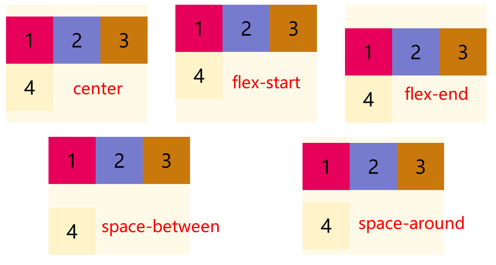
It is worth noting that this attribute is invalid for the single line elastic box model, i.e. with flex Wrap: nowrap
Flex flow property
CSS flex flow attribute is applicable to the telescopic container element. This attribute is the abbreviation of flex direction and flex wrap. The default value is row nowrap.
Grammatical structure
flex-flow: <'flex-direction'> || <'flex-wrap'>
Properties of the scale item
order attribute
The CSS order property specifies the order in which the scalable items in the elastic container are laid out. Elements are arranged in ascending order of the value of the order attribute. Elements with the same order attribute value are laid out in the order they appear in the source code.
Grammatical structure
.item {
  order: <integer>
}
Attribute value
- < integer >: indicates the order group of this scalable item. The default value is 0.
Note: order only affects the visual order of elements and does not affect the logical order of elements.
Sample code
<!DOCTYPE html>
<html lang="en">
    <head>
        <meta charset="UTF-8" />
        <meta http-equiv="X-UA-Compatible" content="IE=edge" />
        <meta name="viewport" content="width=device-width, initial-scale=1.0" />
        <title>order attribute</title>
        <link rel="stylesheet" href="./init.css" />
        <style>
            body {
                display: flex;
                flex-wrap: wrap;
            }
            .container {
                display: flex;
                width: 800px;
                height: 300px;
                align-items: center;
            }
            .item { width: 200px;}
            /*
              order Property defines the order in which items are arranged. The smaller the value, the higher the arrangement. The default value is 0.
            */
            .item1 { order: 2; }
            .item4 { order: -1;}
        </style>
    </head>
    <body>
        <div class="container">
            <div class="item1 item">1</div>
            <div class="item2 item">2</div>
            <div class="item3 item">3</div>
            <div class="item4 item">4</div>
        </div>
    </body>
</html>
The implementation effect is as follows
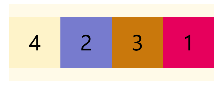
Using this property can easily change its layout
Flex growth attribute
The flex growth attribute specifies the growth of items relative to other elastic items in the same container. The default value is 0
The syntax structure is as follows:
.item {
  flex-grow: <number>;
}
The example code is as follows
<!DOCTYPE html>
<html lang="en">
    <head>
        <meta charset="UTF-8" />
        <meta http-equiv="X-UA-Compatible" content="IE=edge" />
        <meta name="viewport" content="width=device-width, initial-scale=1.0" />
        <title>flex-grow attribute</title>
        <link rel="stylesheet" href="./init.css" />
        <style>
            body {
                display: flex;
                flex-wrap: wrap;
            }
            .container {
                display: flex;
                width: 800px;
                height: 300px;
                align-items: center;
            }
            .item {
                width: 200px;
            }
            /*
              flex-grow Property specifies the growth of items relative to other elastic items in the same container. The default value is 0
            */
            .item2 {
                flex-grow: 2;
            }
        </style>
    </head>
    <body>
        <div class="container">
            <div class="item1 item">1</div>
            <div class="item2 item">2</div>
            <div class="item1 item">1</div>
        </div>
    </body>
</html>
The implementation effect is as follows
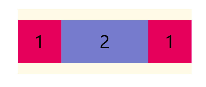
If all flex growth items have a value of 1, they will divide the remaining space equally
If the flex growth value of a scaling item is 2 and the others are 1, the remaining space occupied by the former will be twice as much as that of other items.
Flex shrink attribute
The flex shrink attribute defines the reduction scale of the item, which is 1 by default, that is, if there is insufficient space, the item will be reduced.
The syntax structure is as follows:
.item {
  flex-shrink: <number>;
}
The example code is as follows
<!DOCTYPE html>
<html lang="en">
    <head>
        <meta charset="UTF-8" />
        <meta http-equiv="X-UA-Compatible" content="IE=edge" />
        <meta name="viewport" content="width=device-width, initial-scale=1.0" />
        <title>flex-shrink attribute</title>
        <link rel="stylesheet" href="./init.css" />
        <style>
            body {
                display: flex;
                flex-wrap: wrap;
            }
            .container {
                display: flex;
                width: 500px;
                height: 300px;
                align-items: center;
            }
            .item {
                width: 200px;
            }
            /*
              flex-shrink Property defines the reduction scale of the item. The default is 1, that is, if there is insufficient space, the item will be reduced.
            */
            .item2 {
                flex-shrink: 2;
            }
        </style>
    </head>
    <body>
        <div class="container">
            <div class="item1 item">1</div>
            <div class="item2 item">2</div>
            <div class="item1 item">1</div>
        </div>
    </body>
</html>
The implementation effect is as follows
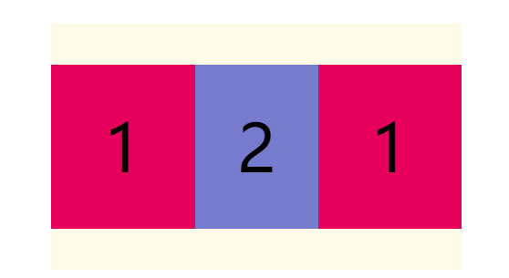
If the flex shrink value of all scaling items is 1, they will be scaled down equally when there is insufficient space
If the flex shrink value of a scaling item is 0 and the others are 1, the former will not shrink when the space is insufficient.
Flex basis attribute
The flex basis attribute defines the initial size of the project in the spindle direction before allocating excess space. Based on this attribute, the browser calculates whether the spindle has excess space. Its default value is auto, which is the original size of the project.
The syntax structure is as follows:
.item {
  flex-basis: <length> | auto;
}
It can be set to the same value as the width or height property. For example, if 230px is set, the project will occupy a fixed space.
flex attribute
CSS flex property is the abbreviation of flex grow, flex shrink and flex basis. It is used to set how the scaling item is elongated or shortened to accommodate the available space in the scaling container.
Grammatical structure
flex: auto | initial | none | [ <'flex-grow'> <'flex-shrink'>? || <'flex-basis'> ]
- none: the element will be sized according to its width and height. It is completely inelastic: it will neither shorten nor elongate to fit the flex container. This is equivalent to setting the property to "flex: 0 0 auto".
- auto: the element will be sized according to its own width and height, but it will elongate and absorb the additional free space in the flex container, and shorten itself to adapt to the flex container. This is equivalent to setting the attribute to "flex: 1 1 auto"
The flex attribute can specify 1, 2, or 3 values.
Single value syntax: the value must be one of the following:
- An unitless number (< number >): it will be treated as the value of < flex growth >.
- A valid width value: it will be treated as the value of < flex basis >.
- Keyword none, auto, or initial
Double value syntax: the first value must be a unitless number, and it will be treated as the value of < flex growth >. The second value must be one of the following:
- A unitless number: it will be treated as the value of < flex shrink >.
- A valid width value: it will be treated as the value of < flex basis >.
Ternary syntax:
- The first value must be a unitless number, and it will be treated as the value of < flex growth >.
- The second value must be a unitless number, and it will be treated as the value of < flex shrink >.
- The third value must be a valid width value, and it will be treated as the value of < flex basis >.
Align self attribute
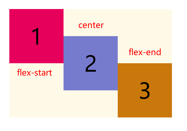
The CSS align self attribute is applicable to the telescopic container element and sets the alignment of the telescopic item's own element on the side axis. This property overrides the align items property. The default value is auto, which inherits the align items attribute of the parent element
Grammatical structure
align-self: center| flex-start| flex-end| baseline| stretch;
- center: the telescopic items are aligned to the middle of the side axis.
- Flex start: the telescopic item is aligned to the starting position of the side axis.
- Flex end: the telescopic item is aligned to the end position of the side axis.
- Baseline: the telescopic project is aligned according to the baseline of the telescopic project.
- Stretch: by default, the stretch item stretches to fill the entire stretch container.
Sample code
<!DOCTYPE html>
<html lang="en">
    <head>
        <meta charset="UTF-8" />
        <meta http-equiv="X-UA-Compatible" content="IE=edge" />
        <meta name="viewport" content="width=device-width, initial-scale=1.0" />
        <title>align-self attribute</title>
        <link rel="stylesheet" href="./init.css" />
        <style>
            body {
                display: flex;
                flex-wrap: wrap;
            }
            .container {
                display: flex;
                width: 600px;
                height: 400px;
                align-items: center;
            }
            .item {
                width: 200px;
            }
            /*
              align-self Property to set the alignment of individual elements
            */
            .start {
                align-self: flex-start;
            }
            .center {
                align-self: center;
            }
            .end {
                align-self: flex-end;
            }
        </style>
    </head>
    <body>
        <div class="container">
            <div class="item1 item start">1</div>
            <div class="item2 item center">2</div>
            <div class="item3 item end">3</div>
        </div>
    </body>
</html>
The implementation effect is as follows
(end)
PS: there is a little game about Flex layout that can help us practice Flexbox Froggy - a game for learning CSS flexbox
CSS styles used
body {
    margin: 0;
    padding: 20px;
}
.container {
    background-color: #fffae8;
    margin: 30px auto;
}
.item {
    height: 200px;
    width: 200px;
    line-height: 200px;
    text-align: center;
    font-size: 80px;
}
.item1 {
    background-color: #e6005c;
}
.item2 {
    background-color: #777bce;
}
.item3 {
    background-color: #c9780c;
}
.item4 {
    background-color: #fef3c9;
}
.item5 {
    background-color: #ce3b3b;
}
.item6 {
    background-color: #e666ff;
}
.item7 {
    background-color: #f4ea20;
}
.item8 {
    background-color: #b4a4ca;
}