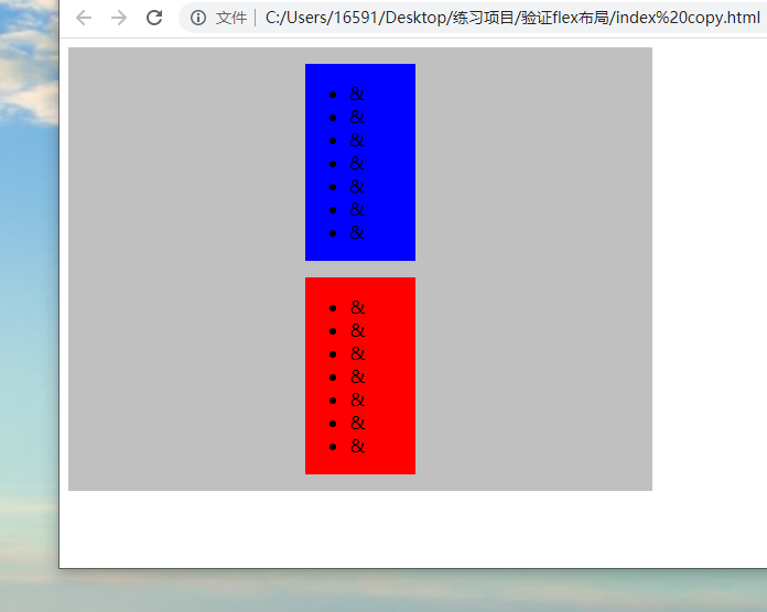
The problem is this: we are going to make a layout effect of the picture below
When the window height is reduced, the red and blue boxes and the largest gray box are reduced accordingly, but the premise is that the red and blue boxes can not overflow to the outside of the gray box, and the contents can not be squeezed
The following is the negative textbook
Content squeeze problem
<style>
.main {
display: flex;
justify-content: center;
align-items: center;
flex-direction: column;
background-color: silver;
width: 500px;
height: 60vh;
padding: 15px;
}
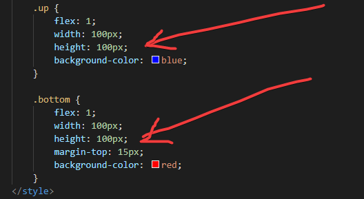
.up {
flex: 1;
width: 100px;
height: 100px;
background-color: blue;
}
.bottom {
flex: 1;
width: 100px;
height: 100px;
margin-top: 15px;
background-color: red;
}
</style>
<div class="main">
<div class="up">
<ul>
<li>&</li>
<li>&</li>
<li>&</li>
<li>&</li>
<li>&</li>
<li>&</li>
<li>&</li>
</ul>
</div>
<div class="bottom">
<ul>
<li>&</li>
<li>&</li>
<li>&</li>
<li>&</li>
<li>&</li>
<li>&</li>
<li>&</li>
</ul>
</div>
</div>
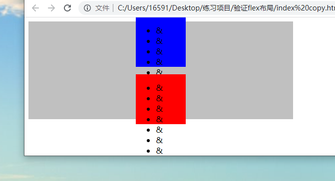
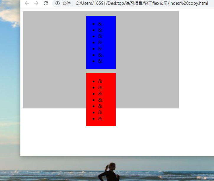
Cause analysis: the root cause of squeezing here is that the sub boxes of classes up and bottom are set with the height attribute. When the parent box does not have enough space to accommodate the child elements, the height of the sub box slowly shrinks first. When the height of the sub box is too small to accommodate its content, the content will slowly overflow and squeeze, Finally, when the height of the sub box is reduced to the value of the height attribute (100px above), the sub box will stop shrinking. At this time, the sub box will overflow outside the parent box, as shown in the figure above, the blue box overflows above and the red box overflows below
At this time, we delete the height attribute of only the blue and red boxes. The above problem is solved, but the following problem occurs
Upper overflow problem
    <style>
        .main {
            display: flex;
            justify-content: center;
            align-items: center;
            flex-direction: column;
            background-color: silver;

            width: 500px;
            height: 60vh;
            padding: 15px;
        }
        .up {
            flex: 1;
            width: 100px;
            background-color: blue;
        }

        .bottom {
            flex: 1;
            width: 100px;
            margin-top: 15px;
            background-color: red;
        }
    </style>
    <div class="main">
        <div class="up">
            <ul>
                <li>&</li>
                <li>&</li>
                <li>&</li>
                <li>&</li>
                <li>&</li>
                <li>&</li>
                <li>&</li>
            </ul>
        </div>
        <div class="bottom">
            <ul>
                <li>&</li>
                <li>&</li>
                <li>&</li>
                <li>&</li>
                <li>&</li>
                <li>&</li>
                <li>&</li>
            </ul>
        </div>
    </div>
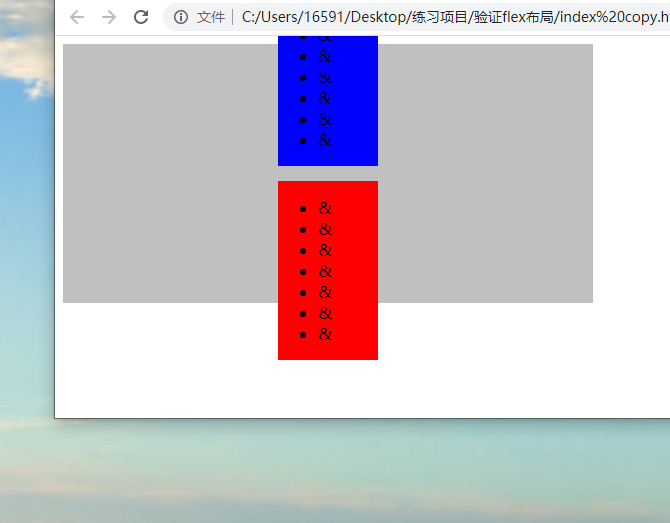
Cause analysis: the root cause of overflow at the top here is that the parent box of class main adopts the justify content: value of center. When the parent box does not have enough space to accommodate child elements, the child elements will overflow to both sides, resulting in overflow at the top and bottom
At this time, we change the justify content: value of the parent box to flex start. The above problem is solved, but the following problem occurs
Overflow problem below
Cause analysis: when the space of the parent box is insufficient to accommodate the child box, the child box will overflow from below
    <style>
        .main {
            display: flex;
            justify-content: flex-start;
            align-items: center;
            flex-direction: column;
            background-color: silver;

            width: 500px;
            height: 60vh;
            padding: 15px;
        }
        .up {
            flex: 1;
            width: 100px;

            background-color: blue;
        }

        .bottom {
            flex: 1;
            width: 100px;

            margin-top: 15px;
            background-color: red;
        }
    </style>
    <div class="main">
        <div class="up">
            <ul>
                <li>&</li>
                <li>&</li>
                <li>&</li>
                <li>&</li>
                <li>&</li>
                <li>&</li>
                <li>&</li>
            </ul>
        </div>
        <div class="bottom">
            <ul>
                <li>&</li>
                <li>&</li>
                <li>&</li>
                <li>&</li>
                <li>&</li>
                <li>&</li>
                <li>&</li>
            </ul>
        </div>
    </div>
The solution is to change the height attribute of the parent box to min height
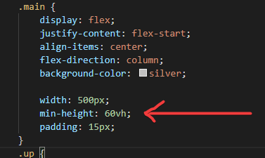
Perfect solution at this time, no matter how small the screen box will not squeeze, deform, overflow and so on