Learn Python data analysis ideas and methods by referring to kaggle: https://www.kaggle.com/startupsci/titanic-data-science-solutions
There are some charts in the micro professional video in the middle, which are completely followed up. In fact, we have a preliminary understanding of how to recognize and clean the data. Although it's not hard to watch, there are still many subtle mistakes in code tapping. It's mainly because I'm not familiar with python just now and need to practice skillfully.
In the process of data processing, there are two points that I personally think are very important: try to back up the original data, and output after each processing to see if you get the desired results.
Data understanding
Import required packages
# -*- coding: utf-8 -*-
import numpy as np
import pandas as pd
import matplotlib.pyplot as plt
import seaborn as sns
import os
import warnings
warnings.filterwarnings('ignore')
plt.rcParams["patch.force_edgecolor"] = True#Fringe line
Import the data, read the head to see the format of the data
#Read data
os.chdir('D:\\Data analysis\\Micro specialty\\kaggle\\titanic\\')
train_data=pd.read_csv('train.csv')
test_data=pd.read_csv('test.csv')
print(train_data.columns.values)
head=train_data.head()
Format of observation data
Category: some data can be classified into sample data, so as to select the appropriate visualization map. It can be found that survived, sex, embanked and Pclass are all variables representing classification.
Numerical: whether there is numerical data, such as discrete, continuous, time series, etc. Continuous data Age, Fare. Discrete data SibSp(
Number of siblings / spouses board, parent (number of parents / children board)
mixed data types: tick and cabinet are in the form of letters + numbers
train_data.info()
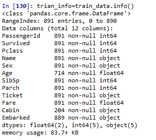
891 training data in total
Age \ cabin \ embanked data missing
train_d=train_data.describe()
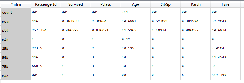
*Passengerid as the unique identification, 891 pieces of data in total
*The mean value of 0.38 indicates 38% survival rate
*The average Age is 29.7, from 80 to 0.42, indicating that 75% of passengers are younger than 38 years old.
*Parch% 75 = 0 more than 75% of samples did not board with parents / children
*Sibsp% 50 = 0% 75 = 1 samples over% 50 no siblings / spouse boarded(
Nearly 30% of the passengers had siblings and / or house about
*I don't know how the two articles in the original are interpreted from the description
Fares varied significantly with few passengers (<1%) paying as high as $512.
Few elderly passengers (<1%) within age range 65-80.
train_d2=train_data.describe(include='O')
By default, describe only calculates the statistics of numerical characteristics. Enter the parameter include=['O '], and describe can calculate the statistical characteristics of discrete variables to get the total number, the number of unique values, the most frequent data and frequency.
*Name is the only variable
*More men than women, 577 / 891 = 65%
*Cabin room number is reused, and multiple people share a room
*Ticket is not a unique number. There are many people with the same ticket
*There are 3 ports of Embarked landing, S is the most
Hypothesis based on data analysis
Analyze the relationship between data and survival
Data that may not have analytical significance:
*Ticket data repetition rate is too high, not as a feature
*Excessive loss of Cabin, omission feature
*Passengerid as a unique identifier has no significance as a classification
*Name because the format is not standard, it may have nothing to do with the analysis features (I've seen the blog extract title such as Mr,Ms as the analysis)
Data processing:
*Fill age, embanked feature
*Create a new data Family based on Parch and SibSp to mark the number of all Family members on the ship
*Extracting title from name as a new feature
*You can classify the Age parameter and convert it to multiple categories
*Create Fare features that may help analyze
Hypothesis:
*female in Sex may have a higher survival rate
*Children (need to set the scope of Age) may have a higher survival rate
*First class (Pclass=1) may have a higher survival rate
Roughly judge the relationship between the classification feature Pclass\Sex\SibSp and Parch and survived
Pclass and sex were significantly correlated with survival rate

Data visualization
#A new data is copied to fill the Age with the mean value and check the distribution of Age
#The real distribution should remove null values instead of filling in train ﹣ data ﹣ age = train ﹣ data [train ﹣ data ['age ']. Notnull()]
train_data_age=train_data
train_data_age['Age'].fillna(train_data['Age'].mean()).astype(np.int)
#age distribution
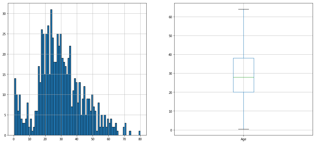
fig,axes=plt.subplots(1,2,figsize=(18,8))
train_data_age['Age'].hist(bins=80,ax=axes[0])
train_data_age.boxplot(column='Age',showfliers=False,ax=axes[1])
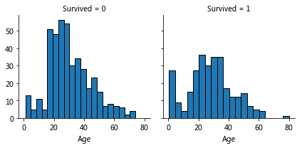
Relationship between age and survival
Observation:
Younger, higher survival
Grade 80 survival
Most of the 15-25-year-olds did not survive
More passengers aged 15-35
Conclusion:
Consider Age characteristics in training model
Complete Age characteristics
Set Age feature group
pclass_survived=sns.FacetGrid(train_data,col='Survived',row='Pclass')
pclass_survived.map(plt.hist,'Age')
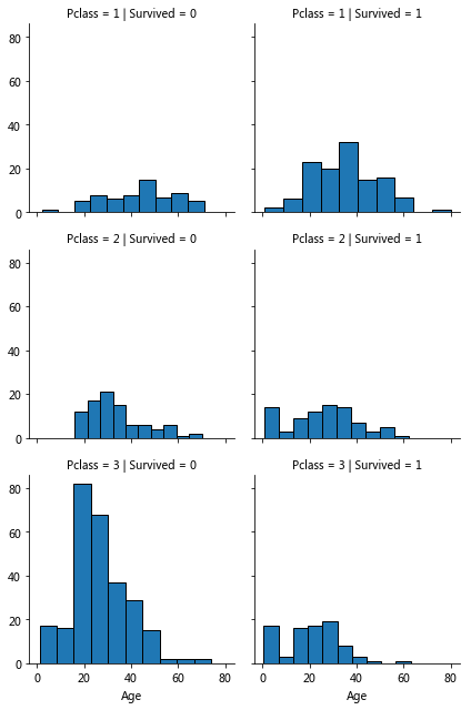
Age, Pclass, Survived
Observations:
Age pclass and survival
Pclass=3 the most passengers but not many survivors, pclass is related to survival, verify hypothesis 1
In Pclass=2 and Pclass=3, the younger passengers are more likely to survive. Verify hypothesis 2
Passengers of different ages are distributed in different Pclass
Conclusion: Pclass should be considered in training model
sns.pointplot(x='Pclass',y='Survived',data=train_data,hue='Sex',
              dodge=True,join=True,markers=['o','x'],linestyle=['--','-'])#? linestyle does not display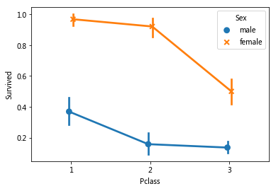
It was observed that the survival rate of women in different pclasses was significantly higher than that of men, and gender was an effective feature of classification
grid=sns.FacetGrid(train_data,col='Embarked',size=3,aspect=1.5)
grid.map(sns.pointplot,'Pclass','Survived','Sex')
#plt.legend()
#Grid. Add legend() legend
for i in range(0,3):
grid.axes[0][i].legend()
Association feature embanked pclass sex
Observations.
The survival rate of women was significantly higher than that of men
It was observed that the female survival rate of S and Q was higher than that of men, and the male survival rate of embanked = C was higher than that of women. It may be that the pclass related to embanked and affects the survival instead of the direct correlation
In Embarked=C Embarked=Q, the male survival rate of Pclass=3 is higher than Pcalss=2
There was a significant difference in the male survival rate of Embarked with different Pclass=3
Decisions.
Increase gender identity
Improve and add embanked features
grid=sns.FacetGrid(train_data,row='Embarked',col='Survived',aspect=1.6)
grid.map(sns.barplot,'Sex','Fare',ci=None)#By default, barplot estimates ci confidence interval with average value
grid.add_legend()
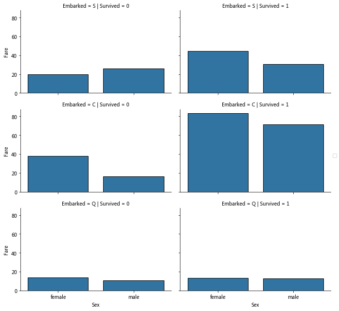
correlating Embarked (Categorical non-numeric), Sex (Categorical non-numeric), Fare (Numeric continuous), with Survived (Categorical numeric)
According to the classification, the corresponding value is calculated by the estimator method (default average value).
Observation:
Compared with the left and right columns, in Embarked=S/C, the average value of surviving passenger tickets is higher
Embarked=Q fare is low, and the survival rate of possible association is low
Embarked=C survivors are significantly more expensive than others.
Conclusion:
Consider dividing the price range of tickets
Wrap data
Remove useless information
Remove useless ticket cabin information
#Remove ticket cabin
print("Before", train_data.shape, test_data.shape)
train_data = train_data.drop(['Ticket', 'Cabin'], axis=1)
test_data = test_data.drop(['Ticket', 'Cabin'], axis=1)
combine = [train_data, test_data]
print("After", train_data.shape, test_data.shape, combine[0].shape, combine[1].shape)
Extract Title from Name (social status)
Feature extraction of Name to extract the title
#Extract title from name, such as Mr. Mrs
for dataset in combine:
    dataset['Title'] = dataset.Name.str.extract(' ([A-Za-z]+)\.', expand=False)
#The crosstab is divided into groups according to the Title, and the frequency of 'Sex' in each group is counted
pd.crosstab(train_data['Title'], train_data['Sex'])
Cross tab cross table results
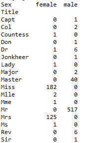
It can be found that Master, Miss, Mr, and Mrs have more dead people, while others have less. Therefore, we can replace the less appellations with race, and replace synonyms such as Mlle with Miss.
#Replace different synonymous writing methods, and replace Rare and unknown meanings with race
for dataset in combine:
    dataset['Title'].replace(['Capt','Col','Countess','Don','Dr','Master','Jonkheer','Lady','Major','Rev',
           'Sir'],'Rare',inplace=True)
    dataset['Title'].replace('Mlle', 'Miss',inplace=True)
    dataset['Title'].replace('Ms', 'Miss',inplace=True)
    dataset['Title'].replace('Mme', 'Mrs',inplace=True)
train_data[['Survived','Title']].groupby('Title',as_index=False).mean()

It can be found that the survival rates of different appellations are quite different, especially Miss and Mrs are significantly higher than Mr, which proves the influence of gender on the survival rate.
Because the text can not be used as training feature, the text is mapped to number through map, and the number is used as training feature
#The text map is projected to the number, which is convenient for training the null value as a feature to be projected to 0
title_mapping={'Mr':1,'Miss':2,'Mrs':3,'Master':4,'Rare':5}
for dataset in combine:
    dataset['Title']=dataset['Title'].map(title_mapping)
    dataset['Title']=dataset['Title'].fillna(0)
train_data[['Survived','Title']].groupby('Title',as_index=False).mean()
#Delete id and name. inplace=True if you don't redirect
train_data=train_data.drop(['PassengerId','Name'],axis=1)
test_data.drop(['Name'],axis=1,inplace=True)#Id to be used for test set submission
Age fill (continuous numeric attribute discretization)
Method 1: generate random numbers in the range of mean and standard deviation (the simplest)
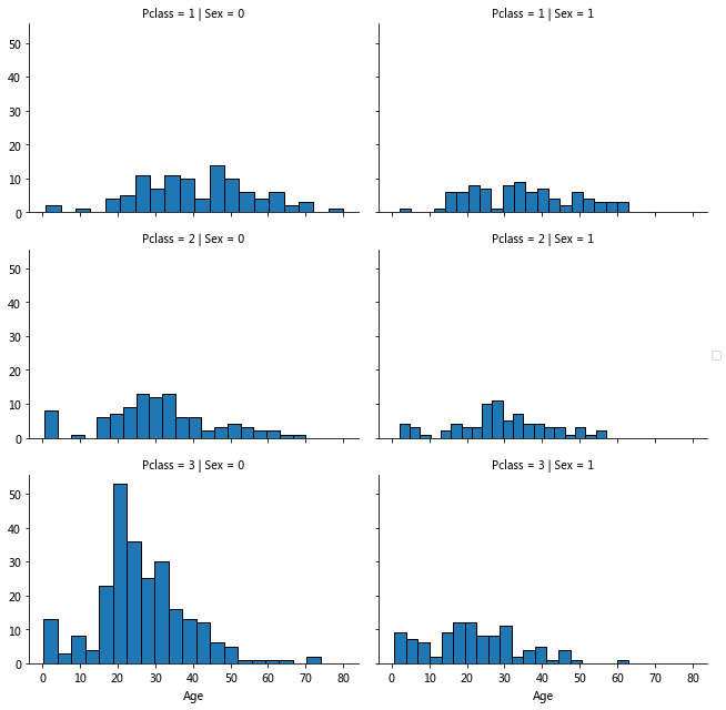
Method 2: fill in the missing value according to the association characteristics, Age Gender Pclass is related, and fill in with the mean according to the classification of Pclass and Gender
Method 3: Based on Pclass and Gender, the random numbers in the range of mean and standard deviation are used for filling
Methods 1 and 3 use random numbers to introduce random noise, and adopt method 2
grid=sns.FacetGrid(train_data,col='Sex',row='Pclass',aspect=1.5)
grid.map(plt.hist,'Age',bins=20)
grid.add_legend()
#Calculate the median of each group according to the grouping of Sex Pclass
guess_ages=np.zeros((2,3))#Notice that there are two brackets
for dataset in combine:#The first dataset is df of train, and the second is df of test
    for i in range(0, 2):
        for j in range(0, 3):
            guess_df = dataset[(dataset['Sex'] == i) & \
                                  (dataset['Pclass'] == j+1)]['Age'].dropna()

            # age_mean = guess_df.mean()
            # age_std = guess_df.std()
            # age_guess = rnd.uniform(age_mean - age_std, age_mean + age_std)
            #age_guess = guess_df.median()
            # Convert random age float to nearest .5 age
            #guess_ages[i,j] = int( age_guess/0.5 + 0.5 ) * 0.5
            guess_ages[i,j]=guess_df.median()
    #Fill in empty values by filter criteria
    for i in range(0, 2):
        for j in range(0, 3):
            dataset.loc[ (dataset.Age.isnull()) & (dataset.Sex == i) & (dataset.Pclass == j+1),\
                    'Age'] = guess_ages[i,j]
    dataset['Age'] = dataset['Age'].astype(int)

#Using cut continuous attribute discretization, the auxiliary column AgeBand is added, and the range of Age is evenly divided into 5 parts
train_data['AgeBand']=pd.cut(train_data['Age'],5)
train_data[['AgeBand','Survived']].groupby('AgeBand').mean().sort_values(by='AgeBand',ascending=True)
train_data['AgeBand'].value_counts()
#Discretization of Age according to cut classification
for dataset in combine:
    dataset.loc[ dataset['Age'] <= 16, 'Age'] = 0
    dataset.loc[(dataset['Age'] > 16) & (dataset['Age'] <= 32), 'Age'] = 1
    dataset.loc[(dataset['Age'] > 32) & (dataset['Age'] <= 48), 'Age'] = 2
    dataset.loc[(dataset['Age'] > 48) & (dataset['Age'] <= 64), 'Age'] = 3
    dataset.loc[ dataset['Age'] > 64, 'Age']=4
#Remove auxiliary column
train_data = train_data.drop(['AgeBand'], axis=1)
combine = [train_data, test_data]#Can't combine be updated without this statement?
train_data.head()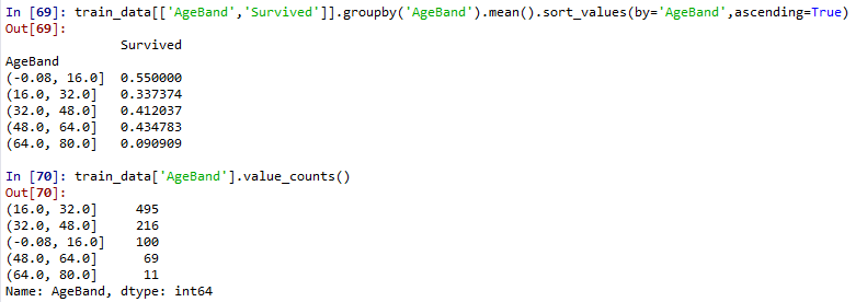
It can be seen that the survival rate of young age group is higher than that of other ages. I don't understand the relationship between combine and train_data, test_? So you can update two DFS directly by changing the combine? But why does the traindata in the combine not change if it is not reassigned after drop AgeBand. Make up lessons!!! ]
'''
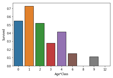
Age*Class
 The younger the hypothesis, the higher the survival rate + the higher the cabin level, the higher the survival rate
 Create joint features (I think this only means that it's hard to survive, but the lowest age is 0, which can't reflect different pclasses)
Just follow the kernel process
'''
for dataset in combine:
    dataset['Age*Class']=dataset['Age']*dataset['Pclass']
sns.barplot(x='Age*Class',y='Survived',data=train_data,ci=False)
IsAlone parameter: SibSp Parch FamilySize
'''
SibSp Parch
a:Do you have any brothers or sisters/The influence of parents and children on survival rate
b:How many relatives and survival rate
'''
#Filter for data
sibsp_df=train_data[train_data['SibSp']!=0]
no_sibsp_df=train_data[train_data['SibSp']==0]
parch_df=train_data[train_data['Parch']!=0]
no_parch_df=train_data[train_data['Parch']==0]

plt.figure(figsize=(12,3))
plt.subplot(141)
plt.axis('equal')
plt.title('sibsp')
sibsp_df['Survived'].value_counts().plot.pie(labels=['No Survived','Survived'],
        autopct='%1.1f%%',colormap='Blues')
plt.subplot(142)
plt.axis('equal')
plt.title('no_sibsp')
no_sibsp_df['Survived'].value_counts().plot.pie(labels=['No Survived','Survived'],
        autopct='%1.1f%%',colormap='Blues')
plt.subplot(143)
plt.axis('equal')
plt.title('parch')
parch_df['Survived'].value_counts().plot.pie(labels=['No Survived','Survived'],
        autopct='%1.1f%%',colormap='Reds')
plt.subplot(144)
plt.axis('equal')
plt.title('no_parch')
no_parch_df['Survived'].value_counts().plot.pie(labels=['No Survived','Survived'],
        autopct='%1.1f%%',colormap='Reds')

#Relationship between survival rate and population size of Parch and SibSp
fig,ax=plt.subplots(1,2,figsize=(13,4))
train_data[['Parch','Survived']].groupby('Parch').mean().plot.bar(ax=ax[0],rot=0)
train_data[['SibSp','Survived']].groupby('SibSp').mean().plot.bar(ax=ax[1],rot=0)

#Relationship between total and survival
#Using Parch and SibSp to create a new parameter FamilySize +1 is because of calculating myself
for dataset in combine:
    dataset['FamilySize']=dataset['Parch']+dataset['SibSp']+1
train_data[['FamilySize','Survived']].groupby('FamilySize').mean().plot.bar(rot=0)
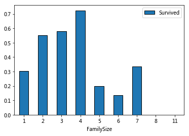
The overall trend is increasing first and then decreasing
#Create a new column based on FamilySize - IsAlone judges whether a person
for dataset in combine:
    dataset['IsAlone']=0
    dataset.loc[dataset['FamilySize']==1,'IsAlone']=1#Define total 1 as IsAlone=1
sns.barplot(x='IsAlone',y='Survived',data=train_data,ci=False)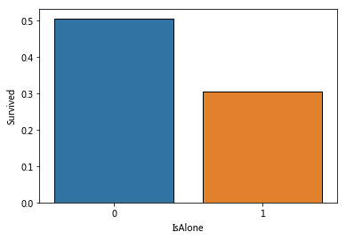
#Use IsAlone instead of FamilySize to delete useless columns
train_data=train_data.drop(['Parch','SibSp','FamilySize'],axis=1)
test_data=test_data.drop(['Parch','SibSp','FamilySize'],axis=1)
combine=[train_data,test_data]
IsAlone=1 means a single person uploads, with a significantly lower survival rate.
Embanked parameter
'''
Embarked Use mode mode Fill
'''
print(train_data['Embarked'].unique())
print(train_data['Embarked'].value_counts())
mode_embarked=train_data['Embarked'].mode()
for dataset in combine:
    #mode gets the list and uses the index to get the value
    dataset['Embarked'].fillna(mode_embarked[0],inplace=True)
#sns.barplot(x='Embarked',y='Survived',hue='Pclass',data=train_data,ci=False)
train_data[['Embarked','Survived']].groupby('Embarked').mean().plot.bar(rot=0)
#Label feature discretization
#Note that the following is the wrong way to write, pay attention to the assignment ah!
#for dataset in combine:
#    dataset['Embarked'].map({'S': 0, 'C': 1, 'Q': 2}).astype(int)
for dataset in combine:
    dataset['Embarked'] = dataset['Embarked'].map( {'S': 0, 'C': 1, 'Q': 2} ).astype(int)
train_data.head()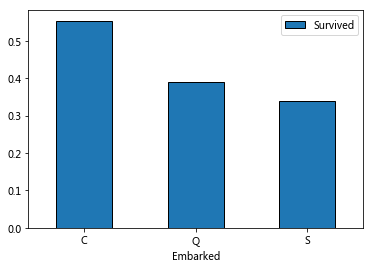

It is speculated that different Embarked ports may have different locations, which may affect the survival rate. Therefore, filling is very important, and mode is selected for filling.
Fare fill, continuous digital attribute discretization
'''
Fare Fill with median
'''
#Median fill
for dataset in combine:
    dataset['Fare'].fillna(dataset['Fare'].median(),inplace=True)
train_data['FareBand']=pd.qcut(train_data['Fare'],4)#Equal frequency division, try to keep the same frequency for each part
train_data[['FareBand','Survived']].groupby(['FareBand'],as_index=False).mean().sort_values(by='FareBand')
#Discretization of continuous digital attributes
for dataset in combine:
    dataset.loc[ dataset['Fare'] <= 7.91, 'Fare'] = 0
    dataset.loc[(dataset['Fare'] > 7.91) & (dataset['Fare'] <= 14.454), 'Fare'] = 1
    dataset.loc[(dataset['Fare'] > 14.454) & (dataset['Fare'] <= 31), 'Fare']   = 2
    dataset.loc[ dataset['Fare'] > 31, 'Fare'] = 3
    dataset['Fare'] = dataset['Fare'].astype(int)
train_data = train_data.drop(['FareBand'], axis=1)
combine = [train_data, test_data]

Similar to the treatment of age, qcut is used to divide the interval (quartile) according to the equal frequency, while cut of age is divided according to the equal width.
It is suddenly found that the partition of test is based on the data partition of train, so there is no auxiliary column in test and it is not necessary to delete it.
Training and testing
The goal is a question of classification and regression, to get the relationship between Survived and other variables.
The existing data is labeled, so it is supervised learning.
Applicable to: (every name knows what it is, but only the simplest ones = =)
Logistic Regression
KNN or k-Nearest Neighbors
Support Vector Machines
Naive Bayes classifier
Decision Tree
Random Forrest
Perceptron
Artificial neural network
RVM or Relevance Vector Machine
#Prepare data to separate features and labels
X_train=train_data.drop('Survived',axis=1)
Y_train=train_data['Survived']
X_test=test_data.drop('PassengerId',axis=1).copy()
#Logistic Regression
from sklearn.linear_model.logistic import LogisticRegression
logreg = LogisticRegression()
logreg=LogisticRegression()
logreg.fit(X_train,Y_train)#Data and labels
Y_pred=logreg.predict(X_test)
acc_log=  round(logreg.score(X_train,Y_train)*100,2)
print('LogisticRegression',acc_log)#LogisticRegression 81.26
#Logistic Regression to see the contribution rate of each characteristic
coeff_df = pd.DataFrame(train_data.columns.delete(0))#delete(0) remove the Survived tag
coeff_df.columns=['Feature']#Custom column name
coeff_df['Correlation']=pd.Series(logreg.coef_[0])#Read coefficient
coeff_df.sort_values(by='Correlation',ascending=False)
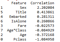
Positive coefficients increase the log-odds of the response (and thus increase the probability), and negative coefficients decrease the log-odds of the response (and thus decrease the probability).
Sex (male: 0 to female: 1) is the largest positive number, and an increase in sex (i.e. = 1 female) is most likely to increase the probability of Survived=1. The second largest positive number (in this case, should assignment be logical when discretizing?)
Pclass is the largest negative number. The larger pclass is, the less likely it is to survive = 1. Age*Class is the second largest negative number in the author's results. I don't know why there is a big difference in this place.
#SVM
from sklearn import svm
svc=svm.SVC()
svc.fit(X_train,Y_train)
Y_pred=svc.predict(X_test)
acc_svc=round(svc.score(X_train,Y_train)*100,2)
acc_svc#83.5

# Linear SVC
linear_svc = svm.LinearSVC()
linear_svc.fit(X_train, Y_train)
Y_pred = linear_svc.predict(X_test)
acc_linear_svc = round(linear_svc.score(X_train, Y_train) * 100, 2)
acc_linear_svc#79.46

#KNN
from sklearn import neighbors
knn=neighbors.KNeighborsClassifier(n_neighbors=3)
knn.fit(X_train,Y_train)
Y_pred=knn.predict(X_test)
acc_knn=round(knn.score(X_train,Y_train)*100,2)
acc_knn# 83.73

# Gaussian Naive Bayes
from sklearn.naive_bayes import GaussianNB
gaussian =GaussianNB()
gaussian.fit(X_train, Y_train)
Y_pred = gaussian.predict(X_test)
acc_gaussian = round(gaussian.score(X_train, Y_train) * 100, 2)
acc_gaussian#76.88

# Perceptron
from sklearn import linear_model
perceptron = linear_model.Perceptron()
perceptron.fit(X_train, Y_train)
Y_pred = perceptron.predict(X_test)
acc_perceptron = round(perceptron.score(X_train, Y_train) * 100, 2)
acc_perceptron#76.66

# Stochastic Gradient Descent
sgd = linear_model.SGDClassifier()
sgd.fit(X_train, Y_train)
Y_pred = sgd.predict(X_test)
acc_sgd = round(sgd.score(X_train, Y_train) * 100, 2)
acc_sgd#77,33

# Decision Tree
from sklearn.tree import DecisionTreeClassifier
decision_tree = DecisionTreeClassifier()
decision_tree.fit(X_train, Y_train)
Y_pred = decision_tree.predict(X_test)
acc_decision_tree = round(decision_tree.score(X_train, Y_train) * 100, 2)
acc_decision_tree#86.64

# Random Forest
from sklearn.ensemble import RandomForestClassifier
random_forest = RandomForestClassifier(n_estimators=100)
random_forest.fit(X_train, Y_train)
Y_pred = random_forest.predict(X_test)
random_forest.score(X_train, Y_train)
acc_random_forest = round(random_forest.score(X_train, Y_train) * 100, 2)
acc_random_forest#86.64

#Sort the performance of different algorithms
models = pd.DataFrame({
    'Model': ['Support Vector Machines', 'KNN', 'Logistic Regression',
              'Random Forest', 'Naive Bayes', 'Perceptron',
              'Stochastic Gradient Decent', 'Linear SVC',
              'Decision Tree'],
    'Score': [acc_svc, acc_knn, acc_log,
              acc_random_forest, acc_gaussian, acc_perceptron,
              acc_sgd, acc_linear_svc, acc_decision_tree]})
models.sort_values(by='Score', ascending=False)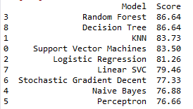
#Export submitted documents by format
submission = pd.DataFrame({
        "PassengerId": test_data["PassengerId"],
        "Survived": Y_pred
    })
submission.to_csv('submission.csv', index=False)


