I DrawerLayout
DrawerLayout is a sliding menu.
DrawerLayout is a layout that allows you to put in two direct sub controls. The first sub control is what is displayed on the main screen and the second sub control is what is displayed in the sliding menu.
① So we can in the xml file of MainActivity
<?xml version="1.0" encoding="utf-8"?>
<androidx.drawerlayout.widget.DrawerLayout
xmlns:android="http://schemas.android.com/apk/res/android"
xmlns:app="http://schemas.android.com/apk/res-auto"
android:id="@+id/drawerLayout"
android:layout_width="match_parent"
android:layout_height="match_parent">
<FrameLayout xmlns:android="http://schemas.android.com/apk/res/android"
xmlns:app="http://schemas.android.com/apk/res-auto"
xmlns:tools="http://schemas.android.com/tools"
android:layout_width="match_parent"
android:layout_height="match_parent"
tools:context=".MainActivity">
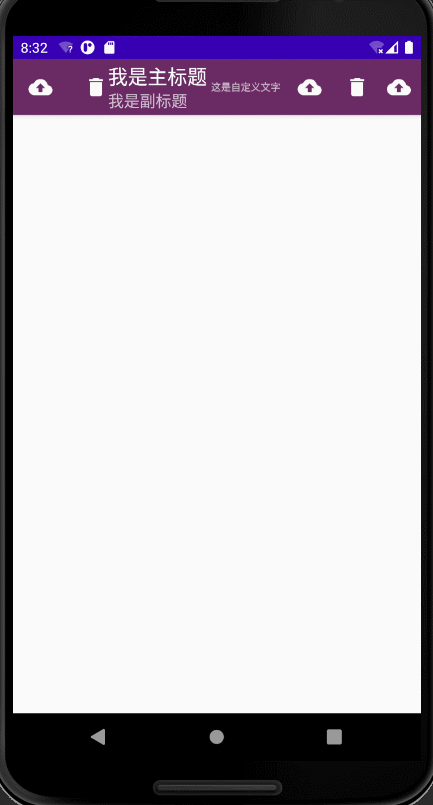
<androidx.appcompat.widget.Toolbar
android:id="@+id/mToolBar"
android:layout_width="match_parent"
android:layout_height="?actionBarSize"
android:background="#f2652260"
android:elevation="4dp"
app:title="I'm the main title"
app:subtitle="I'm a subtitle"
app:logo="@mipmap/ic_delete"
app:navigationIcon="@mipmap/ic_delete"
android:theme="@style/ThemeOverlay.AppCompat.Dark.ActionBar"
app:popupTheme="@style/toolbarMenuStyle">
<TextView
android:layout_width="wrap_content"
android:layout_height="wrap_content"
android:text="This is custom text"
android:textSize="10sp"
android:gravity="center"/>
</androidx.appcompat.widget.Toolbar>
</FrameLayout>
<com.google.android.material.navigation.NavigationView
android:layout_width="match_parent"
android:layout_height="match_parent"
android:id="@+id/navView"
android:layout_gravity="start"
app:menu="@menu/nav_menu"
app:headerLayout="@layout/nav_header"/>
</androidx.drawerlayout.widget.DrawerLayout>
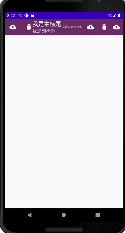
The first direct child control is FrameLayout, and the second direct child control is NavigationView. Regardless of the effect of NavigationView, we only need it to be responsible for the contents of the menu bar. But Android: Layout_ The gravity property must be specified because it determines the roll out orientation of the menu bar. If it is left, it means rolling out from left to right. If it is start, it is judged according to the system language. If the system language is read from left to right, there is no difference between start and left. OK, let's run the program and see the effect
ok, the above is the usage of DrawerLayout. In fact, it is very simple. It is a layout. However, sometimes the menu can only be dragged out when dragging on the left edge of the screen, but many users may not know this function at all, so we generally
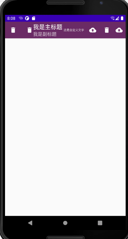
② Add a navigation button on the far left of the Toolbar to prompt.
 		//Let the navigation buttons display
        getSupportActionBar().setDisplayHomeAsUpEnabled(true);
        //Set navigation button icon (two ways)
        //getSupportActionBar().setHomeAsUpIndicator(R.mipmap.ic_settings);
        toolbar.setNavigationIcon(R.mipmap.ic_backup);
        DrawerLayout drawerLayout = findViewById(R.id.drawerLayout);
        toolbar.setNavigationOnClickListener(new View.OnClickListener() {
            @Override
            public void onClick(View v) {
                drawerLayout.openDrawer(GravityCompat.START);
            }
        });
First, display the navigation button, then set the navigation button icon (in two ways), and then set the click event for the navigation button
II NavigationView
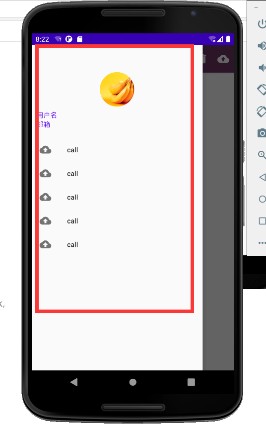
How do we do this red framed page? NavigationView
① First, introduce a library, implementation 'de.hdodenhof:circleimageview:3.0.1'
It can provide API to easily realize the function of image rounding.
Before using NavigationView, we need to prepare menu and headerLayout. Menu is used to display specific menu items in NavigationView. It is responsible for the following. headerLayout is used to display the head layout in NavigationView, which is responsible for the above.
② Let's start with menu.
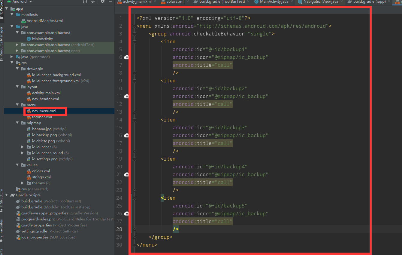
The purpose of the group class is to use the checkableBehavior attribute, which is set to single, indicating that menu items can only be selected
③ Then make headerLayout. Create a new layout file and write the following code
<?xml version="1.0" encoding="utf-8"?>
<RelativeLayout
    xmlns:android="http://schemas.android.com/apk/res/android" android:layout_width="match_parent"
    android:layout_height="180dp"
    android:padding="10dp">

    <de.hdodenhof.circleimageview.CircleImageView
        android:id="@+id/circleImageView"
        android:layout_width="70dp"
        android:layout_height="70dp"
        android:src="@mipmap/banana"
        android:layout_centerInParent="true"/>
    <TextView
        android:layout_width="wrap_content"
        android:layout_height="wrap_content"
        android:id="@+id/mailText"
        android:layout_alignParentBottom="true"
        android:text="mailbox"
        android:textColor="@color/purple_500"
        android:textSize="14sp"/>
    <TextView
        android:layout_width="wrap_content"
        android:layout_height="wrap_content"
        android:id="@+id/userText"
        android:layout_above="@+id/mailText"
        android:text="user name"
        android:textColor="@color/purple_500"
        android:textSize="14sp"/>
</RelativeLayout>
CircleImageView is a round head, and below are two textviews.
Then we officially use NavigationView
④ In the xml file of MainActivity
<?xml version="1.0" encoding="utf-8"?>
<androidx.drawerlayout.widget.DrawerLayout
    xmlns:android="http://schemas.android.com/apk/res/android"
    xmlns:app="http://schemas.android.com/apk/res-auto"
    android:id="@+id/drawerLayout"
    android:layout_width="match_parent"
    android:layout_height="match_parent">

    <FrameLayout xmlns:android="http://schemas.android.com/apk/res/android"
    . . .
    </FrameLayout>
        <com.google.android.material.navigation.NavigationView
            android:layout_width="match_parent"
            android:layout_height="match_parent"
            android:id="@+id/navView"
            android:layout_gravity="start"
            app:menu="@menu/nav_menu"
            app:headerLayout="@layout/nav_header"/>

</androidx.drawerlayout.widget.DrawerLayout>
Use app:menu="@menu/nav_menu" and app:headerLayout="@layout/nav_header" to associate the menu and headerLayout properties of NavigationView with specific files.
⑤ Then we process the click event of the menu item in MainActivity.
       	NavigationView navigationView = findViewById(R.id.navView);
       	//Set backup1 as selected by default
        navigationView.setCheckedItem(R.id.backup1);
        navigationView.setNavigationItemSelectedListener(new NavigationView.OnNavigationItemSelectedListener(){

            @Override
            public boolean onNavigationItemSelected(@NonNull MenuItem item) {
                Toast.makeText(MainActivity.this, "Don't order. I'm so bored", Toast.LENGTH_SHORT).show();
                return true;//Returning true indicates that the event has been processed
            }
        });
First set the default selection, and then handle the click event
effect