This is a copy. openpyxl Use guide for.
General content translation from official website https://openpyxl.readthedocs.io/en/stable/charts/bar.html#vertical-horizontal-and-stacked-bar-charts
This article will have some changes based on the official website. Code please refer to https://github.com/RustFisher/python-playground
Link in this article https://rustfisher.com/2019/11/14/Python/Python-openpyxl_charts_Bar_and_Column/
Cylindrical graph
The data will be plotted as a vertical, horizontal, or stacked column.
Be careful:
- The next settings affect different types of charts.
- Set categories to control whether the column chart is vertical or horizontal.
- When using stacked graphics, you need to set overlap to 100.
- If the column is horizontal, the x and y coordinates will be reversed.
2D chart
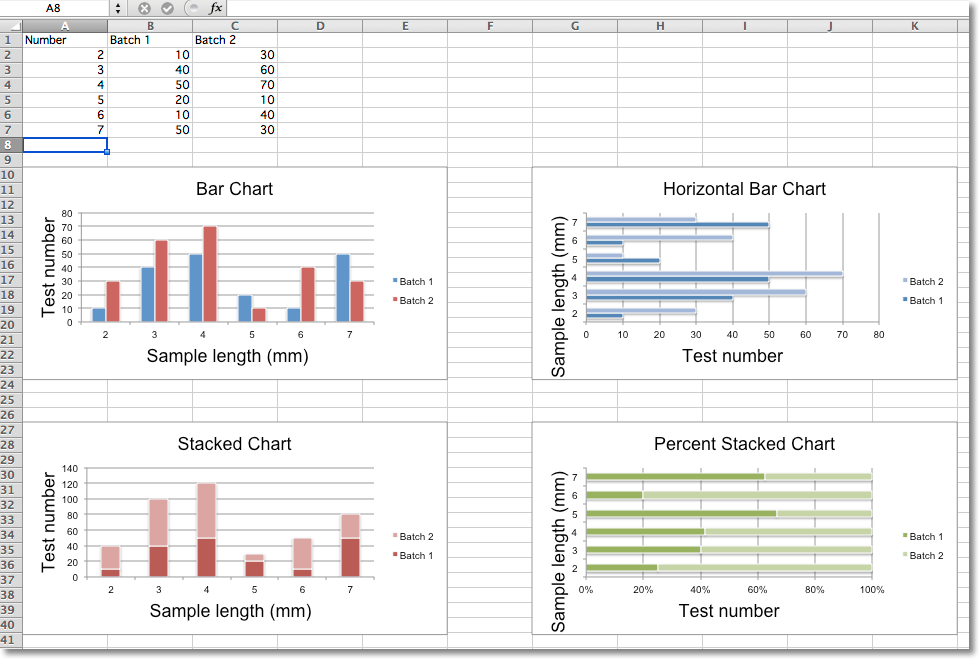
The sample code is as follows, and 4 charts are drawn according to the given data.
from openpyxl import Workbook
from openpyxl.chart import BarChart, Series, Reference


def bar_chart_demo():
    wb = Workbook(write_only=True)
    ws = wb.create_sheet()

    rows = [
        ('Number', 'Batch 1', 'Batch 2'),
        (2, 10, 30),
        (3, 40, 60),
        (4, 50, 70),
        (5, 20, 10),
        (6, 10, 40),
        (7, 50, 30),
    ]

    for row in rows:
        ws.append(row)

    chart1 = BarChart()
    chart1.type = "col"
    chart1.style = 10
    chart1.title = "Bar Chart"
    chart1.y_axis.title = 'Test number'
    chart1.x_axis.title = 'Sample length (mm)'

    data = Reference(ws, min_col=2, min_row=1, max_row=7, max_col=3)
    cats = Reference(ws, min_col=1, min_row=2, max_row=7)
    chart1.add_data(data, titles_from_data=True)
    chart1.set_categories(cats)
    chart1.shape = 4
    ws.add_chart(chart1, "A10")

    from copy import deepcopy

    chart2 = deepcopy(chart1)
    chart2.style = 11
    chart2.type = "bar"
    chart2.title = "Horizontal Bar Chart"

    ws.add_chart(chart2, "I10")

    chart3 = deepcopy(chart1)
    chart3.type = "col"
    chart3.style = 12
    chart3.grouping = "stacked"
    chart3.overlap = 100
    chart3.title = 'Stacked Chart'

    ws.add_chart(chart3, "A27")

    chart4 = deepcopy(chart1)
    chart4.type = "bar"
    chart4.style = 13
    chart4.grouping = "percentStacked"
    chart4.overlap = 100
    chart4.title = 'Percent Stacked Chart'

    ws.add_chart(chart4, "I27")

    wb.save("out/bar.xlsx")


if __name__ == '__main__':
    bar_chart_demo()
Translator's note: the position of the chart in excel is adjusted here. The original text is in column g, i.e. G10 and G27, and here it is changed to column I. There are also tweaks to the code format.
When we need to generate a chart, Excel will ask us to select the data range (source) first. Use Reference in your code to specify the range of data sources.
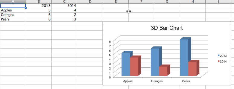
3D chart
Draw a 3D chart using BarChart3D.
def bar_3d():
    wb = Workbook()
    ws = wb.active

    rows = [
        (None, 2013, 2014),
        ("Apples", 5, 4),
        ("Oranges", 6, 2),
        ("Pears", 8, 3)
    ]

    for row in rows:
        ws.append(row)

    data = Reference(ws, min_col=2, min_row=1, max_col=3, max_row=4)
    titles = Reference(ws, min_col=1, min_row=2, max_row=4)
    chart = BarChart3D()
    chart.title = "3D Bar Chart"
    chart.add_data(data=data, titles_from_data=True)
    chart.set_categories(titles)

    ws.add_chart(chart, "E5")
    wb.save("out/bar3d.xlsx")
The created chart is opened with WPS and found to be 2D. Opening with Office Excel is 3D.