Write in front
Usually, when executing EDA, we will face the situation of displaying information about geographical location. For example, for the COVID 19 dataset, one might want to display the number of cases in each region. This is where the Python library GeoPandas comes in.
This article will learn how to use GeoPandas to effectively visualize geospatial data.
Geospatial analysis related terms related to GeoPandas
Geospatial data [1] describes objects, events, or other features relative to the position (coordinates) of the earth.
Spatial data is represented by the basic types of geometric objects.
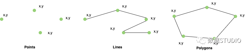
geometry | representative |
|---|---|
points | Center point of plot location, etc. |
lines | Roads and streams |
polygons | Boundaries of buildings, lakes, States, provinces, etc. |
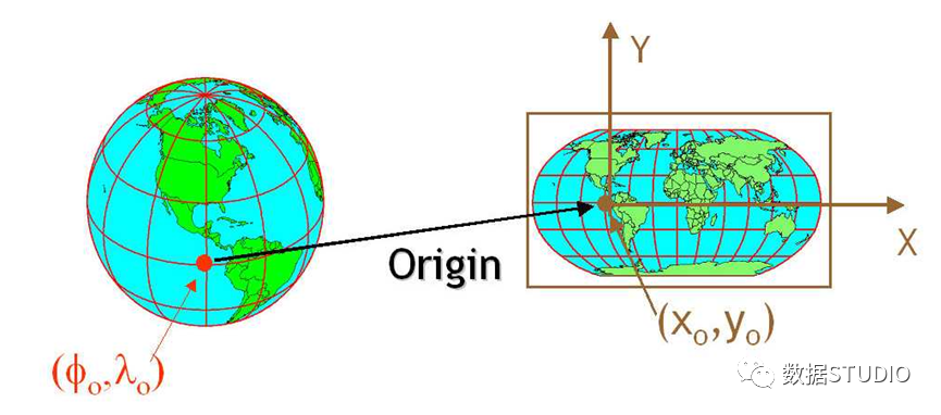
The CRS / coordinate reference system tells us how to convert the position (coordinates) on a circular earth (using projection or mathematical equations) into the same position map on a flat two-dimensional coordinate system (such as a computer screen or paper). The most commonly used CRS is "EPSG:4326".
What is GeoPandas?
GeoPandas is based on Pandas. It extends the Pandas data type to include geometric columns and perform spatial operations. Therefore, anyone familiar with Pandas can easily adopt GeoPandas.
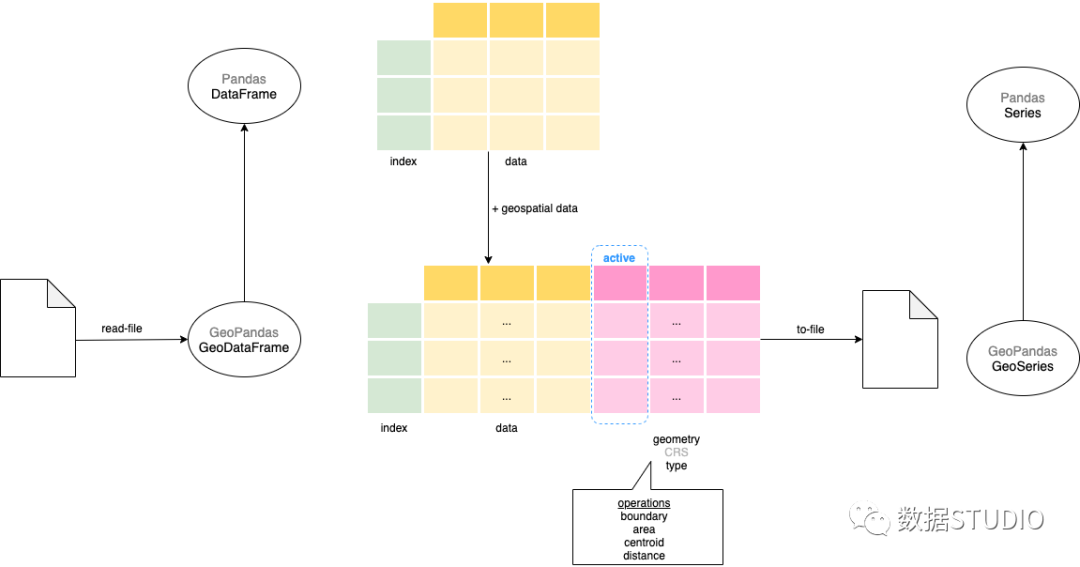
▲ GeoPandas – GeoDataFrame and GeoSeries
The main data structure in GeoPandas is the PandasDataFrame extended by GeoDataFrame. Therefore, all basic DataFrame operations can be performed on GeoDataFrame. The GeoDataFrame contains one or more GeoSeries (extended PandasSeries), each containing a projection of a different geometry (GeoSeries.crs). Although the GeoDataFrame can have multiple GeoSeries columns, only one of them is the active geometry, that is, all geometric operations are on that column.
In the next section, we will learn how to use some common functions, such as boundary, centroid and the most important drawing method. To demonstrate the work of geospatial visualization, let's use Teams data from the 2021 Olympic Games dataset.
Data preparation
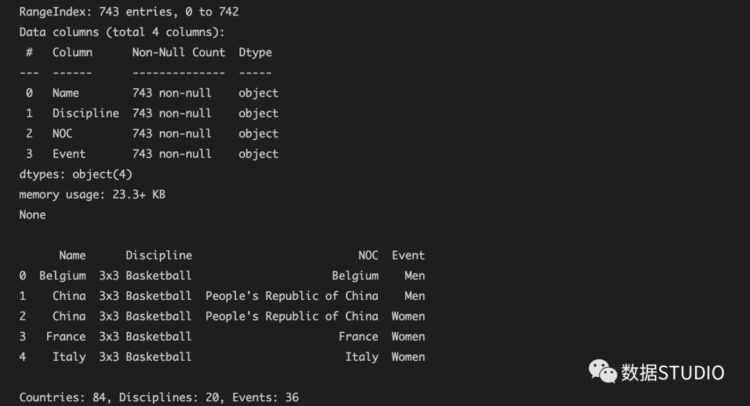
Read the Teams dataset before importing GeoPandas, and the dataset and code can be obtained in the official account "STUDIO STUDIO".
The team's dataset contains the team name, project, NOC (country / region), and event columns. In this exercise, we will use only NOC and project columns.
import pandas as pd
df_teams = pd.read_excel("data/Teams.xlsx")
Summarize each country's project and draw it.
df_teams_countries_disciplines = df_teams   \
    .groupby(by="NOC").agg({'Discipline':'count'} )  \
    .reset_index().sort_values(by='Discipline', ascending=False)

ax = df_teams_countries_disciplines.plot.bar(x='NOC', xlabel = '', figsize=(20,8))
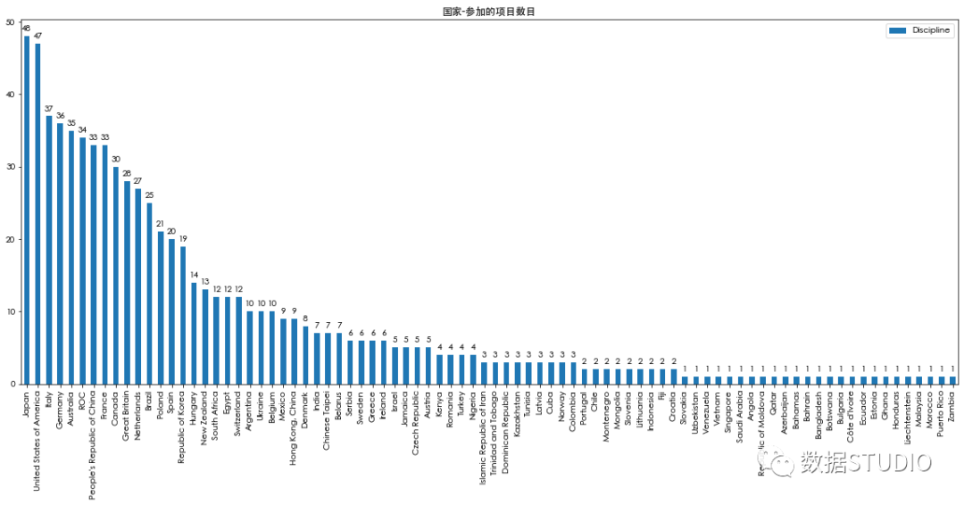
▲ df_teams_countries_disciplines – bar chart
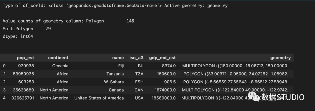
Import GeoPandas and read data
import geopandas as gpd
df_world = gpd.read_file(gpd.datasets.get_path('naturalearth_lowres'))
print(f"{type(df_world)}, {df_world.geometry.name}")
print(df_world.head())
print(df_world.geometry.geom_type.value_counts())
"Naturealth_lowres" is the basemap provided by geopandas we loaded.
▲ df_world
df_ The type of world is the name and geometric column (country region) of GeoDataFrame and continent (country). Geometry belongs to GeoSeries type and is the active geometry with country regions represented by Polygon and MultiPolygon types.
Now draw a map of the world
df_world.plot(figsize=(10,6))
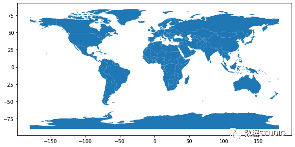
▲ df_world-plot
Merge teams and world datasets
df_world_teams = df_world.merge(df_teams_countries_disciplines,
                                how="left",
                                left_on=['name'],
                                right_on=['NOC'])
print("Type of DataFrame : ",
      type(df_world_teams), df_world_teams.shape[0])
df_world_teams.head()
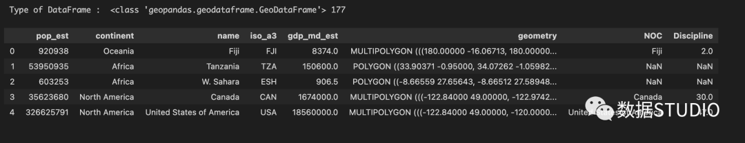
▲ merge data frame
be careful:
- df_world_teams will have some records with NOC and Discipline as NaN. The * * 'left' instead of 'right' * * consolidation is used in the data. This is intentional because there are some countries that do not participate in our data.
- Few country names are inconsistent between the Olympic Games and the world data set. Therefore, the country name has been adjusted as much as possible. Details are in the source code.
Start drawing
Show a simple world map - a map with only boundaries
As a first step, we draw a basic map - a world with only borders. In the next steps, we will color the countries we are interested in.
ax = df_world["geometry"].boundary.plot(figsize=(20,16))
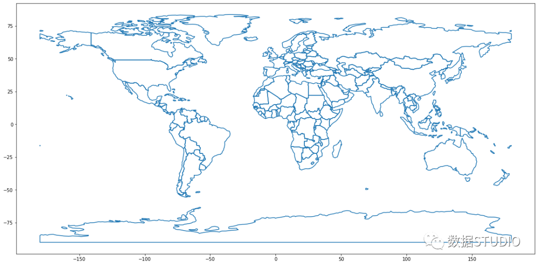
▲ world map
Show Choropleth map - draw area
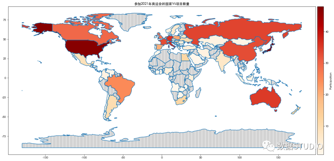
Next, we will color the countries participating in the Olympic Games according to the number of disciplines they participate in. The more subjects the country participates in, the darker the color, and vice versa. Contour maps color areas / polygons related to data variables.
df_world_teams.plot( column="Discipline", ax=ax, cmap='OrRd',
                     legend=True,
                    legend_kwds={"label": "Participation",
                                 "orientation":"horizontal"})
ax.set_title("Countries participating in the 2021 Olympic Games Vs Number of items")
Note here:
- ax is the axis on which the map is drawn
- cmap is the name of the color map
- legend & legend_ Kwds controls the display of the legend
Countries participating in the Olympic Games
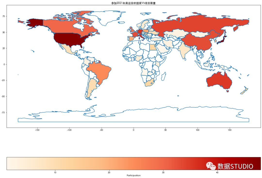
▲ countries participating in the Olympic Games
According to the shadow, we can quickly see that China, Japan, the United States, Italy, Germany and Australia are the countries that participate in more projects.
Note that the legend at the bottom does not look good. We modify df_world_teams.plot to make visualization easier to display.
fig, ax = plt.subplots(1, 1, figsize=(20, 16))
divider = make_axes_locatable(ax)
cax = divider.append_axes("right", size="2%", pad="0.5%")

df_world_teams.plot(column="Discipline", ax=ax, cax=cax, cmap='OrRd',
legend=True, legend_kwds={"label": "Participation"})
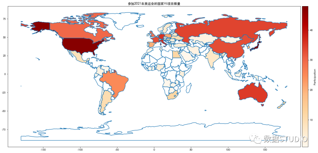
▲ with neat color map
Isn't this visualization cleaner?
Coloring non participating countries
Draw missing_kwds
Now, which countries did not participate? All countries without shadows (i.e. white) are non participating countries. But we make this more obvious by painting these countries / regions gray. We can use missing_kwds with solid color or with color and pattern.
df_world_teams.plot(column="Discipline",
                    ax=ax, cax=cax,
                    cmap='OrRd',
                    legend=True,
                    legend_kwds={"label": "Participation"},

missing_kwds={'color': 'lightgrey'})
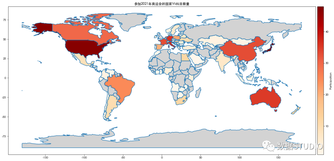
▲ countries not participating in the Olympic Games - gray shadow
df_world_teams.plot(column= 'Discipline', ax=ax,
                    cax=cax, cmap='OrRd',
                    legend=True,
                    legend_kwds={"label": "Participation"},
                    missing_kwds={"color": "lightgrey",
                                  "edgecolor": "white", "hatch": "|"})
▲ countries not participating in the Olympic Games - gray shadows and hatches
Mark the country with the least participation in the project - draw points
Which project has the least participation?
df_discipline_countries = \
df_teams.groupby(by='Discipline'
                ).agg({'NOC':'count'}
                     ).sort_values(by='NOC',
                                   ascending=False)
ax = df_discipline_countries.plot.bar(figsize=(8, 6))
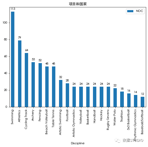
▲ number of projects and countries
Therefore, baseball / softball is the event with the least number of participating countries (12). Now let's find out which countries participated in this event?
To do this, first create a dataset containing only the least participating countries, and then add the dataset df_teams_least_participated_disciplines and df_world merge, and then calculate the centroid.
# Create a dataset with only the least participating countries

councountries_in_least_participated_disciplines = df_discipline_countries[df_discipline_countries['NOC']<13].index.tolist()

print(least_participated_disciplines)

df_teams_least_participated_disciplines = \
df_teams[df_teams['Discipline'].
         isin(countries_in_least_participated_disciplines)]\
.groupby(by=['NOC','Discipline']).agg({'Discipline':'count'})

df_teams_least_participated_disciplines.groupby(by=['NOC']
                                               ).agg({'Discipline':'count'}
                                                    ).sort_values(by='Discipline',
                                                                  ascending=False)

# merge

df_teams_least_participated_disciplines And df_world
df_world_teams_least_participated_disciplines = df_world.merge(
  df_teams_least_participated_disciplines,
  how="right",
  left_on=['name'],
  right_on=['NOC'])
df_world_teams_least_participated_disciplines['centroid'] = \
df_world_teams_least_participated_disciplines.centroid
print("Type of DataFrame : ",
type(df_world_teams_least_disciplines),
      df_world_teams_least_participated_disciplines.shape[0])
print(df_world_teams_least_participated_disciplines[:5])
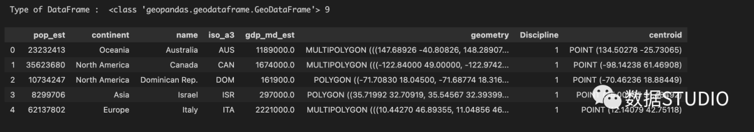
Therefore, Australia, Canada, the Dominican Republic and other countries participated in the least involved disciplines.
Add the following line to the drawing code we wrote earlier and mark these countries with dark blue filled circles.
df_world_teams_least_participated_disciplines["centroid"] \
   .plot(ax=ax, color="DarkBlue")
df_world_teams_least_participated_disciplines.apply(lambda x: ax.annotate(text=x['name'],
xy=(x['centroid'].coords[0][0],
x['centroid'].coords[0][ 1]-5),
ha='center'),axis=1)
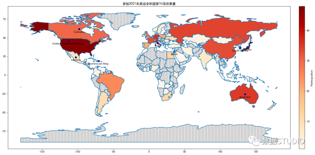
▲ countries with the least participation
Now we show the Olympic team on the world map. We can further expand it to enrich its information.
Warning: don't add too much detail to the map at the expense of clarity.
reference material
[1] Geospatial data: https://www.ibm.com/topics/geospatial-data
[2] Image source: https://www.earthdatascience.org/courses/earth-analytics/spatial-data-r/intro-to-coordinate-reference-systems/