1, Project structure
Encapsulating axios
First, install axios. Generally, I will create a new network folder in the src directory of the project as our network request module, and then create a new http JS and an API JS file and a request js. http.js file is used to encapsulate our axios, API JS is used to uniformly manage our interface url
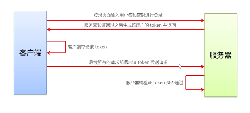
In request JS to add request interception and response interception. In the request interception, the token field will be added to the request header and the loading animation will be started. In response interception, you can close the loading animation and check whether the token is valid or expired according to the status code returned by the back end. The next step is to encapsulate some api interfaces carried out by axios. Here I use async and await to encapsulate the request interface function, so that the asynchronous operation can be synchronized, the code is more friendly and the callback region can be avoided.
You can see the specific packaging steps Packaging of axios
Configuration of multiple environment variables
Create a new in the project root directory env.*
.env.development local development environment configuration
.env.staging test environment configuration
.env.production formal environment configuration
Configure the variables corresponding to the environment. You can modify them according to your needs. The variables will be different according to different environments
You can see the specific packaging steps Multiple environmental variables
2, Development process
- User management module
Login / logout, status switching, editing, paging, role assignment, breadcrumb navigation switching - Authority management module
Add role, assign permission, permission display, edit, delete permission, breadcrumb navigation switch - Commodity management module
Add product, edit, pagination, add parameter, add attribute, select classification, add classification - Order management module
Data rendering and paging - Data statistics module
Ecarts chart and data rendering
1. Login and logout
Login business process
- Enter your user name and password on the login page
- Call the background interface for verification
- After passing the verification, jump to the project home page according to the response status of the background
Relevant technical points of login service
- Record status on the client through cookie s
- Record the status on the server through the session
- Maintain status through token
Analysis of token principle
Landing page layout
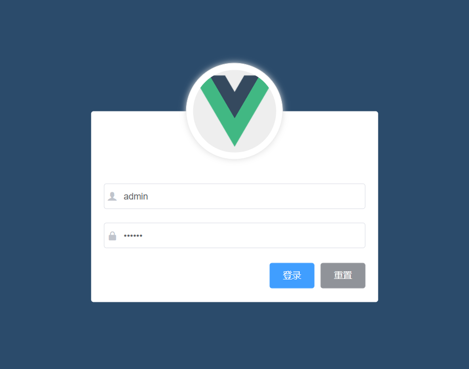
The following element UI components are used
- el-form
- el-form-item
- el-input
- el-button
- Font Icon
Create login component
Create a new login in the components folder Vue component
template, script, style tag, scoped in the style tag can prevent style conflicts between components
<template>
    <div>
         <!-- head portrait -->
         <!-- Login area -->
    </div>
</template>

<script>
export default {
  data() {
    return {}
  }
}
</script>

<style lang="less" scoped>

</style>
Realize login function
Add a click event to the login button. When the user clicks the login button, if the currently entered account information is legal, it is allowed to send a login request to the server. The server checks whether the current account is correct according to the request information and returns the response information. The client makes a corresponding response through the returned response information, that is, if the account password is wrong, it will prompt that the login fails, On the contrary, if the login is successful, store the current token locally and jump to the background home page.
sign out
- Empty token
- Jump to login page
// Bind a logout event to the exit button
logout() {
      // Empty token
      window.sessionStorage.clear()
      // Jump to login page
      this.$router.push('/login')
    },
2. Main page layout and user list function
Master page layout
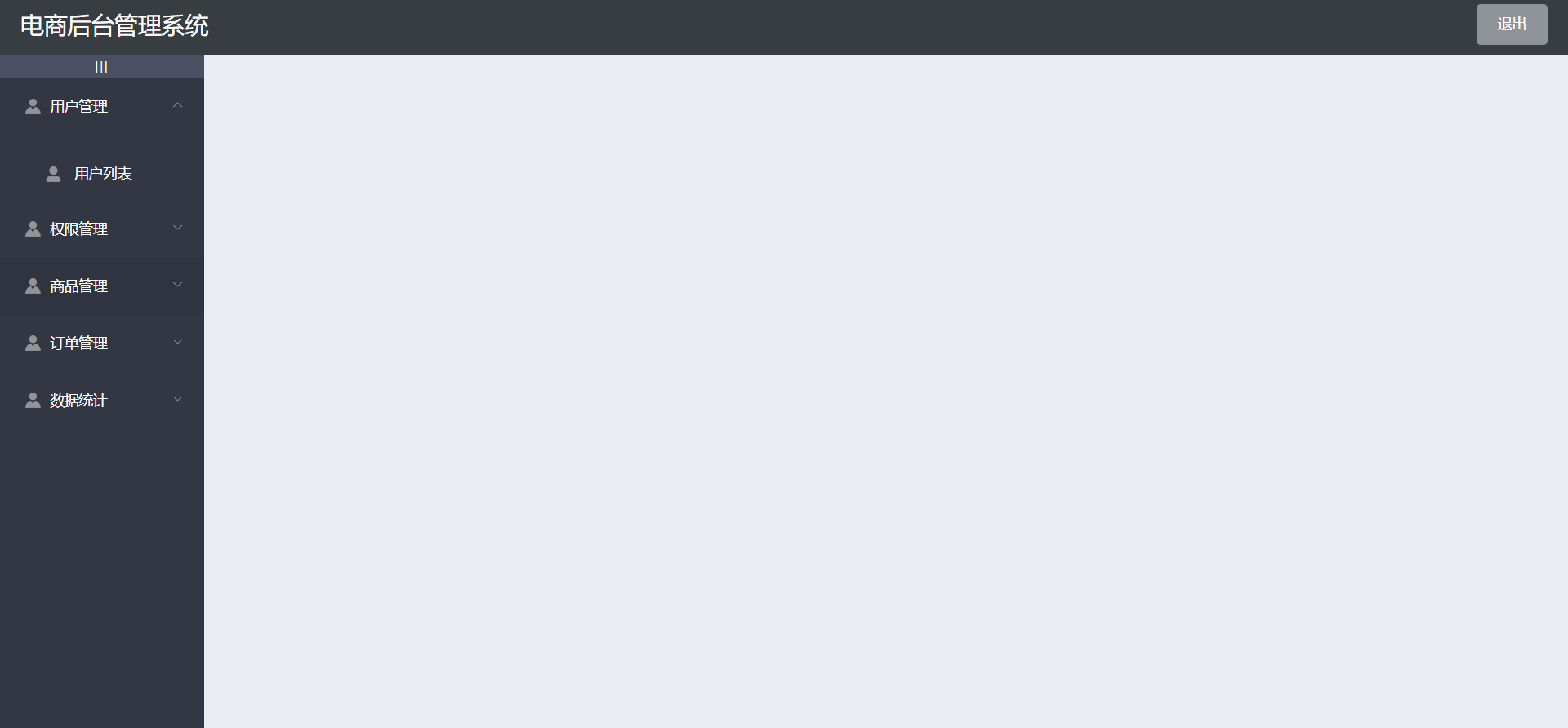
- The structure layout adopts the container component in the element ui
Layout of sidebar and rendering request data
Corresponding components are also provided in element UI, and the corresponding area of corresponding components can be found in NavMenu navigation menu
Define an array menulist in data to receive the left menu data
// Get all menus
    async getMenuList() {
      const {data: res} = await this.$http.get('menus')
      if (res.meta.status !== 200) return this.this.$message.error(res.meta.msg)
      this.menulist = res.data
      console.log(res);
    },
Expansion and contraction of sidebar menu
Define isCollapse attribute, which defaults to false. Click to switch the status
el-aside :width="isCollapse ? '64px' : '200px'">
        <div class="toggle-button" @click="toggleCollapsse">🔺</div>
12
// Click the button to switch the folding and expansion of the menu
    toggleCollapsse() {
      this.isCollapse = !this.isCollapse
    },
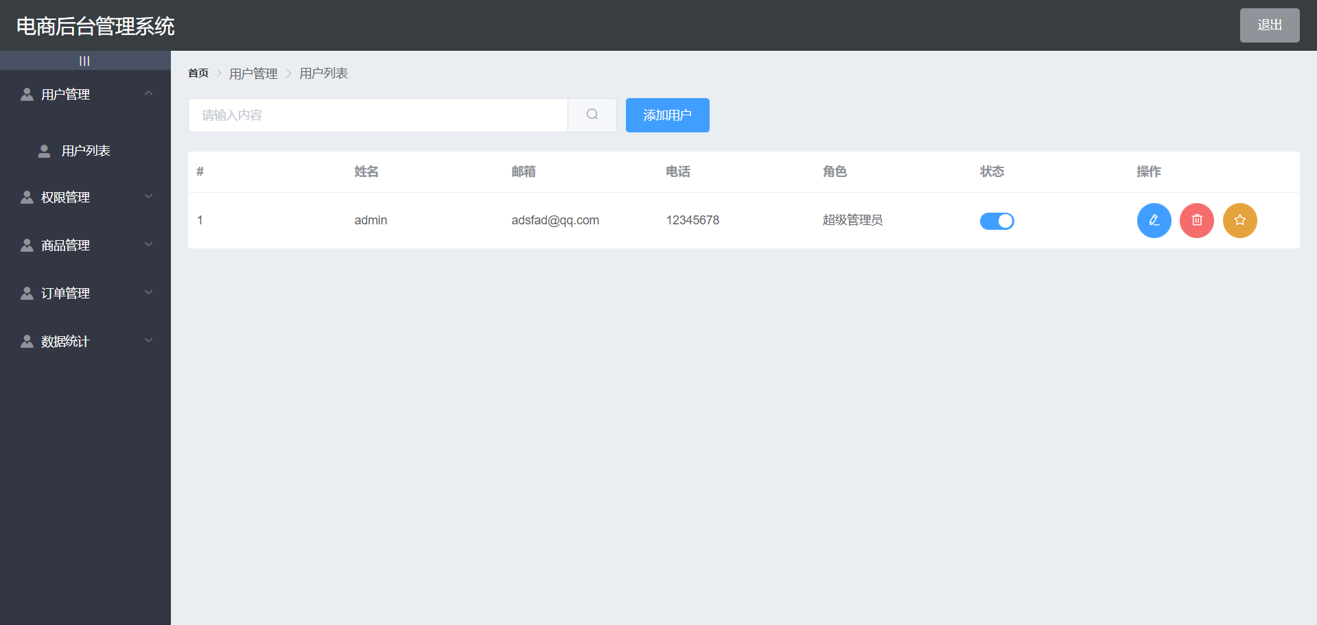
User list function
The following element ui components are used. Remember to import them in element Register in JS
- BreadCRUMB breadcrumb navigation
- Card view
- Form form
- Table table
- DIalog box
- Pagination
- Switch switch
- MessageBox
Breadcrumb navigation area
<!-- Breadcrumb navigation -->
    <el-breadcrumb separator-class="el-icon-arrow-right">
      <el-breadcrumb-item :to="{ path: '/home' }">home page</el-breadcrumb-item>
      <el-breadcrumb-item>user management </el-breadcrumb-item>
      <el-breadcrumb-item>User list</el-breadcrumb-item>
    </el-breadcrumb>
Card view area, search box, add button
<!-- Card attempt area -->
    <el-card>
      <!-- Search and add -->
      <el-row :gutter="20">
        <el-col :span="8">
          <el-input placeholder="Please enter the content" v-model="queryInfo.query" clearable @clear="getUserList"
          >
            <el-button slot="append" icon="el-icon-search" @click="getUserList" ></el-button>
          </el-input>
        </el-col>
        <!-- Button -->
        <el-col :span="4">
          <el-button type="primary" @click="addDialogVisible = true"
            >Add user</el-button
          >
        </el-col>
      </el-row>
</el-card>
Implementation of search function
Bind the value to queryinfo query
// Gets the parameter object of the user list
  queryInfo: {
    query: '',
    // Current number of pages
    pagenum: 1,
    // How many pieces of data are currently displayed on each page
    pagesize: 2,
},
Get user list data
<script>
export default {
  data() {
    return {
      //Get parameters for querying user information
      queryInfo: {
        query: '',
        pagenum: 1,
        pagesize: 2
      },
      //Save the requested user list data
      userList:[],
      total:0
    }
  },
  created() {
    this.getUserList()
  },
  methods: {
    async getUserList() {
      //Send request to get user list data
      const { res: data } = await this.$http.get('users', {
        params: this.queryInfo
      })
      //If the returned status is abnormal, an error is reported and returned
      if (res.meta.status !== 200)
        return this.$message.error('Failed to get user list')
      //If the return status is normal, save the requested data in data
      this.userList = res.data.users;
      this.total = res.data.total;
    }
  }
}
</script>
paging
- element. Import component Pagination in JS
- Change binding data in components
@Size change: listen for pagesize change events
@Current change: listen for the event of page number value change
: current page: current page
: page sizes: the number of pieces of information on a page
: page size: current number of pages
layout: control the display content
: Total: total number of messages
3. Authority management module
Permission list
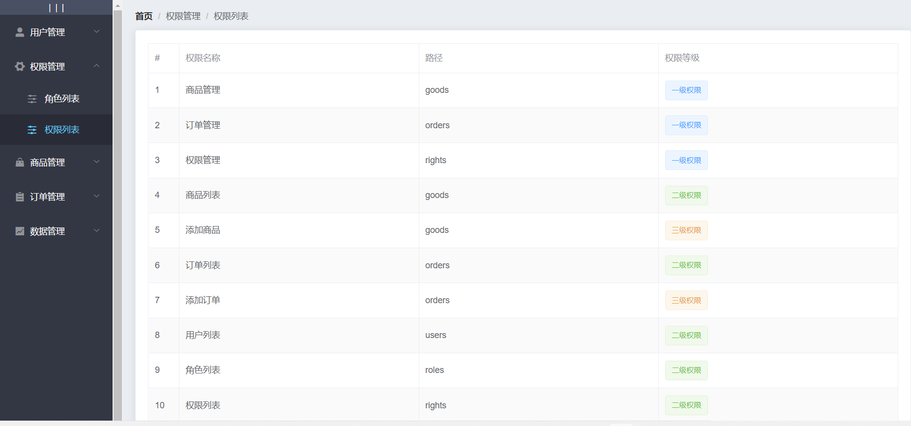
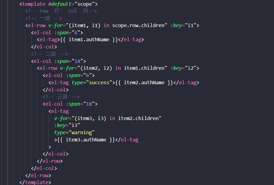
Permission levels can be determined by slots and v-if v-else-if
<el-table :data="list" style="width: 100%" border> <el-table-column type="index" label="#" width="50"> </el-table-column> <el-table-column prop="authName" label="Permission name" width="180"> </el-table-column> <el-table-column prop="path" label="route" width="180"> </el-table-column> <el-table-column label="privilege level"> <template #Default = "scope" > < El tag V-IF = "scope. Row. Level = = 0" > first-class permission < / El tag > < El tag v-else-if = "scope. Row. Level = = 1" type = "success" > second-class permission < / El tag > < El tag v-else-if = "scope. Row. Level = = 2" type = "warning" >Three level permissions < / El tag > < / template > < / El table column > < / El Table >
Role list
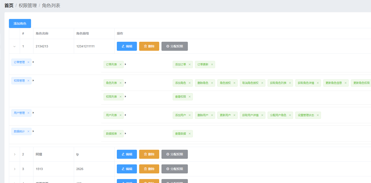
A key point of the role list page is to use the expanded row of the table in the element ui
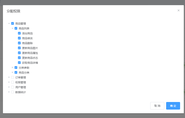
The tree tree control in element ui is also used to allocate permissions
4. Commodity management
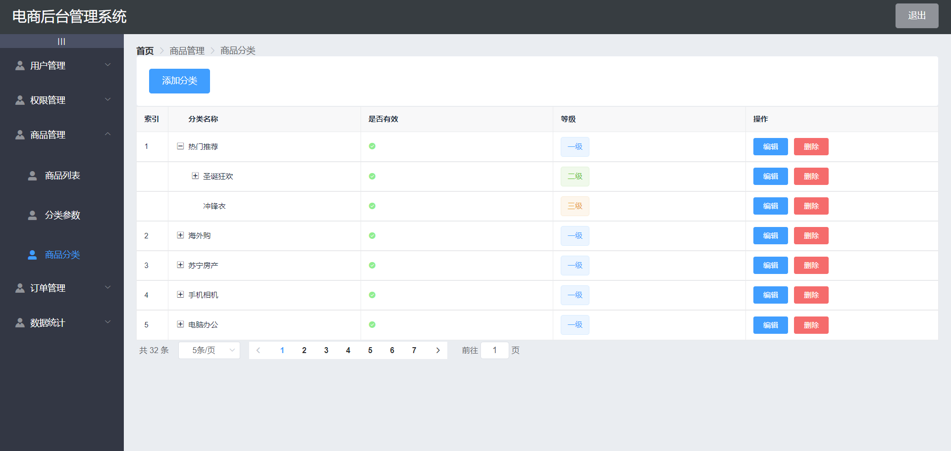
The commodity management page is divided into three pages: commodity classification parameters and commodity list
Commodity classification
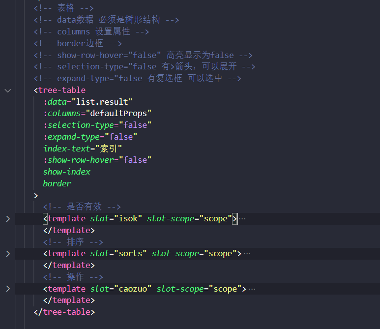
On this page, we use a new component tree table tree table
First we need to download
cnpm i vue-table-with-tree-grid --S
In main JS introduction
import TreeTable from 'vue-table-with-tree-grid'Vue.component('tree-table', TreeTable)
The specific code is as follows
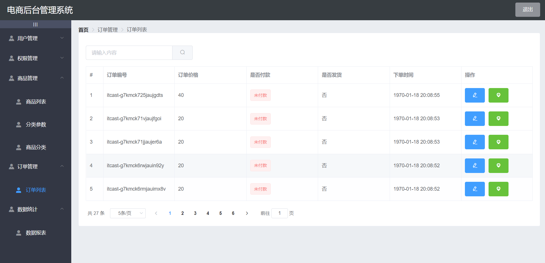
5. Order management
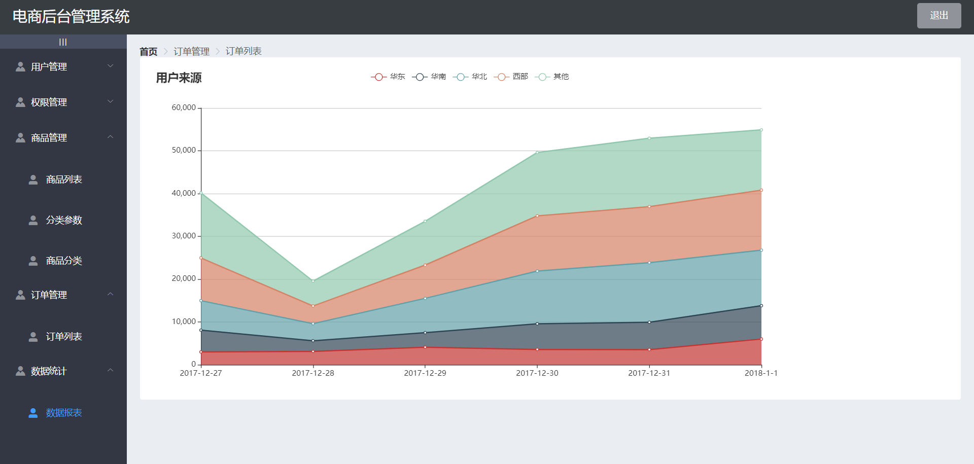
6. Data statistics
Draw an icon using ecarts Ecarts official website
Ecarts is a data visualization chart Library Based on JavaScript, which provides intuitive, vivid, interactive and personalized data visualization charts
Then through lodsh's merge() to merge the requested data.
Installation of lodsh npm i --save lodash
Reference import_ from "lodash"