EasyClick native UI tutorial
Lecturer: Mr old ghost, QQ: 1156346325
EasyClick native UI tutorial:
EasyClick native UI tutorial overview
FlexboxLayout of EasyClick native UI serialization (smart layout)
What is FlexboxLayout?
explain
FlexboxLayout is an open source layout control on Google I/O, which enables the CSS Flexible Layout module in Android to have the same powerful functions.
FlexboxLayout can be understood as an advanced LinearLayout because both layouts arrange their child views in order. The important difference between the two is that FlexboxLayout has the feature of "line breaking". So it's called a smart layout.
FlexboxLayout project open source address: Google open source address
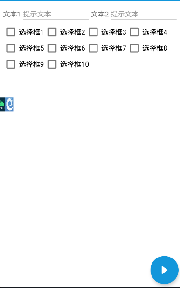
design sketch
Auto typesetting sets child control properties as needed.
FlexboxLayout common properties
flexDirection
The flexDirection property determines the direction in which the spindle controls are arranged. Similar to linear layout's vertical and horizontal, but FlexboxLayout is more powerful. It not only supports horizontal and vertical, but also can set the starting point of different arrangement. The detailed properties are shown below
- row (default): the main axis is horizontal and the starting point is at the left end
- row_reverse: the main shaft is horizontal and the starting point is at the right end.
- column: the main axis is vertical and the starting point is on the top edge
- column_reverse: the main axis is in the vertical direction, and the starting point is at the lower edge
flexWrap
The default FlexboxLayout is the same as LinearLayout without line feed attribute, but the flexWrap attribute can support line feed arrangement. There are two ways to wrap lines. One is to wrap in the positive direction and the other is to wrap in the opposite direction. The detailed properties are as follows.
- nowrap: no line breaks (default attribute)
- Wrap: wrap line in normal direction
- wrap_reverse: wrap in the opposite direction
justifyContent
The justifyContent property defines the alignment of the control on the spindle.
- flex_start (default): align left
- flex_end: align right
- center: center
- space_between: both ends are aligned, and the spacing between controls is equal.
- space_around: the spacing on both sides of each control is equal. The spacing between controls is twice as large as the spacing between controls and borders.
alignItems
The alignItems property defines how the control is aligned on the secondary axis.
- Flex start: align the start point of the cross axis.
- Flex end: align the ends of the cross axes.
- center: align the midpoint of the cross axis.
- Baseline: the baseline alignment of the first line of text of the control.
- stretch (default): if the control is not set to height or set to auto, it will occupy the height of the whole container.
alignContent
The alignContent property defines the alignment of multiple axes. This property has no effect if the control has only one axis.
- flex_start: align with the starting point of the cross axis.
- flex_end: align with the end of the cross axis.
- center: align with the midpoint of the cross axis.
- space_between: align with both ends of the cross axis, and the spacing between the axes is evenly distributed.
- space_around: the spacing on both sides of each axis is equal. Therefore, the spacing between the axes is twice as large as that between the axis and the frame.
- stretch (default): the axis occupies the entire cross axis.
be careful
In fact, the attribute values of alignContent and justifyContent are the same. One is to set the alignment of the main axis, and the other is to set the alignment of multiple axes. Generally speaking, it can be understood that, for example, the layout is a horizontal line feed, justifyContent is to set the alignment of the vertical direction, and justifyContent is to set the alignment of the horizontal direction. Now we want each control to have the same distance from the top right to the bottom left. We need to set both alignContent and justifyContent to space_ Just around,
example
		<!-- EasyClick Official writing-->
		android:alignContent="space_around"
		android:justifyContent="space_around"
FlexboxLayout child element attributes
FlexboxLayout not only has its own properties, but also can set the properties of child elements. Child elements are the child controls contained in the FlexboxLayout layout.
layout_order
By default, the arrangement of sub elements is in the order of xml controls, while the order attribute can control the order of arrangement. Negative values are first, positive values are last, and they are arranged in the order from small to large. That is, you can define the order of sub elements.
layout_flexGrow
layout_ The flexgrowth property defines the magnification of the project. The default value is 0. That is, if there is any remaining space, it will not be enlarged. In fact, it is the weight attribute in LinearLayout. If the layout of all items_ If the flexgrowth property is all 1, they will divide the remaining space equally. If the layout of an item_ If the flexgrowth attribute is 2 and all other items are 1, the remaining space occupied by the former will be twice as much as that of other items.
layout_flexShrink
layout_ The flexshrink attribute defines the reduction scale of the item. The default value is 1, that is, if there is insufficient space, the item will be reduced. If the layout of all items_ The flexshrink attribute is 1. When the space is insufficient, it will be reduced in equal proportion. If the shrink-0 attribute of the former item is not reduced to 1, then if the shrink-0 attribute of the other items is not reduced. Negative values are not valid for this property.
layout_alignSelf
layout_ The alignself attribute allows a single child element to have a different alignment from other child elements, which can override the alignItems attribute. The default value is auto, which means that it inherits the alignItems attribute of the parent element. If there is no parent element, it is equivalent to stretch. This attribute can take six values, except auto, which are all related to align_ The items attribute is exactly the same. The detailed properties are as follows. Refer to the above explanation for details.
- auto (default)
- flex_start
- flex_end
- center
- baseline
- stretch
layout_flexBasisPercent
layout_ The flexbasispercent attribute defines the percentage of spindle space occupied by child elements before allocating extra space. Its default value is auto, that is, the original size of the child element.
example:
android:layout_flexBasisPercent="80%" <!--Occupy 80% of the whole line%space-->
Code demonstration
The effect picture is on the top
<?xml version="1.0" encoding="UTF-8" ?>
<ScrollView xmlns:xsi="http://www.w3.org/2001/XMLSchema-instance"
            xmlns:android="http://schemas.android.com/apk/res/android"
            xsi:noNamespaceSchemaLocation="layout.xsd"
            android:layout_height="match_parent"
            android:layout_width="match_parent">
    <FlexboxLayout android:layout_weight="match_parent"
                   android:layout_height="match_parent"
                   android:background="#FFFFFF"
                   android:flexDirection="row"
                   android:flexWrap="wrap"
                   android:justifyContent="flex_start"
                   android:alignContent="flex_start"
                   android:alignItems="flex_start"
                   android:padding="5dp">
        <!---->
        <TextView android:layout_width="wrap_parent"
                  android:layout_height="40dp"
                  android:gravity="center"
                  android:text="Text1" />
        <EditText android:layout_width="wrap_parent"
                  android:layout_weight="1"
                  android:layout_height="wrap_content"
                  android:layout_order="1"
                  android:layout_flexGrow="20.0"
                  android:layout_alignSelf="baseline"
                  android:layout_flexBasisPercent="30%"
                  android:hint="Prompt text" />
        <TextView android:layout_width="wrap_parent"
                  android:layout_height="40dp"
                  android:gravity="center"
                  android:text="Text2" />
        <EditText android:layout_width="wrap_parent"
                  android:layout_weight="1"
                  android:layout_height="wrap_content"
                  android:layout_order="1"
                  android:layout_flexGrow="20.0"
                  android:layout_alignSelf="baseline"
                  android:layout_flexBasisPercent="30%"
                  android:hint="Prompt text" />
        <CheckBox android:layout_width="wrap_parent"
                  android:layout_height="wrap_content"
                  android:gravity="center"
                  android:text="Select box 1" />
        <CheckBox android:layout_width="wrap_parent"
                  android:layout_height="wrap_content"
                  android:text="Select box 2" />
        <CheckBox android:layout_width="wrap_parent"
                  android:layout_height="wrap_content"
                  android:text="Select box 3" />
        <CheckBox android:layout_width="wrap_parent"
                  android:layout_height="wrap_content"
                  android:text="Select box 4" />
        <CheckBox android:layout_width="wrap_parent"
                  android:layout_height="wrap_content"
                  android:text="Select box 5" />
        <CheckBox android:layout_width="wrap_parent"
                  android:layout_height="wrap_content"
                  android:text="Select box 6" />
        <CheckBox android:layout_width="wrap_parent"
                  android:layout_height="wrap_content"
                  android:text="Select box 7" />
        <CheckBox android:layout_width="wrap_parent"
                  android:layout_height="wrap_content"
                  android:text="Select box 8" />
        <CheckBox android:layout_width="wrap_parent"
                  android:layout_height="wrap_content"
                  android:text="Select box 9" />
        <CheckBox android:layout_width="wrap_parent"
                  android:layout_height="wrap_content"
                  android:text="Select box 10" />

    </FlexboxLayout>
</ScrollView>
reference material:
Google project
Explanation of network collection
Android FlexboxLayout smart UI layout
Instructions for FlexboxLayout
Android FlexboxLayout (I)
EasyClick official document: Elastic box layout
I'm Mr old ghost, QQ1156346325. AC QQ group: 620028786647082990
------------------------------------------------Copyright notice------------------------------------------------------
Copyright of this article ~ Mr old ghost ~ reprint, please indicate the original address