First of all, the old rule is to quote Echarts first when using Echarts. At this time, we have two ways (I forgot to mention it last time, this time add it). One is to introduce labeled single file. This is the way when introducing graph. The second way is to use modular single file. Both cmd and AMD can be used, but it should be noted that Echarts defaults to amd, if C is needed. The introduction of MD requires the modularization of cmd before it is introduced. For convenience, we still choose the first method to introduce Echarts file.
<script type="text/javascript" src="js/echarts3.js" ></script>
After referring to the graph library, we first create a div as a container, which will mount the drawn graph, and then we set the width and height. It should be noted that if the container is hidden, Echarts may not get the width and height of the container and cause initialization failure. At this time, we can specify the width and height of the container explicitly, or call Echa manually after the container is displayed. resize method of rts.
<div id="mycharts" style="width: 600px;height: 400px;"></div>
Pass in the current container and create an Echarts instance
var mycharts = echarts.init(document.getElementById('mycharts'));
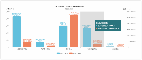
Next is the definition of the chart's configuration items. Let's talk about what kind of chart I'm going to make. Remember the NSA worm extortion events of the past few days. This time I'm going to make a bar chart to count the number of institutions affected and the amount of losses (of course, the data is not true). When making this bar chart, we should pay attention to, though. However, this bar chart still has two dimensions x and y, but we need two Y axes for counting numbers and amounts. See the core code below:
var option = {
    title:{
        text:'NSA Eternal Blue Worm Virus Cylinder', //Title
        subtext:'Data is not true',//Subtitle
        left:'center'
    },
    legend:{
        data:['Total number affected','Total amount of loss'],//Legend name, corresponding to the name in the series of data columns
        top:'bottom'
    },
    tooltip:{
        trigger:'axis',//Set the trigger type of the prompt box to coordinate axis trigger
        axisPointer:{//Coordinate axis indicator configuration item (indicating the current scale of coordinate axis)
            type:'shadow' //Here set its type to Shadow Indicator
        }
    },
    xAxis:{
        type:'category',
        data:['Educational and Scientific Research Institutions','Medical and health institutions','Commercial Centre','Transportation agencies','Religious facilities']
    },
    yAxis:[//The y-axis here is to count the number and amount, so set two axes, series can set the index value of the axis to use the corresponding axis.
        {
            name:'Number (number)',
            splitLine:{//This is the partition line of the coordinate axis in the grid area. The grid component will be introduced later.
                show:false //Here, because each Y-axis scale will have a partition line across the grid area, and there are two y-axis, resulting in the line will be more chaotic, not conducive to user viewing, so remove it.
            }
        },
        {
            name:'Amount (yuan)',
            splitLine:{
                show:false
            }
        }
    ],
    series:[
        {
            type:'bar',//Types of Charts
            name:'Total number affected',// The names of charts, or series of charts, correspond to legends one by one.
            yAxisIndex:0,//Which y-axis to use
            data:[4316,706,3014,2686,85]
        },
        {
            type:'bar',
            name:'Total amount of loss',
            yAxisIndex:1,
            data:[43161000,7064541,268610000,30141000,851100]
        },
    ]
};
The last step is to set the chart configuration items
mycharts.setOption(option);
In this way, an NSA Eternal Blue worm virus histogram comes out.
![pictrue1]()
 But in fact, we can optimize it further. For example, the prompt box looks not very good. Let's optimize it and add the following code:
    backgroundColor:'#27727B', // Modify background color
    padding:10,//Add an inner margin
    formatter:function(params,ticket,callback){//Format the display of the prompt box, where html string splicing is used
        var html = '';//html template
        if(params !== null){
            html = '<span style = "font-size:16px;">'+ params[0].name +'</span><br/>';
            for (var i = 0; i <= params.length - 1; i++) {
                if(params[i].seriesIndex === 0){//Number
                    html += '<span style = "color:'+ params[i].color +';margin-right:5px;">\u25CF</span><span>'+ params[i].seriesName +': <b>'+ params[i].value +'</b> people</span><br/>';
                }else{//Amount of money
                    html += '<span style = "color:'+ params[i].color +';margin-right:5px;">\u25CF</span><span>'+ params[i].seriesName +': <b>'+ params[i].value +'</b> element</span><br/>';
                }
            }
        }
        setTimeout(function(){
            callback(ticket,html);//After splicing the template, trigger callback to pass in the template, and then update the prompt box
        },0);
    }
Or we can change the colour of the column.
color:['#60C0DD','#F0805A','#F4E001','#D7504B','#C6E579']// Add a global color list, from which echarts will cycle out the colors as a series of colors
Of course, you can also modify the shape, add the graphics style attributes to each chart in the series data column, and modify the style, such as adding a rounded corner and shadow.
itemStyle:{
    normal:{
        barBorderRadius:[5,5,0,0],
        shadowColor: 'rgba(0, 0, 0, 0.5)',
        shadowBlur: 1
    }
},
Finally, in order to make the user see clearly, we can also display the data information of the bar chart on the chart. For example, in the following way, add the attribute of graphic text label to each chart. However, it should be noted that because the gap between the bar charts is limited, if some data information is longer, there will be overlap, so whether to display or not needs to be weighed by ourselves.
label:{
    normal:{
        show:true,
        position:'top',
        formatter:'{b}\n{c}people'
    },
}
With a refresh, we can see the final chart coming out.
 For more information, please visit www.eflycloud.com.