1 line chart
- The data effect displayed when the mouse is placed on the point is used in the code tooltip this parameter, where The default value of show is true, which can be omitted. When we don't want to display the floating prompt effect, change show to false.
- trigger sets this parameter. The effect is that you can see a vertical dotted line. If it is not added, it will not be displayed.
- The backgroundColor effect is the background color corresponding to the pop-up window displaying data. You need to set the color yourself.
- extraCssText can set the shadow effect displayed in the pop-up window.
Full code of configuration item
options: {
    title: {
    },
    //Levitation prompt
    tooltip: {
        show: true,
        trigger: 'axis',
        backgroundColor: '#fff',
        textStyle: { color: '#4B9BFB' },
        extraCssText: 'box-shadow: 0px 2px 5px 0px rgba(50,107,174,0.19);'
    },
    xAxis: {
      // name: '1/50mm/s',
      type: 'category',
      data: [0, 1, 2, 3, 4, 5, 6, 7, 8, 9, 10, 11, 12, 13],
      itemStyle: {
        show: false
      }
    },
    yAxis: {
    type: 'value',
    name: 'Company: mm/s',
    axisLine: {
      show:true,
    },
    //Add units to the y axis
    // axisLabel:{formatter:'{value}mm/s'}
    },
    series: [{
      //name: 'data',
      showSymbol: true,//Show dots by default
      symbol: 'circle',     //Set to solid point
      data: [0, -245, -496, -519, -543, -479, 794, -237, -568, -514, -372, -115, -664, -745, -468, -683, -732, -208, -506, -564, -376, -537, -198, -583, -65, -465, -677, -483, -546, -422, 0, -669, -193, -657, -910, -705, -627, -630, -553, 273, -468, -807, -642, -345, -51, -609, -705, -111, -423, -462, -498, -486, -563, -332, -565, -499, -339, -428, -498, -239, -319, -409, -546, -474, -481],
      color: "#4786FF",
      symbolSize: 6,
      type: 'line',
      lineStyle: {
        width: 1,
        color: '#4786FF',
      }
    }],
    dataZoom: [
        {
          show: true,
          realtime: true,
          start: 0,
          end: 100,
          height: 8, //Component height
          left: 30, //Left distance
          right: 30, //Distance to the right
          bottom: 0, //Distance to the right
          handleColor: '#D3DCFD', //h color of sliding Icon
          handleStyle: {
            borderColor: '#D3DCFD',
            borderWidth: '1',
            shadowBlur: 2,
            background: '#D3DCFD',
            shadowColor: '#D3DCFD',
          },
          backgroundColor: '#f4f7f9', //The color of the unselected slider area on both sides
          showDataShadow: false, //Whether to display data shadow {default auto
          showDetail: false, //That is, whether to display detailed numerical information when dragging. The default is true
          // xAxisIndex: [0]
        },
        {
            type: 'inside',
            realtime: true,
            start: 0,
            end: 5,
        },
    ],
   backgroundColor: '#fff'
}
The renderings are as follows
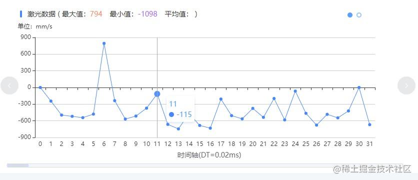 Line chart effect
summary
The data can be customized and modified. If you want to see the effect diagram, you can copy the code directly to the left side of the case of echarts, and then modify the following after option to =.
2 spectrum diagram
- We need to write the corresponding tag in Dom. If we need the rotation effect, we can use it El carousel tag, and the number of rotation chart is displayed by The number of El carousel item tags is determined.
<el-carousel el-carousel @change="onChange" :autoplay="false" height="350px" style="width: 100%" trigger="click">
<el-carousel-item >
<div class="chart-title">Spectrum diagram ( <span>Maximum:</span><span class="chart-max">{{spectrogramMax}}</span><span>Average:</span><span class="chart-min">{{spectrogramAverage}}</span> ) </div>
<IEcharts style="width: 850px; height: 320px;" :option="barOptions" ref="spectChart"></IEcharts>
</el-carousel-item>
</el-carousel>
We can import any plug-ins as needed
import IEcharts from 'vue-echarts-v3';
import 'echarts/lib/chart/line';
import 'echarts/lib/component/dataZoom';
import 'echarts/lib/chart/line';
import 'echarts/lib/component/tooltip';
The following is the core code of the spectrum diagram, which is similar to the contents of options in ecarts
- start and end is used to control the scaling position.
- backgroundColor is used to set the color of the non scaled position.
- showDetail is used to set whether to display detailed numerical information when dragging. The default value is true.
dataZoom: [{
  show: true,
  realtime: true,
  start: 0,
  end: 55, //Controls the distance between two columns
  height: 8, //Component height
  left: 30, //Left distance
  right: 30, //Distance to the right
  bottom: 0, //Distance to the right
}]
Parameter interpretation
- The x-axis data is placed in xAxis data.
- We can join between each member of data '' to increase the separation distance.
- type can be set to category
- axisLabel is used to set the distance between x-axis data
- When the text description of the x-axis is too long and incomplete, we can use it rotate to set the tilt angle.
- The spectrum diagram can be set The data of legend is ['pictorialBar', 'bar'].
- lineStyle can set some styles of lines. The properties used are color, width, opacity, Type, where type can be set to dotted line and solid line.
- The display of the scale in the coordinates can be set In axisTick show parameter, false means that the corresponding scale is not displayed, true indicates that the corresponding scale is displayed.
All configuration codes are as follows:
barOptions: {
  legend: {
    data: ['pictorialBar', 'bar']
  },
  tooltip: {
    show: true,
    trigger: 'axis',
    backgroundColor: '#fff',
    textStyle: { color: '#4B9BFB' },
    extraCssText: 'box-shadow: 0px 2px 5px 0px rgba(50,107,174,0.19);'
  },
  xAxis: {
    type: 'category',
    // data: ['20', '30'],
    data: ['20Hz', '', '46Hz', '', '69Hz', '', '105Hz', '', '160Hz', '', '244Hz', '', '371Hz', '', '565Hz', '', '859Hz', '', '1.30KHz', '', '1.98KHz', '', '3.02KHz', '', '4.60KHz', '', '7.00KHz', '', '10.6KHz', '', '20KHz'],
    axisTick: {
      show: false,
      alignWithLabel: true
    },
    axisLabel: {
      rotate:40,
      margin: 10 //Distance from x-axis data to x-axis
    },
  },
  yAxis: {
    // splitLine: {show: false},
    type: 'value',
    axisLine: {
      show: true, //---Show
    },
    axisLabel: {
      interval: 0,
      margin: 10, //Distance from Y-axis data to y-axis

    },
    axisTick: {
      show: false, //Displays the scale corresponding to each value
    },
    nameGap: 10,
    splitLine: { //---Dividing line in grid # area
      show: true, //---Whether to display or not, the category axis of 'category' will not be displayed. At this time, my y axis is the category axis, and the splitLine attribute is meaningful
      lineStyle: {
        color: '#DADADA',
        width: 1,
        opacity: 0.57,
        type: 'dashed', //---Type
      },
    },
  },
  // animationEasing: 'elasticOut',
  series: [{
    type: 'pictorialBar',
    symbol: 'bar',
    data: [{
        value: 65,
        symbolRepeat: true,
        symbolSize: [20, '10'],
        symbolMargin: 4,
    }, {
        value: 65,
        symbolRepeat: true,
        symbolSize: [20, '10'],
        symbolMargin: 4,
    }],
    itemStyle: {
      color: '#2C90F1'
    },
  }],
  dataZoom: [{
    show: true,
    realtime: true,
    start: 0,
    end: 55, //Controls the distance between two columns
    height: 8, //Component height
    left: 30, //Left distance
    right: 30, //Distance to the right
    bottom: 0, //Distance to the right
    handleColor: '#D3DCFD', //h color of sliding Icon
    handleStyle: {
      borderColor: '#D3DCFD',
      borderWidth: '1',
      shadowBlur: 2,
      background: '#D3DCFD',
      shadowColor: '#D3DCFD',
    },
    backgroundColor: '#f4f7f9 ', / / the color of the unselected slider area on both sides
    showDataShadow: false, //Whether to display data shadow {default auto
    showDetail: false, //Whether to display the default value when dragging
    //xAxisIndex: [0, 1] / / this line of code will__ dzAxisProxy reported an error
    },
    {
      type: 'inside',
      realtime: true,
      start: 0,
      end: 10,
    },
  ],
  itemStyle: { normal: { label: { show: true } } }
},
The effect of spectrum diagram is as follows:
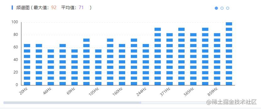 Spectrum effect
usage method
If you want to see the renderings, you can directly go to the official website of echarts and copy the above code to the case of echarts. Just change barOptions: to option =.
3. Three dimensional scatter diagram
Parameter interpretation
- Three dimensional scatter chart requires us to introduce two plug-ins Corresponding to ecarts # 4.9.0 echarts-gl 1.1.2.
- It should be noted that the inconsistent versions of the two plug-ins will cause the 3D scatter distribution map to be unable to be displayed.
- The parameters involved are xAxis3D, yAxis3D, zAxis3D and grid3D.
- Parameters related to adjusting width and height boxWidth, boxHeight, boxDepth, top.
- The name under each coordinate system corresponds to the displayed coordinate name.
- The displayed points are placed on the bottom of the series data.
All configuration codes
option = {
    tooltip: {},
    xAxis3D: {
        name: "x",  //The x axis is displayed as x
        type: 'value',
        //min: 'dataMin', / / get the latest value in the data
        // max: 'dataMax'
        min: 0,
        max: 80,
        interval: 20,//The display interval of the scale label of the coordinate axis, which is valid in the category axis
        axisTick: {
          show: false, //Displays the scale corresponding to each value
        },
        axisLine:{     //x-axis coordinate axis, false is hidden and true is displayed
                show: true
        },
        axisLabel: {
          show: false    Show scale (A number or category on a scale), false To hide, true For display
        },
        itemStyle: {
          borderColor: "#fff",
          backgroundColor: "#fff"
        },
    },
    yAxis3D: {
        name: "y",//The Y axis is displayed as y
        type: 'value',
        splitNumber: 5,
        axisTick: {
          show: false, //Displays the scale corresponding to each value
        },
        min: 0,
        max: 360,
        interval: 90
    },
    zAxis3D: {
        name: "z",//The z axis is displayed as z
        type: 'value',
        min: -20,
        max: 60,
        interval: 20,
        axisTick: {
          show: false, //Displays the scale corresponding to each value
        },
    },
    grid3D: {
        axisLine: {
            lineStyle:{//Axis style
              color:'#070707',//Axis color
              opacity:.8,//(a single scale is not affected)
              width: 1//Line width
            }
        },
        axisPointer: {
            lineStyle: {
                color: '#f00'//Axis indicator
            },
            show: false//Axis indication line
        },
        viewControl: {
            //autoRotate: true, / / rotate the display
            // projection: 'orthographic'
            // beta:0,
            distance:230, //The greater the distance from the viewing angle, the farther the image is from the viewing angle, and the smaller the image
            alpha:7, //The angle of rotation around the x-axis (up and down rotation) increases, and the viewing angle increases clockwise (up)
            beta:20, //The angle of rotation around the y-axis (left-right rotation) increases, and the viewing angle increases counterclockwise (right)
            center:[-15,-5,-20]  //The first parameter: increase, and the viewing angle moves horizontally to the right along the positive direction of the x-axis (left in the figure); The second parameter: increase, and the viewing angle moves vertically upward along the positive direction of the y-axis (downward in the figure); Third parameter: increase, and the viewing angle moves in the positive direction of z axis (the figure becomes smaller)
        },
        boxWidth: 120,
        boxHeight: 70,
        boxDepth: 120,
        top: -100
    },

    series: [{
        type: 'scatter3D',
        dimensions: ['x', 'y', 'z'//Pop up display box information when floating to point
        ],
        // encode: {
            //x: [3, 1, 5], / / indicates that the dimensions 3, 1, and 5 are mapped to the x axis.
            //Y: 1, / / indicates that dimension # 2 # is mapped to y # axis.
            // z: 3,
            //tooltip:['a','c','b '], / / indicates that dimensions , 3,2,4 , will be displayed in , tooltip ,.
            //label: 'a' / / indicates that dimension 3 is used.
        // },
        data: [
            [0, 0, 0],
            [1, 0, 0],
            [0, 1, 0],
            [0, 1, 1],
            [21, 24, 25],
            [22, 25, 26],
        ],
        symbolSize: 4,//Point size
        // symbol: 'triangle',
        itemStyle: {
            // borderWidth: 1,
            color: "#87f0e5",
            //borderColor: 'RGBA (255255255,0.8)' / / border style
        },
        emphasis: {
            itemStyle: {
                color: '#ccc'//Highlight
            }
        },
        // itemStyle: {
        //     color: "#87f0e5"
        // }
    }],
    backgroundColor: "#e8e8e8"
};
The renderings are as follows
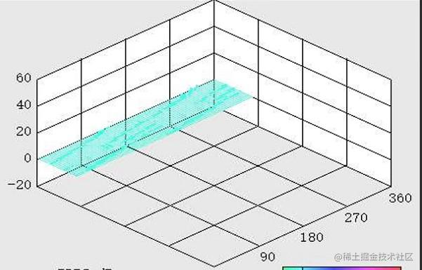 Three dimensional scatter distribution rendering
4 line chart and scatter chart
- Introduce relevant dom code into vue
<IEcharts style="width: 850px; height: 320px;" :option="partialOptions2" ref="partialEchart"></IEcharts>
- Introduce plug-ins as needed in the project
import 'echarts/lib/component/dataZoom';
import 'echarts/lib/chart/line';
import 'echarts/lib/component/tooltip';
Parameter interpretation
- The coordinate system needs to be defined xAxis and yAxis.
- adopt In xAxis type and axisLabel to set the type and interval.
- The number in axisLabel is to divide the data of data. For example, we set data to [0,..., 360] such an array from 0 to 360.
- If If axisLabel is set to 59, only [0, 60, 120, 180, 240, 300, 360] effect, as shown in the figure, the x-axis, similarly, the y-axis can also be set in this way.
- We can set the red line in the figure markLine.
- We can set dataZoom to control the zoom effect.
- Attribute usage of scatter chart scatter
type: 'category',
data: [0,...,360], //The number between 0-360 is omitted in the middle
axisLabel:{
  interval:59
}
- We can also use another way, type is set to value, min is the minimum value, max represents the maximum value, Interval indicates that the interval is 20, and the effect is shown in the y-axis of the figure.
type: 'value',
min: -20,
max: 60,
interval: 20,
All configuration codes are as follows
partialOptions2: {
  title: {
  },
  //Levitation prompt
  tooltip: {
    show: true,
    trigger: 'axis',
    backgroundColor: '#fff',
    textStyle: { color: '#4B9BFB' },
    extraCssText: 'box-shadow: 0px 2px 5px 0px rgba(50,107,174,0.19);'
  },
  xAxis: {
      // name: '1/50mm/s',
      type: 'category',
      // type: 'value',
      data: [],
      itemStyle: {
        show: false
      },
      axisTick: {
        show: false,
        alignWithLabel: true
      },
      //Let the starting point start from the x-axis 0 and leave no blank on the left
      boundaryGap: false,
      // min:0,
      // max: 360,
      // interval: 60
      axisLabel:{
        // minInterval: 0,
        // maxInterval: 360,
        interval:59
      }
   },
  yAxis: {
    type: 'value',
    //name: 'unit: dBmV',
    min: -20,
    max: 60,
    interval: 20,
    axisLine: {
      show:true,
    },
    //Add units to the y axis
    // axisLabel:{formatter:'{value}mm/s'}
  },
  series: [{
      //name: 'data',
      showSymbol: true,//Show dots by default
      symbol: 'circle',     //Set to solid point
      data: [[0,20], [100,58], [200, 0],[260, -20], [360, 20]],
      // data: [0, 20, 58, -20, 20],
      color: "#49d86b",
      symbolSize: 1,
      type: 'line',
      smooth: true,
      //Sets the color of the line chart
      normal: {
          color: "#49d86b", //Change the color of polyline points
      },
      // lineStyle: {
      //   width: 1,
      //   color: 'red',
      // },
      // type: 'line',
  },
  {
      //name: 'data',
      showSymbol: true,//Show dots by default
      symbol: 'circle',     //Set to solid point
      symbolSize: 2,
      data: [],
      color: "#3dcbdb",
      // symbolSize: 6,
      type: 'scatter',
      //Sets the color of the line chart
      // normal: {
      //Color: "#1F824E", / / change the color of polyline points
      // },
      // lineStyle: {
      //   width: 1,
      //   color: 'red',
      // },
      // type: 'line',
  },
  //Line set by y axis
  {
    type: "line", //If , markLine , is written separately in an object, you must add , type, or an error will be reported.
    markLine: {
      symbol: "none", //Equivalent to ["none", "none"] [dotted line, no arrow]
      data: [{
          yAxis: 0, //Controls the value of the y-axis horizontal line
          silent: true, //true - do not respond to mouse events
      }],
      label:{
        //position:"end", / / where to put the warning value, the three values "start", "middle","end" start , midpoint , end
        // fontSize: 14,
        // formatter: function () {
        //     return "17"
        // }
        // formatter: "0"
      },
      lineStyle: {
        color: "#ec3d35",
        width: 2,
        type: "solid", //Solid line, no default dotted line
      },
    }
  }],
  dataZoom: [
    {
      show: true,
      realtime: true,
      start: 0,
      // end: 5,
      end: 100,
      height: 8, //Component height
      left: 30, //Left distance
      right: 30, //Distance to the right
      bottom: 0, //Distance to the right
      handleColor: '#D3DCFD', //h color of sliding Icon
      handleStyle: {n
        borderColor: '#D3DCFD',
        borderWidth: '1',
        shadowBlur: 2,
        background: '#D3DCFD',
        shadowColor: '#D3DCFD',
      },
      backgroundColor: '#f4f7f9 ', / / the color of the unselected slider area on both sides
      showDataShadow: false, //Whether to display data shadow {default auto
      showDetail: false, //That is, whether to display detailed numerical information when dragging. The default is true
      // xAxisIndex: [0]
   },
   {
       type: 'inside',
       realtime: true,
       start: 0,
       end: 5,
   },
 ],
 itemStyle : { normal: {label : {show: true}}
},
The renderings are as follows
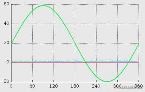 Line chart and scatter chart
Summary
New knowledge requires us to constantly explore. When we encounter problems, we should not only solve them, but also learn from other people's ideas and draw inferences from one instance, so as to turn other people's knowledge into our own. After understanding this knowledge, you can find a few more cases and implement them manually to deepen and consolidate.
last
Focus on the official account [front end daily skills]. Writing is not easy. Hope to be able to praise. 👍 Add collection ❤️ And forwarding.