Reference css file
If there are many, many and complicated styles in our style, we can create a new css file and put it in html in the same directory, and then enter it in style
<link href="./mystyle.css" rel="stylesheet" type="text/css"/>
You can reference css files in html files, which is more convenient for modifying large files!
colour
For color settings, in addition to direct color:red;
It can also be expressed in hex format, such as color:#000000 color:#00FF00;
You can also use RGB format, such as color: rgb (255,0255);
For multiple objects, if we want to modify them at the same time, we need to modify them one by one? We can first define a variable defined in JavaScript_ color:pink; Then css defines the color:defined_color. When we only modify this variable, all objects with this color will be modified! (the knowledge of JS can Kangkang my article)
Other basis
- Padding: set the up, down, left and right distance of the content in the area. Try padding:20px; You will find that the up and down length of the content becomes 20px.
/*body in*/
<p class="k">hello5</p>

/*style in*/
.k{
	color:orange;
	padding:20px ;
}
You see, hello 5 with padding defined is wider than hello 3 without padding defined.
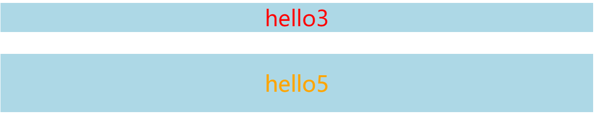
- margin edge: the distance setting outside the edge of the content. You can understand it by looking at the figure below.
/*body in*/
<p class="k">hello5</p>

/*style in*/
.k{
	color:orange;
	margin:20px ;
}

You see, hello5 with margin defined is 20px away from the outside, while hello3 without definition fills the page.
- Grid layout: two-dimensional, you can use grid layout to draw tables quickly!
How to draw a table with 2 rows and 3 columns?
/*body in*/
<div class="container">
		<div class="d1"> 1 </div>
		<div class="d1"> 2 </div>
		<div class="d1"> 3 </div>
		<div class="d1"> 4 </div>
		<div class="d1"> 5 </div>
		<div class="d1"> 6 </div>
</div>

/*style in*/
.container{
		font-size:20px;                       /*The font size is 20px*/
		display:grid;                         /*grid layout*/
		grid-template-columns:1fr 1fr 1fr;    /*3 Column, fr is the unit that fills the page*/
		grid-template-rows:1fr 1fr;           /*2 Line, fr is the full page unit*/
}
.d1{
		background-color:lightblue;   /*Background sky blue*/
		text-align:center;            /*Font centered*/
		border-color:blue;            /*The border color is blue*/
		border-width:5px;             /*Border thickness 5px*/
		border-style:solid;           /*The border type is solid*/
		border-radius:0px;            /*Border without fillet*/
}

I believe you can understand it by looking at the code comments. Note that this fr unit is very good. If 1fr 2fr 1fr, the page will allocate the width of the column in a ratio of 1:2:1. Of course, we can also directly use px to set the length of columns and rows.
- flex elastic layout: corresponding to grid, this is one-dimensional.
<div class="box">
		<div class="d2"> 1 </div>
		<div class="d2"> 2 </div>
</div>

/*style in*/
.box{
		display: flex;                /*flex layout*/
		flex-direction: row;          /*Horizontal distribution*/
}
.d2{
		text-align:center;
		background-color:lightblue;
		border-color:blue;            /*The border color is blue*/
		border-width:5px;             /*Border thickness 10px*/
		border-style:solid;           /*The border type is solid*/
		border-radius:0px;            /*Border fillet*/
		flex: 100%;                   /*Full page*/
}

You understand the grid layout. flex must be ok. The difference is good. One is two-dimensional and the other is one-dimensional. It's ok.
- Repeat (): 1fr 1fr is used in the grid layout. If there are 10 columns, don't we write ten 1frs? The "lazy" program ape invented the repeat function. Repeat (3,1fr) means three 1frs written together. Similarly, 10 1frs are repeat (10,1fr)
You can also repeat (3, 1fr 50px) for 1fr 50px 1fr 50px 1fr 50px, which is much simpler!