Elastic element
+Classification from element type
=>inline element
=>Block level element block
=>Inline block element
=>Elastic element flex
appointment:
+We call the element of display: flex the elastic parent element
+The direct child element of the element with display: flex written is called elastic child element
When an element has elastic layout enabled, some default elastic conditions will appear in the browser
1. A spindle will be generated
=>The spindle direction is from left to right
2. A side axis will be generated
=>The direction of the side axis is from top to bottom
=>The side axis is always perpendicular to the main shaft
3. Arrangement of elastic sub elements in the main axis direction
=>By default, it is arranged from the spindle start direction to the spindle end direction
4. Size problem
=>When the elastic sub element is not set to width or height
=>The dimension of the spindle direction is the dimension of the element content by default. If there is no content, it is 0
=>The side axis dimension defaults to the side axis length and the parent element box length
5. Arrangement of elastic elements
=>Default never wrap
=>When the child element exceeds the range of the parent element, the content area of the child element will be squeezed by default
=>When it is squeezed into the content area and cannot continue to squeeze, it directly overflows the parent box
6. After line feed is allowed, multiple temporary side shafts will appear
=>How many lines are changed and how many temporary side shafts appear
=>The len gt h of multiple temporary side shafts is the same
The style written on the elastic parent element
1. Spindle direction adjustment
=>Styles: Flex direction
=>Value:
->Default: row horizontally from left to right, and side axis from top to bottom
->Row reverse horizontal from right to left, side axis from top to bottom
->Column longitudinally from top to bottom, and the side axis from left to right
->Column reverse longitudinal from bottom to top, side axis from left to right
=>Note:
->The spindle can be selected in four directions
->The side axis can only be left to right or top to bottom
2. Arrangement of elements on the spindle
=>Style: justify content
=>Value:
->Default: Flex start arranges all elements as a whole at the beginning of the spindle
->Flex end arranges all elements as a whole at the end of the spindle
->The center arranges all elements as a whole in the middle of the spindle
->Space between divides the spare positions of all elements equally between every two elements (6 elements, 5 spaces)
->Space around divides the spare positions of all elements equally on both sides of each element (6 elements, 12 spaces)
->Space evenly takes the spare positions of all elements into an absolute equal share (6 elements, 7 spaces)
(Note: space evenly, Android doesn't work well, ios works well)
3. Allow line breaks
=>Styles: Flex wrap
=>Value:
->Default: no wrap does not allow line breaks
->Wrap allows line breaks
->Wrap reverse allows line breaks and reversals
4. Arrangement of side axes in row
=>Style: align items
=>Value:
->Start flex side: default
->Flex end is arranged at the end of the side axis
->Centers are arranged in the center of the side axis
=>Note: this style is effective when elastic child elements are multiline
->When using align items in multiple rows, the position is adjusted based on each temporary side axis
5. Arrangement of side shafts in multiple rows
=>Style: align content
=>Value:
->Flex start arranges all row elements as a whole at the beginning of the overall side axis
->Flex end arranges all row elements as a whole at the end of the overall side axis
->The center arranges all row elements as a whole in the middle of the overall side axis
->Space between divides the spare positions of all lines equally between every two lines (3 lines, 2 spaces)
->Space around divides the spare positions of all lines equally on both sides of each line (3 lines, 6 spaces)
->Space evenly divides the spare positions of all lines absolutely equally (3 lines, 4 spaces)
=>Note: this style has no effect when the elastic sub element is a single line
<!DOCTYPE html>
<html lang="en">
<head>
<meta charset="UTF-8">
<meta http-equiv="X-UA-Compatible" content="IE=edge">
<meta name="viewport" content="width=device-width, initial-scale=1.0">
<title>Document</title>
<style>
* {
margin: 0;
padding: 0;
list-style: none;
}
ul {
width: 1000px;
height: 800px;
background-color: skyblue;
/* Enable elastic layout mode */
display: flex;
/* Adjust spindle direction */
/* flex-direction: column-reverse; */
/* Arrangement of elements in the direction of the principal axis */
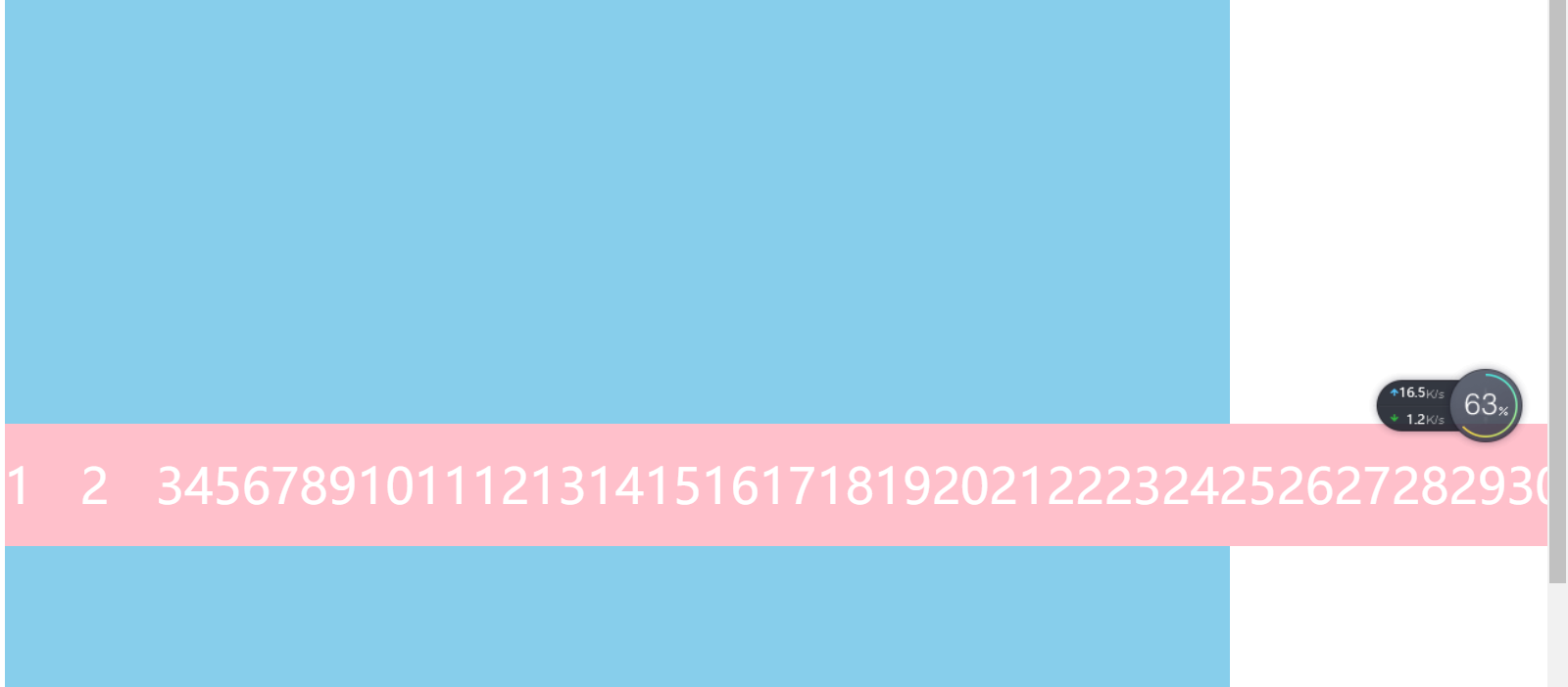
justify-content: space-between;
/* Line feed allowed in spindle direction */
flex-wrap: wrap;
/* Side axis arrangement in single line */
align-items: flex-end;
/* Side axis arrangement in multiple rows */
/* align-content: space-evenly; */
}
li {
width: 100px;
height: 100px;
background-color: pink;
font-size: 50px;
line-height: 100px;
color: #fff;
text-align: center;
}
</style>
</head>
<body>
<ul>
<li>1</li>
<li>2</li>
<li>3</li>
<li>4</li>
<li>5</li>
<li>6</li>
<li>7</li>
<li>8</li>
<li>9</li>
<li>10</li>
<li>11</li>
<li>12</li>
<li>13</li>
<li>14</li>
<li>15</li>
<li>16</li>
<li>17</li>
<li>18</li>
<li>19</li>
<li>20</li>
<li>21</li>
<li>22</li>
<li>23</li>
<li>24</li>
<li>25</li>
<li>26</li>
<li>27</li>
<li>28</li>
<li>29</li>
<li>30</li>
<li>31</li>
<li>32</li>
</ul>
</body>
</html>
Renderings: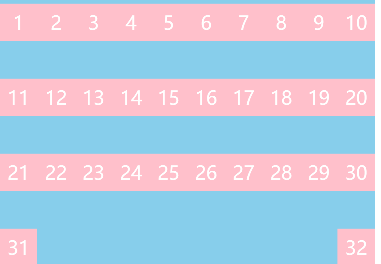
Elastic sub element related styles
Styles related to elastic child elements
1. Adjust the arrangement position on the side shaft separately
=>In case of multiple rows, you can adjust your arrangement on the separate side axis separately
=>Style: align self
=>Value:
->Flex start puts itself at the beginning of the side shaft
->Flex end puts itself at the end of the side shaft
->The center is placed in the middle of the side shaft
2. Element sequence
=>Style: order
=>Value: a number. The larger the number, the later
3. Default size setting of element
=>Styles: flex
=>Value: a number, calculated in proportion
=>Calculation method
->When you set flex style for multiple elements
->First, calculate the data other than the non fixed size (take the following structure as an example, the remaining size is 600)
->Calculate the sum of all elements with flex style as the cardinality (take the following structure as an example, the total cardinality of flex is 30)
->Allocate the total remaining space according to the number of flex copies of each element
+Take the following structure as an example
+Element 2 occupies 8 / 30 of 600
+Element 4 occupies 22 / 30 of 600
=>Note:
->When we do not turn on line feed, if the element exceeds the range of the parent element, it will squeeze the element
->When you have flex elements, you will squeeze them first
->The elements squeezed to flex can't continue to be squeezed until they start to squeeze the elements with fixed width
4. Is it allowed to squeeze elements
=>Style: Flex shrink
=>Value: 0 or 1
->0 means not participating in compression
->1 means participating in compression
<!DOCTYPE html>
<html lang="en">
<head>
  <meta charset="UTF-8">
  <meta http-equiv="X-UA-Compatible" content="IE=edge">
  <meta name="viewport" content="width=device-width, initial-scale=1.0">
  <title>Document</title>
  <style>
    * {
      margin: 0;
      padding: 0;
      list-style: none;
    }

    ul {
      width: 1000px;
      height: 800px;
      background-color: skyblue;

      margin: 50px auto;

      display: flex;

      /* Arrangement in the direction of the side axis */
      align-items: center;

      /* flex-wrap: wrap; */
    }

    li {
      width: 100px;
      height: 100px;
      background-color: pink;
      font-size: 40px;
      color: #fff;
      /* display: flex;
      justify-content: center;
      align-items: center; */

      line-height: 100px;
      text-align: center;
    }

    /* Adjust the position of each element on the side axis separately */
    /* li:nth-child(2) {
      align-self: flex-start;
    }

    li:nth-child(5) {
      align-self: flex-end;
    } */


    /* li:nth-child(3) {
      order: 9999;
    } */


    li:nth-child(2) {
      /* Indicates that li element 2 does not participate in compression */
      flex-shrink: 0;
    }
  </style>
</head>
<body>


  <ul>
    <!-- <li style="width: 100px;">1</li>
    <li style="flex: 4;">2</li>
    <li style="width: 100px;">3</li>
    <li style="width: 100px;">4</li>
    <li style="flex: 6;">5</li>
    <li style="width: 100px;">6</li> -->

    <li>1</li>
    <li>2</li>
    <li>3</li>
    <li>4</li>
    <li>5</li>
    <li>6</li>
    <li>7</li>
    <li>8</li>
    <li>9</li>
    <li>10</li>
    <li>11</li>
    <li>12</li>
    <li>13</li>
    <li>14</li>
    <li>15</li>
    <li>16</li>
    <li>17</li>
    <li>18</li>
    <li>19</li>
    <li>20</li>
    <li>21</li>
    <li>22</li>
    <li>23</li>
    <li>24</li>
    <li>25</li>
    <li>26</li>
    <li>27</li>
    <li>28</li>
    <li>29</li>
    <li>30</li>
    <li>31</li>
    <li>32</li>
    <li>33</li>
  </ul>
</body>
</html>
design sketch: