Preface
The importance of advertising rotation is self-evident. In many types of apps, the appearances are very high.
Today, I'd like to introduce an open source project, which encapsulates the ViewPager and timer needed by the rotation map. It is very convenient to use and supports gradle online dependency. Several kinds of picture sliding animation are also encapsulated.
No plan, no truth:
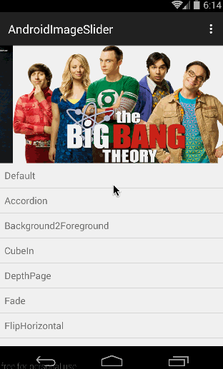
There are more than 10 kinds of sliding animation, with two rolling states. Can meet most of the needs.
How to use
First, depend on three libraries Online
compile 'com.squareup.picasso:picasso:2.3.2'
compile 'com.nineoldandroids:library:2.4.0'
compile 'com.daimajia.slider:library:1.1.5@aar'
Picasso is a very excellent open source image loading library produced by Square Company. It is one of the most popular image loading libraries in Android development. Nineold and ROIDS are also github's well-known open source animation library. Our picture sliding animation is based on this animation library. slider is the Banner Open Source Library. Based on the previous Picasso and Nineold androids to achieve results.
You need to add access to the network in AndroidManifest.xml. After all, the picture might be displayed online in a url.
<uses-permission android:name="android.permission.INTERNET" />
activity_main.xml Home Page Layout File
<?xml version="1.0" encoding="utf-8"?>
<RelativeLayout xmlns:android="http://schemas.android.com/apk/res/android"
    xmlns:custom="http://schemas.android.com/apk/res-auto"
    android:layout_width="match_parent"
    android:layout_height="match_parent">

    <RelativeLayout
        android:layout_width="match_parent"
        android:layout_height="200dp">

        <com.daimajia.slider.library.SliderLayout
            android:id="@+id/slider"
            android:layout_width="match_parent"
            android:layout_height="200dp"
            custom:auto_cycle="true"
            custom:indicator_visibility="visible"
            custom:pager_animation="Accordion"
            custom:pager_animation_span="1100" />

        <com.daimajia.slider.library.Indicators.PagerIndicator
            android:id="@+id/custom_indicator2"
            style="@style/AndroidImageSlider_Corner_Oval_Orange"
            android:layout_alignParentBottom="true"
            android:layout_centerHorizontal="true"
            android:layout_marginBottom="20dp" />
    </RelativeLayout>
</RelativeLayout>
The outermost layer is Relative Layout, which nests a Relative Layout with a height of 200 dp, which is the height of our advertising Banner. There are two controls SliderLayout and Pager Indicator. Pager Indicator is responsible for Banner. Pager Indicator is an indicator that represents the currently selected state.
MainActivity.java Home Page
First, the control is initialized in the onCreate method, and the description and image URLs are placed in the map. Then traverse the Map, create a sliding TextSliderView for each page in the for loop, use the key of the map as the picture description, set the picture url, set the type of picture zoom, etc. Finally, call SliderLayout's addSlider to add it. We can also set SliderLayout's sliding animation, indicator style, picture description display animation, scroll time, and timer time, add page change listener function.
mDemoSlider = (SliderLayout)findViewById(R.id.slider);
HashMap<String,String> urlMaps = new HashMap<>();
urlMaps.put("Hannibal", "http://static2.hypable.com/wp-content/uploads/2013/12/hannibal-season-2-release-date.jpg");
urlMaps.put("Big Bang Theory", "http://tvfiles.alphacoders.com/100/hdclearart-10.png");
urlMaps.put("House of Cards", "http://cdn3.nflximg.net/images/3093/2043093.jpg");

for(String name : urlMaps.keySet()){
    TextSliderView textSliderView = new TextSliderView(this);
    textSliderView
            .description(name)//describe
            .image(urlMaps.get(name))//image method can pass in picture url, resource id, File
            .setScaleType(BaseSliderView.ScaleType.Fit)//Picture zoom type
            .setOnSliderClickListener(onSliderClickListener);//Picture Click
    textSliderView.bundle(new Bundle());
    textSliderView.getBundle().putString("extra",name);//Afferent parameter
    mDemoSlider.addSlider(textSliderView);//Add a sliding page
}

mDemoSlider.setPresetTransformer(SliderLayout.Transformer.Accordion);//Slide animation
//        mDemoSlider.setPresetIndicator(SliderLayout.PresetIndicators.Center_Bottom); //Default Indicator Style
mDemoSlider.setCustomIndicator((PagerIndicator)findViewById(R.id.custom_indicator2));//Custom Indicator
mDemoSlider.setCustomAnimation(new DescriptionAnimation());//Setting Picture Description Display Animation
mDemoSlider.setDuration(4000);//Setting the scroll time is also the timer time
mDemoSlider.addOnPageChangeListener(onPageChangeListener);
Banner's Item click listener, which is a page click listener of ViewPager.
private BaseSliderView.OnSliderClickListener onSliderClickListener=new BaseSliderView.OnSliderClickListener() {
        @Override
        public void onSliderClick(BaseSliderView slider) {
            Toast.makeText(MainActivity.this,slider.getBundle().get("extra") + "",
                    Toast.LENGTH_SHORT).show();
        }
};
Page change monitor, ViewPager is the control we often use. You should be familiar with this callback. But explain more.
//Page Change Monitor
private ViewPagerEx.OnPageChangeListener onPageChangeListener=new ViewPagerEx.OnPageChangeListener() {
    @Override
    public void onPageScrolled(int position, float positionOffset, int positionOffsetPixels) {}

    @Override
    public void onPageSelected(int position) {
        Log.d("ansen", "Page Changed: " + position);
    }

    @Override
    public void onPageScrollStateChanged(int state) {}
};
Slide animation
Calling the setPresetTransformer of SliderLayout sets up the sliding animation, which passes in a Transformer object. This object is an enumeration type with the following values:
- Transformer.Default defaults
- Transformer.Accordion
- Transformer.Background2Foreground
- Transformer.CubeIn
- Transformer.DepthPage
- Transformer.Fade
- Transformer.FlipHorizontal
- Transformer.FlipPage
- Transformer.Foreground2Background
- Transformer.RotateDown
- Transformer.RotateUp
- Transformer.Stack
- Transformer.Tablet
- Transformer.ZoomIn
- Transformer.ZoomOutSlide
- Transformer.ZoomOut
You can set different values to see what effect, or download the demo of author github. I will post the GitHub address of this project at the end of this article.
Setting animation for picture description display
- SetCustom Animation (new Description Animation ()); Describes default animation
- setCustomAnimation(new ChildAnimationExample());
Indicator custom properties
There are many custom attributes of the PagerIndicator class. Let's talk about some common ones.
custom:selected_color selected color
 custom:selected_drawable selected picture
 custom:selected_height selected height
 custom:selected_padding_left checks the left inner margin of the indicator
 Custom: select_padding_right Check the right inner margin of the indicator
 custom:selected_width selected width
 custom:shape indicator. There are two types of oval and rect
 custom:unselected_color unchecked indicator color
 custom:unselected_height unchecked
 custom:unselected_padding_left unchecked indicator left inner margin
 custom:unselected_padding_right unchecked indicator right inner margin
 custom:unselected_width unchecked width
Source download
I wrote the demo source download address:
Open source project github address
It is recommended that you download demo directly from github of the author of the open source project and run it to see the effect. The demo I wrote is not as comprehensive as the author's, but it can also be referred to.
If you want to read my later articles for the first time, scan the code and pay attention to the public number, push Android development articles, latest developments, open source projects for a long time, and let you all kinds of postures.
      Android Development 666 - Android Development Technology Sharing
             Scanning Two-Dimensional Code and Attention