1, Overview
Interaction with users is an essential part of mobile applications. Gesture detection provided in Flutter is GestureDetector. The gesture system in Flutter is divided into two layers:
- The first layer is to touch the original event (pointer)
- PointerDownEvent: the user contacts the screen
- PointerMoveEvent: the finger has moved from one position on the screen to another
- PointMoveEvent: the pointer stops touching the screen
- PointerUpEvent: user stopped touching screen
- PointerCanceEvent: the input to this pointer no longer points to this application
- The second level is gesture events (tap, drag, zoom)
- Control listening with interaction
- RaisedButton,
- IconButton,
- OutlineButton,
- Checkbox,
- SnackBar,
- Switch, etc
- Control listening without interaction
- Gesture detection with GestureDelector
- Sliding deletion with Disable
- Control listening with interaction
2, Gesture event
-
1. Control with interaction
In the Flutter, the controls such as the click event are RaisedButton, IconButton, OutlineButton, Checkbox, SnackBar, Switch, etc. as shown below, add the click event to the OutlineButton:
body:Center(
  child: OutlineButton(
    child: Text('Click on me'),
     onPressed: (){
          Fluttertoast.showToast(
                    msg: 'You clicked FlatButton',
            toastLength: Toast.LENGTH_SHORT,
                gravity: ToastGravity.CENTER,
        timeInSecForIos: 1,
     );
  }),
),
The above code can capture the click event of the outline button.
- 2. Control without interaction
-
-
GestureDetector
Many controls, unlike RaisedButton, OutlineButton, and so on, have responded to presses(taps) or gestures. If you want to listen to the gestures of these controls, you need to use another control, GestureDetector. Let's see what gestures the source GestureDetector supports:GestureDetector({ Key key, this.child, this.onTapDown,//Press, it will be called every time interacting with the screen this.onTapUp,//Lift, call when touch is stopped this.onTap,//Click, called when touching the screen briefly this.onTapCancel,//Untapdown was triggered but not completed this.onDoubleTap,//Double click, touch the screen twice in a short time this.onLongPress,//Long press, touch for more than 500ms this.onLongPressUp,//Long press to release this.onVerticalDragDown,//Touch point starts to interact with the screen, while dragging vertically and pressing this.onVerticalDragStart,//Touch point start drag start in vertical direction this.onVerticalDragUpdate,//Every time the position of the touch point changes, drag vertically to update this.onVerticalDragEnd,//End of vertical drag this.onVerticalDragCancel,//Drag vertically to cancel this.onHorizontalDragDown,//Touch points start to interact with the screen and drag horizontally this.onHorizontalDragStart,//Horizontal drag starts, touch point starts to move in horizontal direction this.onHorizontalDragUpdate,//Horizontal drag update, touch point update this.onHorizontalDragEnd,//Horizontal drag end trigger this.onHorizontalDragCancel,//Horizontal drag cancel onHorizontalDragDown failed to trigger //onPan can replace onVerticalDrag or onHorizontalDrag. The three cannot coexist this.onPanDown,//Triggered when the touch point starts to interact with the screen this.onPanStart,//Triggered when the touch point starts to move this.onPanUpdate,//This callback is triggered every time the touch point position on the screen changes this.onPanEnd,//Triggered when pan operation is completed this.onPanCancel,//pan operation cancel //onScale can replace onVerticalDrag or onHorizontalDrag. They cannot coexist with onPan this.onScaleStart,//When the touch point starts to interact with the screen, a focus of 1.0 will be created this.onScaleUpdate,//Triggered when interacting with the screen, and a new focus will be marked at the same time this.onScaleEnd,//The touch point no longer interacts with the screen, indicating that the scale gesture is completed this.behavior, this.excludeFromSemantics = false })
Note here: onVerticalXXX/onHorizontalXXX and onPanXXX cannot be set at the same time. If you need to move horizontally and vertically at the same time, set onPanXXX.
Direct example:-
2.1.onTapXXX
child: GestureDetector(
   child: Container(
            width: 300.0,
           height: 300.0,
            color:Colors.red,
    ),
  onTapDown: (d){
     print("onTapDown");
   },
  onTapUp: (d){
     print("onTapUp");
   },
  onTap:(){
     print("onTap");
   },
  onTapCancel: (){
      print("onTaoCancel");
   },
)
Click it and lift it up. The result is:
I/flutter (16304): onTapDown
I/flutter (16304): onTapUp
I/flutter (16304): onTap
Trigger onTapDown and onTapUp to continue onTap
-
2.2.onLongXXX
//gesture test
Widget gestureTest = GestureDetector(
 child: Container(
  width: 300.0,
  height: 300.0,
  color:Colors.red,
 ),
 onDoubleTap: (){
   print("double-click onDoubleTap");
 },
 onLongPress: (){
   print("Long press onLongPress");
 },
 onLongPressUp: (){
   print("Long press to lift onLongPressUP");
 },
);
Actual results:
I / flitter (16304): long press
 I / flitter (16304): long press to lift onLongPressUP
 I / flitter (16304): double click on doubletap
-
2.3.onVerticalXXX
//gesture test
Widget gestureTest = GestureDetector(
child: Container(
width: 300.0,
height: 300.0,
color:Colors.red,
),
onVerticalDragDown: (_){
   print("Drag vertically and press onVerticalDragDown:"+_.globalPosition.toString());
},
onVerticalDragStart: (_){
   print("Vertical drag start onVerticalDragStart"+_.globalPosition.toString());
},
onVerticalDragUpdate: (_){
   print("Drag update vertically onVerticalDragUpdate"+_.globalPosition.toString());
},
onVerticalDragCancel: (){
   print("Drag vertically to cancel onVerticalDragCancel");
},
onVerticalDragEnd: (_){
   print("Drag vertically to end onVerticalDragEnd");
},
);
Output results:
I / flitter (16304): drag vertically and press onvertica lDragDown:Offset (191.7, 289.3)
I / flitter (16304): vertical drag start onVerticalDragStartOffset(191.7, 289.3)
I / flitter (16304): vertical drag update offset (191.7, 289.3)
I / flitter (16304): vertical drag update offset (191.7, 289.3)
I / flitter (16304): vertical drag update offset (191.7, 289.3)
I / flitter (16304): drag vertically to update onVerticalDragUpdateOffset(191.7, 289.3)
I / flitter (16304): vertical drag update offset (191.7, 289.3)
I / flitter (16304): drag vertically to update onVerticalDragUpdateOffset(191.3, 290.0)
I / flitter (16304): vertical drag update offset (191.3, 291.3)
I / flitter (16304): drag vertically to end onVerticalDragEnd
-
2.4.onPanXXX
//gesture test
Widget gestureTest = GestureDetector(
 child: Container(
  width: 300.0,
  height: 300.0,
  color:Colors.red,
),
onPanDown: (_){
  print("onPanDown");
},
onPanStart: (_){
  print("onPanStart");
},
onPanUpdate: (_){
  print("onPanUpdate");
},
onPanCancel: (){
  print("onPanCancel");
},
onPanEnd: (_){
  print("onPanEnd");
},
);
Whether you drag vertically or horizontally or together, the results are as follows:
I/flutter (16304): onPanDown I/flutter (16304): onPanStart I/flutter (16304): onPanUpdate I/flutter (16304): onPanUpdate I/flutter (16304): onPanEnd -
2.5.onScaleXXX
//gesture test
Widget gestureTest = GestureDetector(
  child: Container(
  width: 300.0,
  height: 300.0,
  color:Colors.red,
  ),
  onScaleStart: (_){
    print("onScaleStart");
  },
  onScaleUpdate: (_){
    print("onScaleUpdate");
  },
  onScaleEnd: (_){
   print("onScaleEnd");
  }
 );
Whether clicking, dragging vertically or horizontally, the results are as follows:
I/flutter (16304): onScaleStart
I/flutter (16304): onScaleUpdate
I/flutter (16304): onScaleUpdate
I/flutter (16304): onScaleUpdate
I/flutter (16304): onScaleUpdate
I/flutter (16304): onScaleUpdate
I/flutter (16304): onScaleUpdate
I/flutter (16304): onScaleUpdate
I/flutter (16304): onScaleEnd
-
-
GestureDetector
-
-
Implementation of sliding deletion with dispersible
Slide delete mode is very common in many mobile applications. For example, when sorting out the mobile phone address book, we hope to delete some contacts quickly. Generally, the function of deleting can be realized with a flick of the finger. Flutter provides the disable component to make this task easy.-
Constructor
/** *Slide delete * * const Dismissible({ @required Key key,// @required this.child,// this.background , / / when sliding, the content displayed in the next layer of the component will be displayed from right to left or from left to right when the secondaryBackground is not set. When the secondaryBackground is set, the content will be displayed from left to right and from right to left //secondaryBackground cannot be set separately. It can only be set after background has been set. It will be displayed when sliding from right to left this.secondaryBackground,// this.onResize , / / callback when component size changes this.onDismissed , / / callback after component disappears this.direction = DismissDirection.horizontal,// this.resizeDuration =Const duration (milliseconds: 300), / / duration of component size change this.dismissThresholds = const <DismissDirection, double>{},// this.movementDuration =Const duration (milliseconds: 200), / / the duration of component disappearance this.crossAxisEndOffset = 0.0,// }) */ -
Sample demo
/***
 * Slide delete
 */

class MyListView extends StatelessWidget {
  var list = ['first','the second','Third','Fourth','Fifth','Sixth'];
    @override
  Widget build(BuildContext context) {
    // TODO: implement build
    return new ListView.builder(
      itemCount: list.length,
      itemBuilder: (context,index){
        var item = list[index];
        return new Dismissible(
          key: Key(item),
          child: new ListTile(
            title: new Text(item),
          ),

          onDismissed: (direction){
            list.remove(index);
            print(direction);
          },

          background: Container(
            color: Colors.red,
            child: new Center(
              child: new Text('delete',
              style: new TextStyle(
                color: Colors.white
              )
              ),
            ),
          ),
          secondaryBackground: new Container(
            color: Colors.green,
          ),
        );
      },
    );
  }
}
-
Constructor
-
Implementation of sliding deletion with dispersible
3, Raw pointer event
At the mobile end, the original pointer event models of each platform or UI system are basically the same, that is, a complete event can be divided into three stages: finger press, finger move, and finger lift, while higher-level gestures (such as click, double-click, drag, etc.) are based on these original events.
- Response process
When the pointer is pressed, the Flutter performs a hit test on the application to determine which widgets exist where the pointer contacts the screen, Pointer press events (and subsequent events of the pointer) are then distributed to the innermost widget found by the hit test, and from there, the events will bubble up in the widget tree. These events will be distributed from the innermost widget to all widgets on the path of the widget root, which is similar to the event bubble mechanism of browsers in Web development, But there is no mechanism to cancel or stop the bubbling process in Flutter, and the bubbling of browser can be stopped.
Note that only widgets that pass the hit test can trigger events.
- event listeners
Listener widget can be used in fluent to listen to the original touch event. It is also a functional widget.Listener({ Key key, this.onPointerDown, //Finger press callback this.onPointerMove, //Finger movement callback this.onPointerUp,//Finger up callback this.onPointerCancel,//Touch event cancel callback this.behavior = HitTestBehavior.deferToChild, //How to perform during a hit test Widget child })-
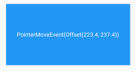
Example demo:
Let's take a look at an example, and then discuss the behavior attribute separately.... //Define a state to save the current pointer position PointerEvent _event; ... Listener( child: Container( alignment: Alignment.center, color: Colors.blue, width: 300.0, height: 150.0, child: Text(_event?.toString()??"",style: TextStyle(color: Colors.white)), ), onPointerDown: (PointerDownEvent event) => setState(()=>_event=event), onPointerMove: (PointerMoveEvent event) => setState(()=>_event=event), onPointerUp: (PointerUpEvent event) => setState(()=>_event=event), ), - design sketch
-
When a pointer event is triggered, the parameters PointerDownEvent, PointerMoveEvent and pointupevent are all subclasses of PointerEvent. The PointerEvent class includes some information about the current pointer, such as:
-
-
- position: it is the offset of the mouse relative to the global coordinate.
- delta: the distance between two pointer move events.
- Pressure: according to the pressure degree, this attribute will be more meaningful if the screen of the phone supports the pressure sensor (such as 3D touch of iPhone). If the phone does not support it, it will always be 1.
- orientation: the direction of pointer movement, which is an angle value.
-
The above is just some common properties of PointerEvent, in addition to which there are many properties. Readers can view the API documentation.
-
-
behavior property
Let's focus on how it determines how the child Widget responds to the hit test. Its value type is HitTestBehavior, which is an enumeration class with three enumeration values:
-
behavior property
-
-
-
deferToChild: child widgets will perform hit tests one by one. If any of the child widgets pass the tests, the current Widget passes. This means that if the pointer event acts on the child Widget, the parent (ancestor) Widget will definitely receive the event.
-
Opaque: when hit testing, treat the current Widget as opaque (even if it is transparent), and the final effect is equivalent to that the whole area of the current Widget is the click area.
for instance:Listener( child: ConstrainedBox( constraints: BoxConstraints.tight(Size(300.0, 150.0)), child: Center(child: Text("Box A")), ), //behavior: HitTestBehavior.opaque, onPointerDown: (event) => print("down A") ),In the above example, only clicking the text content area will trigger the click event, because deferToChild will go to the child widget to determine whether to hit the test, and the child widget in this example is Text("Box A"). If we want the entire 300 × 150 rectangle to be clickable, we can set behavior to HitTestBehavior.opaque .
Note that this property cannot be used to intercept (ignore) events in the Widget tree, it just determines the size of the Widget at the time of the hit test.
-
Transparent: when you click on the transparent area of a widget, you can perform hit tests on the visible areas within its boundary and at the bottom. This means that when you click on the transparent area of a widget at the top, both the widget at the top and the widget at the bottom can receive events, such as:
Stack(
  children: <Widget>[
    Listener(
      child: ConstrainedBox(
        constraints: BoxConstraints.tight(Size(300.0, 200.0)),
        child: DecoratedBox(
            decoration: BoxDecoration(color: Colors.blue)),
      ),
      onPointerDown: (event) => print("down0"),
    ),
    Listener(
      child: ConstrainedBox(
        constraints: BoxConstraints.tight(Size(200.0, 100.0)),
        child: Center(child: Text("Top left 200*100 In range non text area Click")),
      ),
      onPointerDown: (event) => print("down1"),
      //behavior: HitTestBehavior.translucent , / / you can "click through" after releasing this line of comments
    )
  ],
)
In the above example, when you comment out the last line of code and click in the non text area (the transparent area of the top widget) within the upper left corner of 200 * 100, the console will only print "down0", that is to say, the top widget does not receive the event, but only the bottom. When you release the comment and click again, events will be received at the top and bottom, and print:
I/flutter ( 3039): down1
I/flutter ( 3039): down0
If the behavior value is changed to HitTestBehavior.opaque , only "down1" will be printed.
-
-
-
Ignore PointerEvent
If we don't want a subtree to respond to PointerEvent, we can use IgnorePointer and AbsorbPointer, which can prevent the subtree from receiving pointer events. The difference is that AbsorbPointer itself will participate in hit test, while IgnorePointer itself will not participate, which means that AbsorbPointer itself can receive pointer events (but its subtree does not OK), but IgnorePointer can't.
A simple example is as follows:Listener( child: AbsorbPointer( child: Listener( child: Container( color: Colors.red, width: 200.0, height: 100.0, ), onPointerDown: (event)=>print("in"), ), ), onPointerDown: (event)=>print("up"), )When clicking the Container, because it is on the subtree of the AbsorbPointer, it will not respond to pointer events, so the log will not output "in", but the AbsorbPointer itself can receive pointer events, so it will output "up". If you change AbsorbPointer to IgnorePointer, neither will output.