Exploratory Data Analysis EDA (Exploratory Data Analysis) analysis with python
show holy respect to python community, for there dedication and wisdom
Dataset related:
First, UCL wine dataset:
UCI data set is a commonly used standard test data set for machine learning. It is a database for machine learning proposed by the University of California Irvine. UCI data sets are mostly used in the testing of machine learning algorithms. The important thing is the word "standard". The newly compiled machine learning programs can be tested with UCI data sets, and similar machine learning algorithms can also be compared. Its official website address is as follows:
website: UCI Machine Learning Repository
Field related:
Fixed acidity: most wine related acids are either fixed or nonvolatile (not easy to evaporate)
Volatile sour taste: the content of acetic acid in wine is too high, which will produce unpleasant vinegar taste
Citric acid: a small amount of citric acid can increase the freshness and flavor of wine
Residual sugar: the amount of residual sugar after fermentation. There is little wine below 1g per liter, and wine above 45g is considered sweet
Chloride: the content of salt in wine
Free sulfur dioxide: SO2 exists in the equilibrium state between SO2 molecule (as dissolved gas) and bisulfite ion in free form; It can prevent microbial growth and oxidation in wine
Total sulfur dioxide: amount of free and bound SO2; At low concentration, SO2 can hardly be detected in wine, but when the concentration of free SO2 exceeds 50ppm, SO2 will become obvious in the sense of smell and taste of wine
Density of water and sugar
PH value: describes the degree of acidity or alkalinity of wine, from 0 (very acidic) to 14 (very alkaline); Most wines have a pH between 3 and 4
Sulfate: a wine additive that increases the level of sulfur dioxide (SO2) and acts as an antibacterial and antioxidant
Alcohol: the percentage of alcohol in wine
Quality: output variable (score 0 - 10 according to sensory data), with the occupation of special wine appraiser and bartender
Second, the Kaggle Titanic dataset:
The sinking of the Titanic is one of the most well-known shipwrecks in history. On April 15, 1912, during her maiden voyage, the Titanic sank after colliding with an iceberg, killing 1502 of the 2224 passengers and crew on board. This sensational tragedy shocked the international community and promoted the improvement of ship safety regulations.
One of the reasons for the shipwreck is that the passengers and crew did not have enough lifeboats. Although there are some luck factors in surviving the shipwreck, some people are more likely to survive than others, such as women, children and upper class society.
In this challenge, it is required to complete the analysis of who is likely to survive. In particular, machine learning tools are required to predict which passengers will survive the tragedy.
Field related:
passengerid: Passenger ID
Class: class (1 = 1st, 2 = 2nd, 3 = 3rd)**
Name: passenger name
sex: Gender
Age: age
sibsp: number of siblings / spouses on board
parch: number of parents / children on board
Ticket: ticket information
fare: fare
Cabin: cabin
embarked: port of embarkation (C = Cherbourg, Q = Queenstown, S = Southampton)
survived: the variable is predicted to be 0 or 1 (where 1 means survival and 0 means death)
Related to drawing tools:
anaconda
Pandas
Numpy
Matplotlib
Seaborn
Bokeh
plotly
#Import related packages
import pandas as pd
import numpy as np
import matplotlib.pyplot as plt
import seaborn as sns
#Draw nominal variable diagram
def plot_categoricals(x, y, data, annotate = True):
    """Plot counts of two categoricals.
    Size is raw count for each grouping.
    Percentages are for a given value of y."""
    # dict vectorizer
    # Raw counts
    raw_counts = pd.DataFrame(data.groupby(y)[x].value_counts(normalize = False))
    raw_counts = raw_counts.rename(columns = {x: 'raw_count'})

    # Calculate counts for each group of x and y
    counts = pd.DataFrame(data.groupby(y)[x].value_counts(normalize = True))

    # Rename the column and reset the index
    counts = counts.rename(columns = {x: 'normalized_count'}).reset_index()
    counts['percent'] = 100 * counts['normalized_count']

    # Add the raw count
    counts['raw_count'] = list(raw_counts['raw_count'])

    plt.figure(figsize = (14, 10))
    # Scatter plot sized by percent
    plt.scatter(counts[x], counts[y], edgecolor = 'k', color = 'lightgreen',
                s = 100 * np.sqrt(counts['raw_count']), marker = 'o',
                alpha = 0.6, linewidth = 1.5)

    if annotate:
        # Annotate the plot with text
        for i, row in counts.iterrows():
            # Put text with appropriate offsets
            plt.annotate(xy = (row[x] - (1 / counts[x].nunique()),
                               row[y] - (0.15 / counts[y].nunique())),
                         color = 'navy',
                         s = f"{round(row['percent'], 1)}%")

    # Set tick marks
    plt.yticks(counts[y].unique())
    plt.xticks(counts[x].unique())

    # Transform min and max to evenly space in square root domain
    sqr_min = int(np.sqrt(raw_counts['raw_count'].min()))
    sqr_max = int(np.sqrt(raw_counts['raw_count'].max()))

    # 5 sizes for legend
    msizes = list(range(sqr_min, sqr_max,
                        int(( sqr_max - sqr_min) / 5)))
    markers = []

    # Markers for legend
    for size in msizes:
        markers.append(plt.scatter([], [], s = 100 * size,
                                   label = f'{int(round(np.square(size) / 100) * 100)}',
                                   color = 'lightgreen',
                                   alpha = 0.6, edgecolor = 'k', linewidth = 1.5))

    # Legend and formatting
    plt.legend(handles = markers, title = 'Counts',
               labelspacing = 3, handletextpad = 2,
               fontsize = 16,
               loc = (1.10, 0.19))

    plt.annotate(f'* Size represents raw count while % is for a given y value.',
                 xy = (0, 1), xycoords = 'figure points', size = 10)

    # Adjust axes limits
    plt.xlim((counts[x].min() - (6 / counts[x].nunique()),
              counts[x].max() + (6 / counts[x].nunique())))
    plt.ylim((counts[y].min() - (4 / counts[y].nunique()),
              counts[y].max() + (4 / counts[y].nunique())))
    plt.grid(None)
    plt.xlabel(f"{x}"); plt.ylabel(f"{y}"); plt.title(f"{y} vs {x}");
#Import data and view it
df = pd.read_csv('winequality-white.csv', sep=';')
df.head()
df.tail()
df.sample(5)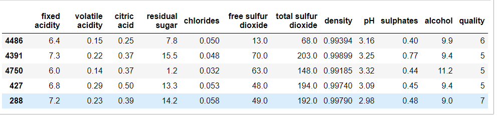
#Check for missing values:
# Check if any of the following is NULL
df.isnull().any()
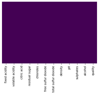
#Use the heat map to see how worthwhile it really is
sns.heatmap(df.isnull(), cbar=False, yticklabels=False, cmap='viridis')
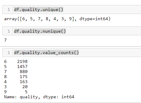
#Check the number and total number of unique values of some nominal variables
df.quality.unique()
df.quality.nunique()
df.quality.value_counts()
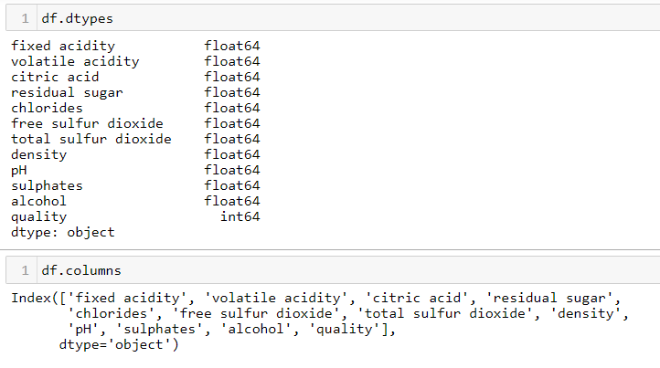
#View data type and column name
df.dtypes
df.columns
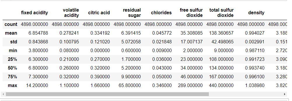
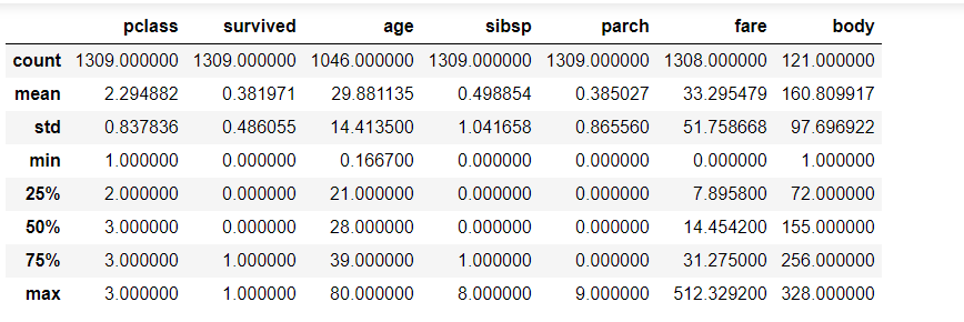
#Get statistics of continuous variables
df.describe()
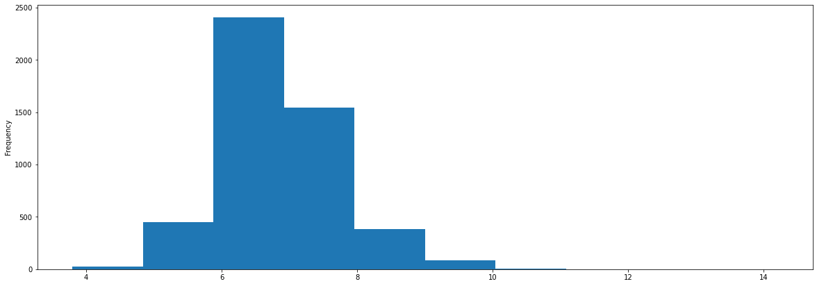
#Draw histogram:
df['fixed acidity'].plot(kind = 'hist',figsize=(20, 7), )
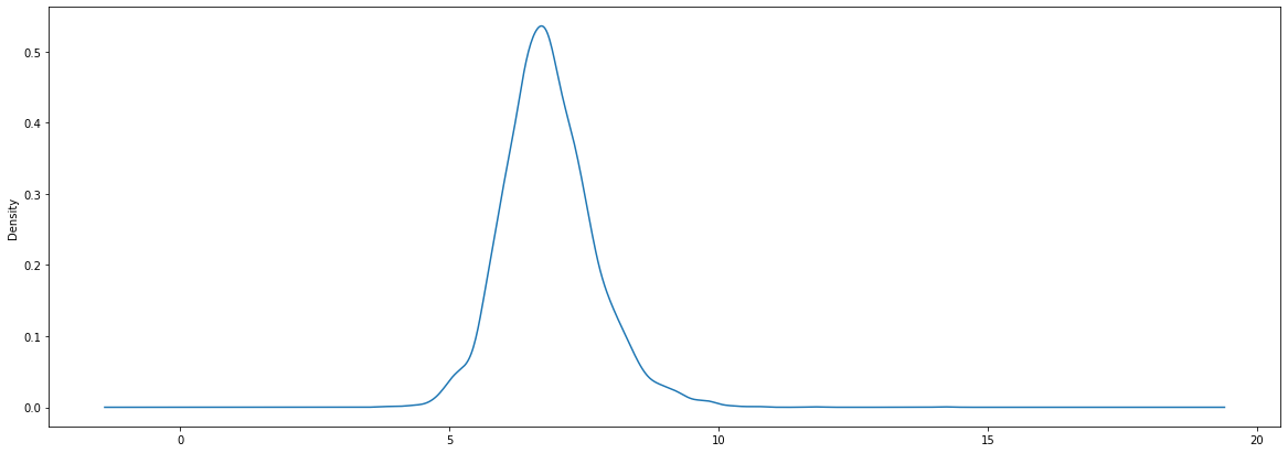
#Draw density map
#Draw box diagram
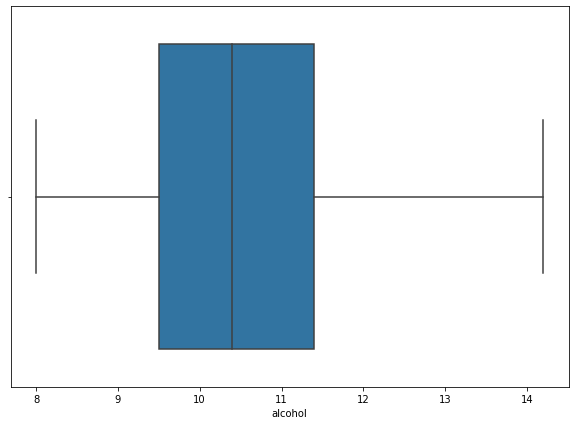
import seaborn as sns
plt.figure(figsize=(10, 7))

sns.boxplot(x=df['alcohol'])
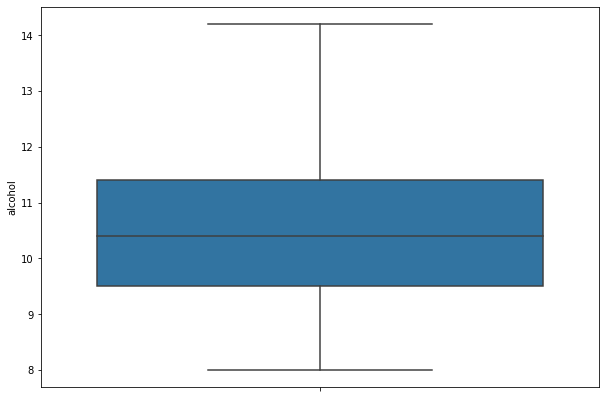
#Draw the box diagram and erect the image
import seaborn as sns
plt.figure(figsize=(10, 7))
sns.boxplot(data = df,y='alcohol',)
#scatter plot
import matplotlib.pyplot as plt
fig, ax = plt.subplots(figsize=(16,8))
ax.scatter(df['volatile acidity'] , df['citric acid'])
ax.set_xlabel('volatile acidity')
ax.set_ylabel('citric acid')
plt.show()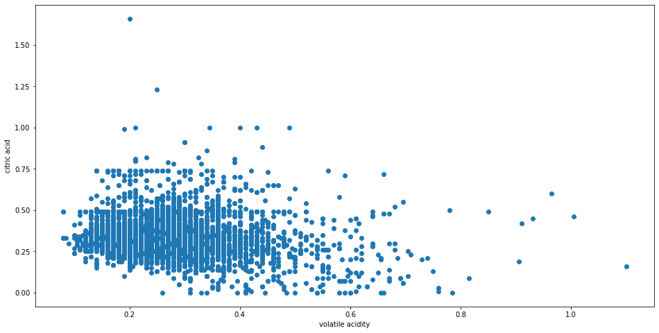
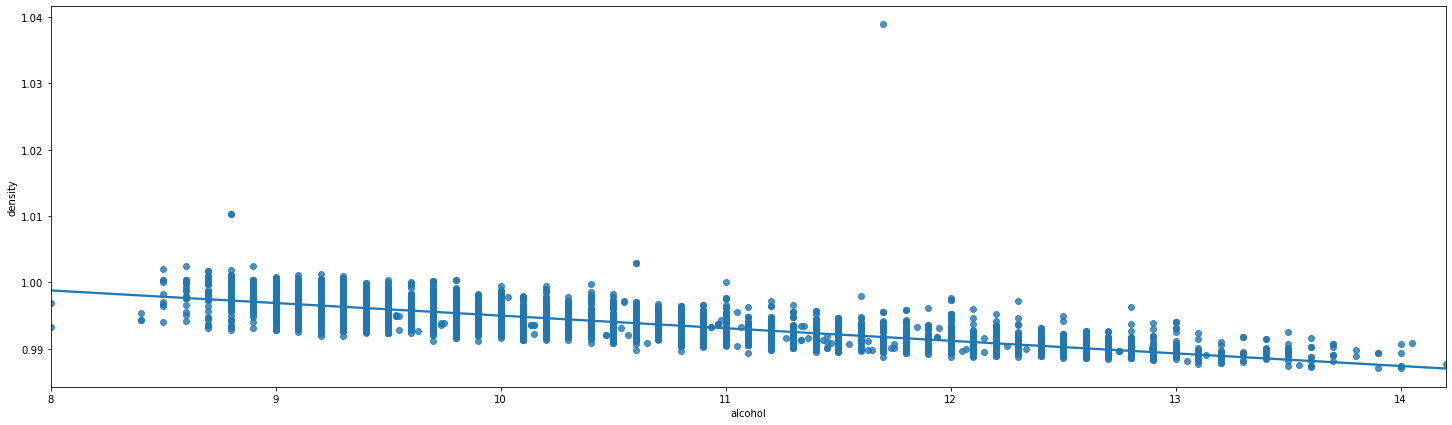
#Regression mapping
plt.figure(figsize=(25, 7))
sns.regplot(x="alcohol", y="density", data=df);
#Histogram drawing
def bar_plot(df,key):
    df[key].value_counts().sort_index().plot.bar(figsize = (12, 5),
                      edgecolor = 'k', linewidth = 2)

    # Formatting
    plt.xlabel(key);
    plt.ylabel('COUNT');
    plt.xticks(rotation = 60)
    plt.title('BAR PLOT for ' + key);
    plt.show()


bar_plot(df,'quality')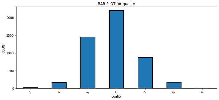
#Multi box drawing
def plot_box_plot2(df,key,value):
    import copy
    box = copy.deepcopy(df)
    box[value] = box[value].astype('float')
    sns.set_style('whitegrid',{'font.sans-serif':['SimHei','Arial']})
    sns.set_context("talk")
    fig,axes=plt.subplots(1,1,figsize = (25,7))
    sns.boxplot(data = box, x=key, y=value)
    plt.show()

plot_box_plot2(df,'quality','citric acid')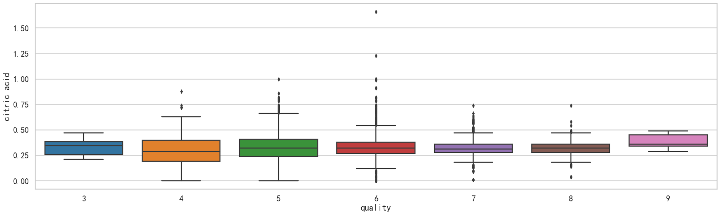
plt.figure(figsize=(25, 7))
# plt.style.use('seaborn-white')
ax = sns.boxplot(x="quality", y="free sulfur dioxide", data=df)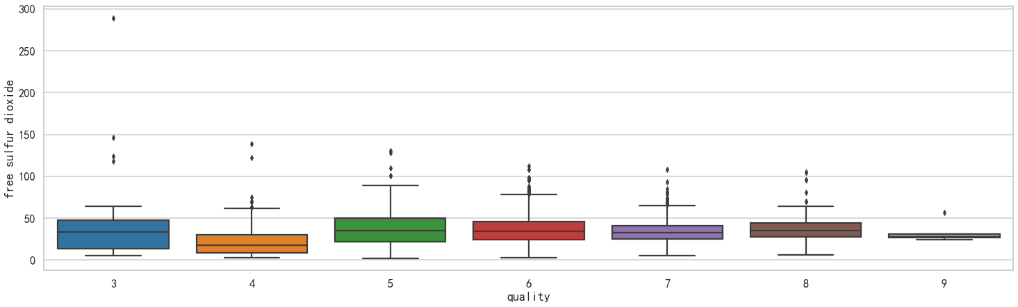
#Drawing violin
plt.figure(figsize=(25, 7))
sns.set_theme(style="whitegrid")

# Draw a nested violinplot and split the violins for easier comparison
sns.violinplot(data=df, x="quality", y="density",
               split=True, inner="quart", linewidth=1,)
sns.despine(left=True)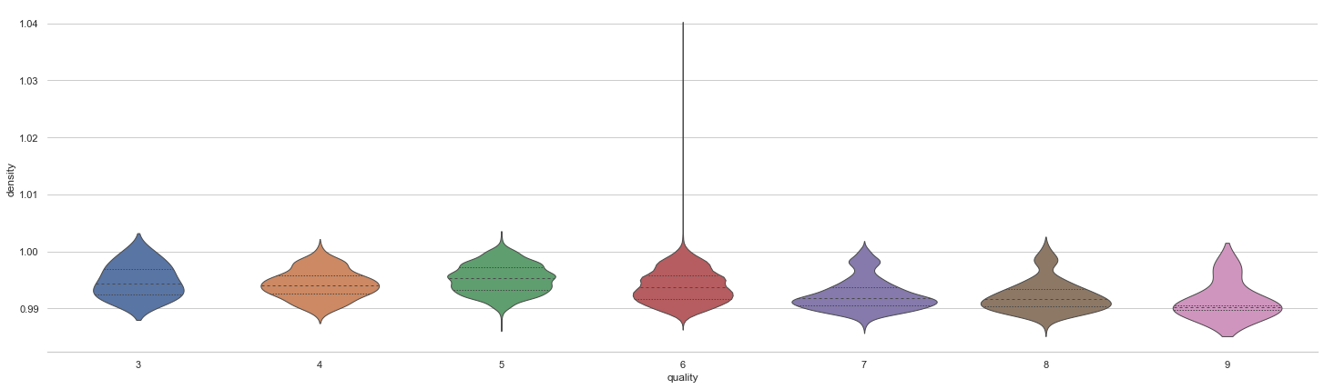
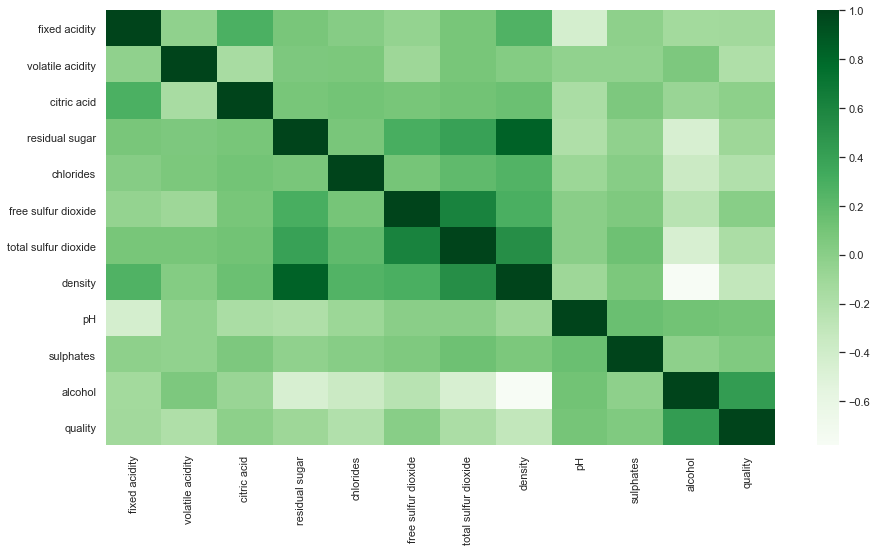
#Draw correlation diagram:
plt.figure(figsize=(15,8))
sns.heatmap(df.corr(),cmap='Greens',annot=False)
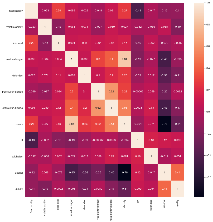
#Draw a correlation diagram and display the correlation value
plt.figure(figsize=(15,15))
sns.heatmap(df.corr(), color='b', annot=True)
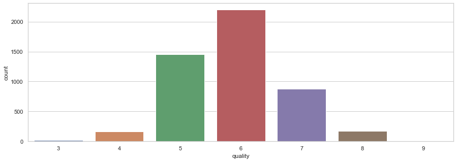
#Draw the statistical chart of nominal variables
plt.figure(figsize=(15,5))
sns.countplot(x='quality', data = df)
#Draw a box diagram of all variables:
plt.figure(figsize=(10,15))

for i, col in enumerate(list(df.columns.values)):
    plt.subplot(4,3,i+1)
    df.boxplot(col)
    plt.grid()
    plt.tight_layout()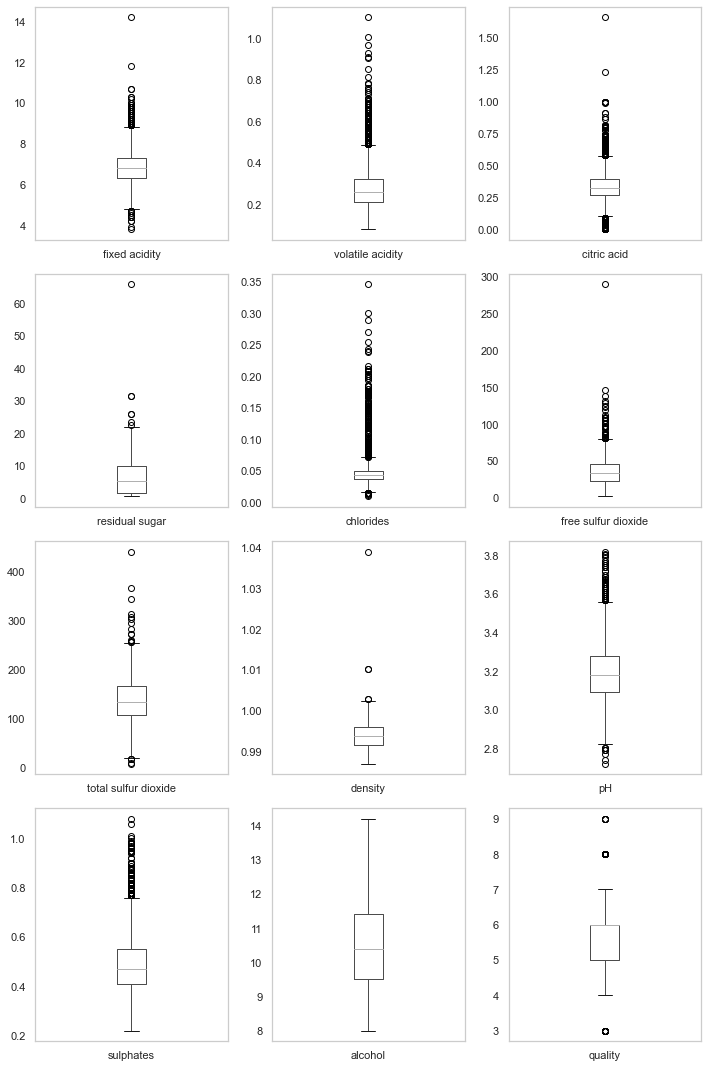
#Draw a histogram of all variables
plt.figure(figsize=(20,16))

for i,col in enumerate(list(df.columns.values)):
    plt.subplot(4,3,i+1)
    sns.distplot(df[col], color='b', kde=True, label='data')
    plt.grid()
plt.tight_layout() 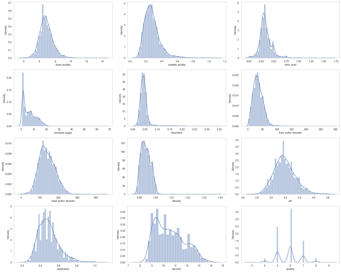
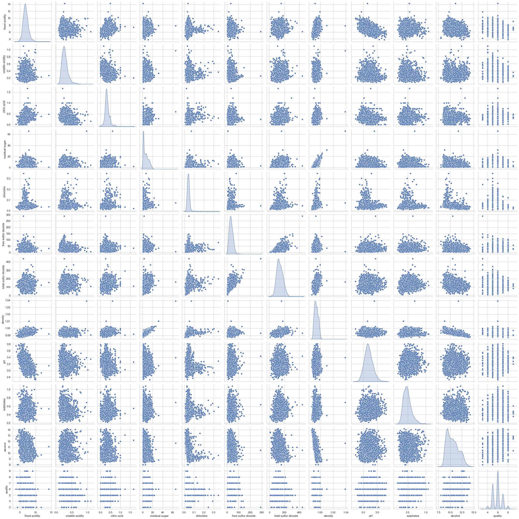
# pair plot
sns.pairplot(data=df, kind='scatter',diag_kind='kde')
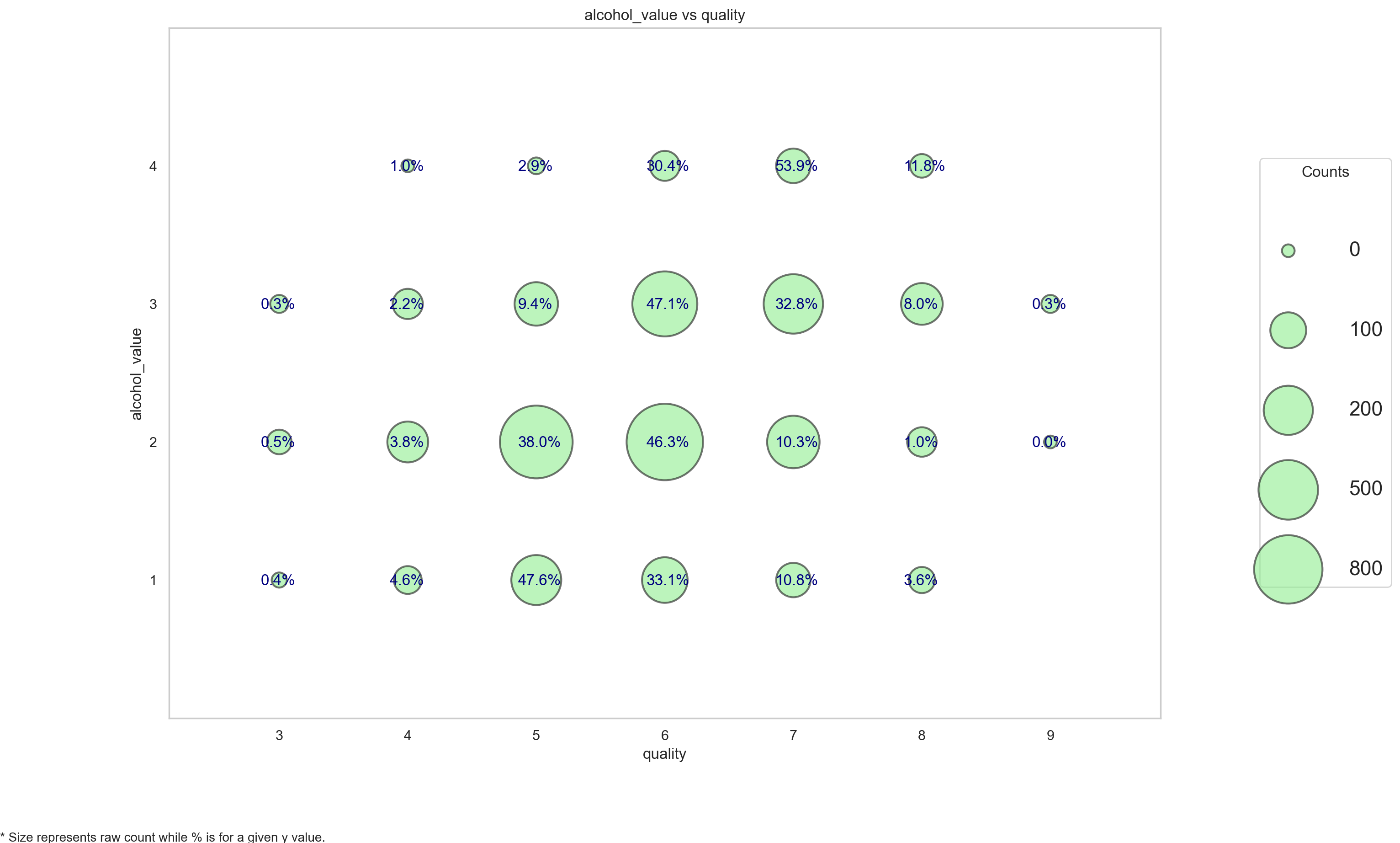
#Discretize the variables and construct the relationship diagram of discrete variables
df['alcohol_bin'] = pd.cut(df.alcohol,bins=[7,9,11,13,15],labels=['low','mid_low','mid_high','high'])
# df.insert(5,'Age Group',category)

df['alcohol_value'] = pd.cut(df.alcohol,bins=[7,9,11,13,15],labels=[1,2,3,4])
# df.insert(5,'Age Group',category)


plot_categoricals('alcohol_value', 'quality', df, annotate = True)
#Titanic dataset
#Load data
df=pd.read_excel(titanic.xls")

df.head()
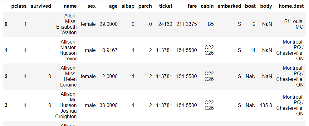
# df.tail()
#df.sample(5)
#df.columns
#df.shape
#df.info()
#Get statistics
df.describe()
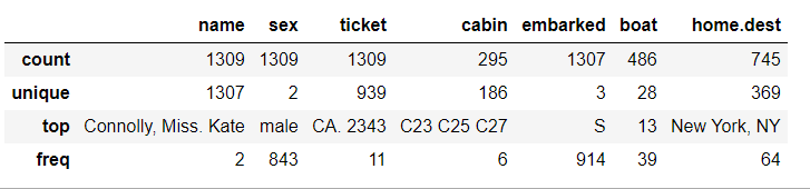
#By default, describe only outputs the information of continuous variables, so I want to see the statistics of data of other variable types:
df.describe(include=[bool,object])
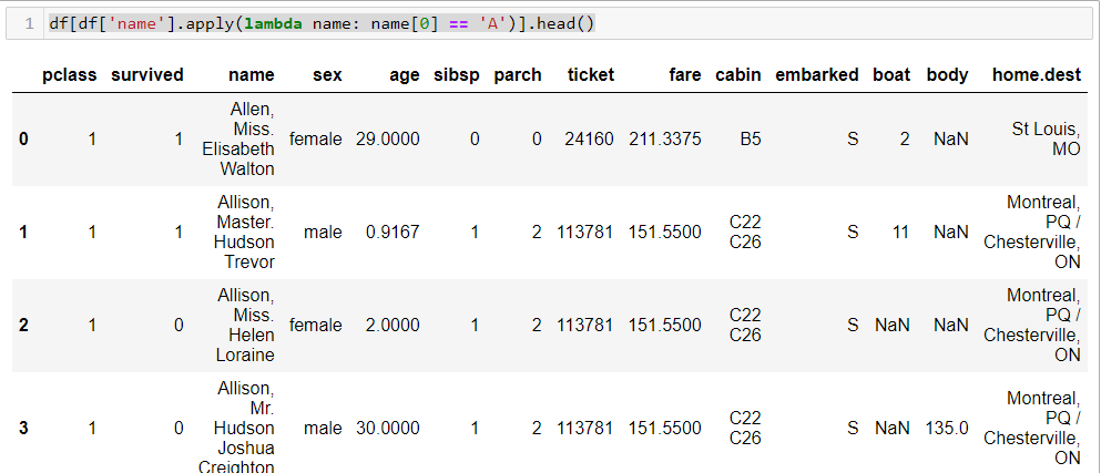
#View statistics (single column)
df.fare.mean()

df[df['survived']==1].mean()

df[(df['survived'] == 1) & (df['pclass'] == 1)]['age'].max()

df[df['name'].apply(lambda name: name[0] == 'A')].head()
df[df['name'].apply(lambda name: name[0] == 'A')].head()
#replace function:
x = {1 : 'Class I', 2 : 'Class II', 3:'Class III'}
df_new=df.replace({'pclass': x})
df_new.head()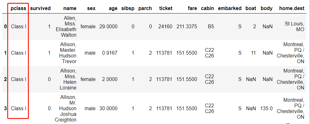
#Get aggregate information (group by)
#Contingency table information
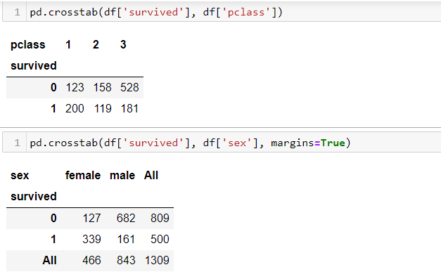
pd.crosstab(df['survived'], df['pclass'])
pd.crosstab(df['survived'], df['sex'], margins=True)
#pivot table
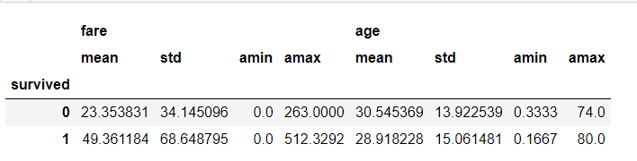
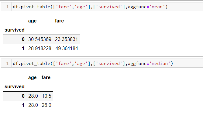
df.pivot_table(['fare','age'],['survived'],aggfunc='mean')
df.pivot_table(['fare','age'],['survived'],aggfunc='median')
#Data sorting (based on a specific field)
df.sort_values(by=["fare"], ascending=False).head()
df.sort_values(by=["fare"], ascending=False).tail()
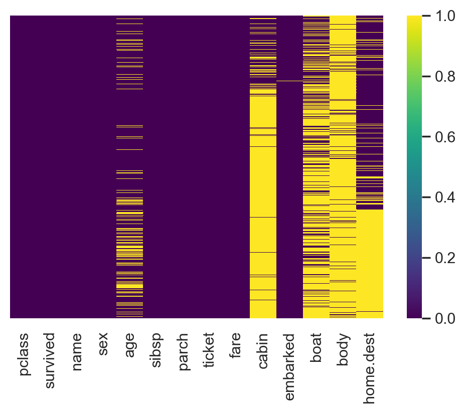
#Visualization of missing values
import seaborn as sns
plt.rcParams['figure.dpi'] = 100# the dpi can be set to enhance the resolution of the image
# Congiguring retina format
%config InlineBackend.figure_format = 'retina'
sns.heatmap(df.isnull(), cmap='viridis',yticklabels=False)
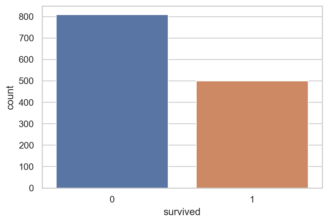
#Survival statistics
sns.countplot(x=df.survived)
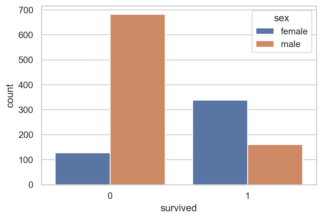
#Survival of different genders
sns.countplot(data =df, x = 'survived',hue = 'sex')
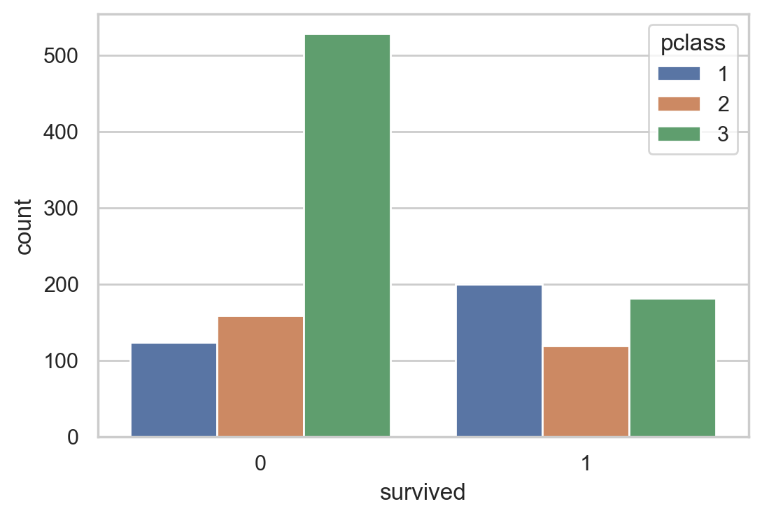
#Different survival statistics of class registration
sns.countplot(data = df , x = 'survived', hue='pclass')
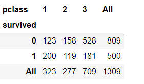
#Cross table of class and survival
pd.crosstab(df['survived'], df['pclass'], margins=True)
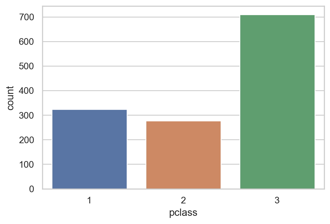
#Class counting statistics
sns.countplot(df.pclass)
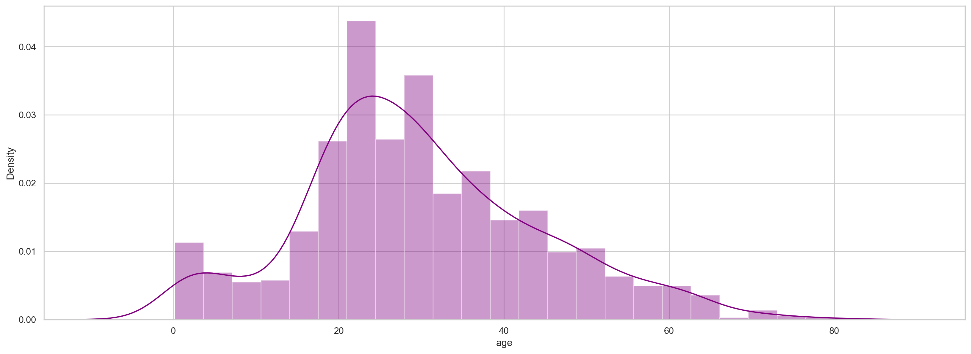
#Draw age histogram and density map
plt.figure(figsize=(20, 7))
sns.distplot(df.age, color='purple')
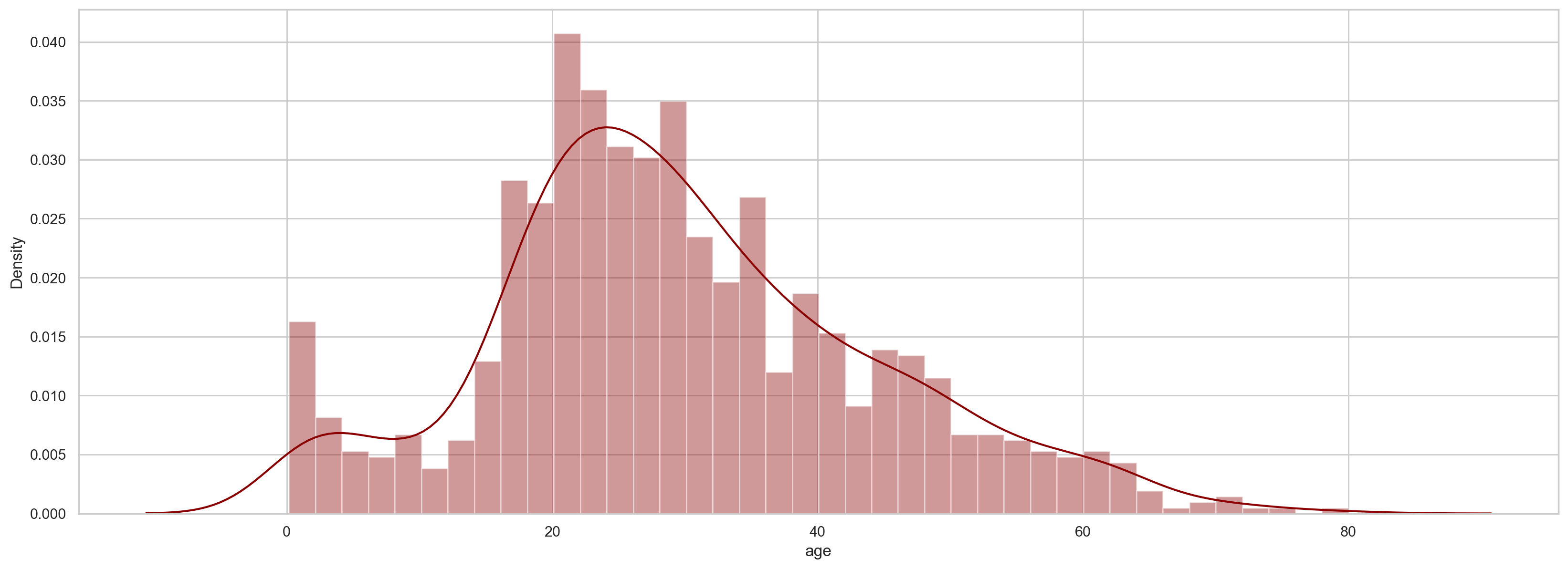
#Draw age histogram and density map (remove missing values)
plt.figure(figsize=(20, 7))
sns.distplot(df['age'].dropna(),color='darkred',bins=40)
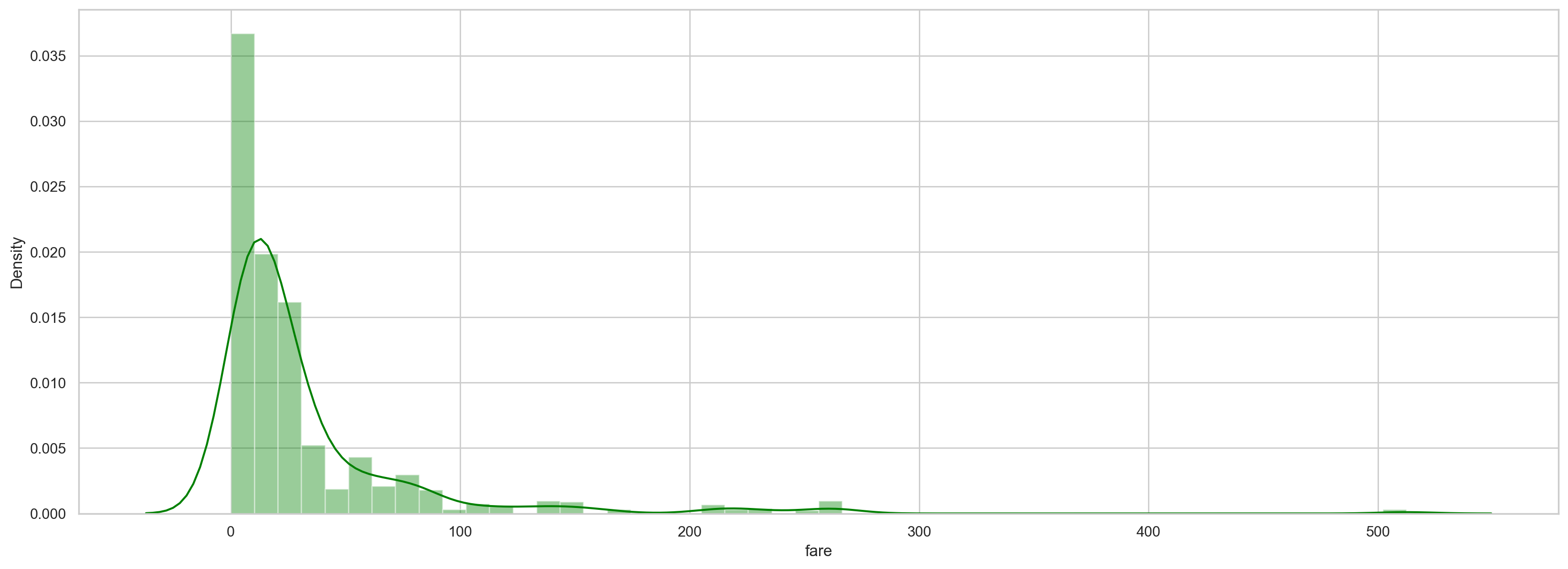
#Cost density map
plt.figure(figsize=(20, 7))
sns.distplot(df.fare, color='green')
#Draw the box diagram and violin diagram of the cost:
plt.figure(figsize=(20, 7))

plt.subplot(1,2,1)
sns.boxplot(data = df, y='fare',orient = 'v')
plt.subplot(1,2,2)
sns.violinplot(data = df, y='fare',orient = 'v')
#(Q1−1.5⋅IQR, Q3+1.5⋅IQR)
#Box diagram of cost and age relative to class
plt.figure(figsize=(20, 7))

plt.subplot(1,2,1)
sns.boxplot(x=df.pclass,y=df.fare)
plt.subplot(1,2,2)
sns.boxplot(x=df.pclass, y=df.age)
#Correlation visualization
# Considering only numerical variables
scatter_var = list(set(df.columns)-set(['name', 'survived', 'ticket','cabin','embarked','sex','sibsp','parch']))

# Creating heatmap
corr_matrix = df[scatter_var].corr()
sns.heatmap(corr_matrix,annot=True);
#Scatter plot of age and cost
plt.scatter(df['age'], df['fare'])
plt.title("Age Vs Fare")
plt.xlabel('Age')
plt.ylabel('Fare')
#Scatter chart of class and cost
plt.scatter(df['pclass'], df['fare'])
plt.title("pclass Vs fare")
plt.xlabel('pclass')
plt.ylabel('fare')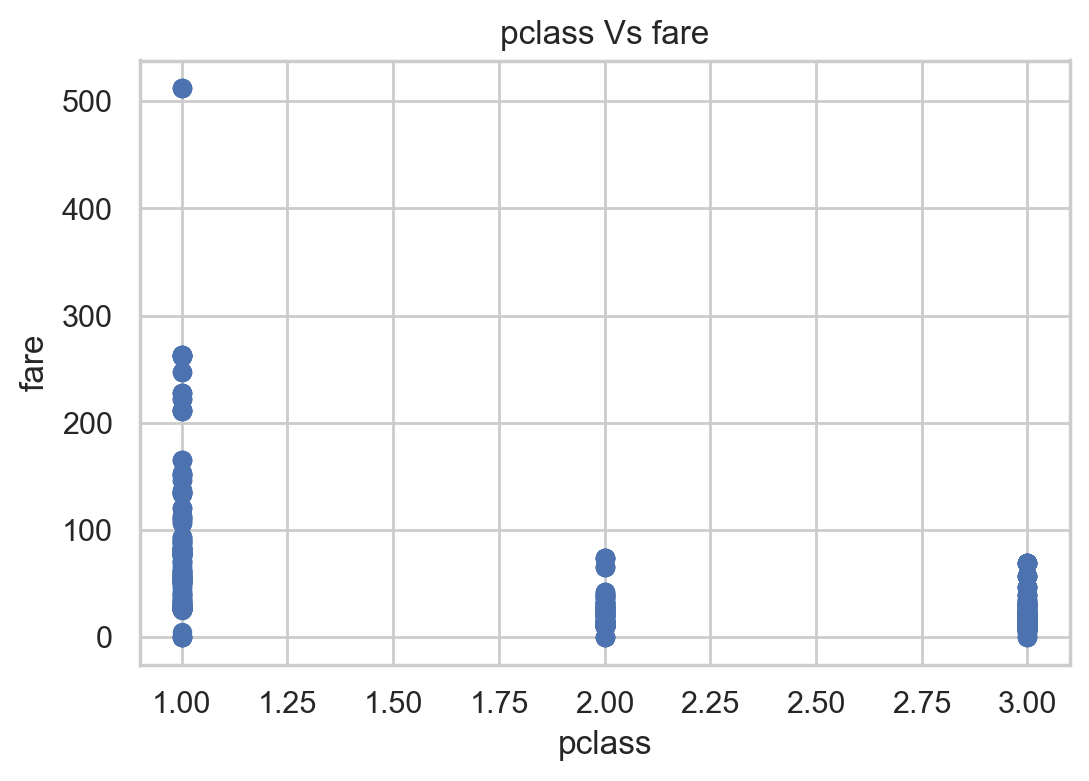
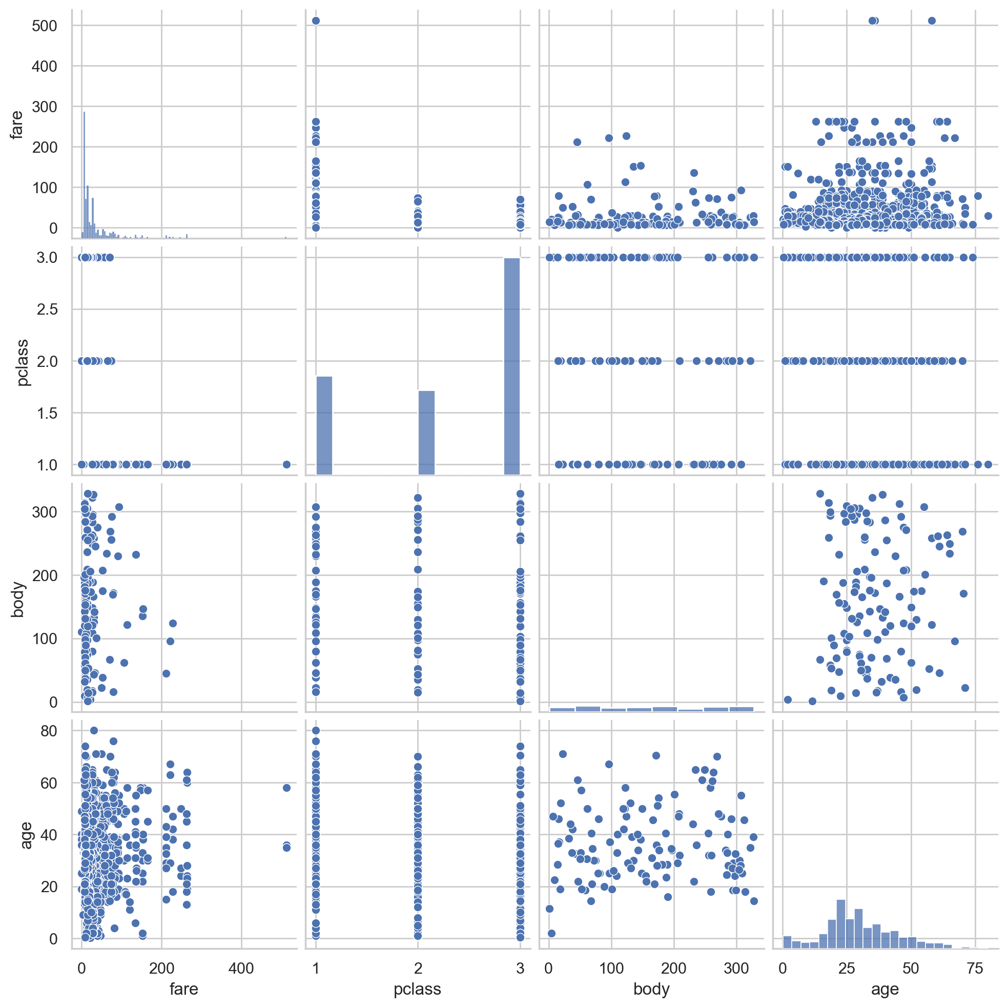
# pair plot of variables
#Scatter relation between two variables
sns.pairplot(df[scatter_var])
#Sex, boarding place, class and survival statistics
f, [ax1,ax2,ax3] = plt.subplots(1,3,figsize=(20,5))
sns.countplot(x='sex', hue='survived', data=df, ax=ax1)
sns.countplot(x='pclass', hue='survived', data=df, ax=ax2)
sns.countplot(x='embarked', hue='survived', data=df, ax=ax3)
ax1.set_title('sex feature analysis')
ax2.set_title('pclass feature analysis')
ax3.set_title('embarked feature analysis')
f.suptitle('categorical feature analysis', size=20, y=1.1)

plt.show()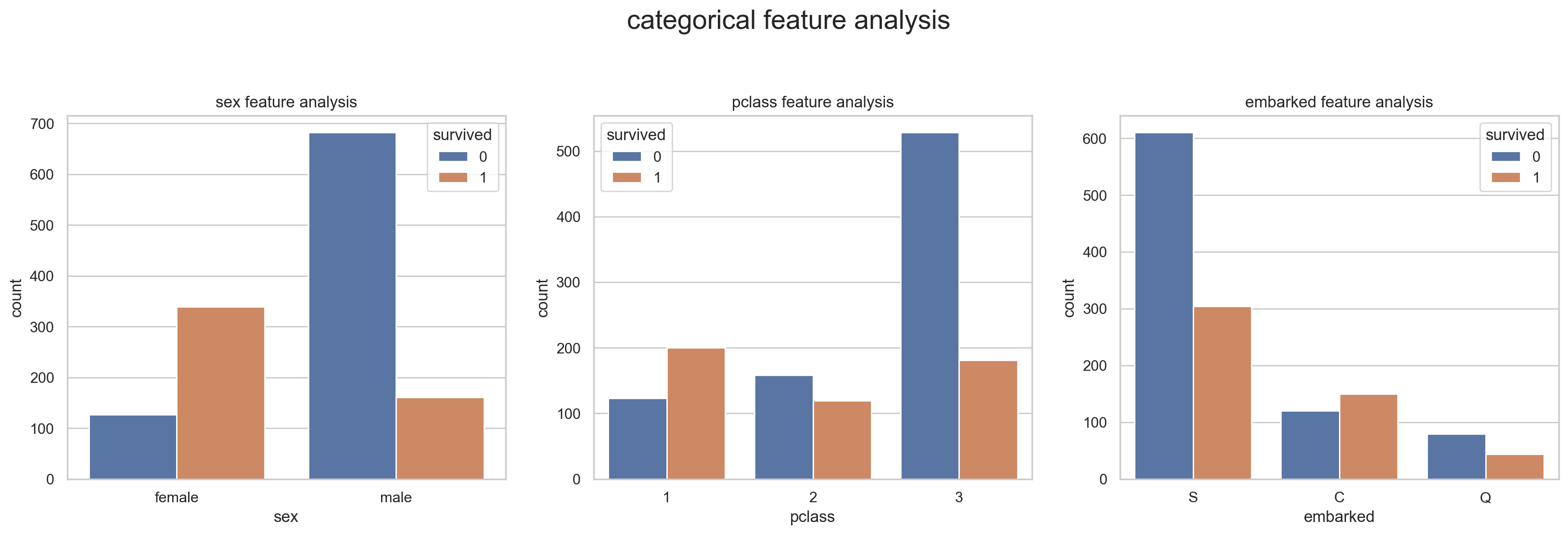
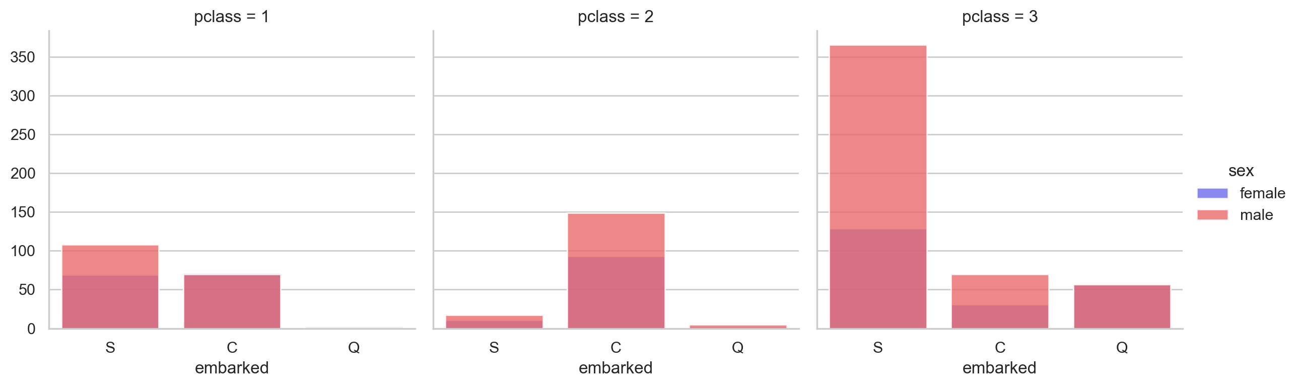
#Cross statistics of boarding place, class and gender
grid = sns.FacetGrid(data = df, col='pclass', hue='sex', palette='seismic', size=4)
grid.map(sns.countplot, 'embarked', alpha=0.8)
grid.add_legend()
#Plot the age density of survival:
f,ax = plt.subplots(figsize=(10,5))
sns.kdeplot(df.loc[(df['survived'] == 0),'age'] , color='gray',shade=True,label='not survived')
sns.kdeplot(df.loc[(df['survived'] == 1),'age'] , color='g',shade=True, label='survived')
plt.title('age feature distribution', fontsize = 15)
plt.xlabel("age", fontsize = 15)
plt.ylabel('frequency', fontsize = 15)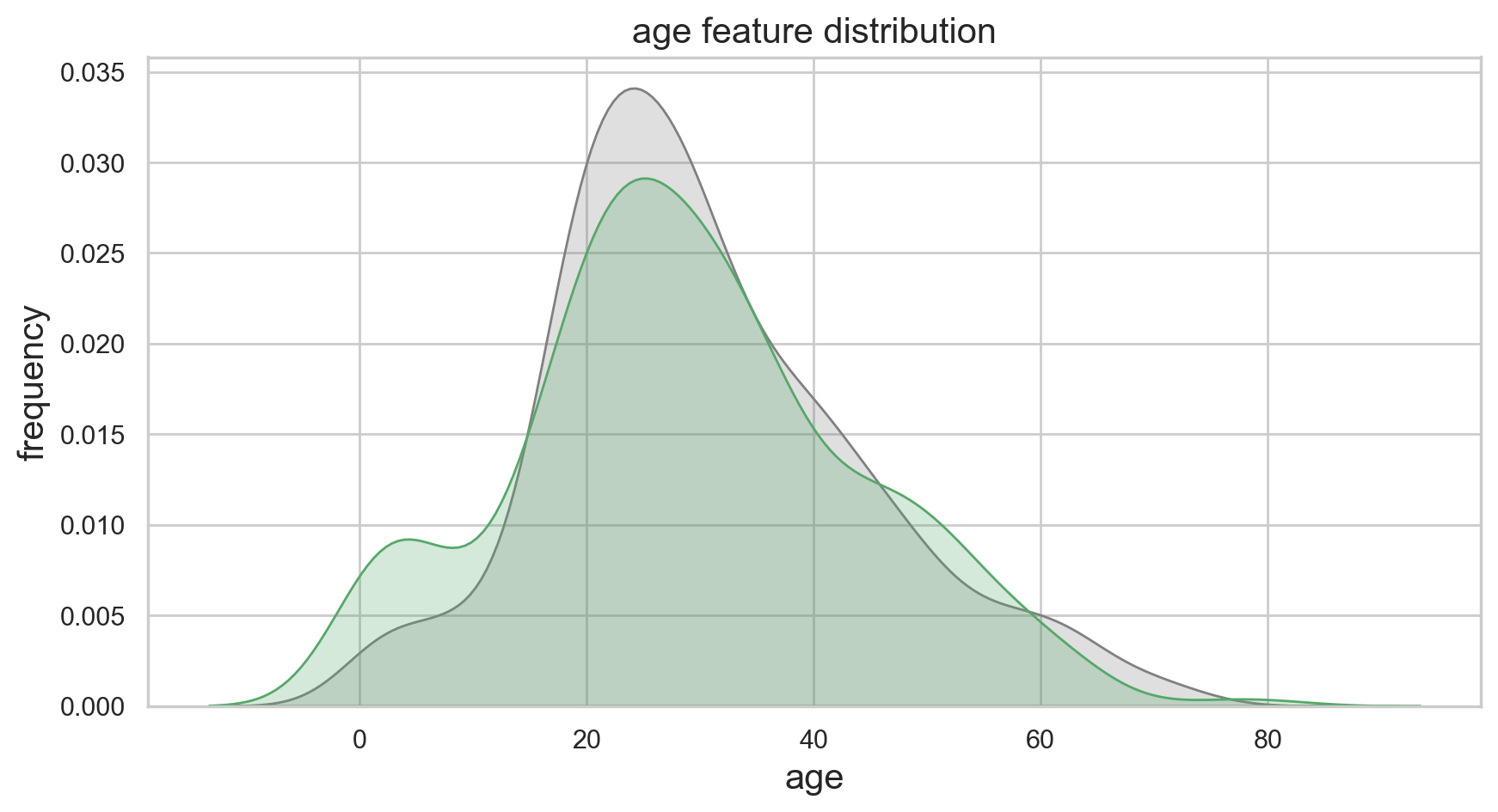
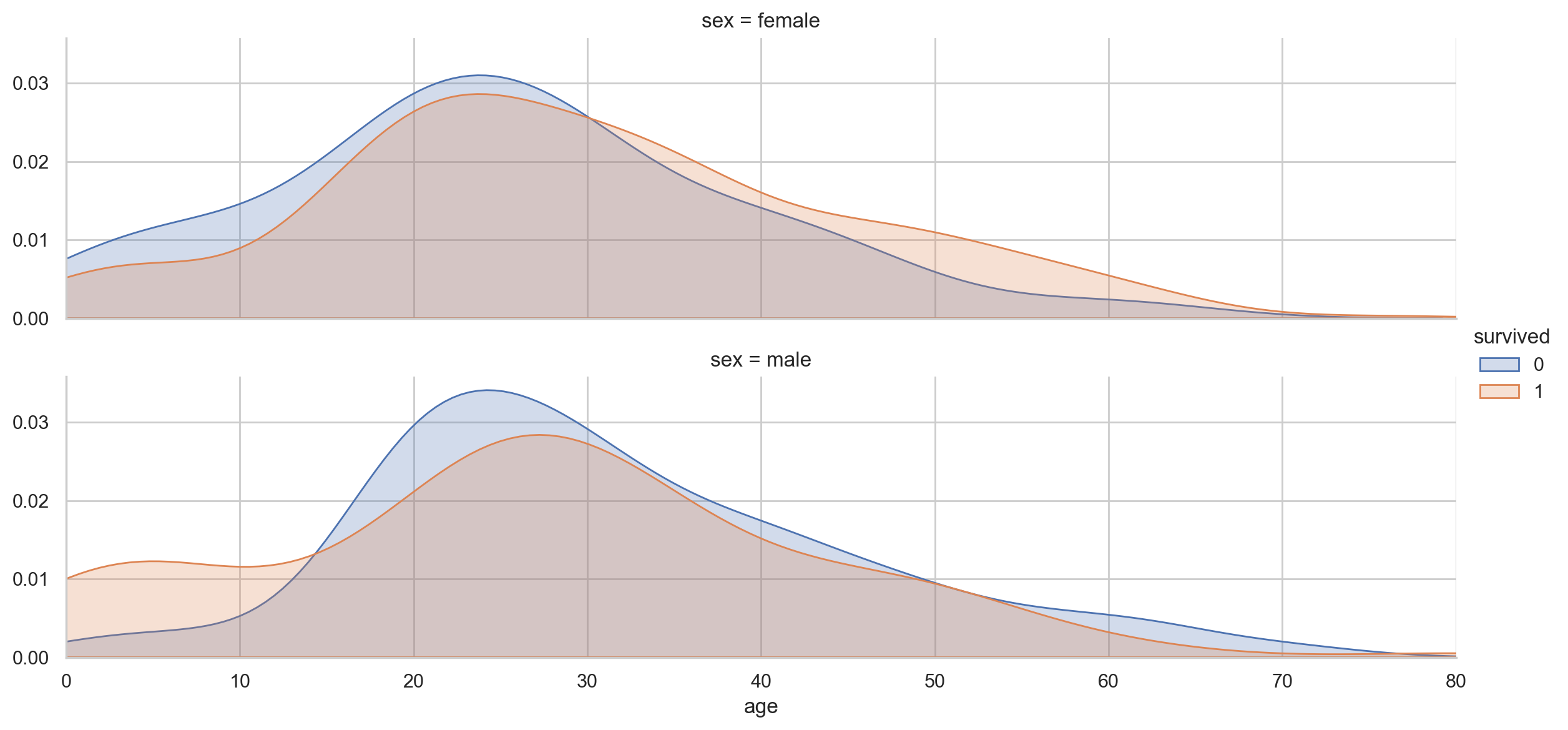
#Age density map under different gender and survival conditions:
def plot_distribution( df , var , target , **kwargs ):
    row = kwargs.get( 'row' , None )
    col = kwargs.get( 'col' , None )
    facet = sns.FacetGrid( df , hue=target , aspect=4 , row = row , col = col )
    facet.map( sns.kdeplot , var , shade= True )
    facet.set( xlim=( 0 , df[ var ].max() ) )
    facet.add_legend()


plot_distribution( df , var = 'age' , target = 'survived' , row = 'sex' )
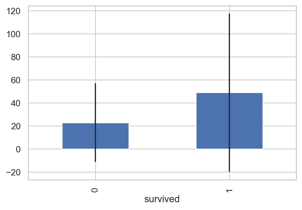
#Cost map of people with different survival conditions
And calculate the variance and mean and conduct visual analysis
# Fill in missing values
df["fare"].fillna(df["fare"].median(), inplace=True)

df['fare'] = df['fare'].astype(int)

# Get the Fare of the surviving and dead passengers respectively
fare_not_survived = df["fare"][df["survived"] == 0]
fare_survived = df["fare"][df["survived"] == 1]

# The mean and variance of far are obtained
avgerage_fare = pd.DataFrame([fare_not_survived.mean(), fare_survived.mean()])
std_fare = pd.DataFrame([fare_not_survived.std(), fare_survived.std()])

df['fare'].plot(kind='hist', figsize=(15,3),bins=100, xlim=(0,50))

avgerage_fare.index.names = std_fare.index.names = ["survived"]
avgerage_fare.plot(yerr=std_fare,kind='bar',legend=False)
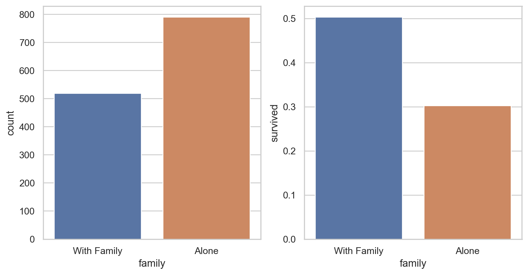
#Statistics of loneliness and starting with family
#The impact of being alone or with your family on survival
df['family'] =  df["parch"] + df["sibsp"]
df['family'].loc[df['family'] > 0] = 1
df['family'].loc[df['family'] == 0] = 0


# Delete Parch and SibSp
df_new = df.drop(['sibsp','parch'], axis=1)

# mapping
fig, (axis1,axis2) = plt.subplots(1,2,sharex=True,figsize=(10,5))

sns.countplot(x='family', data=df, order=[1,0], ax=axis1)

# It can be divided into two situations: taking a boat with your family and taking a boat alone
family_perc = df_new[["family", "survived"]].groupby(['family'],as_index=False).mean()
sns.barplot(x='family', y='survived', data=family_perc, order=[1,0], ax=axis2)

axis1.set_xticklabels(["With Family","Alone"], rotation=0)
# pair plot
g = sns.pairplot(df[[u'survived', u'pclass', u'sex', u'age', u'family', u'fare', u'embarked']], hue='survived', palette = 'seismic',
                 size=4,diag_kind = 'kde',diag_kws=dict(shade=True),plot_kws=dict(s=50) )
g.set(xticklabels=[])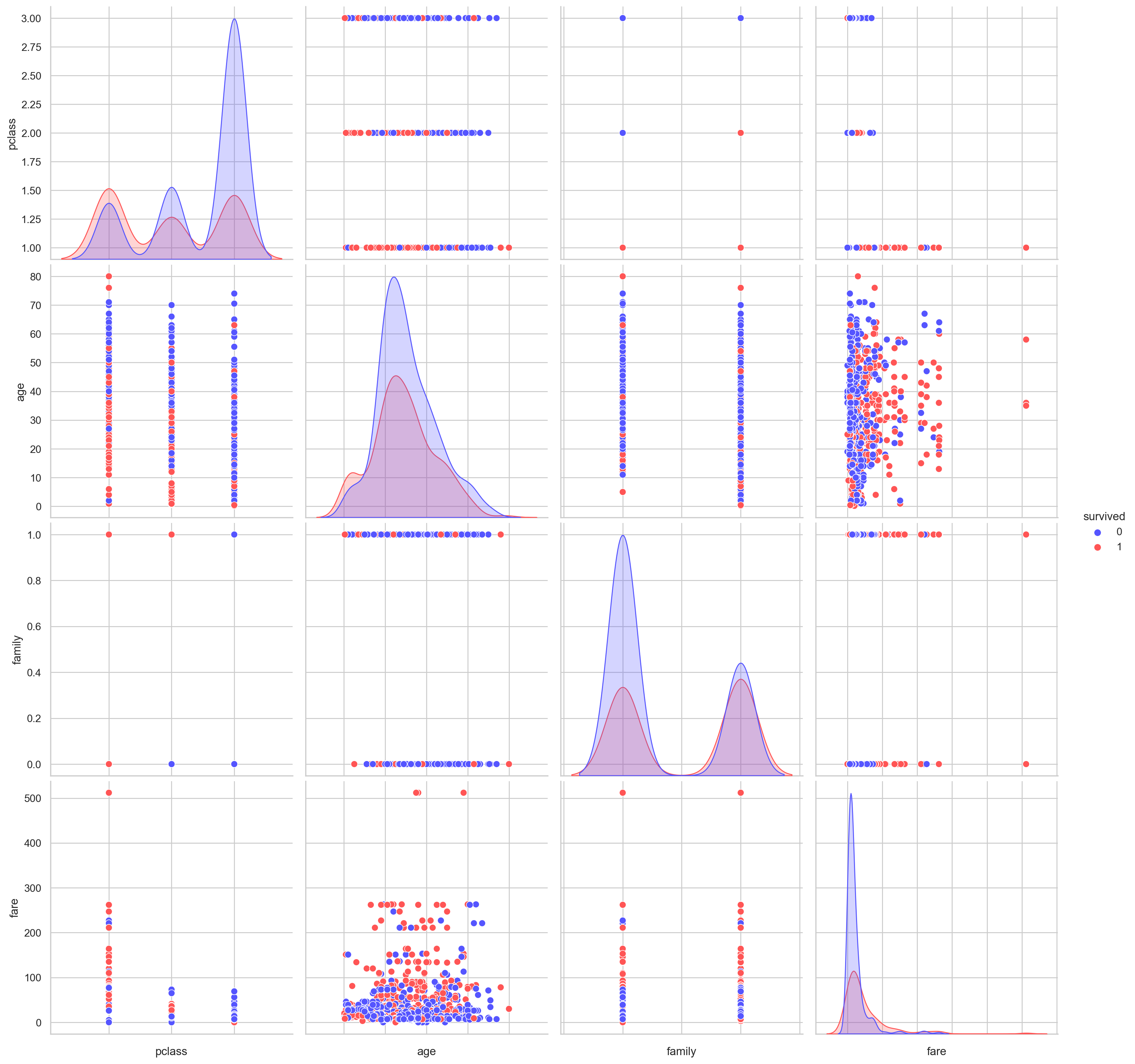
# pandas profiling
#pip install pandas-profiling

# from pandas_profiling import ProfileReport
# EDA_report = ProfileReport(df)
# EDA_report.to_file(output_file='EDA.html')
Reference: kaggle
Reference: Interview Questions on Exploratory Data Analysis (EDA)
Reference: Introduction to Exploratory Data Analysis (EDA)
Reference: How to do Exploratory Data Analysis (EDA) with python?
Reference: Kaggle entry level Title: prediction of Titanic survivors - Data Analysis
Reference: Kaggle entry level Title: prediction of Titanic survivors - Data Mining
Reference: UCI data set sorting (attached with common data sets of papers)
Reference: pandas
Reference: pandas profiling