Objectives of this section
- Master the basic use of justify content.
- Master the skills of using justify content alignment for multi column arrangement of items.
- The reading time is about 5 ~ 10 minutes.
Justify content foundation
The justify content property is used to set the alignment of items in the spindle direction. The syntax format is as follows:
.container {
    justify-content: flex-start((default) | flex-end | center | space-between | space-around;
}
Of which:
1. flex-start Align the start point along the spindle direction (default).
2. flex-end Align the end along the main axis.
3. center Align centered along the main axis.
4. space-between Align at intervals along the main axis, with no spacing between the head and tail.
5. space-around Align at intervals along the main axis, with spacing between the head and tail.
Let's illustrate it with examples. It's not difficult to understand when you have a picture.
Example 1: there is a div (container, 450px). The container contains three div (item, flex basis is 50px). Set justify content to flex start:
.container {
    /* Set the layout of child elements to flex layout */
    display: flex;
    /* Sets the alignment in the direction of the project's principal axis */
    justify-content: flex-start;
}

.item {
    /* Set the project footprint to 50px */
    flex-basis: 50px;
}
Operation effect:
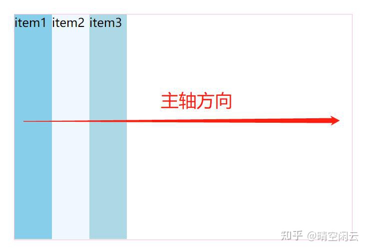
It seems that it is the same without setting justify content, because the default of justify content is flex start.
Example 2, followed by the previous example, set justify content to flex end:
.container {
    /* Sets the alignment in the direction of the project's principal axis */
    justify-content: flex-end;
}
Operation effect:
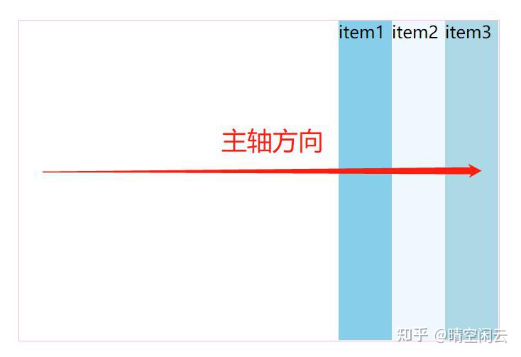
The items are arranged to the right, but the items are sorted as follows: Item 1, item 2 and item 3.
Example 3, continuing from the previous example, set justify content to center:
.container {
    /* Sets the alignment in the direction of the project's principal axis */
    justify-content: center;
}
Operation effect:
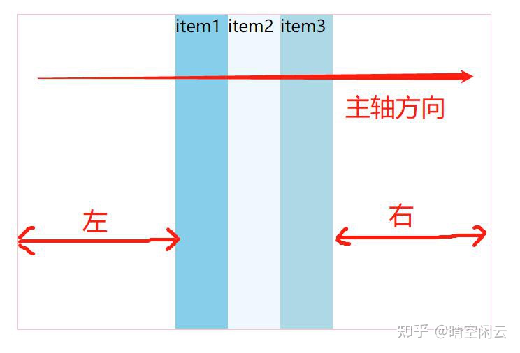
The spacing between the left and right is the same. This is the center.
Example 4, followed by the previous example, set justify content to space between:
.container {
    /* Sets the alignment in the direction of the project's principal axis */
    justify-content: space-between;
}
Operation effect:
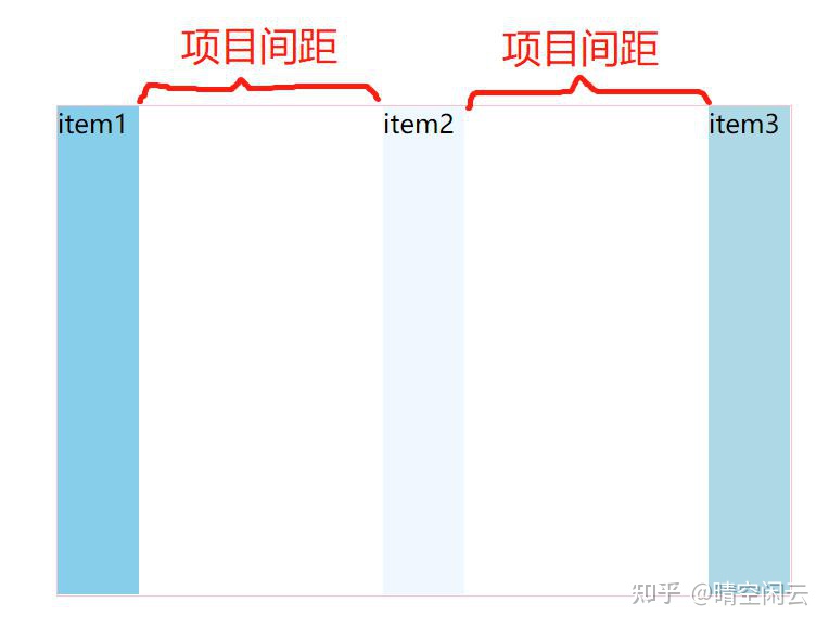
The spacing between items is the same, which means that.
Example 5, followed by the previous example, set justify content to space around:
.container {
    /* Sets the alignment in the direction of the project's principal axis */
    justify-content: space-around;
}
Operation effect:

That is, the scope of each project plus the front and rear space is consistent. This is the meaning of space around.
reflection:
If we all set the flex basis of the project to 50% in the above example, can we see the difference?
answer:
Because flex base is set to 50%, the three items are 150%, which exceeds the width of the container.
In this way, there is no space left, so theoretically, the value of justice content is the same.
The actual operation effect is as follows:

Justify content application
In example 1, we often see such a layout on the website:

In the past, float was used. The difficulty is that the items on the right should be closest to the right. In this way, the spacing between the two items needs to be calculated and set through margin.
If the size of the peripheral container is not fixed, it is difficult to calculate, and it is convenient to use flex layout.
The layout of the project is simulated here, and the pictures, words and other contents in the middle are not specifically written.
1) There is a div (container, 98% wide, aligned in the middle of the left and right), and the container contains 6 div (items, each with background color). The code is as follows:
<style>
    * {
        margin: 0;
        padding: 0;
    }

    .container {
        width: 98%;
        margin: 0 auto;
    }

    .item1 {
        background-color: skyblue;
    }

    .item2 {
        background-color: aliceblue;
    }

    .item3 {
        background-color: lightblue;
    }

    .item4 {
        background-color: cadetblue;
    }

    .item5 {
        background-color: powderblue;
    }

    .item6 {
        background-color: skyblue
    }
</style>
<div class="container">
    <div class="item item1">item1</div>
    <div class="item item2">item2</div>
    <div class="item item3">item3</div>
    <div class="item item4">item4</div>
    <div class="item item5">item5</div>
    <div class="item item6">item6</div>
</div>
Operation effect:

div is a block element, so it will fill a line. Then use flex elastic layout to deal with it.
2) Set the container to flex layout, the item will wrap automatically, and the width of the item is 49%:
.container {
    /* Set the layout of child elements to flex layout */
    display: flex;
    /* Set item wrap */
    flex-wrap: wrap;
}

.item {
    /* Set the spindle space occupied by the project */
    flex-basis: 49%;
}
The code here is not difficult to understand, because there are two in each line, and the width of each line is 50% at most. Considering the spacing, the width of the item is set to 49%.
The operation effect is as follows:

Some children's boots think of this. They can set justify content to space between.
3) Set justify content to space between:
.container {
    /* Set item spacing alignment */
    justify-content: space-between;
}
Operation effect:
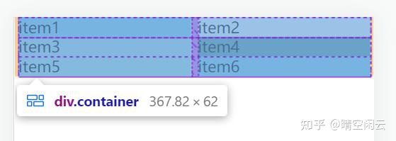
In this way, the layout is perfect. Different mobile phone sizes look the same:

Summary of this section
- The justify content property is used to set the alignment of items in the spindle direction.
- Through the justify content attribute, the problem of multi column arrangement and alignment of items can be well realized.