preface
Study hard and remember these attributes, which will be of great use in the future.
Tip: the following is the main content of this article. The following cases can be used for reference
1, flex flexible layout
Layout principle:
Flex is the abbreviation of flexible Box, which means "elastic layout". It is used to provide maximum flexibility for box model. Any container can be specified as flex layout. Summary: the principle of flex layout is to control the position and arrangement of child boxes by adding flex attributes to the parent box.
be careful:
1. When we set the flex layout for the parent box, the float, clear and vertical align attributes of the child elements will be invalidated.
2. Telescopic layout = elastic layout = telescopic box layout = elastic box layout = flex layout (nickname)
definition:
Elements with flex layout are called flex containers, or "containers" for short. All its child elements automatically become container members, called flex projects, or "projects".
give an example:
div is the parent container of flex, span is the sub container flex item, and the sub containers can be arranged horizontally or vertically.
2, flex layout parent properties
Parent common properties
- List itemflex direction: sets the direction of the spindle;
- Justify content: sets the arrangement of child elements on the spindle;
- Flex Wrap: sets whether child elements wrap lines;
- Align content: sets the arrangement mode (multiple lines) of child elements on the side axis;
- Align items: sets the arrangement method of child elements on the side axis (single line);
- Flex flow: composite attribute, which is equivalent to setting both flex direction and flex wrap.
Main shaft and side shaft
1. The default spindle direction is the X-axis direction, horizontal to the right
2. The default side axis direction is the Y axis direction, vertically downward
1.flex-direction
Attribute value and Description:
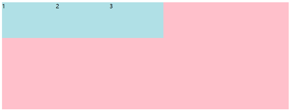
row: from left to right; (default)
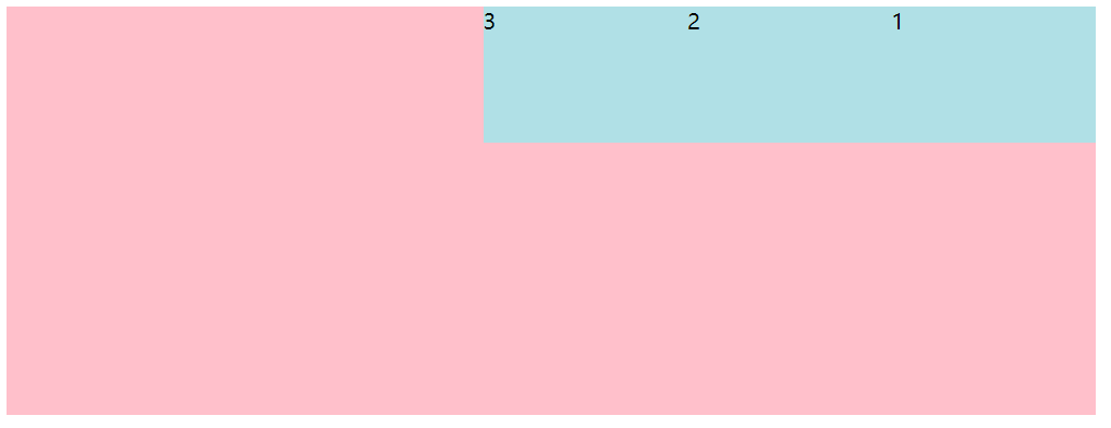
Row reverse from right to left; (opposite direction)
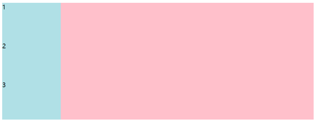
column: from top to bottom;
column: from bottom to top;
The code is as follows (example):
    <style>
        div {
            display: flex;
            width: 800px;
            height: 300px;
            background-color: pink;
            flex-direction: row;
        }

        div span {
            width: 150px;
            height: 100px;
            background-color: powderblue;
        }
    </style>
</head>

<body>
    <div>
        <span>1</span>
        <span>2</span>
        <span>3</span>
    </div>
</body>
Default renderings:
The code is as follows (example):
   div {
            display: flex;
            width: 800px;
            height: 300px;
            background-color: pink;
            /* Y The axis is the main shaft */
            flex-direction: column;
        }

        div span {
            width: 150px;
            height: 100px;
            background-color: powderblue;
        }
Rendering of Y axis:
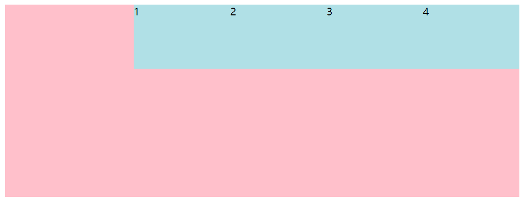
The code is as follows (example):
   div {
            display: flex;
            width: 800px;
            height: 300px;
            background-color: pink;
            flex-direction: row-reverse;
        }

        div span {
            width: 150px;
            height: 100px;
            background-color: powderblue;
        }
Look at the numbers and notice that the order of boxes has changed. The effect picture is as follows:
2.justify-content
The justify content attribute defines the alignment of items on the spindle.
- Flex start: the default value starts from the head. If the spindle is x-axis, it starts from left to right;
- Flex end: arranged from the tail;
- Center: align in the center of the spindle (if the spindle is x-axis, center horizontally)
- Space around: divide the remaining space equally;
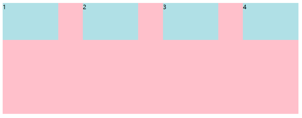
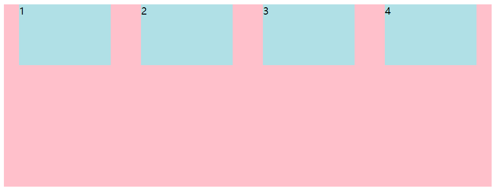
- Space between: edge the two sides first, and then divide the remaining space equally (important)
The code is as follows (example):
  <style>
        div {
            display: flex;
            width: 800px;
            height: 300px;
            background-color: pink;
            /* First edge both sides, and then divide the remaining space equally */
            justify-content: space-between;
        }

        div span {
            width: 150px;
            height: 100px;
            background-color: powderblue;
        }
    </style>
</head>

<body>
    <div>
        <span>1</span>
        <span>2</span>
        <span>3</span>
        <span>4</span>
    </div>
</body>
The effect drawing of trimming on both sides and then bisecting the remaining space is as follows:
The code is as follows (example):
  div {
            display: flex;
            width: 800px;
            height: 300px;
            background-color: pink;
            /* Divide the remaining space equally */
            justify-content: space-around;
        }

        div span {
            width: 150px;
            height: 100px;
            background-color: powderblue;
        }
Rendering of dividing the remaining space equally:
The code is as follows (example):
  div {
            display: flex;
            width: 800px;
            height: 300px;
            background-color: pink;
             /* Align centered on spindle */
            justify-content: center;
        }

        div span {
            width: 150px;
            height: 100px;
            background-color: powderblue;
        }
Effect drawing of centering and aligning the spindle:
The code is as follows (example):
  div {
            display: flex;
            width: 800px;
            height: 300px;
            background-color: pink;
             /* Arrange from the tail */
            justify-content: center;
        }

        div span {
            width: 150px;
            height: 100px;
            background-color: powderblue;
        }
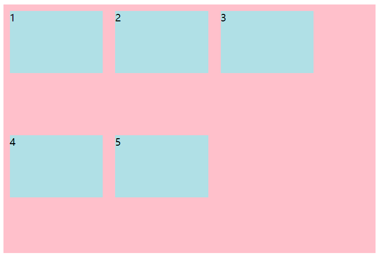
Pay attention to the numbers. The effect picture arranged from the tail:
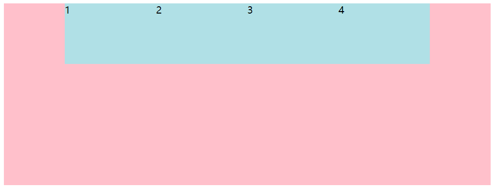
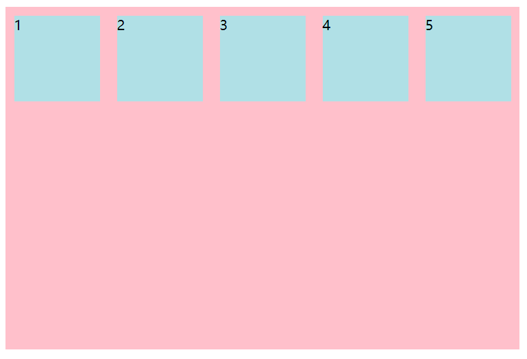
3.flex-wrap
By default, projects are arranged on a single line (also known as a grid line). As defined by the flex wrap attribute, there is no newline in the flex layout by default.
- nowrap: default value, no line break;
- Wrap: wrap line.
The code is as follows (example):
    <style>
        div {
            display: flex;
            width: 600px;
            height: 400px;
            background-color: pink;
        }

        div span {
            width: 150px;
            height: 100px;
            background-color: powderblue;
            margin: 10px;
        }
    </style>
</head>

<body>
    <div>
        <span>1</span>
        <span>2</span>
        <span>3</span>
        <span>4</span>
        <span>5</span>

    </div>
</body>
In the case of no line break, the width of the box will be automatically reduced so that all boxes can be put down in one line. The effect picture without line break by default:
  div {
            display: flex;
            width: 600px;
            height: 400px;
            background-color: pink;
            flex-wrap: wrap;
        }

        div span {
            width: 150px;
            height: 100px;
            background-color: powderblue;
            margin: 10px;
        }
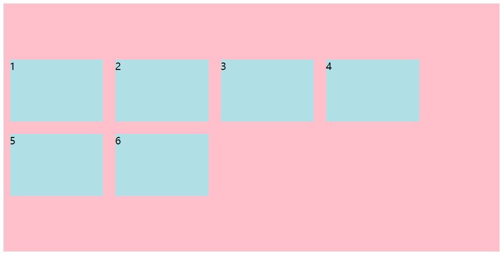
Effect drawing of line feed:
4.align-content
This attribute controls the arrangement of sub items on the side axis, and can only be used when sub items break lines (multiple lines). It has no effect in a single line.
- Flex start: the default value is arranged at the head of the side axis;
- Flex end: start to arrange at the tail of the side shaft;
- center: displayed in the middle of the side axis;
- Space around: the sub item bisects the remaining space on the side axis;
- Space between: the subitems are first distributed at both ends on the side axis, and then the remaining space is divided equally;
- stretch: sets the height of the child element and bisects the element height;
The code is as follows (example):
    <style>
        div {
            display: flex;
            width: 800px;
            height: 400px;
            background-color: pink;
            flex-wrap: wrap;
            align-content: center;
        }

        div span {
            width: 150px;
            height: 100px;
            background-color: powderblue;
            margin: 10px;
        }
    </style>
</head>

<body>
    <div>
        <span>1</span>
        <span>2</span>
        <span>3</span>
        <span>4</span>
        <span>5</span>
        <span>6</span>

    </div>
</body>
Effect of multiline centering:
5.align-items
This attribute controls the child on the side axis
(Y-axis by default), which is used when the sub item is a single line;
- Flex start: default value, from top to bottom;
- Flex end: from bottom to top;
- Center: squeeze together and center (vertical center);
- Stretch: stretch;
3, flex layout child properties
1. Number of shares of flex sub items;
2. Align self controls the arrangement of sub items on the side axis;
3. The order attribute defines the order of children (before and after);
1.flex attribute
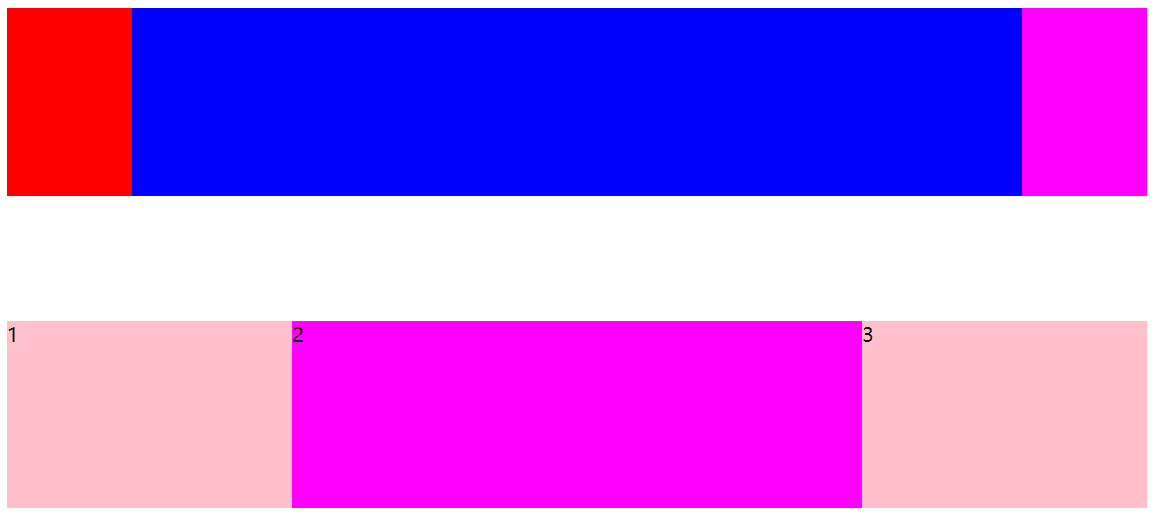
The flex attribute defines the remaining space allocated by the sub project, and flex is used to represent the number of shares.
The code is as follows (example):
 <style>
        section {
            display: flex;
            width: 60%;
            height: 150px;
            background-color: pink;
            margin: 0 auto;
        }

        section div:nth-child(1) {
            width: 100px;
            height: 150px;
            background-color: red;
        }

        section div:nth-child(2) {
            flex: 1;
            background-color: blue;
        }

        section div:nth-child(3) {
            width: 100px;
            height: 150px;
            background-color: magenta;
        }

        p {
            display: flex;
            width: 60%;
            height: 150px;
            background-color: pink;
            margin: 100px auto;
        }

        p span {
            flex: 1;
        }

        p span:nth-child(2) {
            flex: 2;
            background-color: magenta;
        }
    </style>
</head>

<body>
    <section>
        <div></div>
        <div></div>
        <div></div>
    </section>
    <p>
        <span>1</span><span>2</span><span>3</span>
    </p>
</body>
design sketch:
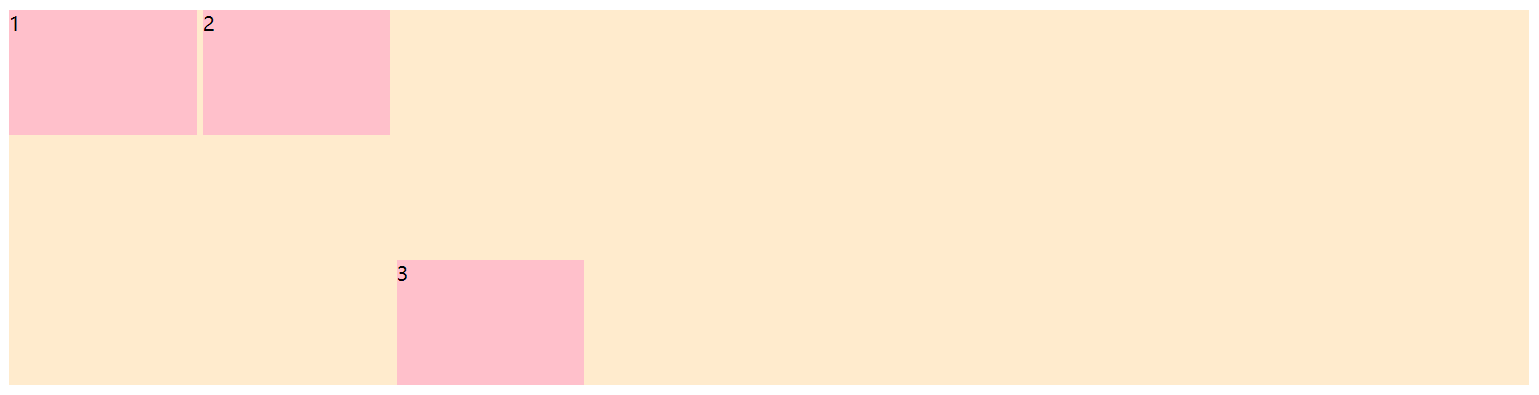
2.align-self
Align self allows a single item to have a different alignment from other items, and can override the align items attribute; The default value is auto, which means that it inherits the align items attribute of the parent element. If there is no parent attribute, it is equivalent to stretch.
Syntax:
div span:nth-child(3) {
//Set your own arrangement on the side axis
align-self: flex-end;
}
The code is as follows (example):
    <style>
        div {
            display: flex;
            width: 80%;
            height: 300px;
            background-color: blanchedalmond;
        }

        div span {
            width: 150px;
            height: 100px;
            background-color: pink;
            margin-right: 5px;
        }
        div span:nth-child(3) {
            align-self: flex-end;
        }
    </style>
</head>

<body>
    <div><span>1</span><span>2</span><span>3</span></div>
</body>
design sketch:
3.order
The order property defines the order in which items are arranged. The smaller the value, the higher the arrangement. The default value is 0.
Note: it is different from z-index.
Next, a line of code is added to the above example. The code is as follows (example):
  div span:nth-child(2) {
            order: -1;
        }
design sketch:
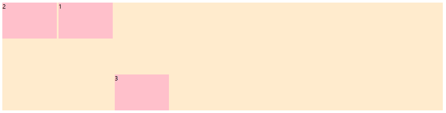
After adding the order attribute to the second box, it will be placed in front of the first box.
summary
Many attributes of flex layout are actually the same attribute values. It will not be difficult to use as long as you pay attention to distinguishing the main axis, side axis and parent and child items. We will continue to update some interesting cases to learn flex layout together later.