Last article Introduces the syntax of Flex layouts, and today introduces Flex writing for common layouts.
You'll see that no matter what the layout is, Flex can usually be done in a few lines of commands.
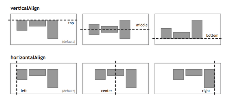
I only list the code, please refer to the detailed syntax explanation Flex Layout Tutorial: Grammar Text .My main reference is Landon Schropp Articles and Solved by Flexbox.
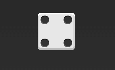
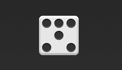
1. Dice Layout
One side of the dice can hold up to 9 points.
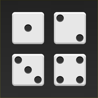
Next, let's see how Flex works, from one point to nine points.You can go to codepen View Demo.
If not specified, the HTML templates for this section are as follows.
<div class="box">
  <span class="item"></span>
</div>
In the code above, the div element (representing one side of the dice) is a Flex container, and the span element (representing a point) is a Flex item.If you have more than one project, add more than one space element, and so on.
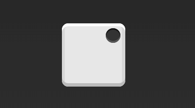
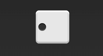
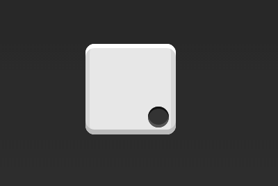
1.1 Single Project
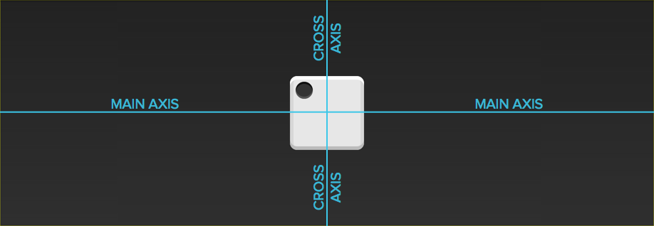
First, if there is only one point in the upper left corner.The Flex layout is left-aligned by default, so one line of code is enough.

.box {
  display: flex;
}
By setting the alignment of the project, you can achieve center alignment and right alignment.
.box {
  display: flex;
  justify-content: center;
}
.box {
  display: flex;
  justify-content: flex-end;
}
Set the cross-axis alignment to move the main axis vertically.
.box {
  display: flex;
  align-items: center;
}
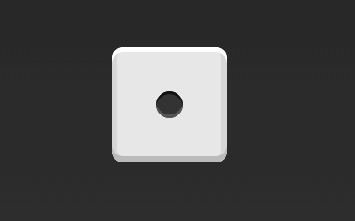
.box {
  display: flex;
  justify-content: center;
  align-items: center;
}
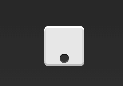
.box {
  display: flex;
  justify-content: center;
  align-items: flex-end;
}
.box {
  display: flex;
  justify-content: flex-end;
  align-items: flex-end;
}
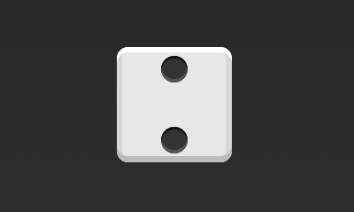
1.2 Double Project
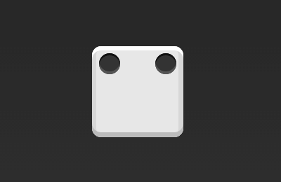
.box {
  display: flex;
  justify-content: space-between;
}

.box {
  display: flex;
  flex-direction: column;
  justify-content: space-between;
}
.box {
  display: flex;
  flex-direction: column;
  justify-content: space-between;
  align-items: center;
}
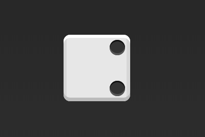
.box {
  display: flex;
  flex-direction: column;
  justify-content: space-between;
  align-items: flex-end;
}
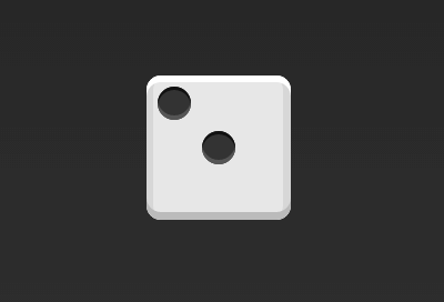
.box {
  display: flex;
}

.item:nth-child(2) {
  align-self: center;
}

.box {
  display: flex;
  justify-content: space-between;
}

.item:nth-child(2) {
  align-self: flex-end;
}
1.3 Three Projects

.box {
  display: flex;
}

.item:nth-child(2) {
  align-self: center;
}

.item:nth-child(3) {
  align-self: flex-end;
}
1.4Four Projects

.box {
  display: flex;
  flex-wrap: wrap;
  justify-content: flex-end;
  align-content: space-between;
}
The HTML code is as follows.
<div class="box">
  <div class="column">
    <span class="item"></span>
    <span class="item"></span>
  </div>
  <div class="column">
    <span class="item"></span>
    <span class="item"></span>
  </div>
</div>
The CSS code is as follows.
.box {
  display: flex;
  flex-wrap: wrap;
  align-content: space-between;
}

.column {
  flex-basis: 100%;
  display: flex;
  justify-content: space-between;
}
1.56 Projects

.box {
  display: flex;
  flex-wrap: wrap;
  align-content: space-between;
}

.box {
  display: flex;
  flex-direction: column;
  flex-wrap: wrap;
  align-content: space-between;
}
The HTML code is as follows.
<div class="box">
  <div class="row">
    <span class="item"></span>
    <span class="item"></span>
    <span class="item"></span>
  </div>
  <div class="row">
    <span class="item"></span>
  </div>
  <div class="row">
     <span class="item"></span>
     <span class="item"></span>
  </div>
</div>
The CSS code is as follows.
.box {
  display: flex;
  flex-wrap: wrap;
}

.row{
  flex-basis: 100%;
  display:flex;
}

.row:nth-child(2){
  justify-content: center;
}

.row:nth-child(3){
  justify-content: space-between;
}
1.69 Projects

.box {
  display: flex;
  flex-wrap: wrap;
}
2. Grid Layout
2.1 Basic Grid Layout
The simplest grid layout is the average distribution.Allocate space evenly inside the container, much like the dice layout above, but set the automatic scaling of the item.

The HTML code is as follows.
<div class="Grid">
  <div class="Grid-cell">...</div>
  <div class="Grid-cell">...</div>
  <div class="Grid-cell">...</div>
</div>
The CSS code is as follows.
.Grid {
  display: flex;
}

.Grid-cell {
  flex: 1;
}
2.2 Percentage Layout
One grid has a fixed percentage of width, and the rest of the grid equally allocates the remaining space.
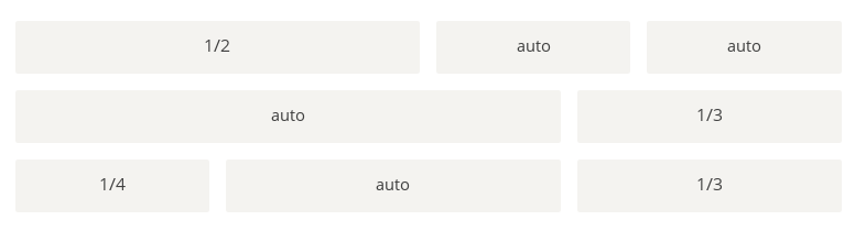
The HTML code is as follows.
<div class="Grid">
  <div class="Grid-cell u-1of4">...</div>
  <div class="Grid-cell">...</div>
  <div class="Grid-cell u-1of3">...</div>
</div>
.Grid {
  display: flex;
}

.Grid-cell {
  flex: 1;
}

.Grid-cell.u-full {
  flex: 0 0 100%;
}

.Grid-cell.u-1of2 {
  flex: 0 0 50%;
}

.Grid-cell.u-1of3 {
  flex: 0 0 33.3333%;
}

.Grid-cell.u-1of4 {
  flex: 0 0 25%;
}
3. Grail Layout
Grail Layout (Holy Grail Layout) refers to one of the most common site layouts.From top to bottom, the page is divided into three sections: the header, the body, and the footer.The trunk is divided horizontally into three columns, from left to right: navigation, main bar, secondary bar.
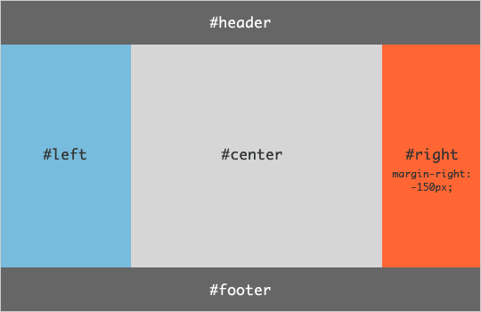
The HTML code is as follows.
<body class="HolyGrail">
  <header>...</header>
  <div class="HolyGrail-body">
    <main class="HolyGrail-content">...</main>
    <nav class="HolyGrail-nav">...</nav>
    <aside class="HolyGrail-ads">...</aside>
  </div>
  <footer>...</footer>
</body>
The CSS code is as follows.
.HolyGrail {
  display: flex;
  min-height: 100vh;
  flex-direction: column;
}

header,
footer {
  flex: 1;
}

.HolyGrail-body {
  display: flex;
  flex: 1;
}

.HolyGrail-content {
  flex: 1;
}

.HolyGrail-nav, .HolyGrail-ads {
  /* Set the width of the two sidebars to 12em */
  flex: 0 0 12em;
}

.HolyGrail-nav {
  /* Navigate to the leftmost side */
  order: -1;
}
If it is a small screen, the three columns of the trunk automatically become vertical overlay.
@media (max-width: 768px) {
  .HolyGrail-body {
    flex-direction: column;
    flex: 1;
  }
  .HolyGrail-nav,
  .HolyGrail-ads,
  .HolyGrail-content {
    flex: auto;
  }
}
4. Layout of input boxes
We often need to add a hint in front of the input box and a button in the back.

The HTML code is as follows.
<div class="InputAddOn">
  <span class="InputAddOn-item">...</span>
  <input class="InputAddOn-field">
  <button class="InputAddOn-item">...</button>
</div>
The CSS code is as follows.
.InputAddOn {
  display: flex;
}

.InputAddOn-field {
  flex: 1;
}
5. Hanging layout
Sometimes, you need to add a picture bar to the left or right of the main bar.
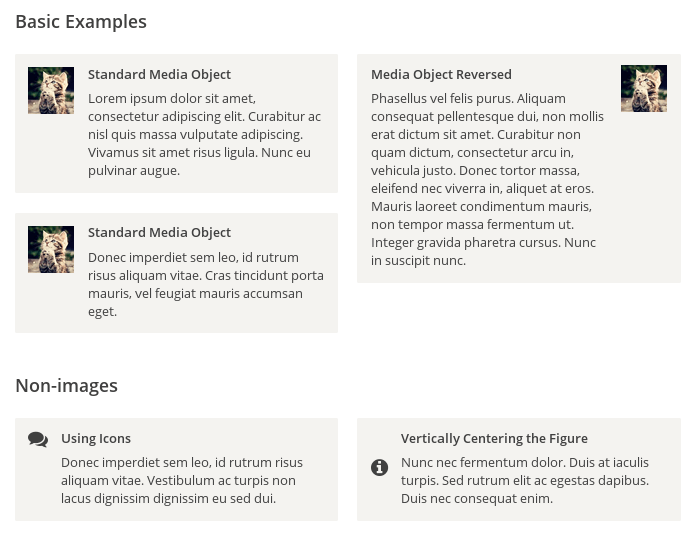
The HTML code is as follows.
<div class="Media">
  <img class="Media-figure" src="" alt="">
  <p class="Media-body">...</p>
</div>
The CSS code is as follows.
.Media {
  display: flex;
  align-items: flex-start;
}

.Media-figure {
  margin-right: 1em;
}

.Media-body {
  flex: 1;
}
6. Fixed Bottom Bar
Sometimes, when there is too little content on a page to fill the height of a screen, the bottom bar will be raised to the middle of the page.You can use the Flex layout so that the bottom bar always appears at the bottom of the page.
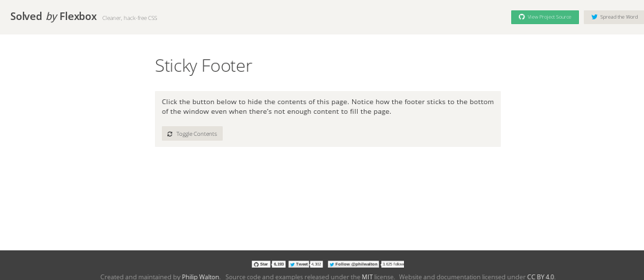
The HTML code is as follows.
<body class="Site">
  <header>...</header>
  <main class="Site-content">...</main>
  <footer>...</footer>
</body>
The CSS code is as follows.
.Site {
  display: flex;
  min-height: 100vh;
  flex-direction: column;
}

.Site-content {
  flex: 1;
}
Seven, Streaming Layout
The number of items per line is fixed and will branch automatically.
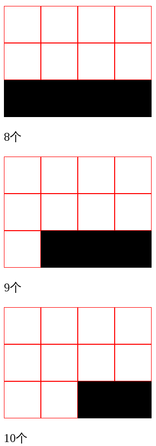
Writing of CSS.
.parent {
  width: 200px;
  height: 150px;
  background-color: black;
  display: flex;
  flex-flow: row wrap;
  align-content: flex-start;
}

.child {
  box-sizing: border-box;
  background-color: white;
  flex: 0 0 25%;
  height: 50px;
  border: 1px solid red;
}