Catalog
1. Set up related file structure
1.2 Introducing Initialization Styles
1.3 Common Initialization Styles
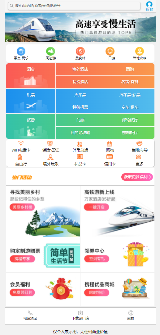
2.1 Search Module - Appearance Layout
2.2 Search Module - Personal Center
2.3 Search Module - Search Box
4. Local Navigation Bar Module
4.1 Local Navigation Bar Module - Overall Appearance Layout
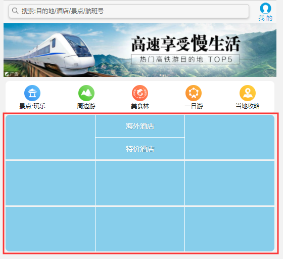
5.1 Main Navigation Bar Module - Overall Appearance Layout
5.2 Main Navigation Bar Module - Content Filling
6. Bottom navigation bar module
7.1 Sales Module Header - Hot Activities
7.2 Sales Module - Content Section
1. Set up related file structure
1.1 File Structure
Create related storage folders and index.html file structure
<!DOCTYPE html>
<html lang="en">
<head>
    <meta charset="UTF-8">
    <meta http-equiv="X-UA-Compatible" content="IE=edge">
    <meta name="viewport" content="width=device-width, initial-scale=1.0">
    <title>Document</title>
</head>
<body>

</body>
</html>
1.2 Introducing Initialization Styles
Introduce index.css style file, built to render the index.css style file for HTML
Introduce normalize. CSS style file, Normalize. CSS allows different browsers to render web page elements more uniformly, and the mobile side initializes css. Normalize supports super-multibrowsers, including mobile browsers, while generalizing HTML5 elements, typesetting, lists, embedded content, forms, and tables.
Normalize. Official address of CSS file: Normalize.css: Make browsers render all elements more consistently. http://necolas.github.io/normalize.css/ Note: Introduce relevant css order
    <link rel="stylesheet" href="css/normalize.css">
    <link rel="stylesheet" href="css/index.css">
1.3 Common Initialization Styles
In index. Set css style for body label inside css file
body {
    max-width: 540px;
    min-width: 320px;
    margin: 0 auto;
    font: normal 14px/1.5 Tahoma, "Lucida Grande", Verdana, "Microsoft Yahei", STXihei, hei;
    color: #000;
    background: #f2f2f2;
    overflow-x: hidden;
    -webkit-tap-highlight-color: transparent;
    height: 2000px;
}
2. Search Module
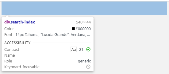
2.1 Search Module - Appearance Layout
In index. Set fixed positioning and width for search module within CSS file. Fixed positioning has nothing to do with the parent and is based on the current browser's screen.
    <div class="search-index">
        <div class="search-content"></div>
        <a href="#"Class=" user ">my </a>
    </div>
/* Search module */
.search-index{
display: flex;
position: fixed;
top: 0;
/* Fixed box centered display */
left: 50%;
-webkit-transform: translateX(-50%);
transform: translateX(-50%);
/* Width of the fixed box should be set because of fixed positioning */
width: 100%;
min-width: 320px;
max-width: 540px;
height: 44px;
}left and transform may not be set, and fixed boxes may be centered, but case-specific writing is advocated. - The webkit-transform settings are designed to be compatible with older browsers.
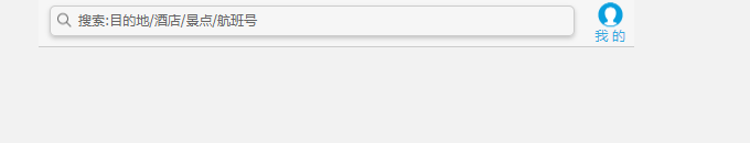
Page Effect Display-Search Module Basic Appearance Layout
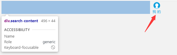
2.2 Search Module - Personal Center
Search bar is adaptive and personal center is fixed size
(1) First set display: flex for the parent search-index
display: flex;
(2) dividing subitems into left and right parts and removing hyperlink styles
a {
    /* Underline hyperlinks */
    text-decoration: none;
}

.search-content{
    flex: 1;
}
(3) Personal Center Content and css Style
.user{
    width: 44px;
    height: 44px;
    font-size: 12px;
    text-align: center;
    color: #2eaae0;
}
/* before Pseudo Elements */
.user::before{
    /* Content cannot be omitted. The default value of content is normal.
    If the content value is set to none, it will not be generated as a pseudo element */
    content: "";
    display: block;
    width: 23px;
    height: 23px;
    /* Wizard zoomed to 2x - 59px and - 194px for individual center icon zoomed coordinates*/
    /* You can use Fireworks */
    background: url(../img/sprite.png) no-repeat -59px -194px;
    /* The zoom icon 104px comes from the zoomed width of the original picture 208px*/
    background-size: 104px auto;
    margin: 4px auto -2px;
}
Page Effect Show - Personal Center Section
2.3 Search Module - Search Box
(1) Search box content and css Style
Search box content
<div class="search-content">search:Destination/Hotel/Scenic spot/Flight number</div>
css styles
.search-content{
    position: relative;
    height: 26px;
    line-height: 24px;
    border: 1px solid #ccc;
    margin: 7px 10px;
    border-radius: 5px;
    font-size: 12px;
    color: #666;
    padding-left: 25px;
    box-shadow: 0 2px 4px rgba(0,0,0,.2);
    flex: 1;
}
.search-content::before{
    content: "";
    /* With absolute positioning, you can use the inline block element display: inline-block;*/
    position: absolute;
    top: 5px;
    left: 5px;
    width: 15px;
    height: 15px;
    background: url(../img/sprite.png) no-repeat -59px -279px;
    background-size: 104px auto;
}
Search for modules as a whole. search-index Add Background Color and Border
    background-color: #f6f6f6;
    border-top: 1px solid #ccc;
    border-bottom: 1px solid #ccc;
Page Effect Display-Search Module
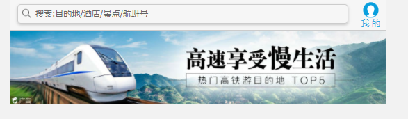
3. Banner Modules
banner content
    <!-- banner Modular -->
    <div class="banner">
        <img src="upload/focus.jpg" alt="">
    </div>
css styles
.banner{
    padding-top: 44px;
}
.banner img{
    width: 100%;
}
Page Effect Display
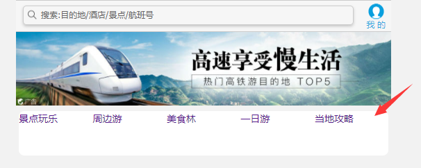
4. Local Navigation Bar Module
4.1 Local Navigation Bar Module - Overall Appearance Layout
Navigation Bar Content
    <!-- Local Navigation Bar Module -->
    <ul class="top-nav">
        <li><a href="#">Play at attractions</a></li>
        <li><a href="#">Peripheral swimming</a></li>
        <li><a href="#">Food Forest</a></li>
        <li><a href="#">One day trip</a></li>
        <li><a href="#">Local Strategy</a></li>
    </ul>
Local Navigation Bar Overall Appearance css Style
ul{
    list-style: none;
    margin: 0;
    padding: 0;
}
.top-nav{
    height: 64px;
    background-color: white;
    margin: 3px 4px;
    border-radius: 8px;
    display: flex;
}
.top-nav li{
    flex: 1;
}
Page Effect Display - Overall Appearance Layout of Local Navigation Bar
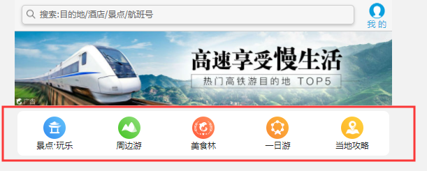
4.2 Local Navigation Bar Module-Content
Add local navigation bar icons for hyperlinks, with flex layout inside the hyperlinks, y-axis as the main axis, text and picture centered
    <!-- Local Navigation Bar Module -->
    <ul class="top-nav">
        <li><a href="#"title=" attractions. play ">
            <span class="top-nav-icon-img1"></span>
            <span>Scenic spot·Play</span>
        </a></li>
        <li><a href="#">
            <span class="top-nav-icon-img2" title="Peripheral travel"></span>
            <span>Peripheral travel</span>
        </a></li>
        <li><a href="#">
            <span class="top-nav-icon-img3" title="Gourmet Forest"></span>
            <span>Gourmet Forest</span>
        </a></li>
        <li><a href="#">
            <span class="top-nav-icon-img4" title="One-day tour"></span>
            <span>One-day tour</span>
        </a></li>
        <li><a href="#">
            <span class="top-nav-icon-img5" title="Local strategy"></span>
            <span>Local strategy</span>
        </a></li>
    </ul>
css styles
.top-nav a{
    display: flex;
    flex-direction: column;
    /* Single line, align-items, side axis centered */
    align-items: center;
    font-size: 12px;
}
/* attribute selectors */
.top-nav li [class^="top-nav-icon"]{
    width: 32px;
    height: 32px;
    margin-top: 8px;
    background: url(../img/localnav_bg.png) no-repeat 0 0;
    background-size: 32px auto;
}

.top-nav li .top-nav-icon-img2{
    background-position: 0 -32px;
}

.top-nav li .top-nav-icon-img3{
    background-position: 0 -64px;
}

.top-nav li .top-nav-icon-img4{
    background-position: 0 -96px;
}

.top-nav li .top-nav-icon-img5{
    background-position: 0 -128px;
}
Page Effect Show - Local Navigation Bar
5. Main Navigation Bar
5.1 Main Navigation Bar Module - Overall Appearance Layout
    <!-- Main navigation bar -->
    <nav>
        <div class="nav-common">
            <div class="nav-items"></div>
            <div class="nav-items">
                <a href="#"title=" overseas hotels ">overseas hotels </a>
                <a href="#"title=" Special Hotel ">Special Hotel </a>
            </div>
            <div class="nav-items"></div>
        </div>
        <div class="nav-common">
            <div class="nav-items"></div>
            <div class="nav-items"></div>
            <div class="nav-items"></div>
        </div>
        <div class="nav-common">
            <div class="nav-items"></div>
            <div class="nav-items"></div>
            <div class="nav-items"></div>
        </div>
    </nav>
First divide the whole navigation bar into three sections, then make a single section into three sections inside
The main navigation bar overall appearance layout css style, using flex layout, setting the background color first for better resolution
nav{
    border-radius: 8px;
    margin: 0 4px 3px;
    overflow: hidden;
}
.nav-common{
    height: 88px;
    background-color: skyblue;
    display: flex;
}
.nav-common:nth-child(2){
    margin: 3px 0;
}
.nav-items{
    flex: 1;
    display: flex;
    flex-direction: column;
}
/* -n+2 Select the first two elements */
.nav-items:nth-child(-n+2){
    border-right: 1px solid #fff;
}
.nav-items a{
    flex: 1;
    text-align: center;
    line-height: 44px;
    color: #fff;
    font-size: 14px;
    text-shadow: 1px 1px rgba(0,0,0,.2);
}
.nav-items a:nth-child(1){
    border-bottom: 1px solid #fff;
}
Page Effect Display - Overall Appearance Layout of Main Navigation Bar Module
5.2 Main Navigation Bar Module - Content Filling
Add content and icons for the remaining blank hyperlinks, and set the background color to a linear gradient
    <!-- Main navigation bar -->
    <nav>
        <div class="nav-common">
            <div class="nav-items">
                <a href="#"title=" Hotel ">Hotel</a>
            </div>
            <div class="nav-items">
                <a href="#"title=" overseas hotels ">overseas hotels </a>
                <a href="#"title=" Special Hotel ">Special Hotel </a>
            </div>
            <div class="nav-items">
                <a href="#"title=" group purchase ">group purchase </a>
                <a href="#"title=" accommodation hostel ">accommodation hostel </a>
            </div>
        </div>
        <div class="nav-common">
            <div class="nav-items">
                <a href="#"title=" ticket ">ticket</a>
            </div>
            <div class="nav-items">
                <a href="#"title=" train ticket ">train ticket</a>
                <a href="#"title=" special fare ">special fare </a>
            </div>
            <div class="nav-items">
                <a href="#"title=" car ticket/ship ticket ">car ticket/ship ticket</a>
                <a href="#"title=" car rental "> car rental </a>
            </div>
        </div>
        <div class="nav-common">
            <div class="nav-items">
                <a href="#"title=" tourism ">tourism</a>
            </div>
            <div class="nav-items">
                <a href="#"title=" ticket ">ticket</a>
                <a href="#"title=" destination strategy ">destination strategy </a>
            </div>
            <div class="nav-items">
                <a href="#"title=" cruise travel ">cruise travel </a>
                <a href="#"title=" customized travel ">customized travel </a>
            </div>
        </div>
    </nav>
Add icons to the main navigation bar and set a linear gradient background color css Style
.nav-items:nth-child(1) a{
    border: 0;
    background: url(../img/hotel.png) no-repeat bottom center;
    background-size: 121px auto;
}
nav div:nth-child(2) .nav-items:nth-child(1) a{
    background: url(../img/ticket.png) no-repeat bottom center;
    background-size: 121px auto;
}
nav div:nth-child(3) .nav-items:nth-child(1) a{
    background: url(../img/places.png) no-repeat bottom center;
    background-size: 121px auto;
}
/* Background linear gradient background: -webkit-linear-gradient (start direction, color 1, color 2)*/
.nav-common:nth-child(1){
    background: -webkit-linear-gradient(left,#FA5A55,#FA994D);
}
.nav-common:nth-child(2){
    background: -webkit-linear-gradient(left,#1B90ED,#53BCED);
}
.nav-common:nth-child(3){
    background: -webkit-linear-gradient(left,#34C2A9,#6CD559);
}
Page Effect Show - Main Navigation Bar
6. Bottom navigation bar module
Similar to the local navigation bar
Bottom navigation bar content
<!-- Bottom navigation bar -->
    <ul class="bot-nav">
        <li>
            <a href="#">
                <span class="bot-nav-icon-img1"></span>
                <span title="WiFi PHONECARD">WiFi PHONECARD</span>
            </a>
        </li>
        <li>
            <a href="#">
                <span class="bot-nav-icon-img2"></span>
                <span title="Insurance·visa">Insurance·visa</span>
            </a>
        </li>
        <li>
            <a href="#">
                <span class="bot-nav-icon-img3"></span>
                <span title="Foreign currency exchange">Foreign currency exchange</span>
            </a>
        </li>
        <li>
            <a href="#">
                <span class="bot-nav-icon-img4"></span>
                <span title="Shopping">Shopping</span>
            </a>
        </li>
        <li>
            <a href="#">
                <span class="bot-nav-icon-img5"></span>
                <span title="Local Wizard">Local Wizard</span>
            </a>
        </li>
        <li>
            <a href="#">
                <span class="bot-nav-icon-img6"></span>
                <span title="Independent travel">Independent travel</span>
            </a>
        </li>
        <li>
            <a href="#">
                <span class="bot-nav-icon-img7"></span>
                <span title="Play outside">Play outside</span>
            </a>
        </li>
        <li>
            <a href="#">
                <span class="bot-nav-icon-img8"></span>
                <span title="Gift Card">Gift Card</span>
            </a>
        </li>
        <li>
            <a href="#">
                <span class="bot-nav-icon-img9"></span>
                <span title="Credit Card">Credit Card</span>
            </a>
        </li>
        <li>
            <a href="#">
                <span class="bot-nav-icon-img10"></span>
                <span title="More">More</span>
            </a>
        </li>
    </ul>
Bottom navigation bar css Style
/* Bottom navigation bar */
.bot-nav{
    border-radius: 8px;
    background-color: #fff;
    margin: 0 4px;
    display: flex;
    flex-wrap: wrap;
    box-shadow: 1px 1px rgba(0,0,0,.2);
}
.bot-nav li{
    flex: 20%;
}
.bot-nav a{
    display: flex;
    flex-direction: column;
    align-items: center;
}
.bot-nav li [class^="bot-nav-icon"]{
    width: 24px;
    height: 24px;
    margin-top: 4px;
    background: url(../img/subnav-bg.png) no-repeat 0 0;
    background-size: 24px auto;
}
.bot-nav li .bot-nav-icon-img2{
    background-position: 0 -25px;
}
.bot-nav li .bot-nav-icon-img3{
    background-position: 0 -51px;
}
.bot-nav li .bot-nav-icon-img4{
    background-position: 0 -276px;
}
.bot-nav li .bot-nav-icon-img5{
    background-position: 0 -86px;
}
.bot-nav li .bot-nav-icon-img6{
    background-position: 0 -141px;
}
.bot-nav li .bot-nav-icon-img7{
    background-position: 0px -171px;
}
.bot-nav li .bot-nav-icon-img8{
    background-position: 0 -115px;
}
.bot-nav li .bot-nav-icon-img9{
    background-position: 0 -200px;
}
.bot-nav li .bot-nav-icon-img10{
    background-position: 0 -249px;
}
Page Effect Show - Bottom Navigation Bar
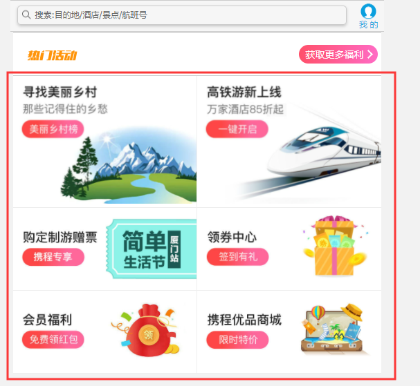
Seven. Sales module
7.1 Sales Module Header - Hot Activities
    <!-- Sales module -->
    <div class="sale-box">
        <div class="sale-hd">
            <h2>Popular Events</h2>
            <a href="#"Class="more">Get more benefits</a>
        </div>
    </div>
Sales Module Header - Hot Activities css Style
/* Sales module */
.sale-box{
    border-top: 1px solid #ccc;
    background-color: #fff;
    margin: 4px;
}
.sale-hd{
    height: 44px;
    border-bottom: 1px solid #ccc;
    position: relative;
}
.sale-hd h2{
    position: relative;
    text-indent: -999px;
    overflow: hidden;
}
.sale-hd h2::after{
    position: absolute;
    top: 8px;
    left: 20px;
    content: "";
    width: 79px;
    height: 20px;
    background: url(../img/hot.png) no-repeat 0 -20px;
    background-size: 79px auto;
}
.more{
    position: absolute;
    top: 0px;
    right: 5px;
    background: -webkit-linear-gradient(left,#ff506a,#ff6bc4);
    border-radius: 15px;
    padding: 3px 20px 3px 10px;
    color: #fff;
}
.more::after{
    content: "";
    position: absolute;
    top: 9px;
    right: 9px;
    width: 7px;
    height: 7px;
    border-top: 2px solid #fff;
    border-right: 2px solid #fff;
    transform: rotate(45deg);
}
Page Effect Show - Top Activities in Sales Module
7.2 Sales Module - Content Section
<div class="sale-content">
            <div class="row">
                <a href="#">
                    <img src="upload/pic1.jpg" alt="">
                </a>
                <a href="#">
                    <img src="upload/pic2.jpg" alt="">
                </a>
            </div>
            <div class="row">
                <a href="#">
                    <img src="upload/pic3.jpg" alt="">
                </a>
                <a href="#">
                    <img src="upload/pic4.jpg" alt="">
                </a>
            </div>
            <div class="row">
                <a href="#">
                    <img src="upload/pic5.jpg" alt="">
                </a>
                <a href="#">
                    <img src="upload/pic6.jpg" alt="">
                </a>
            </div>
        </div>
Sales module content section css Style
.row{
    display: flex;
}
.row a{
    flex: 1;
    border-bottom: 1px solid #eee;
}
.row a:nth-child(1){
    border-right: 1px solid #eee;
}
.row a img{
    width: 100%;
}
Page effect display - Sales module content section
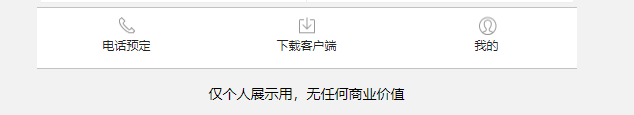
8. Bottom toolbar module
    <!-- Bottom toolbar module -->
    <ul class="tool-box">
        <li>
            <a href="#">
                <span class="tool-icon-img1"></span>
                <span>Phone Reservation</span>
            </a>
        </li>
        <li>
            <a href="#">
                <span class="tool-icon-img2"></span>
                <span>Download Client</span>
            </a>
        </li>
        <li>
            <a href="#">
                <span class="tool-icon-img3"></span>
                <span>My</span>
            </a>
        </li>
    </ul>
Bottom toolbar module css Style
/* Bottom toolbar module */
.tool-box{
    display: flex;
    height: 60px;
    background-color: #fff;
    border-top: 1px solid #c2c2c2;
    border-bottom: 1px solid #c2c2c2;
}
.tool-box li{
    flex: 1;
}
.tool-box a{
    display: flex;
    flex-direction: column;
    align-items: center;
    font-size: 12px;
}
.tool-box li [class^="tool-icon"]{
    width: 20px;
    height: 20px;
    margin-top: 8px;
    background: url(../img/sprite.png) no-repeat -58px -152px;
    background-size: 104px auto;
}
.tool-box li .tool-icon-img2{
    background-position: -58px -172px;
}
.tool-box li .tool-icon-img3{
    background-position: -58px -309px;
}
Page Effect Show - Bottom Toolbar
9. Entire Code
9.1 index.html
<!DOCTYPE html>
<html lang="en">
<head>
    <meta charset="UTF-8">
    <meta http-equiv="X-UA-Compatible" content="IE=edge">
    <meta name="viewport" content="width=device-width, initial-scale=1.0">
    <link rel="stylesheet" href="css/normalize.css">
    <link rel="stylesheet" href="css/index.css">
    <title>Ctrip case</title>
</head>
<body>
    <!-- Search module -->
    <div class="search-index">
        <div class="search-content">search:Destination/Hotel/Scenic spot/Flight number</div>
        <a href="#"Class=" user ">my </a>
    </div>
    <!-- banner Modular -->
    <div class="banner">
        <img src="upload/focus.jpg" alt="">
    </div>
    <!-- Local Navigation Bar Module -->
    <ul class="top-nav">
        <li><a href="#"title=" attractions. play ">
            <span class="top-nav-icon-img1"></span>
            <span>Scenic spot·Play</span>
        </a></li>
        <li><a href="#">
            <span class="top-nav-icon-img2" title="Peripheral travel"></span>
            <span>Peripheral travel</span>
        </a></li>
        <li><a href="#">
            <span class="top-nav-icon-img3" title="Gourmet Forest"></span>
            <span>Gourmet Forest</span>
        </a></li>
        <li><a href="#">
            <span class="top-nav-icon-img4" title="One-day tour"></span>
            <span>One-day tour</span>
        </a></li>
        <li><a href="#">
            <span class="top-nav-icon-img5" title="Local strategy"></span>
            <span>Local strategy</span>
        </a></li>
    </ul>
    <!-- Main navigation bar -->
    <nav>
        <div class="nav-common">
            <div class="nav-items">
                <a href="#"title=" Hotel ">Hotel</a>
            </div>
            <div class="nav-items">
                <a href="#"title=" overseas hotels ">overseas hotels </a>
                <a href="#"title=" Special Hotel ">Special Hotel </a>
            </div>
            <div class="nav-items">
                <a href="#"title=" group purchase ">group purchase </a>
                <a href="#"title=" accommodation hostel ">accommodation hostel </a>
            </div>
        </div>
        <div class="nav-common">
            <div class="nav-items">
                <a href="#"title=" ticket ">ticket</a>
            </div>
            <div class="nav-items">
                <a href="#"title=" train ticket ">train ticket</a>
                <a href="#"title=" special fare ">special fare </a>
            </div>
            <div class="nav-items">
                <a href="#"title=" car ticket/ship ticket ">car ticket/ship ticket</a>
                <a href="#"title=" car rental "> car rental </a>
            </div>
        </div>
        <div class="nav-common">
            <div class="nav-items">
                <a href="#"title=" tourism ">tourism</a>
            </div>
            <div class="nav-items">
                <a href="#"title=" ticket ">ticket</a>
                <a href="#"title=" destination strategy ">destination strategy </a>
            </div>
            <div class="nav-items">
                <a href="#"title=" cruise travel ">cruise travel </a>
                <a href="#"title=" customized travel ">customized travel </a>
            </div>
        </div>
    </nav>
    <!-- Bottom navigation bar -->
    <ul class="bot-nav">
        <li>
            <a href="#">
                <span class="bot-nav-icon-img1"></span>
                <span title="WiFi PHONECARD">WiFi PHONECARD</span>
            </a>
        </li>
        <li>
            <a href="#">
                <span class="bot-nav-icon-img2"></span>
                <span title="Insurance·visa">Insurance·visa</span>
            </a>
        </li>
        <li>
            <a href="#">
                <span class="bot-nav-icon-img3"></span>
                <span title="Foreign currency exchange">Foreign currency exchange</span>
            </a>
        </li>
        <li>
            <a href="#">
                <span class="bot-nav-icon-img4"></span>
                <span title="Shopping">Shopping</span>
            </a>
        </li>
        <li>
            <a href="#">
                <span class="bot-nav-icon-img5"></span>
                <span title="Local Wizard">Local Wizard</span>
            </a>
        </li>
        <li>
            <a href="#">
                <span class="bot-nav-icon-img6"></span>
                <span title="Independent travel">Independent travel</span>
            </a>
        </li>
        <li>
            <a href="#">
                <span class="bot-nav-icon-img7"></span>
                <span title="Play outside">Play outside</span>
            </a>
        </li>
        <li>
            <a href="#">
                <span class="bot-nav-icon-img8"></span>
                <span title="Gift Card">Gift Card</span>
            </a>
        </li>
        <li>
            <a href="#">
                <span class="bot-nav-icon-img9"></span>
                <span title="Credit Card">Credit Card</span>
            </a>
        </li>
        <li>
            <a href="#">
                <span class="bot-nav-icon-img10"></span>
                <span title="More">More</span>
            </a>
        </li>
    </ul>
    <!-- Sales module -->
    <div class="sale-box">
        <div class="sale-hd">
            <h2>Popular Events</h2>
            <a href="#"Class="more">Get more benefits</a>
        </div>
        <div class="sale-content">
            <div class="row">
                <a href="#">
                    <img src="upload/pic1.jpg" alt="">
                </a>
                <a href="#">
                    <img src="upload/pic2.jpg" alt="">
                </a>
            </div>
            <div class="row">
                <a href="#">
                    <img src="upload/pic3.jpg" alt="">
                </a>
                <a href="#">
                    <img src="upload/pic4.jpg" alt="">
                </a>
            </div>
            <div class="row">
                <a href="#">
                    <img src="upload/pic5.jpg" alt="">
                </a>
                <a href="#">
                    <img src="upload/pic6.jpg" alt="">
                </a>
            </div>
        </div>
    </div>
    <!-- Bottom toolbar module -->
    <ul class="tool-box">
        <li>
            <a href="#">
                <span class="tool-icon-img1"></span>
                <span>Phone Reservation</span>
            </a>
        </li>
        <li>
            <a href="#">
                <span class="tool-icon-img2"></span>
                <span>Download Client</span>
            </a>
        </li>
        <li>
            <a href="#">
                <span class="tool-icon-img3"></span>
                <span>My</span>
            </a>
        </li>
    </ul>
    <!-- Remarks -->
    <p class="note">For personal display only, no commercial value</p>
</body>
</html>
9.2 index.css
body{
    max-width: 540px;
    min-width: 320px;
    margin: 0 auto;
    font: normal 14px/1.5 Tahoma, "Lucida Grande", Verdana, "Microsoft Yahei", STXihei, hei;
    color: #000;
    background: #f2f2f2;
    overflow-x: hidden;
    -webkit-tap-highlight-color: transparent;
    height: 2000px;
}

a {
    /* Underline hyperlinks */
    text-decoration: none;
    color: #222;
}

ul{
    list-style: none;
    margin: 0;
    padding: 0;
}

/* Search module */
.search-index{
    display: flex;
    position: fixed;
    top: 0;
    /* Fixed box centered display */
    left: 50%;
    -webkit-transform: translateX(-50%);
    transform: translateX(-50%);
    /* Width of the fixed box should be set because of fixed positioning */
    width: 100%;
    min-width: 320px;
    max-width: 540px;
    height: 44px;
    background-color: #f6f6f6;
    border-top: 1px solid #ccc;
    border-bottom: 1px solid #ccc;
}

.search-content{
    position: relative;
    height: 26px;
    line-height: 24px;
    border: 1px solid #ccc;
    margin: 7px 10px;
    border-radius: 5px;
    font-size: 12px;
    color: #666;
    padding-left: 25px;
    box-shadow: 0 2px 4px rgba(0,0,0,.2);
    flex: 1;
}
.search-content::before{
    content: "";
    /* With absolute positioning, you can use the inline block element display: inline-block;*/
    position: absolute;
    top: 5px;
    left: 5px;
    width: 15px;
    height: 15px;
    background: url(../img/sprite.png) no-repeat -59px -279px;
    background-size: 104px auto;
}
.user{
    width: 44px;
    height: 44px;
    font-size: 12px;
    text-align: center;
    color: #2eaae0;
}
/* before Pseudo Elements */
.user::before{
    /* Content cannot be omitted. The default value of content is normal.
    If the content value is set to none, it will not be generated as a pseudo element */
    content: "";
    display: block;
    width: 23px;
    height: 23px;
    /* Wizard zoomed to 2x - 59px and - 194px for individual center icon zoomed coordinates*/
    /* You can use Fireworks */
    background: url(../img/sprite.png) no-repeat -59px -194px;
    /* The zoom icon 104px comes from the zoomed width of the original picture 208px*/
    background-size: 104px auto;
    margin: 4px auto -2px;
}
.banner{
    padding-top: 44px;
}
.banner img{
    width: 100%;
}

.top-nav{
    height: 64px;
    background-color: white;
    margin: 3px 4px;
    border-radius: 8px;
    display: flex;
}
.top-nav li{
    flex: 1;
}
.top-nav a{
    display: flex;
    flex-direction: column;
    /* Single line, align-items, side axis centered */
    align-items: center;
    font-size: 12px;
}
/* attribute selectors */
.top-nav li [class^="top-nav-icon"]{
    width: 32px;
    height: 32px;
    margin-top: 8px;
    background: url(../img/localnav_bg.png) no-repeat 0 0;
    background-size: 32px auto;
}

.top-nav li .top-nav-icon-img2{
    background-position: 0 -32px;
}

.top-nav li .top-nav-icon-img3{
    background-position: 0 -64px;
}

.top-nav li .top-nav-icon-img4{
    background-position: 0 -96px;
}

.top-nav li .top-nav-icon-img5{
    background-position: 0 -128px;
}
/* Main navigation bar */
nav{
    border-radius: 8px;
    margin: 0 4px 3px;
    overflow: hidden;
}
.nav-common{
    height: 88px;
    /* background-color: skyblue; */
    display: flex;
}
.nav-common:nth-child(2){
    margin: 3px 0;
}
.nav-items{
    flex: 1;
    display: flex;
    flex-direction: column;
}
/* -n+2 Select the first two elements */
.nav-items:nth-child(-n+2){
    border-right: 1px solid #fff;
}
.nav-items a{
    flex: 1;
    text-align: center;
    line-height: 44px;
    color: #fff;
    font-size: 14px;
    text-shadow: 1px 1px rgba(0,0,0,.2);
}
.nav-items a:nth-child(1){
    border-bottom: 1px solid #fff;
}
.nav-items:nth-child(1) a{
    border: 0;
    background: url(../img/hotel.png) no-repeat bottom center;
    background-size: 121px auto;
}
nav div:nth-child(2) .nav-items:nth-child(1) a{
    background: url(../img/ticket.png) no-repeat bottom center;
    background-size: 121px auto;
}
nav div:nth-child(3) .nav-items:nth-child(1) a{
    background: url(../img/places.png) no-repeat bottom center;
    background-size: 121px auto;
}
/* Background linear gradient background: -webkit-linear-gradient (start direction, color 1, color 2)*/
.nav-common:nth-child(1){
    background: -webkit-linear-gradient(left,#FA5A55,#FA994D);
}
.nav-common:nth-child(2){
    background: -webkit-linear-gradient(left,#1B90ED,#53BCED);
}
.nav-common:nth-child(3){
    background: -webkit-linear-gradient(left,#34C2A9,#6CD559);
}
/* Bottom navigation bar */
.bot-nav{
    border-radius: 8px;
    background-color: #fff;
    margin: 0 4px;
    display: flex;
    flex-wrap: wrap;
    box-shadow: 1px 1px rgba(0,0,0,.2);
}
.bot-nav li{
    flex: 20%;
}
.bot-nav a{
    display: flex;
    flex-direction: column;
    align-items: center;
}
.bot-nav li [class^="bot-nav-icon"]{
    width: 24px;
    height: 24px;
    margin-top: 4px;
    background: url(../img/subnav-bg.png) no-repeat 0 0;
    background-size: 24px auto;
}
.bot-nav li .bot-nav-icon-img2{
    background-position: 0 -25px;
}
.bot-nav li .bot-nav-icon-img3{
    background-position: 0 -51px;
}
.bot-nav li .bot-nav-icon-img4{
    background-position: 0 -276px;
}
.bot-nav li .bot-nav-icon-img5{
    background-position: 0 -86px;
}
.bot-nav li .bot-nav-icon-img6{
    background-position: 0 -141px;
}
.bot-nav li .bot-nav-icon-img7{
    background-position: 0px -171px;
}
.bot-nav li .bot-nav-icon-img8{
    background-position: 0 -115px;
}
.bot-nav li .bot-nav-icon-img9{
    background-position: 0 -200px;
}
.bot-nav li .bot-nav-icon-img10{
    background-position: 0 -249px;
}
/* Sales module */
.sale-box{
    border-top: 1px solid #ccc;
    background-color: #fff;
    margin: 4px;
}
.sale-hd{
    height: 44px;
    border-bottom: 1px solid #ccc;
    position: relative;
}
.sale-hd h2{
    position: relative;
    text-indent: -999px;
    overflow: hidden;
}
.sale-hd h2::after{
    position: absolute;
    top: 8px;
    left: 20px;
    content: "";
    width: 79px;
    height: 20px;
    background: url(../img/hot.png) no-repeat 0 -20px;
    background-size: 79px auto;
}
.more{
    position: absolute;
    top: 0px;
    right: 5px;
    background: -webkit-linear-gradient(left,#ff506a,#ff6bc4);
    border-radius: 15px;
    padding: 3px 20px 3px 10px;
    color: #fff;
}
.more::after{
    content: "";
    position: absolute;
    top: 9px;
    right: 9px;
    width: 7px;
    height: 7px;
    border-top: 2px solid #fff;
    border-right: 2px solid #fff;
    transform: rotate(45deg);
}
.row{
    display: flex;
}
.row a{
    flex: 1;
    border-bottom: 1px solid #eee;
}
.row a:nth-child(1){
    border-right: 1px solid #eee;
}
.row a img{
    width: 100%;
}
/* Bottom toolbar module */
.tool-box{
    display: flex;
    height: 60px;
    background-color: #fff;
    border-top: 1px solid #c2c2c2;
    border-bottom: 1px solid #c2c2c2;
}
.tool-box li{
    flex: 1;
}
.tool-box a{
    display: flex;
    flex-direction: column;
    align-items: center;
    font-size: 12px;
}
.tool-box li [class^="tool-icon"]{
    width: 20px;
    height: 20px;
    margin-top: 8px;
    background: url(../img/sprite.png) no-repeat -58px -152px;
    background-size: 104px auto;
}
.tool-box li .tool-icon-img2{
    background-position: -58px -172px;
}
.tool-box li .tool-icon-img3{
    background-position: -58px -309px;
}
.note{
    width: 100%;
    text-align: center;
}
Page Effect Display - Mobile Home Page of Ctrip