text
- Common configuration
class TextTest extends StatelessWidget {
  @override
  Widget build(BuildContext context) {
    return Scaffold(
        body: Padding(
      padding: EdgeInsets.all(30),
      child: Column(
        children: <Widget>[
          Text("hello "),
          //Textflow, maximum number of lines Ellipsis: ellipsis instead
          Text(
            "hello! I'm 345 " * 5,
            maxLines: 1,
            overflow: TextOverflow.ellipsis,
          ),
          //Text scaling factor
          Text("hello 345", textScaleFactor: 2),
          //
          Text("hello 345",
              style: TextStyle(
                  //colour
                  color: Colors.red,
                  //Font size, default 14
                  fontSize: 18,
                  //thickness
                  fontWeight: FontWeight.w800,
                  //Italics
                  fontStyle: FontStyle.italic,
                  //Underline: underline, overline: underline, lineThrough: strikeout
                  decoration: TextDecoration.underline,
                  decorationColor: Colors.black,
                  //Solid: solid line, double: double line, dotted: dotted line, dashed: horizontal dotted line, wavy: wavy line
                  decorationStyle: TextDecorationStyle.wavy))
        ],
      ),
    ));
  }
}

textAlign: text alignment; You can choose whether to align left, right, or center. Note that the aligned reference frame is the Text widget itself
- DefaultTextStyle
- In the widget tree, the text style can be inherited by default. Therefore, if a default style is set at a node in the widget tree, all text in the subtree of the interface will use this style by default
Widget build(BuildContext context) {
  return Scaffold(
      body: Padding(
          padding: EdgeInsets.all(30),
          child: DefaultTextStyle(
              style: TextStyle(
                //colour
                color: Colors.red,
                //Font size, default 14
                fontSize: 20,
                //thickness
                fontWeight: FontWeight.w900,
              ),
              child: Column(
                children: [
                  Text("hello "),
                  Text("hello! I'm 345 " * 5, maxLines: 1,overflow: TextOverflow.ellipsis,),
                  //Replace default text
                  Text("hello 345",style: TextStyle(fontSize: 25, color: Colors.black))
                ],
              ))));
}

- TextSpan If you need to display a Text differently according to different parts, you can use TextSpan at this time, which represents a fragment in the Text
 const TextSpan({
  	TextStyle style,
  	Sting text,
  	List<TextSpan> children,
  	GestureRecognizer recognizer,
  });
Style and text represent style and content. children is an array, that is, TextSpan can contain other textspans. recognizer is used to recognize gestures on the text segment
Widget _richText() {
var textSpan = TextSpan(text: "hello", children: [
    TextSpan(text: "3", style: TextStyle(color: Colors.blueAccent)),
  TextSpan(text: "4", style: TextStyle(color: Colors.black)),
    TextSpan(text: "5", style: TextStyle(color: Colors.green))
]);
  return Text.rich(textSpan);
}
Text. Is used above The rich method adds TextSpan to text because text itself is a wrapper for RichText, which is a widget that can display multiple styles (rich text). The style is as follows:

- typeface Using fonts in fluent requires two steps, first in pubspec Yaml file, and then use the font through the textStyle attribute
flutter:
  fonts:
    - family: Raleway
      fonts:
        - asset: assets/fonts/Raleway-Regular.ttf
        - asset: assets/fonts/Raleway-Medium.ttf
          weight: 500
        - asset: assets/fonts/Raleway-SemiBold.ttf
          weight: 600
    - family: AbrilFatface
      fonts:
        - asset: assets/fonts/abrilfatface/AbrilFatface-Regular.ttf
Use fonts
// Declaration text style
const textStyle = const TextStyle(
  fontFamily: 'Raleway',
);

// Use text styles
var buttonText = const Text(
  "Use the font for this text",
  style: textStyle,
);
Button
Many button components are provided in the Material component library, such as RaisedButton, FlatButton, outlinbutton, etc. They customize the packaging of RawMaterialButton components indirectly or directly, so most of their properties are the same as RawMaterialButton
In addition, the buttons in all Material libraries have the following similarities:
1. Press "water ripple animation"
2. There is an onPressed attribute to set the callback of click events. If there is no callback, the button will be disabled, and the disabled state will not respond to user clicks
Various common buttons
class Button extends StatelessWidget {
  @override
  Widget build(BuildContext context) {
    return Scaffold(
        body: Padding(
      padding: EdgeInsets.all(20),
      child: Column(
        children: [
          //Floating button, with shadow and gray background by default
          RaisedButton(
            child: Text("RaisedButton"),
            onPressed: () => print('RaisedButton'),
          ),
            //Flat button, with transparent background and no shadow by default
          FlatButton(
            child: Text("flatButton"),
            onPressed: () => print('flatButton'),
          ),
          //By default, there is a border without shadow and the background is transparent
          OutlineButton(
            child: Text("OutlineButton"),
            onPressed: () => print('OutlineButton'),
          ),
          //Clickable Icon
          IconButton(
            icon: Icon(Icons.thumb_up_alt),
            onPressed: () => print('give the thumbs-up'),
          ),
          //Button with icon, create button with icon through icon constructor
          RaisedButton.icon(
            icon: Icon(Icons.send),
            label: Text("send out"),
            onPressed: () => print('send out'),
          ),
          FlatButton.icon(
            icon: Icon(Icons.live_help),
            label: Text("doubt"),
            onPressed: () => print('doubt'),
          )
        ],
      ),
    ));
  }
}
Copy code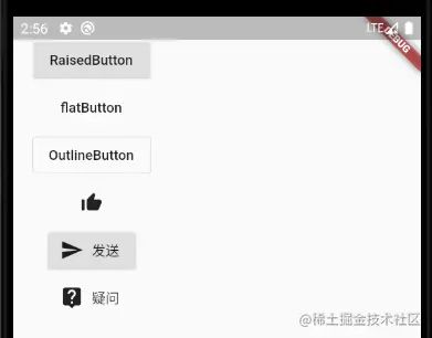
Some buttons are constructed by icon by default. The same constructor can easily create buttons with icons, such as RaisedButton
Customize button appearance
The appearance of buttons can be defined by attributes. Different button attributes are similar. Take FlatButton as an example. Take a look at the commonly used button attributes. You can view the api in detail
const FlatButton({
  ...
  @required this.onPressed, //Button click callback
  this.textColor, //Button text color
  this.disabledTextColor, //Text color when button is disabled
  this.color, //Button background color
  this.disabledColor,//The background color when the button is disabled
  this.highlightColor, //Background color when the button is pressed
  this.splashColor, //When clicked, the color of the water wave in the water wave animation
  this.colorBrightness,//Button theme, the default is light color theme
  this.padding, //Button filling
  this.shape, //appearance
  @required this.child, //Contents of the button
})
Copy code
Chestnut: define a submit button
FlatButton(
  color: Colors.blue,
  child: Text("Submit"),
  splashColor: Colors.grey,
  highlightColor: Colors.red,
  shape:
      RoundedRectangleBorder(borderRadius: BorderRadius.circular(20)),
  onPressed: () => print('Submit'),
)
Copy code
There is no setting to remove the background in the shutter. If you need to remove the background, you can set the background color to transparent, and set color: colors Blue can be replaced by color: Color(0x000000)
FlatButton has no shadow, so it will always feel worse. If you need shadow, you can directly use RaisedButton
const RaisedButton({
  ...
  this.elevation = 2.0, //Shadow in normal state
  this.highlightElevation = 8.0,//Shadow when pressed
  this.disabledElevation = 0.0,// Shadows when off
  ...
}
Copy code
You can set the shadow by setting the above attributes. The attribute of elevation can be seen in many components and is used to control the shadow
picture
In fluent, we can load and display images through the Image component. The loading sources of Image may be asset, file, memory and network
- ImageProvider ImageProvider is an abstract class, which mainly defines the interface load for image acquisition. Acquiring images from different data sources requires different imageproviders. For example, AssetImage implements the ImageProvider for loading images in Asset, while networkimages implements the ImageProvider for loading images from the network.
- Image The Image widget has a required parameter corresponding to an ImageProvider
- Load picture Loading pictures and other resources can refer to this article 1. Load the pictures in assets
Image(
  image: AssetImage("images/avatar.png"),
  width: 100.0
);
Image.asset("images/avatar.png",
  width: 100.0,
)
2. Load network pictures
Image(
  image: NetworkImage(
      "https://avatars2.githubusercontent.com/u/20411648?s=460&v=4"),
  width: 100.0,
)
Image.network(
  "https://avatars2.githubusercontent.com/u/20411648?s=460&v=4",
  width: 100.0,
)
3. Load local picture file
Image.file
4. Load memory pictures
Image.memory
- parameter
const Image({
  ...
  this.width, //Width of picture
  this.height, //Picture height
  this.color, //Mixed color value of the picture
  this.colorBlendMode, //Mixed mode
  this.fit,//Zoom mode
  this.alignment = Alignment.center, //Alignment
  this.repeat = ImageRepeat.noRepeat, //Repetition mode
  ...
})
- Width, height: set the width and height of the picture. If it is not specified, the picture will display its original size as much as possible according to the restrictions of the current parent container. If only one of them is set, the other will be scaled proportionally, but the fit property can be used to adapt to the rules
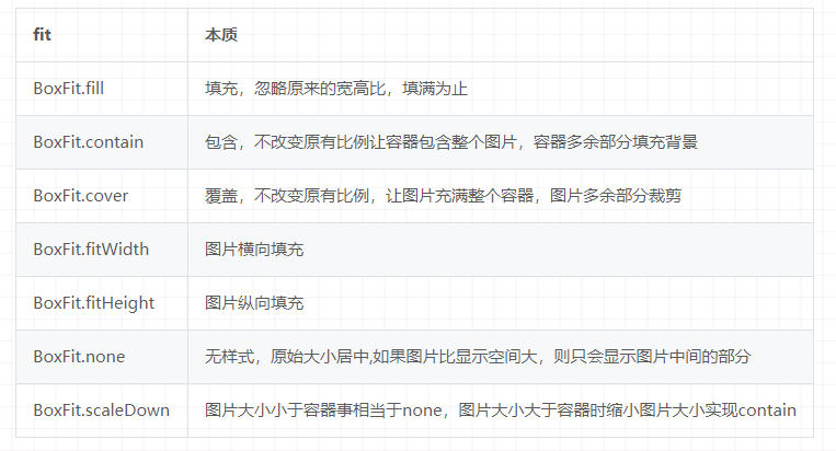
- fit: used to specify the adaptation mode of the picture when the display space of the picture is different from the size of the picture itself
- Color and colorBlendMode: when drawing a picture, you can mix the colors of each pixel. Color specifies the mixing color and colorBlendMode specifies the mixing mode
Image(
  image:NetworkImage("https://gimg2.baidu.com/image_search/src=http%3A%2F%2Fimg.houpao.com%2Fdy%2Fdyrs%2F20200711%2F94fb713a5985aa0c0c6f29a20357880f.jpeg&refer=http%3A%2F%2Fimg.houpao.com&app=2002&size=f9999,10000&q=a80&n=0&g=0n&fmt=jpeg?sec=1614828035&t=cf5430f8cc9a51b7000cde9c9cc30b5a"),
  width: 500,
  height: 300,
  fit: BoxFit.cover,
  color: Colors.red,
  colorBlendMode: BlendMode.difference,
)


- repeat: when the size of the picture itself is smaller than the display space, specify the repetition rule of the picture
- Image cache The fluent framework has a cache (memory) for loading and obtaining pictures. The default maximum number of caches is 1000 and the maximum cache space is 100M
- Common picture components
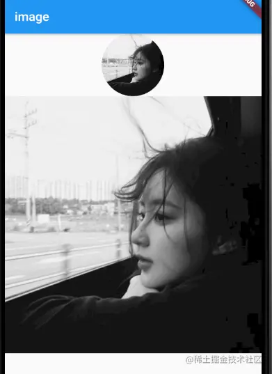
- CircleAvatar
CircleAvatar(
backgroundImage:NetworkImage("https://gimg2.baidu.com/image_search/src=http%3A%2F%2Fimg.houpao.com%2Fdy%2Fdyrs%2F20200711%2F94fb713a5985aa0c0c6f29a20357880f.jpeg&refer=http%3A%2F%2Fimg.houpao.com&app=2002&size=f9999,10000&q=a80&n=0&g=0n&fmt=jpeg?sec=1614828035&t=cf5430f8cc9a51b7000cde9c9cc30b5a"),
  radius: 50,
),
Circular picture
- FadeInImage
 FadeInImage(
  image: NetworkImage("https://gimg2.baidu.com/i......."),
  placeholder: AssetImage("images/icon.png"),
) If you load pictures directly from the network and then display them, it will be a little abrupt. Use  FadeInImage After that, a placeholder will be displayed during the loading of the picture, and a fade in will be displayed after the picture is loaded
ICON
In fluent, you can directly use font icons. It makes icons into font files, and then realizes different pictures by specifying different characters
In the font file, each character corresponds to a code, and each code corresponds to a display font. Different fonts refer to different fonts, and the font corresponding to characters is different. In iconfont, only the glyph corresponding to the bit code is made into an icon, so different characters will eventually be rendered into different icons
In fluent, iconfont has the following advantages over pictures
1. Small volume
2. For vector icons, zooming in will not affect the clarity
3. You can apply text style, change font, icon color, size alignment, etc. like text
4. TextSpan and text can be mixed
Use Material Design Font Icon
By default, fluent contains a set of Font Icon Library of Material Design, which is displayed in pubspec The configuration in yaml file is as follows
flutter:
  uses-material-design: true
 Copy code
Look at a simple chestnut
String icons = "";
icons += "\uE814";
icons += " \uE200";
icons += " \uE80D";

 Text(
 	icons,
 	style: TextStyle(
 	fontFamily: "MaterialIcons", fontSize: 40, color: Colors.green),
 )
Copy code

As can be seen from the above, using icons is like using text, but this requires providing code points for each Icon, which is not friendly to developers. Therefore, fluent encapsulates IconData and Icon to display font icons. The above chestnuts can be realized in the following ways
Row(
  mainAxisAlignment: MainAxisAlignment.center,
  children: [
    Icon(Icons.accessible, color: Colors.green),
    Icon(Icons.error, color: Colors.green),
    Icon(Icons.fingerprint, color: Colors.green)
  ],
)
Copy code
Use custom icon library
1. Import ttf file
fonts:
  - family: myIcon  #Specify a font name
    fonts:
      - asset: fonts/iconfont.ttf
 Copy code
2. The custom icon class has the same function as Icons above. It defines all files in the font file as static variables
class MyIcons{
  static const IconData book = const IconData(
      0xe614,
      fontFamily: 'myIcon',
      matchTextDirection: true
  );
  static const IconData wechat = const IconData(
      0xec7d,
      fontFamily: 'myIcon',
      matchTextDirection: true
  );
}
Copy code
3. Use
Row(
  mainAxisAlignment: MainAxisAlignment.center,
  children: <Widget>[
    Icon(MyIcons.book,color: Colors.purple,),
    Icon(MyIcons.wechat,color: Colors.green,),
  ],
)
Copy code
Radio buttons and check boxes
The Material component library provides radio Switch and check box. They are inherited from StatefulWidget. They will not save the current selection status. The selection status is managed by the parent component.
When the Switch or CheckBox is clicked, the onChanged callback will be triggered. We can change the logic in the callback
class SwitchAndCheckboxTest extends StatefulWidget {
  @override
  State<StatefulWidget> createState() {
    return _SwitchAndCheckboxTest();
  }
}

class _SwitchAndCheckboxTest extends State<SwitchAndCheckboxTest> {
  bool _switchSelected = true; //Radio status
  bool _checkboxSelected = true; //Check box status
  var groupValue = 0; //Radio box, the default selected value
  @override
  Widget build(BuildContext context) {
    return Scaffold(
      appBar: AppBar(
        title: Text("Radio switches and check boxes"),
      ),
      body: Column(
        children: [
          Switch(
            value: _switchSelected,
            activeColor: Colors.red,
            onChanged: (value) {
              setState(() {
                _switchSelected = value;
              });
            },
          ),
          Checkbox(
            value: _checkboxSelected,
            activeColor: Colors.red,
            onChanged: (value) => setState(() => _checkboxSelected = value),
          ),
          Row(
            children: [
              Radio(
                activeColor: Colors.red,
                //The value to which this radio box is bound
                value: 0,
                //Click the callback of status change
                onChanged: (value) => setState(() => this.groupValue = value),
                //The selected value in the current component
                groupValue: groupValue,
              ),
              Radio(
                //The value to which this radio box is bound
                activeColor: Colors.red,
                value: 1,
                //Click the callback of status change
                onChanged: (value) => setState(() => this.groupValue = value),
                //The selected value in the current component
                groupValue: groupValue,
              ),
              Radio(
                activeColor: Colors.red,
                //The value to which this radio box is bound
                value: 2,
                //Click the callback of status change
                onChanged: (value) => setState(() => this.groupValue = value),
                //The selected value in the current component
                groupValue: groupValue,
              )
            ],
          )
        ],
      ),
    );
  }
}

Copy code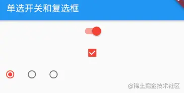
In the above code, you need to maintain the state of the component, so it inherits from StatefulWidget. In build, you build checkBox, Switch and Radio, modify the state when clicking, and then rebuild the UI
attribute
- The common attribute activeColor sets the color of the active state
- Width and height: the Checkbox cannot be customized, and the Switch can only define the width
- Checkbox has an attribute tristate, which indicates whether it is in three states. The default value is false. If it is true, the value of validate will automatically increase by a state null
summary
Switch, Checkbox and Radio itself do not maintain the state, but need the parent component to manage the state. When the user clicks, the state will be notified to the parent component through events. Therefore, whether to select or not will be associated with the user data, and these user data are not their private state. Therefore, we should think about the most reasonable way to customize components
Input boxes and forms
The Material component library provides the input box component TextField and the form component From. Let's take a specific look
TextField
For text input, it provides many attributes. First, take a brief look at the role of key attributes
const TextField({
  ...
  TextEditingController controller,
  FocusNode focusNode,
  InputDecoration decoration = const InputDecoration(),
  TextInputType keyboardType,
  TextInputAction textInputAction,
  TextStyle style,
  TextAlign textAlign = TextAlign.start,
  bool autofocus = false,
  bool obscureText = false,
  int maxLines = 1,
  int maxLength,
  bool maxLengthEnforced = true,
  ValueChanged<String> onChanged,
  VoidCallback onEditingComplete,
  ValueChanged<String> onSubmitted,
  List<TextInputFormatter> inputFormatters,
  bool enabled,
  this.cursorWidth = 2.0,
  this.cursorRadius,
  this.cursorColor,
  ...
})
Copy code- Controller: the controller of the edit box, through which you can set / obtain the content of the edit box, select the content of the edit box, and listen to the text change event of the edit box. In most cases, we need to provide a controller to interact with the text box. If it is not provided, the TextField will automatically create one
- focusNode: used to control whether TextField occupies the focus of the current keyboard input. It is a handler for our interaction with the keyboard.
- InputDecoration: used to control the appearance display of TextField, such as prompt text, background color, border, etc
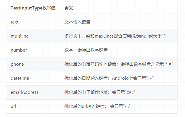
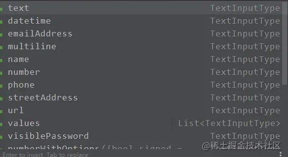
- keyboardType: used to set the keyboard input type of the input box. The values are as follows:
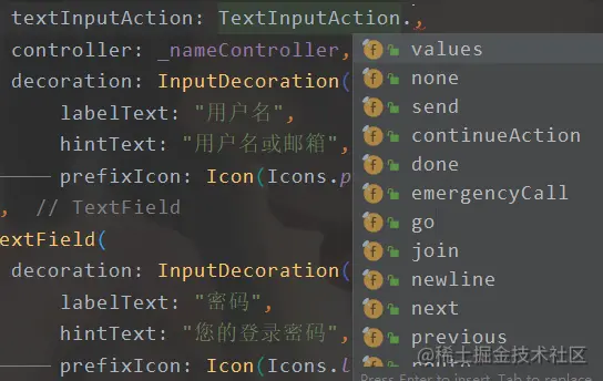
- textInputAction: keyboard action button icon. It is an enumerated value with multiple optional values. For details, see the api
- Style: the text style being edited
- textAlign: edit the horizontal alignment of text in the input box
- autofocus: whether to get focus automatically
- obscureText: whether to hide the text being edited, such as entering a password.
- maxLines: enter the maximum number of lines. The default is 1. If it is null, it is unlimited maxLength and maxLengthEnforced: the former represents the maximum length of the input text. After setting, the input text count will be displayed in the lower right corner of the input box. The latter determines whether the input length is blocked when it exceeds maxLength
- onChange: callback for content change in the input box, which can also be monitored by the controller
- onEditingComplete and onSubmitted: both are triggered when input is completed, such as clicking the keyboard to complete or searching. The difference is that the callback of the latter is valuechanged < string >, and the former does not accept parameters
- inputFormatters: used to specify the input format. When the input content changes, it will be verified according to the specified format
- enable: if false, the input box is disabled
- cursorWidth, cursorRadius and cursorColor: define the width, fillet and color of the cursor
Chestnuts
class InputText extends StatefulWidget {
  @override
  State<StatefulWidget> createState() {
    return _InputText();
  }
}

class _InputText extends State<InputText> {
  @override
  Widget build(BuildContext context) {
    return Scaffold(
      appBar: AppBar(
        title: Text("Input box"),
      ),
      body: Column(
        children: [
          TextField(
            autocorrect: true,
            decoration: InputDecoration(
                labelText: "user name",
                hintText: "User name or mailbox",
                prefixIcon: Icon(Icons.person)),
          ),
          TextField(
            decoration: InputDecoration(
                labelText: "password",
                hintText: "Your login password",
                prefixIcon: Icon(Icons.lock)),
            obscureText: true,
          )
        ],
      ),
    );
  }
}
Copy code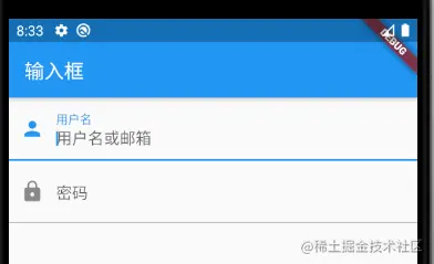
- Get input 1. Define two variables and save when onChange is triggered 2. Get it directly through the controller
//Define a controller
TextEditingController _nameController = TextEditingController();
TextField(
    autofocus: true,
    controller: _nameController, //Set controller
    ...
)
//Direct output is enough print(_nameController.text)
controller can also be used to set default values, select text, etc
_nameController.text="hello world!";
_nameController.selection=TextSelection(
    baseOffset: 2,
    extentOffset: _nameController.text.length
);

TextField(
  controller: _nameController,
)
- Control focus The focus can be controlled through FocusNode and FocusScope node. By default, the focus is managed by FocusScope, which represents the focus control range. Within this range, you can move the focus between input boxes and set the default focus through FocusScope node. We can use FocusScope Of (context) to get the default FocusScope node in the Widget tree.
- Simple focus state change event
// Create focusNode
FocusNode focusNode = new FocusNode();
...
// focusNode binding input box
TextField(focusNode: focusNode);
...
// Monitor focus change
focusNode.addListener((){
   print(focusNode.hasFocus);
});
- custom style
- Hide text
 TextField(
     obscureText: true,
 )
After hiding, the input content will not be visible and become a password type
- Keyboard type
TextField(
	keyboardType: TextInputType.number,
),
For example, number can only enter numbers, and there are many values, as shown below, which can be viewed by yourself
- Keyboard button That is, the button in the lower right corner of the keyboard. Common buttons, such as finish, are a sign matching button, etc
- Case For example, control the case of English initials
TextField(
	textCapitalization: TextCapitalization.words,
),
Options for textCapitalization 1. words: capitalize the first letter of a word 2. sentences: capitalize the first letter of the sentence 3. characters: all letters are capitalized 4. None: none by default
- cursor
TextField(
	cursorColor: Colors.orange,//colour
	cursorWidth: 15,//width
	cursorRadius: Radius.circular(15),//fillet
),
- Counter
TextField(
  maxLength: 11,
),
Set the maximum length counter to display

Custom counters / icons
TextField(
            autocorrect: true,
            maxLength: 11,
            controller: _nameController,
            decoration: InputDecoration(
                labelText: "user name",
                hintText: "User name or mailbox",
                counter: Text("Counter 0/100"),
                prefixIcon: Icon(Icons.person)),
          ),
adopt counter To implement custom counters
 And pass prefixIcon You can set the left inner icon through icon The left outer icon can be set
decoration: InputDecoration(
	suffixIcon: IconButton(
		icon: Icon(Icons.close),
		onPressed: () {
		controller.clear();
	},
),adopt suffixIcon The icon on the right can be set, and the click event can be set
- Error text prompt
TextField(
	controller: controller,
	decoration: InputDecoration(
		errorText: "Please enter the content",
	),
)
- Remove underline
decoration: InputDecoration.collapsed(hintText: "User name or mailbox")),
- frame
  decoration: InputDecoration(
              border: OutlineInputBorder(
                  borderRadius: BorderRadius.all(Radius.circular(15)),//fillet
                  borderSide: BorderSide(color: Colors.red, width: 2.0)),//Color, width
            ),
The color uses the theme color, / / TODO. The color set here does not take effect and will be solved in the future
Form form
In the actual development, the data in the input box will be verified before requesting the interface. If each TextField is verified, it will be very troublesome. Therefore, Flutter provides a Form component, which can group the input box, and then carry out some operations uniformly, such as content verification, reset, save, etc
Form inherits from StatefulWidget class. The corresponding state is FormState, which is defined as follows:
Form({
  @required Widget child,
  bool autovalidate = false,
  WillPopCallback onWillPop,
  VoidCallback onChanged,
})
Copy code- autovalidate: whether to automatically verify the input content. When it is true, each self FormField will automatically verify the legitimacy and directly display the error message. Otherwise, you need to pass formstate Validate() to verify manually
- onWillPop: determines whether the route where the Form is located can be returned directly (for example, click the return button). The callback returns a Future object. If the Future result is false, the current route will not be returned. If it is true, the previous route will be returned. This property is usually used to block the button
- onChange: this callback will be triggered when the content of any word FormField of Form changes
FormField
The descendant element of Form must be of FormField type. FormField is an abstract class with several attributes. FormState completes the operation through them. The FormField part is defined as follows:
const FormField({
  ...
  FormFieldSetter<T> onSaved, //Save callback
  FormFieldValidator<T>  validator, //Validation callback
  T initialValue, //Initial value
  bool autovalidate = false, //Whether to check automatically.
})
Copy code
For ease of use, fluent provides a TextFormField component, which inherits from the FormField class and is also a wrapper class. Therefore, in addition to FormField, it also includes the properties of TextField
FormState
FormState is the State class of Form. You can use Form Of () or Globalkey, through which we can uniformly operate the FormField of the descendant of Form.
- FormState.validate(): this method will call the 1 validate callback of Form and FormFile. If one verification fails, it will return false, and all verification failures will return an error prompt
- FormState.save(): this method will call the save callback of Form field to save the Form content
- FormSata.reset(): after calling this method, the contents of the FormField will be cleared
Chestnuts
class InputText extends StatefulWidget {
  @override
  State<StatefulWidget> createState() {
    return _InputText();
  }
}

class _InputText extends State<InputText> {
  //Define a controller
  TextEditingController _nameController = TextEditingController();

  GlobalKey _formKey = new GlobalKey<FormState>();

  @override
  void initState() {
    super.initState();
    _nameController.addListener(() => print("account number:" + _nameController.text));
  }

  @override
  Widget build(BuildContext context) {
    return Scaffold(
        appBar: AppBar(
          title: Text("Input box"),
        ),
        body: Padding(
          padding: const EdgeInsets.symmetric(vertical: 16, horizontal: 24),
          child: Form(
            key: _formKey,//Set globalKey to get FormState later
            autovalidate: true,//Turn on automatic verification
            child: Column(
              children: [
                TextFormField(
                  autocorrect: true,
                  maxLength: 11,
                  controller: _nameController,
                  decoration: InputDecoration.collapsed(hintText: "User name or mailbox"),
                  validator: (v) {
                    return v.trim().length > 0 ? null : "User name cannot be empty";
                  },
                ),
                TextFormField(
                  decoration: InputDecoration.collapsed(hintText: "Your login password"),
                  validator: (v) {
                    return v.trim().length > 5 ? null : "The password cannot be less than 6 digits";
                  },
                ),
                Padding(
                  padding: const EdgeInsets.only(top: 28),
                  child: Row(
                    children: [
                      Expanded(
                        child: RaisedButton(
                          padding: EdgeInsets.all(15),
                          child: Text("Sign in"),
                          color: Theme.of(context).primaryColor,
                          textColor: Colors.white,
                          onPressed: () {
                            //Get the formState, call validate to verify the legitimacy,
                            if ((_formKey.currentState as FormState)
                                .validate()) {
                              print('Verification successful');
                            }
                          },
                        ),
                      )
                    ],
                  ),
                )
              ],
            ),
          ),
        ));
  }
}
Copy code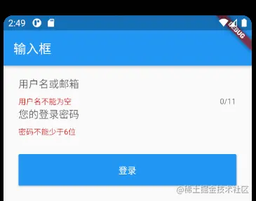
You cannot use form. In the onPressed method of the login button Of (context) because the context here is the context * * of InputText and the form Of (context) is to find the root according to the specified context, and FormState is in the subtree of InputText, so it can't**
The correct approach is to build the login button through the Builder, which will take the context of the widget node as the callback parameter:
Expanded(
  child: Builder(builder: (context) {
    return RaisedButton(
      padding: EdgeInsets.all(15),
      child: Text("Sign in"),
      color: Theme.of(context).primaryColor,
      textColor: Colors.white,
      onPressed: () {
        //Get the formState, call validate to verify the legitimacy,
        if ((Form.of(context)).validate()) {
          print('Verification successful');
        }
      },
    );
  }),
)
Copy code
Use this method
Refer to the actual combat of Flutter