Padding
Padding can add padding (leave blank) to child nodes, which is similar to the effect of margin. It is defined as follows:
Padding({
  ...
  EdgeInsetsGeometry padding,
  Widget child,
})
Copy code
EdgeInsetsGeometry is an abstract class. In development, we generally use EdgeInsets class. It is a subclass of EdgeInsetsGeometry and defines the method of setting filling
EdgeInsets
- From ltrb (double left, double top, double right, double bottom): specify the filling in four directions respectively
- all(double value): all directions are filled with the same value
- Only ({left, top, right, bottom}): you can set the filling in a specific direction, and you can specify multiple directions at the same time
- Symmetric ({vertical, horizontal}): used to set the filling direction of symmetry
Chestnuts
class PaddingTest extends StatelessWidget {
  @override
  Widget build(BuildContext context) {
    return Scaffold(
      appBar: AppBar(
        title: Text("padding"),
      ),
      body: Container(
        color: Colors.red,
        child: Padding(
          padding: EdgeInsets.fromLTRB(5, 10, 15, 20),
          child: Text("I am 345"),
        ),
      ),
    );
  }
}
Copy code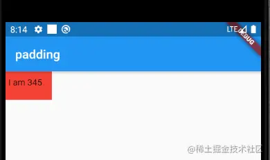
Size restricted containers
Size class is used to limit the size of containers. Many such attributes are provided in fluent, such as ConstrainedBox, SizedBox, UnconstrainedBox, AspectRatio, etc.
ConstrainedBox
ConstrainedBox is used to add additional constraints to subcomponents. For example, set the minimum height, etc
Chestnuts
class BoxTest extends StatelessWidget {
  @override
  Widget build(BuildContext context) {
    return Scaffold(
      appBar: AppBar(
        title: Text("Box"),
      ),
      body: getConstrainedBox(),
    );
  }

  Widget getConstrainedBox() {
    return ConstrainedBox(
      constraints: BoxConstraints(minWidth: double.infinity, minHeight: 50),
      child: DecoratedBox(
  		decoration: BoxDecoration(color: Colors.red),
		),
    );
  }
}
Copy code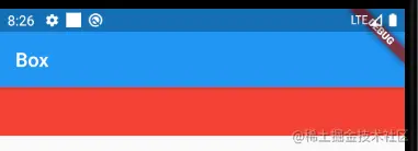
You can see that although the height of the Container is set to 10, the final display is 50 pixels. This is the minimum height of the ConstrainedBox, which takes effect
BoxConstraints
const BoxConstraints({
this.minWidth = 0.0, //Minimum width
this.maxWidth = double.infinity, //Maximum width
this.minHeight = 0.0, //Minimum height
this.maxHeight = double.infinity //Maximum height
})
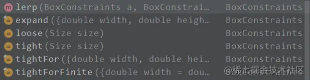
Copy codeBoxConstraints defines some convenient constructors for generating BoxConstraints quickly
- Generated size limit (GTH):
- expand(): you can generate BoxConstraints as large as possible
- There are others, as shown in the figure:
SizedBox
Used to fix the width and height of child elements, for example:
Widget getSizedBox() {
    return SizedBox(width: 50, height: 50, child: getRedBackground());
}
Widget getRedBackground() {
    return DecoratedBox(
      decoration: BoxDecoration(color: Colors.red),
    );
}
Copy code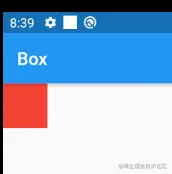
In fact, SizedBox is just a customization of ConstrainedBox
@override
RenderConstrainedBox createRenderObject(BuildContext context) {
  return RenderConstrainedBox(
    additionalConstraints: _additionalConstraints,
  );
}

BoxConstraints get _additionalConstraints {
  return BoxConstraints.tightFor(width: width, height: height);
}
Copy code
From the above source code, we can see that both Sized and ConstrainedBox are generated through RenderConstrainedBox, and their createRenderObject method returns a RenderConstrainedBox
Multiple restrictions
If a component has more than one parent ConstrainedBox, which one will take effect in the end? For example:
Widget getConstrainedBoxS() {
  return ConstrainedBox(
    constraints: BoxConstraints(minWidth: 90, minHeight: 50),
    child: ConstrainedBox(
      constraints: BoxConstraints(minWidth: 50, minHeight: 90),
      child: getRedBackground(),
    ),
  );
}
Copy code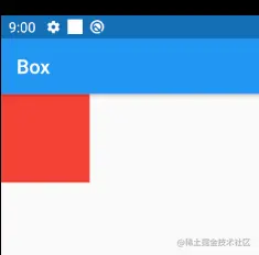
It can be seen from the above width and height that for minWidth and minHeight, the corresponding value between father and son is larger. In fact, only in this way can we ensure that the parent restriction does not conflict with the child restriction
UnconstrainedBox
This component will not impose any restrictions on sub components. It allows sub components to be drawn according to their own size. Generally, we rarely use this component, but it may be helpful to remove multiple restrictions, as follows:
Widget getUnConstrainedBox() {
  return ConstrainedBox(
    constraints: BoxConstraints(minWidth: 90, minHeight: 50),
    //Remove parent restrictions
    child: UnconstrainedBox(
      child: ConstrainedBox(
        constraints: BoxConstraints(minWidth: 50, minHeight: 90),
        child: getRedBackground(),
      ),
    ),
  );
}
Copy code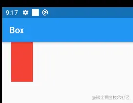
You can see that the parent restriction above has been canceled, and the final display is 50x50.
However, it should be noted that this restriction is actually removed. It can be seen from the figure that there is still blank left and right, that is, the parent restriction exists, but it does not affect the size of the child element getRedBackground(), but it still occupies the corresponding space. This must be noted.
So is there any way to completely remove restrictions? The answer is no! Therefore, if you want to limit the sub components in development, you should pay attention to it, because once you limit the specified conditions, it may be very difficult to customize the size of the sub components!
In the actual development, when we find that SizedBox or ConstrainedBox has been used to give the width and height of the sub element, but it still has no effect, we can almost conclude that there are restrictions set on the parent element!
For example, in the right menu of AppBar in the Material component, we use SizedBox to specify the size of the loading button. The code is as follows:
AppBar(
  title: Text("Box"),
  actions: [
    SizedBox(
      width: 20,
      height: 20,
      child: CircularProgressIndicator(
        strokeWidth: 3,
        valueColor: AlwaysStoppedAnimation(Colors.white70),
      ),
    )
  ],
),
Copy code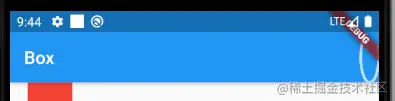
It can be seen that the loading does not change because of the set size. This is because the action restriction condition has been specified in the Appbar. Therefore, we need to remove the restriction according to the defined size of laoding, as follows:
actions: [
  UnconstrainedBox(
    child: Padding(
      padding: EdgeInsets.all(10),
      child: SizedBox(
        width: 20,
        height: 20,
        child: CircularProgressIndicator(
          strokeWidth: 3,
          valueColor: AlwaysStoppedAnimation(Colors.white70),
        ),
      ),
    ),
  )
],
Copy code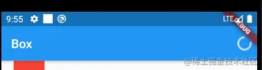
Padding is used above, and an inner margin is taken to prevent pasting on the right side of the screen
Other container restriction classes
In addition to the containers described above, there are other size limited containers, such as:
- AspectRatio: you can know the aspect ratio of sub components
- LimitedBox: used to specify the maximum width and height
- FractionallySizedBox can set the width and height of child components according to the width and height ratio of parent container,
Because these are relatively simple to use, you can understand them by yourself
Decorative container
DecoratedBox
DecoratedBox can draw some decorations before (or after) its sub components, such as background, border, gradient, etc. the definitions are as follows:
const DecoratedBox({
  Decoration decoration,
  DecorationPosition position = DecorationPosition.background,
  Widget child
})
Copy code- Decoration: represents the decoration to be drawn. Its type is decoration. It is an abstract class that defines an interface createBoxPainter(). The main responsibility of the subclass is to create a brush by implementing it, which is used to draw decoration.
- position: this attribute determines where to draw the Decoration. It accepts the enumeration type of decorationposition, which has two types:
- background: draw after subcomponents
- Foreground: draw on the sub components, that is, the foreground
BoxDecoration
We usually directly use BoxDecoration class, which is a subclass of Decoration and realizes the drawing of common decorative elements
BoxDecoration({
Color color, //colour
DecorationImage image,//picture
BoxBorder border, //frame
BorderRadiusGeometry borderRadius, //fillet
List<BoxShadow> boxShadow, //Shadows, you can specify multiple
Gradient gradient, //Gradual change
BlendMode backgroundBlendMode, //Background blending mode
BoxShape shape = BoxShape.rectangle, //shape
})
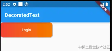
Copy codeBelow is a button to realize the gradient of background color with shadow
class DecoratedTest extends StatelessWidget {
  @override
  Widget build(BuildContext context) {
    return Scaffold(
      appBar: AppBar(
        title: Text("DecoratedTest"),
      ),
      body: Container(
        child: DecoratedBox(
          //Background: background, foreground: foreground
          position: DecorationPosition.background,
          decoration: BoxDecoration(
              //background gradient
              gradient:
                  LinearGradient(colors: [Colors.red, Colors.orange[700]]),
              //fillet
              borderRadius: BorderRadius.circular(10),
              //shadow
              boxShadow: [
                BoxShadow(color: Colors.black26, offset: Offset(2, 2))
              ]),
          child: Padding(
            padding: EdgeInsets.symmetric(horizontal: 80, vertical: 20),
            child: Text(
              "Login",
              style: TextStyle(color: Colors.white),
            ),
          ),
        ),
      ),
    );
  }
}
Copy code
DecoratedBox can be used to decorate sub elements. In the above example, gradient, fillet, shadow, etc. are used for decoration. The effects are as follows:
In fact, the function of DecoratedBox is similar to that of shap in android, which adds various styles to the control.
Transform transform
Transform can apply some matrix transformations to its sub components when drawing to realize some special effects.
Matrix4 is a 4D matrix, through which we can realize various rectangle operations, for example:
class TransformTest extends StatelessWidget {
  @override
  Widget build(BuildContext context) {
    return Scaffold(
      appBar: AppBar(
        title: Text("Transform"),
      ),
      body: Container(
        color: Colors.black,
        child: getSkewTransform(),
      ),
    );
  }

  Widget getSkewTransform() {
    return Transform(
      alignment: Alignment(-1, -1), //
      transform: Matrix4.skewY(0.3), //Tilt 0.3 radians along the Y axis
      child: Container(
        padding: const EdgeInsets.all(8),
        color: Colors.deepOrange,
        child: const Text('Apartment for rent!'),
      ),
    );
  }
}
Copy code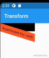
translation
Transform.translate accepts an offset parameter, which can translate the specified distance of the sub components along the x and y axes during drawing
//translation
Widget getTranslate() {
  return DecoratedBox(
    decoration: BoxDecoration(color: Colors.red),
    child: Transform.translate(
      offset: Offset(10, 10),
      child: Text("hello world"),
    ),
  );
}
Copy code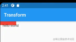
rotate
Transform.rotate can rotate and change sub components
Widget getRotate() {
  return DecoratedBox(
    decoration: BoxDecoration(color: Colors.red),
    child: Transform.rotate(
      angle: math.pi / 2, //Rotate 90 degrees
      child: Text("hello world"),
    ),
  );
}
Copy code
Note that math needs a guide bag
import 'dart:math' as math;
Copy code
zoom
Transform.scale can reduce or enlarge subcomponents
Widget getScale() {
  return DecoratedBox(
    decoration: BoxDecoration(color: Colors.red),
    child: Transform.scale(
      scale: 1.5,
      child: Text("hello world"),
    ),
  );
}
Copy code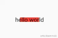
be careful
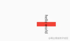
The change of Transform is in the drawing stage, not in the layout stage. Therefore, no matter what changes are made to the sub components, the size of the space occupied and the position on the screen remain unchanged, because these are determined in the layout stage, for example:
Widget getTest() {
  return Row(
    mainAxisAlignment: MainAxisAlignment.center,
    children: [
      getScale(),
      Text(
        "Hello",
        style: TextStyle(color: Colors.green, fontSize: 18),
      )
    ],
  );
}
Copy code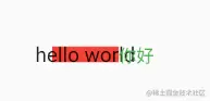
Since the space occupied by the Text in getScale is still red after it is enlarged, the second Text will be next to the red part and will eventually coincide
Since matrix transformation only works in the drawing stage, in some scenarios, when the UI needs to be changed, the visual UI change can be achieved through matrix transformation instead of re build ing the process, which will save the cost of layout, so the performance will be better. For example, the Flow component uses matrix transformation to update the UI internally. In addition, Transform is also widely used in the animation component of fluent to improve performance
RotatedBox
RotatedBox and transform The function of rotate is similar, but there is one difference: the change of RotatedBox is in the layout stage, which will affect the position and size of sub components
Modify the chestnuts above:
Widget getTest() {
  return Row(
    mainAxisAlignment: MainAxisAlignment.center,
    children: [
      getRotate(),
      Text(
        "Hello",
        style: TextStyle(color: Colors.green, fontSize: 18),
      )
    ],
  );
}
Widget getRotate() {
  return DecoratedBox(
    decoration: BoxDecoration(color: Colors.red),
    child: RotatedBox(
      quarterTurns: 1, //Rotate 90 degrees (1 / 4)
      child: Text("hello world"),
    ),
  );
}
Copy code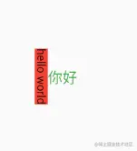
Because the RotatedBox acts on the layout stage, the sub components will rotate 90 degrees (instead of drawing content), and the decoration will act on the actual space occupied by the sub components, so the final effect is as shown in the figure above
Container
The container component has been used many times before. Container is a composite container, which does not correspond to a specific RenderObject. It is a multi-functional container composed of components such as DecoratedBox, ConstrainedBox, Transform, Padding and Align
Therefore, we only need a Container component to realize the scenes of decoration, change and restriction at the same time.
Container({
  this.alignment,
  this.padding, //The white filling in the container belongs to the decoration scope of decoration
  Color color, // Background color
  Decoration decoration, // Background decoration
  Decoration foregroundDecoration, //Foreground decoration
  double width,//Width of container
  double height, //Height of container
  BoxConstraints constraints, //Restrictions on container size
  this.margin,//The white filling outside the container does not belong to the decoration scope of decoration
  this.transform, //Transform
  this.child,
})
Copy code
Most of the properties of Container have been introduced, but there are two points to be mentioned:
- The size of the Container can be specified by the width and height attributes, or by constraints; If both exist, width and height take precedence. In fact, a constraint will be generated inside the Container according to width and height
- Color and decoration are mutually exclusive. If they are specified at the same time, an error will be reported! In fact, when color is specified, a decoration is automatically created in the Container
Chestnuts
class ContainerTest extends StatelessWidget {
  @override
  Widget build(BuildContext context) {
    return Scaffold(
      appBar: AppBar(
        title: Text("Container"),
      ),
      body: Container(
        margin: EdgeInsets.only(top: 50, left: 120),
        constraints: BoxConstraints.tightFor(width: 200, height: 150),
        decoration: BoxDecoration(
         borderRadius: BorderRadius.circular(12),
            //Background radial gradient
            gradient: RadialGradient(
                colors: [Colors.red, Colors.orange],
                center: Alignment.topLeft,
                radius: 58),
            //Card shadow
            boxShadow: [
              BoxShadow(
                  color: Colors.black54, offset: Offset(2, 2), blurRadius: 12),
            ]),
        child: Text("521", style: TextStyle(color: Colors.white, fontSize: 40)),
        transform: Matrix4.rotationZ(.2),
        alignment: Alignment(0,0),
      ),
    );
  }
}
Copy code
It can be seen that the contractor has the functions of multiple components. It can be seen from the source code that it is the combination of multiple components we introduced earlier. In fluent, the Container component is also an example in which combination takes precedence over inheritance
Padding and Margin
Container(
  margin: EdgeInsets.all(20.0), //White filling outside the container
  color: Colors.orange,
  child: Text("Hello world!"),
),
Container(
  padding: EdgeInsets.all(20.0), //Whitening in container
  color: Colors.orange,
  child: Text("Hello world!"),
),
Copy code
The effect is similar to that of padding/margin in Android. Padding is the inner margin and margin is the outer margin
In fact, margin and padding in the Container are implemented through the padding component. The above code is actually equivalent to the following code:
Padding(
  padding: EdgeInsets.all(20.0),
  child: DecoratedBox(
    decoration: BoxDecoration(color: Colors.orange),
    child: Text("Hello world!"),
  ),
),
DecoratedBox(
  decoration: BoxDecoration(color: Colors.orange),
  child: Padding(
    padding: const EdgeInsets.all(20.0),
    child: Text("Hello world!"),
  ),
),
Copy code
It's actually a Padding for the outermost layer
Scaffold, TabBar, bottom navigation
A complete routing page may include navigation bar, drawer menu and bottom Tab navigation bar menu. If each routing page needs to be completed manually by the developer, it will be a boring and troublesome thing.
Fortunately, some ready-made components are provided in the fluent material component library to reduce our development tasks
Scaffold
Scaffold is the skeleton of a routing page, which can easily assemble a complete page
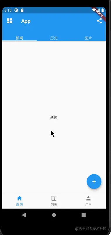
We implement a page that contains
1. Navigation bar, buttons of navigation bar
2. Drawer menu
3. Bottom navigation
4. Suspension button at the lower right corner
The implementation code is as follows:
class ScaffoldRoute extends StatefulWidget {
  @override
  State<StatefulWidget> createState() {
    return _ScaffoldRouteState();
  }
}

class _ScaffoldRouteState extends State<ScaffoldRoute> {
  int _selectedIndex = 0;

  @override
  Widget build(BuildContext context) {
    return Scaffold(
      appBar: AppBar(
        title: Text("App"),
        actions: [
          IconButton(
            icon: Icon(Icons.share),
            onPressed: () => {},
          )
        ],
      ),
      drawer: Drawer(
        child: Text("drawer",style: TextStyle(fontSize: 40,color:Colors.blue),),
      ),
      bottomNavigationBar: BottomNavigationBar(
        items: [
          BottomNavigationBarItem(icon: Icon(Icons.home), label: "home page"),
          BottomNavigationBarItem(icon: Icon(Icons.list_alt), label: "list"),
          BottomNavigationBarItem(icon: Icon(Icons.person), label: "user")
        ],
        currentIndex: _selectedIndex,
        fixedColor: Colors.blue,
        onTap: _onItemTapped,
      ),
      floatingActionButton: FloatingActionButton(
        child: Icon(Icons.add),
        onPressed: _add,
      ),
    );
  }

  void _onItemTapped(int index) {
    setState(() {
      _selectedIndex = index;
    });
  }
  void _add() {}
}
Copy code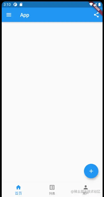
The components we use in the above code are:
- AppBar: a navigation bar skeleton
- MyDrawer: drawer menu
- BottomNavigationBar: bottom navigation bar
- FloatingActionButton: float button
AppBar
Appbar is a Material style navigation bar, through which you can set the title, navigation bar menu, navigation bottom tab, etc
AppBar({
  Key key,
  this.leading, //The leftmost Widget on the navigation bar is usually a drawer menu button or a return button.
  this.automaticallyImplyLeading = true, //If leading is null, whether to automatically implement the default leading button
  this.title,// Page title
  this.actions, // Navigation bar right menu
  this.bottom, // The menu at the bottom of the navigation bar, usually a Tab button group
  this.elevation = 4.0, // Navigation bar shadow
  this.centerTitle, //Is the title centered
  this.backgroundColor,
  ...   //See source code Notes for other attributes
})
Copy code
If a drawer menu is added to Scaffold, by default, Scaffold will automatically set the leading of AppBar as the menu button (as shown in the screenshot above), and click it to open the drawer menu.
If you want to customize the menu icon, you can manually set the leading. For example:
AppBar(
  title: Text("App"),
  leading: Builder(builder: (context) {
    return IconButton(
      icon: Icon(
        Icons.dashboard,
        color: Colors.white,
      ),
      onPressed: () => {Scaffold.of(context).openDrawer()},
    );
  }),
  ...........
 )
Copy code
You can see that the menu on the left has been replaced successfully
The method to open the drawer is in Scaffold State through Scaffold Of() can get the State object of the nearest Scaffold component of the abdominal muscle
ToolBar
Next, create a TabBar component through the Bottom attribute in the AppBar, which can quickly generate the Tab menu,
class _ScaffoldRouteState extends State<ScaffoldRoute> with SingleTickerProviderStateMixin{
  int _selectedIndex = 0;

  TabController _tabController;
  List tabs = ["Journalism", "history", "picture"];

  @override
  void initState() {
    super.initState();
    _tabController = TabController(length: tabs.length, vsync: this);
  }

   AppBar(
        title: Text("App"),
        bottom: TabBar(
          controller: _tabController,
          tabs: tabs.map((e) => Tab(text: e)).toList(),
        ),
        ........
      )

  }
Copy code
The above code creates a TabController, which is used to listen to Tab menu switching, and then generates a menu bar through tabBar.
The tabs property of TabBar accepts a Widget array to represent each Tab submenu. We can customize the component style or directly use the Tab component as in the example
The Tab component has three optional parameters. In addition to knowing the text, you can also specify the Tab menu icon or customize the component style. The definitions are as follows:
Tab({
  Key key,
  this.text, // menu text
  this.icon, // Menu icon
  this.child, // Custom component styles
})
Copy code
Developers can customize according to the actual needs
TabBarView
Through TabBar, we can only generate a static menu, and the real Tab page has not been realized. Because the Tab menu and Tab page need to be switched, we need to monitor the switching of Tab menu through TabController, and then switch the Tab page. The code is as follows:
_tabController.addListener((){
  switch(_tabController.index){
    case 1: ...;
    case 2: ... ;
  }
});
Copy code
If the Tab page can slide and switch, you also need to update the offset of the TabBar indicator during the sliding process. Obviously, this is very troublesome!
To this end, the Material library provides a TabBarView component, which can not only easily realize the Tab page, but also easily cooperate with the TabBar to realize the synchronization of switching and sliding States, as follows:
body: TabBarView(
  controller: _tabController,
  children: tabs.map((e) {
    return Container(
      alignment: Alignment.center,
      child: Text(e),
    );
  }).toList(),
),
Copy code
Now, whether you click Tab or slide the page, the Tab page will switch,
In the above example, the controllers of TabBar and TabBarView are the same. That's why TabBar and TabBarView realize menu switching and sliding state synchronization through one controller. The effects are as follows:
In addition, the Material component library also provides a pageview component, which has similar functions to TabBarView. Next, reorganize the above examples and use pageview to move the navigation bar below
class ScaffoldRoute extends StatefulWidget {
  @override
  State<StatefulWidget> createState() {
    return _ScaffoldRouteState();
  }
}

class _ScaffoldRouteState extends State<ScaffoldRoute>
    with SingleTickerProviderStateMixin {
  int _selectedIndex = 0;

  PageController _pageController;
  TabController _tabController;
  List tabs = ["Journalism", "history", "picture"];

  @override
  void initState() {
    super.initState();
    _tabController = TabController(length: tabs.length, vsync: this);
    _pageController = PageController();
    _tabController.addListener(() {
      print(_tabController.index);
    });
  }

  @override
  Widget build(BuildContext context) {
    return Scaffold(
      body: PageView(
        controller: _pageController,
        children: [
          home(),
          Container(
            alignment: Alignment.center,
            child: Text("list"),
          ),
          Container(
            alignment: Alignment.center,
            child: Text("user"),
          )
        ],
      ),
      bottomNavigationBar: BottomNavigationBar(
        items: [
          BottomNavigationBarItem(icon: Icon(Icons.home), label: "home page"),
          BottomNavigationBarItem(icon: Icon(Icons.list_alt), label: "list"),
          BottomNavigationBarItem(icon: Icon(Icons.person), label: "user")
        ],
        currentIndex: _selectedIndex,
        fixedColor: Colors.blue,
        onTap: _onItemTapped,
      ),
    );
  }

  Widget home() {
    return Scaffold(
      drawer: Drawer(
        child: Text(
          "drawer",
          style: TextStyle(fontSize: 40, color: Colors.blue),
        ),
      ),
      appBar: AppBar(
        title: Text("App"),
        leading: Builder(builder: (context) {
          return IconButton(
            icon: Icon(
              Icons.dashboard,
              color: Colors.white,
            ),
            onPressed: () => {Scaffold.of(context).openDrawer()},
          );
        }),
        actions: [
          IconButton(
            icon: Icon(Icons.share),
            onPressed: () => {},
          )
        ],
        bottom: TabBar(
          controller: _tabController,
          tabs: tabs.map((e) => Text(e)).toList(),
        ),
      ),
      body: TabBarView(
        controller: _tabController,
        children: tabs.map((e) {
          return Container(
            alignment: Alignment.center,
            child: Text(e),
          );
        }).toList(),
      ),
      floatingActionButton: FloatingActionButton(
        child: Icon(Icons.add),
        onPressed: _add,
      ),
    );
  }

  void _onItemTapped(int index) {
    setState(() {
      _selectedIndex = index;
    });
    _pageController.jumpToPage(index);
  }

  void _add() {}
}
Copy code
The effect is as follows:
Drawer menu drawer
The drawer and endDrawer properties of Scaffold can accept a Widget as the left and right drawer menus respectively. The above example also uses the left drawer menu, which is modified as follows:
class DrawerTest extends StatelessWidget {
  @override
  Widget build(BuildContext context) {
    return  Drawer(
      child: MediaQuery.removePadding(
        context: context,
        //Remove the top of the drawer menu and leave it blank by default
        removeTop: true,
        child: Column(
          crossAxisAlignment: CrossAxisAlignment.start,
          children: [
            Padding(
              padding: const EdgeInsets.only(top: 38),
              child: Row(
                children: [
                  Padding(
                    padding: const EdgeInsets.symmetric(horizontal: 16),
                    child: ClipOval(
                      child: Image.asset(
                        "images/icon.png",
                        width: 80,
                      ),
                    ),
                  ),
                  Text(
                    "file",
                    style: TextStyle(fontWeight: FontWeight.bold),
                  )
                ],
              ),
            ),
            Expanded(
              child: ListView(
                children: [
                  ListTile(
                    leading: const Icon(Icons.add),
                    title: const Text('Add account'),
                  ),
                  ListTile(
                    leading: const Icon(Icons.settings),
                    title: const Text('Manage accounts'),
                  ),
                ],
              ),
            )
          ],
        ),
      ),
    );
  }
}
Copy code
drawer: Drawer( child: DrawerTest(), ), Copy code
The final effect is as follows:
Drawer menus usually take the drawer component as the root node. It is a menu panel in Materal style, mediaquery Removepadding can remove some of the default white space in the drawer
Bottom Tab navigation bar
We can set the bottom navigation through the BottomNavigationBar property of Scaffold. As in the above example, we implement the bottom navigation bar through the BottomNavigationBar and BottomNavigationBarItem provided by the Material component. The code is also very simple
But what to do if you want to achieve some special effects? Example:
bottomNavigationBar: BottomAppBar(
        color: Colors.white,
        shape: CircularNotchedRectangle(),
        child: Row(
          children: [
            IconButton(
              icon: Icon(Icons.home),
              onPressed: () => _pageController.jumpToPage(0),
            ),
            SizedBox(), //The middle position is empty
            IconButton(
              icon: Icon(Icons.business),
              onPressed: () => _pageController.jumpToPage(2),
            )
          ],
          //Divide the space of the bottom navigation bar equally
          mainAxisAlignment: MainAxisAlignment.spaceAround,
        ),
      ),
      floatingActionButton: FloatingActionButton(
        child: Icon(Icons.add),
        onPressed: () => _pageController.jumpToPage(1),
      ),
      floatingActionButtonLocation: FloatingActionButtonLocation.centerDocked,
Copy code
The effect is as follows:
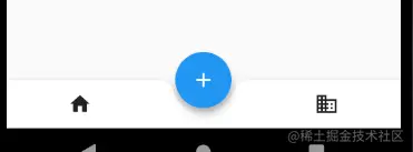
You can see that there is no attribute of punching position in the above code. In fact, the punching position depends on the position of FloatingActionButton, which is floatingactionbuttonlocation Centerdocked, so the punching position is in the middle of the bottom navigation bar
The shape attribute of BottomAppBar determines the shape of the hole. Circular notchedrectangle implements a circular shape, which can also be customized;
Tailoring
Some clipping functions are provided in fluent for clipping components.
Crop Widget | effect |
|---|---|
ClipOval | When the sub component is square, it is clipped as an inscribed circle; when it is rectangular, it is clipped as an inscribed ellipse in the Wie |
ClipRRect | Clipping subcomponents into rounded rectangles |
ClipRect | Clip subcomponents to the size of the rectangle actually occupied (overflow cutting) |
Chestnuts
Widget avatar = Image.asset("images/avatar.jpg", width: 80,);
Copy code
Scaffold(
appBar: AppBar(
title: Text("Tailoring"),
),
body: Center(
child: Column(
children: [
//Original drawing
avatar,
//Clip to circle
ClipOval(
child: avatar,
),
//Clip to rounded rectangle
ClipRRect(
borderRadius: BorderRadius.circular(5),
child: avatar,
),
Row(
mainAxisAlignment: MainAxisAlignment.center,
children: [
//Align: adjust the position of sub components,
Align(
alignment: Alignment.topLeft,
widthFactor: .5,//Own = subcomponent x widthFactor
child: avatar,
),
Text(
"Hello World",
style: TextStyle(color: Colors.green),
)
],
),
Row(
mainAxisAlignment: MainAxisAlignment.center,
children: [
// Clip the overflow part
ClipRect(
child: Align(
alignment: Alignment.topLeft,
widthFactor: .5,
child: avatar,
),
),
Text(
"Hello World",
style: TextStyle(color: Colors.green),
)
],
)
],
),
),
);
Copy code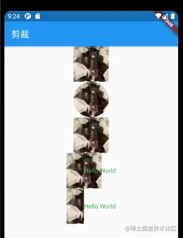
It should be noted that after Align's widthFactor is 0.5, the actual width of the image is equal to 0.5 * 80, that is, half of the width
CustomClippear
If we want to clip a specific area of the sub component, for example, in the picture in the above example, what should we do if we only want to intercept the 40 * 30 upward range in the picture?
At this time, you can use CustomClipper to customize the clipping area, as shown below
1. Customize CustomClipper:
class MyClipper extends CustomClipper<Rect> {
  @override
  Rect getClip(Size size) {
    return Rect.fromLTWH(10, 15, 40, 30);
  }

  @override
  bool shouldReclip(covariant CustomClipper<dynamic> oldClipper) => false;

}
Copy code- getClip The method to obtain the clipping area. The picture size is 80 * 80, and the area we return is rect From ltwh (10, 15, 40, 30), that is, the range of 40 * 30 pixels in the picture
- shouldReclip Whether to re clip. If the clipping area will not change in the application, false should be returned, so that re cutting will not be triggered to avoid unnecessary overhead. If there is a change (such as an animation in the clipping area), you should return true to perform the clipping again after the change
2. Perform clipping through ClipRect
DecoratedBox(
  decoration: BoxDecoration(color: Colors.red),
  child: ClipRect(
    child: avatar,
    clipper: MyClipper(),
  ),
)
Copy code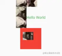
As shown above, it can be seen that the clipping is successful, but the size occupied by the picture is still 80 * 80. This is because the clipping is carried out in the drawing stage after the layout is completed, so it will not affect the size of the component. This transformation principle is similar.
Refer to the actual combat of Flutter