
Note: without special instructions, the versions of Flutter and Dart are as follows:
- Flutter version: 1.12.13+hotfix.5
- Dart version: 2.7.0
DatePicker
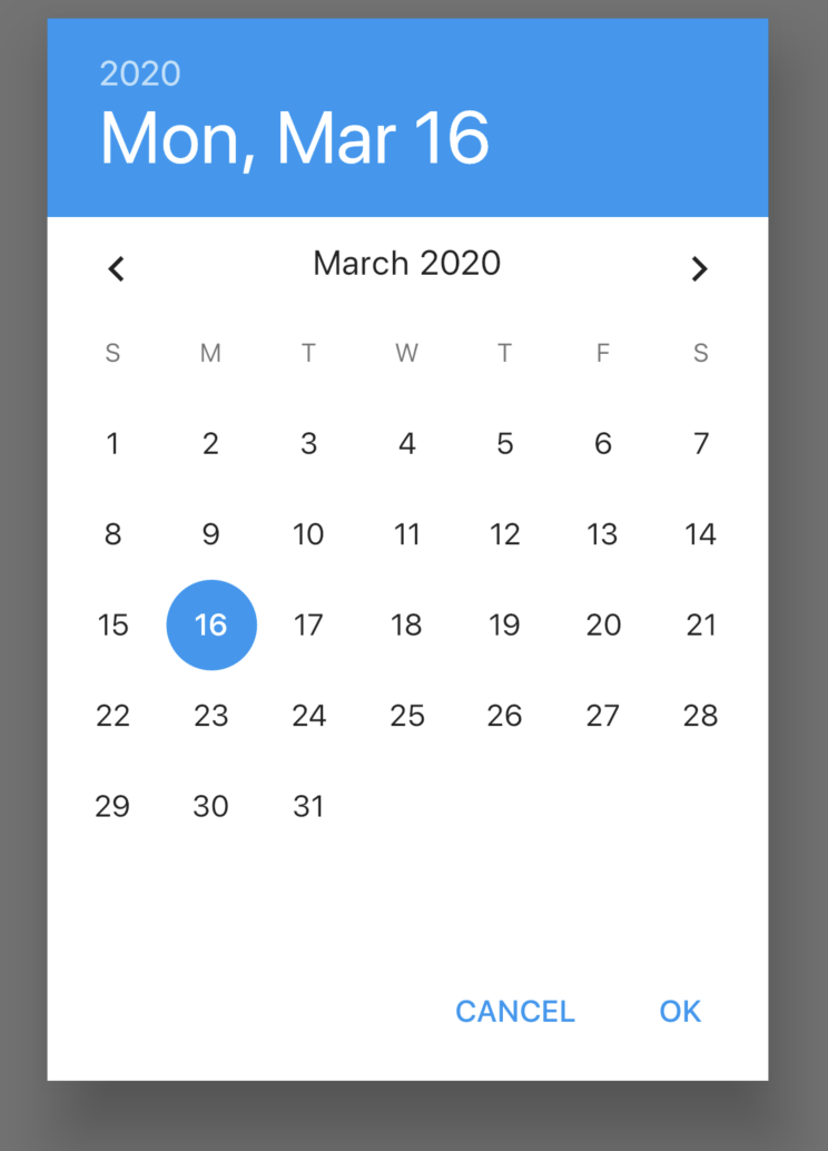
The Flutter does not have the DatePicker control. You need to use the showDatePicker method to pop up the date selection control. The basic usage is as follows:
RaisedButton(
  onPressed: () async {
    var result = await showDatePicker(
        context: context,
        initialDate: DateTime.now(),
        firstDate: DateTime(2020),
        lastDate: DateTime(2021));
    print('$result');
  },
)
initialDate initialization time, usually set to the current time.
The first date indicates the start time. After setting, the selector cannot select a time less than this value.
lastDate indicates the end time. After setting, the selector cannot select a time greater than this value.
The showDatePicker method is the Future method. Click the "OK" button of the date selection control to return to the selected date.
The effect is as follows:
The selectableDayPredicate parameter controls the optional date. Returning true indicates that the date is optional. The usage is as follows:
showDatePicker(
  selectableDayPredicate: (DateTime day) {
    return day.difference(DateTime.now()).inDays < 2;
  },
  ...
)
Indicates the time before the day after tomorrow. The effect is as follows:
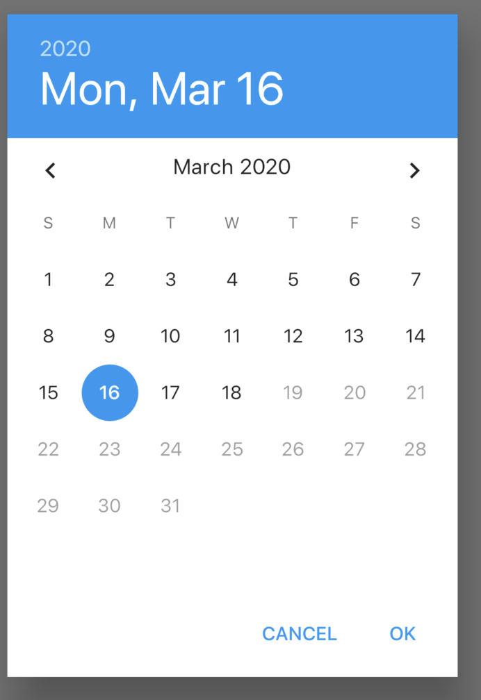
19 and later dates are grayed out and are not optional.
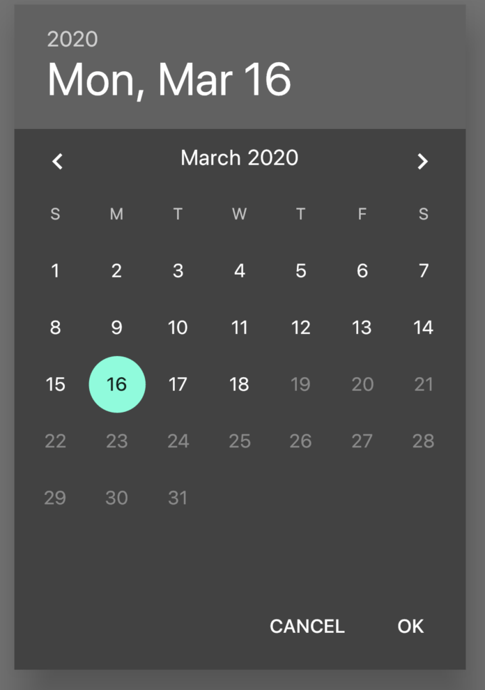
The builder parameter is used to set the setting sub control. For example, the usage of setting the dark theme is as follows:
showDatePicker(
  builder: (context, child) {
    return Theme(
      data: ThemeData.dark(),
      child: child,
    );
  },
    ...
)
The effect is as follows:
Chinese support
Add internationalization processing and support in pubspec.yaml:
dependencies:
  flutter:
    sdk: flutter
  flutter_localizations:
    sdk: flutter
Add internationalization support in the top-level control MaterialApp:
MaterialApp(
localizationsDelegates: [
GlobalMaterialLocalizations.delegate,
GlobalWidgetsLocalizations.delegate,
],
supportedLocales: [
const Locale('zh', 'CH'),
const Locale('en', 'US'),
],
locale: Locale('zh'),
...
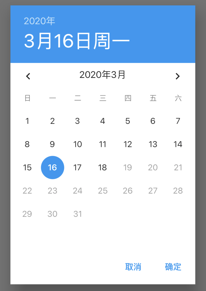
)Set the local parameter of showDatePicker as follows:
showDatePicker(
  locale: Locale('zh'),
  ...
)
The effect is as follows:
TimePicker
Like DatePicker, TimePicker needs to use the showTimePicker method as follows:
RaisedButton(
onPressed: () async {
showTimePicker(
context: context, initialTime: TimeOfDay.now());
},
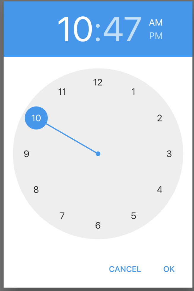
)The effect is as follows:
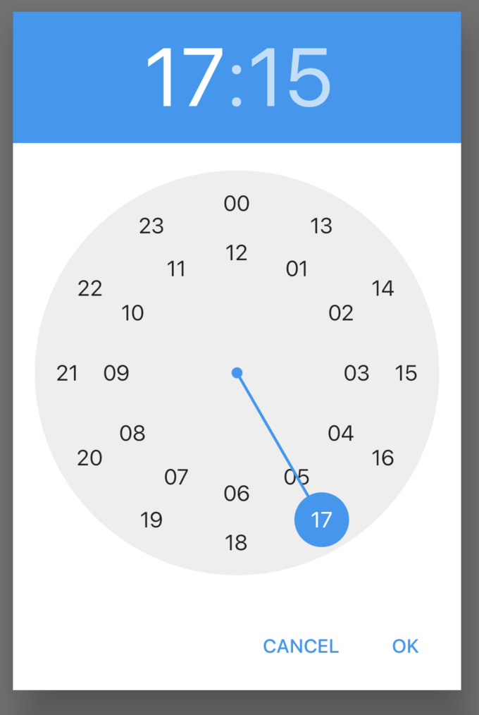
The builder parameter is used to control the child control. You can set the dark theme like the DatePicker, and also set its display for 24 hours. The usage is as follows:
showTimePicker(
    context: context,
    initialTime: TimeOfDay.now(),
    builder: (context, child) {
      return MediaQuery(
        data: MediaQuery.of(context)
            .copyWith(alwaysUse24HourFormat: true),
        child: child,
      );
    });
The effect is as follows:
Chinese support
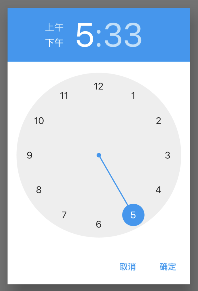
Add internationalization support. The steps are the same as that of DatePicker in Chinese, but showTimePicker does not have local parameters. Use builder parameter settings, as follows:
showTimePicker(
    context: context,
    initialTime: TimeOfDay.now(),
    builder: (context, child) {
      return Localizations(
          locale: const Locale('zh'),
          child: child,
          delegates: <LocalizationsDelegate>[
            GlobalMaterialLocalizations.delegate,
            GlobalWidgetsLocalizations.delegate,
          ]
      );
    });
The effect is as follows:
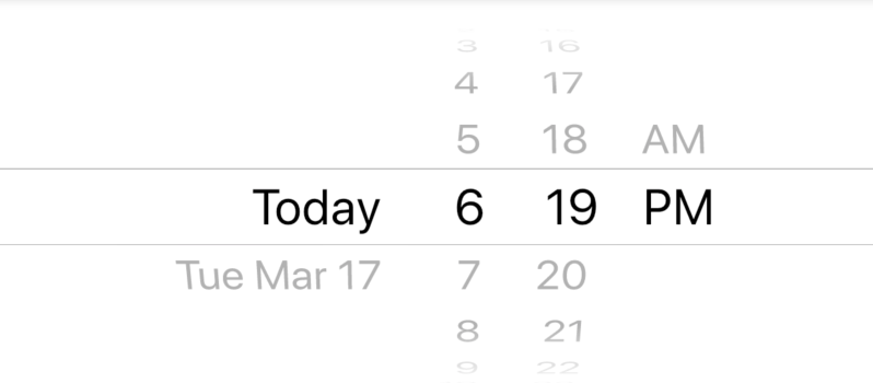
CupertinoDatePicker
ios style date selector, which is used as follows:
 var _dateTime = DateTime.now();
CupertinoDatePicker(
  initialDateTime: _dateTime,
  onDateTimeChanged: (date) {
    setState(() {
      _dateTime = date;
    });
  },
)
The effect is as follows:
The mode parameter formats the date:
- Time: display time only, effect: 4 | 14 | PM
- Date: only show date, effect: July | 13 | 2012
- dateAndTime: time and date are displayed, effect: Fri Jul 13 | 4 | 14 | PM
Set the maximum and minimum dates:
CupertinoDatePicker(
  minimumDate: DateTime.now().add(Duration(days: -1)),
  maximumDate: DateTime.now().add(Duration(days: 1)),
  ...
)
The effect is as follows:
Use the 24-hour system:
CupertinoDatePicker(
use24hFormat: true,
...
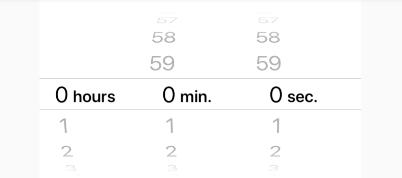
)CupertinoTimerPicker
Cupertino timerpicker is an ios style time selector. Its basic usage is as follows:
CupertinoTimerPicker(
  onTimerDurationChanged: (Duration duration){
  },
)
The effect is as follows:
Set to display only hours and minutes:
CupertinoTimerPicker(
  mode: CupertinoTimerPickerMode.hm,
  ...
)
By default, Cupertino timerpicker displays 0:0:0, setting the display current time:
var now = DateTime.now();
return Container(
  height: 200,
  child: CupertinoTimerPicker(
    initialTimerDuration: Duration(hours: now.hour,minutes: now.minute,seconds: now.second),
    onTimerDurationChanged: (Duration duration) {},
  ),
);
Welcome to Flutter's wechat group (mqd_zzy) to learn and progress together. Life is not just about living in front of you, but also about poetry and far away.
Of course, I also very much hope that you will pay attention to my official account, which contains all kinds of benefits.