Layout components will contain one or more components. Different layout components have different ways to layout sub components. In fluent, the Element tree is the final drawing tree. The Element tree is created through the Widget tree (through Widget.createElement()), and the Widget is actually the configuration data of the Element.
In Fluter, widgets are divided into three categories according to whether they need to include child nodes, corresponding to three elements, as shown in the following table:
Widget | Corresponding Element | purpose |
|---|---|---|
LeafRenderObjectWidget | LeafRenderObjectElement | The leaf node of the Widget tree is used for widgets without child nodes. It belongs to this category through basic components, such as Image |
SingleChildRenderObjectWidget | SingleChindRenderObjectElement | Contains a child Widget, such as: ConstrainedBox, DecoratedBox, etc |
MultiChildRenderObjectWidget | MultiChildRenderObjectElement | It contains multiple child widgets. Generally, it has a children parameter to receive an array of widgets, such as Row, Column, Stack, etc |
Many widgets in fluent inherit from StatelessWidget or StatefulWidget, and then build the real RenderObjectWidget in the build method. For example, Text inherits from StatelessWidget, and then builds a subtree through RichText in the build method, while RichText inherits from MultiChildRenderObjectWidget. Therefore, Text belongs to multichildrenderwidget (other widgets can also be described in this way). In fact, stateleswidget and StatefulWidget are the base classes of two widgets used for combination, and they are not associated with the final rendering object (RenderObjectWidget)
MultiChildRenderObjectWidget inherits from RenderObjectWidget. The method of creating and updating RenderObject is defined in RenderObjectWidget. Subclasses must implement them. In fact, RenderObject is the final layout and the object of rendering UI interface, that is, for layout components, Its layout algorithms are implemented through the corresponding RenderObject object. Therefore, the method of creating and updating RenderObject is implemented in RichText
Layout components are widgets that directly or indirectly inherit (contain) multichildrenderobjectwidgets. They generally have a children attribute to receive child widgets.
A common Widget inheritance route is:
Inherit the (Stateless/Stateful)Widget, and then implement the build method
In the build method, create a class inherited from (Leaf/SingleChild/MultiChild)RenderObjectWidget, and then implement the corresponding method to build the final render UI interface object (RenderObject)
While (Leaf/SingleChild/MultiChild)RenderObjectWidget inherits from RenderObjectWidget, and finally inherits from Widget.
The method of creating and updating RenderObject is defined in RenderObjectWidget and Widget. And the createElement method.
In fact, the createElement method is implemented in the (Leaf/SingleChild/MultiChild)RenderObjectWidget class, while creating and updating ObjectRender is completed in the implementation class of (Leaf/SingleChild/MultiChild)RenderObjectWidget
Linear layout (Row and Column)
Linear layout refers to the arrangement of sub components in a horizontal or vertical direction. Linear layout is realized through Row and Column in fluent, which is similar to the LinearLayout control in Android
Both Row and Column inherit the sub Flex, and Fiex won't talk more about it for the time being
Spindle and longitudinal axis
In linear layout, if the layout is horizontal, the main axis refers to the horizontal direction and the vertical axis refers to the vertical direction; If the layout is vertical and the main axis is vertical, the vertical axis is horizontal.
In linear layout, there are two enumeration classes that define alignment, MainAxisAlignment and CrossAxisAlignment, which represent spindle alignment and vertical axis alignment respectively
Row
The widgets can be arranged horizontally. It is defined as follows:
Row({
  //......
  MainAxisAlignment mainAxisAlignment = MainAxisAlignment.start,
  MainAxisSize mainAxisSize = MainAxisSize.max,
  CrossAxisAlignment crossAxisAlignment = CrossAxisAlignment.center,
  TextDirection? textDirection,
  VerticalDirection verticalDirection = VerticalDirection.down,
  TextBaseline textBaseline = TextBaseline.alphabetic,
  List<Widget> children = const <Widget>[],
})
Copy code- textDirection: the layout order of horizontal components. The default is the text direction of the current Locale environment of the system (Chinese and English are left to right, while Arabic is right to left)
- mainAxisSize: indicates the space occupied by the Row in the spindle (horizontal), such as mainAxisSize Max means to occupy as much space in the horizontal direction as possible. At this time, no matter how much space the sub Widget occupies, the width of Row is always equal to the maximum width in the horizontal direction; MainAxisSize.min means to occupy as little horizontal space as possible. When the sub Widget does not occupy the remaining horizontal space, the actual width of the Row is equal to the horizontal space occupied by all sub components. In fact, it is equivalent to match in Android_ Parent and warp_parent
- mainAxisAlignment: indicates the alignment of the horizontal space occupied by the sub components in the Row. If the value of mainaxisize is min, this attribute is meaningless, and the corresponding values are start, center, end, etc. It should be noted that textDirection is the reference system of mainAxisAlignment. For example, textDirection is textDirection LTR, mainAxisAlignment Start indicates left alignment. If it is rtl, start indicates right alignment
- crossAxisAlignment: indicates the alignment of sub components on the vertical axis. Its values are also start, center and end. However, the reference system is the value of verticalDirection, which is similar to the above, but the direction has changed
- children: array of subcomponents
Chestnuts
class RowTest extends StatelessWidget {
  @override
  Widget build(BuildContext context) {
    return Scaffold(
      appBar: AppBar(
        title: Text("Linear layout Row,Column"),
      ),
      body:  Column(
        crossAxisAlignment: CrossAxisAlignment.start,
        children: [
          Row(
            mainAxisAlignment: MainAxisAlignment.center,
            children: [Text("Hello word"), Text("345")],
          ),
          Row(
            mainAxisSize: MainAxisSize.min,
            mainAxisAlignment: MainAxisAlignment.center,
            children: [Text("Hello word"), Text("345")],
          ),
          Row(
            mainAxisSize: MainAxisSize.max,
            mainAxisAlignment: MainAxisAlignment.end,
            children: [Text("Hello word"), Text("345")],
          ),
          Row(
            mainAxisAlignment: MainAxisAlignment.end,
            textDirection: TextDirection.rtl,
            children: [Text("Hello word"), Text("345")],
          ),
          Row(
            crossAxisAlignment: CrossAxisAlignment.start,
            verticalDirection: VerticalDirection.up,
            children: [
              Text(
                "Hello word",
                style: TextStyle(fontSize: 30),
              ),
              Text("345")
            ],
          )
        ],
      )
    );
  }
}
Copy code
Column
Column can arrange its sub components in the vertical direction. The parameters are the same as Row, but the arrangement is vertical, and the main axis is opposite to the vertical axis.
Chestnuts
class ColumnTest extends StatelessWidget {
  @override
  Widget build(BuildContext context) {
    return Scaffold(
      appBar: AppBar(
        title: Text("Linear layout Row,Column"),
      ),
      body: Column(
        crossAxisAlignment: CrossAxisAlignment.center,
        children: [Text("Hi"), Text("World")],
      ),
    );
  }
}
Copy code
Since the size of the spindle is specified, it defaults to max. The Column will occupy as much space as possible, and the height of the screen is in the chestnut
crossAxisAlignment is center, which means center alignment on the vertical axis. The width of Colum depends on the Widget with the largest width among its child widgets, so hi will be displayed in the middle of the world
Both Row and Column will only occupy the largest possible space on the main axis, and the length of the vertical axis depends on the length of their largest child Widget
There are two ways to align hi and world in the middle of the screen:
class ColumnTest extends StatelessWidget {
  @override
  Widget build(BuildContext context) {
    return Scaffold(
      appBar: AppBar(
        title: Text("Linear layout Row,Column"),
      ),
      body: ConstrainedBox(
        constraints: BoxConstraints(minWidth: double.infinity),
        child: Column(
          crossAxisAlignment: CrossAxisAlignment.center,
          mainAxisAlignment: MainAxisAlignment.center,
          children: [Text("Hi"), Text("World")],
        ),
      ),
    );
  }
}
Copy code
exceptional case
If Row nested Row or Column nested Column, the outermost Row/Column will occupy as much space as possible,
class ColumnTest extends StatelessWidget {
  @override
  Widget build(BuildContext context) {
    return Scaffold(
        appBar: AppBar(
          title: Text("Linear layout Row,Column"),
        ),
        body: Container(
          color: Colors.green,
          child: Padding(
            padding: const EdgeInsets.all(16.0),
            child: Column(
              crossAxisAlignment: CrossAxisAlignment.start,
              mainAxisSize: MainAxisSize.max, //Effective, the outer Colum height is the entire screen
              children: <Widget>[
                Container(
                  color: Colors.red,
                  child: Column(
                    mainAxisSize: MainAxisSize.max, //Invalid. The inner Colum height is the actual height
                    children: <Widget>[
                      Text("hello world "),
                      Text("I am Jack "),
                    ],
                  ),
                )
              ],
            ),
          ),
        ));
  }
}
Copy code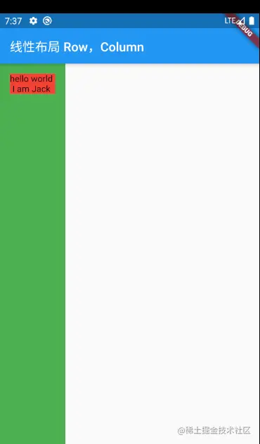
In this case, you can use the Expanded component
children: <Widget>[
 Expanded(
   child:  Container(
     color: Colors.red,
     child: Column(
       mainAxisSize: MainAxisSize.max, //Invalid. The inner Colum height is the actual height
       children: <Widget>[
         Text("hello world "),
         Text("I am Jack "),
       ],
     ),
   ),
 )
]
Copy code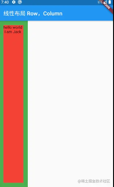
Flexible layout Flex
Elastic layout allows child components to allocate a certain proportion of parent container space. The flexible layout in the shuttle is mainly realized through the cooperation of Flex and Expanded
Flex components can arrange sub components along the horizontal or vertical direction. If you know the direction of the spindle, it will be more convenient to use Row or Column. Both Row and Column inherit the sub flex, and the parameters are basically the same, so Row or Column can be used where flex can be used.
Flex can cooperate with Expanded components to realize flexible layout. Most parameters are basically the same as linear layout. They are not introduced here. They are defined as follows
Flex({
  Key? key,
  required this.direction,
  List<Widget> children = const <Widget>[],
})
Copy code- Direction: the direction of the elastic layout. Row defaults to the horizontal direction and Column defaults to the vertical direction
Flex inherits from the MultiChildRenderObjectWidget. The corresponding renderoflex is RenderFlex, and its layout algorithm is implemented in RenderFlex
Expanded
The space occupied by Row, Column and Flex subcomponents can be expanded proportionally
const Expanded({
  int flex = 1,
  @required Widget child,
})
Copy code- Flex: elasticity coefficient. If it is 0 or null, there is no elasticity and the occupied space will not be Expanded. If it is greater than 0, all Expanded will separate all the free space of the spindle according to the proportion of flex
Chestnuts
class FlexTest extends StatelessWidget {
  @override
  Widget build(BuildContext context) {
    return Scaffold(
      appBar: AppBar(
        title: Text("Elastic layout Flex"),
      ),
      body: Column(
        children: [
          Flex(
            direction: Axis.horizontal,
            children: [
              Expanded(
                flex: 1,
                child: Container(
                  height: 30,
                  color: Colors.red,
                ),
              ),
              Expanded(
                flex: 2,
                child: Container(
                  height: 30,
                  color: Colors.blue,
                ),
              )
            ],
          ),
          Padding(
            padding: const EdgeInsets.only(top: 20),
            child: SizedBox(
              height: 100,
              child: Flex(
                direction: Axis.vertical,
                children: [
                  Expanded(
                    flex: 2,
                    child: Container(
                      height: 30,
                      color: Colors.yellow,
                    ),
                  ),
                  Spacer(
                    flex: 1,
                  ),
                  Expanded(
                    flex: 1,
                    child: Container(
                      height: 30,
                      color: Colors.green,
                    ),
                  )
                ],
              ),
            ),
          )
        ],
      ),
    );
  }
}
Copy code
The effect is as follows:
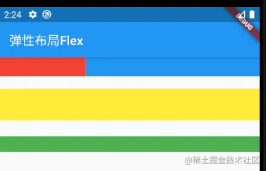
The function of Spacer in chestnut is to occupy a specified proportion of space. In fact, it is just a wrapper class of Expanded
Flow layout Wrap, flow
When using Row and Column, if the child Widget exceeds the screen range, an overflow error will be reported, such as:
class WrapAndFlowTest extends StatelessWidget {
  @override
  Widget build(BuildContext context) {
    return Scaffold(
      appBar: AppBar(
        title: Text("WarpAndFlow"),
      ),
      body: Container(
        height: 100,
        child: Row(
          mainAxisAlignment: MainAxisAlignment.start,
          mainAxisSize: MainAxisSize.max,
          crossAxisAlignment: CrossAxisAlignment.center,
          children: [Text("345" * 100)],
        ),
      ),
    );
  }
}
Copy code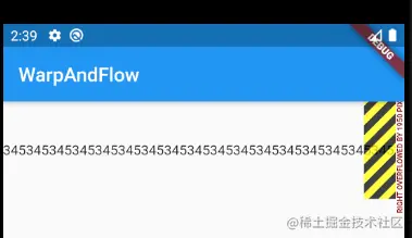
You can see that the overflow error is reported in the right part. This is because Row has only one line by default. If it exceeds the screen, it will not break the line and will report an error
We call the layout beyond automatic line folding as Flow layout. Fluent supports Flow layout through Wrap and Flow.
Wrap is defined as follows
Wrap({
  ...
  this.direction = Axis.horizontal,
  this.alignment = WrapAlignment.start,
  this.spacing = 0.0,
  this.runAlignment = WrapAlignment.start,
  this.runSpacing = 0.0,
  this.crossAxisAlignment = WrapCrossAlignment.start,
  this.textDirection,
  this.verticalDirection = VerticalDirection.down,
  List<Widget> children = const <Widget>[],
})
Copy code
You can see that there are many attributes in Row and Colum, such as direction, textDirection, etc. these parameters have the same meaning, but I won't introduce them here
- Spacing: spacing of subwidgets in the direction of the main axis
- runSpacing: spacing along the longitudinal axis
- runAlignment: alignment of the vertical axis
example
class WrapAndFlowTest extends StatelessWidget {
  final List<String> _list = const [
    "Love is you and me",
    "A pot of old wine",
    "The Hottest Ethnic Trend",
    "Life in full bloom",
    "Goodbye youth",
    "Beijing, Beijing"
  ];

  List<Widget> getMusicList() {
    /* List<Widget> widgets = new List();
    _list.forEach((element) {
      widgets.add(RaisedButton(
        child: Text(element),
        onPressed: () => print(element),
      ));
    });*/

    return _list
        .map((e) => RaisedButton(
              child: Text(e),
              onPressed: () => print(e),
            ))
        .toList();
  }

  @override
  Widget build(BuildContext context) {
    return Scaffold(
        appBar: AppBar(
          title: Text("WarpAndFlow"),
        ),
        body: Padding(
          padding: EdgeInsets.all(10),
          child: Flex(
            direction: Axis.horizontal,
            children: [
              Expanded(
                flex: 1,
                child: Wrap(
                  spacing: 25,
                  runSpacing: 4,
                  alignment: WrapAlignment.center,
                  children: getMusicList(),
                ),
              )
            ],
          ),
        ));
  }
}
Copy code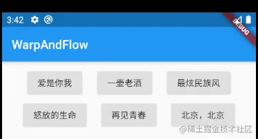
Flow
In general, we seldom use Flow because it is complex and requires manual layout of widget s, which is equivalent to the onLayout method in android.
Flow is mainly used in the following scenes that require highly customized layout or high performance requirements (such as animation),
Flow has the following advantages
- Good performance: flow is a very efficient control for adjusting the size and position of team sub components. Flow optimizes the location of the subcomponents using the transformation matrix. After Flutter positioning, if the size of the sub components changes, the context. is called in the paintChildren() method in FlowDelegate. Paintchild redraws, while contextPaintChild redraws using the transformation matrix without actually adjusting the position of components
- Flexible: since we need to customize the parentchildren () method to implement FlowDelegate, we need to manually calculate the location of each component. Therefore, we can customize the layout strategy
shortcoming
- Complex use
- The child component size cannot be adaptive. You must return a fixed size by specifying the size of the parent container or implementing getSize of TestFlowDelegate
Examples
class TestFlowDelegate extends FlowDelegate {

  EdgeInsets margin = EdgeInsets.zero;

  TestFlowDelegate({this.margin});

  @override
  void paintChildren(FlowPaintingContext context) {
    var x = margin.left;
    var y = margin.top;
    //Calculate the position of each self widget
    for (int i = 0; i < context.childCount; i++) {
      //Get width
      var width = context
          .getChildSize(i)
          .width + x + margin.right;
      //Need to wrap
      print('$width ---- ${context.size.width}');
      if (width < context.size.width) {
        //Draw first
        context.paintChild(i, transform: Matrix4.translationValues(x, y, 0));
        x = width + margin.left;
      } else {
        //Draw the following
        x = margin.left;
        y += context
            .getChildSize(i)
            .height + margin.top + margin.bottom;
        //Draw sub widgets (with optimization)
        context.paintChild(i, transform: Matrix4.translationValues(x, y, 0));
        x += context
            .getChildSize(i)
            .width + margin.left + margin.right;
      }
    }
  }

  @override
  bool shouldRepaint(covariant FlowDelegate oldDelegate) {
    return oldDelegate != this;
  }

  @override
  Size getSize(BoxConstraints constraints) {
    return Size(double.infinity, 200);
  }
}
Copy code
class WrapAndFlowTest extends StatelessWidget {
final List<String> _list = const [
"Love is you and me",
"A pot of old wine",
"The Hottest Ethnic Trend",
"Life in full bloom",
"Goodbye youth",
"Beijing, Beijing"
];
List<Widget> getMusicList() {
return _list
.map((e) => Container(
width: 140,
height: 40,
child: RaisedButton(
child: Text(e),
onPressed: () => print(e),
),
))
.toList();
}
@override
Widget build(BuildContext context) {
return Scaffold(
appBar: AppBar(
title: Text("WarpAndFlow"),
),
body: Padding(
padding: EdgeInsets.all(10),
child: Flow(
delegate: TestFlowDelegate(margin: EdgeInsets.all(10)),
children: getMusicList(),
),
));
}
}
Copy code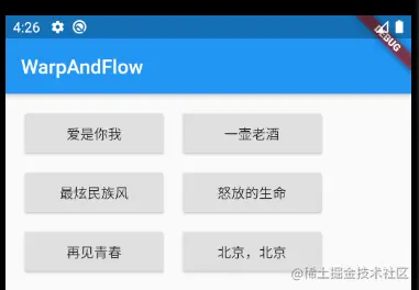
You can see that the main task is to implement paintChildren. His main task is to determine the location of each child Widget. Since Flow cannot adapt to the size of the Widget, a fixed size is returned in getSize to specify the size of Flow
Stack, Positioned
The position of the parent and child components in the layout of the Android frame can be determined by the layout of the four similar corners of the frame.
Absolute positioning allows subcomponents to be stacked (in the order declared in the code). Two components, Stack and Positioned, are used in fluent to determine positioning.
Stack allows components to be stacked, while Positioned is used to determine the position of sub components according to the four corners of the stack
Stack
Stack({
  this.alignment = AlignmentDirectional.topStart,
  this.textDirection,
  this.fit = StackFit.loose,
  this.overflow = Overflow.clip,
  List<Widget> children = const <Widget>[],
})
Copy code- alignment: this parameter determines how to align sub components that are not positioned * * (not Positioned) * * or partially positioned. Partial positioning refers to not positioning on an axis: left and right are horizontal axes, top and bottom are vertical axes. As long as a positioning attribute on an axis is included, there is positioning on the axis
- textDirection: like the textDirection function in Row and Column, it is used to determine the reference system of alignment. That is, if the textDirection value is ltr, then alignment represents left and end represents right. If textdivision is rtl, start is yes and end is left
- fit: this parameter is used to determine how the Stack size is used by sub components that are not located. StackFit.loose indicates the size of the used sub component, and expand indicates the size of the extended Stack
- Overflow: this attribute determines how to display subcomponents that exceed the Stack display space; The value is overflow When you click, the excess part will be clipped (hidden) and only overflow Visible does not
Positioned
const Positioned({
  Key key,
  this.left,
  this.top,
  this.right,
  this.bottom,
  this.width,
  this.height,
  @required Widget child,
})
Copy code
left, top, right and bottom respectively represent the distance between the four sides of the s tack. The widget coupling height is used to specify the width and height of the element to be positioned.
Note that the height and height of the Positioned widget are used to locate components in combination with left, top, right and bottom. For example, in the horizontal direction, only two of the three attributes of left, right and width can be specified. For example, after specifying left and widget, right will automatically calculate (left+widget). If three attributes are specified at the same time, an error will be reported. The same is true in the vertical direction
Chestnuts:
class StackAndPositionedTest extends StatelessWidget {
  @override
  Widget build(BuildContext context) {
    return Scaffold(
        appBar: AppBar(
          title: Text("StackAndPositioned"),
        ),
        ///Use ConstrainedBox to ensure that the Stack fills the screen
        body: ConstrainedBox(
          constraints: BoxConstraints.expand(),
          child: Stack(
            alignment: Alignment.center,
            children: [
              Container(
                child: Text(
                  "hello world",
                  style: TextStyle(color: Colors.white),
                ),
                color: Colors.red,
              ),
              Positioned(
                left: 18,
                child: Text("I am 345"),
              ),
              Positioned(
                top: 18,
                child: Text("your friend"),
              )
            ],
          ),
        ));
  }
}
Copy code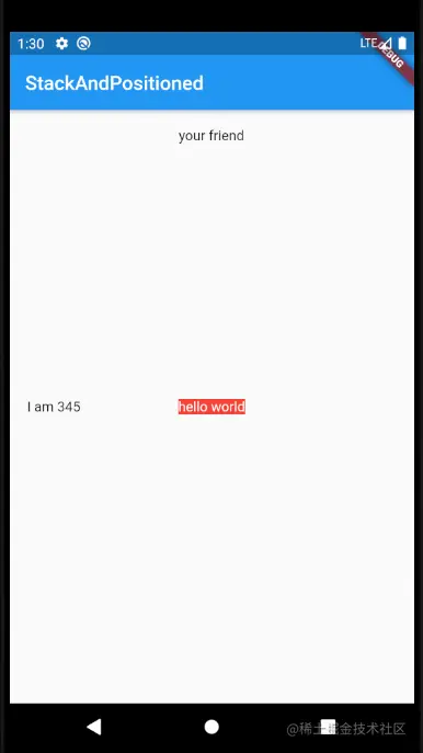
The first component in the code, hello world, does not use the Positioned component, so it will be affected by segment Center constraint, so it is displayed in the center in the figure.
The second sub component I am 345 only specifies the horizontal azimuth left, which belongs to partial positioning, that is, if there is no vertical positioning, it will be aligned according to the alignment in the vertical direction, that is, it is vertically centered
The third your friend is the same as the second, but it has a vertical top. If there is no horizontal positioning, the horizontal direction is in the middle
The modification code is as follows:
 Stack(
  alignment: Alignment.center,
  fit: StackFit.expand,
  children: [
    Positioned(
      left: 18,
      child: Text("I am 345"),
    ),
    Container(
      child: Text(
        "hello world",
        style: TextStyle(color: Colors.white),
      ),
      color: Colors.red,
    ),
    Positioned(
      top: 18,
      child: Text("your friend"),
    )
  ],
)
Copy code
The fit attribute is used above, and it is expand, which means that the sub components without positioning will expand to the size of the Stack
Since the width and height of the second sub component is as large as that of Stack, the first component will be covered
The third component is on the top layer and is displayed normally
Align and position relative align
One or more child elements can be precisely offset relative to each parent element by positional Stack,
However, if you want to simply adjust the position of a child component in the parent element, it will be easier to use the Align component
Align
Align({
  Key key,
  this.alignment = Alignment.center,
  this.widthFactor,
  this.heightFactor,
  Widget child,
})
Copy code
Align component can adjust the position of sub components and determine its own width and height according to the width and height of sub components
- Alignment: a value of type AlignmentGeometry is required to indicate the starting position of the child component in the parent component. AlignmentGeometry is an abstract class. There are two commonly used subclasses: alignment and FractionalOffset
- widthFactor and hightfactor are used to determine the width and height attributes of Align itself; They are two scaling factors, which will be multiplied by the width and height of the sub component respectively. The final result is the width and height of Align. If null, the width and height of the component will occupy as much space as possible
Chestnuts
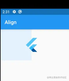
class AlignTest extends StatelessWidget {
  @override
  Widget build(BuildContext context) {
    return Scaffold(
      appBar: AppBar(
        title: Text("Align"),
      ),
      body: Container(
        height: 120,
        width: 120,
        color: Colors.blue[50],
        child: Align(
          alignment: Alignment.topRight,
          child: FlutterLogo(
            size: 60,
          ),
        ),
      ),
    );
  }
}
Copy code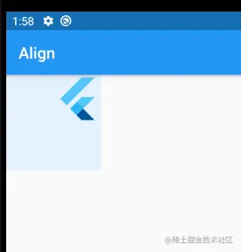
FlutterLogo is a component of Fluter sdk, and the content is the product of Flutter
The width and height of the Container is set as 120. If the width and height of the Container are not specified, and the widthFactor and hightfactor are specified as 2, the same effect can be achieved
Alignment.topRight indicates that the position of the sub component is the top right corner, and the specific value is segment (1, - 1)
Aligment
Segment inherits from the aligngemetry and represents a point in the rectangle. It has two attributes x and y, which represent horizontal and vertical offsets respectively. The definitions are as follows:
Alignment(this.x, this.y)
Copy code
Segment takes the center point of the rectangle as the origin of the coordinates (Aligemtn(0.0, 0.0)). The values of x and y range from - 1 to 1, representing the distance from left to right and the distance from the top to the bottom of the rectangle respectively. Therefore, two horizontal / vertical units are equal to the width / height of the rectangle.
For example, segment (- 1, - 1) represents the left vertex, and 1,1 represents the end point of the right bottom; 1, - 1 is the right vertex, that is, segment topRight. For ease of use, the origin of the rectangle and the four vertices have defined static constants in the segment.
Segment can convert its coordinates into specific offset coordinates of child elements through its coordinate conversion formula:
Offset = (Aligment.x * childWidth/2 + childWidth /2 , Aligment.y * chilHeight/2 + childHeight /2)
Copy code
Where childWidth is the width of the child element and childHeight is the height of the child element
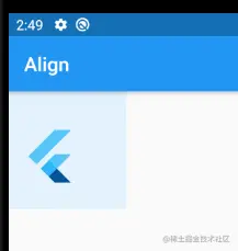
Looking back at the chestnuts above, we bring segment (1, - 1) into the above formula. It can be seen that the offset coordinate of FlutterLogo is (60,0)
Modify the chestnuts above as follows:
class AlignTest extends StatelessWidget {
  @override
  Widget build(BuildContext context) {
    return Scaffold(
      appBar: AppBar(
        title: Text("Align"),
      ),
      body: Container(
        // height: 120,
        // width: 120,
        color: Colors.blue[50],
        // child: Align(
        //   alignment: Alignment.topRight,
        //   child: FlutterLogo(
        //     size: 60,
        //   ),
        // ),
        child: Align(
          // 2x60/2+60/2 ,0x60/2 + 60/2
          //=90           =30
          alignment: Alignment(2, 0),
          widthFactor: 2,
          heightFactor: 2,
          child: FlutterLogo(
            size: 60,
          ),
        ),
      ),
    );
  }
}
Copy code
According to the calculation noted in the code, x offset 90 and y offset 30 can be obtained. The results are as follows:
FractionalOffset
FractionalOffset inherits from segment. The only difference between it and segment is that the coordinate points are different
The coordinate origin of FactionalOffset is the vertex on the left side of the rectangle, which is consistent with the system layout, so it is easier to understand. His coordinate conversion formula is:
deviation=(FractionalOffset.x*childWidth , FractionalOffset * childHeight)
Copy code
Chestnuts:
body: Container(
  height: 120,
  width: 120,
  color: Colors.blue[50],
  child: Align(
    alignment: FractionalOffset(0.2, 0.6),
    // 0.2 *60 , 0.6 * 60
    child: FlutterLogo(
      size: 60,
    ),
  ),
)
Copy code
Bring in the formula, the offset is (12,60), and the result is as follows:
Align vs. Stack
Both Align and Stack/Positioned can be used to specify the offset of the child element from the parent element. Their main differences are as follows
- The positioning reference system is different
- Stack/Positioned positioning refers to the four vertices of the parent container
- Align needs to determine the specific coordinates through the parameter alignment first, and the final offset is calculated through the formula of alignment
- Stack can have multiple child elements and can be stacked, while Align has only one element and there is no stacking
Center components
The Center component is used to house sub elements. We have used it before. Let's introduce it. The definition of Center is as follows
class Center extends Align {
  const Center({ Key key, double widthFactor, double heightFactor, Widget child })
    : super(key: key, widthFactor: widthFactor, heightFactor: heightFactor, child: child);
}
Copy code
Center inherits the child Align, which is only one less alignment parameter than Align;
Since the alignment value in Align is center, the alignment mode of the center component is engagement Center
When the length of factory is htwidth or as much space as possible, please pay special attention to this point
summary
- Row / Column Arrange subassemblies horizontally or vertically
- Flex Elastic layout, personal feeling is a little similar to the layout in Android linear layout_weight attribute. The subcomponent indicates how much the current component needs to account for the total size through flex.
- Flow layout Wrap/Flow Wrap automatic arrangement. You can specify alignment attributes and so on. If it exceeds the width, it will wrap automatically The Flow height customized Widget needs to manually calculate the folding position, arrangement, etc., which is more suitable for height customization
- Stack, Positioned Stack is a stacked layout with multiple subcomponents. The subcomponent Postioned is used to determine the position of the current components according to the four corners of the stack. If it is not used, it will be arranged according to the alignment
- Align There can only be one sub component, which can be located through segment / fractionaloffset
- Aligment / FractionalOffset Both represent this offset, and FractionalOffset inherits from segment The origin of the segment is the center of the Widget, that is, the center point is segment (0,0). The specific offset can be calculated according to the formula The origin of FractionalOffset is the top left corner vertex of the Widget, that is, FractionalOffset(0,0), which is the same as the system layout. The specific offset needs formula calculation
- Center It inherits from Align. Compared with Align, it lacks the alignment parameter, which is centered by default
Refer to the actual combat of Flutter