If you need to reproduce, please indicate the source: Flutter Learning Notes (18) -- Drawer Drawer Drawer Component
Drawer (Drawer Component) can achieve similar drawer pull-out and push-in effects, and can pull out the navigation panel from the sidebar. Usually Drawer is used in combination with ListView components.
| Property name | type | Default values | Explain |
| child | Widget | Drawer's child can place any displayable object | |
| elevation | double | 16 | z-coordinate sequence of components in ink paper design |
Drawer components can add header effects, which can be implemented with Drawer Header and User Accounts Drawer Header.
Drawer Header: Show basic information
UserAccounts DraweHeader: Display user avatars, usernames, emails, etc.
| Property name | type | Explain |
| decoration | Decoration | decoration of header area, usually used to set background color or background image |
| curve | Curve | If the decoration changes, a switching animation will be made using the curve setting change curve and the duration setting animation time. |
| child | Widget | Content control displayed in header |
| padding | EdgeInsetsGeometry | The padding of the content control in the header refers to. If child is null, the value is invalid |
| margin | EdgeInsetsGeometry | Clearance around header |
| Property name | type | Explain |
| margin | EdgeInsetsGeometry | Clearance around Header |
| decoration | Decoration | decoration of header area, usually used to set background color or background image |
| currentAccountPicture | Widget | Used to set the current user's Avatar |
| otherAccountsPictures | List<Widget> | Used to set the avatar of the current user's other accounts |
| accountName | Widget | Current username |
| accountEmail | Widget | Current user Email |
| onDetailsPressed | VoidCallBack | The callback function triggered when accountName or accountEmail is clicked can be used to display additional information. |
Demo example:
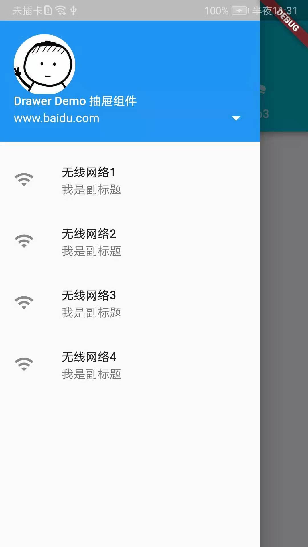
import 'package:flutter/material.dart';

void main() => runApp(MyApp());

class MyApp extends StatelessWidget{
  final List<Tab> _mTabs = <Tab>[
    Tab(text: 'Tab1',icon: Icon(Icons.airline_seat_flat_angled),),
    Tab(text: 'Tab2',icon: Icon(Icons.airline_seat_flat_angled),),
    Tab(text: 'Tab3',icon: Icon(Icons.airline_seat_flat_angled),),
  ];
  @override
  Widget build(BuildContext context) {
    return new MaterialApp(
      title: 'Drawer Demo',
      home: DefaultTabController(
          length: _mTabs.length,
          child: new Scaffold(
            appBar: new AppBar(
              //custom Drawer The button
              leading: Builder(
                  builder: (BuildContext context){
                    return IconButton(
                        icon: Icon(Icons.wifi_tethering),
                        onPressed: (){
                          Scaffold.of(context).openDrawer();
                        }
                    );
                  }
              ),
              title: new Text('Drawer Demo'),
              backgroundColor: Colors.cyan,
              bottom: new TabBar(
                  tabs: _mTabs
              ),
            ),
            body: new TabBarView(
                children: _mTabs.map((Tab tab){
                  return new Center(
                    child: new Text(tab.text),
                  );
                }).toList()
            ),
            drawer: Drawer(
              child: ListView(
                children: <Widget>[
                  Container(
                    height: 150,
                    child: UserAccountsDrawerHeader(
                        //Username
                        accountName: new Text('Drawer Demo Drawer assembly'),
                        //Setting up User Mailbox
                        accountEmail: new Text('www.baidu.com'),
                        //Setting the current user's Avatar
                        currentAccountPicture: new CircleAvatar(
                          backgroundImage: new AssetImage('images/timg.jpg'),
                        ),
                        //Callback Events
                        onDetailsPressed: (){
                        },
                    ),
                  ),
                  ListTile(
                    leading: Icon(Icons.wifi),
                    title: new Text('Wireless Network 1'),
                    subtitle: new Text('I'm the subtitle.'),
                  ),
                  ListTile(
                    leading: Icon(Icons.wifi),
                    title: new Text('Wireless Network 2'),
                    subtitle: new Text('I'm the subtitle.'),
                  ),
                  ListTile(
                    leading: Icon(Icons.wifi),
                    title: new Text('Wireless Network 3'),
                    subtitle: new Text('I'm the subtitle.'),
                    onTap: (){
                      print('ssss');
                    },
                  ),
                  ListTile(
                    leading: Icon(Icons.wifi),
                    title: new Text('Wireless Network 4'),
                    subtitle: new Text('I'm the subtitle.'),
                  ),
                ],
              ),
            ),
          )
      ),
    );
  }
}
Effect screenshots:
Demo feels like there's nothing to explain. It's a simple usage. In particular, adding Drawer components, Scaffold will automatically generate a Drawer button for us. If we set lead manually in appBar, it will change the icon of the button, but clicking on the icon will not pop up Drawer. So if we need to customize Drawer's icon, we need to do the following:
            leading: Builder(
                  builder: (BuildContext context){
                    return IconButton(
                        icon: Icon(Icons.wifi_tethering),
                        onPressed: (){
                          Scaffold.of(context).openDrawer();
                        }
                    );
                  }
              ),